While I am waiting for a book on Arabic typography to arrive from another library, I did some online research on the topic. Unfortunately, the resources are very limited, so I could not find much valuable information. The following paragraphs summarize my findings from the online research.
Early development of Arabic scripts
Archaeologists have discovered inscriptions that prove a close connection between Arabic scripts and several earlier scripts, such as the Canaanite and Aramaic Nabataean alphabets which were discovered in the north of the Arabian Peninsula. These writings originate from the 14th century BC.
Arabic Musnad
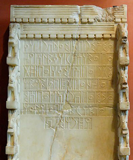
The cursive appearance of modern Arabic scripts is not present in the first Arabic script, Arabic Musnad. This script was used up until the sixth century and was found in Yemen, in the southern part of the Arabian Peninsula – it was discovered around 500 BC. Its shapes were quite simple and more closely resembled the Nabataean and Canaanite alphabets than they did the shapes of modern Arabic.
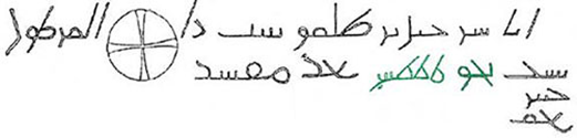
Al-Jazm
The Al-Jazm script, which was utilized by northern tribes in the Arabian Peninsula, is the earliest type of an alphabet which is similar to Arabic. However, the early Arabic scripts also appear to have been influenced by other scripts in the region, such as the Syriac and Persian scripts. Many scholars believe that this script’s origins lie in the Nabatean script. In Mecca and Medina, in the western part of the Arabian Peninsula, the Al-Jazm script continued to advance until the early Islamic period.
The script used in Al-Jazm evolved into a variety of styles, including Hiri, Anbari, Makki, and Madani. Other scripts emerged around this time, including the Ma’il, which is considered to be the predecessor of the Kufic script. Other scripts, such the Mukawwar, Mubsoott, and Mashq, did not make it through the development stage. These scripts were widely utilized before and throughout the early years of the Arabian Peninsula’s Islamic Empire.
Kufic script
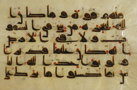
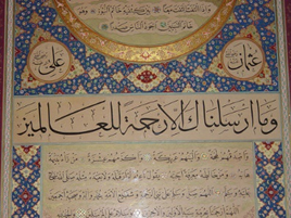
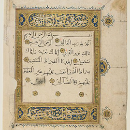
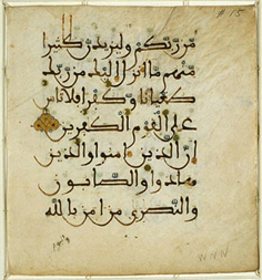
The Kufic script developed as the subsequent step in the evolution of Arabic calligraphy following the Arabic Musnad and Al-Jazm. We can recognize existing letter forms in the early Kufic script development, unlike the other ancient scripts. The Qur’an Kareem, the Muslim holy book, was written in the Kufic script, which developed over the course of the 7th century and was widely used up to the 13th century. Although the script’s name is a reference to the Iraqi city of Kufa, where it initially emerged, the majority of instances could be located in Medina on the Arabian Peninsula, where the Prophet Mohammed lived after leaving Mecca.
The dots which are familiar to us from modern Arabic scripts were absent from the Kufic script in its early phases of development. During the later development of these and other scripts, the letter dots (Nuqat) were introduced. Additionally, at a later point in time, the diacritical marks (Tashkeel) that represent the vowels of the letters were created by Abul Aswad Al Du’ali and Al Khalil Ibn Ahmed Al Farahidi.
If we look closely at inscriptions written in the Kufic script, we’ll see certain traits like angular forms and long vertical lines. Writing long text used to be more challenging since the script letters used to be wider. Nevertheless, the writing was utilized to decorate the outside of structures like mosques, palaces, and schools.
Although Kufic has been around for a long time and is one of the more widely used scripts in Islamic civilisation, several variations of it were developed in particular regions, like Egypt and Iraq. The following are some variations and advancements of the Kufic script: The thick Kufic script, Magribi Kufic script, Mashriqi Kufic script, Piramouz script, Ghaznavid and Khourasan scripts, Fatimid Kufic and Square Kufic.
Abbasid Dynasty
The Abbasid dynasty (750–1258 CE), which followed the Umayyad dynasty, refined Arabic calligraphy. Thuluth and Naskh were developed during this time. These advancements were brought about by three calligraphers: Ibn Muqlah, Ibn Al Bawwab and Yaqut Al Musta’simi.
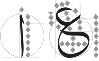
Ibn Muqlah limited the number of cursive script proportions styles to six, including the Thuluth, Naskh, and Muhaqqaq. The rhombic dot, the alif, the circle, and the similarity system are the four foundational parts of these rules.
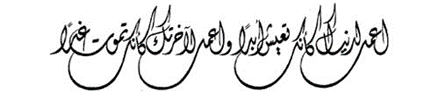
Thuluth script
Thuluth, which means “one third,” may allude to the size of the pen that was used for writing. It was frequently used to embellish mosques and various texts. During the Ottoman dynasty, calligrapher Seyh Hamdullah improved the Thuluth script, which was initially created in the 11th century by the Abbasid dynasty. It serves as the foundation for later scripts, such the Jeli Thuluth, Naskh, and Muhaqqaq.
Naskh script
Another primary script was formed around the same time. Naskh, which means “copy,” was initially used to copy texts, particularly the Holy Qur’an, but was later improved by Islamic calligraphy master Seyh Hamdullah under the Ottoman dynasty. The Naskh was traditionally used for long writings and inscriptions because of its legible characters. Due to its contemporary appearance and cursive letters, it is still used in printed Arabic books today.
Safavid Dynasty
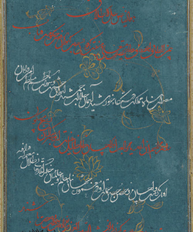
The Safavid dynasty (1502–1736), which was established in Persia after the Abbasid dynasty, made significant contributions to Islamic arts and calligraphy. During the rule of Shah Islma’il and his successor, Shah Tahmasp, it improved the Ta’liq script that was already in existence and created a more developed variant, known as Nasta’liq.
Ta’liq script
The script’s lines, which appear to be hanging together, were the inspiration for the term Ta’liq, meaning “suspension.” The Ta’liq script, which is still in use today, was refined in Persia around the 13th century and is widely used for a variety of things, including messages, books, letters, and poems.
The letters are rounded and have many curves, and as was already noted, the words seem to hang together and link to one another. The script is frequently written with a wide spacing between lines to give the eye more room to distinguish letters and words to increase legibility. The spaces between lines are useful, but they also occupy space on the page, which is an issue when there isn’t much space or if the content is long.
Nasta’liq script
Although it has aspects of Naskh, the Nasta’liq is a polished variant of the Ta’liq script. In Turkey and Persia, it emerged in the 15th century and persisted into the 16th. It is still used in Persia, India, and Pakistan for writing Persian, Urdu, and Punjabi. It combines the traits of both scripts, such as the short vertical lines of Naskh and the long, curved horizontal strokes of Ta’liq. It is more legible than the Ta’liq but more challenging to read than Naskh.
Similar to the Ta’liq script, the letters are slightly hooked and fluctuate in thickness. Although the letter arrangement is harmonious and flows well, it is more difficult to write and less readable compared to many other scripts. Persian art and architecture have been influenced by both the Ta’liq and Nasta’liq scripts, and you can clearly recognize Persian inscriptions by the scripts they are written in.
The Maghribi
The Islamic Empire’s western part of North Africa is referred to as Maghrib. The Maghribi script, which is used in texts, inscriptions, and monuments, distinguishes this region. The 10th-century Maghribi script, which is still in use today in Spain and western North Africa, is most prominent in Morocco, Algeria, and Tunisia. In this manner, the Maghribi script diverged from the scripts that originated in the Middle East and Arabian Peninsula.
The Maghribi script is characterized by letters with uniform thicknesses and descending lines drawn with unusually big bowls. Its distinctive beauty and ease of reading even in lengthy texts are a result of the distinctive letterform.
Ottoman Dynasty
Many scripts, including Diwani, Riq’a, Jeli Dewani, Tughra’a, and Siyaqat, were developed during the course of the Ottoman Empire’s four centuries. Numerous calligraphers, such as Mustafa Halim, Nejmiddin Okyay, and Hamid Aytac Al-Amadi, made contributions to the development of Arabic calligraphy.
Diwani script
The name of the Ottoman royal chancery, “Diwan,” inspired the name of this script. In the courts, it was used to write official papers. It was created in the sixteenth century, achieved its ultimate form in the nineteenth, and is still in use today.
It is characterized by the lovely curving letters that combine to create intricate patterns and ornamental designs. A less complex version of the script is required if it is to be used for long texts since its intricacy makes it difficult to use.
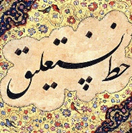
Riq’a script
The word “Riq’a” refers to the little pieces of paper or fabric on which the script was originally written. Having been created in the 18th century and still being used today, it appears to be one of the more modern scripts.
The Riq’a script is renowned for its straightforward structure, which makes it ideal for paragraphs and long texts. It is particularly simple to transform into a digital font because of the way its letters are joined. However, because it lacks the intricate letterforms of the Diwani, Thuluth, and Kufic scripts, it is not very appealing for titles or decorations.
Source
https://www.smashingmagazine.com/2014/03/taking-a-closer-look-at-arabic-calligraphy/