In my last blog, I described how we can organize logos into different categories based on style. This can be used for many types of logos, not just fashion logos. In this blog I would like to delve a bit deeper into it and write about what are the other options to divide logos into categories. How to know which is the most suitable logo for your brand, based on the style of fashion you are selling.
One of the first categories we can come up with is separating logos by gender. There are some fashion brands that only make clothes for women, while others only make clothes for men, and therefore the logo should reflect that. The logo must communicate the story of the brand and has to be appealing to the target group. So, what is the difference?
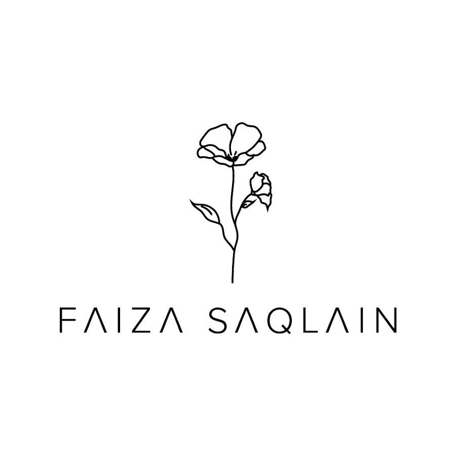
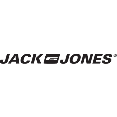
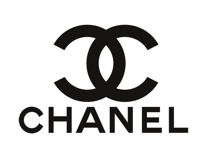
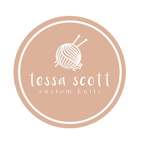
Masculine fashion logos are more likely to include straight lines, acute angles, and wider elements, which can symbolize dependability as one of the features historically associated more with males than females and also represent the fact that men typically have wider bones. Compared with masculine logos, feminine logos often have a more decorative design and include more curves. (1) Also, the colour can tell a lot about which gender the target group belongs to. Feminine logos often have pastel colour palettes, embellishments, floral illustrations, and hand-drawn fonts. Men’s logos in contrast a lot of times include dark colours, capital letters and bold designs.
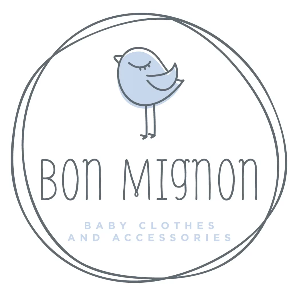
We can also sort logos according to the target group’s age. More specifically there is a special category of logos for kids. These logos have characteristics more associated with feminine logos, such as using pastel colours that are light and bright. Logos for kid’s fashion brands are usually a bit cuter, and include illustrations (often animals) to express their playful style. (2)
Another category I would like to highlight is minimalistic/simple and maximalistic/complex logos. The minimalistic trend has obviously been in the trend for the last few years, but there are also a lot of really creative and well known complex fashion logos. Because of the trend, many complex fashion brands have changed and simplified their logos. Research by Harvard Business Review found that simplistic logos are not authentic or likable. Detailed and descriptive logos are supposed to be more successful because they generate the trust factor among consumers, which simple logos fail to do. Since non-descriptive logos do not communicate what a business does, it is a smart idea for an unfamiliar brand to use a descriptive logo. However, it is important to be careful when talking about complex and descriptive logos. Because a simple logo can also be descriptive (for example Facebook). (3)
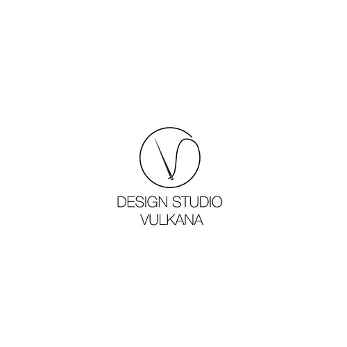
Simple logos are modern, classic, and timeless. Mostly sans-serif and black-and-white are the characteristic of this logos. With this they also express fashion-forwardness, coolness and youth. (2)
Among other things, it is also common for simple logos to make it difficult to decipher what exactly the product is intended for. While more complex logos can give us a hint about it.
Another advantage of a simple logo design is that it becomes universally accepted by everyone. There are no hurdles of nationality, language, and culture do not become a barrier to recognizing simple logos. (4)
Fashion brands that produce handmade fashion like to show off their quality in their logo. They create a connection to the craft behind their brand by incorporating the tools of your trade into the logo. Illustrations of needle and thread, sewing machine, and scissors recall the labour-intensive production process and symbolize skill and quality. (2)
I would also like to point out a group that is not a brand but sells other brands. These are second hand shops. Most often they use logos that relate to what they sell, or are more abstract, since their slogans will always include “second hand” in relation to their business. The same is true with clothing stores selling clothes from a particular era (80s), music period (hip hop) or cultural place (India).
Brands of sport fashion has often also an obvious logo, showing movement, animals and the connections to nature or sport equipment.
A powerful sport logo can evoke strong feelings and associations, just like the national anthem or coat of arms. As a result, sport teams feel more engaged, have more strength and confidence, and are able to support one another.
Literature:
- Can You Tell a Men’s Fashion Logo from a Women’s One? [zitiert 26.01.2023]. Abgerufen von: <https://1000logos.net/can-you-tell-a-mens-fashion-logo-from-a-womens-one/>.
- Fashion logos that express your style. In: 99designs [dostopno na daljavo]. Obnovljeno 20.02.2017 [zitiert 26.01.2023]. Abgerufen von: <https://en.99designs.at/blog/creative-inspiration/fashion-logos-that-express-your-style/>.
- CHRISTIAAN. Minimalist logos aren’t authentic. 2021 [zitiert 26.01.2023]. Abgerufen von: <https://designbro.com/blog/logo-creation/minimalist-logos-arent-authentic/>.
- What Is The Major Difference Between Complex And Simple Logo Design. Designhill. 2018 [zitiert 26.01.2023]. Abgerufen von: <https://www.designhill.com/design-blog/major-difference-between-complex-and-simple-logo-design/>.