The Museu de les Ciències is a scientific hands-on museum and located in Valencia (Spain). At the time of my visit there have been several exhibitions ranging from topics like chromosomes to the exploration of mars. The following post will be about my experience at the museum.
My focus was to analyze the user experience of the exhibits in the exhibitions. Not only did I document my own experience with photos, but also observe how other visitors interact with exhibits.
Exhibition: Pixar
In this exhibition I experienced a lot of consistency when it comes to the design of the user interfaces. Most of them where not only constructed in the same way but also had strong similarity in the layout of the panels. They shared the same button-, slider- and text layout. The color was used to distinguish between the different subtopics as well as the language.
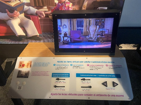
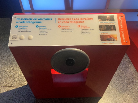
In the following photo you can see an interface that in my opinion broke this consistency as there is, compared to the other interfaces, no clear labeling. While the icon clearly indicated the user action, there was no panel connecting the user action to theoretical background like the other exhibits did.
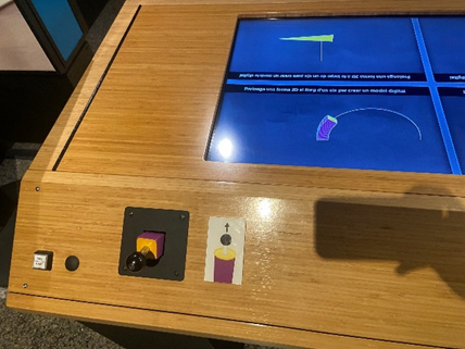
A user interface I interacted with and observed several users interacting with was about stop motion animations.
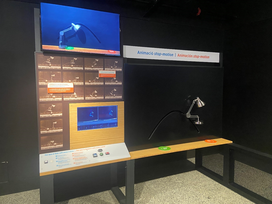
Based on my observation, I don’t think that there was a clear and understandable user journey. By observing four different visitors only one managed to interact with the exhibit as intended.
Possible reasons:
- Different way of interaction
Compared to most other exhibits in this exhibition this one required the user to actively participate. A camera filmed the lamp on the black canvas on the right side and took snapshots as the user pushed a button on the interface on the left side. By moving the lamp and taking multiple snapshots the user could create a stop motion clip. So, the main problem was that most of the visitors don’t recognize the camera. Since the buttons were located on the left side, the user standing in front of the interface didn’t recognize that there was a camera as it didn’t capture the person at this position. Furthermore, since the buttons were located on the left side, at least two persons were needed to take a snapshot.
- No clear explanation and misleading symbols
There was no visual explanation of the camera pointing to the lamp indicating that visitors can take photos of themselves. Most of the visitors didn’t understand that they can move the lamp. A few tried to move the lamp but didn’t succeed since it had to much friction. In my opinion the symbols indicating start and finish was also misleading, as the orange hand can be interpreted as “do not touch”. There is also a monitor on the top indicating the movement, unfortunately I only discovered it on the photo as it was placed too high and out of sight when interacting with the interface.
Exhibition: Terra Extraordinária
This exhibition was about the different scientific processes in our ecosystem. It was more diverse as there was no consistency in terms of user interfaces and only a few exhibits could be controlled via user inputs. While a lot of exhibits showed physical representations combined with text and graphs explaining the scientific background, a few let the user interact with gestures or touch.
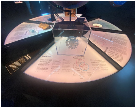
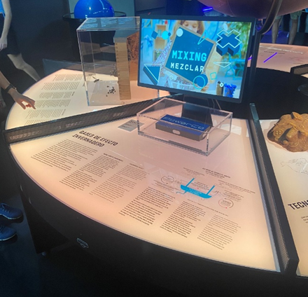
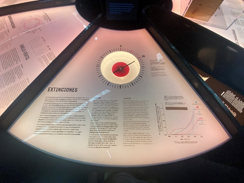
Here you can see a table showing physical representations as well as scientific background. While the table itself was build in the shape of a circle to provide good accessibility, the boxes protecting the physical objects didn’t match in shape and size. While one box was shaped like a cube another one looked like a cylinder.
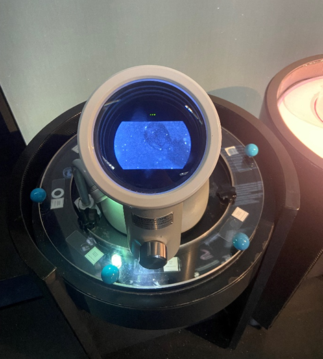
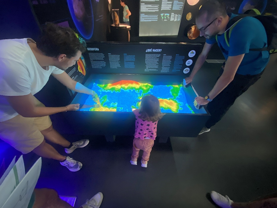
The two pictures above show exhibits visitors could interact with. While in one exhibit visitors could rotate the plate and see different microscope slides through the lens of a real digital microscope, in the other exhibit they could build their own geosphere by moving sand and producing rain with gestures.
While both exhibits encouraged visitors to interact with their hands, they included because of the construction different age groups.
While the exhibits offered different degrees of interactivity, I did not get the feeling of being disconnected. In my opinion, the reason for this is the use of similar colors and shapes. However, as you can see on the pictures above the shapes did not always match.
Also different forms of projections (on 3-dimensional and flat surfaces) were part of this exhibition.
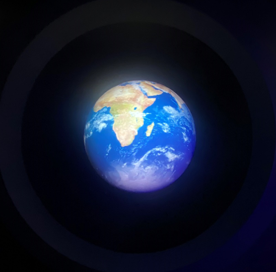
Here you can see another installation that projected the earths surface onto a 3-dimensional sphere. Unfortunately, one can’t recognize the 3-dimensional sphere as the room was very dark and the projection itself not in high resolution.
In comparison following picture shows a projection in high resolution on to a wall with a physical representation next to it. Even though the projection was in a brighter environment, the visibility was very good and the text readable. In my opinion, educational installations placed in dark environments can make tired and unfocused. Additionally, high contrasts can be exhausting for the eyes. The projection showed in the following picture on the other hand was very good optimized for the environment.
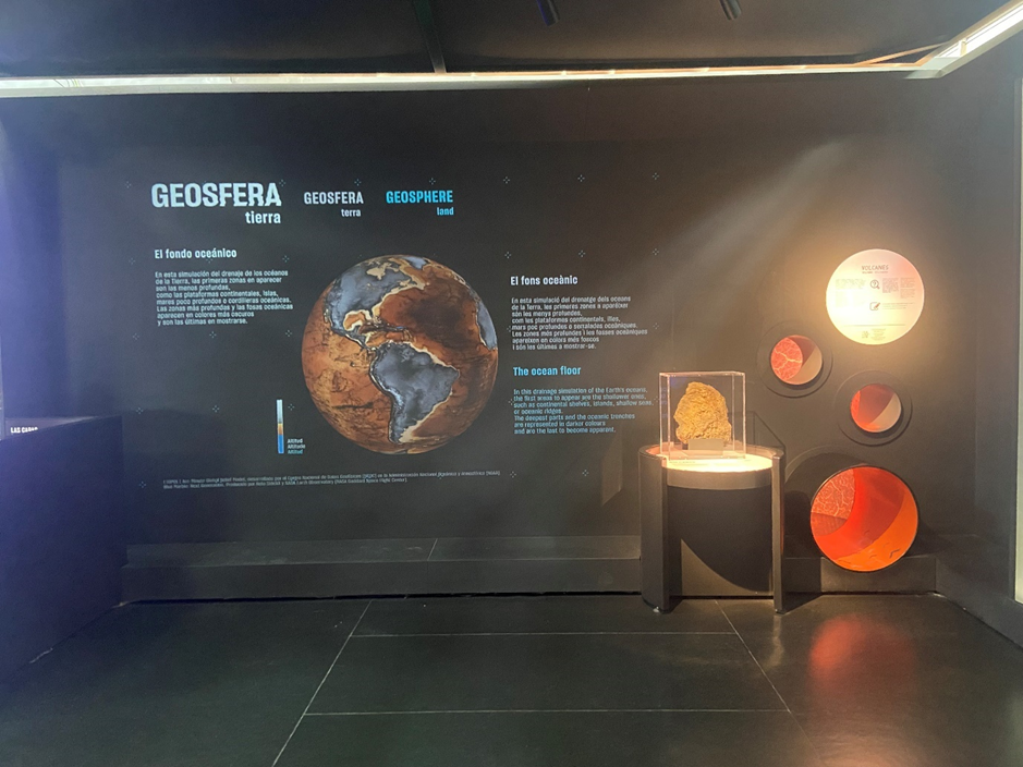
Photo Credits: Edwin Lang