Brand personality & experiment part 3

Since I was aware that people wouldn’t express themselves that much after giving them a chart-survey about how logosare perceived, I decided to ask another group of people directly about their opinion. So I sent the same 10 logos I made in the last blog post to people who didn’t take part in the last survey. I asked them to describe what they think about the brand personality of the logo or target group. With every answer we can again see all of the 10 logos.

Here are the answers:

1. Adolescents (Levis), children or families, fashion brand for teenagers

2. Upper class, classy and modern, more for fashion enthusiasts, a brand that wants to sell stuff that looks expensive and classy but is not

3. Teenage girls (Stradivarius), rather for children or colourful fashion for adults like Desigual

4. Mature population, real luxury, expensive, something classy, doing dresses or suits

5. Children, babies and children, brand for kids or babies, for clothes and teddy bears, good quality

6. Wedding, formal dresses, female fashion, but it’s pretty oldschool and doesn’t look that high quality, for wedding dresses, but not super high quality ones

7. Sporty, menswear or more basic, sailing type clothes, quite expensive, a bit like Petit bateau

8. Something more special, boho, secon-hand, “funky” fashion or accessories, a bit trashy, brand for jewellery but with poor quality, a bit like Claire’s, but for older people like 20-30.

9. Younger generation, girls, for children or the whole family, rather cute

10. Neutral (Tom Tailor), multi-generational, could be women’s or men’s, very modern and contemporary, but not too expensive, for teenage/young adult men, fast fashion

RESULTS

The most significant factor that changed my perspective after the first survey is for sure the quality. People were more likely to express themselves in the second experiment. I believe that good quality is a very important factor, because this can have a huge impact if people will buy the brand or even go inside the store. What is also helpful are the examples that the respondents gave me. I think it Is interesting to see to which brand they compare a logo that might be similar or isn’t at all.

Brand personality & experiment part 2

All the 10 logos I created in the last blog post, I used in a survey about brand personality. Below we can again see all of them.

For all the logos the people who took part in the chart-survey had to decide on following factors of the personality of the fashion logo:

  1. Feminine – masculine. Respondents would indicate whether they perceive the logos as more feminine or masculine.
  2. Young – mature. Participants would indicate whether they perceive the logos as targeting a younger or more mature audience.
  3. Luxury – economical. Respondents would evaluate the logos on a luxury-economical spectrum, indicating whether they perceive the brands as luxurious or affordable.
  4. Modern – classic. Participants would assess the logos as either modern or classic, reflecting the design styles and aesthetics associated with each brand.
  5. Playful – serious. Participants would indicate whether the logos convey a playful or serious tone.
  6. Loud – quiet. Respondents would evaluate the logos on a loud-quiet spectrum, indicating whether they perceive them as bold and attention-grabbing or more subdued.
  7. Simple – complex. Participants would assess the logos as either simple or complex, reflecting the level of visual intricacy and simplicity.
  8. Subtle – obvious. Respondents would indicate whether the logos are subtle or obvious in conveying their intended messages and brand identity.
  9. Organic – geometric. Participants would evaluate the logos on an organic-geometric spectrum, indicating whether they perceive them as having natural, flowing shapes or more structured and geometric forms.

Respondents had a line on which they could choose where to place the logo. This would give the option of being neutral or somewhere in between instead of strictly one (extremely feminine or extremely masculine).

RESULTS 1

In the end I decided to put all logos on one chart so I could clearly see the results. We can see that some logos are distributed along the entire line, while at certain places they are clearly separated. You would determine whether respondents perceive each logo as more feminine or masculine. The results would indicate the extent to which each logo aligns with traditional gender associations.

Between feminine and masculine, logos are distributed along the line. However, it’s clearly to see that the participants had a more clear vision about the feminine logos. Probably also because of the little details (9) and colors (3) that give afeminine vibe. Interesting it’s to see that the simple logos  using sans serif, black, just typography (2,4) made for “luxury” brands people are perceiving more feminine than masculine. Also interesting was to see that the logo for kids (5) was for them more masculine and feminine.

In the second line, we can see that the logos are clearly divided between young and mature. This is an interesting result from my perspective. It is also possible to see that colours have a big impact on this decision.

There is no doubt that the colours played a crucial role in the comparison of luxury and economical. Black and dark logos are perceived as more luxurious, whereas colourful logos are perceived as more economical. Here we can also see the dark green logo (10) and the dark blue logo (7) coming closer to the middle.

On the line between modern and classic, we can see the interviewees were unsure where to place the logos. So most of them are around the middle. The most surprising thing is that logos which could be made for the similar brand (2,4), or on the other side of the line, and the outstanding logos are not perceived as modern.

Once again, there is a clear division in the next line.

The colourful logos are on the side of being playful, and the dark logos are on the serious side.

On the line between loud and quiet, we can see that the logos that take a bigger surface are on the loud side, while the minimalistic ones are on the quiet side. Interestingly, there is that the logo 1 is on the loud side, even if it’s written with thin typography.

Between simple and complex, the logos are again more together. It’s interesting to note that there are no extremes, and that, for instance, the logo without a name, just a symbol, is not the simplest one.

Between subtle and obvious all the logos are more concentrated in the middle. The most surprising thing I noticed was that the kid’s logo (5) and dress logo (6) were more chosen to be subtle than obvious.

And the last line with organic and geometric it is also divided again on two clear sides. Again, the most surprising position if the logo is for me the logo 6, which is perceived as more geometric than organic. When for example, the logo number 3 is perceived as more organic than geometric.

By analyzing the data collected from the chart-survey, I gained a better understanding of how people perceive and interpret the personality factors of fashion logos. This information can help me assess the effectiveness of my logo designs in conveying the desired brand personality and targeting specific audiences.

Brand personality & experiment part 1

In this experiment I wanted to test people on how they understand and perceive fashion logos. In the future, I can use this knowledge to create logos and brand identities. It is imperative to see fashion logos from the perspective of not designers. When perceiving the logos I want to focus on the brand personality.


The perception of a brand’s personality is subjective but vital. Emotional connections with brands affect purchasing decisions, with 95% of decisions based on feelings rather than logic. Brand personality is how it is perceived by customers based on its actions, communication, and appearance. Strong brand personality can attract loyal customers and improve business success.

To create an effective brand personality, several factors should be considered. Authenticity is key, as the brand’s personality should align with its goals and company culture. Memorability is critical for standing out in a competitive market. Value refers to the unique benefits the brand offers to customers. Trustworthiness is essential, as customers expect honesty and transparency. Authority, or expertise in the field, helps attract more business.

Brand personality should be reflected consistently across all branding efforts, from the logo to the website and customer service interactions. Visual elements such as color schemes, shapes, and typography contribute to brand identity, which is the external manifestation of brand personality. While brand personality and brand identity are closely linked, they are distinct concepts.

Developing the best brand personality involves catering to the target customers’ preferences. Gathering quantitative customer data can provide valuable insights. Making a list of adjectives that describe the ideal brand personality can help clarify its traits and values. Visualizing the brand as a person and imagining how they would greet, act, talk, and dress can further refine the brand persona.

Ultimately, actively shaping and understanding a brand’s personality allows businesses to take control of their brand reputation. By translating the brand personality into all aspects of branding, such as the logo, website, and merchandise, businesses can bring their brand personality to life. This will enhance their overall branding efforts.

The first part of the experiment was to design logos with different brand personalities. Using the blog post from my last semester, where I researched what type of logos exist, I created very diverse logos. I picked up three random names for the logos and started creating them. In the beginning, I created all the logos in black, then added some colors. The result is a total of 10 very different logos in different colours with different fonts. They all represent very different fashion brands. 

1. The product I imagined was one made for young people; it was clothing made for skateboarding.

2. My vision was for a brand designed for young people, any gender, modern, affordable, but looking luxury.

3. I was thinking about a brand made for young people who like modern, stand out clothes. For people following trends and influencers.

4. I was thinking about luxury brands.

5. Children and babies are the focus of this brand.

6. A place with dresses for women, could be towards wedding dresses.

7. Sport brand, without really displaying the name, just the logo showing movement.

8. A brand, which could be for young people or a specific group of people who want to wear extraordinary clothes.

9. I was thinking about a fashion brand made for women of any age

10. Fashion brands for men.

Ready to present your fashion logo?

The last time I shortly mentioned all the important things that have to be included into a brand identity. In this blog post I will start to get a bit deeper to all of the important factors.

 It is important to write about the back story of a fashion brand for its brand identity, since this can create a compelling narrative that resonates with the target audience and effectively communicates the essence and values of the brand.  Successful companies are very good storytellers. The purpose of brand storytelling is to build an emotional connection between a brand and its target audience by creating a series of plot points. 

We can start by sharing the inspiration behind the brand. It is relevant to discuss the founder’s vision, the story of how the brand came into existence, and any significant influences or experiences that shaped its creation. This can help establish a personal connection with the audience and showcase the unique perspective of the brand. We have to clearly express the core values and mission of the fashion brand. Explaining the purpose and beliefs that drive the brand’s decisions and actions. This can include commitments to sustainability, inclusivity, craftsmanship, or any other principles that differentiate your brand and align with your target audience’s values. Another relevant stage is to describe the design philosophy of the brand. Discussing the aesthetics, styles, and artistic inspirations that define the collections. Sharing insights into the creative process and how we can translate the brand’s values and vision into unique and desirable fashion pieces.

If the fashion brand has a rich heritage or incorporates traditional craftsmanship or techniques, we should highlight these aspects. Discussing the historical significance or cultural influences that contribute to the brand’s identity. Emphasizing how the honour and reinterpret tradition in a modern context.

Very important is also to develop a distinct brand personality and voice that reflects the brand’s identity. Consider the tone, language, and style of writing that best represents the brand’s character. Whether it’s playful, sophisticated, rebellious, or any other attribute, ensure consistency in expressing this personality across your brand communications. We must craft a compelling and engaging narrative. Using storytelling techniques to create an emotional connection with the audience. Sharing anecdotes, milestones, or pivotal moments that have shaped the brand’s journey and illustrate its unique character. Some elements that can be used are: empathy, attention-grabbing, authentic, relatable, consistency, aligning with business goals and provoking actions. Clearly articulating what sets the fashion brand apart from others in the market. Highlighting the distinctive features, innovations, or experiences that make your brand stand out. This could be a unique design approach, sustainable practices, ethical sourcing, or any other factor that makes the brand unique and different from others.

MOODBOARD

Creating a moodboard for a fashion brand identity is essential to visually convey the brand’s desired aesthetic, atmosphere, and emotions. Serving as a powerful communication tool, the moodboard aligns stakeholders on the brand’s identity and guides its creative direction. By showcasing inspirations from fashion trends, art, culture, and nature, the moodboard informs the overall mood and aesthetic, establishing a foundation for design decisions and creative exploration.

Colors and color palette selection play a vital role in the moodboard, as they evoke specific emotions and contribute to a consistent visual identity. Considering factors like seasonality, brand personality, and target audience preferences, the moodboard carefully selects colors that convey the desired associations, resulting in a memorable and harmonious visual identity.

Textures and materials depicted in the moodboard contribute to the desired look and feel of the brand. Through the curation of fabrics, patterns, finishes, and tactile elements, the moodboard effectively communicates the sensory experience the brand aims to create. By exploring a range of textures, from soft and luxurious to bold and edgy, the moodboard guides the selection of materials that align with the brand’s identity.

The visual style and imagery presented in the moodboard define the creative direction of the brand. Elements such as composition, lighting, perspectives, and overall aesthetic are carefully considered. Examples of photography, illustrations, and other visual elements captured in the moodboard serve as a visual compass, guiding the brand’s creative team in developing assets that align with the brand’s identity and narrative.

Furthermore, the moodboard delves into key themes and concepts that are integral to the brand’s identity. Whether drawing inspiration from culture, nature, history, or emotions, these themes are reflected in the visual elements, shaping the brand’s narrative and strengthening its connection with the target audience.

Coherence and consistency are paramount in the moodboard. It acts as a guiding principle, ensuring that the visual elements harmoniously come together to create a unified brand experience. By aligning the moodboard with other brand assets like the logo, typography, and overall design direction, the brand identity remains consistent across all touchpoints.

In conclusion, the moodboard serves as a powerful tool in shaping the visual identity of a fashion brand. By capturing the desired aesthetic, atmosphere, and emotions, it provides inspiration and guidance to the creative team, resulting in a compelling and coherent brand identity that resonates with the target audience. The moodboard’s incorporation of inspirations, colors, textures, visual style, and key themes sets the stage for a captivating brand identity.
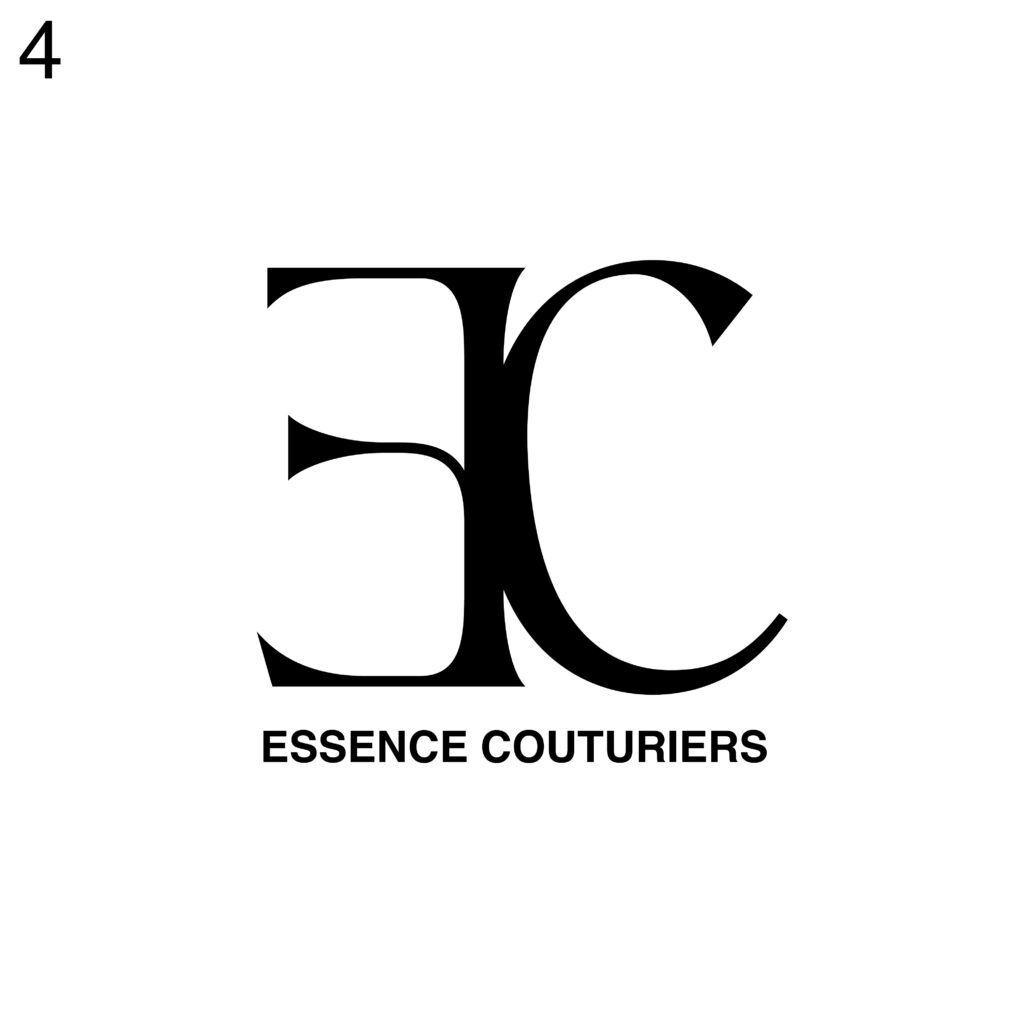
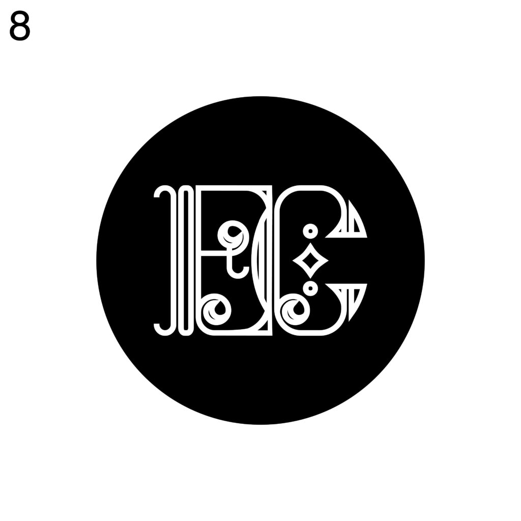
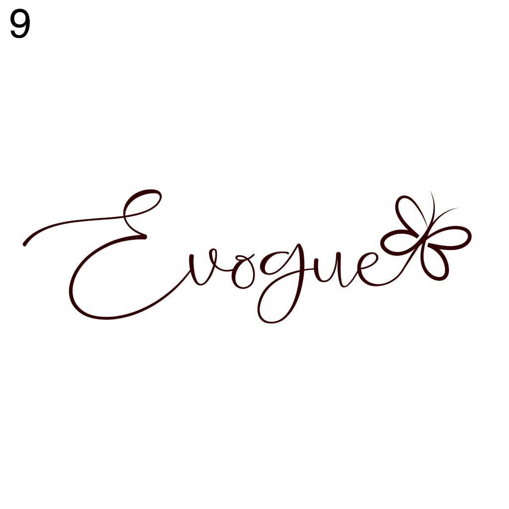
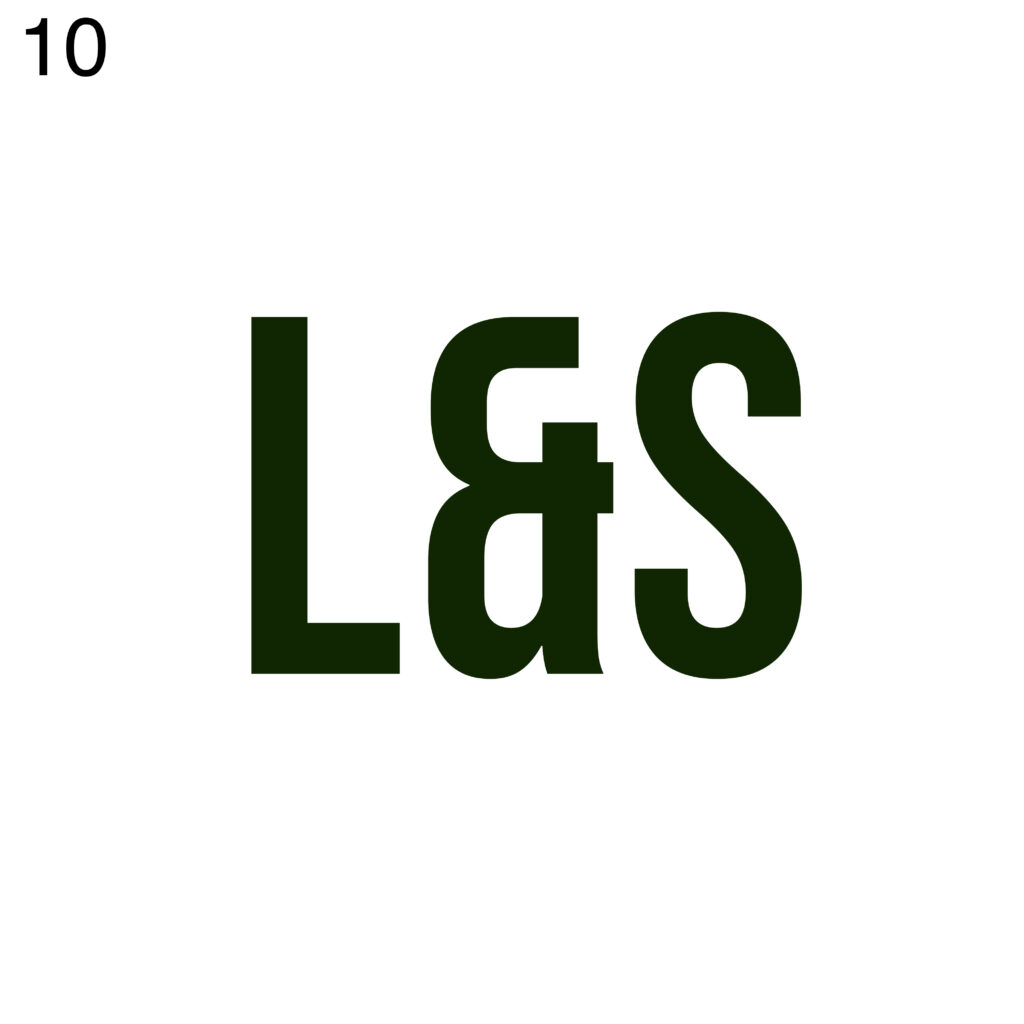
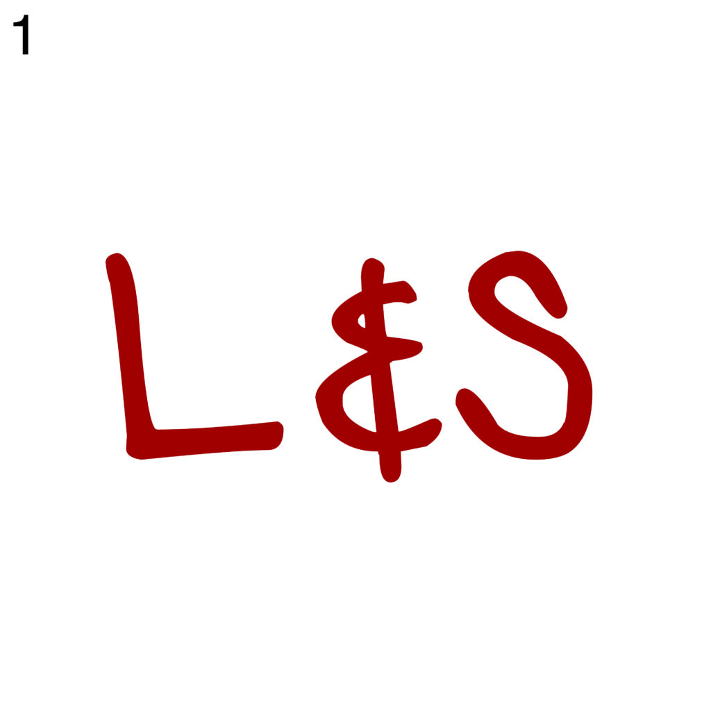
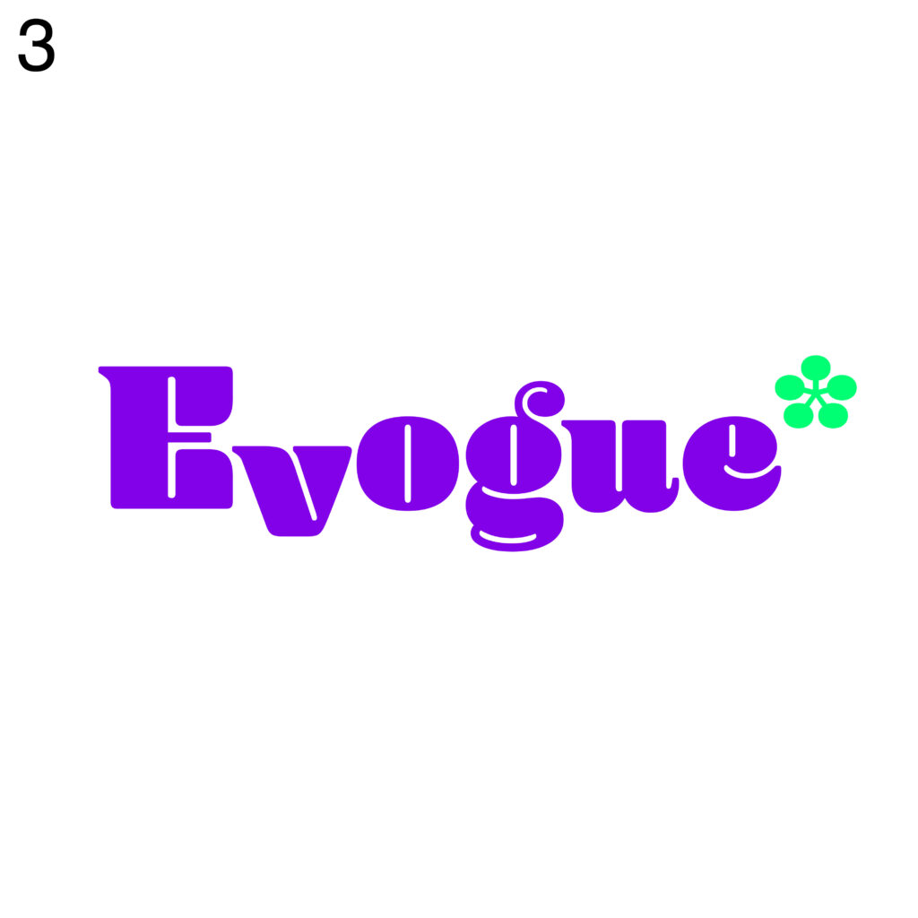
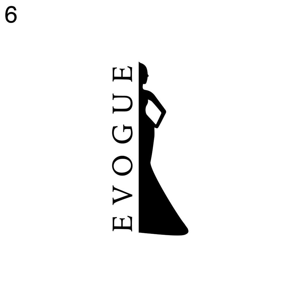
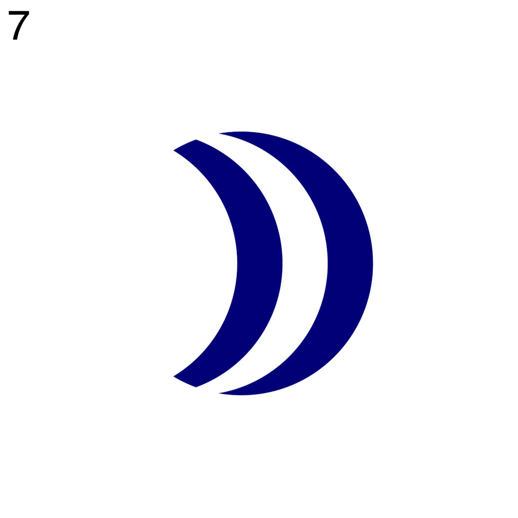
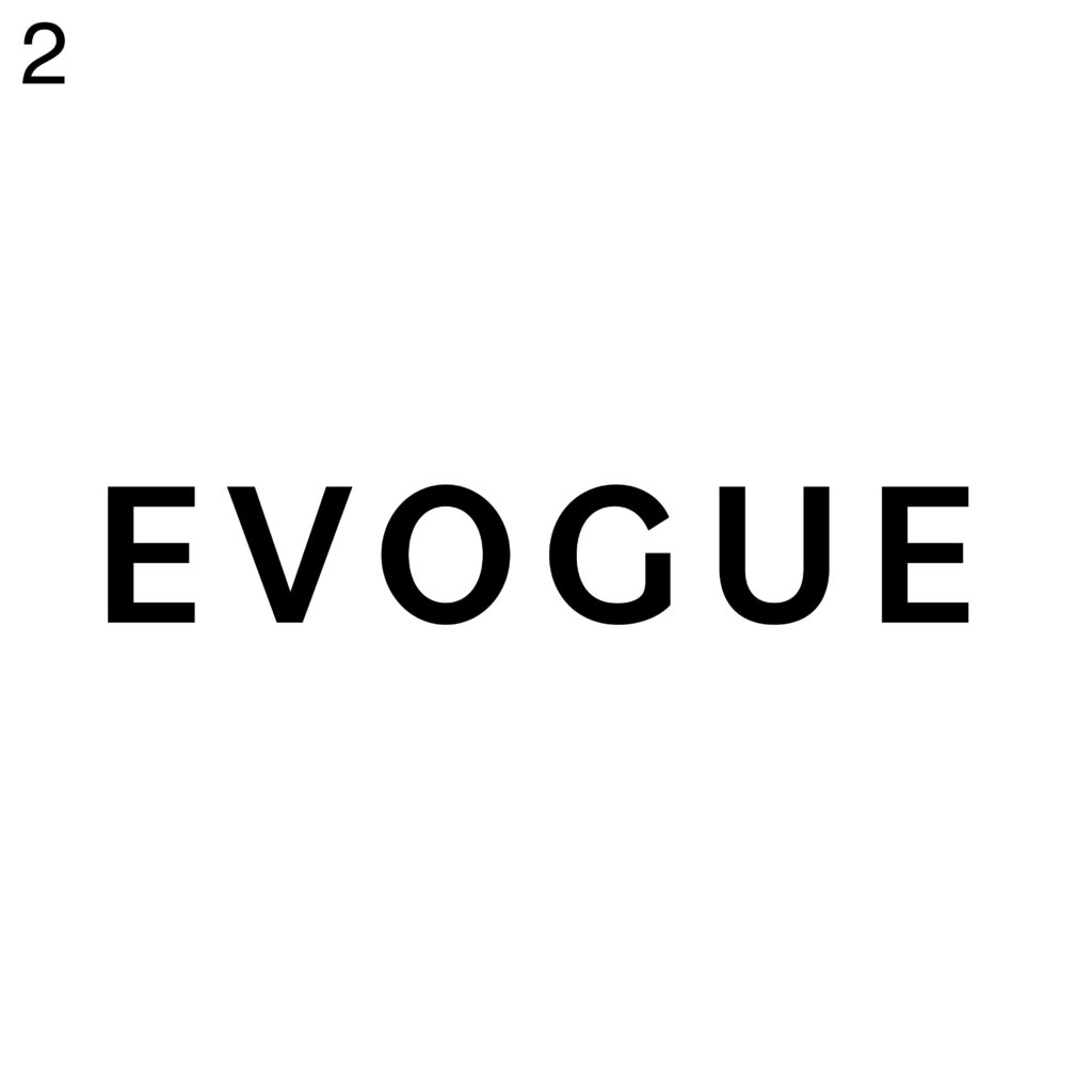
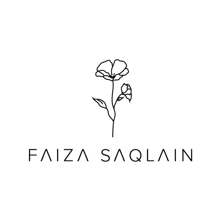
LOGOS

When presenting a logo and its variations there a lot some important things to consider.

The best is to start with explanation from the back story and mouldboard to explain the concept, meaning, and inspiration behind the logo. We have to highlight its unique features and how they align with the brand’s identity and values. This provides context and helps stakeholders understand the logo’s purpose. When showing the variations of the logo we have o ensure to maintain visual consistency in terms of colors, typography, and overall design elements.

It is always good to present different variations of the logo for various use cases. For example, how the logo works in different sizes, orientations (horizontal and vertical), and backgrounds (light and dark). 

COLOR

The chosen colors should align with the brand’s identity, values, and personality. Considering how the brand wants to be perceived—is it bold and energetic, sophisticated and elegant, or playful and vibrant. The colors should reflect these qualities and evoke the desired emotional response from the audience. Understanding the target audience is crucial in color selection. Different colors can have different cultural or psychological associations, and they may elicit different responses from various demographic groups. Considering the preferences, cultural background, and psychological impact of colors on the intended audience to ensure relevance and resonance. The chosen colors should help the brand stand out and differentiate itself from competitors. A logo that stands out visually can capture attention and leave a memorable impression. Also important to consider is that colors have inherent symbolism and meanings associated with them. For example, red may symbolize passion or energy, while blue may convey trust or reliability. Important is also how the colors may look like on a cloth in case they will be sewn on the clothes. 

A logo is a long-term investment for a brand, so it’s important to choose colors that will remain relevant and timeless over time. Avoid overly trendy color schemes that may quickly become dated.

BRAND PATTERN AND ELEMENTS

 If there are some they have to be showcased. All the shapes have to be explained why they have been specifically designed. 

SOCIAL MEDIA FEED

A social media feed example allows stakeholders to see how the logo and brand identity will appear in a real-world setting. It provides a practical and relatable context, showcasing how the logo will be integrated into various content formats, such as posts, stories, or profile pictures. This helps stakeholders envision the logo’s visual impact and how it aligns with the

with the overall brand aesthetic within the digital space. Social media platforms play a significant role in brand communication, and maintaining visual consistency across different touchpoints is crucial. Including a social media feed example demonstrates how the logo and brand identity elements are applied consistently across posts, ensuring a cohesive and recognizable brand presence. It showcases how colors, typography, imagery, and other visual elements work together to create a unified brand experience.

MOCKUPS

Mockups allow stakeholders to see how the logo or brand identity will look when applied to different mediums, such as apparel, packaging, stationery, clothes, or digital platforms. They provide a realistic and tangible representation of the design, enabling stakeholders to visualize its application and assess its visual impact in a practical context. Mockups help understand how the logo or brand identity integrates with other elements and complements the overall brand experience. By placing the design in relevant settings, such as clothing tags, shopping bags, or social media profiles, mockups provide a visual context that allows stakeholders to evaluate the design’s effectiveness in conveying the brand’s identity and messaging.Design Assessment: Mockups facilitate a thorough evaluation of the logo or brand identity. Stakeholders can assess factors such as color harmony, typography legibility, scalability, and overall aesthetic appeal. Mockups also allow for feedback and iteration, as stakeholders can provide specific comments on how the design interacts with different materials, surfaces, or digital environments, helping to refine and improve the final result.

LOGO PRESENTATION

Presenting a brand identity or a logo is not just about sending the client the logo. It is important to covey the client a feeling about the design and the brand. Therefore, we as designers have to prepare a brand presentation. Only so the client understands the direction of the branding. A lot of times designers do 3 or even more logos which they present to the clients, instead of focusing on one and presenting it a best way.

What to include in a presentation of a logo:

  1. Back story: including information about the business and including some words to summarize the brans direction. The client can so see really dived deep into.
  2. Mood board:  normally this is something that already happens before as a compromise with the client about the style. But it is always good to show again where the original inspiration was gathered from.
  3. Logos and variations: including design decisions, why you designed a logo/brand identity in a specific way. Showing all the variations and make it clear to the client what they can be used for.
  4. Typography: there should be consistent set of fonts used across the brand so it is relevant to show them and how they should be used, also one with another.
  5. Colour pallete: the brand has to have a complementary color pallete that is distinct to you client.
  6. Brand pattern and elements: if there are some they have to be showcased. All the shapes have to be explained why they have been specifically designed.
  7. Photography, style, direction: including this elements can really help the client to feel for the brand and can help them to follow the style when they have a brand photoshoot.
  8. Social media feed example: if the client is predominantly on social media and uses this to target the audience it is nice to show how the feed could look like with the implemented branding.
  9. Mockcups: help to create the wow effect for the client and give the client an insight of the possibilities in a real life sitations

BRAND IDENTITY 

A strong brand identity can help a company stand out in a crowded market, connect with its target audience, and build trust and loyalty with customers. In the last semester I wrote about fashion logos and now I want to expand my topic on the topic how to create a strong fashion brand identity. In this article, I will discuss the key elements of brand identity and tools we can conduct to improve a brand identity.

Brand identity is the collection of visual and verbal elements that represent a brand. These elements include the brand name, logo, tagline, colour palette, typography, imagery, tone of voice, and overall aesthetic. Together, these elements create a consistent and recognizable look and feel that distinguishes a brand from its competitors.

One experiment that I can conduct to improve a brand identity is to conduct a brand audit. A brand audit is a thorough analysis of all the visual and verbal elements that make up a brand identity. This can include reviewing the brand guidelines, analysing the website and social media profiles, and conducting surveys or focus groups to gather feedback from your target audience.

Creating a brand identity is a crucial step for any business or organization. A brand identity represents the visual and aesthetic elements of a brand, such as the logo, color scheme, typography, and overall style. These elements communicate the values and personality of the brand to the audience, making it essential to get it right.

Fortunately, there are numerous tools available that can help you design a brand identity. In this article, I’ll take a look at some of the best tools for designing a brand identity.

Adobe Creative Cloud

Adobe Creative Cloud is a comprehensive suite of software tools that includes Adobe Illustrator, Photoshop, InDesign, and other programs. These tools are the industry standard for creating professional-grade design elements, including logos, typography, and layouts. With Adobe Creative Cloud, you have access to a vast library of fonts, graphics, and templates, making it easy to create a cohesive brand identity.

Canva

Canva is a user-friendly online graphic design platform that offers a wide range of templates and design elements. It’s perfect for those who are not familiar with design software or need to create a brand identity quickly. Canva provides templates for logos, business cards, social media graphics, and other design elements. You can customize these templates with your brand colors, fonts, and images to create a unique brand identity.

Sketch

Sketch is a vector-based design tool that’s popular among designers and is commonly used for designing mobile apps, websites, and user interfaces. However, it’s also an excellent tool for creating brand identities, including logos, icons, and typography. Sketch has an intuitive interface, and it offers a wide range of plugins that can help you streamline your workflow.

Figma

Figma is a cloud-based design tool that enables collaboration among team members, making it ideal for remote teams. It’s easy to use, and it offers a wide range of design tools, including vector graphics, typography, and image editing. Figma also includes prototyping and animation features, making it a versatile tool for creating a brand identity.

Gravit Designer

Gravit Designer is a free vector design tool that’s similar to Adobe Illustrator. It’s a versatile tool that’s ideal for creating logos, icons, and other brand identity elements. Gravit Designer includes a vast library of design assets, such as shapes, icons, and fonts. It’s a user-friendly tool that’s ideal for beginners or those on a tight budget.

In conclusion, designing a brand identity requires careful planning, research, and creativity. These tools can help you create a professional-grade brand identity that accurately represents your brand. Whether you’re a beginner or an experienced designer, there’s a tool out there that can help us bring our brand identity to life.

Fashion logo categories based on style

In my last blog, I described how we can organize logos into different categories based on style. This can be used for many types of logos, not just fashion logos. In this blog I would like to delve a bit deeper into it and write about what are the other options to divide logos into categories. How to know which is the most suitable logo for your brand, based on the style of fashion you are selling.

One of the first categories we can come up with is separating logos by gender. There are some fashion brands that only make clothes for women, while others only make clothes for men, and therefore the logo should reflect that. The logo must communicate the story of the brand and has to be appealing to the target group. So, what is the difference?

Masculine fashion logos are more likely to include straight lines, acute angles, and wider elements, which can symbolize dependability as one of the features historically associated more with males than females and also represent the fact that men typically have wider bones. Compared with masculine logos, feminine logos often have a more decorative design and include more curves. (1) Also, the colour can tell a lot about which gender the target group belongs to. Feminine logos often have pastel colour palettes, embellishments, floral illustrations, and hand-drawn fonts. Men’s logos in contrast a lot of times include dark colours, capital letters and bold designs.

We can also sort logos according to the target group’s age. More specifically there is a special category of logos for kids. These logos have characteristics more associated with feminine logos, such as using pastel colours that are light and bright. Logos for kid’s fashion brands are usually a bit cuter, and include illustrations (often animals) to express their playful style. (2)

Another category I would like to highlight is minimalistic/simple and maximalistic/complex logos. The minimalistic trend has obviously been in the trend for the last few years, but there are also a lot of really creative and well known complex fashion logos. Because of the trend, many complex fashion brands have changed and simplified their logos. Research by Harvard Business Review found that simplistic logos are not authentic or likable. Detailed and descriptive logos are supposed to be more successful because they generate the trust factor among consumers, which simple logos fail to do. Since non-descriptive logos do not communicate what a business does, it is a smart idea for an unfamiliar brand to use a descriptive logo. However, it is important to be careful when talking about complex and descriptive logos. Because a simple logo can also be descriptive (for example Facebook). (3)

Simple logos are modern, classic, and timeless. Mostly sans-serif and black-and-white are the characteristic of this logos.  With this they also express fashion-forwardness, coolness and youth. (2)

Among other things, it is also common for simple logos to make it difficult to decipher what exactly the product is intended for. While more complex logos can give us a hint about it.

Another advantage of a simple logo design is that it becomes universally accepted by everyone. There are no hurdles of nationality, language, and culture do not become a barrier to recognizing simple logos. (4)

Fashion brands that produce handmade fashion like to show off their quality in their logo. They create a connection to the craft behind their brand by incorporating the tools of your trade into the logo. Illustrations of needle and thread, sewing machine, and scissors recall the labour-intensive production process and symbolize skill and quality. (2)

I would also like to point out a group that is not a brand but sells other brands. These are second hand shops. Most often they use logos that relate to what they sell, or are more abstract, since their slogans will always include “second hand” in relation to their business. The same is true with clothing stores selling clothes from a particular era (80s), music period (hip hop) or cultural place (India).

Brands of sport fashion has often also an obvious logo, showing movement, animals and the connections to nature or sport equipment. 

A powerful sport logo can evoke strong feelings and associations, just like the national anthem or coat of arms. As a result, sport teams feel more engaged, have more strength and confidence, and are able to support one another.

Literature:

  • Can You Tell a Men’s Fashion Logo from a Women’s One? [zitiert 26.01.2023]. Abgerufen von: <https://1000logos.net/can-you-tell-a-mens-fashion-logo-from-a-womens-one/>.
  •   Fashion logos that express your style. In: 99designs [dostopno na daljavo]. Obnovljeno 20.02.2017 [zitiert 26.01.2023]. Abgerufen von: <https://en.99designs.at/blog/creative-inspiration/fashion-logos-that-express-your-style/>.
  •   CHRISTIAAN. Minimalist logos aren’t authentic. 2021 [zitiert 26.01.2023]. Abgerufen von: <https://designbro.com/blog/logo-creation/minimalist-logos-arent-authentic/>.
  •   What Is The Major Difference Between Complex And Simple Logo Design. Designhill. 2018 [zitiert 26.01.2023]. Abgerufen von: <https://www.designhill.com/design-blog/major-difference-between-complex-and-simple-logo-design/>.

    Klassifizierung von Modemarkenlogos

    Egal ob man ein Logo Designer oder nur ein Freelancer ist, es ist gut zu wissen welche Art von Logo am besten zu der Marke passt, bevor man mit dem Designprozess beginnt. Ein gutes Logo kombiniert zwar viele Elemente (Schriftart, Bilder, Farbpalette…), aber diese Elemente bilden nur dann ein stimmiges Ganzes, wenn man sich darüber im Klaren ist, welche Art von Logo man entwerfen möchte. (1)

    Um Modelogos kategorisieren, ist es zuerst wichtig die einzelnen Gruppen von Logos aufzuklären.  Im Ganzen teilen wir die Logos in zwei Hauptkategorien: Bild- oder symbolbasierte Logos und namensbasierte Logos. Die zwei Kategorien kann man aber noch weiter teilen. (1)

    • Monogramm-Logos oder Buchstabenmarken sind Logos, die aus Buchstaben bestehen, in der Regel aus den Initialen einer Marke. Hierhin gehören Marken wie YSL, H&M, CK… Oft ist der Grund dafür, dass die Markennamen aus mehreren Wörtern bestehen, die man sich nicht leicht merken kann. Bei der Buchstabenmarke geht es um Einfachheit.
    • Bei einer Wortmarke handelt es sich ähnlich wie bei einer um ein auf Schriftarten basierendes Logo, das sich allein auf den Namen eines Unternehmens konzentriert. Hier kann man über Marken wie Zara, Prada, Dior denken. Wortmarkenlogos funktionieren sehr gut, wenn ein Unternehmen einen prägnanten und eindeutigen Namen hat.
    • Eine Bildmarke (manchmal auch Markenzeichen oder Logosymbol genannt) ist ein Symbol oder ein grafisches Logo. Es ist das Bild, das den meisten in den Sinn kommt, wenn Sie an “Logo” denken: das Coco Chanel logo, Puma oder Air Jordan (Jumpman). Jedes dieser Firmenlogos ist so emblematisch und jede Marke so etabliert, dass das Zeichen allein sofort erkennbar ist. Ein echtes Markenzeichen ist nur ein Bild. Aus diesem Grund kann es für neue Unternehmen oder solche ohne starken Wiedererkennungswert schwierig sein, ein solches Logo zu verwenden.
    • Eine abstrakte Marke ist eine besondere Art von Bildlogo. Es handelt sich dabei nicht um ein erkennbares Bild, sondern um eine abstrakte geometrische Form, die Ihr Unternehmen repräsentiert. Einige berühmte Beispiele sind das Logo von Adidas, Nike oder Givenchy. Wie alle Logosymbole funktionieren auch abstrakte Zeichen sehr gut, weil die Marke in einem einzigen Bild zusammengefasst ist. Anstatt jedoch auf ein Bild von etwas Wiedererkennbarem beschränkt zu sein, kann man mit abstrakten Logos etwas wirklich Einzigartiges schaffen, dass die Marke repräsentiert.
    • Eine Kombinationsmarke ist ein Logo, das aus einer kombinierten Wort- oder Buchstabenmarke und einer Bildmarke, einer abstrakten Marke oder einem Maskottchen besteht. Bild und Text können nebeneinander angeordnet, übereinandergestapelt oder zu einem Bild zusammengefügt sein. Zu den bekannten Logos mit kombinierten Marken gehören The North Face, Giorgio Armani und Lacoste.

    (2)

    • Maskottchen-Logos sind Logos, die eine illustrierte Figur beinhalten. Solche Beispiele ist aber bei den Modelogos sehr schwierig zu finden. Einige bekannte Beispiele sind Monopoly, KFC oder Sport-Logos. (2) Trotzdem erscheint es, dass manche Modemarken Maskottchen kreieren. Fendi stellte sein Monster bei der Herbst/Winter-Show 2013 vor, eine sich entwickelnde Figur, die weiterhin in ihrer ursprünglichen Form erscheint. Auch 2018 führte Louis Vuitton Vivienne ein, eine Puppe, die einige ikonische Motive der Marke aufgreift und als Maskottchen dient. (3)
    • Auch eine nicht so beliebte Art von Logos ist ein Emblem-Logo. Der besteht aus einer Schrift innerhalb eines Symbols oder einer Ikone: Abzeichen, Siegel und Wappen. So ein Beispiel ist Levi’s oder das Juicy Couture logo. (2)

    Referenzenliste:

    1.         The 9 Types of Logos & How to Use Them | Tailor Brands. In Aktualisiert [zitiert 26.12.2022]. Abgerufen von: <https://www.tailorbrands.com/logo-maker/types-of-logos>.

    2.         Do you know the 7 different types of logos? In: 99designs [aus der Ferne abgerufen]. Aktualisiert 11.11.2022 [zitiert 26.12.2022]. Abgerufen von: <https://99designs.com/blog/tips/types-of-logos/>.

    3.         Why Do Luxury Brands Have Mascots? – Louis Vuitton Fendi Ralph Lauren. In: L’Officiel USA[aus der Ferne abgerufen]. Aktualisiert [zitiert 26.12.2022]. Abgerufen von: <https://www.lofficielusa.com/fashion/why-do-luxury-brands-have-mascots-fendi-louis-vuitton>.

    Branding

    Branding ist viel mehr als nur ein Logo. Es ist die Kombination aller kreativen Entscheidungen, die sich durch das Produkt, die Verpackung in Marketing widerspiegeln. Gutes Fashion Branding ist Storytelling, das eine Geschichte durch alle Berührungspunkte erzählt. Fashion Branding umfasst alle Elemente, die das Image eines Modeunternehmens in den Augen der Öffentlichkeit bestimmen. In der Modebranche kann das Branding entscheidender sein als das Produkt selbst – das Gütesiegel der Marke hat oft einen höheren Wert als das T-Shirt, auf dem es gedruckt ist. (1) Eine Marke zu etablieren bedeutet auch, Ihren Kunden Vertrauen in Ihre Produkte oder Dienstleistungen zu vermitteln. Wenn die Kunden Ihnen nicht vertrauen, werden sie die Produkte nicht kaufen. Daher geht es bei Markenbildung darum, Vertrauen aufzubauen und zu erhalten. Wichtig ist es auch den Kundenstamm zu verstehen, Beziehungen zu ihm aufbauen und schließlich mit ihm in Verbindung treten. Beim Branding geht es auch darum, die menschliche Psyche und das Verhalten zu verstehen, damit die Marken sie zu ihrem Vorteil manipulieren können.  (2)

    Um die Macht von Modebranding zu verstehen ist es am in Blick näher auf die größten Modemarken zu schauen. Ein Beispiel dafür kann die Modemarke Gucci sein.  Wir erkennen sofort welche Marke es ist, wenn wir den „G“ auf einen Kleidungstuck sehen. Sofort danach denken wir darüber nach, dass die Person, die es trägt, wohlhabend ist. Das ist die Art von Identität, die Gucci geschaffen hat, und das muss es auch, denn es ist eine Marke für Luxuskleidung. (2)

    Um sich ein überblick von gutem Logo design zu schaffen, hilft es zuerst zu sehen, welsche sind die gut gestalteten Logos.

    Helly Hansen Dieses modische Logo ist vielseitig einsetzbar und sieht sowohl auf Herren- als auch auf Damenbekleidung gut aus. HH-Modelogos teilen sich in der Diagonale, um ein einzigartiges und einprägsames Zeichen für die Marke zu präsentieren. Der Schriftzug ist in Helvetica Bold gesetzt und zeigt Ausgewogenheit mit Kühnheit, oft in dem mit der Schweiz assoziierten Rot und Weiß.

    Hugo Boss. Das Logo von Hugo Boss ist eine einfache, aber wirkungsvolle Wortmarke in einer fetten serifenlosen Schrift. Das schwarz-weiße Farbschema lässt das Logo klassisch und zeitlos erscheinen, während die Verwendung von negativem Raum einen interessanten visuellen Effekt erzeugt. Diese originelle Mode logo wurde 1985 von Sören Stauffer entworfen und ist bis 2021 unverändert geblieben. Die Einfachheit dieses Modelogos ist eine seiner Hauptstärken – es kann auf jedem Produkt oder Marketingmaterial verwendet werden, ohne deplatziert zu wirken.

    Coco Chanel. Coco Chanel selbst entwarf das ineinandergreifende “CC”-Logo. Die doppelten Cs stehen für ihre Initialen, aber auch für “chic and classy” – zwei Eigenschaften, die ein Synonym für die Marke sind. Das Chanel-Logo ist eines der bekanntesten Modelogos der Welt.

    Nike. Das Nike-Logo gilt weithin als eines der fantastischsten und berühmtesten Logos. Es ist auch in zahlreichen Zeitschriften wie Time, Forbes, Businessweek und Newsweek erschienen.Das schlichte und doch kraftvolle Design des Nike Swoosh macht ihn zu einem der einflussreichsten Modelogos der Geschichte.

    (3)

    Verasce. Als Gianni Versace 1978 sein Modeimperium gründete, wollte er, dass das Logo die Menschen sofort anlockt und sie wissen lässt, dass sie sich verlieben werden, wenn sie seine Kleider sehen. Deshalb benutzte er Medusa, eine Figur aus der griechischen Mythologie, die Männer mit ihrem Blick steinigt. (4) Die Schrift, die neben dem Logo benutzt wird ist Radiant URW Bold font. (5)

      Referenzenliste:

      1.         Fashion Branding Secrets From 12 Industry Experts. In: Shopify [aus der Ferne abgerufen]. Aktualisiert [zitiert 27.11.2022]. Abgerufen von: <https://www.shopify.com/blog/121012741-fashion-branding-secrets-from-industry-experts>.

      2.         The Power of Branding in the Fashion Industry | What is Brand & Branding? – IIFT Blog. In Aktualisiert [zitiert 27.11.2022]. Abgerufen von: <https://www.iiftbangalore.com/blog/power-of-branding-in-fashion/>.

      3.         Top 10 Fashion Logos: Best Designs In The Industry – 2022. In Aktualisiert [zitiert 27.11.2022]. Abgerufen von: <https://inkbotdesign.com/top-10-fashion-logos/>.

      4.         45 Iconic Fashion Logo Designs. In Aktualisiert [zitiert 29.11.2022]. Abgerufen von: <https://www.manypixels.co/blog/post/fashion-logos>.

      5.         Fonts Logo » Versace Logo Font. In Aktualisiert [zitiert 29.11.2022]. Abgerufen von: <https://fontslogo.com/versace-logo-font/>.

      Grafikdesign In Der Mode – Branding

      Die besten Modedesigner der neuen Generation, kreieren Kollektionen, die sich durch gutes Design auszeichnen. Von Typografie bis zur Manipulation digitaler Bilder und Texturen, versuchen Sie die junge Zielgruppe anzusprechen. (1) Es ist schwierig ein Modehaus, ohne ein Grafikdesigner zu finden. Sie sind nicht nur für die Kreativität von Klamotten verantwortlich, aber auch für die visuelle Identität der Marke. Von Logografik, Typografie auf den Produkten, bis zu Inhalten sozialer Medien und Werbekampagnen. (2) Auch Gestaltung von Büchern und Magazinen, User Experience und User Interface, Art Direktion, Video und Bildmanipulation gehören zu den Bereichen des Grafikdesigns. Der vorteilhafteste Teil zwischen den interdisziplinären Bereichen ist wahrscheinlich die Bilderstellung. Hier werden die Kommunikationsfähigkeiten und das Geschmacksniveau eines Designers getestet. (3)  Um ein breites Publikum zu erreichen, müssen Marketing und Branding daran festhalten, was gerade angesagt ist. (4)

      Ohne Modemarkenidentität bleibt eine Marke nicht in den Köpfen ihrer Kunden, was zu mangelndem Engagement, geringer, bis keiner Markentreue und möglicherweise sogar zu geringeren Umsätzen führt. Verbraucher kaufen Markenprodukte, um zu zeigen, dass sie sich mit der Marke und den Konnotationen, die die Marke repräsentiert, identifizieren. (5)