Impulse #8: Germany and Digitalization – A Horror-Story (Folge: Heute-Show)

I recently watched an episode of the Heute-Show on the subject of digitalization in Germany. Lutz van der Horst and Fabian Köster went on a little journey through Germany and Estonia to see how far Germany is or isn’t in this area. Conclusion: There is still a very long and rocky road ahead to catch up with leading digitalization countries in the European Union, such as Estonia. The two reporters explore various authorities, visit politicians and also end consumers to show how poor network coverage is in Germany in some cases. By comparison, Estonia has 99.9% 4G network coverage. However, around 95% of official procedures in Estonia can be completed online. Only when it comes to marriage and divorce do you still have to visit the office in person. All schools in Estonia have had Internet access since 1999. This is not yet the case in Germany.

I found the episode very interesting because it showed me that when developing an app or a digital service, it is important to pay attention to the digital possibilities of a country. It can also be very exciting to look beyond national borders to see what might be possible in your own country in the future. As far as I know, Austria is in the middle of the EU in terms of digitalization. There will probably be a lot more to do in the future…
Impulse #6: TED-Talk, Luis von Ahn “How to make learning as addictive as social media”


After soaking in Luis von Ahn’s TED Talk on Duolingo, I’m genuinely impressed by the innovative approach they’ve taken to make language learning engaging and accessible. It’s fascinating to hear his personal story, growing up in Guatemala and recognizing the stark inequalities in education. His journey from receiving a privileged education to envisioning a platform that provides equal access to learning for everyone is truly inspiring. The decision to start with foreign languages, backed by the sheer number of people globally learning languages, especially English, makes a lot of sense. The idea of using a smartphone to reach the masses is brilliant, considering the widespread accessibility of these devices compared to building physical schools.

I appreciate the honesty about the addictive nature of smartphones and how Duolingo has tackled this challenge. The freemium model, where users can learn for free with the option to subscribe for an ad-free experience, is a clever way to balance accessibility and sustainability. The subtle wealth redistribution aspect adds an interesting layer to the model. The discussion on psychological techniques borrowed from social media and gaming to keep users engaged in education is intriguing. The use of streaks and notifications, while reminiscent of addictive app strategies, cleverly applies these principles to foster consistent learning habits. The humorous take on the passive-aggressive owl mascot and the resulting internet memes show a keen understanding of how to connect with users on a cultural level. It’s impressive to see Duolingo not just as an educational tool but as a cultural phenomenon.

In the Q&A, Luis’s vision for extending this gamification approach to other subjects, particularly those requiring repetition, opens up exciting possibilities for the future of education. The acknowledgment that the engagement level might not match that of social media apps but can still be highly effective in meaningful learning is a refreshing perspective. Overall, Duolingo’s journey, as presented by Luis von Ahn, leaves me excited about the potential for technology, gamification, and innovative thinking to reshape the landscape of education on a global scale. It’s a testament to what can be achieved when passion, creativity, and a deep understanding of human behavior come together. Time to revisit my language lessons on Duolingo!

Impulse #4: UX and Gamification of Duolingo, by Reyhan Tamang

Duolingo, as the leading language-learning app, presents a compelling case for the strategic implementation of gamification in UX-Design. Here are some key opportunities the author mentions, highlighted by the app’s success:

  1. Clever Copywriting for Positive User Experience:
    • Duolingo employs attention-grabbing and encouraging copywriting throughout the user journey. This creates a positive and engaging experience, particularly crucial in language learning where users may face challenges. Implementing well-crafted messages can motivate and sustain user interest.
  2. Steady Progression for User Motivation:
    • The app’s approach to incremental progress ensures that users start with simple concepts and gradually advance. Real-time progress tracking and a sense of accomplishment after each lesson contribute to user motivation. Incorporating this steady progression model in UX-Design can make complex tasks more manageable and rewarding.
  3. Powerful Use of Streaks as a Motivational Tool:
    • Duolingo effectively utilizes the psychological concept of loss aversion through streaks. Encouraging users to maintain a daily streak taps into the fear of losing progress, a potent motivator. UX designers can explore incorporating streaks or similar gamified elements to foster long-term user engagement.
  4. Community Building Through Friends Quest:
    • The introduction of a team-oriented feature in Duolingo reinforces the importance of community in language learning. Implementing collaborative elements in UX-Design, such as group challenges or shared achievements, can enhance the sense of community among users and provide additional motivation.
  5. Lessons for Designers:
    • Duolingo’s success with gamification offers valuable lessons for designers. Understanding psychological principles behind gamification, including the fear of loss and the joy of achievement, can guide designers in creating engaging digital experiences. Applying similar strategies, like incorporating levels and rewards, can enhance user engagement across various projects.

In conclusion, Duolingo stands as a testament to the effectiveness of gamification in creating an engaging and effective user experience. UX designers can draw inspiration from its success to incorporate gamified elements that not only make learning enjoyable but also keep users committed to their goals. By understanding the psychological principles behind gamification, designers can craft experiences that resonate with users and drive desired behaviors. Duolingo’s innovative approach offers a wealth of insights for designers seeking to create educational and entertaining digital experiences.

I found this text by Reyhan Tamang pretty inspiring because it could be really helpful for my thesis to focus on the advantages of gamification when designing an educational tool for teenagers and young voters.

Source: https://uxplanet.org/ux-and-gamification-in-duolingo-40d55ee09359

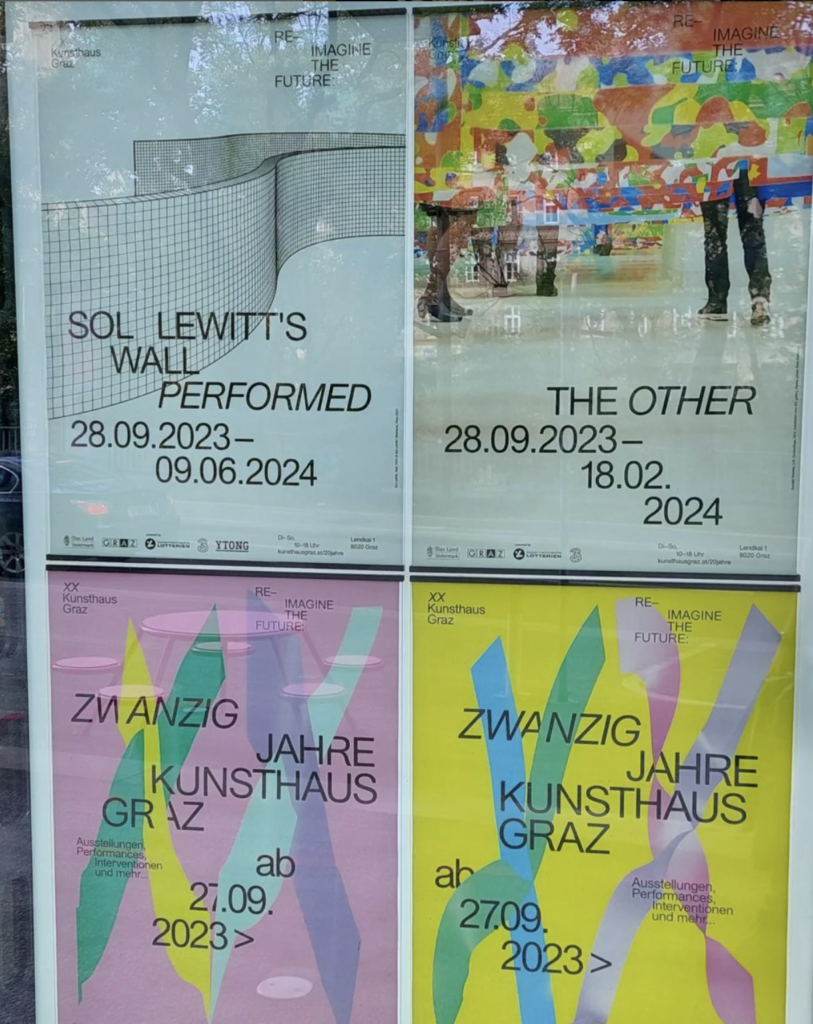
Impulse #3: The Other, Re-Imagine the Future @Kunsthaus Graz

I had the opportunity to explore the exhibition created within the context of “20 Years Kunsthaus Graz,” featuring a diverse array of works from over twenty international artists. The exhibition showcases a variety of art forms, including sculptures, videos, and photos, with a strong emphasis on activist art. One notable piece is “Repaired Broken Mirror” by artist Kader Attia. It’s a shattered mirror creatively transformed to appear as though it has been repaired or stitched together. The intention is to convey the message that people should not turn away from the mistakes of the past.

The curation carries a socio-political inquiry into current societal systems, the essence of being, individual identity, and the delicate line between what is possible and impossible. It aims to challenge and prompt visitors to contemplate, urging them to reconsider traditions and the familiar.

The underlying question posed by the curation is, “What defines us? As humans, as individuals, as groups, as nationalities?” The exhibition encourages reflection on these fundamental aspects, pushing visitors to ponder the thin line between possibility and impossibility. I really liked the approach of questioning everything us as a whole society or group of people. The question of who are we and who are they and where are the similarities is accompany us all the time in our daily lifes.

Impulse #2: OHNE DEN HYPE – Episode with Patricia Reiners (UX-Designer)

I’ve been listening to this podcast for quite a long time and am always happy to gain insights into the creative landscape in Germany. In this episode, Patricia Reiners describes her career as a UX designer. She initially studied biotechnology and graphic design and then worked in an advertising agency. There, however, she realized that graphic design wasn’t really right for her and quickly became frustrated.
I also felt this frustration myself in my previous agency life, which is why I want to focus more on UX design.

In her podcast, Patricia not only explains what exactly distinguishes UX design from UI design, but also explains how she came to her freelance career over several stages. As an Adobe-supported creative, she can now look back on many different awards. She works with Skillshare and Domestica, has appeared at the Forward Festival. She has a YouTube channel, her own podcast and an Instagram page where she shows young UX designers how to gain a foothold in the industry.

This episode was pretty inspiring to me and showed once again that its not necessary to follow a straight path to be successful in the field of design.

Links:
https://open.spotify.com/episode/5AvdASB83wSlnxbJ2d98mB?si=79b44f5097de4607

Patricia Reiners:
https://www.instagram.com/ux.patricia/
https://www.youtube.com/@ux.patricia
https://open.spotify.com/show/7s2Cy6IIimjxE4zVES9wWs?si=08915318d3c24786

Impulse #5: World Press Photo ’23 Exhibition

In the end of September 2023 I visited the exhibition of the world press photos ’23 in the viennese photo gallery Westlicht. I visited this exhibtion for the last 8 years because it combines two topics that I’m really interested in. On one hand whats going on the world, on the other hand reportage photography.

I think its very important as a designer to know in which kind of world or society we live in. What are the effects of climate change, dictatorship, certain illnesses, religion or cultural characteristics. I once got told in my product design bachelors that we as designers are the painters, and the world is our canvas somehow. Of course thats a very exaggerated point of view but at least a tiny bit is true about that approach. A lot of problems on our planet are caused because of the endless need of resources or products. Countries with less resources or products are poor countries or have boiling societies. Countries that are rich of resources (and money is probably the most important resource) are most likely to have social peace and stability. So resources or rather products that are made of resources or lead to gain value or else, are able to define where we as human beings are leading with the world we live in. Thats why its very important to not just through trashy not purpose driven products on the market. One important person once said that good design solves a problem and I think thats a good path to follow.

The world press photo exhibition always reminds me on how blessed I am to live in Europe and to be able to sit in a well tempered room, writing this blog post right now. Even if some of us in Europe don’t know, but we have the power to change the world. Not as individual but as society we do live in. So lets be careful what we are adding to this humanity. (This applies not only to designers but to virtually everyone)

Impulse #7: Final Exhibition of CMS22

As the final project of our final semester before the master thesis we, as the whole degree, where supposed to organise an exhibition. Not only every degree was able to present some of their individual single- or group-projects, also a big portfolio machine had to be built in order to show the portfolios of every individual of the degree of Communication, Media, Sound and Interaction Design.

The portfolio machine was the probably biggest exhibit of this exhibition and was completely developed by the interaction design degree. We where able to choose in which team we’d like to be in order to follow an well organised process. There was the building team, the screen design team, the coding team, the media team and the content section. I chose to be in the building team since I’m already experienced in carpentry and building furniture or other constructions.

During the whole process of the portfolio machine it got even more clear on which different experience levels we’re working. Also the different focuses we are setting towards our creative process or creative work got point out drastically. It very interesting for me to see how different backgrounds like art, industrial design, coding or even psychology inflluences the approach to design. Sometimes a bit shocking but mostly eye-opening. Since I’m studiing and working in the design branch for 10 yrs now, I got kinda blind in terms of approaching a creative project or task. But obviously there are a lot of different approaches when it comes to design. Of course not all of them are leading to creative success or are following the rules of design theory, but thats a road every creative has to go himself.

I’m happy with result of the portfolio machine – it was defenitly a long and sometimes bumpy road to the finish line but in the end we managed pretty good and learned a lot.

New Focus: Less empirical research – more actual design work!

I almost ditched the topic of my thesis because I was afraid to be drowned in empirical research organisations. I was fearing beeing too busy with running from school to school interviewing children or teenagers about their political opinions or awareness. After my talk with Mrs. Ursula Lagger she gave me the hint that I dont have to focus on empirical research in terms of interviewing people myself. Unlike my bachelor thesis, I can totally focus on my design work and don’t have to have a certain amount of people interviewed in a qualitative or quantitative way. So that gave me confidence of beeing able to focus on an iterative approach to a well designed and user centered concept.

In the following i’d like to describe my approach to this thesis i discussed with Mrs. Lagger. First i’d like to gain an overview of all the necessary material thats already there. Such as papers, statistics and articles about the awareness of younger people towards democracy in Austria. Since i’d like to do some user testings and fill a hole in the spectrum of information channels for younger people i’d like to focus on austrian user groups. Even logistically its more easy for me especially when it comes to qualitative interviews or actual focus group testings. After gaining that overview I have to sort and subdivide the content in order to be able to structure my ongoing process. I’ll probably have to look through a lot of literature in the field of sociology and political sciences rather than actual design related papers.
After that I’d like to start my design process with defining a problem and analyzing it to see whats beyond the obvious. Then I’d like to build up a portfolio of solutions so to say in order to interview experts of certain fields to gain more knowledge of which way to go to be as user or teenager-centered as possible. Using various design tools or methods will help me to point out a final solution for my problem. Afterwards I will move from low-fidelity prototypes to highfidelity ones. All and all in an iterative process.

To be able to think more of how to subdivide and look through the existing content in order to focus on actual user experience design is calming me a lot and motivates me at the same time to develop a tool with an actual positive purpose.

End of wahlkabine.at – opportunity for my thesis?

After more than 20 years, the political orientation aid “wahlkabine.at” will no longer exist in the upcoming 2024 election year.

The newspaper “derstandard.at” was publishing following article about it:
“Financial difficulties are cited as the reason: “We have always taken care not to become dependent and to keep ourselves free from political or commercial interests,” says initiator Konrad Becker from the Institute for New Cultural Technologies. As an independent organisation, financing the project has become increasingly difficult. In Austria, state elections in Styria and Vorarlberg are due in 2024 in addition to the National Council and European elections. Before elections, the platform had always developed a catalogue of questions on current political issues and sent them to the candidates to answer. 25 selected questions then made it into an online questionnaire, which potential voters could answer in order to identify possible voting preferences by comparing the matches.
“wahlkabine.at” is a project of the Institute for New Cultural Technologies in cooperation with the Austrian Society for Political Science, the Society for Political Enlightenment and the Institute for Political Science at the University of Innsbruck. Since 2002, over five million questionnaires have been completed before elections.”


In one of my other blogposts I analyzed the platform wahlkabine.at and had a closer look on its usability and pain points regarding especially younger users. Of course its sad that this platform got switched off but I see a clear possibility there to develop a more user friendly version of this tool. Adding some nice interface design and more thoughts of the user flow and target group I see a lot serious potential in that field of digital education tools. Made me even more curious to start working on my thesis!

Impulse #1 Abstrakt: Ian Spalter – Digital Product Design

Couple of Months ago I watched an episode of the netflix-show “Abstrakt”. This one was about the head of design of Instagram Ian Spalter from San Francisco. He explained the history and power of user experience and user interface design.

I thoroughly enjoyed this episode because digital product design is a field I’m truly passionate about. What struck me as particularly fascinating was the realization of how Steve Jobs laid the groundwork for modern digital product design, especially in the mobile realm. The iPhone’s impact on mobile UI/UX is profound, and it’s intriguing to consider how different the landscape might be without it – Instagram and many other apps might not even exist. In the realm of digital product design, there’s a continuous process of building on others’ ideas, inventions, and designs, whether it’s Ian Spalter reimagining Instagram or the very concept of a Graphical User Interface (GUI).

Ian Spalter’s approach to encouraging his team to explore bold designs resonated with me. Having been in less receptive work environments before, where change and new ideas faced resistance, I appreciate Spalter’s effective management style in fostering creativity within a product design team. The challenges Ian Spalter faced after the Instagram update, with its negative feedback, must have been incredibly stressful and discouraging. Examining Snapchat’s downfall due to a poorly received redesign highlights the critical role design plays in a product’s success. Interestingly, Instagram’s adoption of stories contributed to Snapchat’s decline, showcasing how designers can iterate on each other’s work, even though ethical concerns may arise.

While I thoroughly enjoyed the episode, I wished for a deeper dive into product design specifics. Perhaps, having worked in the field myself, I felt the episode didn’t explore the UI/UX design process in as much detail as I would have liked, focusing instead on non-design-related aspects. Of course it’s just an episode of a netflix show and made for a broad audience but some more educational facts would’ve been nice. Anyways, this little journey into the life of a typical silicon-valley-head of design was very inspiring to watch!