Colour Psychology: The Science of Colour Pt 2

This knowledge is incredibly important when we look back at our main question. When the goal is to influence the audience and transport emotions it is important to know which colours evoke which response in the audience. But more on that later. 

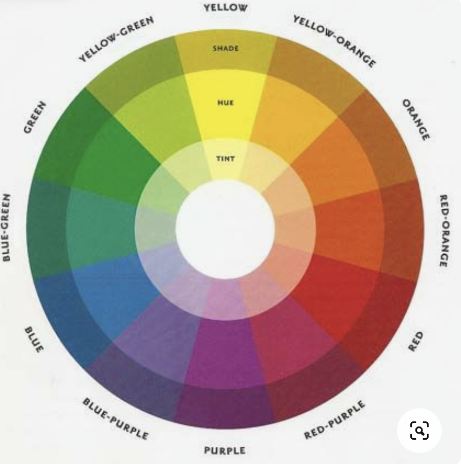
When we take a closer look at the colour wheel we can see that we not only can separate colours into warm and cold colours but we can also operate each colour in hue chroma and value or as seen in the graphic in hue, tint and shade. Hue is defined as the colour. That means that yellow, yellow-orange, orange, red-orange, red, red purple, purple, blue-purple, blue, blue-green, green, and yellow-green are hues. Chroma is the saturation of the hue. It defines how saturated or dull the colour is. The Value defines how bright the colour is. To better imagine the difference between a high and low brightness of a colour it is best to imagine that colour under the influence of different lights. For example, blue will look very different in the late evening compared to midday.
But why is it important to know how outside factors like the current time influence colours? To answer this it is best to look at some phenomena from the field of perception psychology. Not only the time of day can influence the perception of colours but also neighbouring colours and different backgrounds. Depending on the situation our brain can be tricked into perceiving things differently than they are. Usually, the brain is excellent at decoding the world around us. For example when an object is surrounded. The brain can recognize a familiar object as being a consistent colour regardless of the amount or wavelengths of light reflecting from it. When you look at the cube you can tell that it is a consistent yellow, even though the surface looks green in some parts because of the blue cubes that surround the yellow ones.

This phenomenon is called consistency of colour. In other situations however the brain is tricked. When we look at squares whose colour is identical but are placed on two different backgrounds, we perceive the tone and hue of the square differently. This phenomenon is called simultan contrast. It works the same way with black and white. 

Colour Psychology: The Science of Colour

You probably would not want to sleep in a room lit in red light or even walls painted in red.
Colours have a psychological effect on us and can transport emotions.
To understand the why and how and be able to actively use colour to evoke a specific feeling in an audience it is mandatory to understand the science behind colour.

When we look at history we see that it was always there but not scientifically understood and researched. The first scientist we associate with deductions in this particular field is Sir Isaac Newton. He experimented with sunlight and prisms. He discovered that the spectrum of light visible to the human eye consists of seven colours: Red, Orange, Yellow, Green, Blue, Indigo, and Violet.

Roy G Biv

Newton also concluded that every colour in this spectrum is a mix of Red, Yellow and Blue, which is not entirely true.

More modern scientific approaches corrected Yellow to Green and reduced the main colours from seven to six. Indigo got removed because it was hard to distinguish it from its surrounding colours.

Roy G Bv

The Visible Spectrum

Yet the spectrum of light ranges further. The human eye is however restricted to the wavelengths of light mentioned above. These wavelengths are measured in nanometres. The part of the spectrum visible to humans ranges from 380 to 700 nanometres.

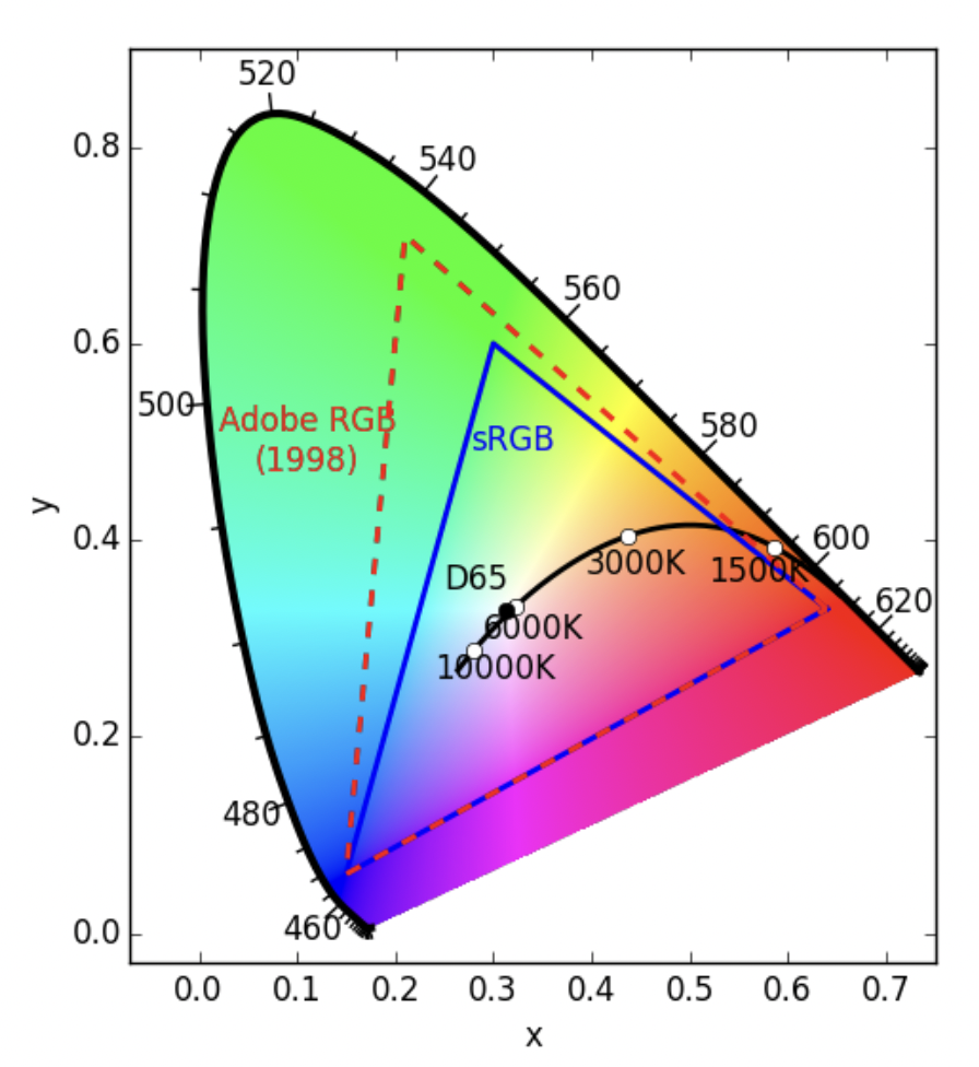
When it comes to colour in films, however, another diagram is more important. The CIE or horseshoe diagram also displays the whole spectrum of colours just as the visible spectrum but in it, there are different colour gamuts. Those gamuts are essentially the ranges of colour a display can portray. Since a film has to be shown on some display regardless, every colour outside these gamuts is rendered useless for filmmakers. The most common types of gamuts are the Adobe RGB Gamut and the SRGB Gamut, in both of which D65 is the white point.

CIE Diagram

Furthermore, the CIE diagram also displays the colour temperature. Colour Temperature is measured in Kelvin. “The color temperature model is based on the relationship between the temperature of a theoretical standardized material, called a black body radiator, and the energy distribution of its emitted light as the radiator is brought to increasingly higher temperatures.” In its original sense is used to measure how warm or cold the colour temperature of the light source feels. For example, a clear blue sky emits light we interpret as cold, whereas light in the early morning or evening is warm. This colour or light temperature, however, can also be applied directly to colours, whereas colours on the left of the D65 White Point can be seen as cold and colours on the right side of the white point can be seen as warm colours.

To be continued…