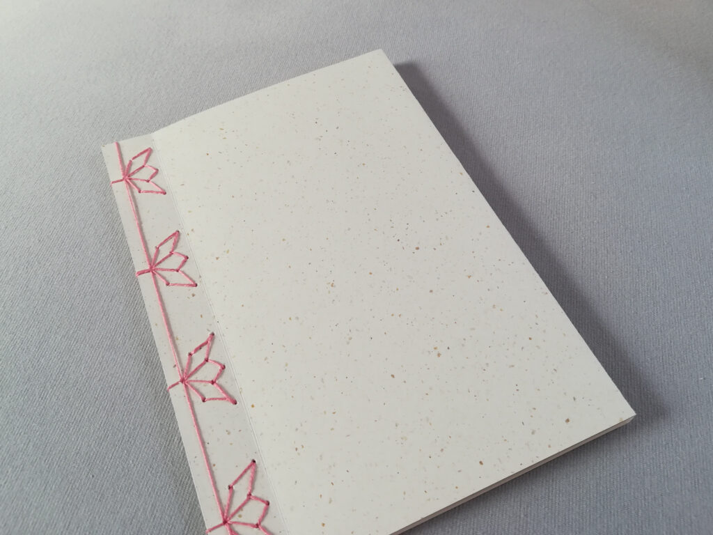
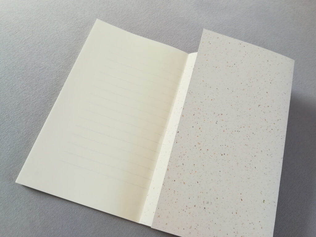
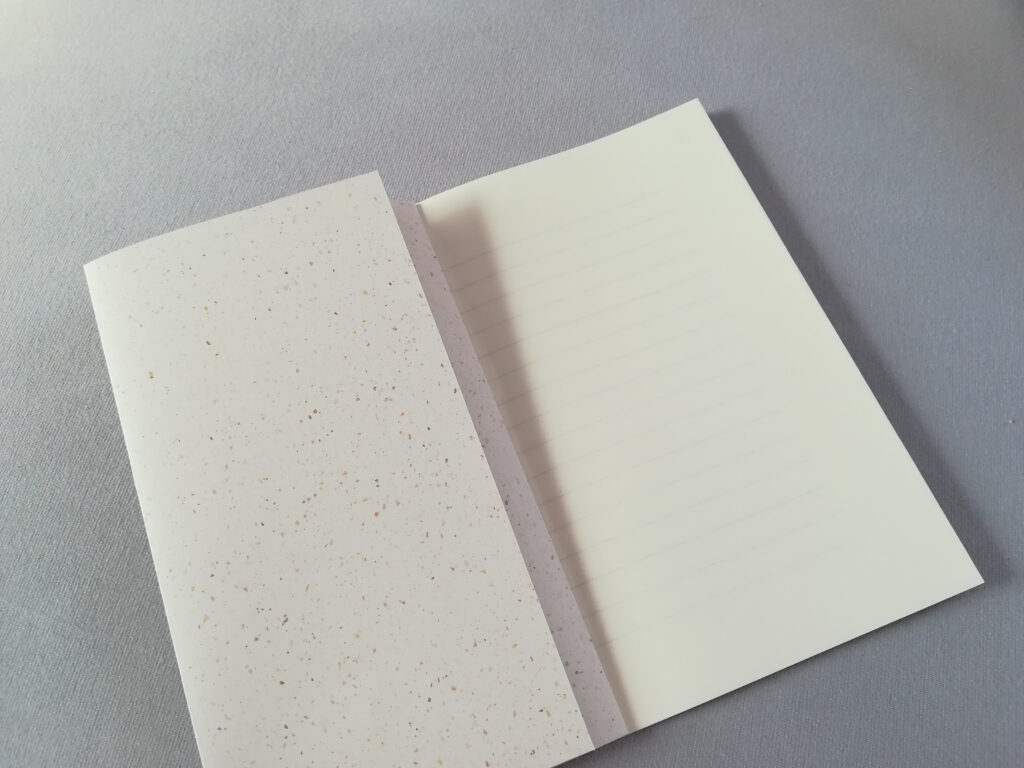
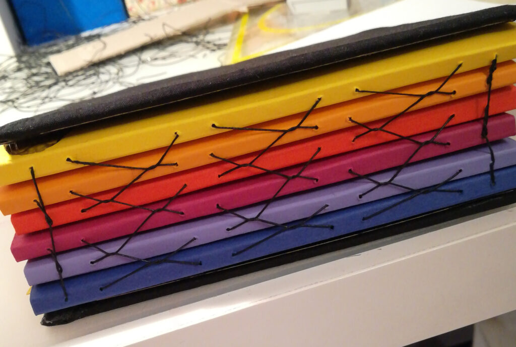
My second experiment was a notebook bound with a variation of the Japanese stab binding. The materials I used for this project are traditional Japanese paper for the inside and recycled coffee paper for the cover.
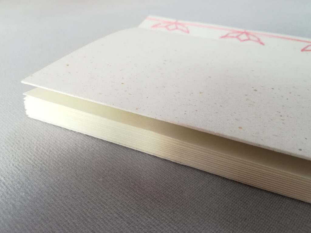
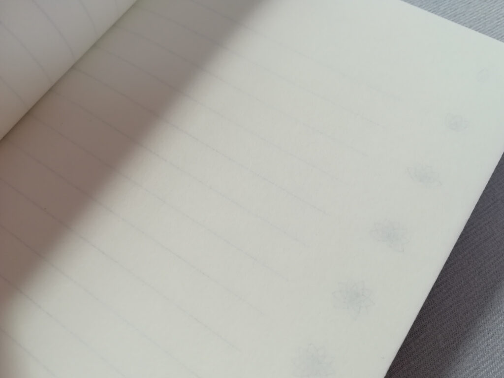
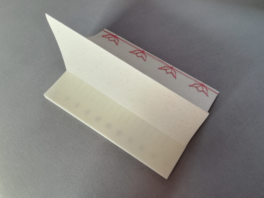
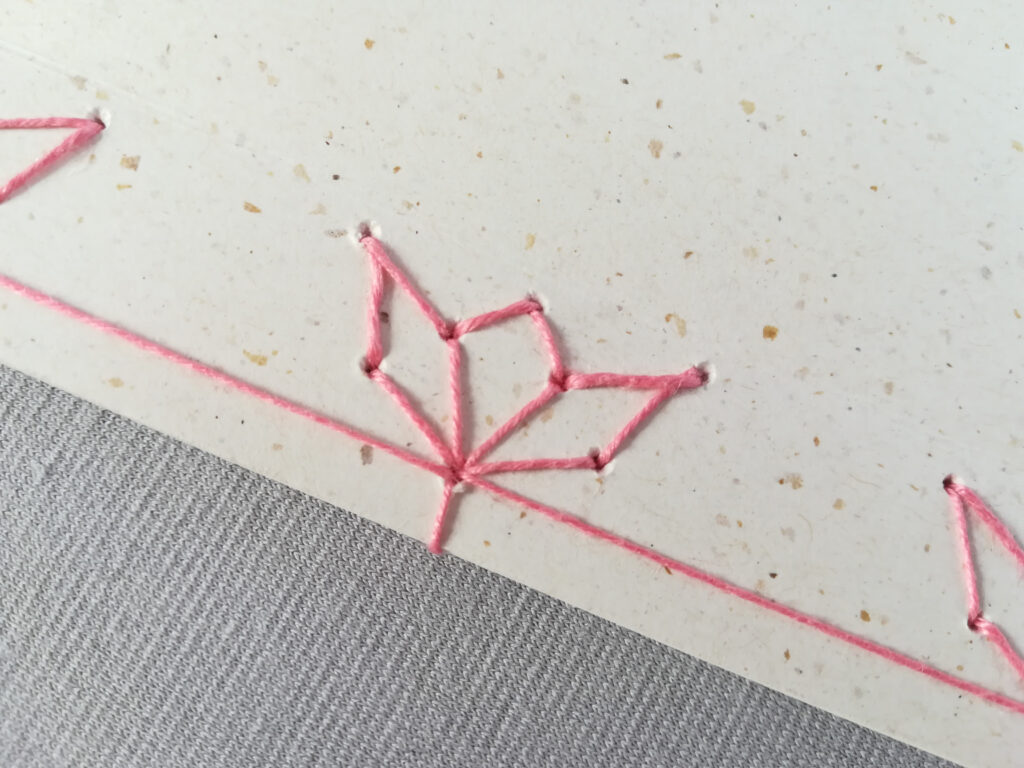
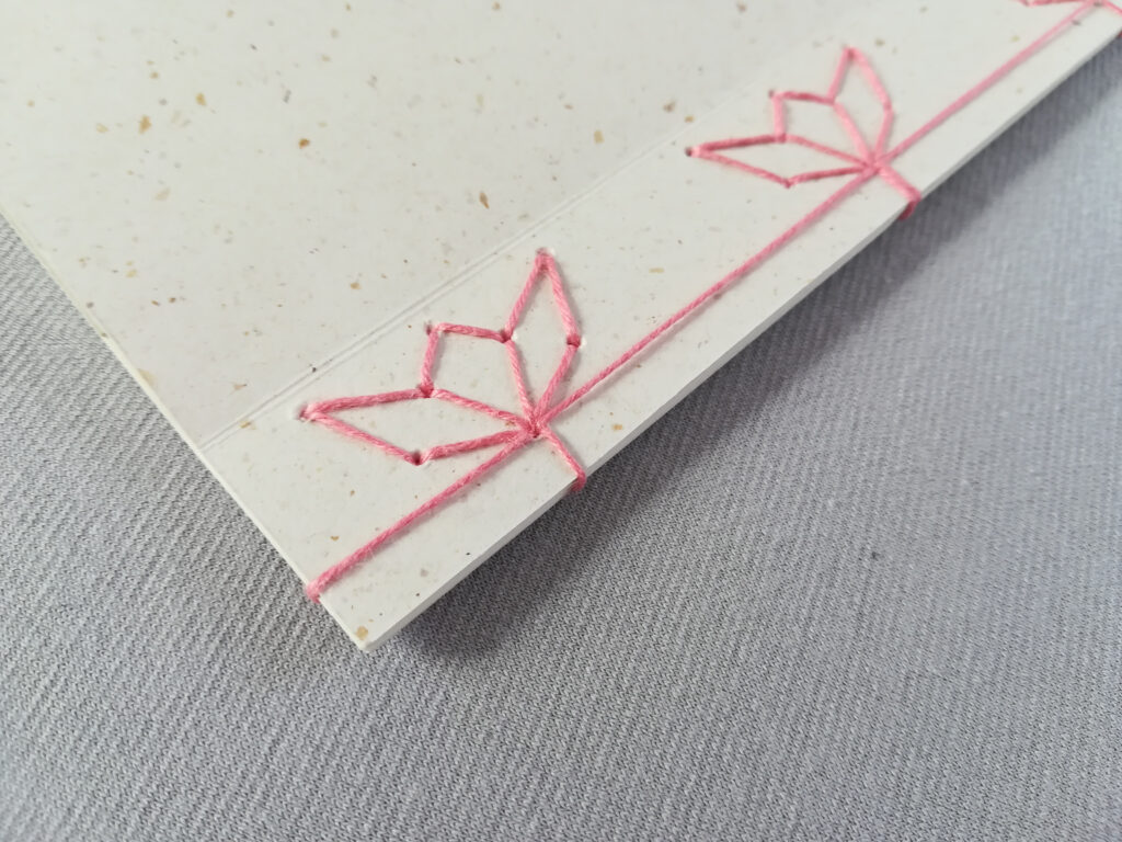
The inside is made up of traditional Japanese paper, which is slightly see-through – I made use of this feature, by printing lines and a decorative border of flowers on one side of the paper and then folding it in half, so that the ink was on the inside of each sheet. To make the effect work, the side where the paper is folded, is on the open side of the book, and the opening of each sheet is bound together and forms the spine. This prohibits people opening up each sheet of paper and encloses the design on the inside. I used a very small stroke weight, so the lines are very subtle and best seen when held against sunlight. The notebook is made up of 11 sheets of paper, and the decorative flower border becomes longer from page to page: On the first page only one single leaf can be seen, on the last page the whole edge is filled with flowers.
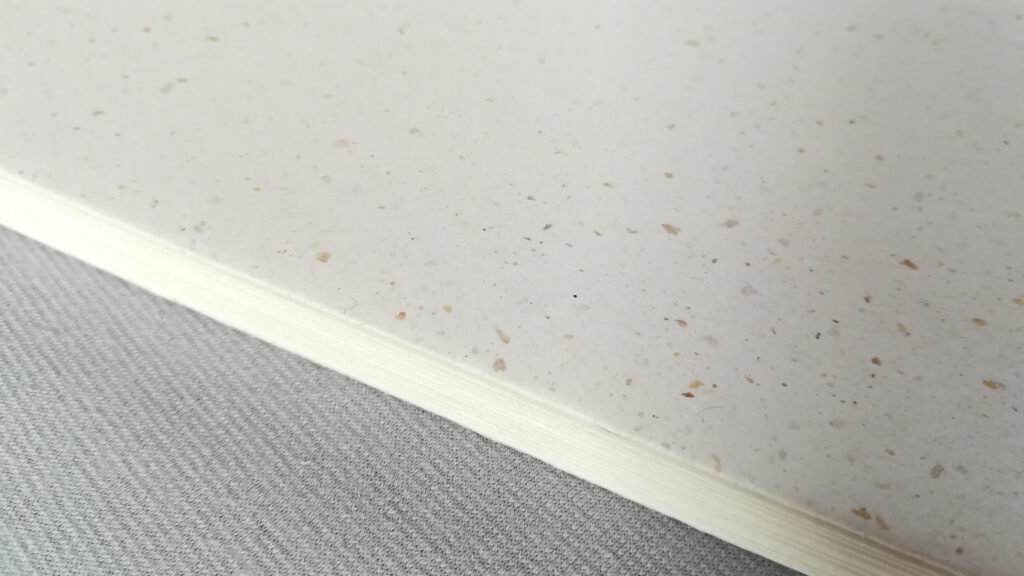
For the cover I picked a recycled coffee paper, which is of creme color and has a beautiful texture. I decided to create a flap on the front and back of the notebook to add stability to the cover.
Instead of a classic Japanese stab binding, I decided to use a variation, which forms flowers. I used a pattern which I found online for reference. The pink thread underlines the delicate nature of the notebook and fits well with the flower edge design of the inside.
This experiment was a great success, as everything came together very nicely and no major issues arose during the production. My only small critic would be the holes, which frayed a little on the backside of the cover, but it’s only a minor problem.
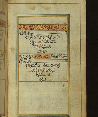
Today, I will take a closer look at Japanese stab binding, an ancient technique for side stitch binding. The stab binding represents the last stage in the history of traditional East Asian bookbinding, which was predominant in the 14th to 17th centuries. Although it is now commonly referred to as Japanese stab binding, this technique was also widespread in China and Korea. Unlike traditional bindings which run along the spine, this method secures the book’s pages by passing the bindings through the front and back covers. The method was widely used during Japan’s Edo Period (1600-1868) and served as the primary commercial binding until the 1890s when it was gradually replaced by Western-style hardcover binding. Due to the right-to-left reading style of Japanese writing, these books were designed to be read in that manner.
The popularity of Japanese Stab Binding can be attributed to its efficient utilization of the available resources during the Edo Period. At that time, Edo (now Tokyo) had become a bustling economic center with a population exceeding one million people. Previously, paper was a scarce and valuable resource, affordable only to the elite class, making book production expensive. However, with the economic prosperity in Edo, paper became more accessible, leading to an increase in literacy and the demand for books. Japanese Stab Binding emerged as the preferred binding method due to its cost-effectiveness, ease of handling compared to scrolls, and its durability.
Books created using this technique consisted of four essential components: covers, text block, internal binding, and external binding. The covers were flexible and easy to bend, composed of layered paper with a recycled core surrounded by higher-quality outer layers. Decorations on the covers were typically subtle and light, often featuring delicate patterns or a design known as clover brush line, which involved hand-painted lines or lattice patterns. Initially, covers were predominantly monochromatic, commonly brown or blue, but as book production expanded, a wider range of colors emerged. Popular fiction books even incorporated multicolored printed images on their covers to appeal to the growing number of literate individuals.
An important element of the cover was the title slip or title strip, a vertical rectangle affixed to the top left corner of the front cover, providing biographical information about the book. The title slip typically occupied around 70% of the book’s height and 20% of its width.
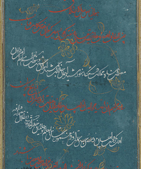
The text block in this binding method consisted of individual sheets of fine, semi-translucent paper that were folded in half. This allowed for single-sided printing, simplifying the printing process. The fold of these pages was oriented towards the fore-edge of the book, opposite the spine. The pages contained text and images enclosed within frames. Historically, woodblock printing was predominantly used for printing the pages, despite the introduction of movable type to Japan in the late 16th century. Woodblock printing offered the advantage of utilizing the same processes and skills for creating both images and text.
Part of the binding’s durability stems from the internal binding, which remains hidden once the book is fully assembled but serves to hold the text block together. Traditionally, a twisted piece of paper is threaded through two pairs of holes punched through the text block and tied at the back.
The final binding is accomplished by threading string through holes and looping it around the spine. While the most simple pattern consists of just four holes, this technique allows for many different binding patterns, ranging from simple to intricate and usually reflecting the origin country’s culture.
Sources:
Faux, Kristen, “Explorations in Book Binding Techniques” (2020). Williams Honors College, Honors Research Projects. 1114.
For my first experiment, I decided to combine two different bookbinding methods: the French link stitch on the outside and single sheet binding on the inside.
The booklet is made up of all kinds of old paper – from magazines, advertisings, newspapers and many other things. Since all of the material was of rather small size, I could not fold it in half for a traditional bookbinding method, but decided to try a method for single sheets. I divided all of my sheets into six bundles and then punched six holes through all of them. Then I bound together six bundles of paper with black bookbinding thread.
Since I wanted to create a colorful spine, I then continued my experiment by preparing a small piece of cardboard in rainbow colors for each bundle (as seen in the picture). I made two creases, so the paper could be folded easily around the paper bundle and punched eight holes through the center of the cardboard. Then I proceeded to glue the cardboards onto the first and last page of each bundle.
To bind the bundles together, I then used the French link stitch. The last step was to glue a front and back cover (a thick cardboard covered in black fabric) onto the booklet.
Concluding, the first experiment can be considered a success. There were some issues with the single sheet binding, since some of the papers were quite thin and the thread therefore ripped the paper a few times. This could be improved by first adding a strip of scotch tape to the edge of each sheet for stability – for this project I decided to skip this step, due to the huge amount of sheets that I needed to bind. Surprisingly, adding the cardboards to each bundle and binding them together with a French link stitch worked out just as I intended. Prior to my experiment I couldn’t find any other projects like mine, so I wasn’t quite sure if my idea could work in reality. The end product is a little wobbly, but the thread seems to hold up well.
During the last semester, I researched the history and characteristics of the Arabic language and typography. While I still find the topic of multilingual typography intriguing, I nonetheless decided to switch to a topic that fascinates me far more. Besides, the size of my last subject area has been somewhat overwhelming for me and left me unsure of which direction to proceed in.
Since I spend most of my creative time sitting in front of a computer, I thought I would like to choose a topic that lies more on the analogue side than on the digital side. After the Bonbonniere Alumni workshop day last month, I was enchanted by the art of bookbinding and would therefore like to focus my further design research this semester on this subject.
More specifically speaking, I want to have a closer look at any bookbinding techniques that put the binding in the spotlight.
As of now, these are some techniques I want to look into based on my first brief research:
The following paragraphs summarize chapter two of the book “Arabic for Designers: An inspirational guide to Arabic culture and creativity” by Mourad Boutros.
Latin vs. Arabic typography
Latin: written from left to right Arabic: written from right to left
Latin: letters stand alone (exception: ligatures) Arabic: combination of connected and single letters
Latin: stretching the letters destroys them Arabic: stretching is decorative and creates an interesting visual effect (not all letterforms may be stretched, rules exist)
Latin: upper and lower case letters, both can be italicized Arabic: no upper case letters, italics may look skewed if not executed properly
Latin: baselines from which the heights of ascenders and descenders are established Arabic: complex system of measurements per basic letter shape, letters hardly sit on the same baseline and the ascenders and descenders vary in length
Latin: each letters has its own shape, ligatures are included in the character set; 52 letters (26 uppercase and 26 lowercase) Arabic: 7 letters have two shapes, 22 letters have four shapes (start, middle and end of the word, as well as free standing); 18 letters are free standing (cf. Boutros, 2017, p. 44-45)
The role of technology in typeface development
For nearly 400 years after Gutenberg invented printing, type was set by hand. Only in the 19th century typesetting machines were developed to automate the process of composing metal type. Linotype, Intertype, and Ludlow machines cast slugs in fully spaced lines, whereas Monotype machines cast individual pieces of type in justified lines.
In 1949 the next major development came with photographic typesetting. The direct image composition, the ability to combine type and images and the reduced number of steps during the process was a great luxury.
In 1961 Letraset Instant Lettering was developed and considered the most innovative typographic process since hot-metal composition. One sheet measure 9 3/4 by 15 inches, making it easy to store and manage. Within two years, a large variation of typefaces existed in more than four sizes, some even being available in ten sizes. The transfer sheets were manufactured by printing letters in reverse onto one side of a polythene sheet, then overprinting the whole sheet with a low-tack adhesive. After it dried, the sheet would be turned over and the letters are rubbed down onto paper, glass or plastic with a soft-edged tool. At the end, the letters are burnished using a wax-coated interleaver to remove any remains of the adhesive and fixing the letters in position. In 1976 Letraset entered the field of Arabic typography and created more than 50 styles, as well as Arabic decorations (illuminated typefaces, borders, ornaments). Due to the collaboration with experts, the typefaces were renowned for their harmony and versatility. (cf. Boutros, 2017, p. 48-51)
Arabic typesetting
In 1938 the first Monotype keyboard and caster were released for Arabic. A reverse delivery mechanism allowed for the right to left character order. A die case with double-size matrices for deep characters and two-piece matrices for wide characters could deal with the extremes of character shapes. The keyboard was composed of over 200 keyes with four alphabets (separate, initial, medial, final). The typeface used was provided from Monotype’s office in India and had Farsi/Urdu origin. By 1948 a more traditional Naksh from Egypt was used. At that time further technical developments also allowed for the addition of vocalization marks and aesthetic ligatures.
The transition from hot-metal to phototypesetter was the next major development. It abolished the necessity for the complex interlocking of overhanging characters and accents. The phototypesetter used 400 characters, sufficient for complete, regular, and bold character sets, including all accents and ligatures. Three more typefaces were developed: Solloss (traditional Thuluth style), Mudir (semi-bold display face of Farsi origin), and Monotype Kufi Bold.
In 1976 Lasercomp marked the beginning of digital typesetting. By the end of the 70s, the existing five Arabic typefaces were in digital form and two new typefaces, Akhbar and Lakhdar Ghazal, were added.
DecoType tackled Arabic typography in a completely different manner. It used algorithms to arrange glyphs into letter shapes. In 1985 DecoType invented the compact Dynamic Font, which was licensed by Microsoft ten years later (in the form of an OLE server). This was the first smart font on any platform and pioneer in the emerging OpenType technology. The DecoType Advanced Composition Engine (ACE) used 70 typographic primitives (glyphlets) to cover the Riq’a script. Today, the DecoType Nastaleeq Press only needs 422 glyphlets to cover every Arabic-scripted language, without sacrificing kashida (elongating connections) and kerning.
Unicode deals with multilingual texts and is a new dimension of typography. It is a protocol, which facilitates information interchange in all scripts of mankind. Computer typography is confronted with conflicting requirements: minimal size for fast speed on the internet versus a large size for comprehensive language coverage and typographic precision. Nastaliq or Farsi script are used to test type technology due to its huge number of ligatures. Mainstream typographic technology can not handle all the requirements of Arabic script, only the ACE by DecoType covers all aspects of the script. (cf. Boutros, 2017, p. 52-54)
References
Boutros, Mourad (2017): Arabic for Designers. An Inspirational Guide to Arabic Culture and Creativity. London: Thames & Hudson Ltd
After receiving the book “Arabic for Designers. An inspirational guide to Arabic culture and creativity” by Mourad Boutros, I was able to dive deeper into the importance of Arabic as a language, its historical background, as well as its cultural context. In this post I will summarize my findings from studying the introduction and the first chapter of the book.
The importance of understanding another culture
When trying to either work for a client of different cultural background, or trying to target the market of another culture, doing research to understand said culture is essential. If one ignores this step in the process, the whole project might turn into a disaster. In case of Arabic, people have made fundamental mistakes in the past, such as not taking into account that the language is not read from left to right, but actually the other way around. (cf. Boutros, 2017, p. 7)
Even as cultures today are merging and ever-changing, core elements and beliefs of cultural and national identities remain unchanged. When companies or individuals try to appeal to their target market, these long-established tendencies can not be ignored. An example of a failed attempt to reach a market with a different cultural background is Google. The search engine is still not the go-to choice for most users in Japan, since they tried to conquer the market with the same visual identity that worked for Americans and Europeans. However, the taste of Japanese internet users is different – they enjoy complex websites, decorated with texts and graphics, not the simple and clean look of Google. Furthermore, they also made major mistakes when introducing Google Maps to the Japanese market. The company made major mistakes, such as taking pictures of people’s backyards, which goes strictly against the country’s values of privacy. They also ignored the importance of public transport in Japan and directed people to a town’s geographical centre, instead of their bus or train stations. There were also inaccuracies in the historical maps, which led to disfavour towards Google from the Japanese. (cf. Boutros, 2017, p. 11)
The origins of the Arabic language
Together with Aramaic and Hebrew, Arabic belongs to the Semitic languages. Arabic is historically the last of the Semitic scripts, which are all read from right to left. The language spread throughout the world along with the religion of Islam and can be divided into two general groups: Classical Arabic and Modern Standard Arabic. The first is the language of the Holy Qur’an and pre-modern texts, the second is the language of media and most scholarly and literary texts. Arabic consists of 28 consonantal signs (three are also used as long vowels). Due to the tradition of passing down poetry and literature orally, written text was not widespread until the beginnings of Islam. Therefore, each calligrapher had his own style and no explicit rules existed. The shape of script held just as much meaning as the content, as the language relied heavily on its visual appearance to convey meaning. There is a common agreement among scholars, that the Arabic script had its origins in the Nabataean script dating from the 3rd century. It took another four centuries, until the 7th century, that written words became of importance. (cf. Boutros, 2017, p. 22)
The influence of Islam
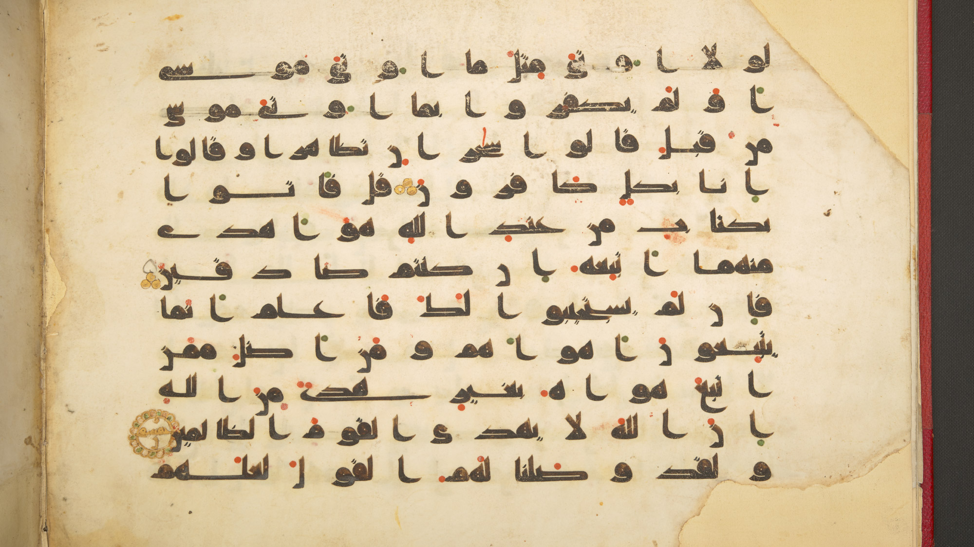
Muslims believe that Angel Gabriel revealed the Holy Qur’an to Muhammad between the years AD 610 and 632. They also believe, that while other holy texts such as the Bible or the Torah have been misinterpreted or forgotten, their Holy Qur’an is the embodiment of perfection. This created the need to capture every single word of the holy text in exact detail and therefore only relying on memory was not sufficient anymore. Islam heavily influenced the devlopment of Arabic calligraphy – it was transformed, improved and beautified. The reason for the aesthetic development of the script was to make it worthy of transmitting God’s divine message. Calligraphy also served as a tool for articistic expression, since figurative art was banned under strict interpretations of Islam. In 651 the first copies of the Holy Qur’an were written in two local variants of Jazm, Mecca and Medina. Soon they were superseded by Kufic, which got its name from the town Kufa located in Iraq. In the early history of Arabic writing, 150 different types of the Kufi script existed, leading to a large amount of variation. Arabic used to be written without any diacritic points, until the language’s development of inserting diacritic points to mean different things depending on the positioning. They were added in the form of red dots and strokes: On the top it stands for the sound ‘a’, on the letter itself for the sound ‘ou’ and below the line for the sound ‘e’. The introduction of diacritic points greatly helped non-Arabic speakers to understand and pronounce the phonetics properly and to read the Holy Qur’an. This process was therefore called Ta’jim, which comes from the word Ajam, meaning non-Arabic speakers. (cf. Boutros, 2017, p. 25)
The development of Arabic script
With the spread of Islam, many cursive scripts were developed and became prominent. All of them vary in style, because of the scriptwriters’ individual tastes.
Nakshi
It is one of the earliest cursive scripts and became popular in the 10th century. Due to its high legibility it was used for copying the Holy Qur’an. Characteristics are the short horizontal stems and the almost equal vertical depth above and below the medial line. Today Nakshi is used for headings, subheadings and body text in newspapers, books or advertising and remains as one of the most widely used Arabic style.
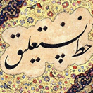
Ta’liq
It was first developed in Persia during the 15th century and later spread to Turkey and the Indian subcontinent. It is characterized by its fluidity and the varying thickness of the strokes. Today it is still used for newspapers and magazines in Iran, Afghanistan, and Pakistan where handwritten calligraphy is still popular.
Diwani
Diwani is based on Ta’liq, but has less dramatic hanging baselines. It evolved in the 16th century in Turkey and there also exists a decorative version known as Diwani Jali, which is widely used for ornamental purposes.
Riq’a
Riq’a has its origins in the 15th century, but only became popular in the 19th century. It is characterized by thick round curves and widely used in Egypt today (in the form of Egyptian Rokaa, a wider and airier verion of the original).
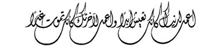
Thuluth
Thuluth can be traced back to the 7th century, but did not become to prominence until the late 9th century. Its thin fluid lines are used for calligraphic inscriptions, titles and headings. (cf. Boutros, 2017, p. 26-27)
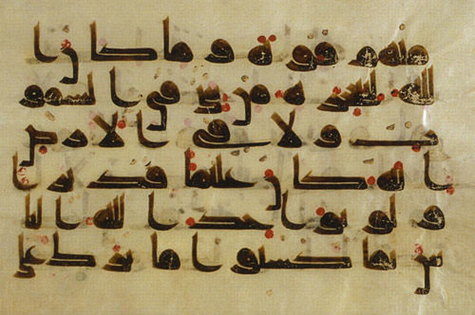
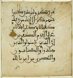
The Kufic script
In the 8th century, the Kufic script achieved a level of perfection. Therefore it was used to transcribe the Holy Qur’an and was the dominant Qur’anic script for more than 300 years. It is characterized by static rectangular lines, short vertical strokes and extended horizontal lines.
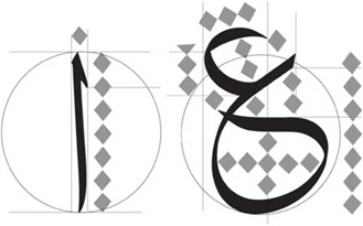
The calligrapher Abu ‘Ali Muhammad Ibn Muqlah standardized the major cursive styles and created a comprehensive system of calligraphic rules. He redesigned the letterforms by using three standard units for measurement: the rhombic dot, the Alif, and the circle.
Alif
The Alif is equivalent to the letter ‘A’ in the Latin alphabet and was a vertical stroke measuring between 6 and 8 rhombic dots. The number of dots varied according to the particular style.
Circle
The standard circle has a radius equal to the height of the Alif.
Rhombic dot
The rhombic dot is the same size as the tip of a bamboo calligraphy stick. (cf. Boutros, 2017, p. 28)
References
Boutros, Mourad (2017): Arabic for Designers. An Inspirational Guide to Arabic Culture and Creativity. London: Thames & Hudson Ltd
While I am waiting for a book on Arabic typography to arrive from another library, I did some online research on the topic. Unfortunately, the resources are very limited, so I could not find much valuable information. The following paragraphs summarize my findings from the online research.
Early development of Arabic scripts
Archaeologists have discovered inscriptions that prove a close connection between Arabic scripts and several earlier scripts, such as the Canaanite and Aramaic Nabataean alphabets which were discovered in the north of the Arabian Peninsula. These writings originate from the 14th century BC.
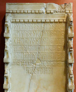
Arabic Musnad
The cursive appearance of modern Arabic scripts is not present in the first Arabic script, Arabic Musnad. This script was used up until the sixth century and was found in Yemen, in the southern part of the Arabian Peninsula – it was discovered around 500 BC. Its shapes were quite simple and more closely resembled the Nabataean and Canaanite alphabets than they did the shapes of modern Arabic.
Al-Jazm
The Al-Jazm script, which was utilized by northern tribes in the Arabian Peninsula, is the earliest type of an alphabet which is similar to Arabic. However, the early Arabic scripts also appear to have been influenced by other scripts in the region, such as the Syriac and Persian scripts. Many scholars believe that this script’s origins lie in the Nabatean script. In Mecca and Medina, in the western part of the Arabian Peninsula, the Al-Jazm script continued to advance until the early Islamic period.
The script used in Al-Jazm evolved into a variety of styles, including Hiri, Anbari, Makki, and Madani. Other scripts emerged around this time, including the Ma’il, which is considered to be the predecessor of the Kufic script. Other scripts, such the Mukawwar, Mubsoott, and Mashq, did not make it through the development stage. These scripts were widely utilized before and throughout the early years of the Arabian Peninsula’s Islamic Empire.
Kufic script
The Kufic script developed as the subsequent step in the evolution of Arabic calligraphy following the Arabic Musnad and Al-Jazm. We can recognize existing letter forms in the early Kufic script development, unlike the other ancient scripts. The Qur’an Kareem, the Muslim holy book, was written in the Kufic script, which developed over the course of the 7th century and was widely used up to the 13th century. Although the script’s name is a reference to the Iraqi city of Kufa, where it initially emerged, the majority of instances could be located in Medina on the Arabian Peninsula, where the Prophet Mohammed lived after leaving Mecca.
The dots which are familiar to us from modern Arabic scripts were absent from the Kufic script in its early phases of development. During the later development of these and other scripts, the letter dots (Nuqat) were introduced. Additionally, at a later point in time, the diacritical marks (Tashkeel) that represent the vowels of the letters were created by Abul Aswad Al Du’ali and Al Khalil Ibn Ahmed Al Farahidi.
If we look closely at inscriptions written in the Kufic script, we’ll see certain traits like angular forms and long vertical lines. Writing long text used to be more challenging since the script letters used to be wider. Nevertheless, the writing was utilized to decorate the outside of structures like mosques, palaces, and schools.
Although Kufic has been around for a long time and is one of the more widely used scripts in Islamic civilisation, several variations of it were developed in particular regions, like Egypt and Iraq. The following are some variations and advancements of the Kufic script: The thick Kufic script, Magribi Kufic script, Mashriqi Kufic script, Piramouz script, Ghaznavid and Khourasan scripts, Fatimid Kufic and Square Kufic.
Abbasid Dynasty
The Abbasid dynasty (750–1258 CE), which followed the Umayyad dynasty, refined Arabic calligraphy. Thuluth and Naskh were developed during this time. These advancements were brought about by three calligraphers: Ibn Muqlah, Ibn Al Bawwab and Yaqut Al Musta’simi.
Ibn Muqlah limited the number of cursive script proportions styles to six, including the Thuluth, Naskh, and Muhaqqaq. The rhombic dot, the alif, the circle, and the similarity system are the four foundational parts of these rules.
Thuluth script
Thuluth, which means “one third,” may allude to the size of the pen that was used for writing. It was frequently used to embellish mosques and various texts. During the Ottoman dynasty, calligrapher Seyh Hamdullah improved the Thuluth script, which was initially created in the 11th century by the Abbasid dynasty. It serves as the foundation for later scripts, such the Jeli Thuluth, Naskh, and Muhaqqaq.
Naskh script
Another primary script was formed around the same time. Naskh, which means “copy,” was initially used to copy texts, particularly the Holy Qur’an, but was later improved by Islamic calligraphy master Seyh Hamdullah under the Ottoman dynasty. The Naskh was traditionally used for long writings and inscriptions because of its legible characters. Due to its contemporary appearance and cursive letters, it is still used in printed Arabic books today.
Safavid Dynasty
The Safavid dynasty (1502–1736), which was established in Persia after the Abbasid dynasty, made significant contributions to Islamic arts and calligraphy. During the rule of Shah Islma’il and his successor, Shah Tahmasp, it improved the Ta’liq script that was already in existence and created a more developed variant, known as Nasta’liq.
Ta’liq script
The script’s lines, which appear to be hanging together, were the inspiration for the term Ta’liq, meaning “suspension.” The Ta’liq script, which is still in use today, was refined in Persia around the 13th century and is widely used for a variety of things, including messages, books, letters, and poems.
The letters are rounded and have many curves, and as was already noted, the words seem to hang together and link to one another. The script is frequently written with a wide spacing between lines to give the eye more room to distinguish letters and words to increase legibility. The spaces between lines are useful, but they also occupy space on the page, which is an issue when there isn’t much space or if the content is long.
Nasta’liq script
Although it has aspects of Naskh, the Nasta’liq is a polished variant of the Ta’liq script. In Turkey and Persia, it emerged in the 15th century and persisted into the 16th. It is still used in Persia, India, and Pakistan for writing Persian, Urdu, and Punjabi. It combines the traits of both scripts, such as the short vertical lines of Naskh and the long, curved horizontal strokes of Ta’liq. It is more legible than the Ta’liq but more challenging to read than Naskh.
Similar to the Ta’liq script, the letters are slightly hooked and fluctuate in thickness. Although the letter arrangement is harmonious and flows well, it is more difficult to write and less readable compared to many other scripts. Persian art and architecture have been influenced by both the Ta’liq and Nasta’liq scripts, and you can clearly recognize Persian inscriptions by the scripts they are written in.
The Maghribi
The Islamic Empire’s western part of North Africa is referred to as Maghrib. The Maghribi script, which is used in texts, inscriptions, and monuments, distinguishes this region. The 10th-century Maghribi script, which is still in use today in Spain and western North Africa, is most prominent in Morocco, Algeria, and Tunisia. In this manner, the Maghribi script diverged from the scripts that originated in the Middle East and Arabian Peninsula.
The Maghribi script is characterized by letters with uniform thicknesses and descending lines drawn with unusually big bowls. Its distinctive beauty and ease of reading even in lengthy texts are a result of the distinctive letterform.
Ottoman Dynasty
Many scripts, including Diwani, Riq’a, Jeli Dewani, Tughra’a, and Siyaqat, were developed during the course of the Ottoman Empire’s four centuries. Numerous calligraphers, such as Mustafa Halim, Nejmiddin Okyay, and Hamid Aytac Al-Amadi, made contributions to the development of Arabic calligraphy.
Diwani script
The name of the Ottoman royal chancery, “Diwan,” inspired the name of this script. In the courts, it was used to write official papers. It was created in the sixteenth century, achieved its ultimate form in the nineteenth, and is still in use today.
It is characterized by the lovely curving letters that combine to create intricate patterns and ornamental designs. A less complex version of the script is required if it is to be used for long texts since its intricacy makes it difficult to use.
Riq’a script
The word “Riq’a” refers to the little pieces of paper or fabric on which the script was originally written. Having been created in the 18th century and still being used today, it appears to be one of the more modern scripts.
The Riq’a script is renowned for its straightforward structure, which makes it ideal for paragraphs and long texts. It is particularly simple to transform into a digital font because of the way its letters are joined. However, because it lacks the intricate letterforms of the Diwani, Thuluth, and Kufic scripts, it is not very appealing for titles or decorations.
Over the last few weeks, I did literature research – the goal was to get an overview of the available resources and based on that decide on one language to start my research journey with. The results showed that there is an extensive amount of books on Chinese typography, which is not surprising, as Mandarin is the second most spoken language on the globe. However, this was not the case for all languages: For example, I barely found any books on Korean typography – the best I could find were short research papers.
In the end I decided to pick a language I have no prior knowledge of and was able to find some books for: Arabic. My next step is to now order a book or two from other libraries and dive into the Arabic language, its history and cultural identity and most important its typography.
For my research I decided on the topic of typography in different language systems. How is it connected to the cultural identity of a society and what are the differences to our Latin typefaces?
I would like to study the history of different writing systems up to today’s typographical practices and usages. There are five major categories of systems, and while in the beginning I would like to learn the basics about all of them, I will then likely focus on just one of them and deep dive into that language and its typography.