UX/UI Aesthetics

With my new topic of aesthetics in UX/UI design in mind, I immediately began researching possible sources and interesting aspects. Here are some first touchpoints worthy of further investigation:

Research paper “The influence of design aesthetics in usability testing: Effects on user performance and perceived usability” by Andreas Sonderegger and Juergen Sauer

This paper is written about a study of 60 teenagers that were tasked with several problems using mobile phone apps (Sonderegger & Sauer, 2010). During the test, two identical phones were manipulated regarding the aesthetic appearance of the apps. The study showed that the more appealing phone was seen as more usable and improved performance (Sonderegger & Sauer, 2010).

Research paper “Is beautiful really usable? Toward understanding the relation between usability, aesthetics, and affect in HCI” by Alexandre N. Tuch, Sandra P. Roth, Kasper Hornbæk, Klaus Opwis, Javier A. Bargas-Avila

This is a similar study where 80 participants tested for versions of the same online shop, which differed regarding their aesthetic appearance (Tuch et al., 2012). However, the researches found the opposite case to be true: They found that the aesthetics did not affect the perceived usability. On the contrary: “In contrast, usability has an effect on post-use perceived aesthetics. Our findings show that the ‘‘what is beautiful is usable’’ notion […] (Tuch et al., 2012, p. 1598).

Research paper: “The Effect of Layout and Colour Temperature on the Perception of Tourism Websites for Mobile Devices” by Kiemute Oyibo and Julita Vassileva

This paper is more specific and examines the effect of layout and colour temperature on tourism websites. The authors found a strong corellation between both factors and the perceived usefulness, enjoyment and intention to use (Oyibo & Vassileva, 2020).

To conclude, we can say that from this first, quick research it is already apparent that some research already exists in this area, but there does not seem a lot of common ground. This conclusive statement must be verified in more detail later.

When it comes to what exactly is regarded as “aesthetic”, there are of course certain visual rules and “laws”, which could require further examination. In addition, there are certain design trends in UX/UI design, which constantly change. On the blog “AIGA Eye on Design” I read an interesting article about the “Era of Rebellious Web Design”, which described the current trend of breaking away from traditional web aesthetics of clean responsive designs, moving towards a more experimentation and a splash of nostalgia (Frey, 2022).

This issue fascinates me also very much. How did our sense of “beautiful” UX/UI design change over time? And what do we perceive as aesthetic UX/UI design now? And is there a universal aesthetic or do aesthetics change from culture to culture?

References:

  • Frey, A. (2022, May 18). The Era of Rebellious Web Design Is Here. Eye on Design. https://eyeondesign.aiga.org/the-era-of-nonchalant-web-design-is-here/
  • Oyibo, K., & Vassileva, J. (2020). The Effect of Layout and Colour Temperature on the Perception of Tourism Websites for Mobile Devices. Multimodal Technologies and Interaction, 4(1), 8. https://doi.org/10.3390/mti4010008
  • Sonderegger, A., & Sauer, J. (2010). The influence of design aesthetics in usability testing: Effects on user performance and perceived usability. Applied Ergonomics, 41(3), 403–410. https://doi.org/10.1016/j.apergo.2009.09.002
  • Tuch, A. N., Roth, S. E., Hornbæk, K., Opwis, K., & Bargas-Avila, J. A. (2012). Is beautiful really usable? Toward understanding the relation between usability, aesthetics, and affect in HCI. Computers in Human Behavior, 28(5), 1596–1607. https://doi.org/10.1016/j.chb.2012.03.024
Change of research topic

Last term, I researched the topic of Social Design, more specifically: Social Poster Design. Unfortunately, while enjoying learning more about it, I eventually hit a wall. Simply not enough research exists about what a “good” Social Poster should look like or what social impact in can have. Even though I was fascinated by the subject, I decided it would be better to switch to a different topic. In addition, I have a lot of passion for poster design but especially when considering the future, I would rather like to use my master’s degree to hone my digital skills a little further.

As a result, I decided to switch to the topic of UX/UI design. While working as a web designer prior to my studies at FH, I already familiarized myself with some issues and practices in this area. For a possible research topic, I started out by mind mapping different points of interest, while keeping my own skillset in mind.

On the one hand, I am very interested in inclusivity in design. Especially since the current EU directive on the expansion of accessibility requires the implementation of measures by mid-2025, the topic is very urgent. However, I feel that already a lot of research has been done in this area and many students already wrote their thesis on this topic.

Secondly, I considered some minor ideas surrounding the gamification of sustainable behaviour, emotions in UX/UI design and typography in the web. However, all those topics did not really strike a nerve with me.

My final idea, and the idea I would like to proceed with, was born out of the consideration of my own roots. As a communication designer, it could make sense to work on a topic at the intersection of UX/UI design and “traditional” graphic/communication design. In this liminal space, I found myself intrigued by the topic of aesthetics in UX/UI design. There seems to be a long history in the debate of a “beautiful” design vs. functionality. The visual appearance of UX/UI design changed over time and also differs from culture to culture. I would like to focus my following research on this and find out

…how important aesthetics are for UX/UI design?

…what the connection between the two of them is?

…how UX/UI aesthetics changed over time?

…what are the current UX/UI design trends?

…how does culture influence the visual appearance of UX/UI?

The next generation of Social Poster Designers – Drawing inspiration from the past

Even tough many pronounced the poster as a dead medium, Social Poster Design has not seen any decline in popularity in the last 10 years. Maybe today’s poster have to be a little more versatile (so they can be shared via social media etc.) but the myriad of social problems and injustice issues have kept the poster production going. From Pussy Riot, Black Lives Matter, Je suis Charlie, Brexit and Peta to anti-war protests, the stream of examples does not seem to end.

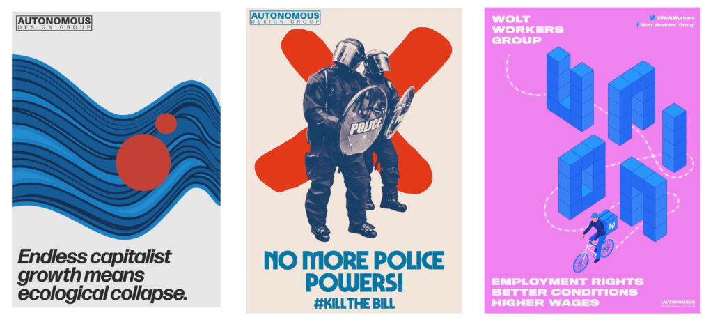
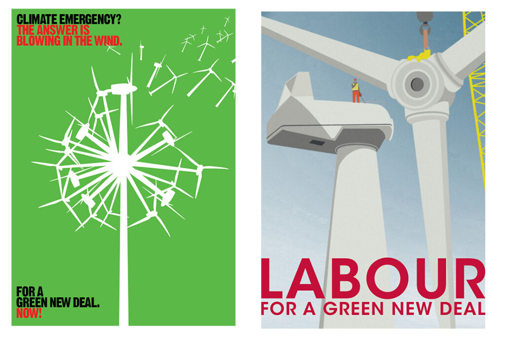
It is difficult to keep track of the may variations of styles and getting an overview of all of today’s social posters might prove impossible. For this reason, I decided to narrow my focus a little bit again and searched for examples that were inspired by famous social poster styles from the past such as Atelier Populaire. In doing so, I came across an article with the title „Designing for social justice: What does it mean to create radical posters for the 21st Century?” in “It’s nice that”. The article featured two artist collectives of young designers working in the social sphere: Labour Party Graphic Designers and Autonomous Design Group (Hingley, 2022a).

The designers from both collectives describe their approach to design as anti-commercial: Sana Iqbal states in the article that “As a result of this commercialisation, ‘the centralisation of design has lost it’s grounding and it feels like a giant sales machine, which I just don’t care for’. It’s this very approach that LPGD are trying to tackle – that being the ephemeral, disposable nature of careless political design” (Hingley, 2022a).

Note. From Autonomous Design Group Posters, by Autonomous Design Group, n.d. (https://designmcr.com/artists/harriet-richardson). Copyright Creative Commons 2021.

For this, the collectives draw inspiration from 20th century design movements and name Atelier Populaire, the See Red Women’s Workshop and the OSPAAAL (Organisation of Solidarity with the People of Asia, Africa and Latin America) as their role models (source 1). With this comes a very distinct poster style: “They see the importance in reinstating a sense of vibrancy, colour and visual distinctiveness in their posters, which is something that will set them apart from the dreary monotony plaguing current political design. And finally, they want to move away from overcomplication, and focus instead on simplicity and accessibility” (Hingley, 2022a).

Note. From LPGD Art Pack Summer ’19 Climate Emergency, by Labour Party Graphic Designers, (2019) (https://www.labourdesign.co.uk/art-packs/summer-19-climate-emergency). Copyright © Labour Party Graphic Designers.

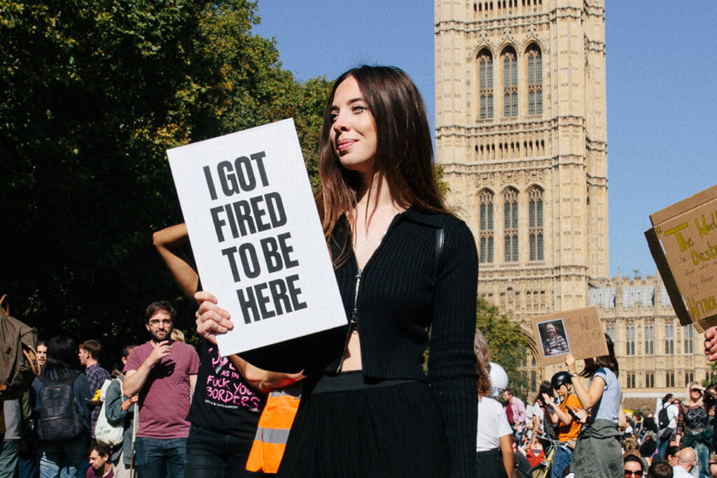
Also in this direction goes designer Harriet Richardson, who has risen to fame lately for her funny and thought-provoking protest posters (Hingley, 2022b).

Note. From Design Manchester, by H. Richardson, n.d. (https://designmcr.com/artists/harriet-richardson). Copyright © Harriet Richardson 2023.

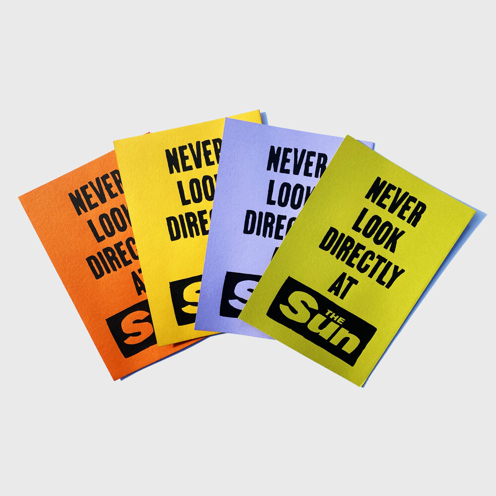
Harriet states in an interview, that simplicity is one of her main methods when coming up with new poster/slogan ideas: “I think conveying a message can be done in so many ways, but simple straightforward ‘punchy slogans’ have been proven to do the job over many years” (Hingley, 2022b). This is especially visible in her poster series “Don’t look directly at The Sun” (referencing the British tabloid paper “The Sun”), which is reminiscent of the simple colored posters from Atelier Populaire.

Note. From Sun Mini Set, by H. Richardson, n.d. (https://artschoolmembersclub.com/shop/p/sun-minis). Copyright © Harriet Richardson 2022

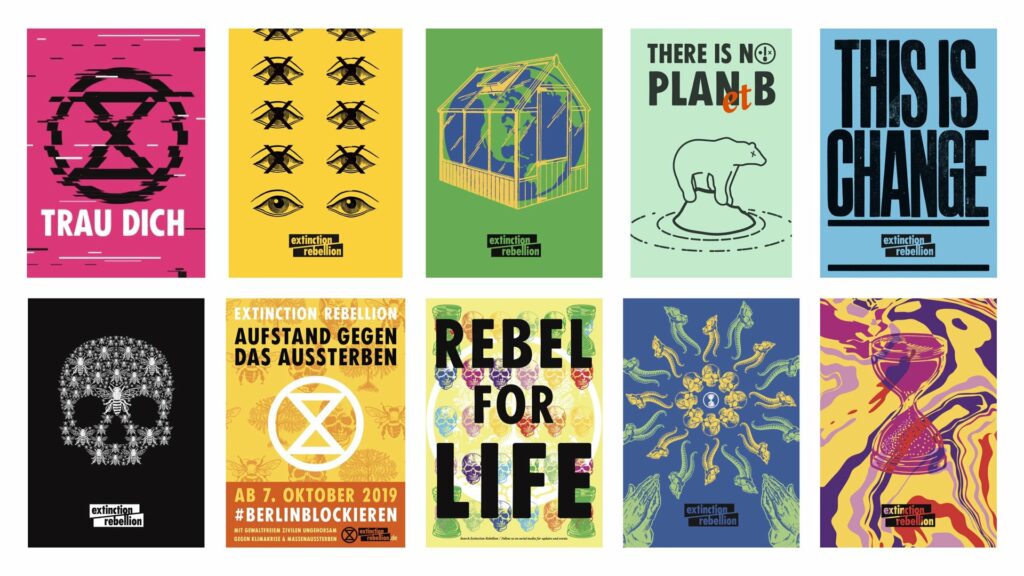
In addition, traces of this very simple graphic language featuring a hand-made look and bold colours one could also name Extinction Rebellion, a group of non-violent climate activists who rose to fame in 2018. Their visual identity was created by the movement’s art group: “This Ain’t Rock’ n’ Roll (identity + activism for culture + causes)” (Bloem & Kempenaars, 2019). When asked about their inspiration, a member of the group states that “[i]n its actual manifestation, we drew a lot of inspiration from Paris ‘68” (Bloem & Kempenaars, 2019, p. 26). This can also be observed when looking at the posters Extinction Rebellion offers for free download on their website:

Note. From Extinction Rebellion Poster Vorlagen, by Extinction Rebellion, n.d. (https://extinctionrebellion.de/mitmachen/material/grafik/). Copyright © Extinction Rebellion 2022.

To sum this up, it seems very difficult to get a general grip of today’s social poster design due to the wide variety of causes and styles. However, some young designers draw inspiration from 20th century examples like the Atelier Populaire and use a simple, bold design style to convey their message. This goes also along with the previous findings about what an effective social poster should look like. Amongst others, a striking visual language and a certain translatory role as well as simplicity were named as positive contributors (see: previous blogposts), which we can definitively observe here.

It seems like the social poster is anything but dead and is constantly evolving and transforming, being an outlet of creativity, rallying for an important cause.

References

  • Autonomous Design Group. (n.d.). Autonomous Design Group poster works. https://www.weareadg.org/
  • Bloem, I., & Kempenaars, K. (2019). Branded Protest: The power of branding and its influence on protest movements. BIS Publishers.
  • Extinction Rebellion. (n.d.). Extinction Rebellion Poster Vorlagen. https://extinctionrebellion.de/mitmachen/material/grafik/
  • Hingley, O. (2022a, May 25). Designing for social justice: What does it mean to create radical posters for the 21st Century? It’s Nice That. Retrieved January 25, 2023, from https://www.itsnicethat.com/features/radical-poster-graphic-design-250522
  • Hingley, O. (2022b, December 19). From Pentagram to political slogans: Designer Harriet Richardson on her witty and disruptive practice. It’s Nice That. Retrieved January 25, 2023, from https://www.itsnicethat.com/features/harriet-richardson-spotlight-graphic-design-191222
  • Labour Party Graphic Designers. (2019). LPGD Art Pack Summer ’19 Climate Emergency. https://www.labourdesign.co.uk/art-packs/summer-19-climate-emergency
  • Richardson, H. (n.d.-a). Harriet Richardson. Design Manchester. https://designmcr.com/artists/harriet-richardson
  • Richardson, H. (n.d.-b). Sun Mini Set. Harriet Richardson. https://artschoolmembersclub.com/shop/p/sun-minis

Effectiveness of stylistic elements on posters for behavioural change

While searching for more information on what Social Posters should look like in order to be effective, I came across a useful master thesis from Hilde Dorman (2015) titled “Effects of a pun versus an explicit message on behavioural change”.

Dorman begins by highlighting the complexity of understanding the effect of posters that do not serve a commercial purpose. She writes that in commercial advertising, simple messages (e.g. the stimulation of a purchase or branding) are communicated while in public communication more complex messages have to be send which serve the purpose of stimulating non-harmful behaviour in citizens (Dorman, 2015, p.10).

Dorman (2015) takes the problem of nurses in care homes wearing jewellery to work as an example and investigates in how far a poster can inspire the nurses to change their behaviour for the better (not wearing jewellery). As a basis of her research functions the distinction between planned and automatic behaviour: “According to Pol et al. (2013) an estimated 95% of our behaviour is automatic behaviour. Automatic behaviour can be defined as behaviour we do not consciously think about” (Dorman, 2015, p.14). Dorman tries to influence the latter via a prompt, that is posters that are hung in the facilities of the nurses’ workspaces.

While doing so, she pays special attention to the element of creativity in the message on the poster, that is if the message is novel, meaningful and connects the audience (Dorman, 2015, p.16). Reviewing literature, Dorman writes that “posters with a pun increase the attitude, attention and recall towards the poster (Toncar et al., 2001; McQuarrie & Mick, 1999; McGuire, 2000) [but] they are more difficult to understand, and it is less likely that they lead to behavioural change than a poster with an explicit message (Van Mulken et al., 2003; Berendsen, 2012)”.

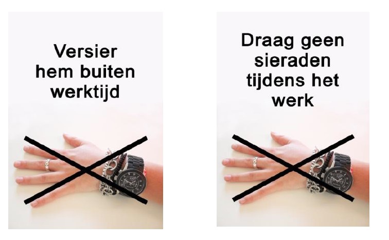
To test this, Dorman (2015) displayed two posters and measured how many people were wearing jewellery before and afterwards in addition to conducting interviews with the recipients. The two posters were identical; however one contained a pun (“versier hem buiten werktijd” = trnsl. to “decorate it outside working hours “) and the other an explicit message (“draag geen sieraden tijdens werk” = transl. to “Do not wear jewelry while working”):

Note. From “Effects of a pun versus an explicit message on behavioural change” [MA thesis] by H. Dorman, 2015, p. 28 (https://essay.utwente.nl/66959/). Copyright 2022 by Hilde Dorman.

Dorman (2015, p.40) comes to the conclusion that a behavioural change did occur after the posters were hung and that “respondents had a more positive attitude towards the poster with the pun and the poster with the pun caught also more attention than the poster with the explicit message”. However, surprisingly, the poster with the pun did not lead to more behavioural change and no better recall and perceived comprehension. She writes that “[t]hose outcomes indicate that the exposition of the posters have served as a prompt, which triggered unconscious processing and finally led to automatic behavioural change” (Dorman, 2015, S.40).

I found this study incredibly fascinating. Creativity does not seem to play such an important role in the poster design. However, Dorman also notes that her study stands in contrast to a similar experiment by Femke Berendsen (2012, as cited in Dorman, 2015) where the poster with the creative message had a higher effect on respondents. It seems like there is a lot of room for further research in this field. And this of course applies only to a small part of all the Social Posters, it still does not explain what effect e.g. a protest poster can have on onlookers.

References:

  • Dorman, H. (2015). Effects of a pun versus an explicit message on behavioural change [MA thesis]. University of Twente.

The purpose of the Social Poster

Having read a lot about ways to influence people’s behaviour via poster design, I started to wonder about what the purpose of Social Poster Design actually is. Especially when looking at history, the term propaganda pops into one’s head, which comes with a strong negative connotation. Before continuing my research, I thus wanted to clarify for myself how to differentiate the Social Poster from the aforementioned term.

First of all, it seems clear that a Social Poster has no commercial purpose, the goal is not to sell a product or service. But what else is its purpose then?

To begin with, I looked back at the definition of Social Visual Communication Design I used in my first blogpost, which frames the term as “a form of visual communication design that had social qualities or properties embedded” (Hananto, 2020). Applied to poster design, one could thus say that a Social Poster would be a poster that has some social properties embedded. However, this statement is not specific enough.

When researching possible definitions, a certain lack of sources and information became apparent. Among the few sources I could find, there was a blogpost from Graphic Art News containing opinions of different designers. In the article, the Finnish designer Pekka Loiri states that in his view, the purpose of the Social Poster is “to awaken, alert, warn and remind. […] We cannot change the world with posters, but we certainly can influence people’s minds and thoughts by/with Posters. This has been always known by both opponents of the war than the war mongers. Posters have always been one of the most effective and used method when making propaganda” (Papaefstathiou, 2012).

This statement pushes the frame wide open for now also posters promoting war and violence are regarded as Social Posters and I do not wish to focus my research on those. In an attempt to clarify this, I looked up the definition of propaganda. Propaganda is defined as “dissemination of information—facts, arguments, rumours, half-truths, or lies—to influence public opinion” (Smith, 2022). It includes the “more or less systematic effort to manipulate other people’s beliefs, attitudes, or actions by means of symbols” and can be distinguished from educatory motivations by deliberate manipulation and selectivity (Smith, 2022).

In addition, I found another definition of the Social Poster from Vasilenko et al. (2021), who define its purpose as orienting “the viewer to the commitment to the highest social values – such as humanism, love for people, for life, and nature”. It seems that there is an underlying moral component to the issue. Unfortunately, a deeper exploration of this, albeit necessary, would go beyond the framework of this blogpost. For now, I will define the Social Poster for myself as a poster that aims to inspire their viewers to behave more ethically and sustainably or to draw attention to injustice and marginalization. This would entail posters advertising for woman’s rights, equality, LGTBQ+ rights, POC, environmental issues and general health and safety. It should be noted, however, that this definition claims neither to be exhaustive nor well-founded and requires closer examination.

After this provisional definition, I was wondering what the purpose of the Social Poster now is? The designer Luba Lukova stated in the blogpost that in her opinion Social Poster Design “provokes discussion, thinking, emotion. That may look not enough to transform the world, but that’s how art works: it has the power to change perception and increase empathy” (Papaefstathiou, 2012). Antonio Casto adds that he believes that “the only thing that a poster can do is calling people into action and it is a way for an artist/designer to channel his/her frustrations towards a particular social problem”. In addition, Susana Machicao also adds the Social Poster’s function of reflecting the prevailing zeitgeist: “Today social posters are the thermometer of the society and become an strong measurement of what happens and moves people. They become the historic registration and, in the future, young generation will be able to interpret a time period in our history”.

In the following, I want to dive deeper into this and find out if there is any scientific proof behind this. What effect can a Social Poster actually have?

References:

  • Hananto, B. A. (2020). What is Social Visual Communication Design? Proposals on How to Identify and Define it. Advances in Social Science, Education and Humanities Research, 27-31.
  • Papaefstathiou, M. (2012, April 17). What is Social Poster Design? 8 Significant Poster Designers Advice! Graphic Art News. Retrieved January 2, 2023, from https://www.graphicart-news.com/what-social-poster-design-is-7-significant-poster-designers-advice/
  • Smith, B. Lannes (2022, October 6). propaganda. Encyclopedia Britannica. https://www.britannica.com/topic/propaganda.
  • Vasilenko, E., Vasilenko, P., Pallotta, V., Barsukova, N., & Sichkar, T. (2021). Features of the design of social posters of the XXI century and their role in the formation of ecological culture. E3S Web of Conferences, 311, 02008. https://doi.org/10.1051/e3sconf/202131102008

Examples of Sustainability Communication Design

In my last post, I dived deep into the topic of whether Communication Design can stimulate behavioural change, while focusing specifically on sustainable behaviour. From this, it becomes clear that graphic means could possibly aid a behavioural change by sensitizing people, creating awareness, engaging them emotionally or translating complex matters into a language comprehensible to the target audience.

As a next step for my research, I decided to dive into the practical field again and look at some examples, where those notions were put into practice.

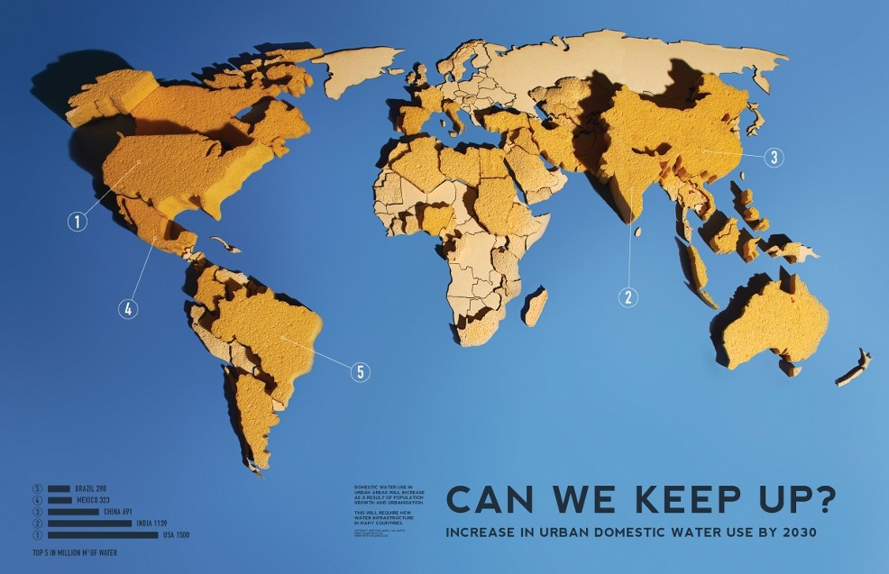
Infographic” Urban Water Needs—Can We Keep Up? (Increase in Urban Domestic Water Use by 2030)” by Matt and Hal Watts

Note. From Can We Keep Up? Increase in Urban Domestic Water Use by 2030 [Infographic], by H. Watts & M. Watts, 2011 (https://www.circleofblue.org/2011/world/infographic-can-we-keep-up-increase-in-urban-domestic-water-use-by-2). Copyright 2022 by Matt and Hal Watts.

The infographic by Matt and Hal Watts showcases beautifully how Communication Design can aide translating a complex topic into an image I can grasp within seconds: the bigger the sponge, the higher the urban domestic water use increase.

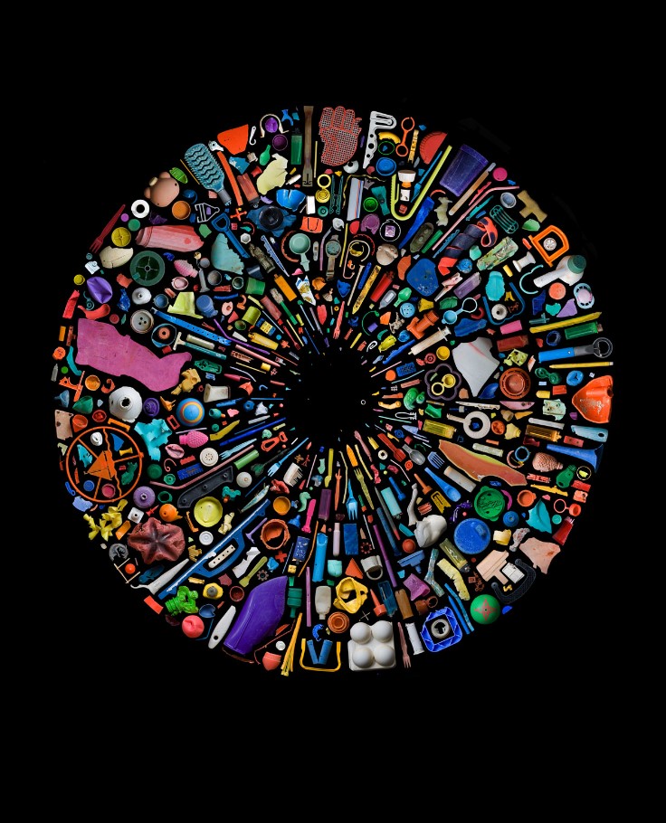
Poster series “Soup” by Mandy Barker

Note. From Soup [Poster], by M. Barker, n.d. (https://www.mandy-barker.com/soup-2). Copyright 2022 by Mandy Barker.

Video “There’s a monster in my kitchen” by Greenpeace International

Note. From There’s a monster in my kitchen , by Greenpeace International, 2020 (https://www.youtube.com/watch?v=prg24EWHNJg). Copyright 2020 by Greenpeace International.

This video from Greenpeace raises awareness for deforestation and uses a beautiful emotionally-laden visual language reminiscent of children’s books.

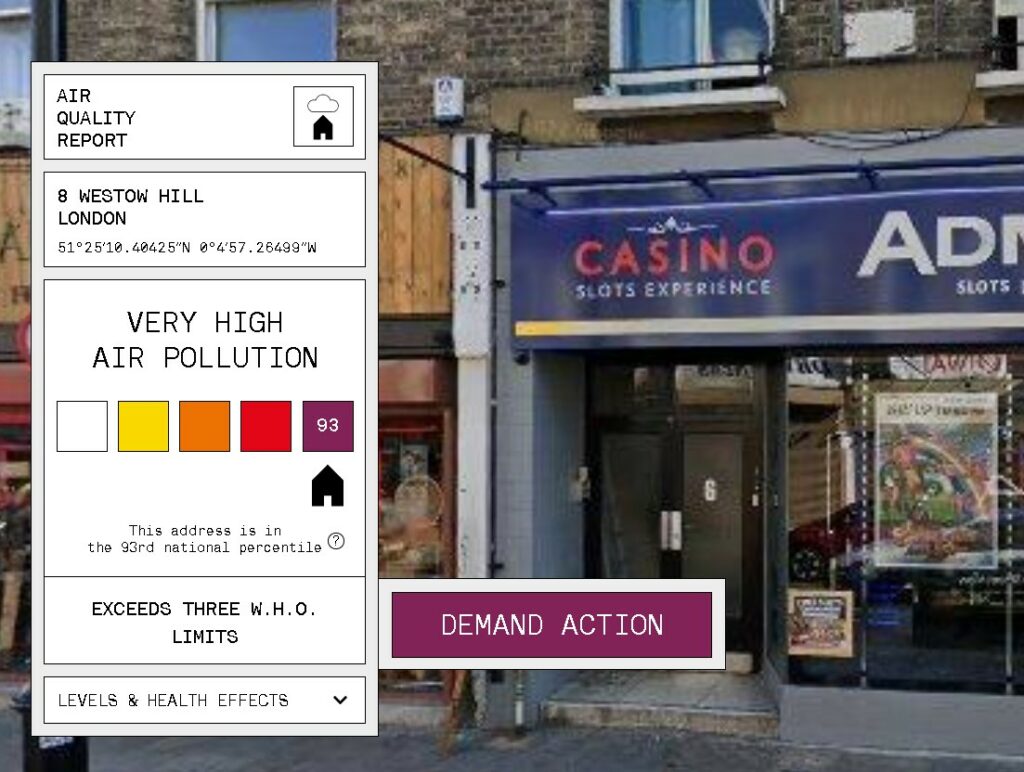
Website “addresspolution.org”

Note. From [Screenshot of the website addresspollution.org], by Central Office of Public Interest, 2022 (https://addresspollution.org/results/f0e570ee-f242-4e38-8a0e-9431f4676bed). Copyright 2022 Central Office of Public Interest.

The website “addresspollution.org” lets residents of London enter their address and returns the air pollution score. With this, the users can see the direct effect pollution has on their very own lives.

References

  • Barker, M. (n.d.). Soup [Poster]. Mandy Barker. https://www.mandy-barker.com/soup-2.
  • Central Office of Public Interest (2022). [Screenshot of the website addresspollution.org]. Central Office of Public Interest. https://addresspollution.org/results/f0e570ee-f242-4e38-8a0e-9431f4676bed.
  • Greenpeace International. (2020). There’s a monster in my kitchen . YouTube AT. https://www.youtube.com/watch?v=prg24EWHNJg.
  • Watts, H., Watts, M. (2011). Can We Keep Up? Increase in Urban Domestic Water Use by 2030 [Infographic]. circle of blue. https://www.circleofblue.org/2011/world/infographic-can-we-keep-up-increase-in-urban-domestic-water-use-by-2.

Sustainability Communication – Can Visual Communication Design influence behaviour?

Since looking at examples of design activism and the medium of the poster, I have dived deeper into the underlying principles behind Social Visual Communication. When observing the graphic artworks produced by the “Ateliers Populaire” in 1968, I could not help but wonder if the students rioting did indeed achieve their goal? Did they catch the onlooker’s eye and maybe even change the opinion of someone with just their printed flyers and posters?

Those musings lead me to the underlying inquiry of whether you can actually influence someone with a poster at all? If yes, what should a poster (or any graphic design) look like and which features should it have to impact someone’s behaviour?

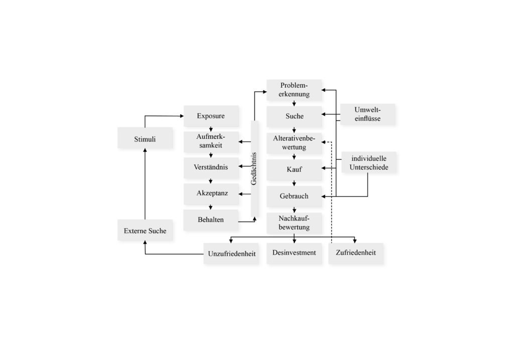
To begin unravelling this aforementioned mystery, I firstly looked back on previous research I conducted. For my bachelor thesis I observed social influencers and their influence on the attitude behaviour gap in the sustainability behaviour of generations Y and Z. While researching this topic, I came across several models and determinants of behaviour, which were albeit focused on consumer behaviour alone. For instance, Blackwell et al. developed a total model to map the entire purchase decision process which can be viewed below (Hoffmann & Akbar, 2019):

Total model of consumer behaviour from Blackwell/Miniard/Engel (Hoffmann & Akbar, 2019)

During the further course of my work, I dived deeper into sustainable behaviour and eco-conscious consumption, explored what barriers hinder people from such and finally researched if influencers on social media could make a positive impact on this. When observing this, I imagine Communication Design could maybe impact the exposure, attention, and comprehension stages of behaviour, but since my work only focussed on the impact of influencers and not design, it is impossible to tell just yet.

Fortunately, after some more reading, I happened upon a book called “Cause and effect – Visualizing sustainability” (2012), which contains examples design approaches that try to raise awareness and stimulate sustainable behaviour.

In the book, the authors describe the unique importance of the communication industry for conveying the necessary knowledge for sustainable practices (Bohle, 2012, p.2-3). They define the concept of sustainability communication:

“What distinguishes successful sustainability communication is that it sensitizes people, puts its finger on problems, and creates a sense of awareness. It arouses enthusiasm, offers guidance, and motivates people to take action. It addresses specific target groups with the aim of reaching the most various stakeholders. It communicates topics of sustainability, conducts PR and communication for environmental and social activities, disseminates information on the environmental impact and social compatibility of products and services, designs sales promotions and events conveying aspects of sustainability, supports and advances strategic consumption, and activates people for the aims of sustainable development. Successful sustainability communication gives attention to the real-life situations of people so that sustainability does not remain an abstract and empty word, but gains relevance”.

(Bohle, 2012, p.2-3)

When it comes to concrete ways with which design could aid the cause of changing people’s behaviour in a positive way, the authors mainly focus on the way topics should be communicated and which topics should be highlighted: “Each and every day, people deal with more than 10,000 units of information. The consequence is an information overload of around 99 percent, meaning that only 1 percent of the information we take in winds up in our short-term or long-term memory. To “slip into” this 1 percent is one of the three barriers that sustainability communication must overcome. […] First it must invite us to take a look by making use of unusual picture combinations. It must develop a pictorial and formal vocabulary that is extraordinary and sets itself off from everyday monotony” (Bohle, 2012, p.6). In addition to this, they also describe that sustainability communication must touch the onlookers emotionally in order to overcome the hurdle of people not feeling personally affected by climate change and must “translate the highly complex and in part complicated interrelations of sustainability into a comprehensible language” (Bohle, 2012, p.6).

The factors mentioned here are very interesting, but I am still wondering of how the visual aspect could aide or hamper inspiring onlookers to change their behaviour to safe our planet. In addition, I am also curious about in how far the learnings from this book could also be transferred to other causes like Social Movement campaigns etc. However, this question shall be the topic of further exploration…

References:

  • Bohle, S. (2012). Cause and effect – Visualizing sustainability. gestalten.
  • Hoffmann, S., Akbar, P. (2019). Konsumentenverhalten – Konsumenten verstehen – Marketingmaßnahmen gestalten. Springer Gabler.

Design Activism – Can a poster change the world?

The first area I would like to explore during my research about Social Communication Design is the topic of Design Activism, beginning with the medium of the poster.

Over the history of mankind, humans have utilized protest art to demonstrate political and social discontent: “From the earliest broadsheets in the 1500s to engravings, photolithographs, prints, posters, murals, graffiti, and political cartoons, these endlessly inventive graphic forms have symbolized and spurred on power struggles, rebellions, spirited causes, and calls to arms” (McQuiston, 2019). Especially during the last century, political protests have reached the public via poster art, hanging from walls and lantern posts, calling their onlookers for action. Bruinsma (as cited in Salmon, 2021, p.11) describes the purpose of those posters as “to cause a small but engaging short-circuit in the mind of the beholder, triggering them”.

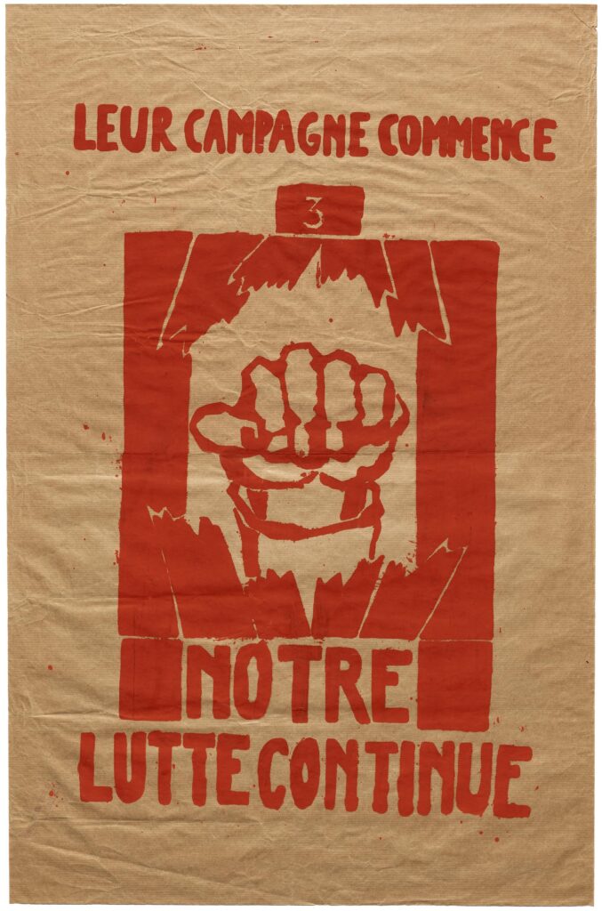
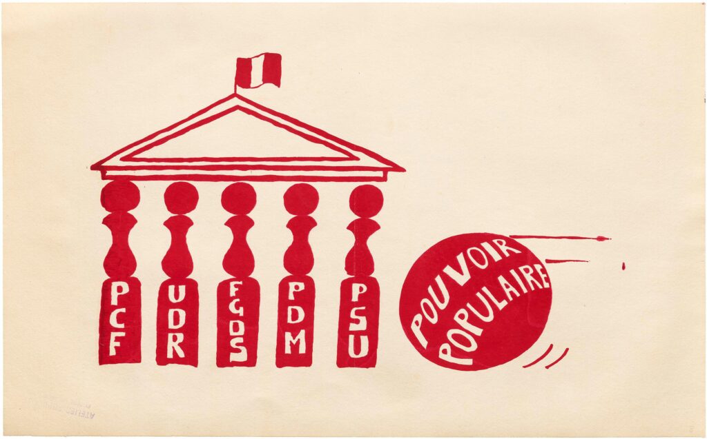
To better understand the medium and see if/how it can have an influence on the public, it might be worthwhile to first observe some historical examples of activist posters. May scholars name the graphic activists of the “Ateliers Populaire”, a collective of students operating during the 1968 uprisings in Paris, as an important trailblazer for politically motivated design. On a blog entry on Letterform Archive, the formation of the collective is described as follows:

“In May 1968 nearly a million students and workers almost shut down France and toppled its government. They had no centralized organization, no single charismatic leader, no trade union nor political party. Their common ideology was a reaction against a Charles de Gaulle regime they saw as increasingly totalitarian, and they took to the streets. They acted through mass demonstrations and labor strikes, and without a core organizing committee their main method of communication was the poster. The production of posters was initiated on May 14 by a group of students from the Ecole National Supérieure des Beaux Arts. Seeking a way to get involved with the protests already underway, they occupied the lithography studio at the venerable art school.”

(Coles, 2018)

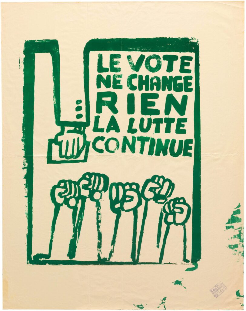
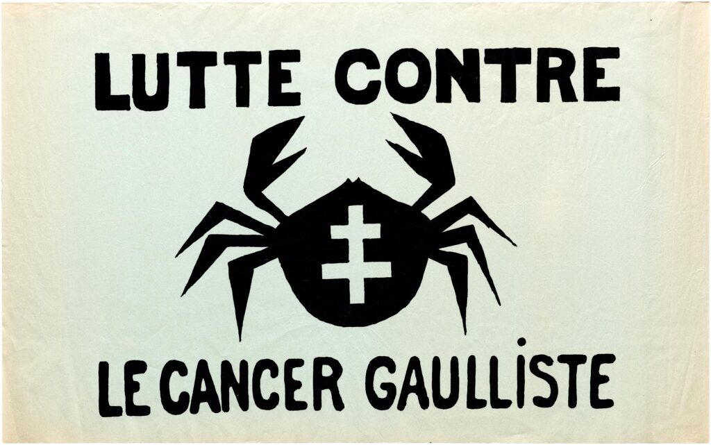
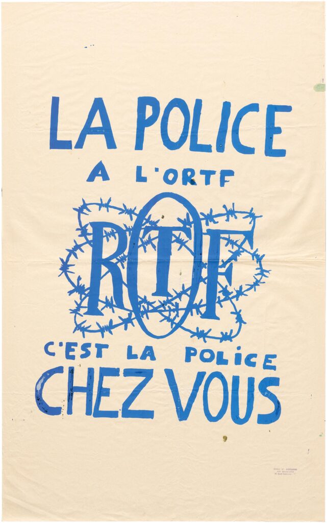
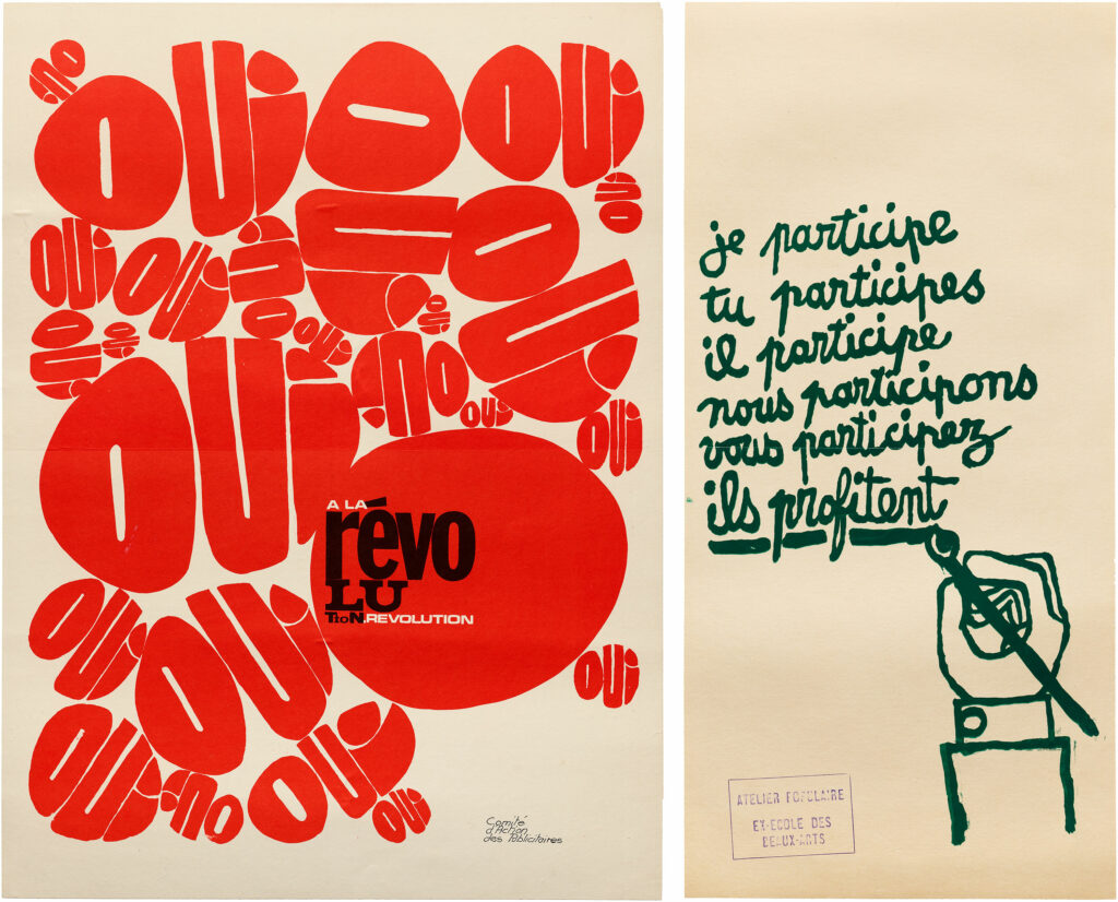
When looking at the posters, the pictogram-like shapes and the use of a simple signal colour catch your eye. This graphic language of posters produced by the “Ateliers Populaire” can be attributed in part to the printing facilities the students had access to. After starting of the production of their posters via lithography, the students later switched to silkscreen printing, which was more affordable, efficient, and allowed a vast production volume (Coles, 2018). In addition, the element of humour and irony was vital to their graphic language, which served the overall purpose of “translating sometimes rather complex social and political issues into deceivingly simple, but deeply referential imagery, readable for an informed, visually literate audience” (Bruinsma, 2021, as cited in Salmon, 2021, p.12).

Image source: letterformarchive.org/news/view/atelier-populaire-posters-of-may-1968

References:

  • Coles, S. (17. 04 2018). Letterform Archive. Von https://letterformarchive.org/news/view/atelier-populaire-posters-of-may-1968 abgerufen 23.11.2022
  • McQuiston, L. (12. 11 2019). Princeton University Press. Von https://press.princeton.edu/ideas/a-look-inside-protest-a-history-of-social-and-political-protest-graphics abgerufen 23.11.2022
  • Salmon, B. (2021). Graphisme en France 2021 – Graphic design and society. Centre national des arts plastiques.

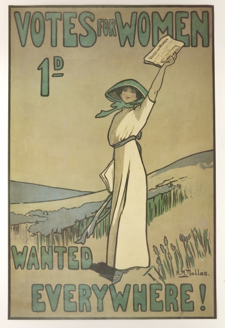
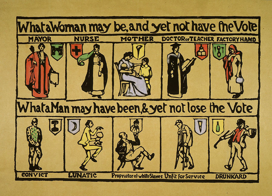
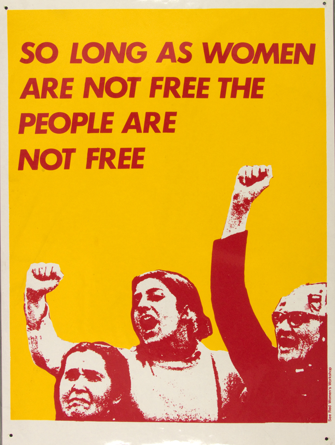
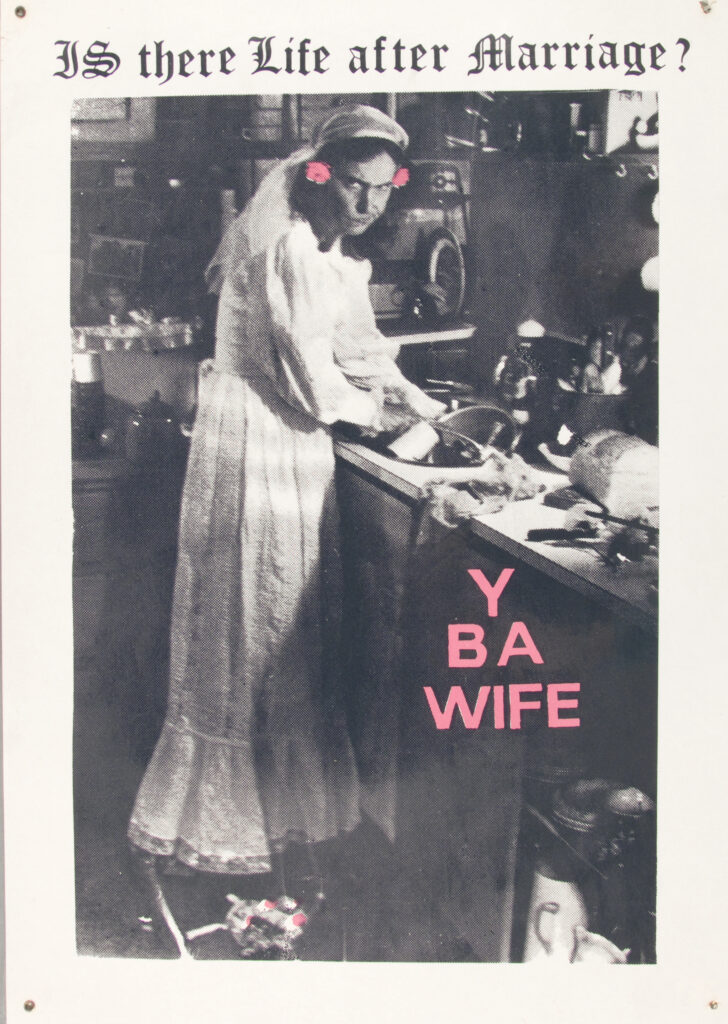
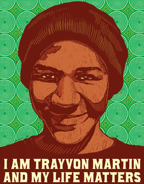
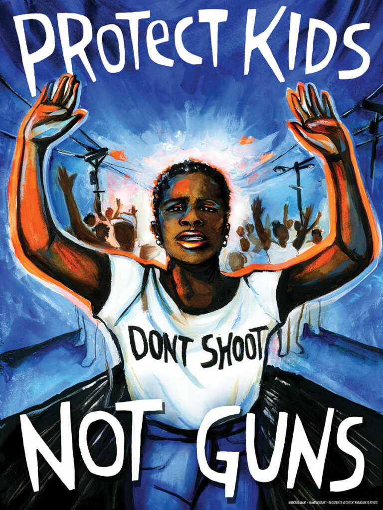
Further examples include the protest against a huge array of issues, ranging from women’s equality, the fight for LGBTQ rights, protests against wars, solidarity with POC and much more. Below, I have listed some examples that are considered to be influential or have caught my eye:

Hilda M. Dallas: Votes for Women (1907)

Image source: https://press.princeton.edu/ideas/a-look-inside-protest-a-history-of-social-and-political-protest-graphics

Suffrage Atelier (artist collective formed in 1909 to promote the women’s movement): What a woman may be and yet not have the vote (1913)

Image source: Suffrage Atelier, What a woman may be and yet not have the vote, c. 1913. Courtesy: Rex Shutterstock/Museum of London via https://www.frieze.com/article/pictures-defiant-art-protest-poster

See Red Women’s Workshop: Feminist posters (1974-1990)

Image source: https://seeredwomensworkshop.wordpress.com/

Jesus Barraza, Mazatl and Melanie Cervantes: I Am Trayvon Martin (2013)

Image source: https://press.princeton.edu/ideas/a-look-inside-protest-a-history-of-social-and-political-protest-graphics

Artist Micah Bazant: Protect Kids Not Guns (2018) for March for Our Lives

Image source: Micah Bazant for Amplifier, Protect Kids Not Guns, 2018. Courtesy: Micah Bazant for Amplifier, 2018 via https://www.frieze.com/article/pictures-defiant-art-protest-poster

Research topic: Social Visual Communication

The term Social Design has recently become the object of much scholarly attention. But what exactly encompasses Social Design? Banz (2016, p. 10) defines the phenomenon in her book “Social Design – Gestalten für die Transformation der Gesellschaft” as the process of changing society through design. Bruinsma (2021, as cited in Salmon, 2021, p.13) concretises this abstract concept and lists “[g]iving a voice to people and communities, helping them to express themselves and clarify their particular points of view, to take responsibility and develop agency in their own living environment” as central issues of Social Design.

From those definitions, it becomes evident that Social Design is intertwined with a vast range of disciplines such as architecture, product design and more. From the perspective of a communication designer, however, it might be of interest to ask to what extent social design influences graphic / communication design and what overlaps and intersections exist between the two terms. Hananto (2020) investigated in his research what he calls Social Visual Communication Design, “a form of visual communication design that had social qualities or properties embedded”. He defines content, form and context as three parameters by which design practices can be categorized as such (Hananto, 2020, p.30).

In search of examples of such design practices, for instance, the design activists of the “Ateliers Populaires” of the uprisings in 1968 in France come to mind, who created activist posters and slogan, thus “productively redirecting resistance into new forms of design practice, resource use, production, consumption and social interaction” (Banz, 2016, p. 14).

Image source: letterformarchive.org/news/view/atelier-populaire-posters-of-may-1968

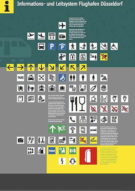
But graphic design that benefits society does not have to be openly radical in its purpose. Bruinsma (2021, as cited in Salmon, 2021, p. 9) describes the example of a fire at a German airport in 1996, in which 17 people died, partly due to poor signage. This incident led to the creation of new emergency pictograms by Erik Spiekermann that significantly improved orientation at the airport and thus passenger safety.

Image source: www.fontblog.de/fontblog-archiv/files/ff_info_poster.html

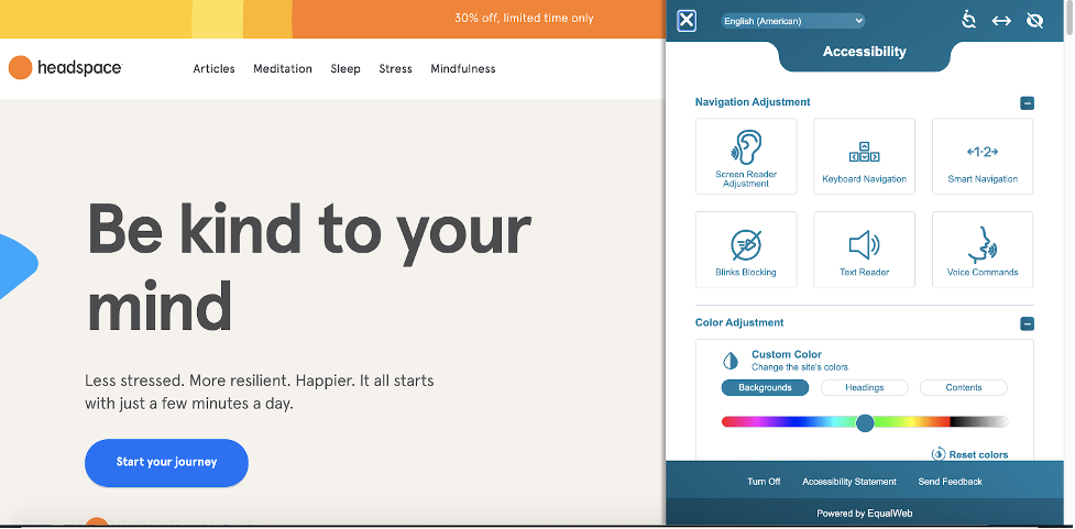
Furthermore, the phenomenon of inclusive design, that focuses on the inclusion of “people with specific mobility, dexterity, sensory, and communication impairments; learning disabilities; continence needs; and people whose mental well-being should be supported by a thoughtfully crafted and managed environment”, can be noted (Commission for Architecture and the Built Environment, 2008).

Customizable widget on headspace website
Image source: https://www.eleken.co/blog-posts/design-that-benefits-everyone-top-5-inclusive-design-examples

Yet, those examples barely scratch the surface of social visual communication design and a deeper dive into the topic could be interesting. Especially considering the numerous crises we are experiencing today, I would like to further explore the question that Salmon has summed up:

„How does graphic design contribute to a greater cohesion, understanding, and harmony of the society in which we live? How does it allow us to better circulate, better educate, better understand and better interact with others? How does it allow us to enhance the environment in which we live, making it richer, more respectful, more interesting”?

(Salmon, 2021, p. 2)

References:

  • Banz, C. (2016). Social Design – Gestalten für die Transformation der Gesellschaft. [transcript] Design.
  • Commission for Architecture and the Built Environment. (2008). Inclusion by design – Equality, diversity and the built environment. Commission for Architecture and the Built Environment.
  • Hananto, B. A. (2020). What is Social Visual Communication Design? Proposals on How to Identify and Define it. Advances in Social Science, Education and Humanities Research, 27-31.
  • Salmon, B. (2021). Graphisme en France 2021 – Graphic design and society. Centre national des arts plastiques.