This post will deal with the 12 principles of animation. It started out as jargon between animators at the Disney studio. As they talked about their work with each other more and more, some terminology was created or assigned new meanings to facilitate this process. After continuously searching for better names and methods, they eventually perfected it into these 12 principles. (cf. Thomas 1995: 48)
1. Squash and Stretch
This term was coined by the idea that most things, while progressing through an action, show some kind of movement in their shape, as little things are rigid enough not to do so. They define squashed as flattened or bunched up and stretched as an extended condition. It was important not to exaggerate to prevent the drawings from looking bloated or stringy. A half-filled flour sack was used as reference and bent into all kinds of shapes, while keeping its original volume. Various newspaper photos of people doing different kinds of sports were also referenced, as they showed their bodies and faces in most unusual and extreme situations. (cf. Thomas 1995: 48ff)
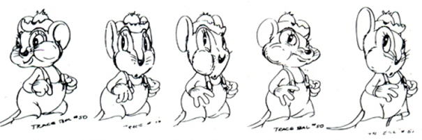
2. Anticipation
This was based on the idea that animation should visually lead the audience from one sequence to the next. Each important action should have a small preceding action which hints at what is to come. Without it, the audience can become nervous and unsure. Especially early animation was often abrupt and jagged, which is why Walt Disney wanted to correct that. (cf. Thomas 1995: 52ff)
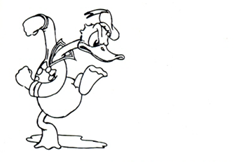
3. Staging
Staging is one of the broadest terms on this list. Characters and action need to be staged for them to come across as intended and be properly understood. As soon as a story point has been decided on, it needs to be properly catered towards. The action must be properly seen, the framing needs to guide attention properly and there should be no other distractions from what is to be shown at any point. Walt also wanted everyone to work in silhouettes, in order to facilitate staging things properly. (cf. Thomas 1995: 54ff)
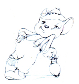
4. Straight Ahead Action and Pose to Pose
These are the two types approaches to animation. Straight Ahead Action means that the animator simply starts drawing and draws frame after frame, letting their creativity flow, getting new ideas along the way. The overall goal and action are obviously clear from the beginning, however this approach is more creative and can lead to more spontaneous results.
The second approach, Pose to Pose is more planned out. As the name suggests, the key poses of a scene are drawn first. This way more time is spent on these key poses, giving more control and opportunity to refine.
Both these methods offer their own unique advantages, which is why they are both still in use. (cf. Thomas 1995: 57ff)
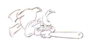
5. Follow Through and Overlapping Action
Whenever a character stopped moving it looked unnatural and abrupt. Consequently, Walt Disney knew that not all things come to a halt at the same time and defined a few basic rules.
1. After the figure has stopped, appendages such as a tail or big ears continue to move according to their weight.
2. The body does not move as one. When one element has already stopped, another can still be in movement.
3. Skeletal parts will move faster than loose parts.
4. The aftermath of an action can be more interesting than the action itself. A swing of a bat will be over in a second, but what that swing causes to the one swinging or anybody around can be shown in the following seconds.
5. Lastly, the Moving Hold is when a distinct pose is kept on screen for 8 to 16 frames to allow the audience to take in what had happened. To keep such a long wait from being boring, the pose that was kept was drawn a second time, but slightly more exaggerated. While holding the initial pose, the character gradually moved towards the second version. (cf. Thomas 1995: 60ff)

6. Slow In and Slow Out
The established key poses were the hero of the animation, while the frames in between were just a way of getting there. This is why everything close to and around a key pose was slower and held on screen longer than the in-betweens.(cf. Thomas 1995: 63)
7. Arcs
This states that in living organisms, most movements will, in one way or another, describe an arc. With this principle, animation broke free from its stiff and rigid nature. It described how a character would arc into their steps, or how even the fist in a straight punch follows an arc during its wind-up. Such action is only visible in in-betweens, since only key frames have no way of showing their relative movement. (cf. Thomas 1995: 63ff)
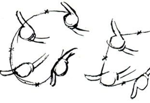
8. Secondary Action
A secondary action supports what the main action is trying to convey. It should never be too weak nor too strong, as not to be inconsequential or overpower the main action. These are things such as a tear dropping or a small change in expression. This also needs to be timed with main movement and action, since a subtle change during one of those times would easily go unnoticed. (cf. Thomas 1995: 64ff)
9. Timing
The time an action takes is of course directly proportional to its number of drawings. Depending on the complexity of these drawings, they might need more or less screen time. The same action can also be interpreted differently based on how many in-betweens are drawn, and therefore the speed at which the action completes. This can range from being hit by a brick to stretching a sore muscle. (cf. Thomas 1995: 65f)

10. Exaggeration
Walt Disney always wanted characters and their actions to be as exaggerated as possible. Bringing across as much as possible through the way they and their actions were drawn was what he called “realism,” as it felt more real, more convincing.(cf. Thomas 1995: 66f)
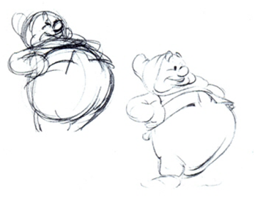
11. Solid Drawing
This simply meant that animators should understand the basics of drawing. With these basics in mind, repeating all steps needed to produce animation is much easier to achieve. (cf. Thomas 1995: 67f)
12. Appeal
Be it a hero or a villainess, the eye of the audience needs to be drawn and what they see should have appeal. This makes people want to watch, want to know more about characters. There were many things that, according to Walt Disney, made something lack appeal. A weak drawing, clumsy shapes, poor design. With this appeal they tried to communicate feelings through lines. (cf. Thomas 1995: 69f)
Sources
(1) Thomas, Frank/Ollie Johnston (1995): The ILLUSION OF LIFE: DISNEY ANIMATION, USA: Abbeville Press
Image Sources
Figure 1: Thomas 1995: 49
Figure 2: Thomas 1995: 53
Figure 3: Thomas 1995: 55
Figure 4: Thomas 1995: 58
Figure 5: Thomas 1995: 62
Figure 6: Thomas 1995: 63
Figure 7: Thomas 1995: 65
Figure 8: Thomas 1995: 67
