Task III: Blog entry. Master thesis evaluation

For the third task in the Proseminar Master’s Thesis course, we got a task to find and evaluate a master thesis from another/foreign university. For this assignment I chose “Design of the User Interface and User Experience of an Application for Hiring Transportation Services in Real Time” by Omar Santiago Quinapallo Vallejo. I chose this thesis because I am thinking about working with app design for my thesis and it is important to see how other people have already done it.

I really liked that the author started the thesis by explaining the motivation for the work and idea, which is that in Ecuador transportation services are still mainly done by calling or personal contact, which makes it more complicated and time-consuming. The author had clear problem and goals stated.

Level of design

The design was minimalist and clean but some elements were not aligned or highlighted. The author showed a high-fidelity prototype but I couldn’t see the process behind creating it. But what I think is important to note is that the author did user interviews beforehand and was creating a prototype based on what people said they would need/want.


Degree of innovation

The work was concentrated on the human-centered design principles and the thesis proposes solutions to improve transportation services in real-time.

Independence

The thesis shows a high level of independence and the author’s research and design thinking. The author had a lot of statistics, conducted user interviews and user tests, which showed that everything they did had a purpose and used the knowledge for creating the product.


Outline and structure

The thesis is well-organised and has a structured framework. It has a logical flow, and clearly organised chapters.


Degree of communication

The author could clearly communicate complex concepts, ideas. Additionally diagrams, illustrations, and other visuals help with understanding what author meant or wanted to address.


Scope of the work

The thesis demonstrates a big scope of work as it shows the process from the very beginning (defining the problem) to the end result. The author was doing a lot of research, interviews, tests, evaluations to make sure that the end result would fit with what people said they needed.


Orthography and accuracy

The author paid attention to accuracy, grammar, spelling and punctuation. The author’s writing style is easy to follow and understand. They also could address and explain complex design concepts related to user interface in a way that is easy to understand as well.


Literature

The master thesis didn’t have a wide range of literature, which I think is a disadvantage of it. The literature and references used are relevant to the field but it was just a few of them listed.
Impulse #4: Video on Digital Wellbeing – oder wie wir in einer digitalisierten Gesellschaft leben wollen

Nowadays it is becoming more difficult to maintain a healthy balance with social media and technology and for a lot of people it is a challenge as well. For my fourth impulse I chose a video posted by Freiwillige Selbstkontrolle Fernsehen in which they discussed the topic of Digital Wellbeing with other experts from the field. They shed a light on this issue and gave some insights.

One interesting concept that I liked was discussion of whether FOMO (Fear of Missing Out) can be transformed to JOYO (Joy of Missing Out) as this is one of the most critical fears a person has when trying to change their media/device usage. For a lot of people balance with social media, use of technologies is a difficult topic and it is important to be able to decide which technologies are good or bad for ourselves, which to waive, which type of media usage is the right one.

Crucially, all of this is difficult for adults but even more difficult for younger generation because medias and devices are part of their socialisation with peers, self-confidence, growing up, etc. So, the solution of completely avoiding media and technologies is not a solution nowadays because doing so will only isolate person from other people and the world.

This video also discussed an important topic: the differences of media perception. It was stated that research showed that men and women perceive social medias and experience them differently, which I have never actually thought before but also think it is an interesting topic to explore for my future posts.

In conclusion, it was insightful to see that this topic gets more attention and researchers are trying to find solutions. This impulse also gave me ideas for my future research.

Source:

Impulse #3: Master Thesis

Last week we had a chance to go through some master theses and had a task to choose one and analyse it. My choice was “Ethics of Interaction Design: A Comprehensive Research On How Interaction Designers Can and Should Be More Ethical” by Güney Güner. I chose this thesis because it is related and helpful to the topic of digital well-being.

This master thesis used the method of epistemological study and focused on acquiring as much knowledge as possible. The main goal of the thesis is close to mine because it is about raising awareness, as the topic of ethics in interaction design is often disregarded. I liked that the author of this thesis had a clear goal and structure, it was easy for me to find information and understand what they were writing about.

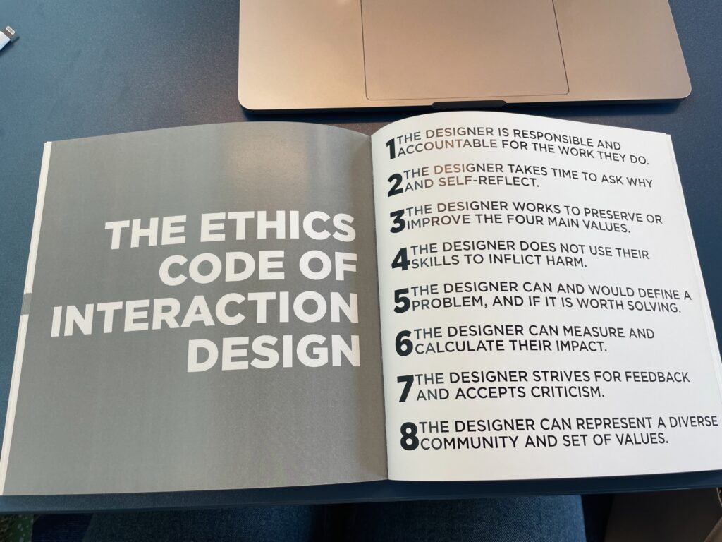
The result of the author’s research was the creation of a guideline and eight principle for designers to use when working on a certain product.

To my mind, it is important to think about ethics in interaction design because with all the technologies and products we have now, often ethics is neglected, which puts the user’s well-being not on first place in the UX field. Additionally what was interesting to read were the examples of immoral use of interaction design in the industry (The author used Twitter, Youtube, Google, etc for those examples). This thesis can serve as a guide or reminder while doing my research/creating certain products. The author specifically stated that further research and interview conductions can be made. Moreover, the code of ethics that was created can be turned into a visual aid (website, app, print) to increase the reach, which I think is also inspiring.

Impulse #2: Problematic Attachment to Social Media: Lived Experience and Behavioural Archetypes.

Research by Majid Altuwairiqi

For my second Impulse, I chose the research from Bournemouth University by Majid Altuwairiqi. Since I want to dive more into user emotions, and well-being while using devices, and social media, this research is a perfect way to start gaining more information about it.

Numerous studies revealed that social media addiction mirrors the symptoms of the usual addiction and contains the same elements: salience, tolerance, conflict, withdrawal, relapse, and mood modification. Additionally, this results in negative psychological experiences, such as anxiety, stress, etc.

When thinking about the usual addiction withdrawals, it is often something that we perceive as not that close to us (if we/our close circle don’t have the experience with it). Still, when we think about those from social media usage we can recognize not only someone close to us but also ourselves.

The author also states that when people are asked to spend less time on social media or online interactions, they start feeling more anxious even if they don’t have any clear purpose for that interaction. This is what I was already researching a little bit because to my mind, trying to avoid, spending less time by locking apps won’t solve the problem but will put the user into an anxious mode.

This research gave me more insights into studies and experiments, which were made for this topic as well as literature that I can use for my own research in the future. I also think that I would use this same research for my other blog post for my topic but will use it for a deeper understanding of psychological factors happening to the user while interacting with social media.

Sources:

Impulse #1: Measuring the Emotional User Experience. WUC

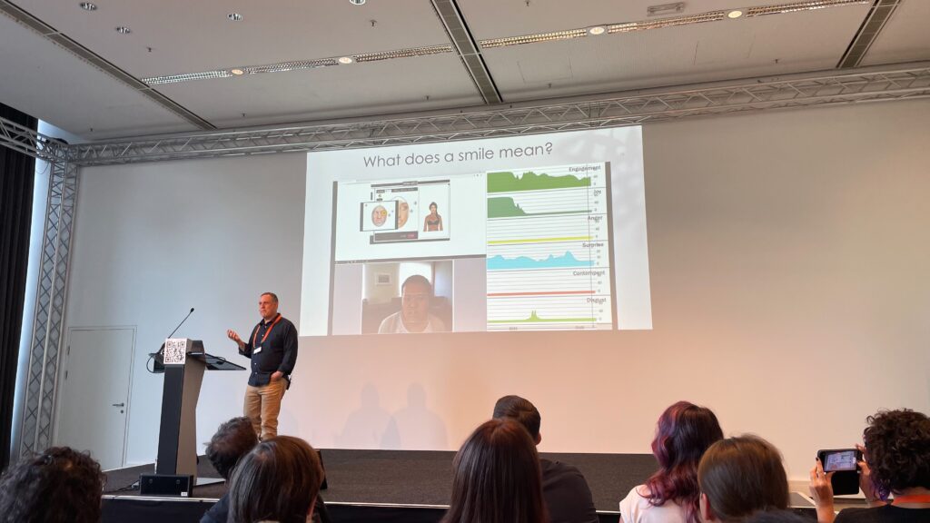
During World Usability Congress 2023, I attended the talk by Bill Albert “Measuring the Emotional User Experience”, who is the SVP and Global Head of Customer Experience at Mach 49. He began his talk by making us think about what makes a successful UX design and showing that it actually goes beyond just good usability and functionality. What matters are the emotions the product makes users feel.

He was talking about how considering a variety of potential emotions a user may experience while interacting with a product helps in designing the experience. To show how this works, Bill had a few examples of when users’ emotions and facial expressions were analysed when they were trying out a certain service or product. He highlighted that the topic of emotional analysis is complex and unequivocal because certain expressions may represent two completely different feelings, for example, a smile can represent either happiness, joy, or uncertainty and confusion. Because of this complexity, researchers try to think of techniques, methods, and tools to help interpret and understand human emotions. Additionally, Bill Albert mentioned the Journal of User Experience – an online journal, which can be accessed by everyone and to my mind, will be a good resource for my future research.

What additionally makes this process even more complex is cultural differences and mentalities. Bill didn’t state this in his talk, but one of the quests had a question about it, which is really important to always keep in mind. Due to this, researchers try to find a way to create more universal models that can adapt to different contexts.

In summary, I chose this for my Impulse because it’s always been fascinating to me – the topic of the multifaceted nature of emotions, and this talk gave me information about what softwares are being used for that and how important it is in the field of UX Design.

Sources:

New Semester – New Research Topic

Last year I was exploring the topic of cultural adaptation through interfaces. It was an interesting topic to explore because through it I also could learn something new. I analysed government websites, conducted surveys, and explored technologies that are out there relevant to my topic. It was a nice experience, which helped me understand that researching and analysing different emotional states of people while using certain products/interfaces is what is interesting to me.

Because of this, I decided to take the opportunity to change the topic and try something a little bit different. The topic I want to explore in this semester is – Digital Well-Being. Why the shift? The past few years have strongly shown that technologies will become a part of our daily lives more and more with each year and it sometimes becomes harder to control time and quality of the experience. We rely on our digital devices a lot, which we can notice even more during global events like COVID-19.

This raises the question about the negative consequences this has on our mental and physical well-being. It is now nearly impossible to control what you’ll see on your feed and how that will affect you. For this many resources were created to help with controlling time spent on digital devices or certain apps (for example: do not disturb or lock app modes) but what I’ve experienced and what I saw people experiencing is the result of thinking even more about your devices, feeling guilty/irritated, avoiding any locks. And since we rely on our devices too much these days, the solution of just leaving or turning off your phone (for example) won’t work.

So, my idea now lies in the question – is it possible to create something that would make the experience with the device more “ecological” for the user without compromising their need for the device? And what emotions/feelings do users have while interacting with their device?

ChatBot Prototype 2.0

For my first prototype, I choose to do something really simple because in this step it was important to me to understand how chatbots work, what people use to create them, and how I can make one that would be simple. In this stage, I concentrated on researching resources that are out there, that I could use to create a simple prototype. I used SendPulse – an automation platform, which has a lot of features and chatbot is one of them. 

This platform was perfect for making a prototype because it is quite simple and I could focus more on trying things out and seeing how working with a chatbot feels. It also gave me more understanding of how detail-oriented this is because you have to think ahead about what a person might need or ask. But overall it was also very interesting to do this and learn about it because I have had no previous experience with chatbots.

Future steps:
After this prototype, I would dive more into the creation of chatbots and research how people code them because using a platform is good but it has a lot of limits. I would also collect a few frequently asked questions from people who moved to Austria, collect answers and try creating something out of it. 

This step of trying to make my own prototype gave me a different perspective about how this could look like and what could be done differently.

ChatBot as a solution

In my previous post I wrote about the idea of creating a chatbot for the purpose of helping with cultural adaptation. To my mind, chatbots are an effective solution to this topic. The AI-powered chatbots improve their communication, information and interaction with the use of machine learning.

Why are they effective? 

  • They work 24/7 and provide communication to users at any time of the day or night. 
  • A chatbot can easily help the user with answering urgent questions,  navigating through the problem and finding a solution. 
  • Dramatically reduced wait times
  • No need to wait, schedule appointments, call, etc.
  • Near-human understanding of citizens’ intent during interactions

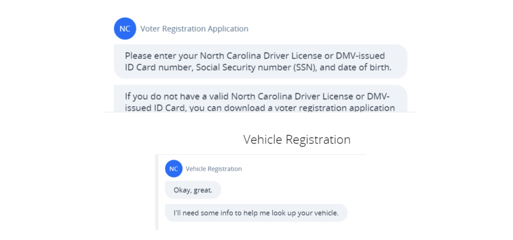
One of the examples of it is the chatbot in North Carolina. “Residents can register new vehicles, renew registrations and driver’s licenses, order license plates, register to vote, and update their address in one citizen self-service portal with help from a versatile chatbot. So far, the conversational workflow built into the myNCDMV chatbot and portal has generated a 25% increase in online revenue collection and a 40% reduction in DMV office wait times.” 1


It is also important to remember that a lot of the times when people just moved to another country, they may feel intimidated to talk to other people regarding documents, etc because of language barriers. But with the chatbot, for the person it doesn’t really matter because then they can actually see the message and if needed translate it and not feel overwhelmed. 

Cultural sensitivity and empathy are also other issues when it comes to moving to another country. A chatbot could also be designed and programmed to learn and understand cultural nuances and become a more culturally aware interface. 

Source:

  1. https://payitgov.com/chatbots-in-government/

Survey: Results

In my exploration of cultural adaptation through interfaces, I recently conducted a survey to gather information and details about people’s opinion on this topic. The survey, which was given to 6 people from different countries with different cultural backgrounds, consisted of questions about each person’s interaction experience. 

Key findings:

  • Language. Language is a critical factor because all respondents emphasized that having an English translation helps but there are also sometimes information, specifications, important notes on government or similar websites that are only available in German. Using a feature for changing languages to English or online translator doesn’t really work. This makes them more stressed. 
  • Document hand off. Multiple respondents said that they would like to be able to send documents online and come to the office after. This would take less time and pressure, especially when you still don’t know the city that well.
  • Navigation problems. In order to find what you are looking for you have to go through hundreds of different pages and then you get lost in plenty of information and there is no clear navigation, which would tell you where you are, what you need to do and where you can find it. Some also said that government websites felt old-fashioned. 
  • Open information. Respondents said that they want to be able to find needed information online without having to talk to someone. One of them clearly stated – “I want all the info available online because I always avoid calling or writing an email”. Some of them said that a lot of the time they couldn’t even understand if they needed an appointment or not, or the information was incorrect or not updated. 
  • FAQ section. Something like the FAQ section is really important because then you can find your question there and answer for it right away.


Future directions:
The survey results have provided significant insights, which helped with the idea of what to do next. After my last Design & Research meeting, I decided to research and explore the creation of an open-source bot or chatbot.

Survey: Preparation & Flow

As part of my Design and Research topic, my goal is to comprehend how interfaces can be modified to different cultural contexts in order to improve user experiences. So, for my next step I decided to do a survey with people on this subject. 

I decided to use a questionnaire as a data gathering tool to learn more about the opinions and experiences people had, who moved to Austria from other countries. I wanted to gather information about their cultural adaptability through interfaces. By doing the survey, I wanted to get a wide range of responses from people with different cultural backgrounds. 

I created a questionnaire to get information on the person’s experience with interfaces in Austria, their experience with bureaucracy, moving, etc and their opinion on how it is done now. I decided to do a first survey with one person to get both: receive information and also to see if some adjustments were needed. And after the first person, I realized that some questions needed to have more information or needed to be rephrased to make it easier for a person to understand and give a proper answer. After that I also added one more question to learn what flow people would have if they wanted to find something/ sign up for something, what kind of information they would need and what features would make the process easier.