Experiment #4: Presents with a Story

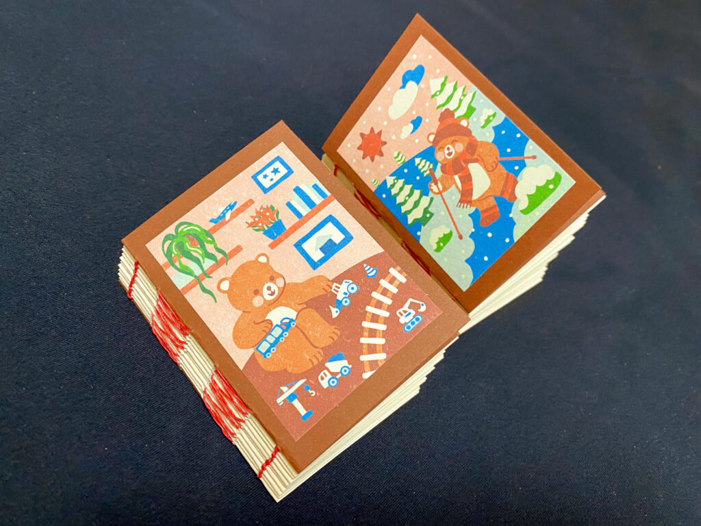
For this blog post’s experiment, I used the opportunity to prepare my next Christmas presents. I personally really like illustrations that tell a story where the longer you look, the more little details you notice. I wanted to try to make illustrations that contain a personal story for the people who will receive my gifts. Each element in the pictures is kind of an “easter egg” that the recipients will recognize and understand. For example, one person really likes hiking, while the other person is interested in specific machines used on construction sites and collects little model toys of those machines.

I have wanted to try bookbinding for quite a while now but never really knew how to, so I was very happy about the bookbinding workshop(s) we had at FH until now and that I finally found some time to try this in personal projects. So, I ended up making mini notebooks.

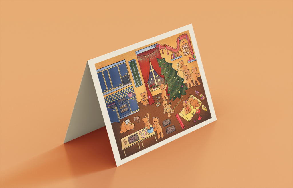
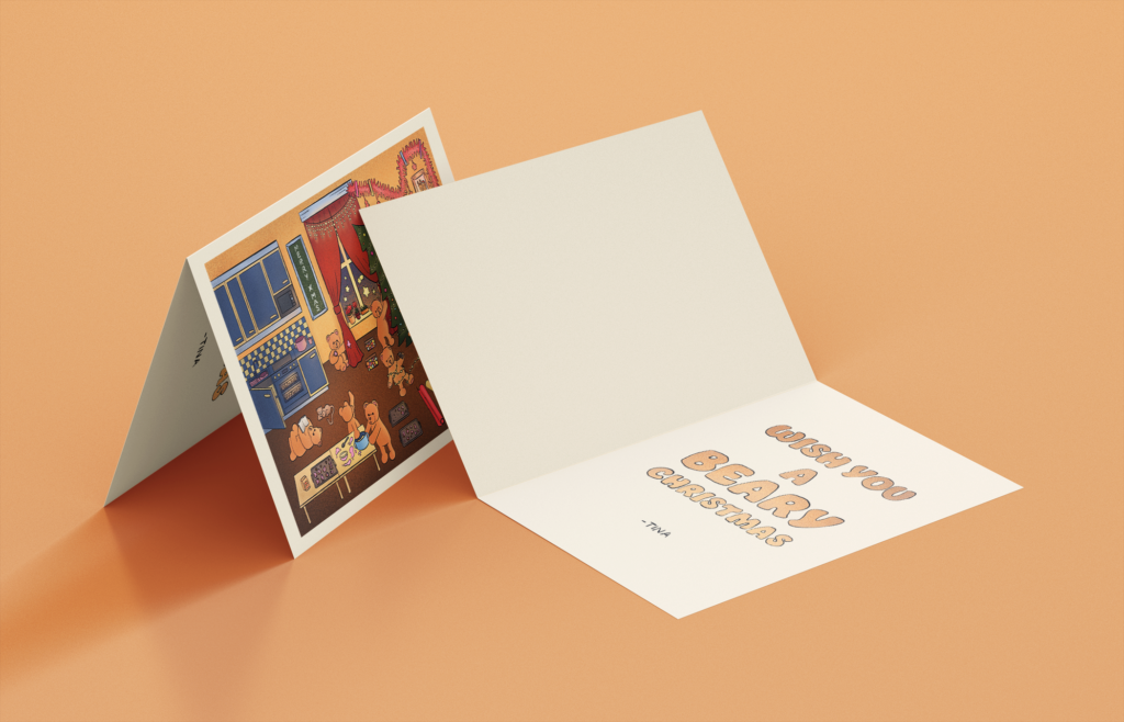
As it fits the topic, I would also like to show another illustration I did for a Christmas card last year that also had the concept of telling a story in an image that reveals more details the longer you look at it. It has the theme of teddy bear characters creating chaos while doing Christmas preparations, and the longer you look, the more situations where something is going wrong you will notice – like the Christmas tree being about to fall, one character secretly stealing some freshly baked cookies and spilling the frosting on the curtain…

Experiment #3: Using the Gestalt Principles to Tell Visual Stories

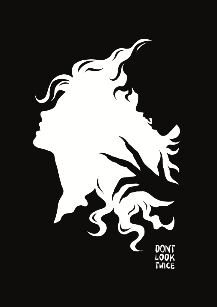
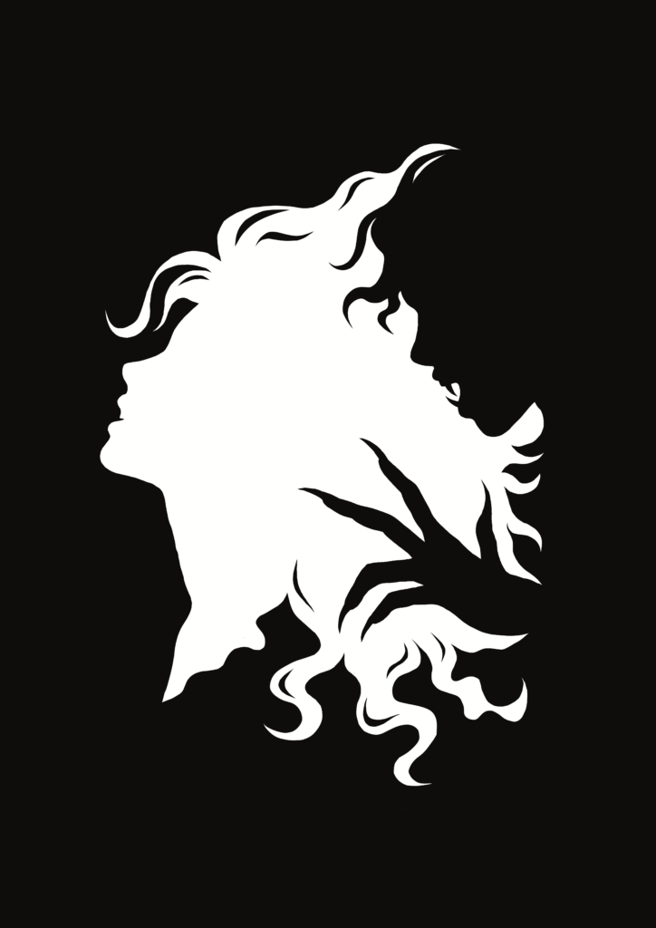
A project I did recently that correlates a lot to the topic of visual storytelling is an illustration I did using the figure-ground principle, one of the Gestalt Principles. The Gestalt Principles are principles of human perception that describe how humans group similar elements, recognize patterns and simplify complex images when we perceive objects. We as designers can use these principles in order to make our designs easily understandable and leave a stronger impression.

The figure-ground principle explains how human brains always try to split an image into a figure and the background on which the figure sits.

I was fascinated by the kind of black-and-white pictures that reveal a different image depending on whether the viewer looks at the black part of the image versus the white part, so I wanted to create an illustration that uses this technique and also plays with the concept of black and white or light and dark in a more literal way.

As I learned from the research in the previous semester, a dark atmosphere is commonly associated with the unknown, scary or evil, while a positive, friendly mood is often expressed with white or light colors.

That’s why my illustration shows a black silhouette of a creature with fangs and sharp claws creeping up on the white silhouette of a seemingly good creature. This image could carry the meaning of good and evil always being intertwined, nothing and no one is ever purely good or evil and one can’t exist without the other. That sounds very philosophical, but I think the figure-ground principle is just perfect if one wants to convey a philosophical meaning like this. Used in real life, I think this illustration or generally illustrations with this concept could work very well as a movie poster, maybe for a movie that shows a conflict or a relationship between two characters, one seemingly evil and the other seemingly good, or an inner conflict of a character.

On one version of the illustration, I added “DON’T LOOK TWICE” because, of course, the viewer has to look exactly twice – once at the white space and once at the black space – to see the whole picture, but in the context of the picture, the evil may reveal itself or take over if the “good” character looked twice.

Experiment #2: Visual Storytelling In A Frame-By-Frame Animation

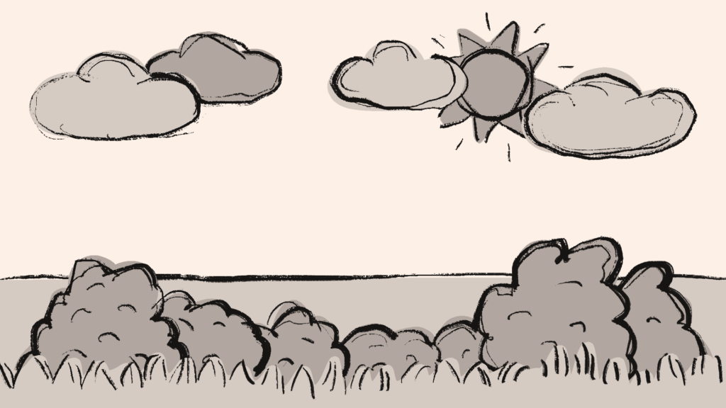
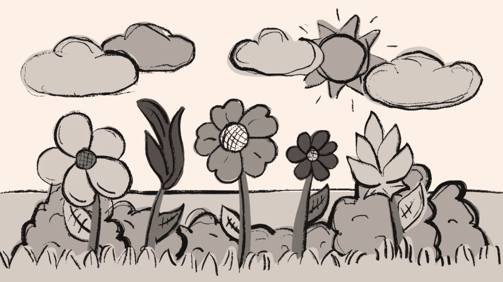
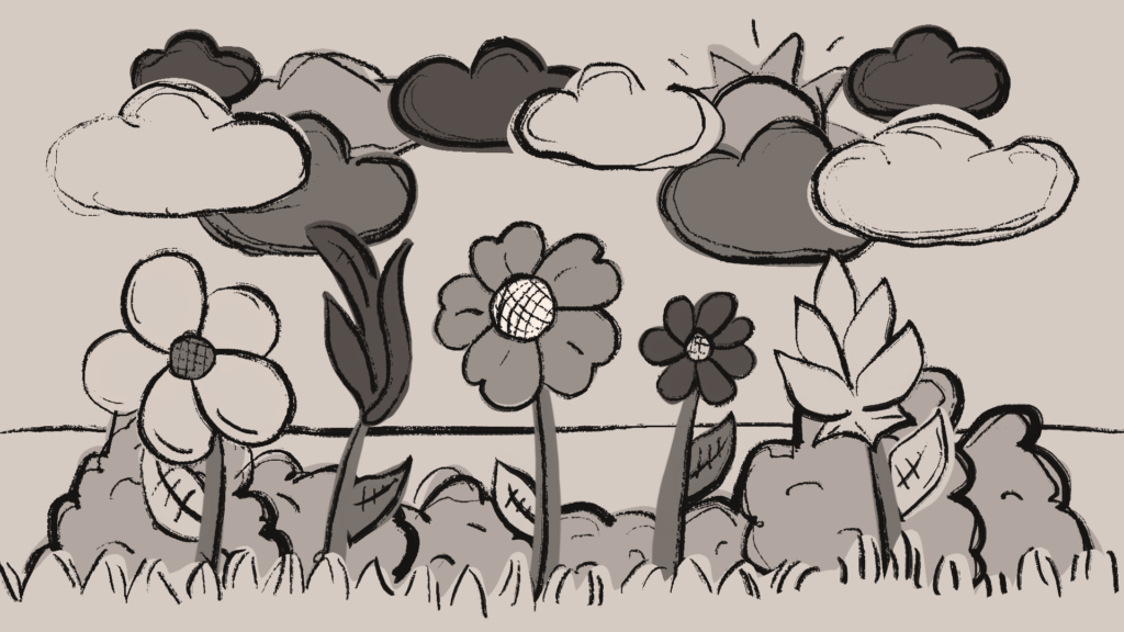
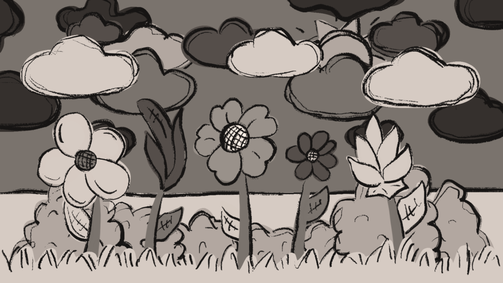
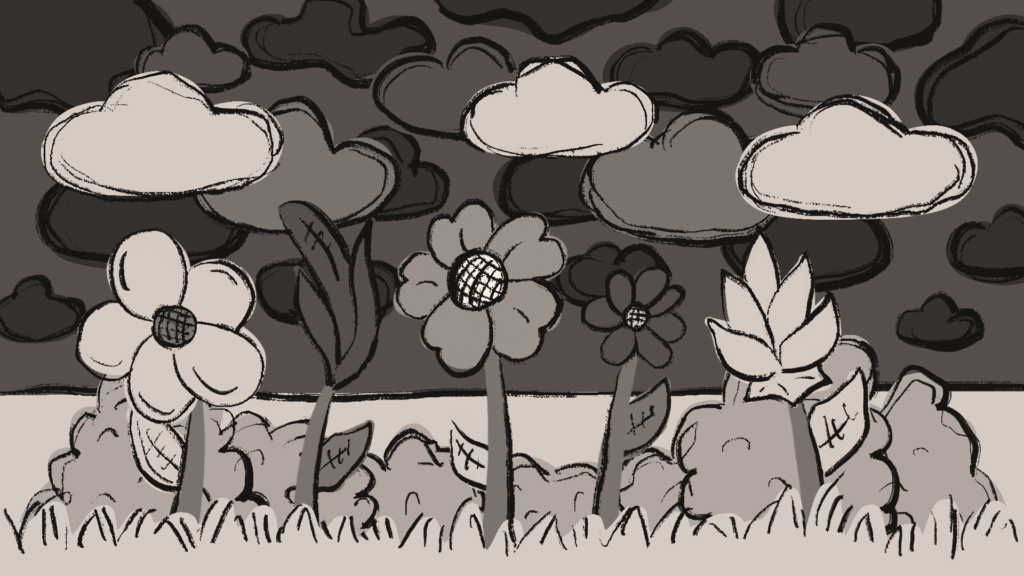
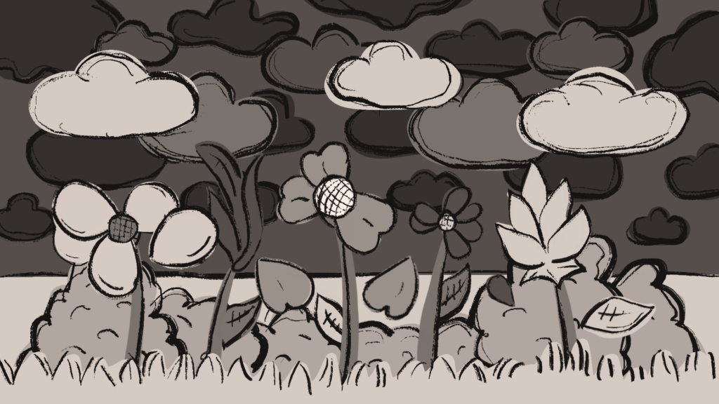
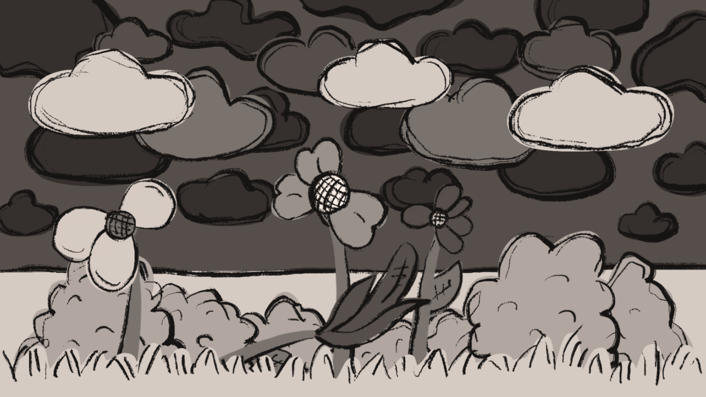
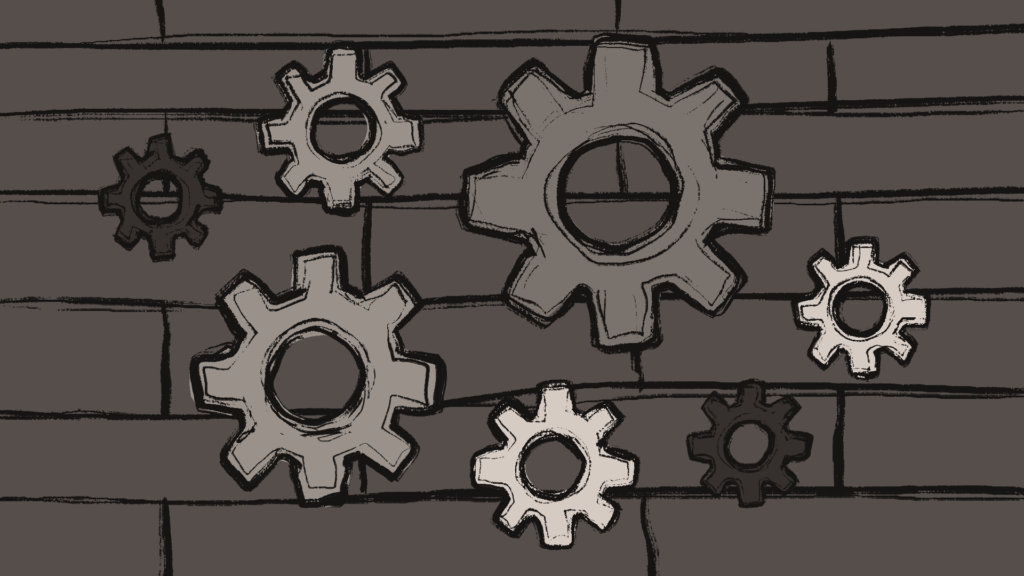
This time I wanted to write my blog post about a video I worked on recently. It‘s a frame-by-frame animation with a very low framerate of 4fps using a very reduced grey-brownish color palette and a  rough-looking art style. The topic of the video was how industrialization and the invention of new machines and technologies can be harmful to nature and the environment and we wanted to narrate this topic in an abstract way with fitting background music that was already composed for this video. While thinking of what I could draw for this video, I tried to think in a visual storytelling way. As the storyline idea for the video was showing scenes that slowly transition from a happy, peaceful mood at the beginning of the video to a dark, rather disturbing mood near the end of the video, I tried to use what I learned about visual storytelling to compose each scene.

For the first scene, I created a peaceful-looking little landscape that slowly emerged from outside the screen. For this scene, I used the lightest colors in the color palette and I kept the composition very open, simple, and uncomplicated, so the viewer would feel this atmosphere while watching this scene.

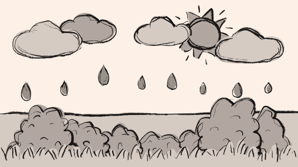
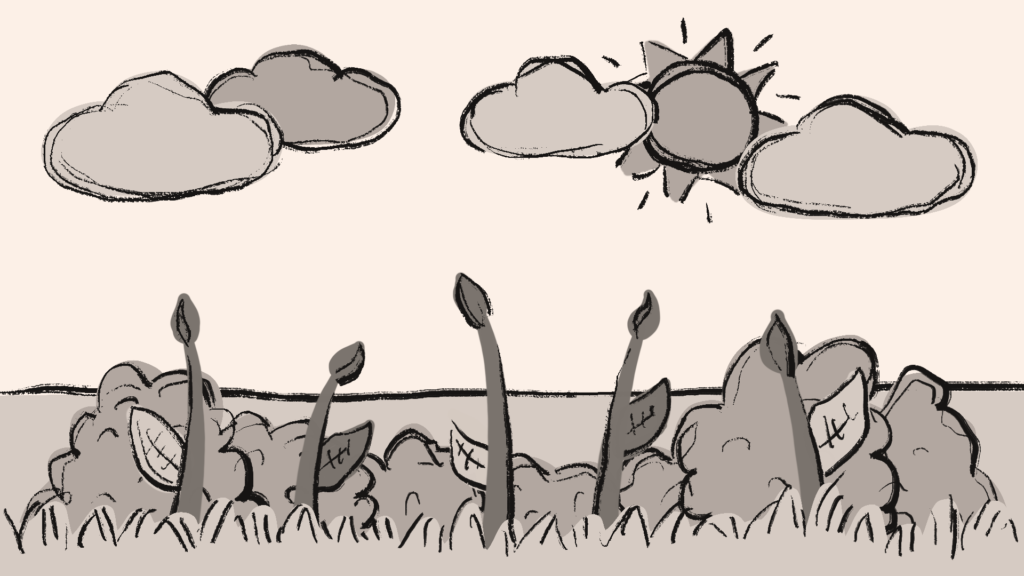
Even the raindrops that fall from the clouds a few seconds in seem light and airy so as to not destroy this light-hearted atmosphere. The flowers that slowly bloom right after should also put the viewer in a hopeful mood. Although the flowers are disproportionately big for the scene, they don‘t make the scene and therefore the viewer feel crowded yet.

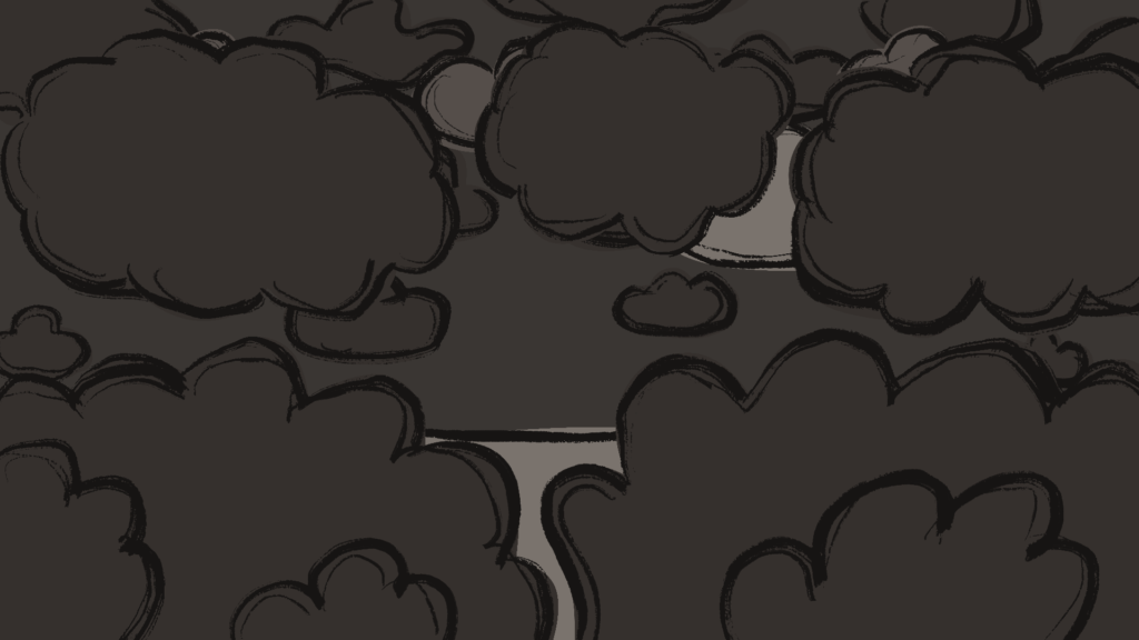
This changes when more and more clouds come into the scene. The more clouds gather, the darker they become and so does the sky. By cluttering and darkening the composition, I aimed to make the viewer feel the more and more restless and uncomfortable mood of the scene. This feeling becomes even stronger as the flower petals, and afterward, the flowers themselves, disappear into the ground and the scene becomes cluttered by black clouds until the screen is completely dark.

As I was playing with the light-dark contrast in the scenes to convey a literal positive and negative atmosphere and outlook, I went with an even more literal visualization of this idea in the next scene.

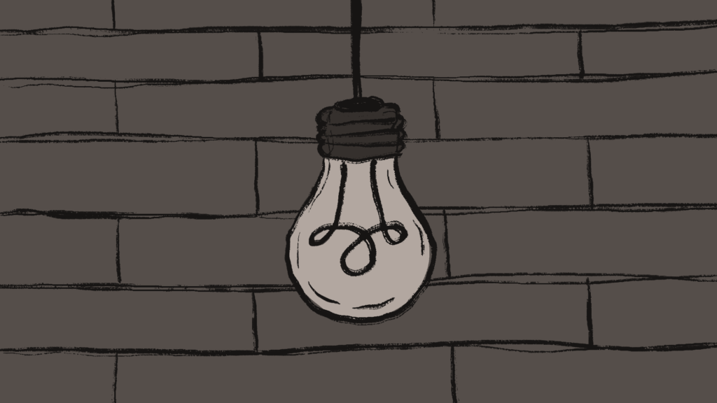
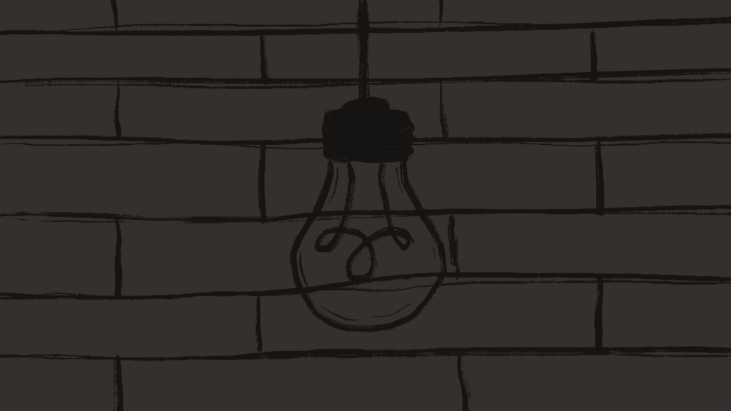
A lightbulb suddenly lights up the darkness from the previous scene and, although it flickers while the screen goes dark again, it should give the viewer a small flicker of hope.

I drew the lightbulb to be in front of a rather bleak-looking brick wall to make the scene still feel constricted like the light bulb is in a closed-off, dark room.

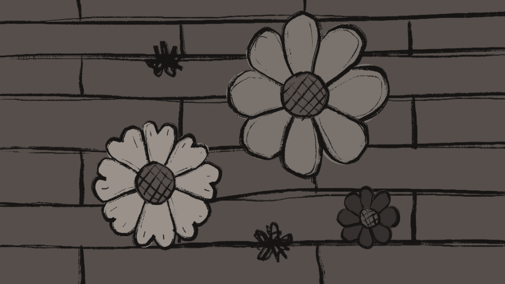
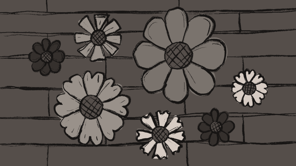
As the lightbulb disappears from view, flowers emerge from the cracks between the bricks and due to the slightly lighter colors of the flowers, the visual seemingly brings back a bit of peace.

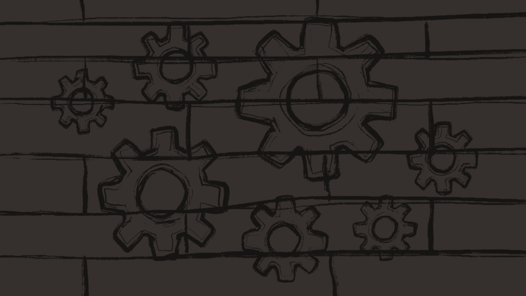
However, as the flowers start spinning, the scene feels hectic again as the light flickers to darkness again a few times and the flowers transition into gears. The harsh-looking shapes of the gears are in contrast to the soft shapes of the flowers, again giving off an unfriendlier, harsher feeling to the viewer.

The scene flickering to darkness again by hinting at the lightbulb going out or stopping to function concludes my part of the video.

Visual Storytelling Experiment #1: Lighting

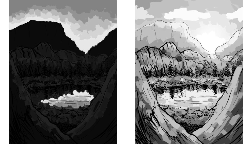
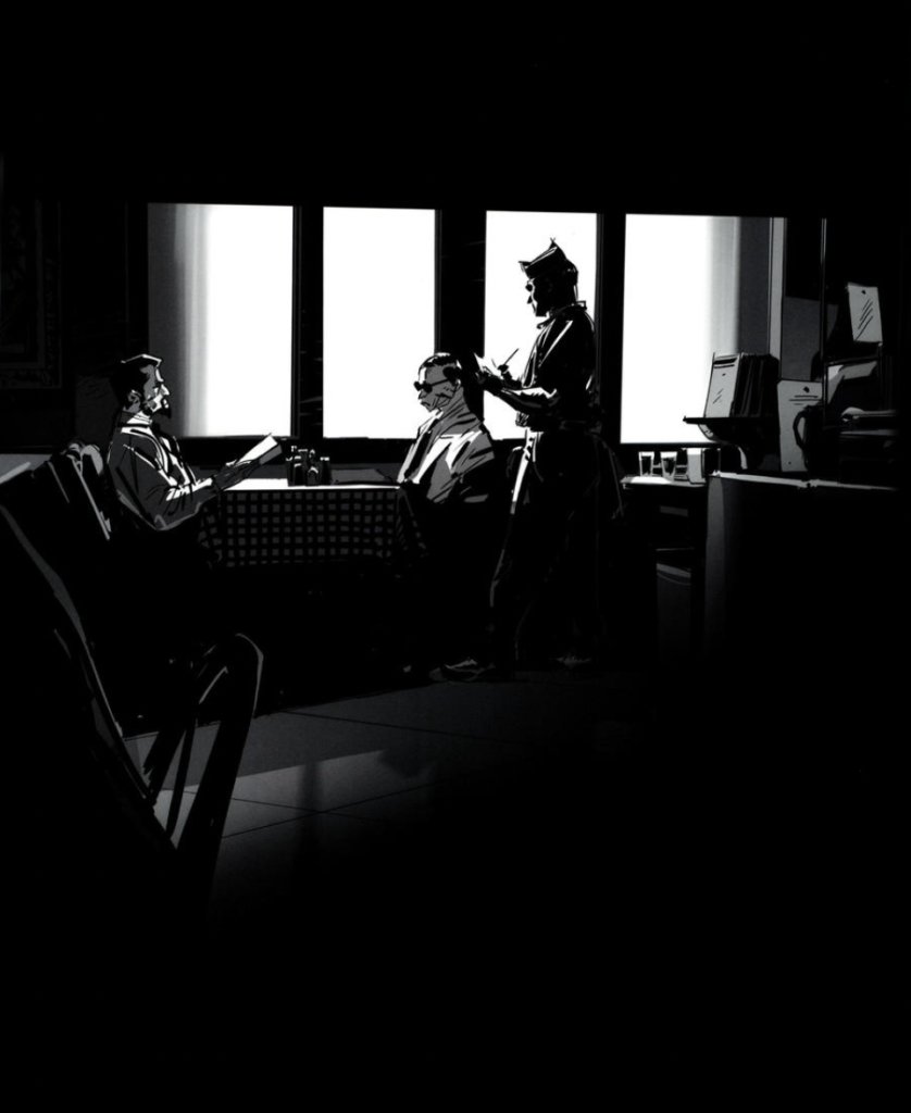
For this blog post, I tried to experiment with the visual storytelling concepts I learned about while doing research last semester. I did two rough sketches to try out how the light situation in an environment can change its mood. Scenes seem more unsettling to us when details of it are hidden, like in the nighttime image the viewer would not know what is hidden in the shadows, creating a sense of uneasiness.

The well-lit image seems more friendly and inviting to us because we can clearly make out all the details. This technique of hiding certain parts of the image to create uncertainty does not only work well for daytime/nighttime situations but it can be used in any context, of course.

Visual Storytelling: Experiments

This semester, I would like to continue learning and especially trying out more about my research topic from the previous semester. I am planning to experiment with the knowledge I acquired last semester. In particular, I would like to use the different principles and theories of visual storytelling in my own work, so I am planning to create sketches and illustrations that incorporate these theories. I would like to try out and find different ways how I can make my illustrations more impactful, expressive, emotional, etc. based on the conventions of visual storytelling.

Character Design in Sequential Art and Comics

In this blog post, I will elaborate on the role of character design as well as character expressions in sequential art and comics and gather some tips on what to consider when creating such characters.

Depicting Characters

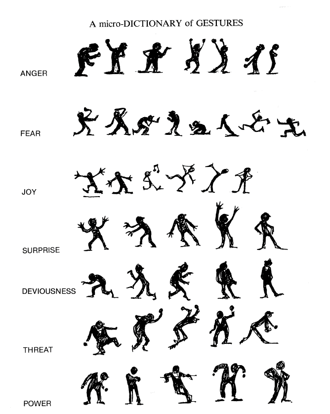
Eisner explains that one of the most important things about comics, or art that has characters in general, is the specific way in which characters are depicted. Due to our experiences, we can recognize the emotions and feelings of others based on many different factors. Not only facial expressions signal us what someone may be feeling – whether they are sad, angry, happy, etc. We can also recognize the emotions someone may be feeling at the moment by their postures and gestures: the way someone is standing, sitting, or lying down, the way someone is bending their body, positioning their arms, whether they have a visible tense body posture or are posing in a relaxed way. Artists should understand and make use of these common expressions of feelings through not only facial expressions but also body language, posture, and gestures in order to further clarify for the readers what the characters are feeling. (cf. Eisner 1985: 100) Eisner gives examples of different emotions expressed through gestures and postures:

Figure: Eisner, Will (1985). Comics and Sequential Art, p. 102

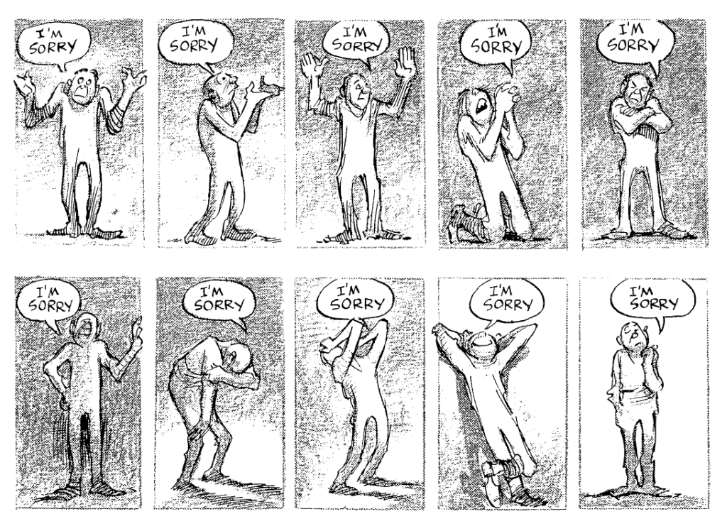
Eisner points out that what we see about a character strongly influences the meaning of the text surrounding the character: the emotion we recognize in the character through their expressions dictates how we interpret the text or speech around the character. (cf. Eisner 1985: 103)

Figure: Eisner, Will (1985). Comics and Sequential Art, p. 103

Designing Characters

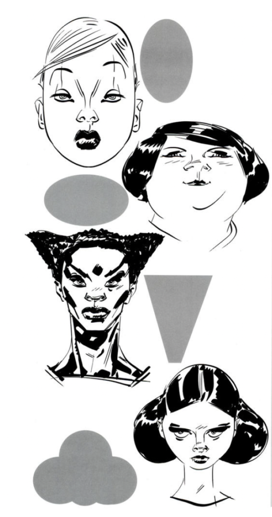
Making the story comprehensible by depicting the emotions and therefore body language of the characters correctly is one thing, but what is there to consider when designing characters in general? Mateu-Mestre explains that to enjoy a story, the reader should always be able to tell apart the different characters, of course. He suggests that compared to seeing real people in movies, for example, drawn characters are inherently harder to recognize to us and that is why we should focus on designing each character to be very distinctive. It can be helpful to make each character have a certain “shape” that is easily recognizable, whether this concerns their head from the front, their side profile, or their whole silhouette from afar. It is common in comics and graphic novels to exaggerate character designs for them to be easily recognizable. According to a character’s personality, we can design one character to have a round silhouette and features and design a different character to appear somewhat triangular or rectangular. We also can make our characters more distinct by adding details to their clothes or armor, for example. Of course, color is another way to make our different characters truly different from one another. (cf. Mateu-Mestre 2010: 96-98)

Figure: Mateu-Mestre, Marcos (2010). Framed Ink: Drawing and Composition for Visual Storytellers, p. 98

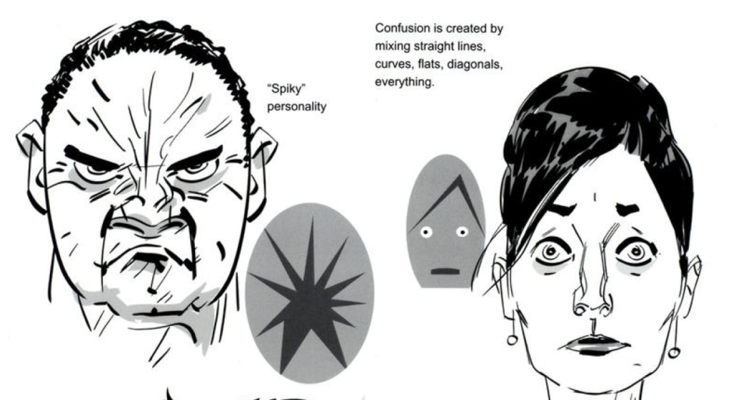
Generally, soft or rounded shapes will seem more relaxed and friendly than harsh, angular shapes, which will seem tenser. This can be applied to the general facial or bodily features a character has, but also to the facial expression a character has at a certain moment in the story. A generally grumpy or unfriendly character can have straight or angular-looking face details like angry, harsh eyebrows, or straight wrinkles, while a friendly character could have rounded hair details. By mixing different, conflicting shapes, we can make our character look conflicted or confused, for example. (Mateu-Mestre 2010: 102-103)

Figure: Mateu-Mestre, Marcos (2010). Framed Ink: Drawing and Composition for Visual Storytellers, p. 103

Bibliography:

Eisner, Will (1985). Comics and Sequential Art. Tamarac, FL: Poorhouse Press.

Mateu-Mestre, Marcos (2010). Framed Ink: Drawing and Composition for Visual Storytellers. Culver City, CA: Design Studio Press.
Further Literature:

Eisner, Will (2008). Graphic Storytelling and Visual Narrative: Principles and Practices from the Legendary Cartoonist. New York, NY: Norton.

Mateu-Mestre, Marcos (2020). Framed Ink 2: Frame Format, Energy, and Composition for Visual Storytellers. Culver City, CA: Design Studio Press.

Mateu-Mestre, Marcos (2016). Framed Perspective: Technical Perspective and Visual Storytelling. Culver City, CA: Design Studio Press.

McCloud, Scott (1993). Understanding Comics: The Invisible Art. New York, NY: HarperCollins.

Story-Picture-Text Relation in Sequential Art and Comics

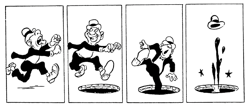
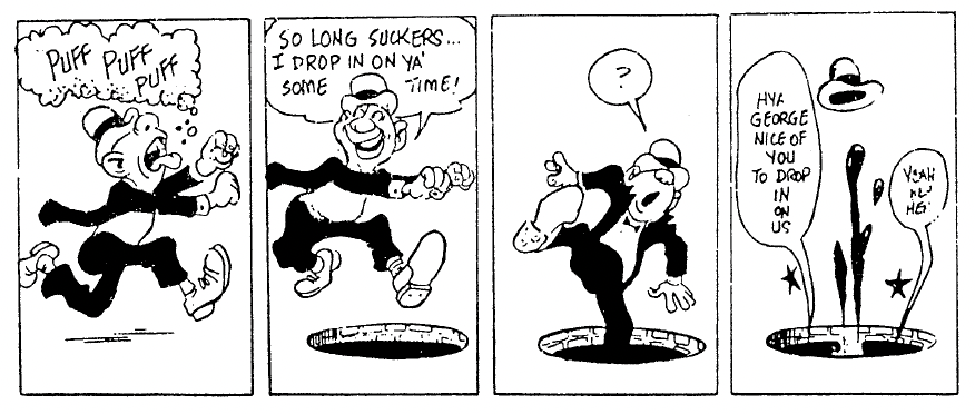
For this blog post, I wanted to find out more about techniques on how to create a good balance and relation between pictures and text when it comes to visual storytelling in comic form. First of all, comic artist Will Eisner points out that, in relation to using text or images in comics or about creativity in general, there is no right or wrong way of doing things. An artist can tell a story in different ways, some may choose to tell a certain story in more images than text, and some may use many speech bubbles or use more descriptions. (cf. 1985: 125-127)

Figures: Eisner, Will (1985). Comics and Sequential Art, p. 125

It also depends on whether the artist wants to depict a story in a humorous way, a realistic way, etc. Eisner also does not think of comics as something that has a defined word-to-picture ratio as the words are very often part of the illustration and not just text on the side of an image. (cf. 1985: 125-127)

Placement and Effect of Text

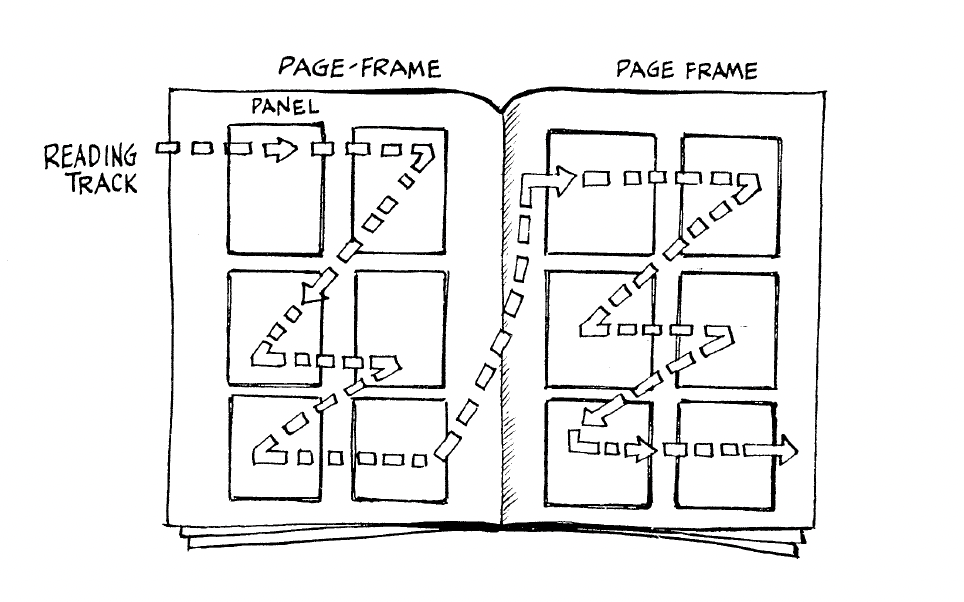
Eisner points out that text needs to be placed in a way so that readers immediately know which text part comes after which text part. It should be clear which character speaks first, which commentary comes before which scene, etc. Text elements and images follow the same conventions as text, so in order to establish a clear sequence, elements that follow each other need to be placed from left to right and from top to bottom in western countries. (cf. Eisner 1985: 26)

Figure: Eisner, Will (1985). Comics and Sequential Art, p. 41

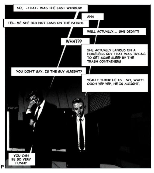
This reading order also applies to text bubbles in a single panel. In the following image, Mateu-Mestre demonstrates how conversations between two people can be shown in speech bubbles in a very clear way:

Figure: Mateu-Mestre, Marcos (2010). Framed Ink: Drawing and Composition for Visual Storytellers, p. 116

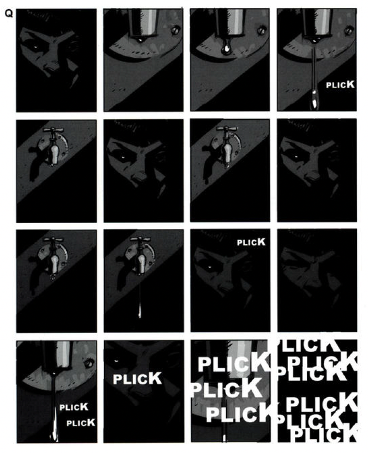
Another commonly used element in comics are onomatopoeias – sounds written out in words. When used right, they supply information about sounds in a scene to the reader in a very natural way that enriches the story. By using many onomatopoeias at once, making them very big, very small, or distorting them, we can strengthen their meaning even more. (cf. Mateu-Mestre 2010: 117) Here, Mateu-Mestre gives one example of how to work with onomatopoeias:

Figure: Mateu-Mestre, Marcos (2010). Framed Ink: Drawing and Composition for Visual Storytellers, p. 117

Making sound or speech seem “alive” and truly part of the story can be achieved by using different kinds of balloons or bubbles around it.

Figure: Eisner, Will (1985). Comics and Sequential Art, p. 27

Comics often use hand lettering in speech bubbles. The way letters look and whether they are handwritten (or use a handwritten-looking font) or use a set-type font such as a sans serif font influences the emotion the text conveys. Different kinds of handwriting are not only the personal style of the artist, but they can also express the personality features of characters. So, the choice of font for each text should be considered because it also influences the emotion the whole image portrays. (cf. Eisner 1985: 27)

Figure: Eisner, Will (1985). Comics and Sequential Art, p. 27

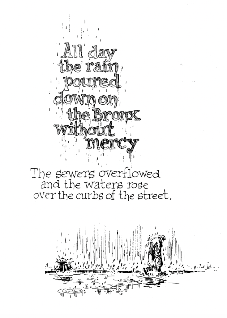
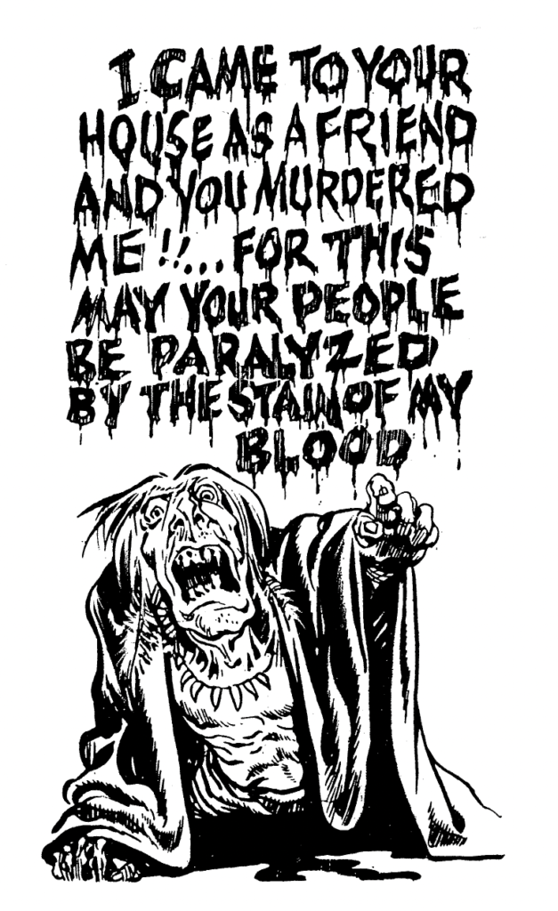
Next to using text in an image in the form of squares or speech bubbles on top of the drawing, Eisner points out that text can also be artistically integrated into an image. Designing text or choosing fonts so they match the current emotion in the image can make the text feel more involved in the story and convey emotions stronger. (cf. Eisner 1985: 10-12)

Figure: Eisner, Will (1985). Comics and Sequential Art, p. 11
Figure: Eisner, Will (1985). Comics and Sequential Art, p. 12

Bibliography:

Eisner, Will (1985). Comics and Sequential Art. Tamarac, FL: Poorhouse Press.

Mateu-Mestre, Marcos (2010). Framed Ink: Drawing and Composition for Visual Storytellers. Culver City, CA: Design Studio Press.
Visual Storytelling In Sequential Art And Comics

While in my previous blog posts, I focused more on how to create or compose single images in a visual story, in this blog post I would like to explore how to create a story with a sequence of images, for example for a comic. In the book Comics and Sequential Art, Will Eisner explains the effects different graphical elements in comics have on the reader and how to compose a story in images in a way that truly conveys what we want it to convey. In the book, Eisner gives a lot of advice on telling a story with comic panels, shapes and text, etc.

Conveying Time

Critical to the success of a visual narrative is the ability to convey time. It is the dimension of human understanding that enables us to recognize and be empathetic to surprise, humor, terror and the whole range of human experience.

(Eisner 1985: 26)

According to Eisner, it is first of all important to convey time in a comic in a natural way. However, he distinguishes between time and timing. While he considers time as our natural perception of time and how it is recreated in comics, he defines timing as manipulating the “elements of time to achieve a specific message or emotion” (Eisner 1985: 26). This change in timing can be achieved by adding panels or elements to stretch scenes, for example. (cf. Eisner 1985: 26)

In order to make the reader clearly recognize how long a certain scene is supposed to be and how much time is supposed to pass in the story between panels, it is good to use elements of which everyone knows how long they take to happen. In order to illustrate the passage of time, elements like a dripping water faucet, striking a match or actions like a character brushing their teeth or walking up a staircase can be integrated into the illustrations because we instinctively get a feeling for the time that passed without anyone having to tell us directly. (cf. Eisner 1985: 30)

Effect of Different Panel Shapes, Sizes, Placements and Borders

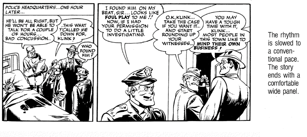
So, the idea is to tell and portray our story at the pace we intend. In fast-paced, thrilling scenes, we want to convey a different emotion and visual than in scenes that are supposed to be relaxed and calm. Eisner explains how we can influence how fast-paced or slow-paced scenes or a sequence of panels are perceived. How many panels there are in a row, for example, how big they are and whether they are perfectly square-shaped, landscape format and wide or long and narrow – all of this influences how we perceive the scenes and story. (cf. Eisner 1985: 30)

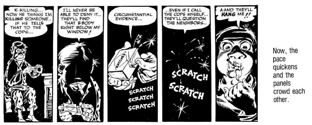
Long narrow panels, especially the use of many long panels next to each other make the scene feel more fast-paced and thrilling because they evoke a crowded feeling:

Figure: Eisner, Will (1985). Comics and Sequential Art, p. 35

When the story events become more relaxed or if a certain moment should feel drawn out, wider panels can be used:

Figure: Eisner, Will (1985). Comics and Sequential Art, p. 37

Of course, not all comics use panels in different sizes or shapes. In many graphic novels and newspaper comics, all panels have the same shape and size, and the narration is only done by what is shown in each panel and through text. Eisner explains the emotional effect of panels as they are commonly found in more traditional comic books. However, in my opinion, this knowledge about which emotions certain shapes and compositions evoke can be applied to more than just traditional comic books.

In addition to the panel’s shape and size, the border of the panel can also help express different feelings or happenings. The panel border does not have to be drawn in simple straight lines, it can also be drawn with wavy lines in order to express a flashback, for example. Panel “C” in the figure may be recognized as a typical thought bubble and panel “D” is associated with noises, something loud, emotional or explosive. (cf. Eisner 1985: 44)

Figure: Eisner, Will (1985). Comics and Sequential Art, p. 44

We can also design the panels in a way that visually supports or mimics whatever is happening in the story at that specific moment:

Figure: Eisner, Will (1985). Comics and Sequential Art, p. 46

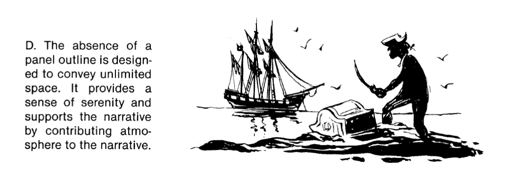
We can also leave some panel outlines away entirely to make a scene feel like it is happening in a very wide, open area:

Figure: Eisner, Will (1985). Comics and Sequential Art, p. 47

Planning And Composing The Panels

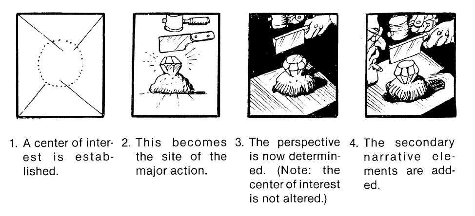
Next to determining the flow of the story and how the panels support this flow, we also need to consider what is in each panel, of course. We need to establish what character, object or action we need to depict in each panel, where the center of attention is to place this main object or character, and then we need to think about which perspective or lighting best supports the message of the panel. (cf. Eisner 1985: 44)

Figure: Eisner, Will (1985). Comics and Sequential Art, p. 88

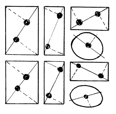
To decide where in a panel to place our main object or character, we can find out where the focal points are in the panel – they are the approximate areas our eyes tend to fall on first when looking at the panel. These focal points are determined as depicted in the following image and they depend on the shape of the panel. (cf. Eisner 1985: 151)

Figure: Eisner, Will (1985). Comics and Sequential Art, p. 151

Bibliography:

Eisner, Will (1985). Comics and Sequential Art. Tamarac, FL: Poorhouse Press.

Composition of a Single Image for Visual Storytelling and Narrative Art

After looking into the basics of what to consider when creating any kind of narrative art and how to start thinking storytelling-oriented, in the past two weeks I researched the effect and meaning of one single image in narrative art and what to think about when creating one image for a narrative project with a sequence of images.

Catching the feeling of a figure or a scene

Mateu-Mestre points out that no matter how hard we try, we can never depict reality as it is. After all, our drawn landscape will be an image on paper and not a real-life scene, no matter how realistic it looks. Therefore, Mateu-Mestre explains his personal approach of trying to figure out the main characteristics and mood of the main object or figure depicted in a single image and recreating it in an abstract way. If we try to recreate every single detail of a scene we see in real life, our drawn image might show details but lose the overall mood that the real-life image radiates. He explains this concept using the face of a character as an example: instead of focusing on realistic details, he would try to make his vision blurry in order to see which features of the face stand out that give the face its characteristic expression and capture its mood. He would then focus on bringing attention to these “mood-giving” important features and not so much on details. The same principle applies to any kind of scene, not only to characters and faces. If we take a landscape as an example, we could try to make out what it is that gives this picture its atmosphere and then make these points stand out with their characteristic features in our drawing. (cf. Mateu-Mestre 2010: 18) In order to create strong impressions, we should also eliminate details that are not necessarily needed in the image (cf. Mateu-Mestre 2010: 21). This is also our natural way of seeing and perceiving things because we naturally only really perceive what information is needed by us at the moment and blend out the rest. For example, when we are searching for a friend in a crowd, we may not notice other details we see and only focus on recognizing the friends’ features. Understanding how selective vision works will also help us decide what might be important and unimportant in our scene. (cf. Mateu-Mestre 2010: 24)

So we look at things depending on what we require at the moment, and this is how we will select and highlight certain elements in our compositions as part of the visual message we want to deliver. Let’s frame and illuminate things in order to show what we need to show, how we need to show it, and, as much as we can, let’s crop out the rest.

(Mateu-Mestre 2010: 24)

Telling a story with lighting

By changing the lighting, we can change the entire meaning and mood of a scene. If we take two identical locations, depict them and only change the lighting, the two pictures will tell a completely different story. Mateu-Mestre uses a room with minimal furniture items and windows as an example. If we depict this scene well-illuminated and show many details, such as what is outside the windows, the image may radiate a calm and secure vibe because the whole scene is visible – there is nothing hidden. We may create a comfortable, light-hearted mood this way. However, we can also depict this same scene in a horror setting. If we choose to depict this same room with very dark lighting, where, naturally, many details are hidden in the darkness and there is maybe only a faint outline of the furniture, the viewers will feel this dark and mysterious mood because many details are hidden and most of the scene is unidentifiable. (cf. 2010: 19)

Mateu-Mestre also points out that it is good to not always focus on the outlines of objects as we do not perceive the outlines of objects in real life. Focusing on outlines might even stop us from drawing what we really want to express. If we stop concentrating on outlines and focus more on light and dark areas, we might be able to portray objects with more emotions depending on what we want to draw. (cf. 2010: 20)

Now, how do we actually start composing a scene?

Mateu-Mestre explains in a helpful checklist what aspects to pay attention to when composing a single image for narrative art. However, he also mentions that these guides can and should sometimes be broken depending on what exactly we want to express. Sometimes, we might have a better idea for our specific image that conveys exactly what we want it to. (cf. 2010: 24)

Choice of shot

Long or wide shot: Usually, a scenery is depicted from far away to establish a scene and show a character in their environment.

Medium shot: Medium shots are used to still show the situation but crop out information that would disrupt the main message of the image.

Close-up: In close-ups, the features of the character are clearly visible. They are used when the reaction of the character is the most important thing in the image.

Extreme close-up: Extreme close-ups are good for when the audience should “become” the character and feel very close to them.

Positioning elements

Rule of thirds: Positioning our elements using the rule of thirds will help us to get interesting and natural-looking compositions.

Symmetrical images and center position: If we position the main elements in the center in ordinary scenes, the image may feel awkward. However, the center position can be used for epic and special moments.

Staying on the same side of the line: We should avoid axis jumps in order to not make the viewers lose the sense of direction and confuse them.

Lighting

We can use lighting to direct the viewers’ attention, to create mood and visual tension.

Lines and shape language

The shape of lines, whether they are actual lines or when we are just talking about the positioning of elements in a scene, influences how we perceive the image and what emotions we assign to it. Curved shapes and curves are generally perceived as more peaceful and kinder, while straight lines and diagonals seem more assertive and harsher. We can also use lines or the positioning of elements in some kind of line to direct the viewer towards something important and bring their attention to it. We should also pay attention to anything that accidentally catches the viewers’ attention, such as a weird positioning of some element, as this distracts from what we actually want to show.

Cutting in

Sometimes, we may need to show an establishing shot of a scene and, immediately after that, a close-up of some detail in this scene to point out this specific detail. When doing this, the detail should stay in the same position in both images.

Size difference

To create visually interesting images, we can portray the main objects or characters in the scene in different sizes. This makes an image seem more dynamic. We can also depict a more important subject bigger in size, or make it seem closer and therefore bigger to also bring attention to it.

Perspective and direction

Because our eyes naturally follow lines and where they point, the vanishing point in an image will naturally be the center of attention. Where an important character in an image is looking at also affects the viewers’ attention, as we tend to look in the same direction in which we see someone looking in. Viewers expect that something important will be happening in that area. Our reading direction also influences how we perceive images. In our culture, we read from left to right. So, if whatever is happening in an image moves in the right direction, we tend to get the feeling that something positive is happening because it is the natural direction we are used to. If something seems to move from right to left, we automatically connect it to difficulty. To create a clear, well-flowing story, the direction in which a series of actions is happening should be the same in a sequence of images, unless we want to create a dramatic turn, then we can change the direction of actions to make use of this effect.

(All of the above “checklist”: cf. Mateu-Mestre 2010: 25-27)

Bibliography:

Mateu-Mestre, Marcos (2010). Framed Ink: Drawing and Composition for Visual Storytellers. Culver City, CA: Design Studio Press.
Introduction to Visual Storytelling and Narrative Art

In the past two weeks, I researched storytelling, especially visual storytelling focusing on illustration. In the first chapter of Framed Ink: Drawing and Composition for Visual Storytellers, Marcos Mateu-Mestre gives a great first insight into how to start creating narrative art and which aspects are important to consider (cf. 2010: 13-16).

As designers or artists, it is first of all important to know what we want to and need to express with our designs, so we can choose what elements we can use to get our intended meaning across. For visual storytelling that uses a sequence of images or illustrations, Mateu-Mestre emphasizes that each image should visually convey the mood and emotions of what is happening in the story at that moment. Depending on whether the moment in the image is very quick and filled with action, slow and sad, or lively and happy, the composition and elements in the illustration will be very different. Furthermore, while creating we should not think of each image as a separate element, but it should be seen in relation to the whole story. This way, we can establish a rhythm in the story. (cf. Mateu-Mestre 2010: 11)
Making the Audience Feel the Story

Each image should also have a specific purpose in the story, no image should just be added for aesthetic reasons without a meaning. According to Mateu-Mestre, creating a storyboard or any kind of visual story is more of a storytelling-oriented thinking process and it is very different from just drawing art for people to look at. If an image is just beautiful but it has no purpose in the story, the audience will get distracted and get pulled out of the whole story. With visual stories, the audience should forget they are just looking at images, it should be an immersive experience. Every environment or scene we see in real life evokes an emotional response in us. Even if we don’t notice it consciously, everything we see makes us feel a certain mood. We are put in different moods when we see a sunny landscape, or a dark alleyway at night – every environment evokes feelings in us. As creators, we need to notice and observe these details so we can capture the moods we want to express and recreate them in an illustration or a visual story. It is important that we feel our story ourselves – otherwise, we can’t move our audience. (cf. Mateu-Mestre 2010: 14)
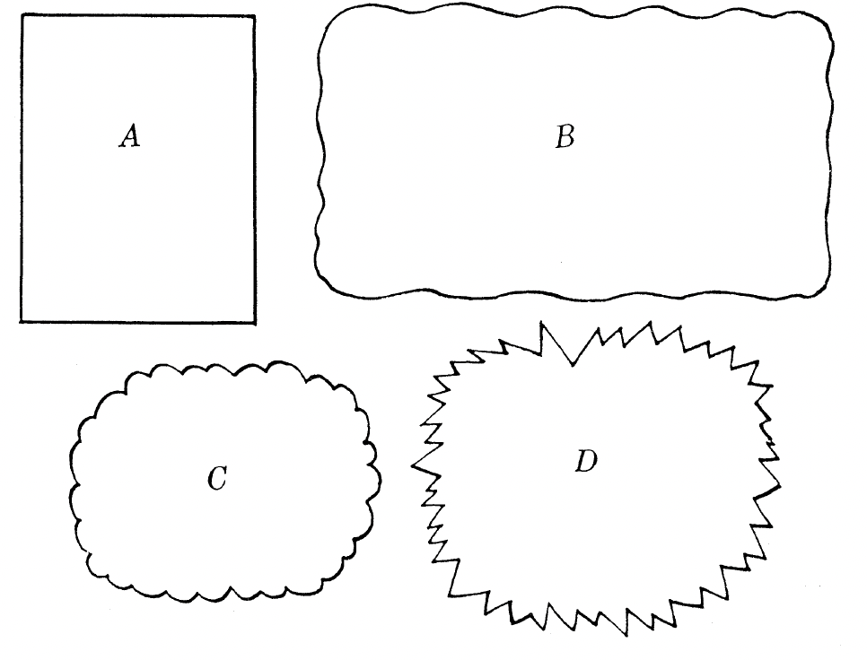
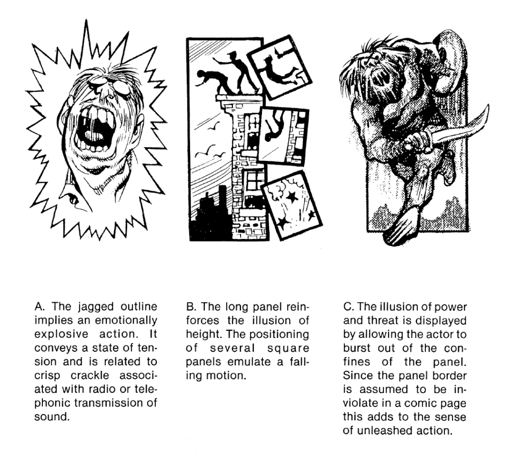
Figure: Mateu-Mestre, Marcos (2010). Framed Ink: Drawing and Composition for Visual Storytellers, p. 10

When we are creating a visual story, we are creating a world – everything in this world has to be coherent. Before we draw anything, we should be sure what the tone of our story is. Is it funny and light-hearted, is it dramatic and emotional? When we are sure what our story should make the audience feel, we can establish our drawing style and the way we choose to tell and depict the story based on what we want the story to be. This is how we can “build” our world. Mateu-Mestre also points out that it is often good to leave things to the audience’s imagination when telling a story, both on a visual and narrational level. We should not explain everything in detail, we should often insinuate and foreshadow details and parts of the story so the audience can fill these information gaps in their own minds. This makes the experience more immersive and makes the audience want to continue with the story. No matter what is shown, every person still has their own way of interpreting and thinking about things based on their personality and past experiences and as creators, we should encourage the audience’s imagination and play with people’s different ways of perceiving and interpreting things. (cf. Mateu-Mestre 2010: 15)

Bibliography:

Mateu-Mestre, Marcos (2010). Framed Ink: Drawing and Composition for Visual Storytellers. Culver City, CA: Design Studio Press.