At 7th October I attended the Game Dev Days, and I found the talks quite interesting. Most of them provided valuable insights into the game development process. The speakers discussed how they created their games, whether it was a small indie game developed by a single person, like „Roto Force“, or a larger project sponsored by Apple, such as the Game „Gibbon“.
While it was motivating to see how proud the speakers were of their accomplishments, it was also intimidating to realize the amount of work required to create a game. For instance, one speaker showed the complexities of designing an algorithm for different NPCs that appear on different days. This involved ensuring that characters didn’t overlap, especially when interacting with the player, and that important storylines for various tasks were properly integrated. This level of detail in game development was something I hadn’t considered before.
Another revelation was when a developer who single-handedly created a game shared the number of hours it took. His game took approximately 4000 hours to develop, and the profit was the same, resulting in an hourly wage of just 1 €, which was quite frustrating to hear.
There were also talks with more general topics, such as the talk from Phil Strahls which was about choosing colors in games. I particularly enjoyed this talk because the speaker not only covered the theoretical aspects of color selection but also provided practical advice. For example, he explained that front colors should be darker than back colors and cautioned against using too many colors, which can create visual noise that is challenging to manage. These insights are not only useful for game design but can also be applied to other design fields, such as animation and illustration.
In summary, the talks at the event were truly inspiring. While I may not be ready to develop a game for my master’s thesis due to the potential overload, I am certainly interested in exploring topics like the intricacies of NPC algorithms for a possible thesis subject. I think some other talks where quite useful for my Master Thesis, like the one about colors, because this theory will be similar to User Interfacedesign. The event has broadened my perspective on the world of game development and design.
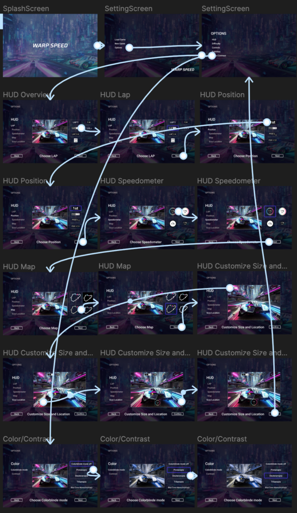
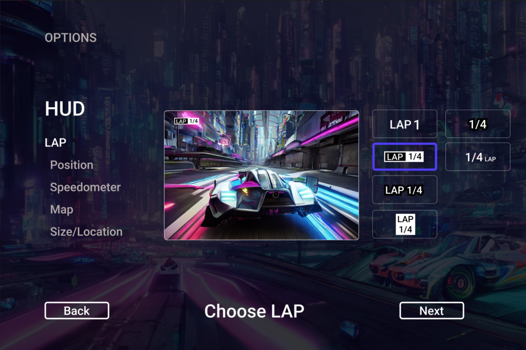
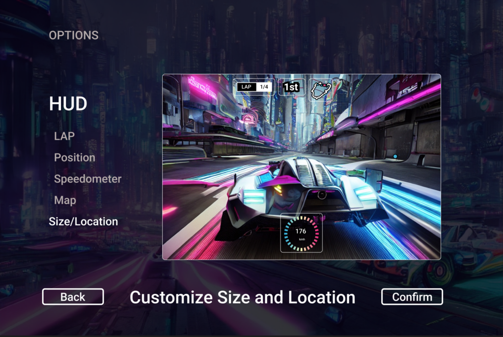
more about this topic: