I chose to explore Sam Bilbow’s paper ‘Evaluating polaris~ – An Audiovisual Augmented Reality Experience Built on Open-Source Hardware and Software’.
The text discusses how augmented reality technology is being used in artistic practice to create experiences that combine virtual and real-world elements. The paper introduces an AR experience called polaris~, which was created using a combination of open-source hardware and software. The experience is designed to be cost-effective and privacy-respecting. The AR elements are spatially aligned with the real-world environment using Unity and PureData, and can be interacted with gesturally to foster artistic and musical expression.
To evaluate the polaris~ experience, the author recruited 10 participants who spent about 30 minutes each in the AR scene and were interviewed about their experience. The results showed that the experience engaged participants effectively, allowing them to express themselves audiovisually in creative ways.
Overall, the paper presents a framework for creating similar AR experiences using open-source components and highlights the potential of AR as a medium for artistic expression. The polaris~ experience and the framework used to create it are available on Github, providing a valuable resource for other artists and developers interested in exploring the creative possibilities of AR technology.
One big advantage of this project is the focus on using open-source hardware and software to create cost-effective and privacy-respecting AR experiences. This is an important consideration given the potential privacy concerns associated with AR technology and the need to make it accessible to a wide range of users.
In my opinion this project provides a valuable contribution to the field of AR art and offers a useful framework for creating similar AR experiences.
Starting a game in CoD: Warzone requires six steps, which is a significant amount of interaction costs. Interaction costs refer to the mental toll that each added step takes on the player, causing fatigue or frustration. To provide the best player experience, it is important to minimize interaction costs as much as possible. Unfortunately, in Warzone, the process of even understanding the mode or version of the game one is entering requires reading through a multitude of confusing panels, adding to the interaction costs and potentially causing fatigue. To improve the player experience, it is crucial to simplify and streamline the process of starting a game, reducing the interaction costs and reducing the risk of player frustration.
Red Dead Redemption 2
Red Dead Redemption 2
The control system in Red Dead Redemption 2 is a problem. Control systems play a critical role in shaping the player‘s experience, similar to lighting in movies or balance in music recordings. The control system in RDR2 has been criticized for its awkward finger movements required to use the selection menu and its added complexity using triggers to navigate through options and different menus, leading to unintended results. In the game, the player is punished for unintended actions such as firing a weapon in the wrong place or removing a mask at a critical moment. The controls vary based on the context of the player‘s actions, causing confusion and increasing the risk of mistaken actions.
The Half Life 2 HUD is praised for its simple, clean and unobtrusive design that complement the game‘s overall aesthetic. The monochromatic amber palette gives it a distinctive look and makes it a part of the game‘s identity. The HUD is simple and effective, as it only displays necessary information. The Half Life 2 HUD shows that a game‘s HUD can be more than just a necessary element and can be both beautiful and functional.
Assassin‘s Creed
Assassin‘s Creed
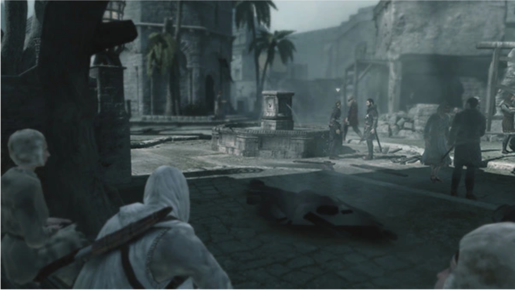
The game was designed without a HUD in mind, and the pure presentation of the action creates a more engaging and rewarding experience compared to having icons on a mini-map. The absence of a HUD requires a specific approach to environment design, mission design, and dialogue writing, making the game more interactive and allowing players to learn the city and find their goals.
Dead Space
Dead Space
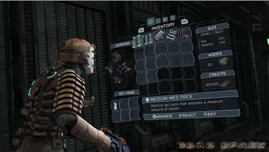
Dead Space teaches that a HUD can be effectively integrated into the game to maintain player immersion without sacrificing functionality. The game is praised for its unique approach to the HUD, which was a mix of shooter and survival horror genres and helped keep players focused in the moment. The health bar and map projection contributed to the mood and tension, while also guiding players through complicated levels and making them vulnerable when they stop to review their objective. This made the player experience more engaging and added to the suspense of the game. Dead Space demonstrates that good design can transform the HUD into an integral part of the game world.
In the HUD, graphics are used to present important information to players, like score, health, time, item count, location, and direction.
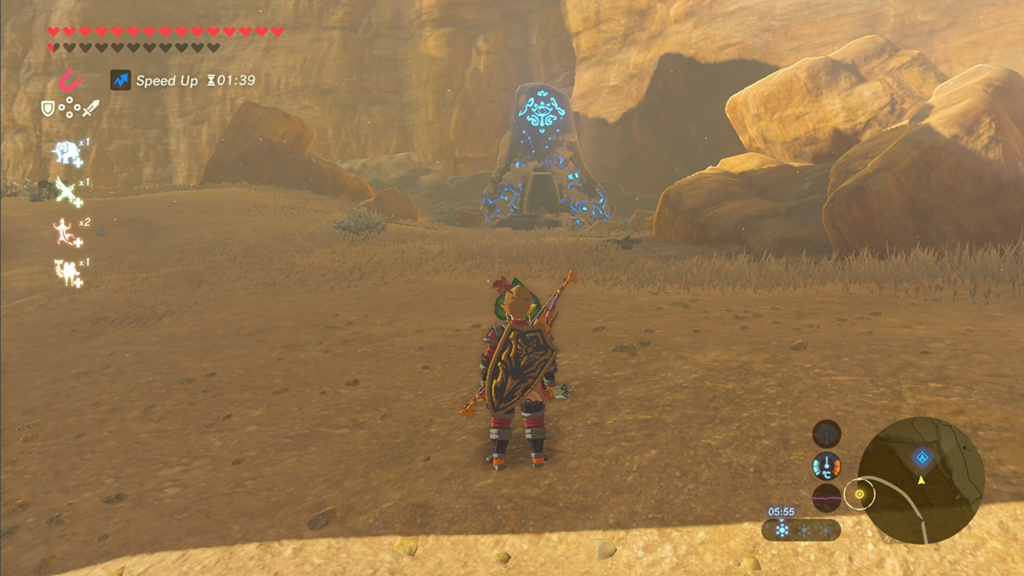
The Legend of Zelda: Ocarina of Time (health bar)
Health
Health is often displayed as a number, percentage, icon, or bar, showing the range of full health to empty. A typical health bar shows full health on the left and low health or death on the right. Some health bars also show the state of bonus health with different graphics and colors. To inform players, games often show the percentage or amount of health being gained or lost, and in some cases, the health bar or number will flash when a character‘s health gets too low. The health widget should be placed close to the action, such as in the upper-left or upper-right corner or bottom center, so that the player can assess their health state quickly without it covering the gameplay.
Score
The score widget can be displayed in the top left, top middle, or top right, opposite of the health stats, and should provide feedback when the player‘s score increases, such as by increasing the total, flashing graphics, or cutscenes for important milestones. The placement of these HUD components may also depend on the camera focus and gameplay.
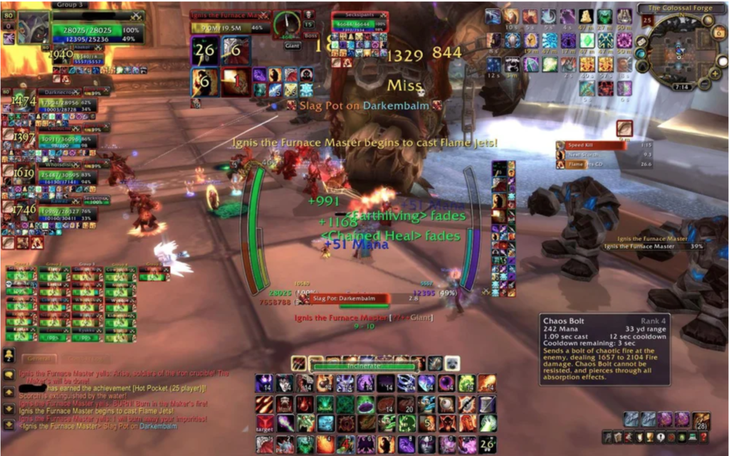
Call of Duty
Timers
Timers are usually displayed in the top center or bottom center of the screen, and during the final countdown, they can alert the player through flashing, changing color, and sound effects.
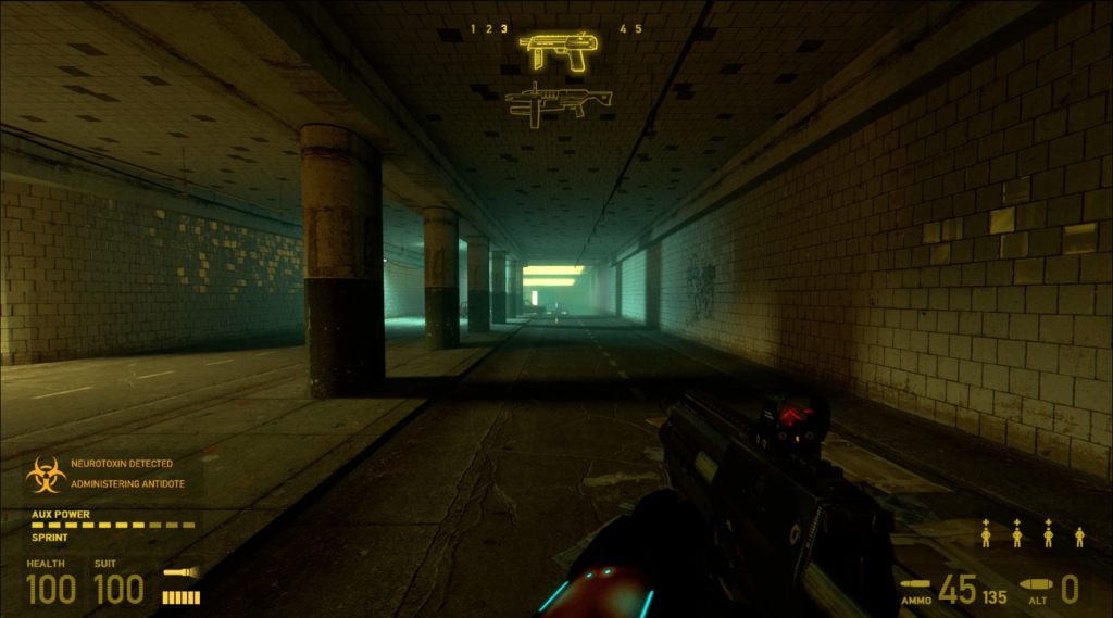
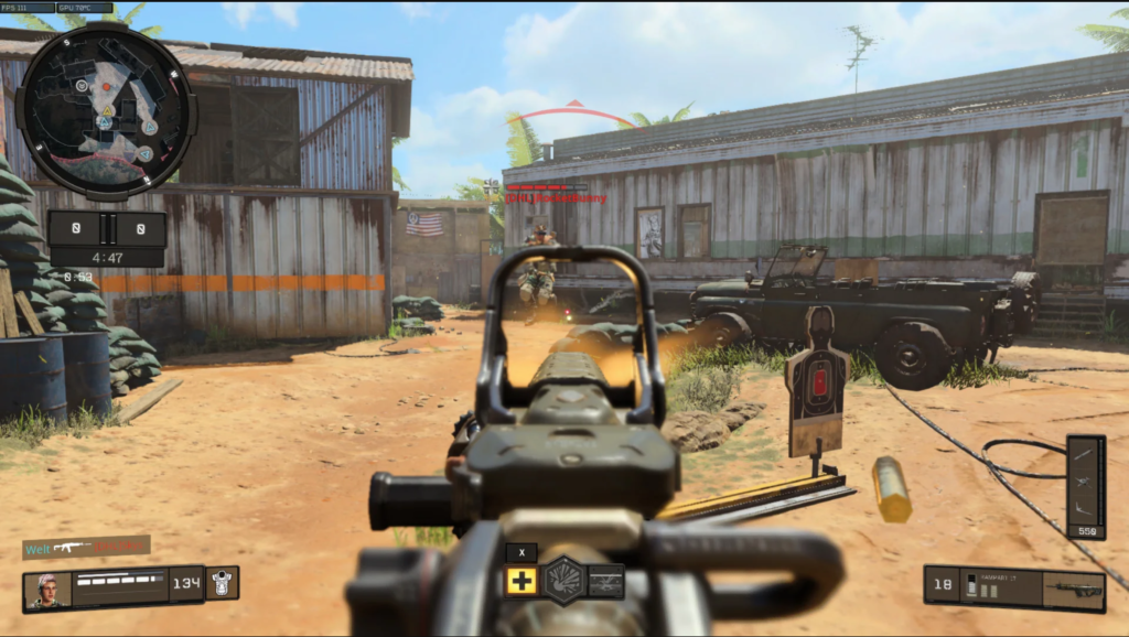
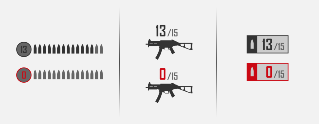
Ammo count
Ammo count
In shooter games, the ammo count is an important part of the Head-Up-Display. There are various ways to display the ammo count such as showing it close to the weapons and ammo count, indicating when the weapon runs out of ammo, changing the count‘s color, displaying an empty ammo clip graphic, or using a sound effect when the player tries to shoot with an empty gun clip. In shooter games, the location of the ammo count can vary based on the point-of-view (POV) used. In third-person POV, the character is usually in the bottom center of the screen, so the ammo count is displayed in the upper-right or upper-left corner to avoid obscuring the character. In first-person POV, the focus is in the center of the screen, so the ammo count is best placed in the mid-bottom part of the screen. In newer sci-fi games, the ammo count is integrated with the weapon itself, eliminating the traditional ammo count component.
Reticle
A reticle is a cursor used for targeting and indicating interactions or the direction of a projectile. The reticle should be easily noticeable and customizable for different weapons, items, and interactions. In first-person and third-person games, the reticle is typically placed in the center of the screen, while in RTS and top-down games, it is controlled with a right stick. To indicate a hit or positive interaction, the reticle should change shape or color.
Minimap
A minimap should be included in games where it‘s important for players to know the location of different elements, such as teammates, enemies, etc. The minimap should be a small, top-down map and can include a compass, off-screen indicators, and objective markers. To ensure it doesn‘t take up too much space, it should occupy no more than 1/8th of the screen and have limited details displayed. The minimap should be placed in a corner of the screen that is not where most of the gameplay takes place as it provides secondary information.
The heads-up display (HUD) is an essential component of video games that displays important information to the player on the screen during gameplay. A good HUD design should be unobtrusive and aid the player without being distracting. Examples of HUD elements are mini-maps, health bars, and ammo counts. Some games even allow the player to customize the HUD to their preferences. The HUD should be easily visible in all lighting and environmental conditions.
HUD design choices
The choice of heads-up display design for a video game depends on the game‘s genre and style. The amount of information to be displayed to the player should also be considered. For example, in the Halo game, the HUD is comprehensive and displays all the information the player needs. However, this design may not be suitable for other games like Tomb Raider, where the HUD is minimalistic and only shows necessary information that changes based on player actions.
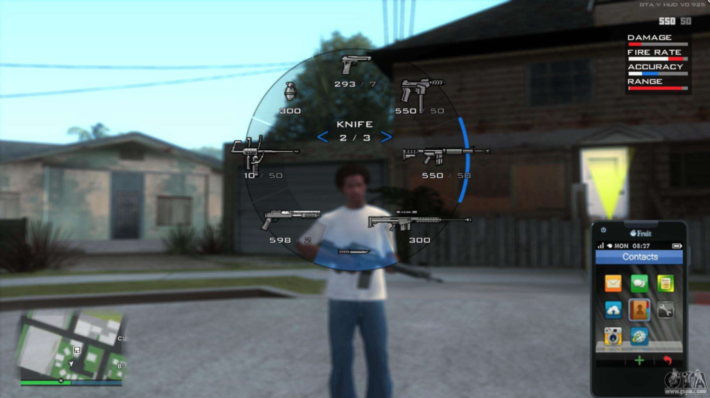
GTA
When designing a video game heads-up display, it‘s crucial to keep it from overpowering the screen and becoming a distraction to the player. It‘s important to assess if the features included in the HUD are actually necessary and helpful to the player. For instance, in a first-person shooter game, it may not be necessary to display the weapon the player is holding if they are already aware of it. A good example is Grand Theft Auto 5, where the HUD displays all necessary information without cluttering the screen. The HUD only appears when needed and quickly disappears, providing the player with information when necessary without being a distraction.
HUD Trends
Many game companies are moving away from the traditional, static HUD that displays a lot of information to the player. They aim to create a more immersive experience where the player forgets they‘re playing a game. Games like Dead Space use interactive cues instead of a traditional HUD to give the player information, such as audio cues to indicate low health. As game development progresses, more creative and non-visual elements are being used to replace traditional HUDs, to create a more immersive experience for the player.
The key to designing a good UI or HUD for a game is to conduct research on the genre, test on the audience, and refine the design. The first step in the process is to play or watch videos of several games within the genre or on the target platform. This helps to identify general conventions which can reduce the cognitive load for players who are familiar with playing similar games.
Accesibility
Designing game UI with accessibility in mind is crucial. Accessibility should be a priority from the start, considering factors such as impaired vision, hearing, and physical control abilities. Game accessibility guidelines should be applied (gameaccessibilityguidelines.com). Controls should allow players to carry out tasks easily and have muscle memory. Deviating from common control trends may negatively impact the player‘s experience.
Digital tools to improve accessibility, such as Stark (= Adobe XD plugin) for checking contrast and color should be used. Accessible Colors and Color Oracle, and the Harding FPA suite of applications to avoid seizure triggers are also important. In general fixing accessibility issues during the design phase is easier and less expensive than trying to retroactively fix them. Improving accessibility can also improve usability for all players.
Target group
The target group should be taken into account when designing the controls. Factors to consider include the player‘s experience level, age (children have smaller hands and less dexterity), and playing environment (near a monitor or on a TV from a distance). One should exercise empathy by imagining specific players and their needs. Seeking advice from experts, specialists, and disabled gamers through user research and social media is recommended.
Prozess
For prototyping tools like Adobe XD are recommended. They help to identify limitations and weaknesses in the design, and allow fast iteration and testing. Testers can access the prototypes from the cloud, and test the work on their device to identify any shortcomings.
The process of improving the user interface and user experience of a game involves constantly testing and iterating. This can be done by having users play an unfinished version of the game to see if the design is engaging. It is important to gather feedback and make changes to enhance the overall quality of the UI. Ideally, this should be done in an environment that allows recording players and gameplay. Interviewing or surveying players after the session is also helpful. Feedback can be used to identify and remove pain points and make changes to the UI, control, and game design.
The design of a user interface varies depending on the genre, theme, and style, but there are fundamental guidelines to create a good UI.
Research
Designing a user interface for a video game involves considering the conventions and successful design patterns used in similar games. It is recommended researching and looking to other games in the same genre for inspiration. It‘s important to understand the conventions of the genre, such as the placement of health bars, and the color coding used for different elements. The UI should also match the theme of the game, taking into account how other games with similar themes approach their aesthetic. However, it‘s important to follow conventions, there‘s also room for creativity and innovation in UI design.
Right Placement of UI Elements
This is done through wireframing, where a greyscale diagram is created to show what the UI will look like. During this process, the focus is on the placement and shape of UI elements, not on color. The idea is to ensure the fundamentals of UI and UX are solid before adding the aesthetic elements. The wireframe structure should be based on the genre of the game and the UI should be based on the theme of the game. To design effective UI, it‘s important to always keep the player‘s perspective in mind and anticipate how they will interact with the UI.
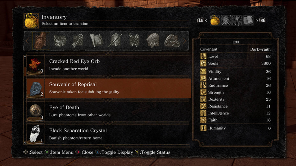
Dark Souls
Hierarchy
When designing UI, it is important to consider what information the player is likely to want to know or see, and arrange the UI elements in a hierarchy of importance. The inventory screen in „Dark Souls“ is a good example, where the inventory is the main focus and the controls are secondary. It is also effective to gate off information, reducing the amount of UI elements on the screen to draw attention to the most important elements. Clutter is the main factor that can cause a game‘s UI to fail. Multiplayer games are particularly prone to having cluttered visuals, as they often require players to attend to many tasks simultaneously while only having one screen to do it all on. This includes gameplay, upgrading, strategizing, executing special attacks, reading a map, and communicating with other players.
World of Warcraft
Animation
Animation can be used to enhance the visual design of the UI, making it more appealing and lively. This could be in the form of a subtle pulse effect or moving backdrop. However, it should not detract from the functionality of the UI and should guide the player‘s eyes to the information, the interface, and menu options. The text should be easily readable to ensure the player knows where to focus.
Feedback
In designing UI it is important to gather feedback from players. It is crucial to ask for their opinions on icon design as the meaning of an icon may be different for different people. It is best to ask open-ended questions about what they think the UI is trying to convey and what they expect to happen when they press certain buttons. Also, it is important to gather feedback about their experience with the UI and identify any confusion or misunderstandings. Always prioritize the player‘s experience and never assume what they think.
There are 4 types of visual representation in game UI design: diegetic, non-diegetic, spatial and meta. Diegetic UI elements are seen or heard by the character and fit within the story‘s context. Non-diegetic elements exist outside of the game or story and only the player sees them. Spatial elements are represented within the game space but not visible to characters. Meta elements are contextual to the game but not represented in the game space. It‘s important to understand the meaning and use of these types.
non-diegetic
Non-diegetic
Non-diegetic UI components are those that do not exist within the story or space of a game. These components are only seen by the player and not by any of the characters in the game. The design, placement and context of these components are critical for a good player experience. Examples of non-diegetic components in video games are stat meters that track points, time, damage, and resources.
diegetic
Diegetic
Diegetic UI elements are those that exist both within a game‘s story and space, and are known by the characters in the game, including the player‘s avatar. A challenge in using diegetic components is in scaling, as a small component like an in-game speedometer may not be easily visible.
spatial
Spatial
Spatial UI elements are located in the game space but characters in the game don‘t see them. They often act as visual aids to help players select objects or point out landmarks.
meta
Meta
Meta UI components exist in the game‘s story but not in the game space. They can be subtle, like a layer of dirt accumulating on a 2D plane, or they can be prominent like shaking, blurring, or discoloring of the field of view to show player damage.
Playing video games is one of my hobbies, but I often noticed that poor UI and UX can detract from the overall gaming experience. I have come to realize that something as small as a game‘s user interface can have a huge impact on the quality of the game and lead to less enjoyment.
This sparked my interest in understanding what constitutes good UI in games and how it differs from UI in websites. With this goal in mind, I decided to dive into this topic and gain a better understanding of good and bad practices for game user interfaces.
My focus will mainly be on AAA games. I want to find out what the best methods for developing user interfaces are, as well as determine if there are general principles for designing user interfaces in games.
Another area of interest for me is the essentials for a good head-up-display (HUD) in games. I am curious about how much information is appropriate for a HUD, as well as the most common HUD components and how they can be effectively visualized.
Additionally, I want to explore the process of prototyping UI and UX in games, as I believe that the prototyping process in games may differ from that of websites.
Before i get more into the topic of user interfaces in gaming, it is important to find out what a user interface is in general and which topics it covers:
What is UI-design?
The field of UI design focuses is the aesthetic design of all visual elements of a digital product‘s user interface. It is distinct from UX design, which focuses on optimizing of user satisfaction by improving the usability and accessibility of a product. UI designer are involving users preferences and are trying to create an interface that fulfills them. It has become an important tool for connecting with users and is vital for building customer loyalty and brand recognition.
What is a User Interface?
A user interface is the point of interaction between a person and a computer system or device. This includes elements such as display screens, keyboards, and the appearance of a desktop. The goal of a UI is to enable users to effectively control the computer or device they are interacting with by making it intuitive, efficient, and user-friendly.
What is a good User Interface?
„A user interface is like a joke. If you have to explain it, it’s not that good.“ – Martin Leblanc
Good user interface design is creating an enjoyable experience for users. Poor UI design can lead to confusion and frustration for users, making it difficult for them to complete their task flow. The are many principles for good UI design, some of the important are:
minimizing cognitive load by avoiding unnecessary information
maintaining consistency throughout the interface
prioritizing clarity over complexity
giving users control over their interactions
and making the design invisible to the user.
Types of User Interfaces
Types of User Interfaces
GUI
A Graphical User Interface (GUI) is the most common type of user interface that most people are familiar with. It allows users to interact with a computer by using a mouse, trackpad, or other input device to point and click on graphics or icons on the screen. GUI has several advantages such as being self-explanatory, easy to use, and not requiring memorizing command lists.
Touchscreen GUI
A Touchscreen Graphical User Interface (GUI) is similar to the regular GUI, but it allows users to interact with a device by using their fingers or a stylus to select icons and perform tasks, instead of a mouse or trackpad. These interfaces are commonly found on tablets, smartphones, and medical devices like insulin pumps.
CLI
A Command Line Interface (CLI) is a type of user interface that allows users to interact with a computer by typing in commands. This type of interface is not commonly used in everyday consumer products, but it is still used in certain situations. With CLI, users type instructions into the command line, which directs the computer to a specific file or directory. From there, a range of commands become available, such as retrieving files or running programs.
Menu-Driven Interface
A menu-driven interface is a type of user interface that presents users with a list of commands or options, usually in the form of a menu displayed on the screen. An example of a menu-driven interface is an ATM machine.
VUI
A Voice User Interface (VUI) is a type of user interface that allows users to interact with an application using voice commands. They do not require clicks or swipes, but instead accept user input through spoken commands. These interfaces are used in voicebot or smart speaker technology and well-known examples include Amazon‘s Alexa and Apple‘s Siri.
User Interfaces on Websites or Apps
There are different types of user interface elements that are used to build interactive websites or apps. These elements provide touchpoints for users as they navigate and interact with the product. The four main categories of user interface elements are: input controls which allow users to input information into the system, navigation components that help users move around a product or website, informational components that share information with users, and containers that hold related content together.
User Interfaces in Games
A video game user interface is a design that provides players with tools to navigate, gather information and achieve objectives in the game. This includes elements like life bars, coin counters, maps, etc. Effective UI design in video games is critical and requires careful consideration of functionality and detail, much like mobile app UI design.
Why are User Interfaces in Gaming important?
The design of a game‘s user interface is crucial for players to understand gameplay mechanics, access relevant information, and start playing quickly. A well-designed UI with good storytelling, animations, graphics, mechanics and user experience can increase playtime and lead to more purchases. The quality of a game‘s UI has a significant impact on potential customer behavior and revenue.