Anti-pattern

Anti-patterns often result from a quickfix to a problem. They might look like the right solution but are not that good in practice. Anti-pattern are also not dark pattern. The difference is that dark pattern use psychological knowledge to mislead while anti-pattern design happens when the solution does not fit the context, and is still recurring in the design. Anti-pattern are created out of fixing problems. The solution should solve a problem and seems to help in the short term but is not a good solution on the long run. The solution would be okay but does not fit the specific context. There are structural problems or issues with management that lead to bad design. Also finding a workaround for an issue caused by outdated technology can lead to anti-pattern design.

Anti-patterns can be categorised according to the problems they cause.

There might be an increased cost of interaction, which means additional taps for certain features or increased thumb stretching, like if buttons are located at a hard-to-reach position for the thumb. Also increased context switching can appear when not using transitions for changing the layout.
Increased confusion across platforms can happen when icons are used that usually mean something else.

By observing the usual rules those problems can be avoided. It becomes more difficult when the anti-pattern grows into an established design pattern. For example, the use of the hamburger menu, evolving when phones and tablets got popular. Therfore every new UI pattern has to be very well considered.

As normal design pattern had their origin in software, antipatterns also appear in software development. Apps have to be constantly adapted to new user requirements and in the process, solutions may not fit, thus unintentionally creating bad solutions, i.e. antipatterns. Detecting and improving these antipatterns improves the quality of the software. Using antipattern can also lead to higher costs for maintance. [2]

Design patterns have been introduced to collect solutions that have proven to be good, while anti-patterns represent solutions that have not proven to be good.

There are a number of rules and guidelines for the design of user interfaces. These are often too simple or abstract, or they conflict with other rules. It also depends on the designer whether he understands the underlying problem and how to solve it, and how he interprets the guidelines. Guidelines are more on the meta-level, whereas design patterns start from a concrete problem and are much more specific which makes them a better tool than guidelines.

Appleton [B. Appleton, “Patterns and Software: Essential Concepts and
Terminology,” http://www.bradapp.com/docs/patterns-
intro.html, retrieved: January 2017.] distinguishes between two kinds of anti-patterns:

1. Those that describe a bad solution to a problem,
which resulted in a bad situation.
2. Those that describe how to get out of a bad situation and how to proceed from there to a good solution.
The second type of anti-pattern is also known as an “Amelioration Pattern” [The Portland Pattern Repository Wiki. http://c2.com/cgi/wiki,
retrieved: January 2017.].

Amelioration patterns are a combination of the first category, the description of a bad solution with showing a regular pattern for the solution.

Antipatterns are often created with the best intentions – they might “look like a good idea, but whichbackfire badly when applied.” [J. O. Coplien, “Software Patterns,” SIGS Books, New York, NY, USA, 1996.] Often it is not so obvious if the solution is a dark pattern.

Mirnig and Tscheligi decribed a in their paper what what criteria an antipattern must fulfil, based on the criteria a regular pattern must have.

The antipattern musst like the regular pattern be available and be easily found. It needs an description of the problem and a context description. The structure is almost the same, because the reader needs to understand why the solution is not working in this context. The only difference comes with the descriptio of the usage. Regular patterns offer a solution that fits the problem, while in anti-pattern the steps to the solution should be documented. To understand why the pattern is not working the designer musst understand the decicions made leading to this bad solution. It should also offer a better way to solve the problem with comparing it to the result that is considered the better solution. The anti-pattern should also contain at least one example.

[1] P. Tiangpanich and A. Nimkoompai, “An Analysis of Differences between Dark Pattern and Anti-Pattern to Increase Efficiency Application Design,” 2022 7th International Conference on Business and Industrial Research (ICBIR), Bangkok, Thailand, 2022, pp. 416-421, doi: 10.1109/ICBIR54589.2022.9786470.

[2] G. Hecht, R. Rouvoy, N. Moha and L. Duchien, “Detecting Antipatterns in Android Apps,” 2015 2nd ACM International Conference on Mobile Software Engineering and Systems, Florence, Italy, 2015, pp. 148-149, doi: 10.1109/MobileSoft.2015.38.

[3] Mirnig, A.G. and Tscheligi, M., An Initial Analysis and Classification of Regular, Anti-, and Dark Patterns. PATTERNS 2017 : The Ninth International Conferences on Pervasive Patterns and Applications, 2017

Image Processing

In this blogpost we are looking into a second feature of ZigSim which uses a video-over-IP protocol called NDI™ to transmit video and audio captured by the device. The data can be received with any NDI client apps – in our case we use vvvv and OpenFrameworks to get familiar with the corresponding workflows.

Setup:

The goal is to setup a connection between our sender (iPad Pro) and receiver (Laptop) to have a second possibility for tracking physical objects via a local network.

First, we need to install the NDI® Tools which can be found here:

https://www.ndi.tv/tools/

They contain several applications (like Test Patterns and Screen Capture) to create NDI Sources on the computer.

For our first test we run the Studio Monitor app and select the broadcast from the ZigSim iOS app.

Note: After some debugging, I found out that ZigSim does not always connect successfully with the computer – without raising an error. So if your device does not show up, just force close the ZigSim app and open it again.

1. Example: Setup for vvvv

For displaying video content within vvvv we need an addon called VL.IO.NDI which can be downloaded under the following link:

https://github.com/vvvv/VL.IO.NDI

Be aware that this addon needs the latest vvvv preview build (5.0) to work properly!

2. Example: Setup for OpenFrameworks

For testing the connection in OpenFrameworks we use the ofNDI addon which can be downloaded under the following link:

https://github.com/leadedge/ofxNDI

After opening the project with the OpenFrameworks project generator we need to build the app in Visual Studio. While running, the app searches for available sources and lets us display the video output within the app.

With the help of various image detection, tracking or machine learning tools like TenserFlow or OpenCV this video source can be processed within vvvv or OpenFrameworks.

The following prebuild vvvv example shows how the Yolo3 algorithm successfully recognizes objects within a picture. The amount and accuracy depends on the data set which could also be custom made to suite the use case of a given exhibit.

Expanding on the VR Game Experience: Creating an Engaging Journey for Players

In my previous blog post, I discussed the concept of designing a virtual reality (VR) game experience centered around the theme of an apprentice in a garage. Today, I will delve deeper into the storyline and provide additional details on the gameplay elements. Additionally, I will address the valuable feedback I received from Birgit, highlighting the importance of making the experience more exciting, particularly for teenagers who have shorter attention spans.

The Storyline:

Imagine stepping into a virtual garage as an apprentice mechanic. As soon as you put on the VR goggles, you find yourself surrounded by tools, car parts, and an inviting menu screen. A friendly avatar, your supervisor, appears to greet you and provide an introduction to the world of automotive mechanics. This avatar becomes your guide throughout the game, offering insights into the various tasks and challenges you’ll encounter.

To ensure a comprehensive understanding of the apprenticeship, the avatar presents you with a choice between diving straight into the game or obtaining more information about the apprentice experience. This decision empowers players to tailor their journey based on their preferences and level of curiosity.

Choosing the game path leads you into an immersive adventure where the avatar explains the main task at hand and provides instructions for accomplishing smaller subtasks along the way. Let’s explore a brief example of the story through a storyboard:

Enhancing the Gameplay Flow:

After sharing my progress with Birgit, she raised a valid point about the gameplay potentially feeling too linear, which could lead to boredom, particularly among teenagers. She emphasized the importance of maintaining their engagement throughout the experience. Taking Birgit’s feedback to heart, I recognize the need to inject more excitement and intrigue into the gameplay.

My Next Challenge:

Moving forward, my primary objective is to brainstorm creative ways to make the VR game experience more thrilling and captivating, especially for the target audience of teenagers. This will involve integrating elements such as unexpected twists, timed challenges, and rewarding achievements to keep players motivated and immersed in the virtual world. By addressing this challenge head-on, I aim to create an experience that not only educates but also entertains, ultimately fostering a genuine interest in the world of mechanics.

In my next blog post, I will delve deeper into my research and experimentation phase, sharing my ideas and progress in making the gameplay more exciting and captivating for players of all ages, with a special focus on engaging the teenage demographic.

Designing an eHealth App for Sustainable Healthcare: case of Benin republic

This article seek to present and overiew of the implementation of ehealth in Benin to help us see the opportunities and challenges we might face while trying to present a contextualized framework to “Designing an eHealth App for Sustainable Healthcare in Benin” that can contribute to improve community health but also support the National eHealth Strategy in Benin .

Zouléha Karimou, a 35-year-old housewife and mother of five boys, takes part in a bednet demonstration in her village of Sibongou in the health zone of Bariénou, about 500 kilometers north of Cotonou, Benin, on June 17, 2018

Source: JSI- Improving Community Health in Benin | by JSI | Medium

The implementation of eHealth in Benin Republic has been driven by the National eHealth Strategy, which aims to improve the country’s healthcare sector through the use of information and communication technology (ICT). The strategy was adopted in November 2017 and covers the period from 2018 to 2022. The key components of the strategy include the establishment of an eHealth infrastructure, strengthening human resources for health, improving access to healthcare services, enhancing healthcare quality and patient safety, and developing a legal and regulatory framework.

The situational context in Benin Republic reveals that eHealth initiatives have been implemented in the country in the past, mainly through private projects supported by NGOs, international organizations, or bilateral cooperation. However, the Ministry of Health had limited engagement in these programs, and many of them faded away due to a lack of funding and little assessment of their impact on the health system.

To institutionalize the use of digital health, the Ministry of Health assigned the Department of Information Technology and Pre-archiving to develop a national eHealth plan. Two strategic documents on the use of ICT in health have been created. However, the review in 2015 highlighted the lack of a nationwide and uniform network for the Ministry of Health, limited connectivity of health structures, and a lack of ICT infrastructure, particularly in rural areas.

Despite these challenges, the government of Benin has shown strong commitment to eHealth. The national eHealth strategy includes best practices such as government commitment, a favorable institutional and legislative framework, the development of a national eHealth master plan, and engagement with health professionals and the private sector. Lessons learned from previous projects and initiatives are also being applied to the strategy’s implementation.

The national eHealth strategy aims to establish an eHealth infrastructure, enhance human resources for health, improve access to healthcare services, enhance healthcare quality and patient safety, and develop a legal and regulatory framework. The strategy includes the creation of a national health information system, the use of telemedicine, and the development of eLearning programs for healthcare worker training.

The implementation of the strategy faces various challenges, including a lack of funding, insufficient technical human resources, delays in legal and regulatory aspects, poor user confidence, limited ICT infrastructure, and low accessibility to health structures. However, the government’s commitment, favorable institutional environment, and qualified human resource pool provide a solid foundation for the strategy’s implementation.

To ensure accountability and transparency, the strategy has established a monitoring and evaluation system to track the implementation of projects and their impact on the health system. Impact indicators are being developed, and an independent team is responsible for collecting and analyzing these indicators. The strategy also emphasizes the involvement of health professionals and the private sector in the implementation process.

In Benin, the eHealth segment is expected to show positive growth and development. The revenue in the eHealth segment is projected to reach US$9.59 million by 2023. Furthermore, there is an estimated annual growth rate (CAGR 2023-2027) of 18.42%, which would result in a projected market volume of US$18.85 million by 2027. User penetration in the eHealth segment is expected to be 7.77% in 2023, and it is projected to increase to 12.33% by 2027. This indicates a growing adoption of eHealth solutions by the population in Benin. The average revenue per user (ARPU) is anticipated to be US$9.40, reflecting the potential value and monetization opportunities within the eHealth market in Benin. It is worth noting that in global comparison, China is expected to generate the highest revenue in the eHealth segment, with an estimated revenue of US$23,270 million in 2023. These figures highlight the potential and growth prospects of the eHealth segment in Benin, indicating increasing adoption and revenue generation in the coming years.

In conclusion, while challenges exist, Benin Republic is committed to using eHealth to improve its healthcare system. The strategy’s implementation is supported by a favorable institutional and legislative environment, government commitment, and lessons learned from previous projects. With continued efforts and addressing the challenges, eHealth has the potential to improve healthcare access and quality in Benin Republic. The eHealth segment in Benin is poised for significant growth and offers promising opportunities for improving healthcare accessibility and enhancing overall health outcomes in the country.

Reference:

  • Y. A. A. Sossou, “Status of eHealth in Benin republic,” March 2023. https://www.intgovforum.org/en/filedepot_download/278/24571.
  • https://jsihealth.medium.com/improving-community-health-in-benin-842df2bcadca
  • https://www.statista.com/outlook/dmo/digital-health/ehealth/benin
  • www.itu.int
  • www.sante.gouv.bj
  • www.who.int

Dark design pattern

When speaking about design pattern, dark pattern are a special topic within. The term dark pattern refers to design techniques in UI Design that manipulated or deceives users to agree to things which are not in their best interest. These patterns abuse the knowledge of psychological studies and behaviourial studies to influence user behavior and achieve certain goals, which are in the interest of the company. The problem with those dark patterns is the unethical part and they often lead to user frustration, confusion, or worse even financial losses or social harm. These practices might involve hidden costs, misleading information, aggressive upselling, or making it difficult to exercise consumer rights like cancellation or refunds.

Manipulation in sales, supermarketes, insurance contracts or other points of sale are not a new thing. They are also very well reasearched. Some very aggressive methodes are forbidden by law.

According to a study conducted at Princeton University in 2019 on manipulative pattern in Online-Shops, almost 40% of retail websites use dark pattern. They found three types of known dark pattern:

  1. Fake countdown timers – the deadline suggests that you have to buy this product now, else you would miss this opportunity. According to behaviourial studies this works very well, because people are always afraid to miss some good opportunity, even if they don´t need anything at all.
  2. Misleading consumers to subscribtions or more expensive products from subscriptions to more expensive products or delivery options – either through their visual design or choice of language;
  3. Hiding important information or making it less visible for consumers. That includes information related to delivery costs, the composition of products, cheaper option or manipulating them into a subscription. [1]

There are some attempts to regulate the usages of aggressive dark patterns. In the EU there is already a regulation to protect consumer rights and privacy like General Data Protection Regulation (GDPR) and the ePrivacy Directive for transparency and protection of personal data. Since December 2020 Digital Services Act (DSA) is implemented.

It should ensure customer protection and social media and other online platforms have to take more responsibility for the content on their platforms. Also this DSA will prohibit some dark pattern on online platforms.

The social media platforms have to make sure that there is no inappropriate content like hate speech or deceiving product sales and remove it. Online platforms are not allowed to use manipulative methodes anymore. [2]

Dark pattern Origin

The term “dark pattern” itself was first used by Harry Brignull, a user experience (UX) designer, in 2010 on the website darkpatterns.org which goes under the URL https://www.deceptive.design/ toady. After this first attempt to show deceptive and misleading methodes (Quote: “tricks used in websites and apps that make you do things that you didn’t mean to, like buying or signing up for something.”) the academical interest in researching this subject increased. Mathur, Kshirsagr and Mayer used the resulting publications to summarize and specifically define categories in their work. [6]

There are of three psycological fators—pricing strategys, nudging and growth hacking—that preceded the dark pattern, starting with the researchfield of behavioral economics. Trying to trick customers to buy more did not start with online retail. Psychological pricing for example is used to influence consumer behaviour. Psychological pricing is setting prices slightly below round numbers. 9,99 instead of 10,00. Consumers focus on the first number and perceive these prices to be lower, even though the difference is minimal. There are a few more techniques like the anchoring effect but all are very common in real life, not just in the internet. Nudging is also based on studying behaviour in real life, resulting in methodes like: People no longer have to actively agree, they have to actively opt-out of the decision made for them, like experienced with organ donation. Or a rule is presented as a social norm to influence people’s behaviour in this direction. The last one is growth hacking. Growth hacking is about achieving a lot of growth and awareness with as little money as possible but with innovative ideas. Also the methode of A/B testing help to develop dark pattern. It is a method to compare and evaluate two different versions of a webpage, email, or marketing campaign to determine which one performs better in terms of achieving a specific goal. This research is comparatively simple in digital products and the data is immediately available, often analysed analysed and the results are trustworthy. If 90% of the users have clicked on one button but only 10% on the other, then you know for certain that this solution works better. Therefore you can generate manipulative pattern more easily. [3]

Dark pattern are not only found on e-commerce websites or subscribing to services, they are also used in the game industries and mobile apps. (José P Zagal, Staffan Björk, and Chris Lewis. 2013. Dark patterns in the design of games. In Foundations of Digital Games 2013. Society for the Advancement of the Science of Digital Games, Santa Cruz, CA, 8.)

Arunesh Mathur, Mihir Kshirsagar, and Jonathan Mayer published their study on dark patterns in 2021, based on a series of 20 papers published at conferences and in journals in the field of UX or HCI, as well as data from legal and administrative regulations that related to the use of deceptive practices. In their research they made an attempt on identifying and categorizing different types of dark patterns.

They found four main caracteristics to define a dark pattern:

  1. Characteristics of the user interface – Terminologie used to describe the UI such as: Coercive, Deceptive, Misleading, Seductive, Trickery.
  2. Mechanism of effect for influencing users – such as deceivie, confuse, trick, mislead users or undermine users autonomy
  3. Role of the user interface designer – they abuse their knowledge of human behavior for the benefit of the service
  4. Benefits and harms – Benfits for company, Harm for the User

There is also a vast variety of taxonomie for dark pattern, just as inconsistent typification and lack of clear and consitent concept. Therefore they tried another approch, found in a recent paper of Mathur et al., to define dark pattern in the form of superior attributes that should classify the pattern.

Asymmetric

Asymmetrical dark patterns put an unequal burden on the available choices, highlighting those options that serve the provider best, hiding other options on other pages or positions. Often combined with other types of dark pattern.

Covert

As covert dark patterns, they describe the method of influencing the user’s decisions without showing the mechanisms of the method. Many of these covert dark patterns are perceived through the visual interface design. Primary/secondary buttons can be used very well to influence a decision, also to the disadvantage of the user.

Other hidden patterns are simply psychological tricks, such as “free” additional gifts in online shops when you order above a certain amount. There is also the well-known effect of comparison, not a purely digital strategy, in which options appear more attractive when unattractive options are presented in comparison and then influence the decision-making process.

Deceptive

Deceptive pattern evoke misleading presumptions/beliefs of users. That includes affirmatve misstatements like fake testimonials, ratings or countdowntimer or scarcity of products.

Information hiding

Important Information is hidden or presented at a very late stage. There are 3 subcategories in information hiding: Sneaking, Hidden Subscribtion, Hidden Costs. Sneaking means that there are products in your cart even if you did not put them there. Hidden subscribtions do not reveal that the are recurring and Hidden Costs show cost information at a very late stage in the process.

Restrictive

This pattern reduces the choices presented to the user. There are Forced Action pattern where two actions are summarized into one. Agreeing to terms of use and receiving marketing e-mails might be the same action. Another example is that it is easy to subscribe but hard to cancle the service again.

Disparate treatment

In this dark pattern one group of users is treated differently from another. It often appears in Games or Apps. Pay to Skip – if you pay you get better options.I would also put the new Youtube subscription in this category, because users who do not pay still have to see advertising.

When is a Dark pattern dark?

The welfare aspect is what matters. If the pattern affect the welfare of consumers/users it is considered a dark one. This includes any user interface that manipulates the choice options for the user against his or her welfare.

In three points, dark patterns can affect the welfare of the user:

  1. Financial loss
  2. Invasion of privacy
  3. Cognitive burden

[4]

UX is very much concerned with people’s perception and behavior, combining knowledge from behavioral economics, psychology and perception research. Strictly speaking, any influence on the user that happens when this knowledge is used for the benefit of others could be called manipulative. One can use this knowledge to increase the USer experience and at the same time influence it in one’s own interest. Even “normal” patterns make use of the knowledge and the collected data to ensure a good user flow. But isn’t influencing users in most cases already manipulation towards intentions that are not always in the users’ interest? So when does a pattern become dark? When the intention behind it is manipulative or only when someone comes to (financial) harm? Isn’t everything that promotes sales rarely in the consumers’ interest? Even if the consumer is not harmed, today’s well-known problems of returned goods and the destruction of new goods are certainly not in the interest of the consumer. So at what point is what we design in the interest of the user?

Examples for Dark pattern

Harry Brignull made the first„dark pattern library“ athttps://www.deceptive.design/types which lists 16 types of dark pattern.

Deceptive countdown timer and limited offers/Scarcity and Urgency

Countdown timers are used to trick the consumer into believing that the opportunity is about to end. Any time-limited special offer or promotion creates a feeling that the user has to decide quickly to get the cheaper option. This method aims to make impulsive spontaneous purchases that are not driven by reason. One of these methods is scarcity, when the user is told that there is only one item left, he has to act fast. [3]

Confirmshaming

Confirmshaming also targets our subconscious decision-making process. Our decision-making processes are dictated by options that are vital to human beeings. An important given for humans is the need for community. Confirmshaming makes the user feel bad if he chooses the option that is bad for the entrepreneur. The user should feels guilty or excluded from a special group, because thats what humans want to avoid. When unsubscribing a newsletter or canceling an account the message states that they are sad to see you leave and often tells you that you will miss good opportunities. [4]

Nagging

The term “nagging” comes from repetitive requests that the user is supposed to follow. In this method, The user is constantly urged to do something. Often it is about entering data or subscribing to newsletters.

Social proof

Social proof relies on people doing things that others do, for example, showing that other customers have bought the same product. Or that testimonials were satisfied and that others have rated the product well. This should strengthen our trust in the product. Often it is not obvious for the user if it is a fake message.

Obstruction

There are several methods in this category. All of them aim to make an action difficult for the user. This includes deleting accounts or cancelling options.

  • Roach motels make it very easy to subscribe but very hard to get out again.
  • Price comparision prevention make it very hard for the users to compare the prices of products or there are confusing price options.
  • Intermediate currency means that you purchase with something else than money like tokens and you have to pay the receit later. It also includes payment by instalments and the option of paying by credit card.
  • Immortal accounts are accounts wher you cannot delete your data.

Sneaking

Sneaking can mean that you have something in the cart you did not add or that there are hidden costs or hidden subcriptions. Like Airlines offer a very cheap price but there are several extra costs like taxes and luggage. Bait and switch means, that in the offer you see another product than what you get.

Interface interference

Any knowledge and method can be used against the interests of the user. Laws of Design can be used to make the userflow seamless and help the user, but it can also be manipulative – like false hierachies where the more expensive product is featured. The same is true for UX writing – trick questions can be used as a trap for manipulating the user to do somthing not in his best interest.

Interface interference means that there is hidden information, preselction or visual distraction. Toying with emotions is a methode not only seen in the digital world – it means to manipulate with emotional messages.

The disguised ad is also not just found in the digital world. It can be found in every newspaper, where an ad pretents to be a journalistic article. The layout and font are a little bit differnt and there is a very tiny hint at the end of the page that states that this text is an ad. The same works for newspaper ads.

And something else that is truly not a secret is that humans love beautiful things. The shinier the better – it is called Cuteness in terms of dark pattern.

Forced action

Forced actions can be Friend spam or address book leeching where information about others is shared while Privacy Zuckering means that the user is tricked into sharing his own personal. With Forced Registration Users give their data even if it is not necessary – like with analog customer cards. Gamification is also a powerful tool to influence users and can be used against the interests of the user.

[5]

[1] Dark Patterns at Scale: Findings from a Crawl of 11K Shopping Websites, Mathur, Arunesh and Acar, Gunes and Friedman, Michael and Lucherini, Elena and Mayer, Jonathan and Chetty, Marshini and Narayanan, Arvind, 2019, Proc. ACM Hum.-Comput. Interact., ACM, Volume 1; November 2019 (Consumer protection: manipulative online practices found on 148 out of 399 online shops screened Brussels, 30 January 2023; Press release https://ec.europa.eu/commission/presscorner/detail/en/ip_23_418)

[2]https://digital-strategy.ec.europa.eu/en/policies/digital-services-act-package

[3] Arvind Narayanan, Arunesh Mathur, Marshini Chetty, and Mihir Kshirsagar. 2020. Dark Patterns: Past, Present, and Future: The evolution of tricky user interfaces. Queue 18, 2, Pages 10 (March-April 2020), 26 pages. https://doi.org/10.1145/3400899.3400901

[4] Arunesh Mathur, Mihir Kshirsagar, and Jonathan Mayer. 2021. What Makes a Dark Pattern… Dark? Design Attributes, Normative Considerations, and Measurement Methods. In Proceedings of the 2021 CHI Conference on Human Factors in Computing Systems (CHI ’21). Association for Computing Machinery, New York, NY, USA, Article 360, 1–18. https://doi.org/10.1145/3411764.3445610

[5] Jamie Luguri, Lior Jacob Strahilevitz, Shining a Light on Dark Patterns, Journal of Legal Analysis, Volume 13, Issue 1, 2021, Pages 43–109, https://doi.org/10.1093/jla/laaa006 – Table 1 p.11 in: Jamie Luguri, Lior Jacob Strahilevitz, Shining a Light on Dark Patterns, Journal of Legal Analysis, Volume 13, Issue 1, 2021, Pages 43–109, https://doi.org/10.1093/jla/laaa006

Pivoting: AI & UX Design

After spending one semester diving into all AI has to offer us as designers, I am undertaking a slight narrowing in scope. In the second semester of design and research, I want to focus my research efforts towards my professional areas of interest. As I would like to work as a UX designer following the completion of the degree program, I am very interested in how AI will, can, and is affecting UX design.

In the initial exploration of this topic, I found two talks given by usability consultant and human computer interaction researcher Jakob Nielsen. In the first, Nielsen was asked about the relationship between AI and UX, and how UX designers can get more involved with AI. Nielsen remarked first that many things are being done with AI now “just because they can [be]”, not necessarily because they are needed. According to Nielsen, this is reminiscent of chasing after the train, or trend, but the use of AI in design is only “good” if it solves a human need in a better and/or faster way. Additionally, exposure to substandard AI products can leave people with a bad impression of AI, who will then be more reluctant to use similar products in the future. For this reason, Nielsen says, it’s better to wait until an AI-integrated design feature is done well before releasing it, rather than hopping on the bandwagon. We must always ask, “What does this actually do for people?”, a sentiment Nielsen believes is lacking in many UX-AI projects.

One aspect of AI in UX that Nielsen is excited about is the possibility of AI becoming proficient at knowing what people want, vs. literally interpreting what they say. Many of us have now had the experience of asking ChatGPT to help us analyze or generate code, or have asked DallE for imagery that never turns out quite as we imagined. Currently, successful use of AI in design requires one to know exactly how to ask for what you want, but Nielsen envisions a future where AI can interpret our wants better than we can communicate them, and “do what I want, not what I say”.

What was particularly interesting to me in these two talks was Nielsen’s predictions for the future of UX work in an increasingly AI-dominated space. In great contrast to many doom and gloom “the robots will take our jobs” positions, Nielsen believes that AI will make UX designers more productive and improve the quality of our output, leading to more jobs and more good UX design being done. More output generally equals more money to be made, and the growth of the UX design field itself. Some examples of AI use in UX include using AI to transcribe user interviews, or to conduct them and analyze the results for points of interest. AI can also comb through massive amounts of data for statistics and points of interest. On the visual side, AI can produce a design draft that is then edited by the designer (we already saw this last term, with Adobe Spark). Nielsen notes that if something can be done more cheaply and easily with AI, then that’s what people will do.

Sources

Fratz Graz

Fratz Graz is a youth and family center that offers a lot of engaging activities, events, and programs which foster a connection between the children and their surroundings and gives them a sense of community.

Children and teenagers can immerse themselves in arts and crafts workshops, where they can paint, draw, sculpt, and create something. The center’s instructors and mentors encourage self-expression and help the kids’ interests.
Fratz Graz understands the importance of active play and the benefits it brings to children’s physical and mental well-being. With a range of sports activities the center invites kids to engage in friendly competitions, develop their motor skills, and embrace a healthy lifestyle.
The center also hosts acting workshops and music classes, offering opportunities to learn different instruments, vocal techniques, and even songwriting.
Furthermore, Fratz Graz acts as a community hub with their monthly program and events. Picnics in the park, excursions by bike, and community gatherings allow parents, children, and teenagers to come together.
Lastly, they are bringing children and nature closer together not only through outdoor activities but also through environmentally cautious activities such as upcycling workshops.

Sources:

https://www.fratz-graz.at

Likes Gone Incognito: Unmasking the Disappearing Act of Instagram’s Hide-Likes

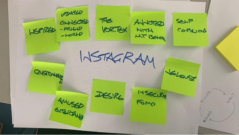
Instagram screenshots of the new tool

After examining the negative aspects of Instagram, including its manipulative tactics, design features that encourage user retention, and its impact on us, I now want to shift focus to more positive aspects, specifically solutions to this problem. One notable solution is the introduction of the Hide-Likes function on Instagram in 2021. This small feature was implemented to mitigate some of the harm caused by the platform. Initially, I was surprised to discover that the idea behind this feature was actually conceived about a decade ago, and Instagram didn’t give credit to the creator. However, upon reflection, I wasn’t entirely surprised.

The individual behind this idea is Ben Grosser, an artist who examines the cultural, social, and political effects of software. He explores how interfaces that emphasize friend counts impact our understanding of friendship. He questions who benefits when a software system can intuit our emotions and how democracy and society are influenced when growth-oriented platforms become our primary window to the world. To investigate these questions, Grosser develops interactive experiences, machines, and systems that make the familiar unfamiliar, revealing how software dictates our behavior and alters our identity.

Since 2012, Ben Grosser has been studying how numerical metrics, such as the number of likes on a post or the number of friends and followers, shape our experience of using social media platforms like Facebook, Twitter, Instagram, and YouTube. He argues that these metrics have a more profound and insidious impact on our online behavior than we realize and that we would all be better off without them.

Grosser created a browser extension called the Facebook Demetricator, which removed all visible metrics from the site, in order to experience how the social network would feel without them. This project encompassed art, a social experiment, and academic research, and he never anticipated that he would still be maintaining and updating it seven years later.

Now, seven years later, in a significantly changed era for social media, the world’s largest tech companies have started experimenting with Grosser’s Demetrication. Twitter released a beta app that hides the number of likes, retweets, and replies on each tweet in reply threads, unless specifically tapped on. Instagram also recently announced an expansion of its test, which hides the number of likes and video views on every post in users’ feeds. While individuals can still see how many people liked their own posts, this change removes the ability to compare like counts between posts. Additionally, YouTube decided to replace real-time subscriber counts on channels with rounded estimates.

Grosser’s once-fringe and obscure ideas have gained traction over the years among technology critics and have received mainstream press coverage. The CEOs of Twitter and Instagram have articulated similar perspectives, acknowledging how prominently displaying like and follower counts can turn the platforms into a competitive space.

This case demonstrates how a technology critique ahead of its time can be disregarded for years, only to gain attention in Silicon Valley when circumstances change, and companies find it advantageous to adopt these views. However, it remains uncertain whether they have genuinely internalized these ideas.

These developments lead Grosser to question whether social media platforms are truly attempting to alter the dynamics of online interaction or if they are merely using demetrication as a public relations tactic. He suggests that these companies face pressure to take action and present solutions when facing inquiries from Congress regarding various aspects of their operations, from business models to their impact on democracy. He believes that these platforms may have chosen to hide one specific metric in order to claim that they are addressing the issue.

Ironically, platforms like Instagram and Twitter likely utilize metrics to assess the impact of hiding metrics themselves. Grosser expresses his curiosity regarding the precise criteria for success and failure in tests such as Instagram’s hiding of likes. He suspects that the company aims to ensure that these changes do not significantly hinder growth and engagement numbers.

Ben Grosser and the Hidden Likes Feature

Ben Grosser

Released Hidden Likes Feature

Die Ziele des DUH


Der digital university hub (DUH) ist darauf hinaus, eine kollektive Pattform für den Austausch von Wissenswertem zu schaffen. Die Ziele dafür sind vielfältig und darauf ausgerichtet, die digitale Transformation im österreichischen Hochschulwesen voranzutreiben.

Der DUH strebt danach, eine zentrale Plattform für den Austausch von Informationen und die Zusammenarbeit im Bereich der Digitalisierung in österreichischen Hochschulen zu werden. Durch die Vernetzung von Akteur*innen sollen Synergien geschaffen und der Wissenstransfer gefördert werden.

Gleichzeitig agiert er als eine Einheit, die Zusammenarbeit und den gemeinsamen Austausch von Know-how, um innovative Open-Source-Softwarelösungen für die Digitalisierung an Hochschulen zu entwickeln und zu verbreiten. Dadurch sollen Ressourcen gebündelt und effiziente Lösungen für die Herausforderungen der Digitalisierung geschaffen werden.

Der Plattform zielt darauf ab, Expert*innen-Netzwerke für die Digitale Transformation an österreichischen Hochschulen aufzubauen. Durch den Austausch von Erfahrungen, bewährten Praktiken und Expertise sollen Kompetenzen gestärkt und das Wissen im Bereich der Digitalisierung erweitert werden.

Weiters arbeitet der DUH an der Entwicklung eines Transformationsmanagement-Ansatzes für die Digitalisierung an Hochschulen. Dies umfasst Strategien, Methoden und Werkzeuge, die bei der Planung und Umsetzung von digitalen Transformationsprozessen unterstützen sollen, und strebt an, ein “Kollaboratives Mindset” an österreichischen Hochschulen zu fördern. Dies beinhaltet die Schaffung einer Kultur der Zusammenarbeit, des offenen Austauschs und der gemeinsamen Innovation, um die Digitalisierung voranzutreiben.

Diese Ziele verdeutlichen den ganzheitlichen Ansatz des DUH, um die Digitalisierung im österreichischen Hochschulwesen zu fördern und eine aktive und kollaborative Community aufzubauen.

Mission: Explore

Mission: Explore is a successful book series that was developed by the Geography Collective. Their goal is to encourage children to explore the outdoors.

Pros:

Mission: Explore features a diverse range of missions that are either set in or are about the outdoors. Constructing miniature rafts or crafting nature-inspired artwork for example.

It cultivates curiosity and critical thinking by engaging children in observation and investigation. Through active exploration of their surroundings, children learn to analyze and make sense of the world and furthering cognitive abilities.

The flexibility of Mission: Explore ensures that it is applicable in different surroundings, including urban, suburban, and rural settings. By offering missions that can be adapted to any environment, the project serves as a valuable resource for children worldwide.

Cons:

The availability and accessibility of Mission: Explore books and resources may vary, depending on geographical location and distribution channels. This could be a challenge for people who don’t have easy access to the materials.

Mission: Explore reduces the dependence on screens. While this aspect encourages direct engagement with nature, children who are accustomed to digital activities may lose interest quickly. A Mission:Explore app could be the solution for this problem.

Sources:

https://www.researchgate.net/publication/289792890_Curiosity_and_fieldwork

https://danravenellison.com/portfolio/missionexplore/