The article Feeling the Effort of Classical Musicians – A Pipeline from Electromyography to Smartphone Vibration for Live Music Performance provides an insightful overview of the live-stream MappEMG pipeline project, in which a mobile application was developed to mimic the muscle response of classical music performers for audience members. This project began with the notion that these “gestures”, or invisible muscle movements made by musicians while performing, are integral to the musician’s sense of place within a piece, and would increase the audience’s sense of immersion if they could be shared.
The project utilizes EMG sensor mapping to track muscle movements, “From an artistic perspective, EMG gives a direct access to the performer’s intention in terms of implied musical effort, which is expressed through actual physiological effort”. These movements are then reproduced as vibrations through the mobile device. Sound-based vibrotactile feedback has already been used for collaborative composition, audience interaction, and greater immersion for those with hearing impairments.
I found this case very compelling as I had never heard of a similar project. It is also interesting to see a real world use case involving the tools we are using now, such as Max8. I appreciate the drive to create a more immersive audience experience, and also to explore a new element of the performance in the musicians’ gestures.
References
Verdugo, F., Ceglia, A., Frisson, C., Burton, A., Begon, M., Gibet, S., & Wanderley, M. M. (2022). Feeling the Effort of Classical Musicians – A Pipeline from Electromyography to Smartphone Vibration for Live Music Performance. NIME 2022. https://doi.org/10.21428/92fbeb44.3ce22588
The topic of this article is the idea, development and evaluation of the On Board Call, a handheld device for imitating wildlife sounds.
“The On Board Call device is a handheld electronic gestural instrument that synthesises sounds resembling wildlife calls. It is designed to encourage deep listening and personal expression through imitation of natural sounds and as a performance tool.” This is the description of the device by the developer. Rather than playing back recorded wildlife sounds the On Board Call creates an imitation by synthesized sounds. The user creates these sounds with the board through a user interface on the device.
The article spends a lot of time explaining the technicalities of the hardware and software. It does state some reasoning for the choices that have been made, but I would be more interested in the arguments behind the gestures and interface layout. This is what the user interacts with, and will threrefore be critical for their experience. The article does for example not explain how well the ergonomics, learnability or feedback is.
Despite missing information about the argumentation behind the interaction between user and device, the article does explain that user trials have been carried out. It is not completely clear what the results and measures taken after the trials was when it comes to the interface, so this would have been interesting to hear more about.
Overall the project seems interesting, but a natural next step would be to test the interface more. It seems this has been designed out of ease for the producer, not out of usability.
The ambiDice is a small tangible interface that enables players of TRPGs to immerse more into their games through sound experiences. The dice consists of a microcontroller that supports WIFI functionality to connect to it. The raw sensor data is sent to AmbietMusicBox, which is a self-contained software to process the audio values. The implementation of the scripting language has been refined after multiple user tests.
As the device is still in development there are a few factors that make the usability of the device open for improvement. While the idea is good and the first prototype is already working and being tested, there are a few major questions that are still unanswered for me.
Does the dice actually work as a dice and is it fair?
How good is the audio quality?
Does the dice need to be charged? How long does its battery last? TRPG sessions are usually going for many hours.
Once these questions are answered the ambiDice will improve greatly in my opinion.
The following blogpost covers the content of the scientific paper named “SOIL CHOIR v.1.3 – soil moisture sonification installation”. It was published at the NIME 20 conference in Birmingham by Jiří Suchánek from Janáček Academy of Music and Performing Arts.
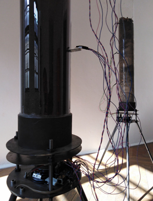
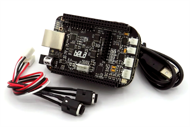
The project deals with the sonification of moisture values in soil, where each tube is filled with a different type of soil. The tubes form independent units, each consisting of three low-cost capacitive soil moisture sensors. The sensors are located at different depths and send information about the moisture values to a Bela board where they get transformed into organized sound structures.
The challenge in this project are the slowly changing values of the moisture sensors, letting the artist focus on creating a suitable listening experience for slowly evolving data inputs. Therefore, the idea was to create a sonic behavior similar to that of a Geiger counter.
I also tried to understand the sound mapping, unfortunately I did not understand it completely as I need to dig deeper into the theory of sonification first. However, I think this project shows the potential of sonification in nature and the ability to give a voice to normally silent processes. In my opinion the contrast between expected human musical time scale and the extremely slow environmental processes could listeners let rethink the perception of time.
References:
SOIL CHOIR v.1.3 – soil moisture sonification installation; Jiří Suchánek; Nime 2020 https://bela.io/images/products/bela.png
For this task i choose the article Debris: A playful interface for direct manipulation of audio waveforms published in 2021 by Frederic Anthony Robinson. It gives an overview of Debris which as the title suggests is a fun and intuitive software interface for manipulating audio waveforms. Its playful and engaging design aims to make audio editing a more creative and enjoyable process. The direct manipulation tools and real-time feedback help users understand the effects of their actions on the waveform. This encourages the user to experiment more throughout their creative process.
The interface is user-friendly, with clearly labeled tools and easy access to different features. The variety of tools available, such as looping, reversing, and layering tracks, provide users with many options for creating unique audio effects.
However, Debris may not be suitable for more advanced audio editing tasks due to its limited functionality. It is also only available as a standalone application for macOS, which limits its accessibility for some users.
Overall, Debris is a good tool for anyone looking to experiment with audio editing in a fun and intuitive way. It is well-suited for beginners and anyone looking for a creative audio editing experience.
For the Interaction Design class, I chose the article “COSMIC: A Conversational Interface for Human-AI Music Co-Creation” by Yixiao Zhang, Gus Xia, Mark Levy, and Simon Dixon as artificial intelligence is becoming more and more involved in our everyday lives.
The article describes the software COSMIC, developed as an interface for the creation of music between humans and AI. The AI assistant provides the user with musical ideas, which are developed and refined during communication. The machine learning model is based on a large data base and learns to generate new ideas while using the system. The idea is finally presented to the user and adapted to the user’s preferences by feedback from the user.
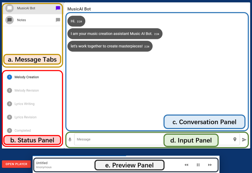
The interface has a very clean design and is divided into the five categories:
message tabs
status panel
conversation panel
input panel
preview panel
The interface has a minimalistic design with a clear structure. The design resembles already known platforms and the used icons are clear and easy to understand.
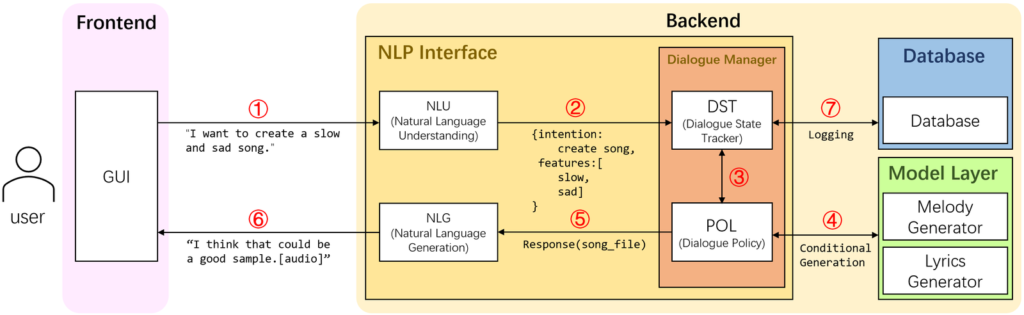
Without going into the technical details, the system is based on the following architecture.
In my opinion, the system arouses my interest to test it. Especially as a person who has no musical background, I can imagine getting a simplified and explorative generation of music ideas in it.
Sources:
COSMIC: A Conversational Interface for Human-AI Music Co-Creation
by Yixiao Zhang, Gus Xia, Mark Levy, and Simon Dixon
The paper examined the concept of feedback musicianship, which involves the use of feedback in musical performance and composition. The authors of the paper were inspired by Bebe and Louis Barron’s cybernetic explorations, the screaming sound of Jimi Hendrix’s guitar, and the systems design of David Tudor or Nic Collins. The Barrons were a husband and wife duo who pioneered electronic music, creating custom-built instruments to explore the relationships between machines and humans. Jimi Hendrix was an influential guitarist known for his use of feedback and distortion. David Tudor was a composer and performer who worked with electronic music and designed instruments and systems, often collaborating with John Cage. Nic Collins is a composer and performer who works with homemade electronic instruments and circuits and wrote a book on the intersection of DIY electronics and experimental music.
To gain insight into their practice and the underlying theoretical framework, the authors interviewed a group of contemporary feedback musicians. They discovered that feedback musicianship has evolved over time, influenced by scientific and theoretical ideas of the time, and that today’s feedback musicians are interested in exploring systems, agency, design, complexity, and post-human (as one of the interviewees was reported to have said “I’m interested in the instrument being in the way of my intent”) in their work.
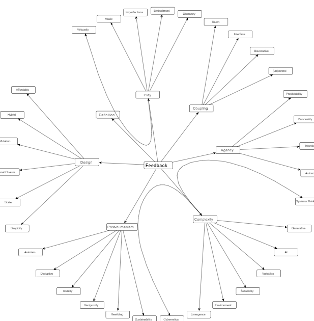
A mindmap of representation of key terms as analyzed from the interviews. by Thor Magnusson, Chris Kiefer, and Halldor Ulfarsson. source:https://nime.pubpub.org/pub/feedback#nszoex43a83
The discussion of post-humanism and the de-centering of humans in global ecology systems is an intriguing aspect of the paper. According to the authors, this trend is related to the renewed interest in building feedback systems as an artistic practice. The interviewees expressed a desire to relinquish control over their performances, preferring to play “with” rather than “on” an instrument.
However, some of the paper’s proposals may be impractical in practice. For example, many musicians may find it difficult to abandon traditional musical values such as virtuosity and mastery. Additionally, while the authors suggest that the new complexity science is the current theoretical framework of feedback musicianship, it is unclear how widely this approach is adopted in practice.
In conclusion, the paper offers an intriguing examination of feedback musicianship and its evolution over time. While some of the ideas presented may not be feasible or widely adopted, they do provide an intriguing starting point for further discussion and exploration of the subject.
The design of a bespoke musical interface designed to engage the public’s interest in wildlife sounds by Andrew R. Brown
I liked that this project used smooth real-time mapping of human gesture data to synthesis the sound of wildlife calls. As seen in the P.L.A.C.E performance https://www.youtube.com/watch?v=uKgLrrI-MEU it forces the musician to move in unusual ways to produce sounds which makes the performance interesting to watch. I liked the idea of the inventor to design the Call as an a compact and inexpensive device design with minimal gestural dimensions in order to be suitable for use by the general public in community workshops or for infrequent personal interaction, thus sparking creativity.
The User Interface of the Opject seems simple enough to be easily learnable. For the hardwear design I like that it is a handheld objektiv and that the size was kept as compact as possible to minimize resource usage in production. As the software was built with an Arduino it still feels very much like a replicable project. The gestural interface spoke to be as we already produced our own prototypes last semester with our phones using the sensors. So I could imagine myself being able to construct something like this someday.
Designing a good interface, good means the degree of usability, requires knowledge of design rules and experience with interactions. Patterns can also be used to document and share existing design knowledge. Design pattern libraries are good because they capture the most important aspects of the problem and offer a solution approach. The structure of the pattern is scalable and can be applied to other and broader problems. The interest in creating patterns and creating a pattern language for user interface design was already present in 1994. (Rijken 1994, Bayle 1998). Several different approaches to building model libraries were made by different people around the turn of the millennium. (Mahemoff and Johnston 1998). Mahemoff proposes the following categories: task related patterns, user related patterns, user interface element patterns and system-based patterns. Common Ground (Tidwell 1998) or the Web patterns collection (Perzel and Kane 1999), Martijn van Welie/Hallvard Trætteberg (2000). But in 2000 there was still none that had become established. The reason is that there was no agreement on a format and focus.
With the introduction of the iPhone in 2007 and the hype that followed, it became necessary to design software and its interface for mass use on these devices. Erik Nilsson presented a pattern library for mobile patterns in 2008. He drew his insights from the problems encountered during the development of the projects UMBRA (UMBRA is a graphics software technology company founded 2007 in Helsinki, Finland. Umbra specializes in occlusion culling, visibility solution technology and provides middleware for video games running on Windows, Linux, iOS, PlayStation 4, Xbox One, PlayStation 3, Xbox 360, Wii U, handheld consoles, and other platforms. In 2021, Amazon acquired Umbra. Information copied from Wikipedia) and FLAMINCO (web pattern library from Nilsson!? – no information found) appeared.
He refers to three main challenges that the small touch screen poses. He has classified these as the three main problem areas.
use of screen space.
interaction mechanisms.
design as a whole.
Each pattern is divided into one of these 3 problem areas, within these problem areas there are smaller units of problem areas. This division into problem areas helps to concentrate on individual aspects of a larger problem. It becomes difficult when the collection grows. It needs a good problem structure to find matching patterns. The connection between problem and solution was a challenge because there is always more than one solution to a problem and the solution can always be applied to several problems. This results in either a lot of repetitions or a lot of cross-references, which affects the readability of the pattern collection.
Main problem area
Problem area
Description and individual problems (with connected UI design patterns)
He also thinks separately about UI components such as buttons, tabs, scrollbars etc. and their adaptation to touch interaction. The patterns collection was presented by Erik Nilsson at the HCI International conference in 2007 and at the IASTED HCI conference in 2008. [1]
Pattern collections:
In 2008 there were a few pattern collections, including some on Mobile UI design patterns.
Jenifer Tidwell created her website in 1999. According to the information on the website, there should be a new website, but the new website does not show much content.
Alexander’s intention with the design pattern in architecture was to involve the inhabitants of a house and give them a tool to communicate their needs to the architect. His approach was user centred. He created a structure for his architecture pattern consisting of name, ranking, picture, context, problem statement, problem description, solution, diagram (graphical explanation), references. So, the structure is very similar to the structure used in software and HCI pattern. Software patterns consist of name, context, problem, solution, examples, diagrams, and cross-references. In software development, however, the pattern language was not intended to involve users in the process, but rather to allow developers to communicate with each other. The idea of UI patterns as described by Alexander influenced Norman in Psychology of Everyday Things (published 1988; p. 229). Apple’s Human Interface Guidelines also referred to it, and the Utrecht School of Arts used patterns in their teaching. (In the year 2000, however, there was still no binding pattern language.) [1]
Jenifer Tidwell recognised 1997 in her article A Pattern Language for Human-Computer Interface Design that designing user interfaces requires a systematic approach. She also mentioned that the creation of good design solutions often worked better when the designers were talented but, above all, experienced. As in any other discipline, designers in the user interface field benefited from studying and adopting the work of other designers and applying already successful solutions. Reinventing solutions is not only time-consuming, it can also lead to results that do not meet the desired expectations. Tidwell speaks of bizarre solutions that are the result of reinventing common designs. Experienced designers, on the other hand, use their knowledge of design principles and process to make ideas feasible in a new context. Experience, on the other hand, requires time and making mistakes to gain the knowledge. In her first article on the subject, Tidwell argues that there should be a simpler solution, a shortcut. She sees this shortcut in the introduction of design patterns along the lines of software development and architecture. The advantages for designers are that they can draw on accumulated knowledge and have a common language that simplifies communication within the team and with the client, thus reducing misunderstandings. In addition, new solutions can come about when creatives are forced to stay within a certain framework and focus on that one task. Design patterns could also form the basis for frameworks for programming. Design patterns also represent advantages for the entire community of HCI designers. The usability of an interface design could be discussed on this basis – if the solution works or not. The patterns could also take over working solutions from other analogue fields and exchange them in an interdisciplinary context. Solutions that already work well elsewhere can also be helpful in user interface design. This has already been done (e.g. metaphor for the desktop) but it would be possible on a more abstract level. We could also learn from solutions that have been dismissed for various reasons, e.g. due to unfashionability. The exchange of ideas could be greatly facilitated and made accessible to a broader community. It would be easier to build on existing results and find new solutions more quickly, innovatively and across sectors. [2]
Basically, all these ideas are not new, they have just not yet been sufficiently emphasised and systematically introduced in this young discipline. It is no secret that our knowledge is based on the knowledge of our ancestors, that we learn quickly and easily through imitation. That this behavioural pattern: learning by imitation also extends to this new discipline is therefore no surprise. What is important in these beginnings of design patterns, however, is the systematic approach in which a broader mass can benefit from prior knowledge and insights. As has been shown throughout humanity, the more people have access to existing knowledge and can build on it to develop new ideas, technologies, and approaches, the faster we develop. For me, this is also a call to form a worldwide community that supports each other, analogous to the beginning of globalization and the start of the WWW.
In her article, Tidwell proposes an approach for a design pattern library for the first time. Analogous to software patterns, each design pattern should include the problem to be solved, the context of use, a primary rule, and good and bad examples. However, it is important to note that these descriptions are not recipes, nor should the design patterns reference the GUI directly. Just as a user need should not include a design suggestion to leave the design space as open as possible, the pattern should not be too prescriptive either. For Tidwell, one of the most important points in terms of acceptance of a pattern is if the basic concept can be applied in other disciplines (also analogue). If the pattern works in a different context, if it would work outside the HCI/GUI environment, it is most likely a good solution. (example)
In the same way, the pattern language can also be used to analyse existing interfaces. The structure of the pattern language itself is easy to understand. But to use it, you need to understand the purpose of the solution and the factors that are relevant to solving the problem. It is also important to make the process iterative. Tidwell’s intention for the development of a pattern language is to ensure a high level of quality in the interaction between human and machine aka the software. High quality is when the user has a successful and satisfying experience. This means that the content has been adequately prepared and presented for the user so that the user fully understands the content and is able to use it. Furthermore, the software guides and supports the user to the necessary extent and pace in their task. Successful software supports in such a way that the user can fully concentrate on his task and the software “to fade from the user’s awareness”. If these two goals are met and learnability, user empowerment, and enjoyability are added, the criterion of “high-quality interaction” is fulfilled. Tidwell divides the patterns into “primary patterns” from which larger patterns can be composed. The content Narrative, High-density Information like Maps, tables, and charts or as Status Display the state of something that will change like clock or dashboard. The primary patterns for actions can be Forms, Control Panel, WYSIWYG Editor, Command-line, Social Spaces like Newsgroups and Chat Rooms. The action primary patterns are very limited with the things users can do. A control panel with one button reduces the complexity to this one action, where the button can be used multiple times in many ways. Tidwell says that unlike the pattern languages that evolved from Alexander’s theory, this language can be arbitrarily combined and used on a larger or smaller scale. Form filling can appear as the main action on the page, or only as a small secondary action – depending on the context. (p. 11) In her article, Tidwell has compiled an approximately 70-page collection of patterns, which she has structured according to the method Example, Context, Problem, Forces, Solution, Resulting Context, Notes.[2]
Tidwell called her pattern language Common Ground. Common Ground (Tidwell 1998) or the Web patterns collection (Perzel and Kane 1999) are pattern collections that were created around this time. Martijn van Welie and Hallvard Trætteberg created their own pattern collection around 2000. In their article they criticise the lack of user perspective in the pattern collections of Tidwell, Perzel and Kane. They have created their own collection to compensate for this lack. And they present a different format that can remedy this deficiency. They focus more on the end-user and the problems they may have when using the software. For them, usability is the focus of the pattern language. Tidwell’s language is more for designers than users, while they want a solution which is more user centred. Their argument cannot be dismissed: If a pattern fits for a user, it fits for a designer, but the reverse is not always the case.
The focus of this pattern collection should be on user centred design and usability. For this reason, it is very important to consider the how and the why in the format. In the pattern the description must explain how the solution works and why it is a good solution. The focus on user centred design is also important to ensure usability and not to put the interests of the stakeholders above those of the users. Banners and splash screens for advertising purposes are considered a good solution at the time but are neither important for usability nor certainly do not enhance the user experience. The pattern collection has been structured with reference to Norman’s interface principles formulated in 1988.
Visibility – Gives the user the ability to find out how to use something simply by looking at it.
Affordance – Refers to the perceived and actual properties of an object that indicate how to use the object.
Natural Mapping – Creates a clear relationship between what the user wants to do and the mechanism by which they can do it. To complete my task, I need to select this option, enter this information, and then press this button….
Constraints – Reduces the number of ways to perform a task and the amount of knowledge required to perform a task, making it more manageable. Oh no, what do I have to enter here? Ok, I only have these choices….
Conceptual models – A good conceptual model is one where the user’s understanding of how.
how something works matches the way it works. This way the user can confidently predict the effects of their actions.
Feedback – Indicates to the user that a task is being performed and that the task is being performed correctly.
Safety – The user must be protected from unintended actions or errors.
Flexibility – Users can change their minds and each user can do things differently.
The increase/improvement of usability should be in the foreground when creating the pattern and should cover the following criteria: learnability, memorability, speed of performance, error rate, satisfaction, and task completion. These are called usage indicators and each pattern must cover at least one of these indicators.
Structure of Wellie:
Progress ( by Martijn van Welie, p. 7)
Problem Description
Usability Principle which it confirms.
Context
Forces
Solution
Rationale
Examples
Known Uses
Counter Example
Related Patterns
Example for this pattern: Problem
The user wants to know whether or not the operation is still being performed as well as how much longer the user will need to wait.
Usability Principal Guidance
Feedback
Context
Systems tasks that take a long time (typically more than a few seconds) and must be completed before the next tasks can be started.
Forces
The performance of the operation cannot always be controlled/avoided by the user (or designer), e.g. because it relies on an external system or hardware, which may fail, block or have low performance.
The users do not want to wait need clear feedback on the progress and estimated time to completion.
The users may not be familiar with the complexity of the task. During the operation the user might decide to interrupt the operation because it will take too long.
Solutions
Show that the application is still working and give an indication of the progress. Provide feedback at a rate that gives the user the impression that the operation is still being performed e.g. every 2 seconds using animation. Additionally, provide a valid indication of the progress. Progress is typically the remaining time for completing, the number of units processed, or the percentage of work done. The progress can be shown using a widget such as a progress bar. The progress bar must have a label stating the relative progress or the unit in which it is measured.
Rationale
By providing new feedback at a rate around 1 or 2 seconds, the user can see whether the application is still processing and has not died. The progress indication gives feedback on how long the application will remain in this state. Combining these two aspects relieves the user’s worries. Leaving one of the two out would not solve the user’s problem. The solution increases satisfaction because the user knows what is going on and how much longer the user needs to wait. It increases the sense of control. The pattern also avoids additional system load by avoiding retries from users.
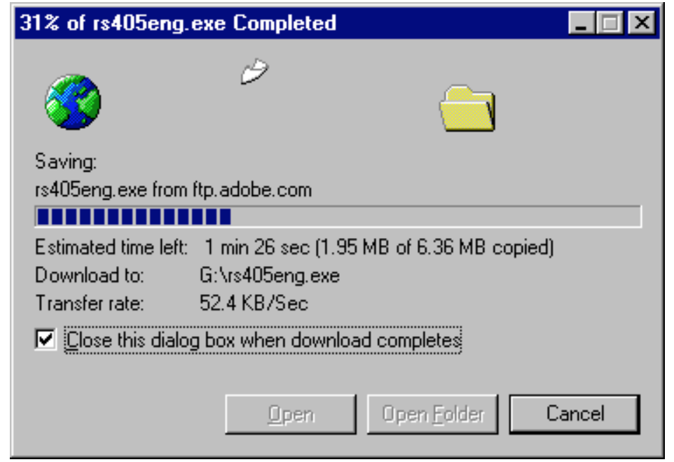
Examples When downloading a file using Internet Explorer 5, the user is presented with this dialog. It shows the progress in percentage as well as the amount of kilobytes of received data. Additionally, the estimated time left is shown and updated couple of seconds. An animation of a flying document shows that the download has not stalled. Known Uses Netscape’s Download box, Apple’s file cop [3]
[1] Jan O. Borchers. 2000. A pattern approach to interaction design. In Proceedings of the 3rd conference on Designing interactive systems: processes, practices, methods, and techniques (DIS ’00). Association for Computing Machinery, New York, NY, USA, 369–378. https://doi.org/10.1145/347642.347795
[2] A Pattern Language for Human-Computer Interface Design, Jenifer Tidwell, May 17, 1997, p. 1-5
[3] INTERACTION PATTERNS IN USER INTERFACES, Martijn van Welie, Hallvard Trætteberg, 2000