HUD – Part 2

In the HUD, graphics are used to present important information to players, like score, health, time, item count, location, and direction.
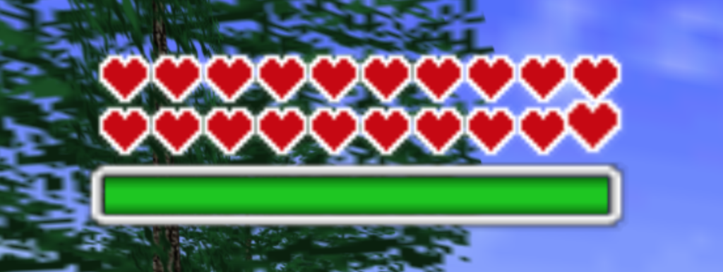
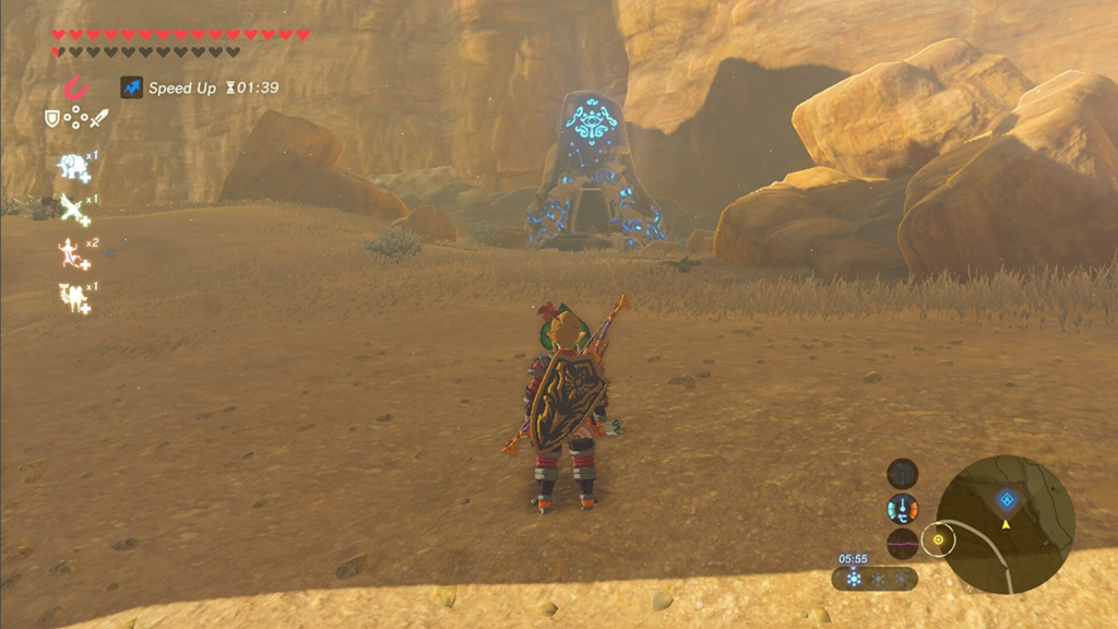
The Legend of Zelda: Ocarina of Time (health bar)

Health

Health is often displayed as a number, percentage, icon, or bar, showing the range of full health to empty. A typical health bar shows full health on the left and low health or death on the right. Some health bars also show the state of bonus health with different graphics and colors. To inform players, games often show the percentage or amount of health being gained or lost, and in some cases, the health bar or number will flash when a character‘s health gets too low. The health widget should be placed close to the action, such as in the upper-left or upper-right corner or bottom center, so that the player can assess their health state quickly without it covering the gameplay. 

Score

The score widget can be displayed in the top left, top middle, or top right, opposite of the health stats, and should provide feedback when the player‘s score increases, such as by increasing the total, flashing graphics, or cutscenes for important milestones. The placement of these HUD components may also depend on the camera focus and gameplay.
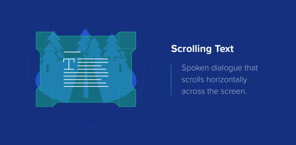
Call of Duty

Timers

Timers are usually displayed in the top center or bottom center of the screen, and during the final countdown, they can alert the player through flashing, changing color, and sound effects.
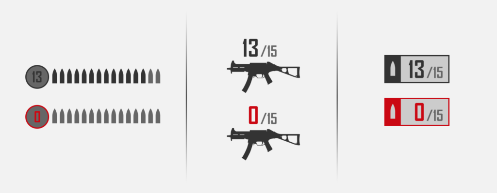
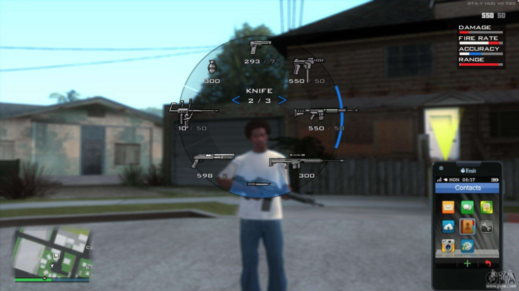
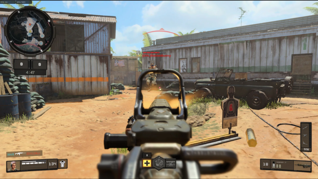
Ammo count

Ammo count

In shooter games, the ammo count is an important part of the Head-Up-Display. There are various ways to display the ammo count such as showing it close to the weapons and ammo count, indicating when the weapon runs out of ammo, changing the count‘s color, displaying an empty ammo clip graphic, or using a sound effect when the player tries to shoot with an empty gun clip. In shooter games, the location of the ammo count can vary based on the point-of-view (POV) used. In third-person POV, the character is usually in the bottom center of the screen, so the ammo count is displayed in the upper-right or upper-left corner to avoid obscuring the character. In first-person POV, the focus is in the center of the screen, so the ammo count is best placed in the mid-bottom part of the screen. In newer sci-fi games, the ammo count is integrated with the weapon itself, eliminating the traditional ammo count component.

Reticle

A reticle is a cursor used for targeting and indicating interactions or the direction of a projectile. The reticle should be easily noticeable and customizable for different weapons, items, and interactions. In first-person and third-person games, the reticle is typically placed in the center of the screen, while in RTS and top-down games, it is controlled with a right stick. To indicate a hit or positive interaction, the reticle should change shape or color.

Minimap

A minimap should be included in games where it‘s important for players to know the location of different elements, such as teammates, enemies, etc. The minimap should be a small, top-down map and can include a compass, off-screen indicators, and objective markers. To ensure it doesn‘t take up too much space, it should occupy no more than 1/8th of the screen and have limited details displayed. The minimap should be placed in a corner of the screen that is not where most of the gameplay takes place as it provides secondary information.

https://www.gamingscan.com/best-video-game-huds/: HUD – Part 2 https://gameuxmasterguide.com/2019-05-09-HUDComponents/: HUD – Part 2

HUD – Part 1

The heads-up display (HUD) is an essential component of video games that displays important information to the player on the screen during gameplay. A good HUD design should be unobtrusive and aid the player without being distracting. Examples of HUD elements are mini-maps, health bars, and ammo counts. Some games even allow the player to customize the HUD to their preferences. The HUD should be easily visible in all lighting and environmental conditions.

HUD design choices

The choice of heads-up display design for a video game depends on the game‘s genre and style. The amount of information to be displayed to the player should also be considered. For example, in the Halo game, the HUD is comprehensive and displays all the information the player needs. However, this design may not be suitable for other games like Tomb Raider, where the HUD is minimalistic and only shows necessary information that changes based on player actions.

GTA

When designing a video game heads-up display, it‘s crucial to keep it from overpowering the screen and becoming a distraction to the player. It‘s important to assess if the features included in the HUD are actually necessary and helpful to the player. For instance, in a first-person shooter game, it may not be necessary to display the weapon the player is holding if they are already aware of it. A good example is Grand Theft Auto 5, where the HUD displays all necessary information without cluttering the screen. The HUD only appears when needed and quickly disappears, providing the player with information when necessary without being a distraction.

HUD Trends

Many game companies are moving away from the traditional, static HUD that displays a lot of information to the player. They aim to create a more immersive experience where the player forgets they‘re playing a game. Games like Dead Space use interactive cues instead of a traditional HUD to give the player information, such as audio cues to indicate low health. As game development progresses, more creative and non-visual elements are being used to replace traditional HUDs, to create a more immersive experience for the player.

https://www.pluralsight.com/blog/film-games/designing-a-hud-that-works-for-your-game#: HUD – Part 1 https://arstechnica.com/gaming/2013/07/heads-up-history-a-visual-look-at-the-evolution-of-the-hud/: HUD – Part 1

UI Prototyping in Games

Research

The key to designing a good UI or HUD for a game is to conduct research on the genre, test on the audience, and refine the design. The first step in the process is to play or watch videos of several games within the genre or on the target platform. This helps to identify general conventions which can reduce the cognitive load for players who are familiar with playing similar games.

Accesibility

Designing game UI with accessibility in mind is crucial. Accessibility should be a priority from the start, considering factors such as impaired vision, hearing, and physical control abilities. Game accessibility guidelines should be applied (gameaccessibilityguidelines.com). Controls should allow players to carry out tasks easily and have muscle memory. Deviating from common control trends may negatively impact the player‘s experience.

Digital tools to improve accessibility, such as Stark (= Adobe XD plugin) for checking contrast and color should be used. Accessible Colors and Color Oracle, and the Harding FPA suite of applications to avoid seizure triggers are also important. In general fixing accessibility issues during the design phase is easier and less expensive than trying to retroactively fix them. Improving accessibility can also improve usability for all players.

Target group

The target group should be taken into account when designing the controls. Factors to consider include the player‘s experience level, age (children have smaller hands and less dexterity), and playing environment (near a monitor or on a TV from a distance). One should exercise empathy by imagining specific players and their needs. Seeking advice from experts, specialists, and disabled gamers through user research and social media is recommended.

Prozess

For prototyping tools like Adobe XD are recommended. They help to identify limitations and weaknesses in the design, and allow fast iteration and testing. Testers can access the prototypes from the cloud, and test the work on their device to identify any shortcomings.

The process of improving the user interface and user experience of a game involves constantly testing and iterating. This can be done by having users play an unfinished version of the game to see if the design is engaging. It is important to gather feedback and make changes to enhance the overall quality of the UI. Ideally, this should be done in an environment that allows recording players and gameplay. Interviewing or surveying players after the session is also helpful. Feedback can be used to identify and remove pain points and make changes to the UI, control, and game design.

https://blog.adobe.com/en/publish/2019/07/09/game-ui-how-to-prototype-test-designs: UI Prototyping in Games https://www.gamedeveloper.com/business/ux-walkthrough-prototype-testing-do-s-don-ts-part-1: UI Prototyping in Games

Tipps for designing UI in Games

The design of a user interface varies depending on the genre, theme, and style, but there are fundamental guidelines to create a good UI.

Research

Designing a user interface for a video game involves considering the conventions and successful design patterns used in similar games. It is recommended researching and looking to other games in the same genre for inspiration. It‘s important to understand the conventions of the genre, such as the placement of health bars, and the color coding used for different elements. The UI should also match the theme of the game, taking into account how other games with similar themes approach their aesthetic.  However, it‘s important to follow conventions, there‘s also room for creativity and innovation in UI design.

Right Placement of UI Elements

This is done through wireframing, where a greyscale diagram is created to show what the UI will look like. During this process, the focus is on the placement and shape of UI elements, not on color. The idea is to ensure the fundamentals of UI and UX are solid before adding the aesthetic elements. The wireframe structure should be based on the genre of the game and the UI should be based on the theme of the game. To design effective UI, it‘s important to always keep the player‘s perspective in mind and anticipate how they will interact with the UI.

Dark Souls

Hierarchy

When designing UI, it is important to consider what information the player is likely to want to know or see, and arrange the UI elements in a hierarchy of importance. The inventory screen in „Dark Souls“ is a good example, where the inventory is the main focus and the controls are secondary. It is also effective to gate off information, reducing the amount of UI elements on the screen to draw attention to the most important elements. Clutter is the main factor that can cause a game‘s UI to fail. Multiplayer games are particularly prone to having cluttered visuals, as they often require players to attend to many tasks simultaneously while only having one screen to do it all on. This includes gameplay, upgrading, strategizing, executing special attacks, reading a map, and communicating with other players.

World of Warcraft

Animation

Animation can be used to enhance the visual design of the UI, making it more appealing and lively. This could be in the form of a subtle pulse effect or moving backdrop. However, it should not detract from the functionality of the UI and should guide the player‘s eyes to the information, the interface, and menu options. The text should be easily readable to ensure the player knows where to focus.

Feedback

In designing UI it is important to gather feedback from players. It is crucial to ask for their opinions on icon design as the meaning of an icon may be different for different people. It is best to ask open-ended questions about what they think the UI is trying to convey and what they expect to happen when they press certain buttons. Also, it is important to gather feedback about their experience with the UI and identify any confusion or misunderstandings. Always prioritize the player‘s experience and never assume what they think.

https://www.mockplus.com/blog/post/game-ui-design: Tipps for designing UI in Games https://www.gamesindustry.biz/best-practices-for-designing-an-effective-video-game-ui: Tipps for designing UI in Games https://uxstudioteam.com/ux-blog/whats-make-or-break-in-game-ui-design/: Tipps for designing UI in Games

UI Components in Games

There are 4 types of visual representation in game UI design: diegetic, non-diegetic, spatial and meta. Diegetic UI elements are seen or heard by the character and fit within the story‘s context. Non-diegetic elements exist outside of the game or story and only the player sees them. Spatial elements are represented within the game space but not visible to characters. Meta elements are contextual to the game but not represented in the game space. It‘s important to understand the meaning and use of these types.

non-diegetic

Non-diegetic

Non-diegetic UI components are those that do not exist within the story or space of a game. These components are only seen by the player and not by any of the characters in the game. The design, placement and context of these components are critical for a good player experience. Examples of non-diegetic components in video games are stat meters that track points, time, damage, and resources. 

diegetic

Diegetic

Diegetic UI elements are those that exist both within a game‘s story and space, and are known by the characters in the game, including the player‘s avatar. A challenge in using diegetic components is in scaling, as a small component like an in-game speedometer may not be easily visible.

spatial

Spatial

Spatial UI elements are located in the game space but characters in the game don‘t see them. They often act as visual aids to help players select objects or point out landmarks.

meta

Meta

Meta UI components exist in the game‘s story but not in the game space. They can be subtle, like a layer of dirt accumulating on a 2D plane, or they can be prominent like shaking, blurring, or discoloring of the field of view to show player damage.

https://www.toptal.com/designers/gui/game-ui#: UI Components in Games https://www.sketch.com/blog/game-ui-design/: UI Components in Games

UI Design: A Key Element in Gaming

The Legend of Zelda: Breath of The Wild

Motivation and Goals

Playing video games is one of my hobbies, but I often noticed that poor UI and UX can detract from the overall gaming experience. I have come to realize that something as small as a game‘s user interface can have a huge impact on the quality of the game and lead to less enjoyment.

This sparked my interest in understanding what constitutes good UI in games and how it differs from UI in websites. With this goal in mind, I decided to dive into this topic and gain a better understanding of good and bad practices for game user interfaces. 

My focus will mainly be on AAA games. I want to find out what the best methods for developing user interfaces are, as well as determine if there are general principles for designing user interfaces in games.

Another area of interest for me is the essentials for a good head-up-display (HUD) in games. I am curious about how much information is appropriate for a HUD, as well as the most common HUD components and how they can be effectively visualized.

Additionally, I want to explore the process of prototyping UI and UX in games, as I believe that the prototyping process in games may differ from that of websites.

Before i get more into the topic of user interfaces in gaming, it is important to find out what a user interface is in general and which topics it covers:

What is UI-design?

The field of UI design focuses is the aesthetic design of all visual elements of a digital product‘s user interface. It is distinct from UX design, which focuses on optimizing of user satisfaction by improving the usability and accessibility of a product. UI designer are involving users preferences and are trying to create an interface that fulfills them. It has become an important tool for connecting with users and is vital for building customer loyalty and brand recognition.

What is a User Interface?

A user interface is the point of interaction between a person and a computer system or device. This includes elements such as display screens, keyboards, and the appearance of a desktop. The goal of a UI is to enable users to effectively control the computer or device they are interacting with by making it intuitive, efficient, and user-friendly.

What is a good User Interface?

„A user interface is like a joke. If you have to explain it, it’s not that good.“ – Martin Leblanc

Good user interface design is creating an enjoyable experience for users. Poor UI design can lead to confusion and frustration for users, making it difficult for them to complete their task flow. The are many principles for good UI design, some of the important are:

  • minimizing cognitive load by avoiding unnecessary information
  • maintaining consistency throughout the interface
  • prioritizing clarity over complexity
  • giving users control over their interactions
  • and making the design invisible to the user.

Types of User Interfaces

Types of User Interfaces

GUI

A Graphical User Interface (GUI) is the most common type of user interface that most people are familiar with. It allows users to interact with a computer by using a mouse, trackpad, or other input device to point and click on graphics or icons on the screen. GUI has several advantages such as being self-explanatory, easy to use, and not requiring memorizing command lists.

Touchscreen GUI

A Touchscreen Graphical User Interface (GUI) is similar to the regular GUI, but it allows users to interact with a device by using their fingers or a stylus to select icons and perform tasks, instead of a mouse or trackpad. These interfaces are commonly found on tablets, smartphones, and medical devices like insulin pumps.

CLI

A Command Line Interface (CLI) is a type of user interface that allows users to interact with a computer by typing in commands. This type of interface is not commonly used in everyday consumer products, but it is still used in certain situations. With CLI, users type instructions into the command line, which directs the computer to a specific file or directory. From there, a range of commands become available, such as retrieving files or running programs.

Menu-Driven Interface

A menu-driven interface is a type of user interface that presents users with a list of commands or options, usually in the form of a menu displayed on the screen. An example of a menu-driven interface is an ATM machine.

VUI

A Voice User Interface (VUI) is a type of user interface that allows users to interact with an application using voice commands. They do not require clicks or swipes, but instead accept user input through spoken commands. These interfaces are used in voicebot or smart speaker technology and well-known examples include Amazon‘s Alexa and Apple‘s Siri.

User Interfaces on Websites or Apps

There are different types of user interface elements that are used to build interactive websites or apps. These elements provide touchpoints for users as they navigate and interact with the product. The four main categories of user interface elements are: input controls which allow users to input information into the system, navigation components that help users move around a product or website, informational components that share information with users, and containers that hold related content together.

User Interfaces in Games

A video game user interface is a design that provides players with tools to navigate, gather information and achieve objectives in the game. This includes elements like life bars, coin counters, maps, etc. Effective UI design in video games is critical and requires careful consideration of functionality and detail, much like mobile app UI design.

Why are User Interfaces in Gaming important?

The design of a game‘s user interface is crucial for players to understand gameplay mechanics, access relevant information, and start playing quickly. A well-designed UI with good storytelling, animations, graphics, mechanics and user experience can increase playtime and lead to more purchases. The quality of a game‘s UI has a significant impact on potential customer behavior and revenue.

https://careerfoundry.com/en/blog/ui-design/what-is-a-user-interface/: UI Design: A Key Element in Gaming https://altia.com/2014/09/22/different-types-of-ui/: UI Design: A Key Element in Gaming https://www.futureofvoice.com/blog/voicebots/voice-user-interface-vui-was-ist-das: UI Design: A Key Element in Gaming https://careerfoundry.com/en/blog/ui-design/what-is-a-user-interface/: UI Design: A Key Element in Gaming https://www.mockplus.com/blog/post/game-ui-design: UI Design: A Key Element in Gaming

Analysis the strengths and weaknesses of different media formats 

In one of my previous blogposts I was talking about the various touchpoints between companies and teenagers. To dive a bit deeper into the topic I analyzed different formats on their performance, strengths and weaknesses. The results are the following:

Selfcheck tests

There are a tons of selfcheck tests online, where people can test theirself on their skills and personality. In the end the test will present you some professions which might suit your strenghts. I tested a few of them and I they are all quite similar. One which stood out (negatively) was “Berufskompass” by AMS.

Berufskompass

  • The design was really unsexy and not really appealing (at least to me). There are inconsitencies in their design propals (e.g. different formats in four sections – list, cards, checkboxes, …)
  • Some questions at the last part of the test were almost the same – just asked differently.
  • I would think that lots of the questions were quite difficult to understand. Especially when thinking of young people taking the test

Company website

Companies who train a high number on apprentices each yeat are likely to have a company/job website specifically for apprenticeships. Small businesses mostly have a section in their job offers on their carreer subpages or does not have any vocational positions displayed. The company website of voestalpine.com/lehre has a really clear structure. The provided information is attracting young people as well as their parents. They have an extra section for parents which in my opinion is a good aspect as they are involved (to a certain point) as well.

  • Very good structure
  • Appealing to the user
  • Embedded videos and pictures
  • FAQ section

Startseite | voestalpine Lehrlingsportal

Social Media

Social Media is nowadays one of the must haves when it comes to communication and branding of the company. Especially when it comes to addressing young people. A lot of companies are on Facebook, Instagram and even a few businesses are posting on TikTok. Not so many youths are active on Facebook – which makes Instagram and TikTok the number 1 tools.

I found an account on TikTok, which is posting insights of several apprenticeships and jobs.

  • nice idea of presenting jobs in a really short video
  • might be very appealing for young people (but I am not to judge)
  • account is also posting other content which is not related to jobs/work

https://www.tiktok.com/@hicksmarvin

Unterschiede von Websites. Wie Branchenabhängig ist der Einsatz von Gamification?

Die Spielindustrie

Beim Gestalten von User-interfaces und dem Kreieren von User Experience kann viel von Videospielentwickler*innen abgeschaut werden. Diese sind dafür verantwortlich unterhaltsame Erlebnisse an Spieler*innen zu liefern und damit die Spielerinnen und Spieler nicht nur zu motivieren, sondern auch zum Wiederkehren zu bewegen. Entwickler*innen von Spielen definieren Spielmachaniken und Regeln und testen und verbessern die Gameplayerfahrung. Sie loten die schmale Gradwanderung zwischen Sieg und Niederlage aus und balancieren das Spieleerlebnis durch das gesamte Spiel, sodass die Spielenden nicht zu gelangweilt aber auch nicht zu überfordert sind. Diese Ausgewogenheit an Prinzipien sollte man auch in anderen gamifizierbaren Bereichen anwenden, um die User*innen Experience auf ein neues Level zu bringen.

Schon wieder Effizienz

Seit Jahren war die Websiteentwicklung darauf ausgelegt, effizient zu sein. Websites sollten schnell die Informationen liefern, nach welchen die User*innen Ausschau hielten. Diesen Effizienzgedanken hielt man seither fest, egal ob es sich um Informations-Websites (Enziklopädien und Nachrichten), Unternehmenswebsites (bsp: AVL:

https://www.avl.com/?avlregion=GLOBAL&groupId=10138&lang=en_US ), E-Commerce-Websites, Blogs oder Finanz- oder Regierungswebsites handelt. Für meine Forschungsfrage möchte ich in späterer Folge auf interaktive Websites eingehen, da der Sinn von Unternehmen oder Informations-Websites ist, rein Informationen zu liefern. Eine gute User Experience erzielt man dadurch, dass man die Bedürfnisse des Kund*innen und der User*innen beachtet und nicht bei allen erkennbaren Möglichkeiten Spielelemente einbaut.

Informationswebsites wie Enzyklopädien (Wiki’s) entfernen sich weit genug weg von Gamification, da sie rein aus Textbausteinen und wenigen Bildern bestehen.

Für Unternehmenswebsites, wie die der AVL Graz, würden beispielsweise Punkte- und Ranglistensysteme oder interaktive Spieleelemente keinen Sinn ergeben, da die klare und direkte Präsentation von Produkten oder Dienstleistung im Vordergrund steht. Durchaus aber kämen Mikroanimationen in Frage, die zum professionellen Design und Layout der Website passen, um der Website einen Hauch von Modernität einzuflößen – ist aber optional.

Eher noch auf Bildungs-, Reise- oder Unterhaltungs-Websites kann man gamifizierte Interaktionen vermerken, da diese Gebiete mehr Potential an Schnittstellen zu Spieleinhalte aufweisen können. Auf Bildungswebsites beispielsweise können sie sogar sinnvoll sein, da es den Benutzer*innen helfen kann, ihre Erfahrungen zu verbessern und komplexere Systeme durch Quiz- oder ähnliche Aktivitäten zu verstehen. Z.B.: Quizlet.com, Duolingo.

Benchmarking

Die Digitalagentur Poprocket (https://gamification.poprocket.com) entwickelt digitale Erlebnisse mit Konzentration auf Motivationsdesign. Die vielfältigen Beispiele von Gamification und die unterschiedlichsten Art und Weisen seiner Darstellung stellt es ein gutes Beispiel von gamifizierten Interaktionen auf Websites dar.  

Conclusio:  

Den Start meiner Recherche sollte Gamification auf interaktiven Websites sein, um mit der gefundenen Quintessenz ein angenehmes Benutzer*innenerlebnis in Form einer Website zu schaffen. Von der Browsergeschichte über Merkmale von Motivation bis hin zu diversen Beispielen der Gamification auf Websites hat sich mein Interesse für Gamification ein wenig verlagert. Interessant für mich sind nicht länger nur schlicht Websites, sondern näher noch Branchen, wo der Einsatz von gamifizierten Inhalten einen Sinn ergibt. Für künftige Recherche begebe ich mich von nun an konkret in die Richtung von Bildungs-, Reise- und Sportwebsites.

Sources:

Schell, Jesse: The Art of Game Design. A Book of Lense, 2. Aufl. Pittsburgh, Pensylvania: CRC Press 2015, S. 149

Gert Frankhänel im OMT Podcast:  https://soundcloud.com/omt-podcast/omt-podcast-116-gamification-als-engagement-booster?utm_source=www.omt.de&utm_campaign=wtshare&utm_medium=widget&utm_content=https%253A%252F%252Fsoundcloud.com%252Fomt-podcast%252Fomt-podcast-116-gamification-als-engagement-boo

Huizinga, Johan: Homo ludens – Vom Ursprung der Kultur im Spiel. Hamburg: Rowohlt. 1938

https://gamification.poprocket.com

https://www.avl.com/?avlregion=GLOBAL&groupId=10138&lang=en_US

Definition of designpattern and the value of designpattern in software design

The concept invented by Christoph Alexander for architecture has been taken up and adapted by the software industry. One of the first publications on software pattern was Design Patterns: Elements of Reusable Object-Oriented Software in 1993. Followed by Patterns of Software, Tales from the Software Community by Richard P. Gabriel in 1996. [1] In the article of design pattern a pattern is defined as a solution to a recurring problem in a particular context. (Gamma et al. (1995, page 2-3) ) Dirk Riehle and Heinz Züllighoven define a pattern as mental concept which derives from our experience. Only through past experience can we recognize patterns at all. The recognition of patterns always takes place in retrospect. If there was a good solution to a problem, if we know this solution, if the concept of the solution fits our new problem, we can use it. To do this, it can and in most cases must be adapted and can be improved. A pattern is therefore a template for future solutions based on solutions that have already proven themselves. If the context of the pattern does not fit the context of use, there is a mismatch and adapting the pattern to the new concept could be more work and also more expenses. [2]

A solution which has proven itself through practical application, usefulness and repetition can become a pattern. To meet the requirements of a pattern the solution must be useful, applicable in the similar context and reused by others.[3]

Dirk Riehle and Heinz Züllighoven describe three general pattern types:

Conceptual patterns

Conceptual patterns are a kind of mental model of the work situation and the corresponding system. They are used to understand the user and his tasks. They must be abstract enough to be applicable to other situations, but not too specific, otherwise they cannot be reused. In my opinion, this can be compared to pattern of process, closely related to creating scenarios in the UX process.

Design patterns

Design pattern in software design have nothing to do with surface design, it describes the intent of a pattern and explains problem and solution which can be solved with the pattern. They show the structure and construction of the code and contains objects, classes, inheritance, aggregation and relations. A Framework on the other hand consists of design pattern and components. A pattern is more a best practice, a framework is collection of components based on design pattern. Both concepts follow the same purpose, which is the reuse of former solutions to save time for development.

Programming patterns

A programming pattern is closely related to the specific programming language. It is about programming styles in certain programming languages. [3]

A lot of approaches tried to make software development easier less time consuming, like higher-level programming, languages, object-oriented programming, faster computers, design methodologies, compilers, debuggers, editors, programming environments, automatic programming and artificial intelligence. In 1996 programming was still something not a lot of people are able to do.

Richard Gabriel explains a common problem of this industry by comparing it to craft of building bridges. Bridge building has a long history and profound methods and technologies the engineers can draw upon. These advantages do not exist in software design, and with constantly evolving technology, software engineering must also constantly adapt. [4]

Also the reuse of code, which was supposed to speed up the development process, was not yet mature at that time. Developers had to have a central repository, they had to find the right piece of code, which had to be documented to understand not only the purpose but also the code itself. It is often easier and faster to write the code yourself then to search, find and understand code to reuse it. [5]

A solution for this can be found in design pattern. If programmers know a certain pattern they understand it more easily and can work with it faster. Gabriel compares it with the structure of language – if people know the most common patterns they can use it. [6] A problem can be solved with more than one pattern, so it needs a certain context to work effectively. Using a pattern is also not just copying because it will not work with certain circumstances. [7]

  • [1] Understanding and Using Patterns in Software Development, Dirk Riehle and Heinz Züllighoven, 1996
  • [2] Understanding and Using Patterns in Software Development, Dirk Riehle and Heinz Züllighoven, 1996, P. 2-3
  • [3] Understanding and Using Patterns in Software Development, Dirk Riehle and Heinz Züllighoven, 1996, P. 4
  • [4]Patterns of Software, Tales from the Software Community, Richard P. Gabriel, 1996 [preface p. 12-13]
  • [5]Patterns of Software, Tales from the Software Community, Richard P. Gabriel, 1996 [P. 3-4]
  • [6]Patterns of Software, Tales from the Software Community, Richard P. Gabriel, 1996 [P. 26]
  • [7]Patterns of Software, Tales from the Software Community, Richard P. Gabriel, 1996 [P. 46-47]

Insta-Facery: A Look at How Instagram’s Design Encourages Us to Fake the Perfect Life

On Instagram, people tend to present themselves in a highly curated and idealized way, often portraying an image of a perfect and happy life. This can be achieved through the use of filters, photo editing tools, and selective posting. It’s not uncommon for users to only post the highlights of their lives and to avoid sharing the more mundane or difficult aspects.

Additionally, many users tend to use filters and other editing tools to enhance their photos and to present themselves in the best possible light. These tools can be used to conceal imperfections, to change the lighting and color of a photo, or to add special effects. This can create an unrealistic and misleading representation of a person’s life and appearance.

It’s important to remember that the images we see on Instagram are not always an accurate representation of reality. Many users are presenting an idealized version of themselves, and we should be cautious of comparing our own lives to the filtered and curated images we see on the platform.

There are several reasons why people tend to present themselves in an idealized and curated way on Instagram. One major factor is the desire for validation and attention. Instagram is a platform that is based on likes, comments, and followers, and users may feel pressure to present a positive image in order to gain more engagement and followers.

Another reason is the fear of rejection and the desire to fit in. Instagram can be a highly competitive platform, and users may feel pressure to present themselves in a certain way in order to be accepted by their peers. Additionally, users may also feel pressure to present a certain image in order to be attractive to potential partners or to be successful in their careers.

Instagram’s design also plays a role in encouraging this behavior. The platform’s algorithm prioritizes posts with higher engagement, which means that users who present an idealized image of themselves are more likely to gain visibility and followers. Additionally, Instagram’s features, such as filters and editing tools, make it easy for users to present an idealized image of themselves.

However, this tendency to present an idealized image of oneself can be toxic. It can lead to feelings of inadequacy and low self-esteem among users who feel like they can’t measure up to the curated images they see on the platform. Additionally, it can create a distorted and unrealistic image of reality, which can be harmful for users who are trying to form an accurate understanding of themselves and the world around them.

Moreover, the constant need to present an idealized version of oneself can be time-consuming and can lead to the neglect of real life connections and experiences. It can also lead to a lack of authenticity, which can make it hard for users to form meaningful connections on the platform.

In conclusion, while Instagram’s design can encourage users to present an idealized image of themselves, it’s important to be aware of the potential negative consequences of this behavior and to find a balance between the curated image we want to show and the real one.