Nonverbal communication

Nonverbal communication can convey multiple aspects of information such as:

  • Emotions
  • Needs
  • Intentions
  • Attitudes
  • Thoughts

As a large part of information is transported through nonverbal cues the communication changes drastically when they are missing. Sarcasm, humor or anger might be missed if facial expressions can not be read properly. However, a major part of nonverbal communication is based on social and cultural habits that can differ from person to person.

“Nonverbal signals are important in many psychological processes, including attachment, attraction, social influence, deception, self-presentation, and interpersonal self-fulfilling prophecies.”

Typical ways of expression emotion or transfer information nonverbally are eye and head movements, gestures, posture, and gait.

Another important aspect that is part of conversations but isn’t communicated through speech are auditory cues like tone of voice, pitch, speed and pace of speech, and volume.

References:

Please like me – a take on the pros and cons of Instagram Engagement 

Like buttons and comments on Instagram are features that allow users to interact with each other’s content. They are a fundamental part of the platform and have a significant impact on how users experience the platform.

Like buttons, also known as “likes,” are a simple way for users to indicate that they appreciate a post. They are often used as a form of validation and can serve as a measure of the popularity of a post. The number of likes on a post can influence how users perceive the value of the content and how they interact with it. For example, a post with a high number of likes may be considered more valuable or interesting than one with fewer likes. This can also lead users to feel pressure to get more likes on their own posts and create content that they think will be more likely to get likes.

Comments, on the other hand, are a more interactive way for users to express their thoughts and opinions on a post. They can be used to start conversations and to build relationships with other users. However, comments can also be used to bully, harass, or spread misinformation. This can lead to negative experiences on the platform and can have a significant impact on a user’s mental well-being.

Both like buttons and comments have the power to shape how users interact with the platform and with each other. They can be used positively to connect and engage with others, but they can also be used negatively to manipulate or harm others. It’s important for users to be aware of the potential impact of these features and to use them responsibly.

What is interaction design?

Also regarded as the design of the interaction between users and products, Interaction design is a multidisciplinary area that focuses on designing user-friendly goods, services, and systems. It integrates design, psychology, and technological principles to develop user interfaces that are intuitive and efficient. Interaction designers take a user-centered approach to design, which means they begin by learning about the wants, goals, and behaviors of the people who will use the product or service. They then apply this knowledge to design interfaces and interactions that are specific to the user’s wants and preferences.

Websites, mobile apps, consumer gadgets, autos, and even physical venues like museums and public transportation all benefit from interaction design. Interaction designers produce effective interfaces using a range of techniques such as wireframing, prototyping, and user testing. To produce unified and polished products, they often cooperate with other design and development experts such as graphic designers, engineers, and user researchers.

As new technologies and design trends arise, the discipline of interaction design is continually evolving. To build interfaces that are both useful and appealing, interaction designers must keep up with the newest design tools, technologies, and best practices.

“Design is not just what it looks like and feels like. Design is how it works.” – Steve Jobs

Interaction design is a field that integrates design, psychology, and technological concepts to produce user-friendly products and services. As Steve Jobs noted, design is about more than just how something looks; it is also about how it operates. Interaction designers utilize a user-centered design approach to create interfaces that are intuitive and efficient for users. This implies that they begin by gaining an understanding of the objectives, goals, and behaviors of the people who will be using the product or service, and then utilize that information to build interfaces that are personalized to the user’s wants and preferences. In other words, design the experiences people want next.

“Design is not just about aesthetics, it’s about problem-solving” – Jared Spool

“Design should never say, ‘Look at me.’ It should always say, ‘Look at this'” – David Craib

“Design is not just what it looks like and feels like. Design is how it works.” – Steve Jobs

“Design is not just an aesthetic decision, it’s a strategic decision” – Marty Neumeier

“Design is not a thing you do, it’s a thing you are” – Paul Rand

“Design is thinking made visible” -Saul Bass

“Design is not for philosophy, it’s for life” – Issey Miyake

These statements underline the importance of design is about more than simply the visual, as well as functionality, and issue resolution, as well as a strategic and comprehensive approach to the design process. Interaction design is an ever-changing subject, and interaction designers must keep up with the newest design tools, technologies, and best practices in order to develop interfaces that are both useful and beautiful.

AI Case Study: Recommender Systems

Recommender Systems are the AI that suggests YouTube videos or Netflix shows you might like, curates social media posts based on your interests, or creepily shows you ads for a book you were just discussing with a friend. This AI combines supervised and unsupervised learning systems, meaning that it works with data sets (unsupervised) and also responds to the decisions you are making (supervised).

Most recommender systems combine three recommendation types: content-based, social, and personalized. Content-based recommendations ignore the user and recommend based on the quality or recency of the content. Social recommendations favour what is most popular, based on likes, subscriptions, amount of purchases, etc. Personalized recommendations are based on what you, specifically, are interested in. For example, a YouTube video might be recommended to you because you have previously engaged with that channel, or because users similar to you watched it, or both.

A few issues with recommender systems include the creation of ideological echo chambers – where we are trapped in a bubble of people who think exactly like us, which can have serious social consequences. Additionally, recommendations can be based on harmful stereotypes. Less serious issues might be missing a show you would have liked, because the AI thought it didn’t match your preferences, or seeing ads for products you just bought, or websites you just visited.

Each of us experiences a different version of the internet. Recommender systems aren’t going anywhere anytime soon, and to coexist with AI in an ethical and knowledgeable way, it is our responsibility to understand how AI influences our everyday lives

Design pattern – Origins in architecture

Christopher Alexander was an architect and professor of architecture, born in Vienna 1936. He died in March 2022 in England. His family left Vienna when he was two years old because of takeover of the nazi regime and went to Oxford were his parents worked as german teachers. He went to Cambridge and after that went to architecture school at Harvard, where he earned a Ph.D. in 1963. In the same year he became professor of architecture at the University of California, Berkeley until 1998. [1]

His book “A Pattern Language: Towns, Buildings, Construction” (1977) inspired the upcoming software community. He wrote an introduction for Richard Gabriel’s book “Patterns of Software”. In 1996 he was invited to give a speech at a software conference in San Jose, California at the ACM Conference on Object-Oriented Programs, Systems, Languages, and Applications (OOPSLA). [2] In his speech he provided an overview of his former studies and approaches the question of the connection between his work and the computer science. From the very beginning of his studies he searched for the soul of buildings. Today we would call it human-centered architecture. His ideas are similar also to the UX process. He wanted to bring more live into buildings and also include normal people to design their houses, not leave everything to the architect. [3]

He used the term “living structure” a lot, which meant to him the feeling a building evokes in people. Back then the modern structure of the buildings were functional but for many people the buildings didn´t feel comfortable. One of the characteristics of any good environment is that every part of the environment works as a whole. In his first book he tried to find the features which makes the building and its surroundings positive and create a good and health feeling. He wanted a more hands-on handbook which collects all the information to get a good result even for non-architects. He studied generative schemes or instructions of traditional cultures. One of the things he researched on was to find the impact on our life and get an holistic approach. In his book he explained things which are good for people – like warm colours, improving the daylight, entrances etc. and finding the ideal proportions for houses. What was the method to find out if the one design of a chair has a more living structure than the other design? He and his team did simple empirical experiments by asking people if they feel more whole with this or that object or in this or that building. The asked questions like: “Do you feel more whole? Do you feel more alive in the presence of this thing? Do you feel that this one is more of a picture of your own true self than this thing you know whatever?”[4] A lot of architects dismissed the findings because they said there is no objectivity about life or quality but Alexander could prove an 80-90% agreement on what a living structure is. The conclusion was that what people find more living and what makes them more whole is not just a personal question and can lead to certain pattern which have a highly approach to be good design. His book should lead to better architecture which makes people feel good.
But not only following the advices written in the book but also the process is important for creating a good result. There is a good way to do things and a bad one, according to this the result of the things will be good or bad. When it comes to software there is no sense in asking if this or that object in the code has more live or if a program makes you feel more whole by observing the code. In Software Development they could use the concept as a format. Also the idea with the process is an important aspect. A process can help produce good code an therefore good programms. [5]

Everything we see in our surroundings raises our spirits a bit or lowers them a bit.

Christopher Alexander, 1994 [6]

  1. https://www.nytimes.com/2022/03/29/arts/christopher-alexander-dead.html (22.01.2023)
  2. The origins of pattern theory, C. Alexander, “The origins of pattern theory: the future of the theory, and the generation of a living world,” in IEEE Software, vol. 16, no. 5, pp. 71-82, Sept.-Oct. 1999, doi: 10.1109/52.795104.
  3. https://www.nytimes.com/2022/03/29/arts/christopher-alexander-dead.html (22.01.2023)
  4. Christopher Alexander in: The origins of pattern theory, C. Alexander, “The origins of pattern theory: the future of the theory, and the generation of a living world,” in IEEE Software, vol. 16, no. 5, pp. 71-82, Sept.-Oct. 1999, doi: 10.1109/52.795104.
  5. The origins of pattern theory, C. Alexander, “The origins of pattern theory: the future of the theory, and the generation of a living world,” in IEEE Software, vol. 16, no. 5, pp. 71-82, Sept.-Oct. 1999, doi: 10.1109/52.795104.
  6. https://www.nytimes.com/2022/03/29/arts/christopher-alexander-dead.html)

Insta-Genius: Unraveling the Algorithm Behind the Gram

The Instagram algorithm is a complex system that uses machine learning and data analysis to personalize the content that is shown to each user. The algorithm takes into account various factors such as the user’s past behavior, engagement levels, and interests to determine what content is most relevant to them.

One of the main ways the algorithm works is by prioritizing content from accounts that the user engages with frequently. This means that if a user frequently likes, comments, and shares posts from a particular account, that account’s posts will be more likely to appear at the top of their feed. This can lead to a filter bubble effect, where users are only exposed to content that they already agree with or are interested in, and they miss out on diverse perspectives and ideas.

Another way the algorithm works is by analyzing the engagement levels on posts. Posts that receive a lot of likes, comments, and shares are considered to be more popular and relevant, and will be shown to more users. This can lead to a popularity contest on the platform, where users are encouraged to create content that is likely to get a lot of engagement, rather than content that is meaningful or important to them.

The algorithm also uses a process called “shadowbanning” to limit the visibility of certain accounts or hashtags. This can happen when an account or hashtag is deemed to be in violation of Instagram’s guidelines or is considered to be spammy. This can have a significant impact on the reach and engagement of an account, and it can be difficult for the account owner to determine why their content is not being seen by as many people.

In summary, the Instagram algorithm is designed to personalize the content that is shown to each user, but it can also lead to filter bubbles, popularity contests, and shadowbanning, that can limit the diversity of perspectives and ideas that users are exposed to and can manipulate them into creating and engaging with certain type of content.

AI Case Study: ChatGPT – Friend or Foe?

At the end of November last year, the San Francisco based software giant OpenAI released ChatGPT – the most powerful chatbot yet – transforming our relationship with AI in a matter of days. ChatGPT can debug code, both providing and explaining its solutions, write a persuasive essay for your high school English class, compose lyrical poetry or write alternate endings to your favourite books and movie scripts. Over 1 million people signed up to test it within the first five days.

A poem generated by ChatGPT

ChatGPT’s response to the prompt “What do pushMatrix() and popMatrix() functions do?”

Unlike previous “stateless” chatbots, ChatGPT remembers its conversation history with you, enabling more complex and personal interactions, and leading many to wonder if ChatGPT could replace Google. Some think that the software spells the end of the educational system as we know it. Mere weeks after ChatGPT’s launch, a Princeton University student developed GPTZero, a system to detect ChatGPT usage, but it’s far from perfect. New York TImes technology columnist Kevin Roose argues that educators would be better off learning to work with ChatGPT and other AI, as software of this kind will only multiply and improve going forward. Roose also argues that students should be learning how to exist in the world they will graduate into, and living alongside powerful AI tools is a prerequisite.

A similar angle could be taken with regards to ChatGPT’s role in the design community. Some fear that the AI will put web developers out a job, but others argue that developers who know how to work with GPT will simply become more efficient and employable, and that for all affected industries, keeping up to date and familiar with this kind of software is critical as it changes the face of our technological world.

I asked ChatGPT to rewrite the above blog post be more concise and engaging

Some Food for Thought:

Roose, K. (2022, December 5). The Brilliance and Weirdness of ChatGPT . The New York Times. https://www.nytimes.com/2022/12/05/technology/chatgpt-ai-twitter.html

Roose, K. (2023, January 12). Don’t Ban ChatGPT in Schools. Teach With It . The New York Times. https://www.nytimes.com/2023/01/12/technology/chatgpt-schools-teachers.html?smid=url-share

Metz, C. (2023, January 12). How Smart Are the Robots Getting?. The New York Times. https://www.nytimes.com/2023/01/20/technology/chatbots-turing-test.html?smid=url-share

Do government websites affect user’s experience and life?

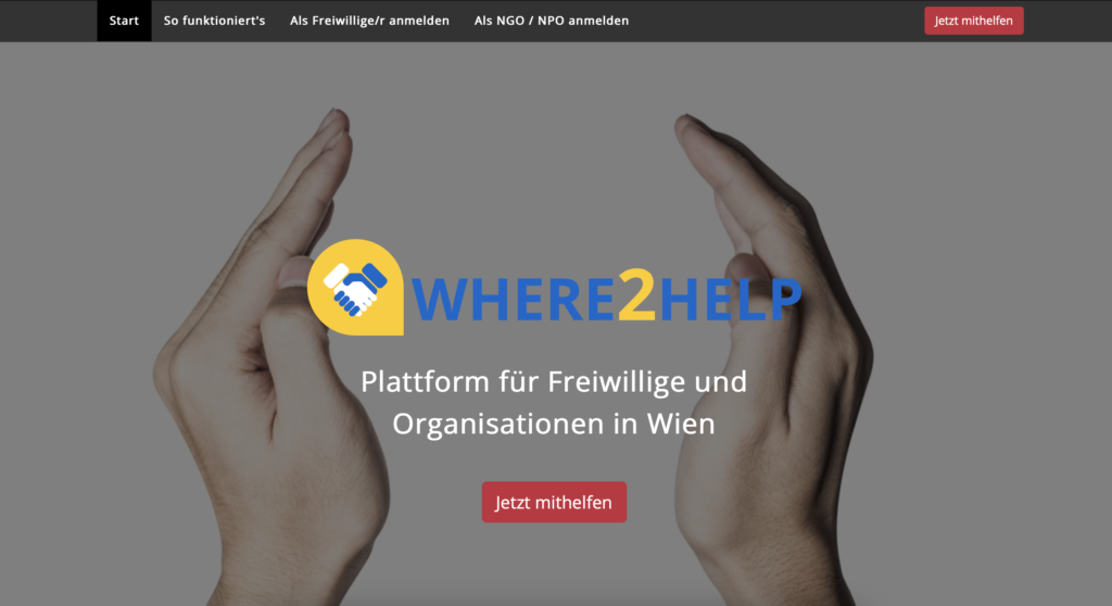
For a lot of people, the official city website is the point from which they define where they need to go or what they need to do for a certain solution to be achieved. And refugees are no exception. 

Government websites serve a variety of helpful functions. It’s crucial to remember that citizens visit government websites for relevant, educational, and, in some cases, urgent information. Today, people expect to find everything online, which means answers to their questions as well. For this, I analyzed and compared the official London city [1] and Vienna city websites. [2]

In 2022 a new London city website was launched. They conducted user interviews (with Londoners) to create a clean, accessible design. [3]

What you instantly see on the main page:
– Information about what Mayor and Assembly do
– Upcoming events
– Priorities
– News
– Tweets from Mayor


But every piece of information has its own block, which makes it easier to understand what you’re looking at. Compared to the Vienna city website, the first thing we see here is – a lot of information in different places.


For example, it would be more difficult for a Ukrainian refugee to spot the information about help because every font looks almost the same (so there is no recognition of what is the headline, regular text, important news, etc.) and photos chosen for the specific information don’t actually represent them.

London city website

Vienna city website

So, if you need to find a specific answer to your question, you would probably need to go through a lot of text and download a lot of PDFs + the information, that will be available to you depends on the language you choose, which can make a person go through more “work” just to find what they need.

Vienna city website doesn’t seem to have its information regularly updated, whereas the UK government uses the London city website to update about their work, what they do for people, and their plans. It is even possible to watch videos about their strategic plans for the future of the city.

ITIF [4] confirmed that 41% of government websites fail the usability test, meaning that these sites had a substantial number of known problems that might prevent someone with a disability from using the site. This is important because the website stores important information for everyday life, and provides help and if it’s difficult for a person to get from point A to B, then it doesn’t reach its main goal. When people turn to government websites, they need to receive the answer as soon as possible, especially if they are a refugee. So, the answer is – yes, government websites can definitely affect certain aspects of life, how easy or difficult you will find your way into living in the city/country.


References:
[1] https://www.london.gov.uk
[2] https://www.wien.gv.at/english/
[3] https://www.london.gov.uk/who-we-are/city-hall-blog/welcome-new-londongovuk-beta
[4] https://itif.org

Enhancing Exhibits with Physical Objects

The Lifelong Kindergarten group at the MIT Media Lab is focused on using technology to support creative learning and playful expression. One of their main research areas is based on a constructivism-based approach, an educational theory that emphasizes the role of active learning and experimentation in the learning process. This approach is one of the key elements that make Lifelong Kindergarten projects accessible and easy to use for people of all ages.

While the Lifelong Kindergarten group’s work is primarily focused on how technology can be used to support creative learning and playful expression, it also overlaps with the field of tangible user interfaces (TUIs). TUIs are a type of user interface that uses physical objects or devices to control and interact with digital information or systems. This can include interactive tables and walls or physical objects such as buttons, knobs, and other controls that can be manipulated by the user.

MIT Media Lab edited by Edwin Lang

Museums and science centers are increasingly incorporating TUIs into their exhibits to enhance the visitor experience. By using physical objects to control digital information and systems, visitors can engage with the exhibit in a more intuitive and natural way. For example, an exhibit about physical forces could be build with a TUI that allows visitors to explore different forces and motion by moving physical objects on a table and visualizing the effects.

Hiroshi Ishii (2008)

One of the key aspects of TUIs is the use of physical objects to control digital information and systems. This is something that the Lifelong Kindergarten group’s approach also involves, as it is based on constructivism, which emphasizes the role of active learning and experimentation in the learning process. This approach makes learning and digital interaction more accessible and tangible, especially for children and others.

References:

interactions: experiences, people technology; Volume XIX.1 2012
Lifelong Kindergarten: Cultivating Creativity through Projects, Passion, Peers, and Play; Mitchel Resnick; 2018
https://tangible.media.mit.edu/vision/
https://courses.media.mit.edu/2015fall/mas834/index.html

Examples of successful interaction design for a sustainable future.

An effective interaction design for a sustainable future will emphasize user demands and goals while simultaneously considering the product or service’s environmental impact. This could include using sustainable materials, conserving energy, and planning for ease of repair and recycling. It could also include features that support sustainable behavior, such as tracking and boosting energy efficiency. The main goal would be to produce a design that is user-friendly and accessible while also supporting long-term sustainability. More specifically, a successful interaction design for a sustainable future may incorporate the following elements:

  • Efficient and user-friendly interface: The design should be simple to use and comprehend, with clear and unambiguous instructions and feedback.
  • Minimalistic environmental impact: The materials and manufacturing processes used should minimize environmental harm and promote sustainability.
  • Energy-saving features: The design should include features that reduce energy consumption, such as automatic shut-off or sleep modes.
  • Durability and longevity: The product should be designed to last as long as possible, with easy-to-repair or upgrade components.
  • Encourages sustainable behaviors: The design should include features that encourage sustainable behavior, such as tracking and promoting energy efficiency, or providing feedback on environmental impact.
  • Accessibility: The design should be inclusive, taking into account the needs of those with impairments, older folks, and users with low literacy.
  • Circular Economy Consideration: The product should be built so that materials may be easily reused and recycled at the end of its life cycle.

That being mentioned we would then like to draw your attention to some of the practical examples of successful interaction design applications for a sustainable future. Of course, the list is not exhaustive.

Energy-efficient home appliances: Interaction design can make home appliances more energy-efficient by making it easy for users to adjust settings, monitor usage, and schedule usage for off-peak hours. For example, smart thermostats can be controlled through a mobile app and can learn user preferences and automatically adjust settings to conserve energy.

source: 5 Facts of Energy Efficient Home Appliances | Visual.ly

Sustainable transportation: Interaction design can encourage sustainable transportation by making it easy for users to plan and track their journeys, find the nearest public transportation, and pay for fares using mobile apps. Especially with  newly trending electric and self-driving cars, usability and affordance should gain focus while designing in order to drive the interest of the customers and users.

source: https://www.arup.com/perspectives/sustainable-urban-transport-in-the-uae

Recycling and waste management: Interaction design can make recycling and waste management more efficient by providing clear, easy-to-understand instructions for sorting and disposing of waste, and by using sensors and other technologies to track waste and alert users when it needs to be disposed of.

Sustainable food choices: Interaction design can help people make more sustainable food choices by providing information about the environmental impact of different foods, and by making it easy for people to find and purchase locally-sourced and organic foods.

Sustainable travel: Interaction design can encourage sustainable travel by making it easy for users to plan and book trips that have minimal environmental impacts, such as by providing information about carbon offset options or eco-friendly accommodations. Also, how do we encourage the reduction of carbon dioxide emissions through the design of engaging and useful transportation solutions?

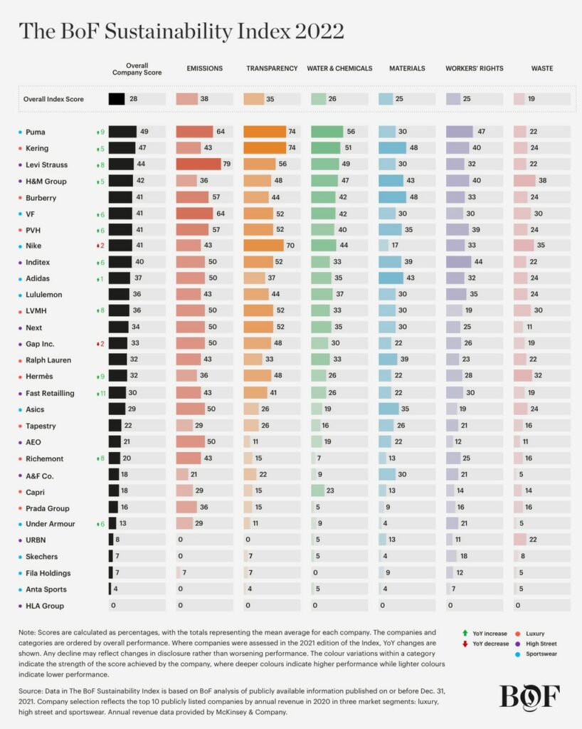
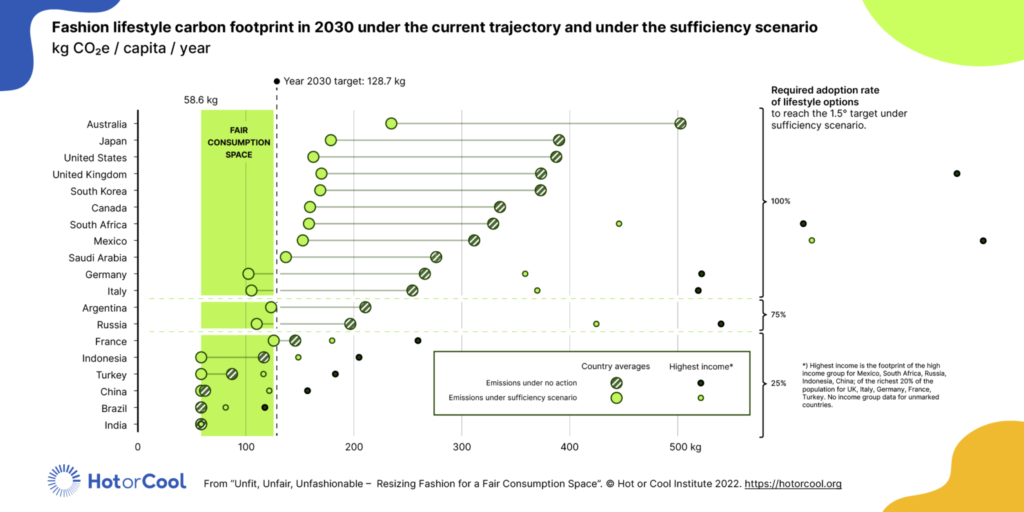
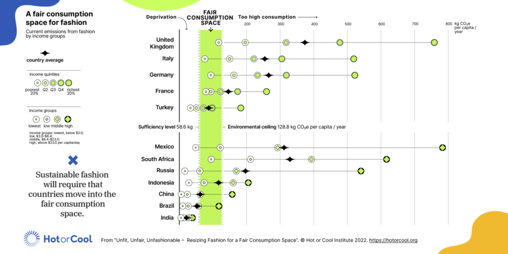
Sustainable fashion: Interaction design can encourage sustainable fashion by providing information about the environmental impact of different fabrics and clothing production methods, and by making it easy for users to find and purchase sustainable clothing options.

Here is also some descriptive example of sustainable design patterns that can be implemented in buildings

Green roofs: This is a sustainable design pattern in which vegetation is grown on the roof of a building. This not only helps to reduce the heat island effect but also helps to insulate the building and reduce stormwater runoff.

Passive solar design: This is a design pattern that utilizes the sun’s energy to heat and cool a building. This can be achieved through the use of large windows that face the sun, thermal mass materials that absorb and store heat, and strategic shading and ventilation to control temperature.

Rainwater harvesting: This is a design pattern that involves the collection and storage of rainwater for later use, such as for irrigation or flushing toilets. This helps to reduce the demand for municipal water supplies and can help to mitigate the effects of drought.

Biophilic design: This is a design pattern that incorporates elements of nature, such as plants, water, and natural light, into the built environment. This can help to improve the well-being of building occupants and can also help to reduce energy consumption.