“Hooked: How to Build Habit-Forming Products” by Nir Eyal
For my 5th Impulse, I decided to choose a book “Hooked: How to Build Habit-Forming Products” by Nir Eyal. At the core of the book lie principles and an understanding of how habits are formed while using certain products or services. The main goal the author had was to show how design decisions can be used to captivate the user’s attention, and make them use the product more.
I chose this book because it also explains the psychology of user engagement but also shows real examples from already existing products and how they were created, which decisions were made, and how they affected the user’s experience.
To my mind, Eyal’s method of the “Hook Model” for product and service creation can be used for my thesis work as well. It will help to create a product that will trigger curiosity and make people engage more. Additionally, by understanding and using psychological drivers for habit formation, it is easier to design a product that really resonates with people.
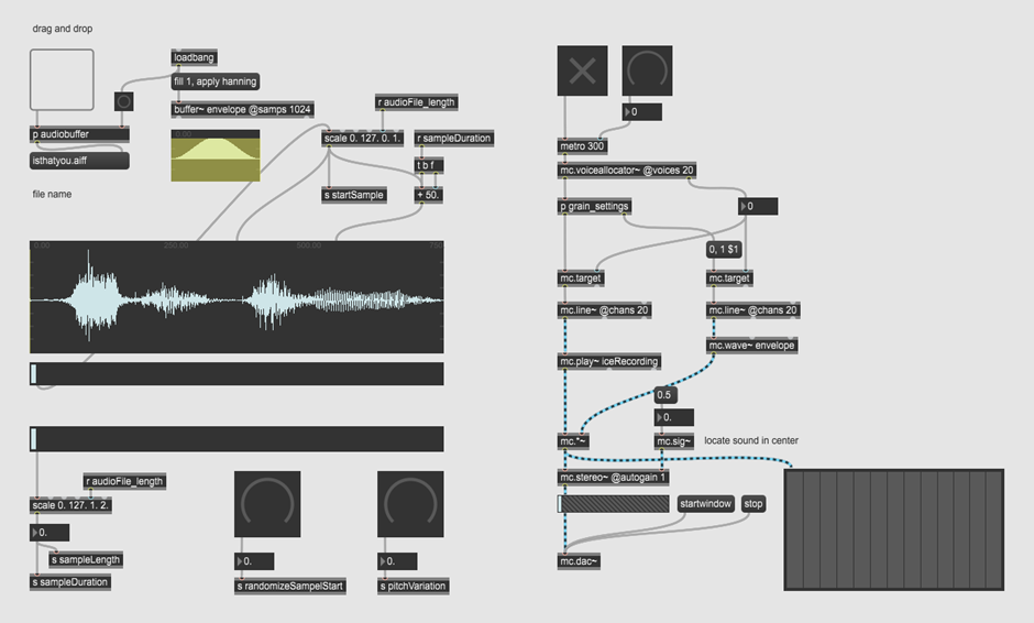
For this blog post I took a tutorial class about Max MSP integrated MC objects and their capabilities for programming granular synthesis. The tutorial series consists of 5 parts and was held by Federico Foderaro who has the YouTube channel Amazing Max Stuff.
Granular Synthesis Granular synthesis is based on the same principle as sampling, however with samples split into many pieces of around 1 – 100 ms of duration.
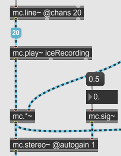
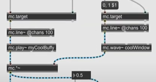
First, he gave an introduction to MC objects which allows us to send multiple channels of audio in a single patch cord. So, in general we have the possibility to operate on many channels of audio at the same time while preserving a rather simple patch environment.
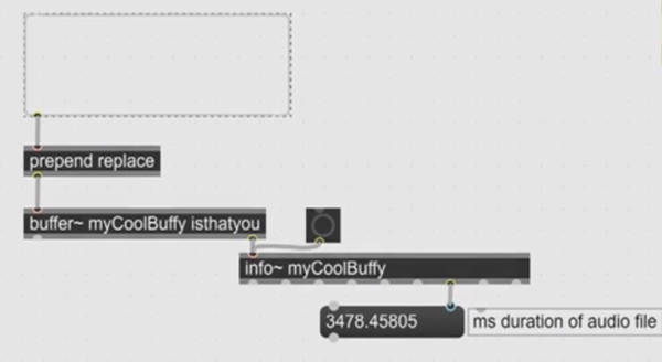
First we build the core structure of our audio playback system. Therefore, we need an audio file which is being loaded into a buffer Object and get information about playback time with the info Object.
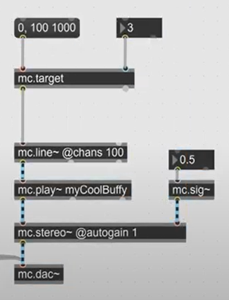
The following MC objects in Max MSP can process multiple channels in one object:
mc.traget – takes on the left side a message which is passed on to the mc.line object and on the right side a channel number to which the message is send.
mc.line – counts from 0 to 1 in a given time.
mc.play – reference to the loaded buffer and plays the audio file at the triggered channel number.
mc.stereo – converts the audio signal into a stereo signal.
mc.dac – sends the signal inputs to the audio hardware.
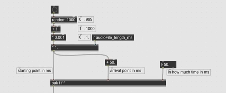
Now we want to be able to play multiple smaller pieces of the audio file at different positions and with different pitch.
For this we will create a random number between 0.001 and 1.000 and multiply it with the audio file length. Then we define the end of our playback by adding for example 50ms to the start and play the file with the same speed of 50ms.
To play multiple samples at the same time we now replace the toggle with a metro Object that sends a bang every 10 ms. To avoid a clicking produced when a file has not finished playing and gets replayed we first duplicate MC target and MC line and then apply an envelop to every sound being played which gets later multiply with the corresponding channel of the audio playback.
Later we can add a parameter to adjust the playback start position with a slider and randomize it with a knob. The pitch variations will be also realized with random number that can be controlled with a second knob and controls the playback speed per channel.
Granular synthesis is characterized by sample lengths of 1 – 100ms, however I found out that for my recording of cracking ice this duration is too small. I still want some sound characteristics of the original file while being able to play multiple versions with different pitch to produce a controllable intensity of cracking ice. Therefore, I adapted the parameters and added a second slider to be able to define a custom playback length that gives the opportunity to incudes important parts of the sample.
Auf der Suche nach Literatur zu meinem Thema stieß ich auf eine interessante Studie vom 23. Oktober 2023. In dem Paper „Glazko, Kate S., et al. “An Autoethnographic Case Study of Generative Artificial Intelligence’s Utility for Accessibility.” Proceedings of the 25th International ACM SIGACCESS Conference on Computers and Accessibility. 2023“ untersuchte ein Team von Wissenschaftler*innen aus den USA, New York, die Nützlichkeit von generativer künstlicher Intelligenz (GAI) für die Bedürfnisse von Menschen mit und ohne Behinderung. Die Testpersonen nutzten verschiedene GAI, darunter Github Copilot, Midjourney, DALL-E, GPT-4, GPT3, ChatPDF und Bing, um ethisch bedenkliche, voreingenommene und/oder diskriminierende Annahmen zu untersuchen.
Mit Amalgamen erforschten sie in 7 Fallstudien zwischen März 2023 und Oktober 2023, ob ChatPDF ein barrierefreies PDF erstellen kann. Ein Autist durchlief diverse GPTs, um Texte zu übersetzen und von anderen bewerten zu lassen. Ein blinder Softwareentwickler ließ mit GAI Code für eine App erstellen und baute diese. Eine Fallstudie prüfte HTML-Inhalte durch GPT-4 auf digitale Barrieren. Und noch weitere 5 Fallstudien. In allen sieben Fallstudien war der GUI-Einsatz unbefriedigend und begünstigte Behindertendiskriminierung. Ein Beispiel war die Frage an Midjourney: “group of people with a variety of disabilities looking happy, illustration format” The resulting images are not representative of many disabilities and “inaccurate [in their] use of assistive technologies” even after specific requests in new prompts. Also, despite repeated attempts to vary the prompt, Midjourney can “only represent disabled happiness as attending a party”.. [S.4]
Zusammenfassend schließen die Forscher*innen darauf, dass dies auf ein “lack of relevant training data” und “Build-in Ableism by biases in training data” zurückzuführen ist. Ohne ethisch besseres Material für Machinelearning wird diese Hürde immer bestehen bleiben.
Vieritz, Helmut. (2015). Barrierefreiheit im virtuellen Raum: Benutzertentrierte und modellgetriebene Entwicklung von Weboberflächen. Wiesbaden: Springer Verlag
Ich habe mir das Buch Vieritz, Helmut. (2015). Barrierefreiheit im virtuellen Raum: Benutzertentrierte und modellgetriebene Entwicklung von Weboberflächen. Wiesbaden: Springer Verlag. ausgeliehen in der Hoffnung, daraus für meine Masterarbeit zitieren zu können. Leider musste ich feststellen, dass der Inhalt zu technisch und spezifisch für die Softwareentwicklung im Bereich digitaler Barrierefreiheit ist und nicht ausschließlich auf Weboberflächen abzielt. Zwischendurch schreibt der Autor auch über Coding Standards, die ich zwar verstehe, aber für meinen Fall weniger anwenden kann. Daher werde ich dieses Buch nicht als direkte Quelle verwenden können. Aber, was ich trotzdem gefunden habe, sind ein Haufen weiterer Quellen und Referenzen. Meine Literaturrecherche erweitert sich nun und ich habe eine Menge an weitere Nachschlagewerke gewonnen. Und nicht nur das, durch die vielen technischen Einblicke konnte ich zudem auch einiges über DIN und ISO Normen in diesem Bereich sowie über Rechtstexte und Gesetze erfahren, an was ich zuvor nicht gedacht habe, aber durchaus wertvoll für meine Zwecke sind.
The term gamification emerged around 2010. It serves as collective term for including game-based elements into non-game-based activities and applications. Using game elements should increase the engagment of users and enhances User Experience. Most importantly it make non-gmae-based tasks more interessting, engageing and the user is more motivated to finish those tasks. (656-657) [1]
It is worth to take a look at the concept of gamification pattern. There are certain pattern that are very successfully used within non-game apps and software. It is well reasearched that certain pattern can lead people to get addicted to games, so some of those pattern should also work in normal environments, and indeed it does. Still it is important to distinguish between motivational design patterns and game design patterns. While motivational pattern offer more autonomy and flexibility, they can be combined in parallel, Game design pattern are influencing each other. A motivational pattern must meet user needs to be successful. It is not neccessary for the user to understand the functionality. For successful implementation, a motivational design pattern must meet user needs, even if users aren’t consciously aware of its functionality. Whereas recognising a pattern is important for gamification makes it possible to find order in chaos and/or recognise connections between different types of information. Humans are used to recognize pattern, existing in concepts, behaviors, historical events. They are important or us to make the future more predictable and guide our decision-making across various fields. So it is also a part of the gamification pattern to find those patterns. Successfull and effective gamification relies on our motivational drivers rather than just on including game elements ike badges, points, or leaderboards. Yu-kai Chou is a researcher in the filed of games. He created the „Octalysis framework“, in which he outlines eight core drivers of motivation. Those are essential for successful games. While this is very interesting for games, it is not so neccessary for gamification. (665-667) [2]
Nadya Direkova is a known designer and User Experience Manager at Google Fitbit. She previously directed R&D at Airbnb and helped establishing Google’s Sprint Leader Academy. She is also very exerienced with game design pattern. [2] According to her, in gamified applications there are three critical aspects of user engagement: the first one is to encourage users to try, second is the social participation, and keeping the users commitment. Each one involves specific design patterns used for various stages of the user journey.
Direkova defines three gamifaction stages that are neccessary for successfull user engagement:
“Come and try the new gamified product or service,”
“Bringing Friends to try the new gamified product or service”
“Come back to retry the new gamified product or service (as frequent customers)”
These aspects are crucial for successful gamified applications and they rely on the implementation of various game mechanics. These can be categorized under each of the three stages:
Prize and Awards: This is used to attract user interest, often seen in gaming and non-gaming contexts.
Visual Storytelling: Integration of visual features to increase engagement and effectively communicate values
Visual Cues: Visual elements in software applications are specifically designed to ease user interaction.
Tutorials and Coaching: Those are designed to help users with navigation and specific features.
Reward Schedule: Rewaring user for tasks in moderate dosage to maintain motivation
Gated Trial-Form a team to start: This encourages social engagement by inviting users to work together.
Design Conversations: Easy social feedback and bondage through chat and comments.
Structured Social Feedback: Urges users to express opinions and preferences, allowing vital feedback.
Reputation: Establishes user status within a community or platform, fostering belonging and engagement.
Sharing Achievements: Allows users to showcase their achievements to others, boosting engagement.
“Come back to retry the new gamified product or service (as frequent customers)” patterns:
Create Scores: Monitoring and displaying scores that drive specific behavior or actions.
Throttle Actions: Gradually presents challenges after achieving scores, maintaining user interaction.
Advanced User Paths: Offers simple-to-complex tasks, such as assigning privileges based on user ranks, fostering continuous engagement.
These patterns are engaging users at different stages. Implementing those pattern is fundamental for successful gamification in software applications. [1] (667-671)
Those design patterns can be also be used in other environments, they can play a vital role in teaching and learning. Ivanov and Breuer colleced a set of 36 design patterns that can be used in the field of innovations.
These patterns are structured across four dimensions:
I. Domains of challenges: 12 domains linked to operational, strategic, and normative innovation management
II. Challenges tackled by gamification: Focused on typical innovation and entrepreneurship challenges
III. Flow patterns: These are reusable interactions among participants that address specific innovation or entrepreneurial challenges. There are 11 flow patterns such as Agile Retrospective, Ideation, and Workshop Facilitation.
IV. Component patterns: These are standalone game elements. There are 25 component patterns like Challenges, Rewards, Storytelling, and Voting.
The study focuses on innovation management, but also has potential for application in other areas. These patterns provide solutions for abstract concepts to translate them into working practices. Flow patterns get participants to understand values in different organisations. Gamification workshops raise awareness of new values and encourage experimentation with real-life tasks.
[1] Gamification Design Patterns for User Engagement, Serafeim A. TRIANTAFYLLOU1, Christos K. GEORGIADIS, Informatics in Education, 2022, Vol. 21, No. 4, 655–674
[3] Design Patterns to Teach and Learn About Gamification for Innovation, Kiril Ivanov, Henning Breuer, This paper was presented at The ISPIM Innovation Conference – Innovating Our Common Future, Berlin, Germany on 20–23 June 2021. Event Proceedings: LUT Scientific and Expertise Publications: ISB
Inclusive Design means for everyone and every situation. Accessibility enhences usability. Therefore good responsive design plays a crucial role in inclusive design practices. Following some responsive principles, ensures inclusive and user-friendly digital experiences across diverse devices and user preferences.
Content breakpoints or tweakpoints One crucial aspekt that springs in mind when talking about responsiveness are breakpoints. Creating fixed breakpoints however will not always lead to a good experience according to the diverse range of viewport variations available. Instead, designers should create flexible design from the beginning, implementing breakpoints where the content breaks the layout. This delievers successful layouts across various devices. As the content reaches a point of collision, overlap, or wrapping, when resizing the window, it becomes evident where breakpoints are needed.
Avoid fixed width or heights
Another rule according to always deliver a good content is to avoid fixed widths or heights off elements. Instead use the innate flexibility of boxes to accommodate content across various spaces.
Pinch-to-zoom
Another pattern, a more technical one is the enabling of pinch-to-zoom via the viewport meta tag. It is essential for responsive design functionality. Disabling this feature can make user experience worse by making text too small to read, limiting the view of image details and making it utterly complicated to select text for copy/paste.
Responsive Font-size
A good practice for setting font-size in responsive design is setting the font size as a percentage on the root (<html>) element. For consistency when resizing font-size, padding, and margin, relative units like rem or em are to be preferred. These units ensure that scaling is proportionately on all pages, so it is also easy to use for consitency reasons.
Viewport units
Additionally, viewport units (vh and vw) can be used to create text that scales relative to the height or width of the viewport. Using viewport units enables responsive text without the use of extensive media queries. This guarantees a minimum font size and allows incremental scaling and proportionate adjustments relative to the viewport size.
Website Structur
The use of semantic HTML guarantees technical accuracy for users of assistive technologies and at the same time determines the interaction behaviour for predictability and efficiency.
Webfonts
Although there are special fonts for the web, webfonts can still become a major issue for readability. There is an effect called FOIT (flash of invisible text), which might leave users on a page without visible text if the font is not loaded. To avoid this a default font should be embedded in the stylesheet. This in turn, might show the text but might result in FOUT (flash of unstyled text). It causes a sudden transition and jumping of linies when the system fonts changes to web fonts. To avoid this select a fallback system fonts with similar intrinsic dimensions.
Skip Link
Skip links allow keyboard users to easily move through the page via keyboard and bypass the navigation and header content. They primarily help screen reader users, but are also helpful for those who rely on keyboards by providing efficient navigation.
Formating Text
Text can be a big pitfall when it comes to readability. Although it should be clear by nowadays that text must be formatted according to the medium and that different principles apply to the formatting of text on the web than in print design, it very often happens that texts on the web are difficult to read for all users because this has not been taken into account.
Text justification is almost never a good choice. It works in print because there you could manually break lines and avoid empty spaces but it will not work with flexible boxes. This diminishes readability due to uneven word spacing for all users, not only handicapped ones. Using the default text-alignment left provides better readability. Also adjusting the line height or leading of textblocks is neccessary. A bigger line-height makes ensure readability.
Content
When it comes to content, it is essential to be aware of the importance of creating engaging and accessible content. Writing content is often outperformed by the visual design. Nevertheless it is an essential aspect of designing a website that deserves equal attention. Content creation should not be postponed and must be integrated into the overall design strategy.(66) The readability of written content relates to comprehension. Tools such as the Flesch-Kincaid readability test can be used to assess content. Content is scored on a scale from 0 to 100, with a higher score indicating a more reader-friendly text. Similarly, the Flesch-Kincaid level test gives a US school grade indicating readability based on the age of the target audience. A higher grade indicates more complex content that is less accessible to younger readers. (88-89)
Videocontent
It is good practice to subtitle videos. Closed captions contribute greatly to inclusion. Subtitles should be available as a separate file rather than embedded so that users have the option to enable or disable them. Subtitles in videos are important, improving accessibility for a wider audience. They serve not only the hearing impaired, but anyone temporarily unable to hear audio, in public places for example. (97).
Links
Links should be labled. For screen reader and keyboard support, identifying links could be a challange. This additional text should not replace the existing link text, but rather be appended or prepended to it. The use of visually hidden text that is accessible to screen readers, such as “Current page”, is a suggested approach to improve link identification (135). Labelling interactive elements is fundamental to accessibility. Each interactive element should have an accessible name to facilitate interpretation and communication using assistive technologies. This is in line with WCAG criterion 4.1.2. Such considerations contribute significantly to the creation of an inclusive digital environment. [1]
One of the main ressourches or accessibility are W3C specifications for accessibility which offer implementation solutions aligned with the accessibility guidelines. This approach closes the gap between human-computer interaction and the development of accessible web applications.
Accessibel patterns are categorized according to three primary functions. The three categories are:
Web content: How the content is organized on the webpage
Navigation structures across all pages
User interaction components, such as CTA-Buttons
This pattern language presented at W3Cis a reference for web designers and accessibility tester. It presents a structured overview of design knowledge regarding accessibility. The classification of the patterns according to functions and the abstraction level makes it easy to pick the relevant patterns for each specific design issues. It is crucial to prioritize accessibility in structure and content for the web. [2]
2 Daniela Fogli, Loredana Parasiliti Provenza, and Cristian Bernareggi. 2010. A design pattern language for accessible web sites. In Proceedings of the International Conference on Advanced Visual Interfaces (AVI ’10). Association for Computing Machinery, New York, NY, USA, 307–310. https://doi.org/10.1145/1842993.1843048
At the WUC 2023, I participated in one of the workshop led by Sabina NB about “Design Declutter – a hands on guide” The workshop focused on the use of design methodes to soptimise our lives. Sabina, is an Human-Centered Design specialist. She told us how to analyzing our digital media habits to declutter our life from stressful habits with digital media.
Based on UX design research strategies, we tried to better understand our habits with dsmartphone and social media plattforms. Questioning ourslelfe we scrutinised our relationship with our everyday habits with the smartphone from waking up until the end of the day. We oberserved our daily routine to find out about where we could improve our habits. With this observation and self-interviewing, we should be able to identify stress-inducing patterns and inefficiencies in our digital consumption.
Using the principles of human-centred design, we tried to become more conscious about the use of digital media. We understood the importance of developing solutions that are specialy designed to our individual needs to ensure that our digital activities align with our goals and our lives. She also emphasized the importance of building a team of friends to sustain the changes. A team like family or friends is often a good supporter to help you keep up the strategies for a more balanced life with digital media.
Sabina’s workshop provided a holistic insight that used UX design methodologies to gain personal development. It encouraged us to reimagine and refine our digital lifestyles. The idea was that we as designers us the tools and strategies we already have to create a more mindful interaction with digital media in our daily lives.
Impulse II
How bad UX can lead to catastrophes
Usually UX problems are just annoying and can annoy and drive customers away but in some cases bad UX is fatal. That happens when boing devloped his new Maneuvering Characteristics Augmentation System (MCAS) for Boeing 737 Max for more aerodynamic stability. This system has major design flaws which led to critical problems. The system intended to prevent stalling by automatically adjusting the plane’s nose, but Boeing failed to communicate this addition to pilots effectively.
Two planes crashed due to this failure and shows the disastrous consequences of inadequate human-computer interaction in aviation. Neglecting UX design rules cost 346 lives and costs Boeing dearly.
The design flaws in the MCAS system of the Boeing 737 Max can be understood through Jakob Nielsen’s usability heuristics to see the key issues:
Visibility of system status: Pilots were not informed about the MCAS activation or the erroneous data from the AoA sensor, lacking crucial warnings or indications. An optional AoA Disagree Alert could have aided pilots, but it wasn’t included.
Help users recognize, diagnose, and recover from errors: Pilots faced the consequences of the system’s error without any clear error messages. They needed information on what was causing the plane to dive and how to counteract it.
User control and freedom: Pilots lacked a clear emergency exit from the situation caused by MCAS’s erroneous decision. They couldn’t easily override the system, leading to a struggle to regain control.
Help and documentation: The aircraft manual failed to offer timely help during critical moments, forcing pilots to juggle through it without finding any helpful information. The lack of a user-friendly manual compounded the crisis.
These problems could have been addressed with a cockpit warning light for MCAS status, proper scenario testing, and an easy-to-use manual providing real-time guidance. A more comprehensive testing approach and an AI-based system capable of offering instant guidance during emergencies could have averted these disasters.
Was Boeing 737 Max Lion Air Crash Caused by Poor UX Design? Greg Nudelman Oct 31, 2019 https://medium.com/@greg_2590/was-boeing-737-max-lion-air-crash-caused-by-poor-ux-design-aa04c7a7d285
Fatal UX — How a poorly designed feature led the Lion and Ethiopian Airplanes to Crash Raju Verma https://medium.com/@raju.vrm2/fatal-ux-how-a-poorly-designed-feature-led-the-lion-and-ethiopian-airplanes-to-crash-dae475564c4
Impuls III
Does AI kills jobs in creative industries?
People in the creative business are worried about AI taking over their jobs. AI can generate pictures, write Stories, create logos a lot faster than humans. Ashley Still, Adobe’s senior vice president of digital media, compares AI to the invention of the camera. She believes AI won’t eliminate graphic design roles. She said that the develpoment of digital cameras has not replaced professional photographers. Adobe recently introduced new AI features, like text-to-template capabilities, across its Creative Cloud tools. They emphasized the need for design-focused people to guide AI effectively. Despite fears among people in creative industries about AI job displacement there will always be humans neccessary to supervise AI and ensure proper system functionality. But the rise of generative AI will reshape creative jobs. And will these tools support or hinder our creative evolution? Can AI really be creative?
Creativity, as defined by Margaret Boden in “The Creative Mind,” encompasses two human types: psychological (p-type) and historical (h-type). The P-type is about thinking of something new, even if it has been thought of before, and synchronising thoughts with others, like a child recognising the adaptability of water. The H-type is about groundbreaking thoughts that have never been conceived, like Archimedes’ “eureka” moment. Extraordinary legacies, such as Wandjina’s petroglyphs or Einstein’s work, characterise thinking. Generative AI does not fit into either category. AI lacks the neccesary connection between mind and reality to work like human creativity. AI is based on statistical data. This limits its relevance in the real world and its ability to trigger “eureka” moments. To distinguish AI-driven creativity Boden coined the term “generic” (g-like) creativity, which recognises the innovation of AI within its data constraints. It is expected that the widespread use of AI will lead to an increase in generic creativity, resulting in less cognitive diversity and cultural rigidity. This could limit creativity and social flexibility and impact everything from our living spaces to shared environments. By incorporating more and more content into AI, the results are becoming generic. While AI is good use for specialised tasks, its omnipresence brings the danger of a generic spiral that could lead to an Orwellian-like political economy. To preserve human creativity, human creativity must be prioritised over artificial creativity. Legal frameworks, especially intellectual property laws, are crucial. If AI is restricted by rights such as “fair use” of copyrighted material can change further development of the creative system. The impact of artificial intelligence on jobs, whether for high-skilled or low-skilled jobs – have often proven wrong. Historical predictions, such as those about computers in the 1950s, underestimated the long-term impact and created new job categories instead. The rise of AI raises concerns about job displacement, but predicting the exact impact remains difficult. Human imagination and creativity are benefiting from the advances of AI, and our work life will continue to be defined by our human qualities.
UX Optimizations For Keyboard-Only And Assistive Technology Users with Aaron Pearlman
Aaron Pearlman´s speech is about the importance of optimizing designs for Keyboard-Only and Assistive Technology users in web applications. He introduces himself as the Principal User Experience Designer and proceeds to discuss the importance of optimizations on keyboard navigation or assistive technologies. The target users are people who use keyboards to navigate web systems. They might have problems with motoric skill or visual impairments. Therefore designers need to consider incorporating assistive technologies like screen readers or braille readers.
He explaines three major categories of optimizations:
skip links
modal enhancements
focus handling
Skip links menas to allow users to skip sections of a webpage, making it easier for Keyboard-Only and Assistive Technology users to reach the main content. There are different types of skip links like displacement, overlay, and multiple skip links.
Modal optimizations means that the focus is set within within modals. Some examples of modal behavior show where focus is not properly trapped explain the significance of focusing on modal content or headers for better accessibility.
He also talks about the UX design process, discussing its discovery phase and the importance of thinking about accessibility from the beginning to throughout the whole design process. He introduces Deque’s Trane, an accessible pattern library, and how it can help create accessible web applications.
Impulse V
User Needs/User Requirements vs. User Stories
Im Alltag, wenn agile Prozesse eingesetzt werden kommt es immer wieder zu einem grundlegenden Missverständnis zwischen Product Owner, Requirements Engineer und UX Designer. Ein Hauptproblem ist oft das fehlende Verständnis für Erforschung der Bedürfnisse der Nutzer. Projektleiter auf der Kundenseite und Product Owner auf der Seite der Entwicklung stellen ihre Schlussfolgerung und damit Lösung oft einfach über die Notwendigkeit mit dem Benutzer zu sprechen. Oft ist das einfach der Bequemlichkeit geschuldet und dem Umstand, dass User Stories ausreichend sind um ein Produkt zu umschreiben und zu erstellen. Eine User Story hilft aber nicht dabei eine benutzerorientierter Lösungen zu finden. Im Gegenteil verhindert eine übereilt erstellte User Story einen passenden Lösungsansatz.
Was ist im Umfeld des UX-Designs unter Benutzerbedürfnis zu verstehen? Formal ausgedrückt heißt das: Benutzerbedürnisse sind die Dinge, die Menschen von einem Produkt oder einer Dienstleistung brauchen, um eine Aufgabe ausführen zu können. Um die Bedürfnisse der Benutzer zu verstehen, muss man in die Erfahrung der Benutzer eintauchen und sich in ihre Probleme, Motivationen und Ziele einfühlen. Es geht darum, relevante Fragen zu stellen wie: Vor welchen Herausforderungen stehen die Nutzer? Was sind ihre Ziele? Was erwarten sie von dem Produkt oder der Dienstleistung?
Das wichtigste ist: Die Bedürfnisse der Nutzer legen keine spezifische Lösung nahe! User Stories hingegen, wie sie im agilen Entwicklungsumfeld genutzt werden, bieten eine Lösungsperspektive. Sie bescheiben, wie ein Benutzer mit einem Produkt oder einer Dienstleistung interagiert, um ein bestimmtes Ziel zu erreichen. Diese Geschichten skizzieren das “Wer”, “Was”, “Warum” und “Wie” der Benutzerinteraktion.
In der agilen Entwicklung werden User Stories verwendet, um Funktionen und Features eines interaktiven Systems in verständlicher Sprache zu beschreiben und zu priorisieren. Die Lösung selbst ist bereits vorgegeben, ob eine vorherige UX-Phase durchlaufen wurde oder nicht.
Wikipedia: „A requirement is a formal description of a need, a user story is the informal description of a feature”
Eine User Story hat in der Regel das folgende Format: “Als [Benutzer] möchte ich [eine Aktion] durchführen, damit [ein Ergebnis] erzielt wird”. Diese Form klingt zwar nach einem Bedürfnis, wenn zuvor aber die eigentlichen Nutzerbedürfnisse nicht identifiziert werden, ist diese Formel nur eine leere Floskel. User Stories sind Beschreibungen von schon gefassten Lösungen, welche sich häufig nicht auf tatsächlich ermittelte Ziele oder Anforderungen der Benutzer im Nutzungskontext beziehen. Im Arbeitsalltag erschwert dieses Unverständnis die Zusammenarbeit zwischen PO, UI/UX Designer, Entwickler und trägt nicht zu einer benutzfreundlichen Lösung bei. Es geht bei der Entwicklung von digitalen Produkten nicht nur um die Erfüllung einer Liste an funktionalen Anforderungen, sondern darum, die Bedürfnisse des Benutzers zu verstehen um dann diese Bedürfnisse mit dem Produkt zu erfüllen. Wie diese Lösung aussieht soll im UX-Prozess und vom UX Designer ermittelt werden, erst danach formuliert man die User Story für die Umsetzung.
Aaron Walter’s Book “Design for Emotion” deals with the integration of emotional elements into the design to provide better user experiences. TIn his book, he writes about the important role that emotions play in the design of products, services and digital interfaces. He highlights the big part emotions hold in the interaction of individuals and technology. Emotions like joy, surprise, sadness, or fear should be used to create a connection between users and the product
To integrate emotions or evoke them with the design can have a huge impact tof the perception of a product. He explains that while usability and functionality are crucial, they alone might not be responible for customer loyalty and bond with the product.
Walters also presents approaches, methodologies, and real-life case studies. These are guiding principles for designers, and show how to embed emotion into the design process.
Human emotions intertwine with cognitive processes, leaving an imprint on the memory. Emotions, generated and stored within the limbic system of the brain, are very strong and determine our perceptions and responses for a product. By evoking positive emotions, designers can steer users to overlook imperfections and errors, provide guidance and lead them on to to things. There was a study that people tent to overlook bad usability when the UI is beautifully made. Still a lack of functionality, reliability, or usability, will damage the envisioned positive experience and could lead to user frustration.
Our perception of beauty often reflects our innate ability to extract meaning from forms. The human mind identifys patterns and shapes. If a design is flooded with elements it can overwhelm users and lead to cluttered design, lacking clarity and comprehension. Therefore design shoudn´t be merely ornamental. but neglecting aesthetics undermines the overall impact of functionality. Personal objects mean more to people and creates deeper connections. Therefore design should be able to adjust and better be adjustable. Personalisation is a good way to better user experience. Emotional design should help human-to-human communication. Its is not essential to create a good connection with the computer. Nevertheless the design needs to understand and follow real-life interactions. Emotional design isn’t only about aesthetics. It is about integrating emotions into the every part of the design, enriching user experiences through profound and engaging interactions.
As technology evolves and user behaviors changes, there are always new challenges for the UX industry. Some articles of UX designers claim UX is on the decline, but is that true? There are some arguments that might lead our perception into that direction:
The massiv interest and hype in UX design led to a market saturation and overcrowded market. The result is that there are fewer entry-level opportunities for newcomer. They often find it challanging to get a good position and start their UX career. This over-saturation represents a significant challenge. Bad circumstances, like economic stagnation or declinement can withhold technological or any investments and growth. That means that there are reduced budgets, layoffs, or a slowdown in innovative projects, which affects UX within the industry. With the opularity of UX careers, there came the self-learning and consulting businesses. Numerous educational programs and bootcamps evolved, but not all have high-quality standards, which produces underqualified professionals. People often struggle with real life circumstances like what they had been taught and what is needed in a project. A big thing is that for some jobs you need design skills. Making visually appealing interfaces with optimal functionality is a challenge. Providing that balance ensures a good user experience. Not every UX Designer is also a good UI Designer. Also meeting diverse user needs is a challenge. Accommodating various user groups requires a deeper understanding of diverse needs. This includes considerations for accessibility, cultural differences, and varying user expectations. And of course a good understanding of all stakeholders and keeping the budget in mind. Good teamwork with diverse stakeholders is crucial. It is a priority to keep good communication and relationship with all stakeholders.
Constant technological development makes it neccessary to know new devices, platforms, and interaction tools. Designers have to constantly keep up with this fast evolving tech landscape. Staying ahead of the changes and designing flexible experiences is key to success.An important part of UX is also the ROI and impact of UX improvements on the business which is always challenging. Demonstrating the value of UX in terms of user satisfaction and business success requires ongoing reasearch and analyses. This challenge is about effectively presenting the tangible results of UX efforts. Exept for the first problem with the market situation those are ongoing, problems but are there some real future challenges we are not aware of yet? Of course the evolution of technologies like AR, VR, AI, and IoT creates new challenges. To integrating and work with these technologies requires not just an understanding of the experience those technologies offer but also a technical understanding. Designers have to learn this new technologies. With globalization comes also challenges. We need to understand diverse user perspectives and cultural differences. As the world becomes more interconnected, knowing about cultural differences in design becomes a crucial factor for a product´s success. Designers are also very responsible for maintaining thical standards in design practices, privacy, accessibility, and responsible AI use.
And what about AI, will it be a helpful tool or replace designers? AI often raises questions and concerns about its impact on job roles and the future of designers. While AI definitly provides opportunities to enhance and make certain aspects of UX design more effitient, its will not replace the designers.AI can be a helpful tool by automating repetitive tasks such as data analysis, pattern recognition, and generating design iterations based on user feedback. It enables designers to focus on more creative and strategic aspects of their work. AI can help with personalization based on data-driven insights, predicting user preferences for bespoken experiences. Also it could assist with prototyping and design generation. What AI can not provide is the Human-centric aspect like understanding human emotions, motivations, and behaviors. AI is not able to solve complex problems, as it has to take different perspectives, cultural nuances and ethical considerations into account. These are areas where AI lacks contextual understanding. The technology will always struggle with ethical and moral decisions, also emotional design, creating experiences that deeply connect with users, remains a strength of human designers.
The masterclass is from Mia Guo, a Senior UX Designer at Magic Leap and a Harvard alumna. She is crafting immersive experiences in Extended Reality (XR). Mia explains how to build compelling XR experiences, emphasizing three design principles that define the user experience: Information Hierarchy & Density, Context, and Usability.
Understanding the context off an XR product is very important. You have to understand the setting in which the product will be used and how various factors might impact the UX. Mia categorizes XR applications into four main pillars: XR Training and Simulations, XR Gaming, XR Workspace, and XR Communication and Social Interaction. Each of these areas presents unique challenges and requirements. For instance, in XR Training, replicating real-world scenarios for professionals like firefighters. They need the most authentic environment to improve real-life skills. XR Gaming requires considerations of gameplay mechanics that make use of the interactive capabilities of the XR technology. In XR Workspaces, enhancing efficiency while ensuring security and integrating the app with existing systems is crucial. Safety measures in noisy or hazardous environments, such as manufacturing facilities, have to be consider. In XR Communication and Social Interaction, it is important that users can personalize the app and to offer emotional feedback and expressions within the XR environment.
Usability is a very important factor for a good immersive experience. XR apps can be very complex and hard to learn, therefore the onboarding process becomes a critical aspect. Users need guidance on navigating XR interfaces, including learning how to use controllers and accessing tutorials easily within the app.
Information Hierarchy & Density is also an important point for user navigation and the overall user experience. Designers need to reduce the cognitive load, improve task efficiency, and enhance safety and contextual awareness. This means prioritizing important elements in the XR interface through size, color, positioning, and effectively organizing information to minimize visual clutter. In XR this is even more important than in normal UI/UX Design.
There are also some other things to consider like technical limitations, including motion sickness, tracking accuracy, and glitches. Overcoming these problems is essential, because the user retention rate because of discomfort and complexity is very high.
Kristina Heidinger, BSc, Faculty of Informatics, TU Wien, Advisor: Ao.Univ.Prof. Dipl.-Ing. Dr.techn. Peter Purgathofer
Gestaltungshöhe
Die Arbeit ist für eine Diplomarbeit nett gestaltet. Der Text bzw. die These wird mit Bildern erläutert, das lockert die Arbeit schon ein wenig auf. Die Bilder wurden in den Text eingebunden. Überschriften und Titel sind gesondert gestaltet und die Gliederung im Text ist auch durchdacht.
Innovationsgrad
Die in der Dissertation vorgestellten Methoden sind alle bekannt und weisen daher einen mäßig hohen Innovationsgrad auf. Die Generative Walkthroughs verwenden soziotechnischer Prinzipien und stellen daher einen neuen Ansatz zur Entwicklung von Designalternativen dar. Während das Konzept des szenariobasierten Designs nicht neu ist, sind die Anwendung von Prinzipien wie “Situated Action”, “Rhythms & Routines” zur kreativen Ideenfindung für die Neugestaltung eine Neuerung. Die Methode GWIDO (Game with Interaction Design Objective) bietet die Möglichkeit, große Gruppen von Benutzern zu befragen, um die beste Wahl für ein UI-Element zu treffen. Während es nicht neu ist für Design-Feedback mit Benutzern zu sprechen, ist in der Anwendung von GWIDO in einem interaktiven, spielerischen Rahmen innovativ.
Selbstständigkeit
Die Arbeit stützt sich stark auf bestehende Methodiken und Literatur. Die Autorinn greift auf vorhandene Theorien und Forschungsergebnisse zurück, um ihre Arbeit zu untermauern. Die Arbeit verwendet eigene Untersuchungsmethoden wie eine vergleichende Analyse anderer Studenteninformationssysteme an anderen Universitäten. Auch der vergleichenden Experten-Workshops ist eine eigene Untersuchungsmethode. Die Arbeit beschreibt bereits vorhandenes Wissen über das TISS-System sowie vorangegangene Arbeiten zur Problemanalyse aus der Sicht der Student:innen. Durch diese Eigenständig. Vor allem die Anwendung von vergleichenden Analysen und Expertenworkshops, um das Verständnis für das Problemfeld zu erweitern, machen die Arbeit eigenständig und innovativ.
Gliederung und Struktur
Struktur und Gliederung wirken konsitent und gut geordnet. Die einzelnen Kapitel und Unterkapitel sind klar benannt und behandeln verschiedene Aspekte des Redesign-Prozesses von Informationssystemen. Darüber hinaus wird in der Einleitung erklärt, wie in der Arbeit vorgegangen wird und welche Ziele verfolgt werden. Die klare Struktur und Gliederung der Arbeit erleichtern das Verständnis und die Orientierung.
Kommunikationsgrad
Die Arbeit vermittelt den Sinn und die Relevanz der Arbeit gut, angefangen mit der Zielsetzung, der Erörterung von Theorien und Literatur, einer detaillierten Beschreibung des Prozesses und Präsentation des Vorschlags für die Neugestaltung. Am Ende gibt es eine abschließenden Empfehlungen für zukünftige Bemühungen. Der Text ist klar und schlüssig und vermittelt die Erkenntnisse und Ergebnisse der Forschung in verständlicher Sprache.
Umfang der Arbeit
Der Umfang der Arbeit ist ausreichend. Es wurde ausführlich hergeleitet wie die Ergebnisse zu Stande kommen, es gibt ausreichend Bildmaterial, die Arbeit ist mit etwa 60 Seiten aber nicht zu ausufernd.
Orthographie sowie Sorgfalt und Genauigkeit
Der Text enthält keine offensichtlichen Rechtschreibfehler oder grammatikalischen Ungenauigkeiten, soweit ich das beurteilen kann. Fachausdrücke werden angemessen verwendet und tragen zur Klarheit und Präzision des Textes bei. Informationen werden präszise und klar beschrieben. Einige Details werden erklärt (z.b. Mockups) und das trägt zum Verständnis bei.
Literatur
Die Literaturliste enthält viele unterschiedliche Quellen, darunter Websites, Blogposts, technische Artikel, Konferenzpapiere, Berichte, Thesenarbeiten und Bücher. Das weist auf eine umfassende Recherche hin. Viele der Quellen sind aktuell. Einige ältere Referenzen, die sich mit grundlegenden Theorien vefassen sind aus den frühen 90er Jahre, ansonsten sind alle Quellen aktuell. Die verwendete Literatur enthält auch Fallstudien, Evaluationsmethoden, Theorien des Designs und praktische Leitfäden.
Für den vierten Impuls gebe ich Einblicke der OpenAi Devdays und in die neuesten Entwicklungen von GPT. Die Livetalks habe ich zwar verpasst, aber glücklicherweise konnte ich die Keynote und die Produktentwicklungen von OpenAI nachträglich in Artikeln nachgelesen und auf deren YouTube-Kanälen ansehen. Die Insights lieferten wertvolle Informationen für die Implementierung eines eigenen GPTs am digital university hub. Ich würde davon abgeraten, einen GPT von OpenAi direkt in den Hub einzubauen, stattdessen soll die Arbeitsweise anderer Modelle studiert und eine Firma gefunden werden, die ebenfalls GPTs entwickeln kann.
In der Keynote von Sam Altman wurden neue Features, wie DALL·E-ChatGPT Enterprise, sowie Verbesserungen und Pricing-Modelle vorgestellt, welche für meine Zwecke jetzt nicht relevant sind, aber dennoch nicht uninteressant zu verfolgen, was sich in dem Bereich verändert. Besonders spannend ist für mich die Integration von GPT-4 Turbo sowie den eigen entwickelten GPT, denn um die digitalen Barrieren vom DUH abzuschaffen benötigt es eine Übersetzung von akademischem Text in leichte Sprache. Da kommt der eigene GPT von OpenAI gerade recht für Prototyp Testing, bevor es für den Hub als endgültiges Produkt ausgelagert werden.