Blog #6 – DesRes Stakeholder Map

How do you design the healthiest environment, with the greatest economy, for all in society?

Inclusive digital design:

Since my topic for Design&Research/ my masterthesis is all about a redesign and relaunch of a web platform called digital university hub (duh), which should enhance Austria’s universities collaboration, my approach on this question will be, that I’d remove all digital barriers on the platform and thinking about implementing an ai, which will translate dense academic written text into easy English.

With this inclusive approach, I’d create a healthy environment, with the greatest economy for all in society while letting more people participate in the duh project. It would not only widen the target group by inviting people with any impairment regarding digital barriers, but it would also make the mass of information on the digital university hub easier to understand for everyone in some aspects. One doesn’t necessarily need to have a certain disability for having a more or less bad time while seeking specific content on the duh platform.

Another thought on inclusivity is that impaired people need to be involved in the design process. Their thoughts and feedback are important in order to design correctly and sustainably.

For a great economy, the digital university hub needs to be stable in financial aspects of course, so services would be a vision which could be provided via the platform. One service has been already established – it’s the DUH Lab. It is a conference where university stakeholders can come together, work on current topics and use the know-how gained to continue working in their fields. Several other small services are currently being developed, which the DUH and its employees will finance in the future.

Regarding inclusivity one service can be, that the duh provides software which will translate not only content on the duh into easy English, but also on other platforms. Another service that comes to mind is that the duh could offer software that checks whether other platforms – not just websites, but also apps – are accessible and if not, what to do and(!) how to do it (also codewise).

Economic inclusivity would be a narrower view of the segment. Establishing partnerships with not only universities but also companies to offer exclusive internships, job fairs and training programs is one idea. This collaboration opens up additional career opportunities for users and strengthens their economic inclusion.


The stakeholder map for that would look like this:


Main stakeholders: The Team of the digital university hub would be responsible for designing the relaunch of the platform, implement the process of the ai for translation as well as the project management works on financial stability and service development. The team: Project manager, Content-creator, Web designer, Graphic designer.

The Users: All current university employees, especially in the areas of administration, research, teaching and IT also including people with impairments – not only as users of the platform, but also as important stakeholders for evaluating the effectiveness of inclusivity measures.

Technology Experts and Developers:

  • The ZID (Zentrale Informatik Dienst) of TU Graz, who offers the infrastructure, servers and technical know-how is an important part for maintaining the Website.

  • The main web developer of the Platform Digital University hub, who’s expertise lays within Typo3 – the backend where the duh is set up.
  • Seeking for Ai-Developers or a company, who’s familiar with develop and implement ai/GPT content to a web platform. Experts who offer training for the team on content creation should also be considered (if nessesary).

Universities in Austria: Cooperation partners whose commitment influences the direction of the platform. Their cooperation strengthens the future services of the duh.

Accessibility organizations: For example, the EAA – European Accessibility Act or WCAC – Web Accessibility Certificate. Stakeholders in this field who specialize in accessibility. Collaboration ensures that DUH’s inclusion initiatives are in line with industry standards and best practice.

  • Inclusion experts: Three specific names are already collected. Specialized, experienced individuals at TU Graz who are committed to inclusive practices.

Service providers: Considering special services when they are evolved -> organizers, product owner and service developer are important key contributors for keeping services alive.

Find out where you could create the biggest impact.

As the duh’s web designer, I focus on user-centered design and even more so with a focus on accessibility. I think I can make the biggest impact by implementing an own GPT on the platform, because everyone benefits from simple language / easy English. However, for seamless AI integration for academic content translation and scalability, it is important to find a company or expert and define the framework conditions in terms of technology and budget.

How can designers foster long-term relationship between products and users? | Blog post review

While researching literature and information that would help in my work and master’s thesis, I stumbled upon a blog post by Ashlesha Dhotey about how designers can foster long-term relationship between products and users. To my mind relationships between products and users cannot be overstated because they define the experience too.

What I liked about the blog post that I found was that it was written by a student after their internship with Microsoft. It is a showcase of thesis work, which shows the dates and steps that the student did. The interesting aspect that she had was the use of literature through the research, she was using knowledge from the resources and applied them to her research questions and ideas, with this she was also sharing her own insights from them. She mapped out product qualities (for example: responsive functioning, interaction, etc) and in the end created a data sheet out of it. The main idea that could be seen through her work was that every object and product can be evaluated and if possible reused in some way. She was aligning work and decisions with products’ values.

Additional aspect that I liked about that blog post was author’s honesty. This is something I don’t see that often when reviewing or reading other designers’ process and workflow. She was honest about sometimes having bad weeks and not being able to get the information she wanted and admitting that sometimes certain tasks took her longer time than expected.

In my opinion, it is important to see and research other people’s workflow as it gives a deeper understanding of how certain problems are addressed and gives ideas to solve them in a more innovative or creative way.

References:

Using the regenerative field kit to test the idea of a mobile health application (mHealth app) in the Republic of Benin’s rural communities.

Stakeholder mapping for the introduction of a digital healthcare solution in rural Benin is shown in the image above. Health ministries, local government representatives, founders, non-governmental organizations, foreign aid organizations, healthcare information providers, technology suppliers, the local community, local leaders, local companies, patients, educators, donors, investors, physicians, nurses, local hospitals, and the app design team, which I lead, are some of the important stakeholders. This map offers a thorough overview of all the people and things connected to and affected by the digital healthcare initiative. It also shows possible areas where cooperation and focused actions could have a major influence.

This is to help understand how the mHealth app helps create the healthiest possible environment while maintaining economic viability, which benefits everyone in society, but especially those who live in underserved areas. In that regards, What is if for? How did it get here/there? Who used it?What does it do? Where is it used? What is it made of? Who made it? Why does it exists?

Purpose: The mHealth app is designed to enhance healthcare access and management in rural areas, bridging the gap caused by limited physical healthcare infrastructure.

Origin: In addition to highlighting the differences in healthcare access between urban and rural populations as a result of geographic remoteness, reports from the WHO, other global health organizations, and academics have occasionally provided in-depth documentation of the severe shortages in healthcare infrastructure in rural areas. The idea emerged from the need to address healthcare disparities and leverage growing mobile technology penetration in Benin.

Users: Primarily used by rural patients, healthcare workers, and community health promoters.

Function: It facilitates remote consultation, health education, disease tracking, and data collection.

Usage Location: Primarily in rural communities with limited healthcare access.

Materials: The application is digital and consists of software that runs on mobile devices. An interactive voice response system is an additional component.

Creators: This will be a collaborative team of app designers, healthcare professionals, and local stakeholders, possibly with input from international health organizations.

Existence Reason: Its purpose is to improve community wellbeing and health results by offering a creative and long-lasting solution to the problems associated with delivering healthcare in underprivileged rural communities.

Expose

German:

Titel: Die Rolle von Pattern im UI-/UX-Design: Erforschung innovativer Alternativen zur Verbesserung des Nutzererlebnisses und die kritische Auseinandersetzung mit bestehenden Designmustern.

Problemstellung: Die aktuelle gängige Praxis der Erstellung von UI-/UX Designs konzentriert sich auf die Verwendung von Designmustern. Diese sollen die Benutzerinteraktion passend unterstützen und erleichtern. Allerdings gibt es eine wenig Forschung darüber, ob abweichende oder Nicht-Patterns eine innovative Alternative darstellen könnten, die den Alltag interessanter gestalten und Nutzer vor manipulativem Design schützen könnten. Wären UI-/Ux Designer besser beraten die Benutzeroberfläche nach innovativen Lösungen zu gestalten oder den Designmustern zu folgen?

Stand der Forschung: Bisherige Forschung im Bereich des UI-/UX-Designs hat sich vorrangig auf bewährte Designmuster konzentriert, die aufgrund ihrer intuitiven Natur und einfachen Handhabung bevorzugt werden. Es gibt jedoch begrenzte Erkenntnisse darüber, ob die Verwendung von Nicht-Patterns oder abweichende Designmuster das Nutzererlebnis positiv beeinflussen könnten.

Fragestellung der Thesis: Die vorliegende Arbeit zielt darauf ab, die Rolle von Nicht-Patterns im UI-/UX-Design zu untersuchen und zu ergründen, ob sie innovative Alternativen bieten können, um das Benutzererlebnis zu verbessern und die Interaktion mit digitalen Produkten zu verbessern.

Hypothese bzw. Zielsetzung: Die Hypothese für die Arbeit ist, dass durch die Verwendung von Nicht-Patterns für Benutzeroberflächen, das Benutzererlebnis passender gestaltet werden könnte. Das Ziel besteht darin, die Auswirkungen von neuen Pattern, die nicht den gängigen Designpattrn folgen, auf die Benutzerinteraktion zu erforschen. Es gilt herauszufinden, ob sie eine positive Alternative zu etablierten Designmustern darstellen können.
Obwohl sich UI-Pattern nach menschlicher Wahrnehmung und kognitiven Fähigkeiten richten, können sie in verschiedenen Kulturen unterschiedlich sein, da sie oft von kulturellen Normen, Gewohnheiten und Erwartungen der Benutzer beeinflusst werden. Daher möchte ich untersuchen, welches Geschlecht von welchem Designpattern mehr überzeugt ist. Gibt es hier signifikante Unterschiede, außer in Designfragen, die oft stereotyp als “männlich” betrachtet werden, wie dunkle Farbpaletten oder männlich konnotierte Bilder? Haben Benutzer des jeweils anderen Geschlechts Schwierigkeiten bei der Interaktion mit bestimmten Elementen der Benutzeroberfläche? Wie stark ist das Designpattern von der männlich dominierten Welt der Technologie beeinflusst? Natürlich sollten bei der Gestaltung von Benutzeroberflächen Geschlechterklischees vermieden werden, aber leiten sich Pattern möglicherweise auch von männlichen Denkweisen ab? Dazu möchte ich untersuchen, woher das Muster ursprünglich stammt und welche Vorschläge Frauen und Männer für ein neues Design haben.
Es wäre auch interessant zu erfahren, welche Muster den Testpersonen selbst einfallen oder welches Design sie als sinnvoll erachten. Mein Ansatz zielt darauf ab herauszufinden, ob Designmuster von Designern geprägt sind oder ob sie tatsächlich unserer Wahrnehmung entsprechen. Wie verändert sich unser Verhalten, wenn sich das Muster ändert?

Bezug zur Theorie: Die Arbeit stützt sich auf bestehende Theorien des UI-/UX-Designs, kognitiver Psychologie und menschlicher Wahrnehmung, um die Auswirkungen von abweichenden Designmustern auf das Nutzerverhalten zu analysieren. Sowie etablierte Methoden zum Test von Userexperience wie A/B Tests.

Methodik: Die Forschung wird durch eine Kombination aus qualitativen und quantitativen Methoden durchgeführt. Es werden A/B-Tests durchgeführt, in denen Probanden verschiedene Designvarianten, präsentiert werden, um deren Präferenzen und Nutzererfahrungen zu bewerten. Darüber hinaus werden Beobachtungen, Interviews und Fragebögen genutzt, um das Nutzerverhalten und ihre Wahrnehmungen zu erfassen.

Mit Hilfe des Prototyps soll die Frage beantwortet werden, ob Designpattern der beste Weg sind, Benutzererlebnisse zu gestalten. Ein bestehendes Pattern soll mit einem vollkommen neuen und abweichenden Pattern verglichen werden. Die Vorteile von Design Patterns sind unbestritten, aber ein größerer Mut zum Unkonventionellen wäre für Benutzer:innen eventuell interessant.

Eine der Herausforderungen bei intuitiven Innovationen ist, dass Menschen nur ungern von vertrauten Mustern und Verhaltensweisen abweichen. Neue Muster haben daher oft Schwierigkeiten, sich zu etablieren. Wenn diese jedoch klare Vorteile gegenüber den alten Mustern aufweisen, sollte die Nutzerakzeptanz steigen. Deshalb sollen bestehende Websites und Apps getestet werden, indem innovative Designmuster mit bestehenden verglichen werden. Sowie fiktive User-Flows ohne sinnvollen Content, um Benutzer für neue Vorschläge zu öffnen.

Material: Als Material werden lediglich bestehende digitale Produkte und Benutzeroberflächen, wie Websites, Apps verwendet. Außerdem ein eigens entwickelte Prototype mit unterschiedlichen Designmustern und Nicht-Patterns. Ein weiterer Schritt besteht in der Implementierung eines Designmuster-Baukastens. Dieser soll es den Testern ermöglichen, das Layout selbst zu verändern und kreativ zu sein. Mit Figma sollte es fast jedem möglich sein, vorgefertigte Elemente anzuordnen, ohne sich intensiv mit dem Programm beschäftigen zu müssen.

Gliederung:

  1. Einleitung
  2. Theoretischer Hintergrund: UI-/UX-Design und Designmuster
  3. Die Rolle von Designpattern im UI/UX Design: Theoretische Konzepte und Hypothesen
  4. Methodik: A/B Testing und Testen mit Testpersonen
  5. Analyse und Ergebnisse der Tests
  6. Fazit: Auswirkungen der Pattern und Alternativen zu Designpatter
  7. Schlussfolgerung und Ausblick

English:

he role of patterns in UI/UX design: exploring innovative alternatives to improve the user experience and critically analysing existing design patterns.

Problem: The current common practice of creating UI/UX designs is centred on the use of design patterns. These are intended to appropriately support and facilitate user interaction. However, there is little research on whether deviant or non-patterns could be an innovative alternative that could make everyday life more interesting and protect users from manipulative design. Would UI/Ux designers be better advised to design the user interface according to innovative solutions or to follow the design patterns? State of research: Previous research in the field of UI/UX design has primarily focused on proven design patterns that are favoured for their intuitive nature and ease of use. However, there is limited evidence on whether the use of non-patterns or deviating design patterns could positively influence the user experience. Thesis question: This thesis aims to investigate the role of non-patterns in UI/UX design and whether they can provide innovative alternatives to enhance the user experience and improve interaction with digital products.

Hypothesis or objective: The hypothesis for the thesis is that by using non-patterns for user interfaces, the user experience could be designed more appropriately. The aim is to explore the effects of new patterns that do not follow the established design patterns on user interaction. The aim is to find out whether they can represent a positive alternative to established design patterns. Although UI patterns are based on human perception and cognitive abilities, they can be different in different cultures as they are often influenced by cultural norms, habits and user expectations. Therefore, I would like to investigate which gender is more convinced of which design pattern. Are there significant differences here, except in design issues that are often stereotypically considered “masculine”, such as dark colour palettes or images with a masculine connotation? Do users of the other gender have difficulties interacting with certain elements of the user interface? How strongly is the design pattern influenced by the male-dominated world of technology? Of course, gender stereotypes should be avoided when designing user interfaces, but are patterns possibly also derived from male mindsets? I would like to investigate where the pattern originally came from and what suggestions women and men have for a new design. It would also be interesting to find out which patterns occur to the test subjects themselves or which design they consider useful. My approach aims to find out whether design patterns are characterised by designers or whether they actually correspond to our perception. How does our behaviour change when the pattern changes?

Relation to theory: The work draws on existing theories of UI/UX design, cognitive psychology and human perception to analyse the effects of deviating design patterns on user behaviour. As well as established methods for testing user experience such as A/B tests.

Methodology: The research is carried out using a combination of qualitative and quantitative methods. A/B tests are carried out in which test persons are presented with different design variants in order to evaluate their preferences and user experiences. In addition, observations, interviews and questionnaires are used to record user behaviour and their perceptions. The prototype will be used to answer the question of whether design patterns are the best way to design user experiences. An existing pattern is to be compared with a completely new and different pattern. The advantages of design patterns are undisputed, but a greater courage to be unconventional might be interesting for users. One of the challenges of intuitive innovation is that people are reluctant to deviate from familiar patterns and behaviours. New patterns therefore often find it difficult to establish themselves. However, if they have clear advantages over the old patterns, user acceptance should increase. Existing websites and apps should therefore be tested by comparing innovative design patterns with existing ones. As well as fictitious user flows without meaningful content to open users up to new suggestions.

Material: Only existing digital products and user interfaces, such as websites and apps, are used as material. In addition, a specially developed prototype with different design patterns and non-patterns. A further step is the implementation of a design pattern construction kit. This should enable testers to change the layout themselves and be creative. With Figma, it should be possible for almost anyone to arrange prefabricated elements without having to work intensively with the programme.

Structure:

1. introduction

2 Theoretical background: UI/UX design and design patterns

3. the role of design patterns in UI/UX design: theoretical concepts and hypotheses

4 Methodology: A/B testing and testing with test persons

5. analysis and results of the tests

6 Conclusion: Effects of the patterns and alternatives to design patterns

7 Conclusion and outlook

Exposé Masterthesis

@Birgit Bachler: Feedback zum Exposé

Questions:

  • Exposé clear and understandable?
  • Is the research questions clear and concrete enough? How can I improve it?
  • How could a realistic timeframe look like?
  • How to start strategically?
  • How to write/practice proper academic english?

working title

Unlocking Careers: Exploring Virtual Reality’s Potential in Simulating Various Apprenticeships – Case Study: Cooking Apprenticeship

the problem

It is no secret, that Austria has a skilled worker shortage. The numbers of young people starting an apprenticeship decreases each year. What are the main issues why teenagers decide against an apprenticeship? One main problem is that a lot of teenagers don’t know what they want to become and where their professional journey is heading. The market is flooded with job opportunities and it might be overwhelming as well. And the possibilities to dive into every single job is not possible.

state of research

There are several ways for young people to gain realistic insights into various apprenticeships. However, none of them provide a comprehensive focus on informing young people about apprenticeships and their tasks through a virtual reality simulation. The Austrian Federal Economic Chamber uses a similar method to deliver information about apprenticeships to teenagers, but they opt for an observational approach. This thesis and experiment aim to supplement this with a simulation. Users can try out common tasks and obtain information in a gamified and exploratory manner.

the question

How can young people be given realistic insights into different apprenticeships to make their decision easier?

Subquestion: How can Virtual Reality support in giving realistic insights?

the objective

In the forthcoming master’s thesis, evidence will be presented to establish that the innovative use of virtual reality technology holds significant potential in the representation of various apprenticeships. This utilization of technology can serve as a powerful tool to assist young individuals in navigating their career paths, ultimately helping them discover and pursue their ideal profession.

the reference to theory

Teenagers are inherently curious and have a natural inclination towards exploring new technologies. Virtual reality, as one of these emerging technologies, serves as an intriguing platform for them. In the context of Austria, a nation currently grappling with a shortage of skilled labor, it is essential to find fresh and engaging ways to reach out to these young individuals. Traditional methods may not resonate with them. Instead, they are more likely to be receptive to interactive and innovative approaches, particularly those that present learning as a fun and gamified experience. This approach not only makes learning enjoyable but also enhances information retention, which is vital in addressing the skilled labor shortage.

the method

Initially, I plan to create a VR simulation featuring a cooking apprenticeship case study with simple tasks. This simulation will then be tested by pupils aged 13-15 years. To evaluate the effectiveness, I will use a quantitative approach, asking the teenagers several questions both before and after the user testing.

(preliminary) structure

Title Page

Abstract (DE/EN)

Table of Contents

List of Figures and Tables

List of Abbreviations and Acronyms

Chapter 1: Introduction

Background and context of the study

Statement of the problem

Research objectives and questions

Significance of the study

Thesis structure

Chapter 2: Literature Review

Educational psychology and cognitive science theories related to learning in VR

The evolution and state of VR technology

VR in education and apprenticeship training

The role of realism and immersion in VR learning

VR content creation and design principles

User experience and HCI in VR

Chapter 3: Theoretical Framework

Framework for creating realistic insights into apprenticeships using VR

Integration of educational theories and VR technology

Chapter 4: Methodology

Research design

Data collection methods

Participants and sample selection

Data analysis procedures

Chapter 5: VR Content Development

VR hardware and software

Design and development of the chef’s apprenticeship VR simulation

User interface design and interaction techniques

Chapter 6: Implementation and Evaluation

Implementation of the VR simulation

Data collection for evaluation

Analysis of learning outcomes

User feedback and surveys

Comparison with traditional cooking apprenticeship learning methods

Chapter 7: Results and Discussion

Presentation of findings

Discussion of the effectiveness of the VR simulation

Interpretation of data

Comparison with existing literature

Implications of the results

Chapter 8: Conclusion and further Development

Summary of key findings

Contributions to the field

Final thoughts, recommendations and further development

References

Bibliography

Appendices

timetable

February – March 2024 – working on the prototype, theoretical part

March – June 2024 – working on the prototype, theoretical part

July – August 2024 Testing, Evaluation, conclusion

#Blog5 – Das Exposé zur Masterarbeit

@Birgit Bachler: Feedback zum Exposé

Vorläufiger Titel:

Redesign des digital university hubs: Der Relaunch einer barrierefreien Plattform und die Integration eines eigenen GPT für eine effizientere Informationsvermittlung.

Der digital university hub ist eine Kooperationsplattform, welche als zentrale Schnittstelle für Themen zur Digitalisierung an Österreichs Hochschulen fungiert. Mit seinen hochschulübergreifenden Veranstaltungen wie Konferenzen, Podiumsdiskussionen, Bootcamps und viele mehr, schafft er es regelmäßig, mehrere Akteure von Universitäten zusammenzubringen und zu einem kollaborativen Mindset zu motivieren. Der DUH fördert digitale, hochschulübergreifende Projekte, Events zum Thema Digitalisierung sowie hochschulübergreifende Zusammenarbeiten in Form von Arbeitsgruppen, und bildet all diese auf der Plattform https://www.digitaluniversityhub.eu ab.

Der digital university hub hat sich in den letzten beiden Jahren von einer einst kleinen Projektwebsite zu einer großen Plattform mit enormem Informationsgehalt hin entwickelt. Das Design damals war ursprünglich mit Microsoft Powerpoint gestaltet- und im selbem Format dem Entwickler übergeben worden. Im damaligem Designprozess wurden nur knappe Korrekturschleifen angesetzt und daraus geformt hat sich eine Website mit einigen Fehlern, nicht nur hinsichtlich Barrierefreiheit, sondern auch die der Benutzer*innenfreundlichkeit.

Das Problem bezüglich Barrierefreiheit liegt einerseits beim Design per se: zu wenig Farbkontrast, Überschriften in Großbuchstaben, teilweise zu kleine Schriftart sowie eine nicht einheitliche Layoutstruktur erschweren das Lesen für sehbeeinträchtigte Benutzer*innen. Entwicklungstechnisch muss der DUH auch überholt werden, da zwischen den Schrifthierarchien H1 – H6 einiges ignoriert, Tags nicht vollständig eingebaut sind und beim befüllen des Contents unbewusst falsche Parameter eingesetzt wurden. Ein weiteres, großes, barrierefreiheitstechnisches Problem liegt an der Informationsflut selbst. Die akademische Ausdrucksweise ist nicht verständlich genug für das breite Publikum. Administratives Personal an Universitäten werden möglicherweise daran gehindert, Informationen in den langen Texten filtern zu können, geschweige denn sich zu merken. Leichte Sprache ist eine Ausdrucksform, die einige Barrieren diesbezüglich aus dem Weg räumt, und eine Plattform wie den DUH zugänglicher machen würde, selbst für jene, die nicht unbedingt hochformulierte Texte lesen möchten.

Benutzer*innen die nicht irgendwelchen Einschränkungen unterliegen haben dennoch eine schwere Zeit, die gewünschten Inhalte am DUH zu finden und sich intuitiv durch die Plattform zu navigieren. Falsche Formulierungen, nicht konsistente Anwendung von Layout, und verwirrende Verlinkungen kreuz und quer erschweren die Zeit der User*innen auf der Plattform DUH.

Die Annahme ist nun, dass sowohl durch: Design Thinking, Prototyping, Usertesting und ein Redesign der gesamten Plattform „digital university hub“, als auch das Miteinbeziehen eines eigenen GPTs diese Probleme aus dem Weg räumt.

Ziel ist es, nach Ablauf des vom Bundesministerium geförderten Projektes „digital university hub“ Ende 2024 eine selbstständigen Service- und Kooperationsplattform zu hinterlassen, die sich durch die im Laufe der Zeit entstandenen Services, wie z. B. des Konferenzformates DUH Lab oder der Open Source Software „ePas+“ selbsterhält. Durch ein klares und wohlstrukturiertes Design soll die Plattform mehr Benutzer*innen hervorbringen, welche sich länger auf der Plattform aufhalten möchten. Durch die Abschaffung aller digitalen Barrieren soll der DUH inklusiver werden und somit die Zugänglichkeit verbessern. Und das Einbauen eines eigenen GPTs am digital university hub soll darauf abzielen, sowohl alle erfragten Inhalte in Leichte Sprache zu übersetzen, als auch die Effizienz der Informationsvermittlung zu optimieren.

Heranwagen möchte ich mich an Forschungsfragen wie:“ Inwiefern kann die Integration eines eigenen GPT-Modells die Informationsvermittlung auf der Plattform verbessern“ „Welche spezifischen Herausforderungen und Chancen ergeben sich aus der Implementierung eines GPT auf einer Bildungsplattform?“ Da das Thema künstliche Intelligenz aktueller denn je ist, möchte ich herausfinden, wie viel leichter die Informationen auf der Plattform nach einer solchen GPT-Implementierung vermittelt werden können.

Durch den Einsatz von Interviews möchte ich die Zielgruppen nicht nur besser verstehen, sondern auch erste Hürden im Designprozess aus dem Weg räumen. Vor allem mithilfe von jenen Personen, die Barriere behafteten Zugängen unterlegen sind, möchte ich bewusst all meine Designentscheidungen umso konzentrierter treffen. Mithilfe von Usabitlity Tests möchte ich den Prototyp verbessern und infolge im iterativen Prozess eine optimale benutzer*innenfreundliche und barrierefreie Umgebung schaffen. Zusätzlich bleibt noch die Erklärung von Auswahlkriterien wie Skalierbarkeit oder technische Aspekte und Implementierungsansätze durch etwaige Stakeholder für den GPT zu klären.

Insgesammt erhoffe ich mir innerhalb der nächsten fünf Monate den Theorieteil, die Methodik und das Prototyping aufgearbeitet zu haben, sodass all meine Ergebnisse in einen definitiven High Fidelity Prototyp überführt werden können, welcher schlussendlich mit Ende Juli2024 den Entwickler*innen übergeben wird, und damit umgesetzt werden kann.

Vorläufiges Inhaltsverzeichnis:

  1. Einleitung
    1. 1.1 Hintergrund
    1. 1.2 Zielsetzung der Masterarbeit
    1. 1.3 Relevanz des Themas

  2. Digital University Hub: Eine Analyse
    1. 2.1 Funktionen und Aktivitäten des Digital University Hub
    1. 2.2 Evolution der Plattform in den letzten zwei Jahren
    1. 2.3 Probleme und Herausforderungen in Bezug auf Barrierefreiheit und Benutzerfreundlichkeit

  3. Begründung für das Redesign
    1. 3.1 Designmängel und ihre Auswirkungen
    1. 3.2 Technische Defizite und ihre Barriereeffekte
    1. 3.3 Informationsflut und ihre Folgen für verschiedene Benutzergruppen

  4. Design Thinking und Prototyping als Lösungsansatz
    1. 4.1 Design Thinking-Prinzipien und ihre Anwendung
    1. 4.2 Prototyping-Methoden für die Plattformoptimierung
    1. 4.3 Nutzertests als integraler Bestandteil des Redesign-Prozesses

  5. Integration eines eigenen GPTs
    1. 5.1 Bedeutung von GPTs für Bildungsplattformen
    1. 5.2 Ziele der GPT-Integration am Digital University Hub
    1. 5.3 Chancen und Herausforderungen der GPT-Implementierung

  6. Forschungsfragen und Hypothesen
    1. 6.1 Inwiefern kann die Integration eines GPT-Modells die Informationsvermittlung verbessern?
    1. 6.2 Herausforderungen und Chancen bei der Implementierung eines GPT auf einer Bildungsplattform
    1. 6.3 Beitrag zur Verbesserung der Zugänglichkeit und Inklusivität

  7. Methodik
    1. 7.1 Auswahl der Forschungsmethoden
    1. 7.2 Durchführung von Interviews zur Bedarfsanalyse
    1. 7.3 Usability-Tests für den Prototypen
    1. 7.4 Erklärung von Auswahlkriterien und Implementierungsansätzen für den GPT

  8. Erwartete Ergebnisse
    1. 8.1 Theoretische Erkenntnisse und Ableitungen
    1. 8.2 Methodische Erkenntnisse aus Interviews und Usability-Tests
    1. 8.3 Entwicklung eines High Fidelity Prototyps für den Digital University Hub

  9. Schlussfolgerung und Ausblick
    1. 9.1 Zusammenfassung der wichtigsten Erkenntnisse
    1. 9.2 Implikationen für die Praxis und weitere Forschung
    1. 9.3 Ausblick auf die Umsetzung und Potenziale des Redesigns

Erste Literaturrecherche:

>>Literatur bezüglich GPT und Machine Learning folgt bald.<<

Bücher

Digitale Barrierefreiheit (E-Book):

  • Rutter, Richard et al. Web Accessibility: Web Standards and Regulatory Compliance. 1st ed. Berkeley, CA: Apress, 2006.

  • Staiano, Fabio. Designing and Prototyping Interfaces with Figma: Learn Essential UX/UI Design Principles by Creating Interactive Prototypes for Mobile, Tablet, and Desktop. Birmingham: Packt Publishing Limited, 2022.

  • Bühler, Peter; Schlaich, Patrick; Sinner, Dominik. Webdesign: Interfacedesign – Screendesign – Mobiles Webdesign. 2. Aufl. Berlin, Heidelberg: Springer Berlin Heidelberg, 2023.

Digitale Barrierefreiheit (analoges Buch):

  • Vieritz, Helmut. Barrierefreiheit Im Virtuellen Raum: Benutzungszentrierte und Modellgetriebene Entwicklung Von Weboberflächen. 1. Aufl. Wiesbaden: Springer Fachmedien Wiesbaden GmbH, 2015.

Webdesign OR Webdevelopment:

  • Erlhofer, Sebastian; Brenner, Dorothea. Website-Konzeption und Relaunch: Planung, Optimierung, Usability. 2., aktualisierte und erweiterte Aufl. Bonn: Rheinwerk Verlag, 2019.

User Experience Design:

  • Kauer-Franz, Michaela; Franz, Benjamin. Usability und User Experience Design: Das umfassende Handbuch. 1. Aufl. Bonn: Rheinwerk, 2022.
  • Thesmann, Stephan. Interface Design: Usability, User Experience und Accessibility im Web gestalten. 2. Aufl. Wiesbaden: Springer Fachmedien Wiesbaden, 2016.

Zeitschriftenartikel

Digitale Barrierefreiheit / Digital Accessibility:

  • Hagel, Frank; Sawall, Anett; Ermert, Axel. “Barrierefreiheit digital und analog gedacht.” Information Wissenschaft & Praxis, 2022, Vol. 73 (1), S. 36-40. Frankfurt: De Gruyter.
  • Moreno, Lourdes; Martinez, Paloma. “Overlapping Factors in Search Engine Optimization and Web Accessibility.” Online Information Review, 2013, Vol. 37 (4), S. 564-580. Bradford: Emerald Group Publishing Limited.

Webdesign OR Webdevelopment:

  • Ziegler, Jürgen. “Heide Balzert: Webdesign & Web-Ergonomie.” I-com, 2004, Vol. 3 (3), S. 40-40. De Gruyter Oldenbourg.

User Experience Design:

Ramadhanti, Natasya Titania et al. “The Use of Heuristic Evaluation on UI/UX Design: A Review to Anticipate Web App’s Usability.” AIP Conference Proceedings, 2023, Vol. 2540 (1). Melville: American Institute of Physics.

Impulse #7 – The Local Library – Part 2

The Art and Science of Interface and Interaction Design

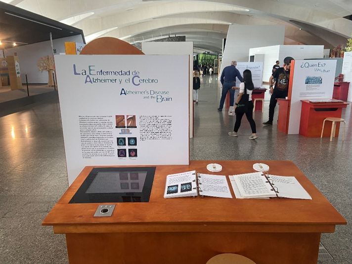
In this book experts in the field of interaction design and interactive art outline currently discussed topics in their research. One chapter I would like to focus on is called “Interfaces in Public and Semi-public Space” by Joachim Sauter one of the founders of ART+COM.

Expert Interface vs Non-expert interfaces

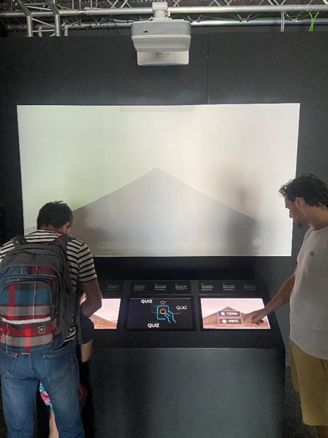
According to Joachim Sauter, ART+COM has only realized a small number of interfaces, as the focus lies on installations in the context of mediating information. For example, interactive installations in museums, trade fairs or in an artistic context. These places can also be called public or semi-public spaces and require the user to understand the interface within a short time. As often by the visitors used only once, the interface needs to be intelligent, simple and functional without giving the feeling of banality.

Joachim Sauter presented a selection of realized projects and outlined the importance of prototyping and their ambitions of creating new paradigms of access to information. Furthermore, he noted the importance of making installations endurable, weatherproof and safe from vandalism.

Innovation Is Substituted by Quality

Unfortunately, in the 1990s projects often were acknowledged just because of their innovation and fascinating interface technology – the conveyed content was seen as secondary. However, today the way we see interactive installations has changed. Nowadays, they get acknowledged for their quality of concept and design, quality of experience they evoke, the information mediated by them and their utility.

“Today, you no longer talk about a handle as an interface to a cup (and the incorporation of content this involves), but you talk about the formal and functional qualities of the cup as a whole.” – Joachim Sauter

Media Art Installations – Preservation and Presentation

In this Book, Tiziana Caianiello wrote a chapter with the following title:

“What Is an Interactive Installation? An Attempt at Clarification”

According to her, “interaction” is a fundamental concept in sociological and can be seen as human actions carried out in relation to each other, implying interpersonal communication.

In the 1960s this term was also used by computer scientist to describe the ability of a computers to react to user input within a certain time (delay). While the concept of the interfaces still was based on the model of interpersonal communication, the definition of the term “interaction” shifted to Human-Computer-Interaction (HCI).

Tiziana Caianiello, defines the term “interaction” strictly as human-human or human-medium-human communication, while “interactivity” as human-machine communication.

Furthermore, she states, that human-machine communication should not be equated with interpersonal communication, as it can’t actively construct meaning.

Art Installations should therefore be categorized according to their service they deliver to the visitors.

A second definition from “The Variable Media Network” includes additional participative art forms:

“While the word is most commonly applied to electronic media such as computer-driven installations and Web sites, interactivity also describes installations that allow visitors to manipulate or take home components of a physical artwork” (Permanence Through Change 2003, p. 126).

While most of the cited authors try to define interactivity with a clear definition, Quiring and Schweiger see the term more as gradually classifiable.

Therefore, the author herself presents in cooperation with Julia Giebeler a model for analyzing the interactive characteristics of installations in a qualitative and quantitative way.

The model is called “Model for Registration of Interactive Installations” and can be found at the end of Tiziana Caianiello’s chapter.

Stakeholdermap and What is this

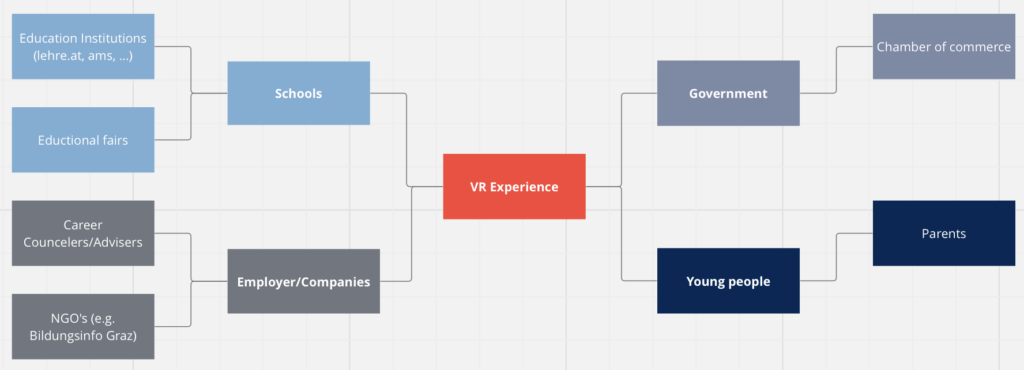
As I want to create a VR experience I examined the following stakeholders:

Young People: As the VR experience will be mainly targeted for young people they would be one of the primary stakeholders for the product. Right after that there would be parents/guardians who will be directly affected through the young people.

Government: The government would be one of the stakeholders in terms of new laws and regulations. Also the chamber of commerce would be a party of interest.

Schools: Another important stakeholder will be schools as they would act as one of the main parties where young people can try out the experience. Educational institutions and educational fairs for instance BeSt could also carry out such experiences.

Employers: Companies are from interest in providing resources and gaining new apprentices and employees. Career Counselors and NGO’s e.g. Bildungsinfo Graz would also benefit from the application.

Stakeholder Map:

For the task: What is this I chose VR Goggles as my product for the task

What is this: VR Goggles

  • What is it for
    • Creating experiences
    • To put it on
    • To immerse
    • To play, watch
  • How did it get there
    • By delivery
    • By carrying it
    • By ship/plane
  • who uses it?
    • People who like to try something new
    • People who don’t get motion sick
    • People who like to immerse themself
    • People who like to play/watch
    • People who like to gather experience
  • What does it do?
    • blinking
    • playing
  • When is it used?
    • Whenever the battery is charged
    • When it is needed
    • When people want to get entertain
    • When people want to get help
    • When people want to research
    • When people want to educate themselves
  • What is it made of?
    • Plastic
    • Metal
    • Aluminium
    • Ruber
    • Fabric
    • Battery
  • Who made it?
    • a company in e.g. China
    • a worker
    • researcher
    • designer
    • software programmer
  • Why does it exist?
    • For “help” purposes
    • For entertainment purposes
    • For research purposes
    • For educational purposes

Bewertung der Masterthesis: Beobachtung der VR User Experience Erstellung einer Benutzeroberfläche zur Beobachtung von Patient*innen in der VR Therapie

Für die Recherche habe ich die Masterthesis von Nicole Bilak, Bsc von der FH St. Pölten mit dem Titel “Beobachtung der VR User Experience Erstellung einer Benutzeroberfläche zur Beobachtung von Patient*innen in der VR Therapie”, ausgewählt.

  • Gestaltungshöhe
    Die Arbeit ist übersichtlich gestaltet und beinhaltet Tabellen, Abbildungen und Fließtext.
  • Innovationsgrad
    Das Thema behandelt Virtual Reality und Therapieansätze. Meiner Meinung nach ist der Innovationsgrad sehr hoch, aufgrund der Wichtigkeit und Aktualität der Technik mit dem Fokus auf mentale Gesundheit.
  • Selbstständigkeit
    Für das Experiment hat die Autorin eine eigens entwickeltes User Interface in Virtual Reality entwickelt, welche von außen (Personen außerhalb der VR) gesteuert und modifiziert werden kann.
  • Gliederung und Struktur
    Die Arbeit ist sehr strukturiert. Diese beinhaltet einen empirischen Teil und einen praktischen Teil. Der klassische Aufbau einer Masterarbeit wurde korrekt eingehalten und übersichtlich verfasst.
  • Kommunikationsgrad
    Die Autorin nutzt gendergerechte Sprache und drückt sich klar und deutlich aus. Der Lesefluss ist angenehm und flüssig.
  • Umfang der Arbeit
    Der Umfang der Masterarbeit erstreckt sich über 92 Seiten und ist befasst sich sowohl mit Literatur als auch mit empirischen Studien und deckt alle relevanten Aspekte im Detail ab.
  • Orthographie und Genauigkeit
    Die Thesis ist sauber und nachvollziehbar verfasst und beinhaltet einen roten Faden durch die gesamte Arbeit.
  • Literatur
    Für die Literaturrecherche hat die Autorin aus unterschiedlichen Quellen zitiert wie z. B. Büchern, aber auch aktuellen Fachzeitschriften und Internetquellen. Insgesamt hat die Autorin Quellen auf fünf Seiten aufgezeigt.

Impulse #6 – The Local Library – Part 1

One impulse that sounds very straight forward is the local library. However, as in times of the internet this approach is by any means not “straight forward” anymore. I am currently on my Erasmus, studying at an Art Faculty with a dedicated library. So, I made the plan to go to this library without any previous search in their catalog and spend one day getting inspired by all the physical books I would discover. I went through the whole library looking at every bookshelf, took books, read a few pages and marked the ones that interested me most. Finally, I reduced the amount to the maximum I could borrow and took them home for further research.

So, in this post I give an overview of the different books I found and the new insights I got.

Generative Gestaltung: Entwerfen Programmieren Visualisieren

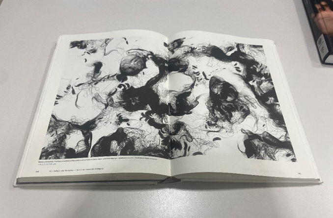
This book offers a very nice collection of generative art projects made with the Processing IDE. Every project is very well documented and code snippets with comments and illustrations give insights into the algorithmic art. In every chapter the reader gets introduced to a new technic ranging from simple shapes like square or rectangle to complex noise algorithm like Perlin-noise. One project I was particularly interested in was called “Verrauschte Bewegung” and could inspire me for creating a generative iceberg texture.

Since the authors made the code publicly available, the following link leads to the code of every project: CODE

A touch of code

I am very happy about this book as I had searched a lot of libraries and shops for this book. At the end I nearly tried to import it from the USA, when I suddenly discovered it in the university’s library here in Valencia. The book is a collection of projects where design studios merge hardware and software with architecture and design. It gives an overview of interdisciplinary projects at the intersection of laboratory, trade show, and urban space that play with frontiers of perception, interaction and staging created by current technology.

Therefore, the book is divided into the following five chapter:

  • Look (The visitor as an observer)
  • Touch (The visitor acting)
  • Explore (The visitor is exploring)
  • Engage (The visitor takes an active role in the storyline)
  • Intervene (The visitor gets empowered)

In my opinion this structure also illustrates the different degrees of interactivity and the role of the user within a project.

While the chapters are very well defined, the descriptions of the projects are not very detailed and lack in information I would like to get. Most projects are described in one or two paragraphs without going much into detail. Therefore, I used the book mainly as inspiration and collection of design studios working in this field. However, I would like to list the design studios I liked most – from the capitals Touch, Explore, Engage to Intervene.

Touch:

  • Jonas Friedemann Heuer and Jürgen Graef (Hochschule für Gestaltung Schwäbisch Gmünd): Noteput
  • ART+COM: Salt Worldwide
  • TacTable: Climate Change; Map of the Future
  • Ishac Bertran: Pas A Pas

Explore:

  • Torsten Posselt and Martin Kim Luge (Digital Media Design at the University of the Arts Berlin): Literally Speaking

Engage:

  • Jordi Puig: Lummo
  • Niklas Roy: My little Piece of Privacy
  • TheGreenEyl: Whispering Table
  • Informationlab: Cell Phone Disco
  • ART+COM: Duality
  • Jim Campbell: Scattered Light

Interventions:

  • YesYesNo: Night Lights
  • Sonice Development: Facadeprinter
  • Felix Vorreiter: txtBOMBER
  • Niklas Roy and Jari Suominen: Little Fountains to Hire
  • Vr/Urban: SMSlingshot
  • Paul Notzold: TXTual Healing
  • ART+COM: Reactive Sparks / Pulse

Interactive Installation Art & Design

Terminology

Installation art / Ready-made Art: A form of artistic expression that directly uses physical things to create artworks.

Interactive installations: Are based on installation art but more interactive experience has been added.

Interactive installation art diversifies the communication over a brother range of channels often resulting in multi-sensory experiences transforming the viewer into a participant. In this context the term “play” has become a key word letting the audience create a deeper connection between artwork and viewer.

“In short, installation art is an art combining “site + material + emotional expression”; interactive installation art makes innovations in terms of “emotional expression”.

According to this quote the main focus of interaction is the emotional expression – but from who? I would argue that not only from the artist but also from the audience.

How to start an Interactive Installation

Conception is the first important step of an installation. According to the author it should not only include sketches and drawings but also references to the works of other artists, a selection of ways of expression, appearance and materials of the installation.

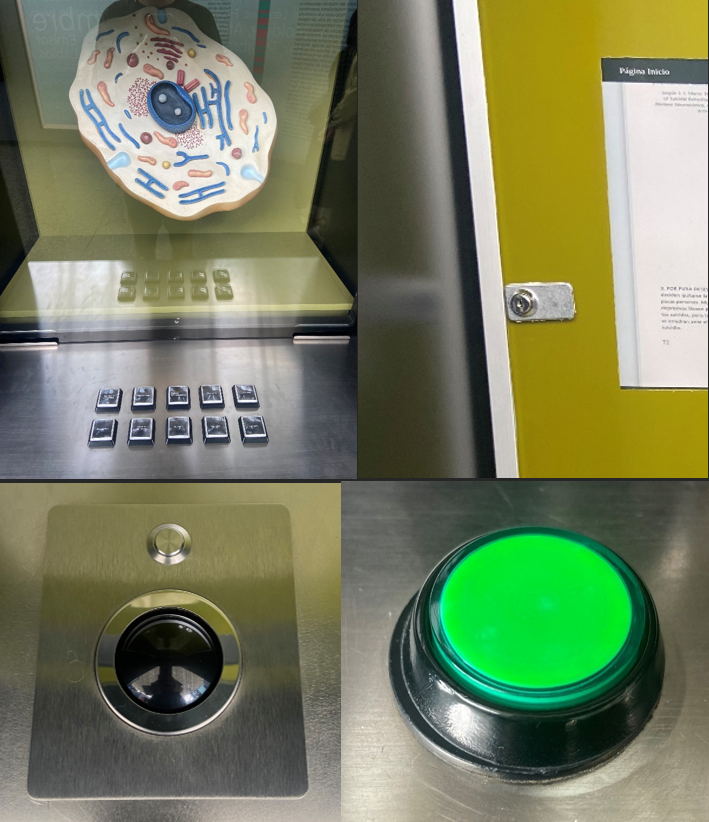
While the basis is creativity, artist also need to know the basics of technological equipment (hardware and software). For example, sensors can be seen as the main input device for interactive installations and are not limited to their original use cases.

A few examples for such sensors as input are:

  • Infrared sensor
  • Touch sensor
  • Thermo sensor
  • Motion sensor
  • Depth sensor
  • Pulse sensor

With such sensors the following interactive modes (ways of expressions) can be established:

  • Body movements
  • Gestures
  • Touch
  • Face
  • Additional Equipment acting as controllers

Dedicated Hardware (for example an Arduino) and Software (e.g. OpenFrameworks or Processing) can process the information gathered from such sensors and perform predefined outputs.

The output of interactive installations can be divided into the following three categories:

  • Visual experience: Change of light and the shape of the installation (usually the preferred form of output).
  • Auditory experience: Change of sound (speakers are usually hidden)
  • Olfactory Experience: Change of smell (less common form of output)

While the importance of technological equipment has drastically advanced, it should not act as the main project’s driver. Creative ideas and the way they are implemented are far more important and don’t need to include digital equipment.

While traditional installations require the viewer to read the attached description, interactive installations attract to participate, experience and feel the work.

References:
Lazzeroni, Claudius (2009). Generative Gestaltung: Entwerfen Programmieren Visualisieren. Verlag Hermann Schmidt Mainz.
Klanten, R., Ehmann, S., Hanschke, V. (2011). A touch of code. Gestalten
Wang, Chen (2011). Interactive Installation Art & Design. Artpower International