Ux Meetups

For the first time in my career, I got the courage to go to a networking event, to be honest I did not go to one before because I often felt like I did not have enough experience in the field or I just had no idea what I could talk about, but this event changed my perspective. Yes, there is still some professional feeling to it and most of the people have years of experience but most of the time they’re willing to share how they got their opportunities and how they build their careers.

I had the opportunity to attend UX Graz meetup, right in the midst of the World Usability Congress, where I had the chance of meeting amazing people in the field of design, I find interesting.

There I met the organizers and they talked to me about the community, how it was built and what are their future plans, I also talked to UX professionals based in Graz and Munich, they work in small product development companies, big tool and industrial companies or on a freelance basis.

I would totally recommend attending to a networking event even if it’s just to go out of your comfort zone, you will make amazing connections and engage with professionals who are always happy to guide you.

The need of light

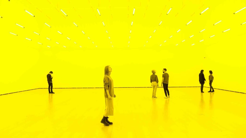
Light is something that connects us, we all witness light independently of where we are, we but our experiences with it differs depending on the time, the season or the location. Thinking about how something like light that we take for granted can change our moods, perspectives and thoughts.

From growing our food, to sleeping or working, light plays such an important role in how we as beings develop in a society, but every community in the world has their own habits and conducts that might be related to the amount & type of light there is in their context, whereas that’s physical or artificial.

You don’t have to be the same in order to share a space. How light changes the experience of every expectant, playing with space and structure you can make the expectant see a certain image even if that is not real in the physical world but real for out minds to see.

In this new chapter of research, I want to find out more about light, color and its implications in the human behavior, and how we can create a new experience in a space just with basic necessity, the need for light.

References:  

Rikard Küller , Seifeddin Ballal , Thorbjörn Laike , Byron Mikellides & Graciela Tonello (2006) The impact of light and colour on psychological mood: a cross-cultural study of indoor work environments, Ergonomics, 49:14, 1496-1507, DOI: 10.1080/00140130600858142

Zeldes, J. (Director). (2019). Abstract the Art of Design (Olafur Eliasson, Art Design) [Streaming Platform]. Netflix.

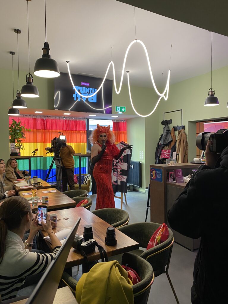
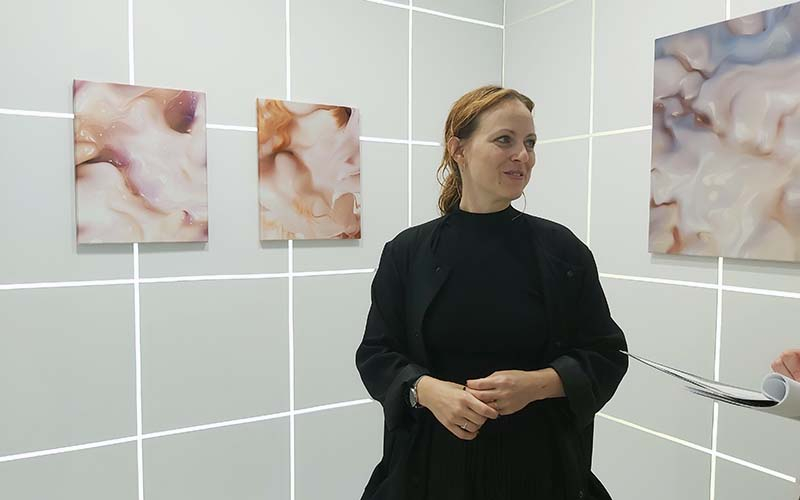
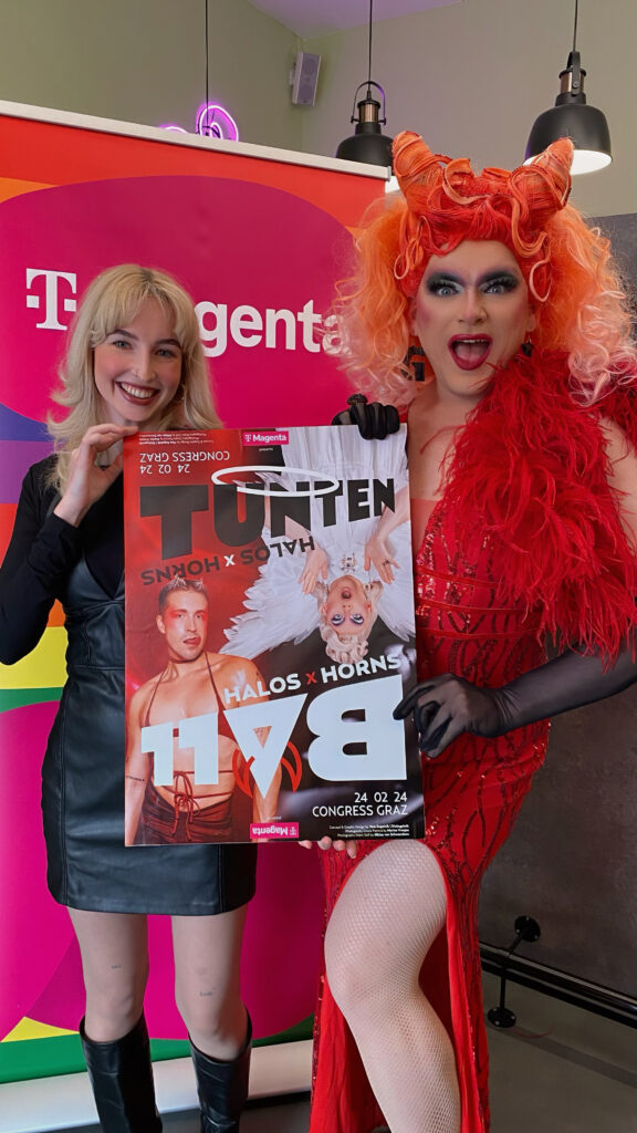
Impuls 2: Pressekonferenz Tuntenball

Im Zuge der Erstellung des Designs für den Grazer Tuntenball 2024 durfte ich zum ersten Mal in meinem Leben eine Pressekonferenz besuchen, was für mich eine spannende und neue Erfahrung war, da ich noch nie im Public Relations Bereich gearbeitet oder Praktika absolviert habe.

Die Pressekonferenz, die im neuen Community Center der RosaLilaPantherInnen stattfand, zog die Aufmerksamkeit von Journalisten aller bekannten Zeitungen, sowie einigen Drag Queens und Kings in Graz auf sich. Für mich war es hier besonders interessant neue Personen kennenzulernen und mein Netzwerk als selbstständige Designerin zu erweitern.

Ein Höhepunkt der Pressekonferenz war die Enthüllung des diesjährigen Thema “HALOS x HORNS”. Unter diesem Motto wird die Vielfalt in der Gesellschaft gefeiert, wobei himmlische Eleganz und teuflischer Charme aufeinandertreffen. Der Tuntenball ist nicht nur eine der größten Partys in der Steiermark, sondern auch ein Ort, an dem Freiheit gelebt und für eine offene Gesellschaft gekämpft wird.

Insgesamt verspricht der Tuntenball 2024 eine Nacht voller Glanz, Unterhaltung und positiver Energie zu werden. Die Pressekonferenz hat bereits Lust auf mehr gemacht, und die Vorfreude auf dieses einzigartige Event steigt mit jedem Tag.

Impuls 1: Klanglicht

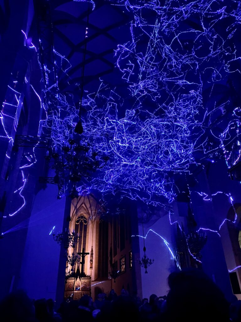
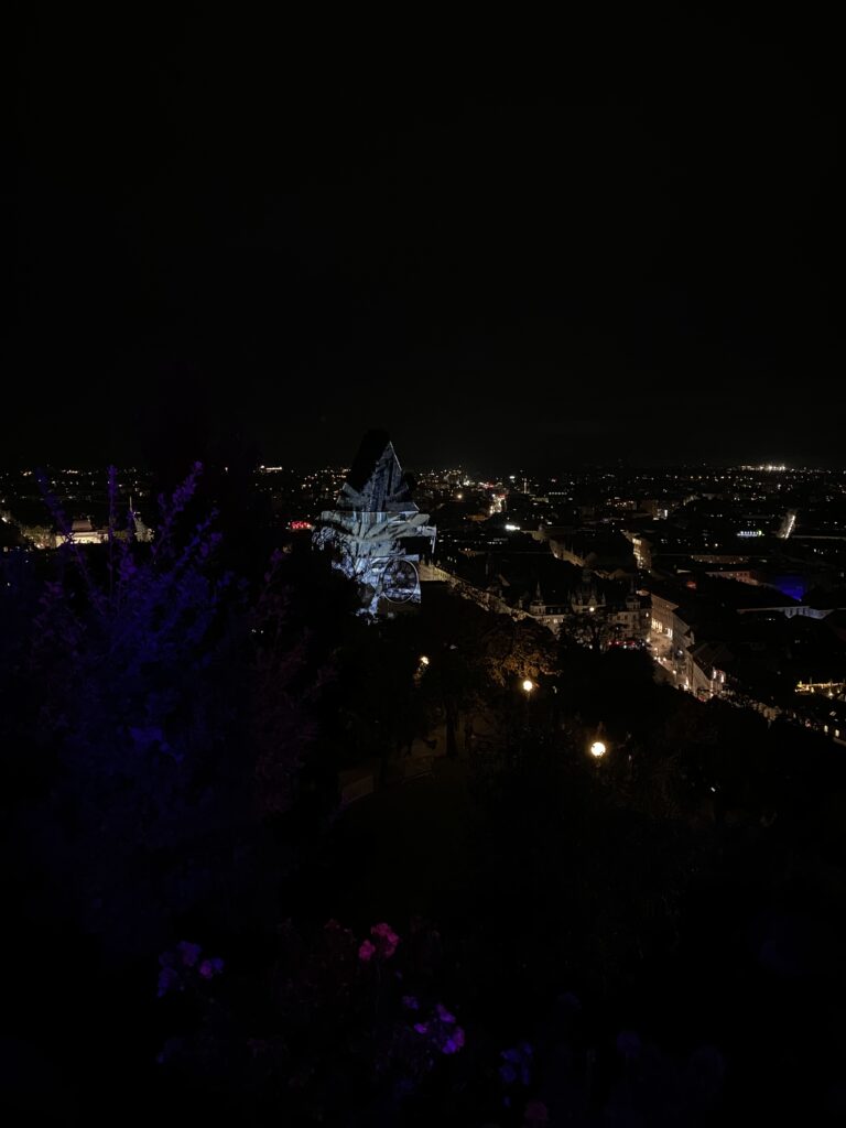
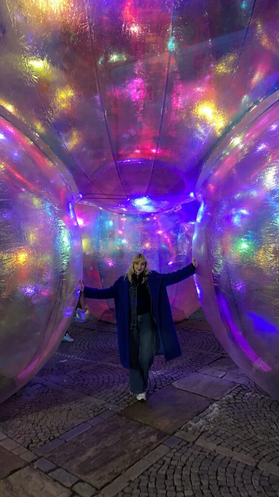
Jedes Jahr findet in Graz das Klanglicht-Festival in Graz statt – dieses Jahrvom 25. bis 27. Oktober. Dabei wurden die Straßen und Gebäude der Innenstadt mit beeindruckenden Licht- und Klanginstallationen von verschiedenen Künstlern gestaltet. Das Festival erkundete Themen wie Realität, Wahrnehmung, Beständigkeit und Vergänglichkeit. Das Publikum wurde bei einigen Installationen aktiv einbezogen, und die physische Interaktion führte zu visueller Interaktion der Installation. Das Festival zeigt, wie es die Stadt Graz mit Lichtinstallationen in ein lebendiges Gesamtkunstwerk verwandeln kann.

Folgende Installationen habe ich mir im Zuge meines Besuchs am 27. Oktober angesehen:

  • Symphonie der Begegnungen
  • constellations
  • Patterns of Time (Uhrturm)
  • Shadow whispers
  •  The ice is melting at the Pøules
  •  BROCKEN 5.6
  • Evanescent (Grazer Burg)
  •  Arkestra of Light vague II (Orangerie)
  • Solar Dust (Stadtpfarrkirche)
  • Strom

Vienna Contemporary 2023

Christiane’s Peschek approach to a new form of art.

On the summer break I tried to go to as many cultural events as possible, while traveling through Austria. One of those events it was Vienna Contemporary during September, it is an art event where contemporary galleries around Europe present curated artwork from contemporary artists, to be honest the ambience of the event felt posh and exclusive, but nevertheless it was interesting.

Personally, the most fascinating exhibition was a digital art piece THE FETCH, by Christiane Peschek in collaboration with META & MAK (Museum of Applied Sciences), exploring the connection between art & the digital work. It was a 10 min VR experience mixed with sound where visitors encounter with the digital representation of Peschek’s aura.

I would try to put into works how it looked, graphically it was a world of spheres with calming music on the background, it had gradients that depending on the sound moved and generated new figures, it was a relaxing and mystic experience. It reminded me like the art pieces of Refik Anadol in the MOMA, where he creates huge digital paintings generated by data.

I found interesting how even art events are collaborating with tech companies to create digital experiences, maybe this is the evolution of art.

Impuls 1: An Environmental Toolkit for the New Zealand Screen Production Industry

An Environmental Toolkit for the New Zealand Screen Production Industry:

Given that my thesis will address Sustainable Production Workflows in Independent Nature Conservation Films, I aim to explore established guidelines designed to ensure eco-friendly production practices. It’s worth noting that many existing guides primarily focus on feature films with various involved parties, such as makeup departments and lighting crews. In this blog entry, I intend to assess the feasibility of applying some of these concepts to independent conservation film productions. Additionally, I’ll examine if there are any pertinent aspects missing in this guide or others that could be relevant to such productions.

This specific toolkit was developed by South Pacific Films in collaboration with the Ministry for the Environment, Landcare Research, and Waitakere City Council. I chose this particular guide because it offers more comprehensive information compared to others like the Green Toolkit Film & TV.

Since environmental films are typically shot in natural settings rather than studios, I will primarily focus on the environmental impacts at the filming location. Here, the guide outlines the following impacts:

  1. Vehicle use
  2. Damage to natural landscapes
  3. Damage to wildlife habitats
  4. Overexposure of sensitive and protected environments
  5. Modifications to natural landscapes
  6. Noise and artificial light pollution
  7. Damage to infrastructure, such as historic buildings and monuments

All of these factors are indeed applicable to independent conservation film production.

Werner Heisenberg once said that it’s impossible to observe something without altering it. For most of the last 300 years, scientists believed they could objectively observe the natural world without influencing what they were studying. They presented their scientific findings as if no specific person had made the observations. This approach differed from fields like the humanities and theology, where the observer’s perspective was an integral part of the subject. In the scientific realm, the observer seemed detached, with no apparent influence on the results.

However, in the 20th century, this perception changed. Scientists realized that when they attempted to observe very small particles, such as atoms, their observations unavoidably altered the particles’ behavior. For example, trying to measure the position of an atom would change its speed. This concept became known as the Heisenberg Uncertainty Principle: When you closely monitor something, you unavoidably affect it. Ultimately, it became evident that all scientists were active participants in the universe they were studying, and they couldn’t remain purely detached observers.

With this in mind, it’s essential to understand the impact that filming, essentially glorified observation, can have on an environment. The guide refrains from providing specific examples, but based on personal experience, I’ll offer an example. When you observe nature using a drone, it becomes evident how your observation alters the subject’s behavior. Drones are unnatural objects that most animals fear. Birds flee from them, and they can startle horses. This is one of the reasons why flying drones in Protected Areas is prohibited.

Returning to the guide, it lists several reasons for complying with its recommendations, such as the necessity of protecting nature to maintain picturesque backdrops for stunning productions.

In the “Office” section of the guide, you’ll find additional guidelines that are applicable to independent conservation films, including:

  1. Working digitally
  2. Minimizing printing

Many of the office guidelines are tailored to companies with multiple employees. I’ll skip over makeup and lighting since they are not relevant to my research.

The most significant aspect for my thesis is production and post-production, so let’s continue with that:

  1. Unplug video players, television monitors, and other equipment with stand-by mode when not in use.
  2. When purchasing or renting technical equipment, inquire about energy-efficient alternatives or more efficient ways to use the equipment.
  3. Use digital processes for filming and sound recording where quality allows.
  4. When using film, ensure that your suppliers have end-of-life management programs compliant with local regulations for disposing of photographic processing chemicals.
  5. Explore recycling options with your film supplier to avoid sending waste film to landfills.

In general, these recommendations are all applicable to conservation films. However, this section of the guide seems relatively brief. Considering that this is the most relevant part of my project, it will be intriguing to delve into how specific equipment choices can make a more significant impact.

Now, let’s proceed to post-production:

  1. If available and suitable, use tapeless post-production workflow systems.
  2. Utilize the energy-saving features of technical equipment and computers.
  3. If compatible with your customers, distribute projects and demonstration reels on DVD.
  4. Apply the purchasing, energy efficiency, water conservation, and waste reduction tips provided for the office.

These post-production guidelines are also applicable, but, as before, it seems that there is potential for further expansion in this section.

In conclusion, it’s worth noting that these guides tend to skim over production and post-production aspects, which is unfortunate because there is much to discuss in these areas. For instance, it’s essential to explore which camera companies align with eco-friendly practices and carbon emissions reduction in filmmaking.
Stage free for the new “wahlkabine.at”

For my prototype, I gave the wahlkabine.at website a new look. Not only that, I focused on being more modern, friendly and inclusive when presenting the election information. This should give the website a more positive impression, especially on young people, and invite them to actively participate in shaping Austria’s democracy. Have fun watching the video! 🙂

Below you’ll find the transcript of the video if the audio is not working well on your audio device.

Here is the new prototype for the website Wahlkabine.at. I have tried to make the website more modern, user-friendly, and inclusive. It was important to me that the site appeals to both young and old voters, but I have currently focused on a young audience.

The entry to the site is much friendlier right from the start, designed with a positive header image. Here on the right, you will find icons for the most popular social media platforms – Instagram, TikTok, and Twitter.

Next, there is a reminder for the upcoming election and the option to go straight to the voting booth.

Below that, two or more voters talk about why they go to vote. Here, I can also envision a collaboration with influencers.

Democracy is explained here, and its history is briefly told with a timeline.

Different forms of participation are presented here to show that it doesn’t always have to be about major national elections to actively participate. If you click on one of the buttons, you can learn more.

Here is the hover-over map of Austria, where you can find out who holds positions in the respective government.

Below that, the most well-known parties in the country are introduced. By clicking on the “Learn more” field, you can find out more about their positions and values. Afterward, the parties that are less known or primarily regional are shown.

Finally, there is a slider that introduces the different governments and councils in Austria. For example, the National Council with its 182 seats and a displayed distribution of party seats. 

Now off to the voting booth…

First, we read a small disclaimer to find out what wahlkabine.at actually is, or rather, what it is not. Then we can get started.

Here is the first question out of twenty general questions in total. It is important that the questions are formulated in a way that they are understandable and relate to people’s real lives. If you want to learn more about a question, you can click on the small info button – a window will pop up where you can either read a short information text or watch a brief 20-second video explanation.

After answering the 20 questions, you will be presented with your own voting tendency, and hopefully, you’ll be more interested in politics.

Closeup on the UI/UX of wahlkabine.at

In the following I would like to talk more about the interface and the user experience of the website. I would analyze from a basic point of view how the website is built and at the end I’ll give suggestions for improvement, show what are important attributes for young people nowadays and give a small preview of my prototype. I will just display two images to proof my suggestions of improvement.

01. Landing page:
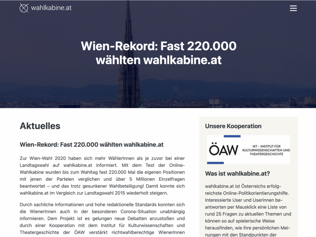
On the start page, one experiences a relatively conservative introduction. If you didn’t know that you were on wahlkabine.at, you probably wouldn’t immediately recognize that it’s about democracy or election information. The many text or the quasi hidden header image make the website seem relatively unemotional or dry. I can imagine that this entrance seems less inviting for children and young people. To get other information, beyond the start page you can reach the other subpages via the citizen menu. A direct link in the direction of the survey or, for example, past results, is not possible directly or only visible after scrolling down for a long time.

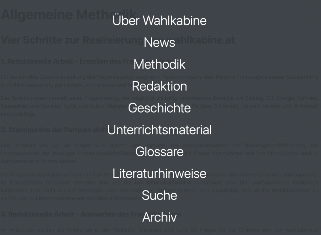
02. Burger menu
The burger menu has a lot to offer. It seems like it was very important for the developers to show all possibilites of the website. Furthermore it would have been possible to sum up several bullet points such as “Über Wahlkabine”, “Redaktion” and “Methodik” and/or “Geschichte”. Also its not really common to place the search function inside a burger menu. The coloring of the whole webpage is probabyl chosen because of its diplomatic color (grey) but it’s also pretty boring and not appealing in the colorful world we do live in.

I would suggest adding more emotion, information, and user-friendliness to the webpage. By incorporating different colors, more images, and providing more possibilities for barrier-free information, the website will become more attractive to users of all ages. By intentionally incorporating interaction options on the website, such as sliders, checkboxes, or hover effects, it creates a mild gamification of the website. This increases engagement, and the dry topics of politics, democracy, and participation appear more modern, friendly, and inviting. After completing my prototype, I would focus on testing it in the next semester to form a well-informed opinion about the “new” wahlkabine.at.