All the 10 logos I created in the last blog post, I used in a survey about brand personality. Below we can again see all of them.
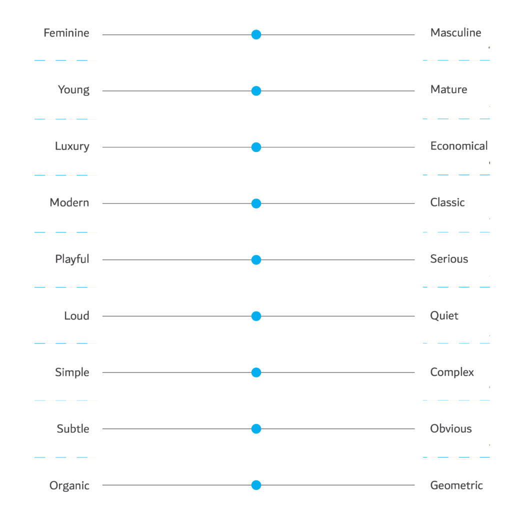
For all the logos the people who took part in the chart-survey had to decide on following factors of the personality of the fashion logo:
- Feminine – masculine. Respondents would indicate whether they perceive the logos as more feminine or masculine.
- Young – mature. Participants would indicate whether they perceive the logos as targeting a younger or more mature audience.
- Luxury – economical. Respondents would evaluate the logos on a luxury-economical spectrum, indicating whether they perceive the brands as luxurious or affordable.
- Modern – classic. Participants would assess the logos as either modern or classic, reflecting the design styles and aesthetics associated with each brand.
- Playful – serious. Participants would indicate whether the logos convey a playful or serious tone.
- Loud – quiet. Respondents would evaluate the logos on a loud-quiet spectrum, indicating whether they perceive them as bold and attention-grabbing or more subdued.
- Simple – complex. Participants would assess the logos as either simple or complex, reflecting the level of visual intricacy and simplicity.
- Subtle – obvious. Respondents would indicate whether the logos are subtle or obvious in conveying their intended messages and brand identity.
- Organic – geometric. Participants would evaluate the logos on an organic-geometric spectrum, indicating whether they perceive them as having natural, flowing shapes or more structured and geometric forms.
Respondents had a line on which they could choose where to place the logo. This would give the option of being neutral or somewhere in between instead of strictly one (extremely feminine or extremely masculine).
RESULTS 1
In the end I decided to put all logos on one chart so I could clearly see the results. We can see that some logos are distributed along the entire line, while at certain places they are clearly separated. You would determine whether respondents perceive each logo as more feminine or masculine. The results would indicate the extent to which each logo aligns with traditional gender associations.

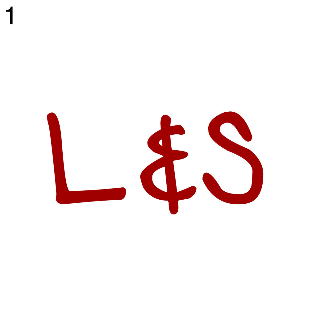
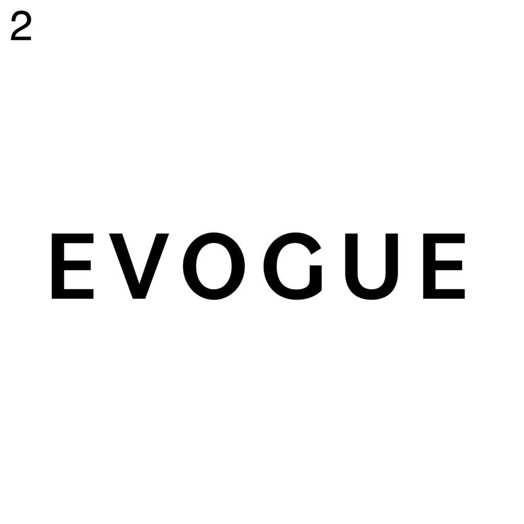
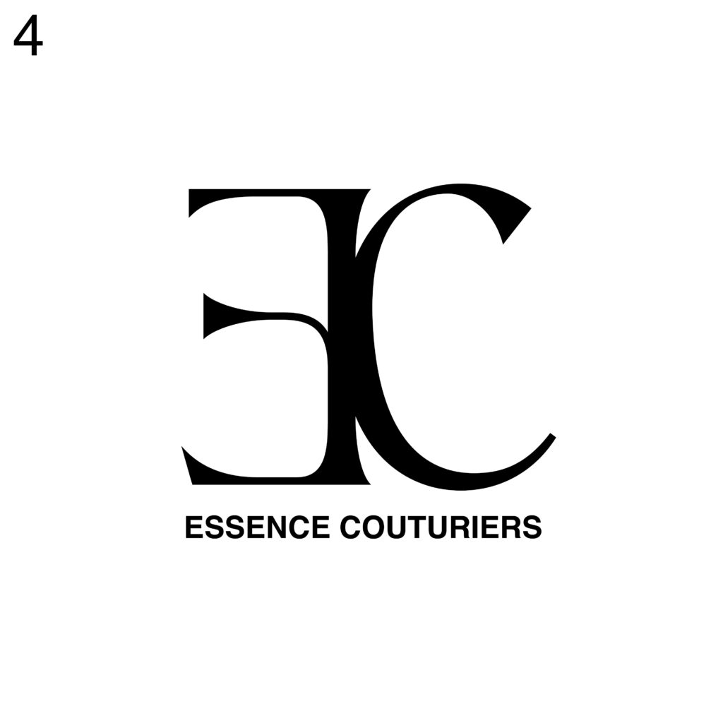
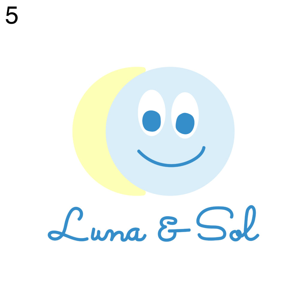
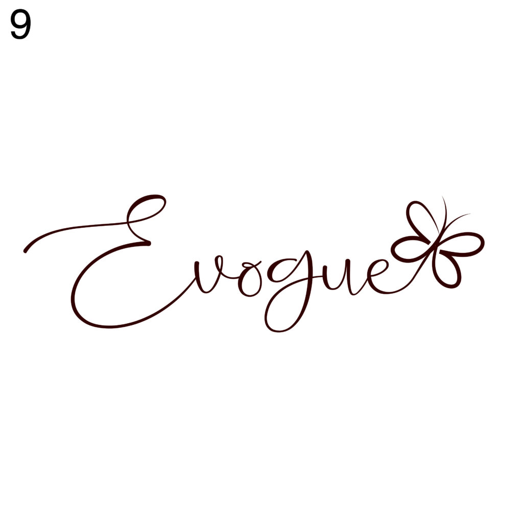
Between feminine and masculine, logos are distributed along the line. However, it’s clearly to see that the participants had a more clear vision about the feminine logos. Probably also because of the little details (9) and colors (3) that give afeminine vibe. Interesting it’s to see that the simple logos using sans serif, black, just typography (2,4) made for “luxury” brands people are perceiving more feminine than masculine. Also interesting was to see that the logo for kids (5) was for them more masculine and feminine.
In the second line, we can see that the logos are clearly divided between young and mature. This is an interesting result from my perspective. It is also possible to see that colours have a big impact on this decision.
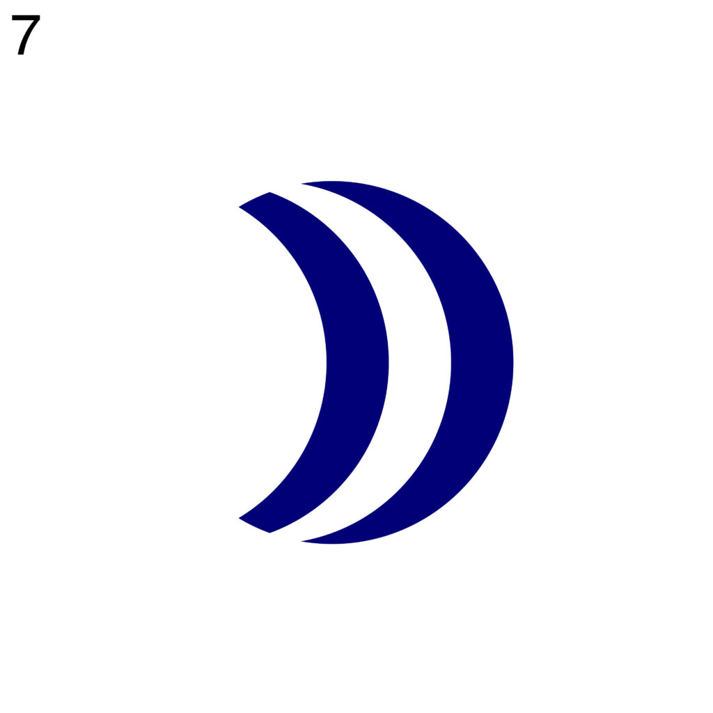
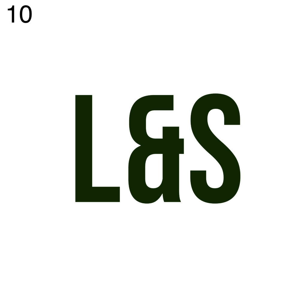
There is no doubt that the colours played a crucial role in the comparison of luxury and economical. Black and dark logos are perceived as more luxurious, whereas colourful logos are perceived as more economical. Here we can also see the dark green logo (10) and the dark blue logo (7) coming closer to the middle.
On the line between modern and classic, we can see the interviewees were unsure where to place the logos. So most of them are around the middle. The most surprising thing is that logos which could be made for the similar brand (2,4), or on the other side of the line, and the outstanding logos are not perceived as modern.
Once again, there is a clear division in the next line.
The colourful logos are on the side of being playful, and the dark logos are on the serious side.
On the line between loud and quiet, we can see that the logos that take a bigger surface are on the loud side, while the minimalistic ones are on the quiet side. Interestingly, there is that the logo 1 is on the loud side, even if it’s written with thin typography.
Between simple and complex, the logos are again more together. It’s interesting to note that there are no extremes, and that, for instance, the logo without a name, just a symbol, is not the simplest one.
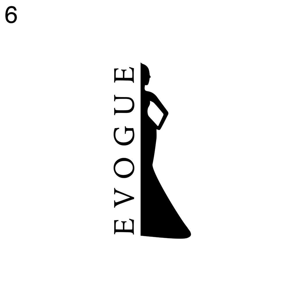
Between subtle and obvious all the logos are more concentrated in the middle. The most surprising thing I noticed was that the kid’s logo (5) and dress logo (6) were more chosen to be subtle than obvious.
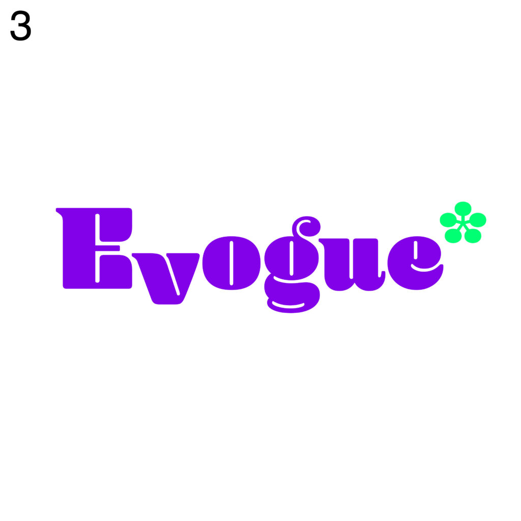
And the last line with organic and geometric it is also divided again on two clear sides. Again, the most surprising position if the logo is for me the logo 6, which is perceived as more geometric than organic. When for example, the logo number 3 is perceived as more organic than geometric.
By analyzing the data collected from the chart-survey, I gained a better understanding of how people perceive and interpret the personality factors of fashion logos. This information can help me assess the effectiveness of my logo designs in conveying the desired brand personality and targeting specific audiences.