In this blog post, I will elaborate on the role of character design as well as character expressions in sequential art and comics and gather some tips on what to consider when creating such characters.
Depicting Characters
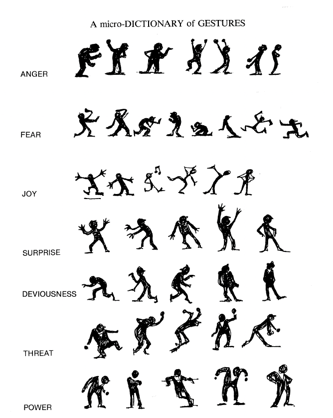
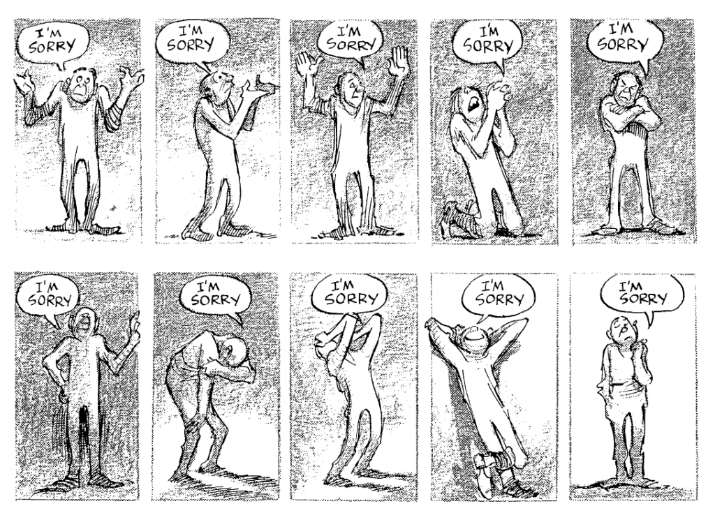
Eisner explains that one of the most important things about comics, or art that has characters in general, is the specific way in which characters are depicted. Due to our experiences, we can recognize the emotions and feelings of others based on many different factors. Not only facial expressions signal us what someone may be feeling – whether they are sad, angry, happy, etc. We can also recognize the emotions someone may be feeling at the moment by their postures and gestures: the way someone is standing, sitting, or lying down, the way someone is bending their body, positioning their arms, whether they have a visible tense body posture or are posing in a relaxed way. Artists should understand and make use of these common expressions of feelings through not only facial expressions but also body language, posture, and gestures in order to further clarify for the readers what the characters are feeling. (cf. Eisner 1985: 100) Eisner gives examples of different emotions expressed through gestures and postures:

Eisner points out that what we see about a character strongly influences the meaning of the text surrounding the character: the emotion we recognize in the character through their expressions dictates how we interpret the text or speech around the character. (cf. Eisner 1985: 103)

Designing Characters
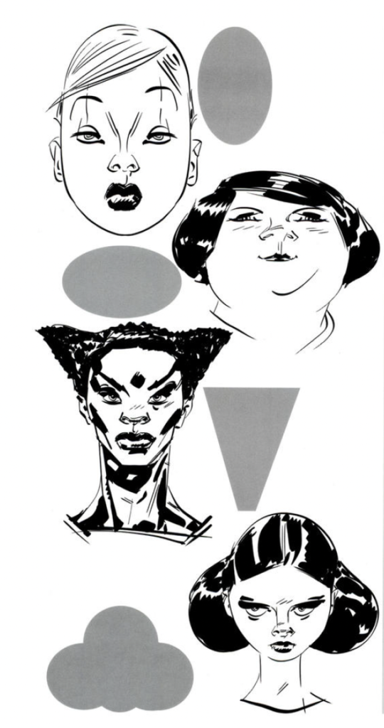
Making the story comprehensible by depicting the emotions and therefore body language of the characters correctly is one thing, but what is there to consider when designing characters in general? Mateu-Mestre explains that to enjoy a story, the reader should always be able to tell apart the different characters, of course. He suggests that compared to seeing real people in movies, for example, drawn characters are inherently harder to recognize to us and that is why we should focus on designing each character to be very distinctive. It can be helpful to make each character have a certain “shape” that is easily recognizable, whether this concerns their head from the front, their side profile, or their whole silhouette from afar. It is common in comics and graphic novels to exaggerate character designs for them to be easily recognizable. According to a character’s personality, we can design one character to have a round silhouette and features and design a different character to appear somewhat triangular or rectangular. We also can make our characters more distinct by adding details to their clothes or armor, for example. Of course, color is another way to make our different characters truly different from one another. (cf. Mateu-Mestre 2010: 96-98)

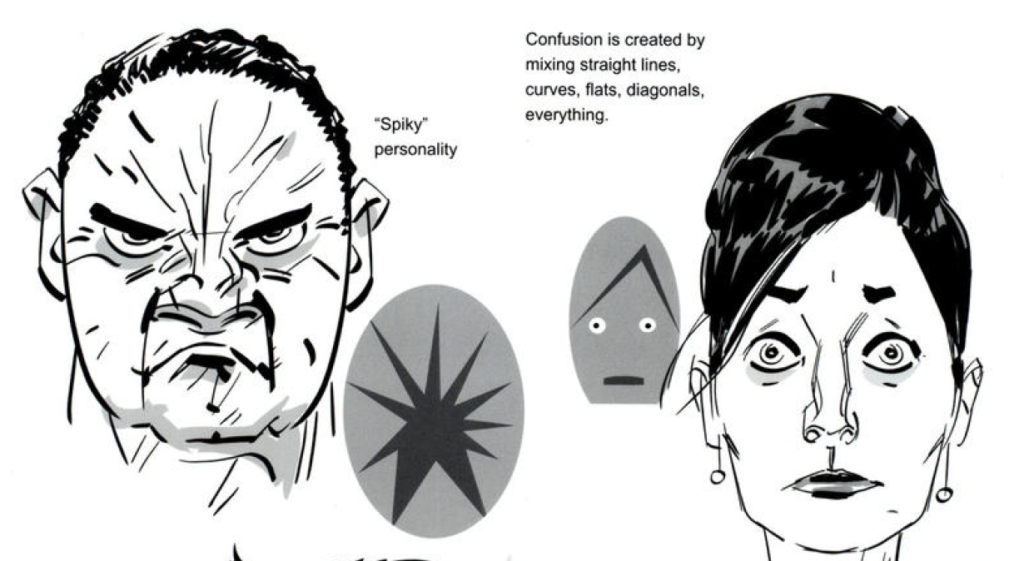
Generally, soft or rounded shapes will seem more relaxed and friendly than harsh, angular shapes, which will seem tenser. This can be applied to the general facial or bodily features a character has, but also to the facial expression a character has at a certain moment in the story. A generally grumpy or unfriendly character can have straight or angular-looking face details like angry, harsh eyebrows, or straight wrinkles, while a friendly character could have rounded hair details. By mixing different, conflicting shapes, we can make our character look conflicted or confused, for example. (Mateu-Mestre 2010: 102-103)

Bibliography:
Eisner, Will (1985). Comics and Sequential Art. Tamarac, FL: Poorhouse Press.
Mateu-Mestre, Marcos (2010). Framed Ink: Drawing and Composition for Visual Storytellers. Culver City, CA: Design Studio Press.
Further Literature:
Eisner, Will (2008). Graphic Storytelling and Visual Narrative: Principles and Practices from the Legendary Cartoonist. New York, NY: Norton.
Mateu-Mestre, Marcos (2020). Framed Ink 2: Frame Format, Energy, and Composition for Visual Storytellers. Culver City, CA: Design Studio Press.
Mateu-Mestre, Marcos (2016). Framed Perspective: Technical Perspective and Visual Storytelling. Culver City, CA: Design Studio Press.
McCloud, Scott (1993). Understanding Comics: The Invisible Art. New York, NY: HarperCollins.