The design of the exhibition and visitor experience play important roles in the exhibition spaces, as do the properties of color in the exhibition. However, given the survey of literature, there is limited research on the specifics of color properties in exhibition design and how these properties affect the visitors.
Engaging color properties, exhibition design, and visitor experience is the purpose of this creative project to understand how color affects visitors in exhibit spaces by understanding the influence of atmospheric variables in the exhibit environment, specifically background color. Color contains such an unconscious emotion that is uncontainable however, color choice in a museum exhibition is a conscious decision.
This research seeks to understand the relationship of 14 that color choice within the exhibit environment. The intention of the project is to explore the human reaction to different styles of paintings against each color property within an exhibit space. Through the physical exhibits I created, I am able to fully engage the viewer and comprehend their reactions.
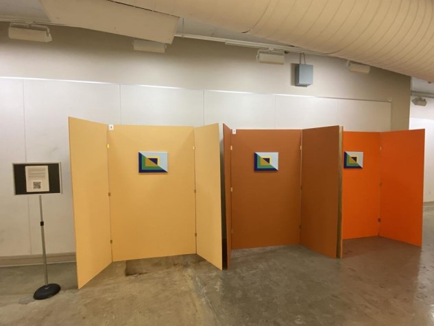
Three tri fold exhibits were constructed, and three distinct colors selected. A monochromatic scheme, using variations of orange was selected. The paint colors were chosen from an assortment of color-aid sheets, and taken to a hardware store to be individually mixed according to the cards.
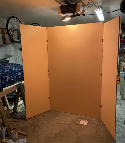
The bright orange hue was selected because of its bold saturation and attention-grabbing capabilities. The warm orange color was chosen intentionally , warm colors tend to appear nearer in depth to the viewer so this would encourage the focus of the experiment to be the wall color rather than solely on the painting. This is due to the theory that the eye can adjust quicker to warm colors because of the longer wavelengths .

The prototype exhibit was setup for two weeks; one week for a well-known traditional painting and one weeklong for a contemporary abstract piece of art. These two particular styles of art were chosen because of their distinct features. A van Gogh painting , in which many recognize, is in the style of Impressionism which revolves more around an abstract visualization of a particular subject matter. A contemporary art piece takes that one step farther with a completely geometric abstract image. The color palettes of both paintings remained similar so that only the style of the artwork was a factor in visitor experience not the color of the artwork itself.
For the first week, van Gogh’s painting, “Wheatfield with Cypresses”, was hung in each exhibit. This famous artist was chosen because of its familiarity to most audiences . This way the focus in the exhibit was less on the artwork and more about the relationship between the wall color and the artwork. The particular painting was selected due to the balance of warm and cool colors again to give the majority of the focus on the wall color without having too much one area of the painting stand out.
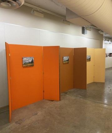
During the second week of the experiment another set of paintings were hung in each exhibit space. An original contemporary painting, each hand painted by the author of this study, was hung to inquire if the style of art in the space affected the visitor experience via color. The size , orientation , and color palette of my painting remained the same so that there was consistency throughout the study.
For the contemporary painting, colors were taken from van Gogh’s “Wheatfield with Cypresses” painting in order to create a similar color palette. The initial design layout and color scheme was created in Illustrator and then mapped out on each canvas with tape. the original Illustrator design. After the design was mapped out, acrylic paints were mixed, and each canvas was hand painted in the same layout as the digital file.

The collection of data involved a survey for participants of the study as well as an onsite observation. Before any of this was done, an initial literature review directed research into topics like color theory, museum design, and visitor experience.
From the survey it was determined that the exhibit that least attracted the viewers was the third exhibit or the hue orange. Based on both weeks of the study, a majority of the participants would not likely return to an exhibit of this wall color. The graphs below represent survey results from each week asking if the wall color from the exhibit they were least attracted to takes away from the actual artwork.
From the results it can be concluded that the background color of the third exhibit was found to be too distracting for the viewers causing the color to be more prominent than the actual artwork. The two graphs side by side also demonstrates that the style of painting in the exhibit does not necessarily affect the perception of colors within the space. In both weeks, the color of the second exhibit was found not take to away from the actual artwork by a majority vote. The first and third colors were said to take away from the artwork by the participants. A prediction was made that the third exhibit with the bold hue color would appeal more to the contemporary painting style than the van Gogh, however, the survey results show that this is not the case.
The second survey received only 20 participants but with some changes to the initial predictions. The second exhibit still turned out to be the most preferred exhibit with 50% of responses in favor. Only 5% answered that they were very likely to return to an exhibit with the orange hue background color paired with the contemporary painting. During the same week, 55% of viewers felt overwhelmed by the exhibit while only 15% felt captivated or indifferent. during the first week’s survey, a majority of people reported feeling distracted, overwhelmed, or anxious in this exhibit. The orange hue was so overwhelming and distracting that it was universally the least appealing exhibit with 84% in the first week and 65% in the second week agreeing.
Through the engagement color properties, exhibition design, and visitor experience, the purpose of this creative endeavor was to determine if the style of art hanging in the exhibit affected the response to the wall colors. The prediction was that the contemporary style painting would appeal more to the bright hue of orange instead of the van Gogh painting. The size, orientation, and color palette of the paintings remained the same so that those factors would not sway the viewers. The prediction was that perhaps the colors of the artwork is not what influences the visitor experience, but the style of artwork paired with the color of the space.