Having read about the importance of aesthetics and its influence on the way interfaces are designed, I began to wonder if what I personally perceive as “beautiful” or aesthetic overlaps with other people’s perception? Do people share a sense for aesthetics or does this change from person to person / from culture to culture?
When searching for answers to this question in an UX/UI context, one comes across the term “cross-cultural UX/UI design”, which spans a multitude of conducted studies, research papers and more. Core of this topic is to determine the differences between cultural design preferences and to find rules or guidelines for how to design for each culture or for different ones.
For instance, Rohles describes in a summary in blog post format that not only do design elements evoke different associations in different cultures, but “culture [also] influences what is considered aesthetically pleasing and beautiful” (Rohles, 2019). The author gives the example of the webpage of the Japanese music store Ishibashi, which is shown below.
Figure 1: Webpage of the Japanese music store Ishibashi
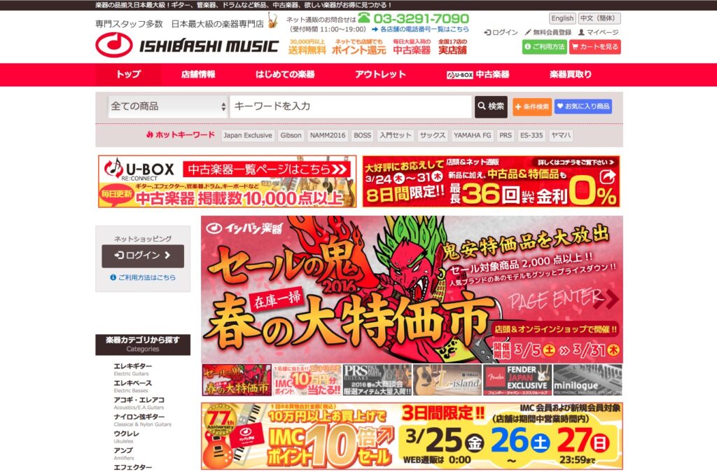
Note. From How to do intercultural UX design for the web, by B. Rohles, 2019 (https://rohles.net/en/articles/intercultural-webdesign). Copyright 2019 by Ishibashi.
Here, the site is designed in an arguably quite maximalistic style, using colourful imagery and huge slogans. One might assume, that people from a Western culture would generally prefer a more “airy” layout with white space. In contrast to this, Rohles quotes a study by Choi et.al. that was presented at CHI 2005, which found that Korean and Japanese participants prefer an “efficient use of the available space, showing a lot of information simultaneously” (Rohles, 2019).
When trying to navigate such difficult waters, many UX/UI designers refer back to the works of the Dutch researcher Geert Hofstede. Hofstede build a framework for assessing cultural differences by defining 6 dimensions, in which cultures score differently (Mahanta, 2021). The six dimensions are (see: Mahanta, 2021):
- Power distance index
- Individualism vs. Collectivism
- Masculinity vs. Femininity
- Uncertainty Avoidance
- Long-term vs. Short-term
- Normative Orientation
- Indulgence vs. Restraint
Hofstede Insights offers an online tool, where one can compare the individual scores of two countries with regard to the dimensions given by Hofstede. Below, you can view a comparison of Austria and Vietnam (Hofstede Insights, 2023).
Figure 2: Country comparison tool by Hofstede Insights
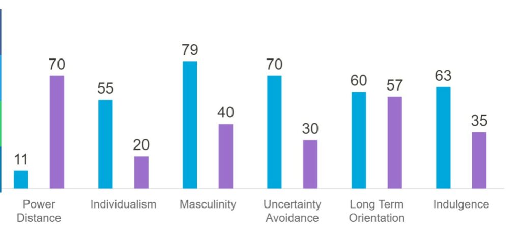
Note. From Country Comparison – Hofstede Insights, by Hofstede Insights, 2023 (https://www.hofstede-insights.com/country-comparison/austria,vietnam/). Copyright 2023 by Hofstede Insights.
Personally, I found those new insights fascinating: It is possible that I would design a (in my mind) perfect, beautiful website or app and if I showed this to customers in Vietnam, they might rate it as very ugly, which, in turn could have a negative effect on the perceived usability (see: previous blogposts).
References:
- Hofstede Insights. (2023, January 27). Country Comparison – Hofstede Insights. https://www.hofstede-insights.com/country-comparison/austria,vietnam/
- Mahanta, A. (2021, October 7). Cross-Cultural Design: Designing for Global Audiences – UX Mastery. UX Mastery. https://uxmastery.com/cross-cultural-design-designing-for-global-audiences/
- Rohles, B. (2019, August 5). How to do intercultural UX design for the web. Retrieved April 17, 2023, from https://rohles.net/en/articles/intercultural-webdesign