After having selected a testing interface and certain visual variables that I want to experiment with, I developed variations of the original basis interface.
Colour
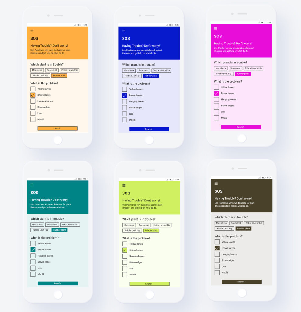
Starting with colour, I first researched what has been dubbed as the world’s “most beautiful” colour: “Marrs Green” by G.F Smith (n.d.). Secondly, I searched for the world’s “ugliest” colour, which some people claim is the brown hue Pantone 448C (Pathak, 2016). Then I filled up my test palette with several colours from Odushegun’s (2023) research and landed on a trial palette of 6 colours.
Typography
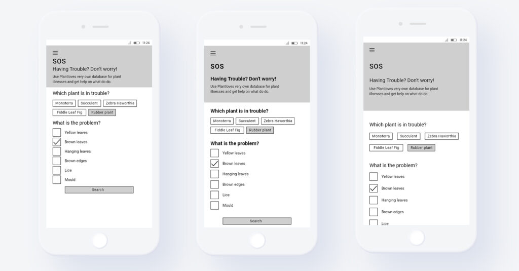
Subsequently, I build a typographic palette. I added some more typefaces from Odushegun (2023) but also included freely selected other fonts. I used the following typefaces: Roboto by Christian Robertson (Google Fonts), Raleway by, Roboto Slab by Christian Robertson (Google Fonts), Comic Sans by Vincent Connare (Microsoft Corporation), Playfair Display by Claus Eggers Sørensen (Google Fonts), Papyrus by Chris Costello (Microsoft Corporation) and Courgette by Karolina Lach (Google Fonts).
White Space
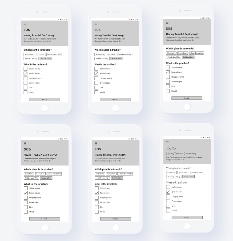
Then, I adjusted the white space between texts, once trying very little, a medium amount and a lot of white space.
Webdesign Styles
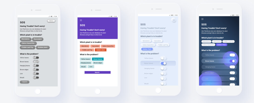
And finally, I moved away from my more serious testing framework and tried to build my testing interface in the different web design styles (see: previous blog posts). I tried out (from left to right) skeuomorphismus, flat design, neomorphism and glassmorphism. However, those did not feature in the following experiment as they were very complex and included not only one isolated change of an aesthetic feature but multiple changes and the addition of stylistic elements like drop shadows, transparency, …
After having build those variations, I decided to put my first trial framework to test. More in the next blogpost…
References:
- G.F Smith. (n.d.). G . F Smith Colorplan Marrs Green. Retrieved June 17, 2023, from https://www.gfsmith.com/gf-smith-colorplan-marrs-green
- Odushegun, L. (2023). Aesthetic semantics: Affect rating of atomic visual web aesthetics for use in affective user experience design. International Journal of Human-computer Studies, 171, 102978. https://doi.org/10.1016/j.ijhcs.2022.102978
- Pathak, S. (2016, June 7). The world’s ugliest colour is Pantone 448C, say experts. Evening Standard. Retrieved June 17, 2023, from https://www.standard.co.uk/lifestyle/the-world-s-ugliest-colour-is-pantone-448c-experts-say-a3265856.html