Color is an everyday element of our lives that becomes a subconscious concept the more we are exposed. Whether we are aware of or not, color relationships affect our behavior and emotions. The three basic properties of color; hue, value, and intensity/chroma, have intense power to influence color association. Variation of any of these properties could influence human behavior, emotion, or the functionality of a space.
Color Properties: 1) to catch attention, 2) hold attention, 3) convey information, and 4) make information memorable. Its function is determined how it is perceived in the space. As Josef Albers states, “In visual perception a color is almost never seen as it really is – as it physically is.”
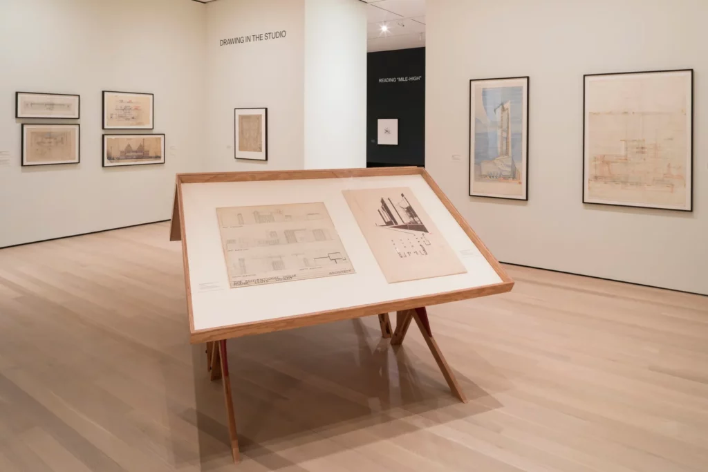
While there’s likely no place we’re more focused on seeing than in a museum, it’s, ironically, one of the places where many design details go unnoticed. The main event in any museum or gallery exhibition is, of course, the art, but hours of thought and labor go into framing it in a certain, precise manner. From gallery layouts to framing styles, each small decision made by curators and exhibition designers will have an impact on the final show. One of the most important? Paint. Though many museumgoers might be hard-pressed to remember the color of the walls behind the art after their visit, paint selection is an important aspect of exhibition design. In the case of MoMA’s recently opened show “Frank Lloyd Wright at 150: Unpacking the Archive,” the museum’s curators worked with Farrow & Ball to create a color palette that would underscore the multimedia exhibition and act as a visual guide, connecting certain displays that are most relevant to one another. In one portion of the exhibit, for example, plans for Wright’s Imperial Hotel and the Midway Gardens, though displayed in adjacent rooms, hang on the same colored backdrop. “These two projects were concurrent and share a lot stylistically, so we used the same color across their galleries to indicate that they’re connected,” explains Betty Fisher, MoMA’s senior design manager. Though these details might not be explicitly noticed by every visitor, they play an invaluable, if subconscious, role in establishing not only the layout but the general feel of the show.

Generally, it is the curators or exhibition directors who select the paint colors, as it is their vision that needs to be translated into the space. I think that you look at the collection as a whole and decide what reaction they want to elicit from museumgoers and what mood they are looking to create in each space they are planning, as color will have a huge impact on how the guest feels as they experience the exhibition. Some curators opt for bolder palettes while others opt for more traditional neutral colors, but whichever they choose from our offering, they always love how richly pigmented colors like ours can completely change the space in question and impact the works of art themselves.
The most difficult aspect is really that each of colors can have a completely different impact on a given space depending on the lighting and layout. all colors have the potential to be a backdrop.
What continues to surprise even the curators who choose the colors is how much of a dramatic impact paint can have on a gallery space or installation—whether it is the backdrop for the artwork or part of the artwork itself created by the artist. That being said, the colors are often integrated so perfectly into shows, museum visitors sometimes do not even notice the specific colors; rather, they experience the mood that the paint colors and art work to create in the space together. every color can impact a space and mood drastically.
For me the backdrop can make or break the show—color can help accentuate details, can hide others, and can dramatically affect the experience of the visitor by helping to either highlight the mood the artist was trying to convey in the piece or act as a juxtaposition to it.