For this blog post, I wanted to find out more about techniques on how to create a good balance and relation between pictures and text when it comes to visual storytelling in comic form. First of all, comic artist Will Eisner points out that, in relation to using text or images in comics or about creativity in general, there is no right or wrong way of doing things. An artist can tell a story in different ways, some may choose to tell a certain story in more images than text, and some may use many speech bubbles or use more descriptions. (cf. 1985: 125-127)
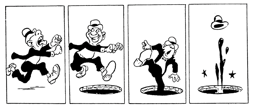
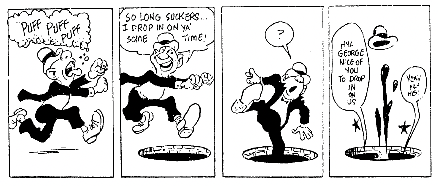
It also depends on whether the artist wants to depict a story in a humorous way, a realistic way, etc. Eisner also does not think of comics as something that has a defined word-to-picture ratio as the words are very often part of the illustration and not just text on the side of an image. (cf. 1985: 125-127)
Placement and Effect of Text
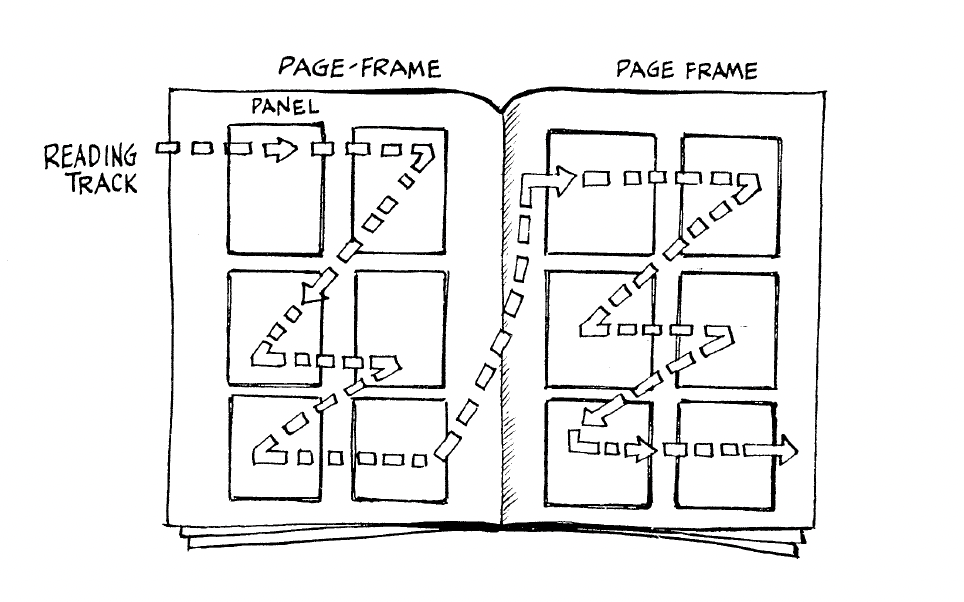
Eisner points out that text needs to be placed in a way so that readers immediately know which text part comes after which text part. It should be clear which character speaks first, which commentary comes before which scene, etc. Text elements and images follow the same conventions as text, so in order to establish a clear sequence, elements that follow each other need to be placed from left to right and from top to bottom in western countries. (cf. Eisner 1985: 26)
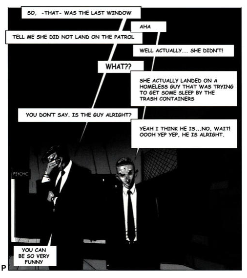
This reading order also applies to text bubbles in a single panel. In the following image, Mateu-Mestre demonstrates how conversations between two people can be shown in speech bubbles in a very clear way:
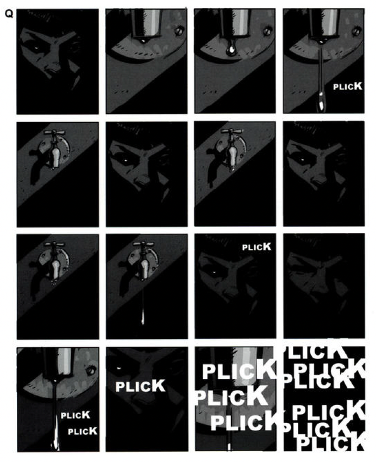
Another commonly used element in comics are onomatopoeias – sounds written out in words. When used right, they supply information about sounds in a scene to the reader in a very natural way that enriches the story. By using many onomatopoeias at once, making them very big, very small, or distorting them, we can strengthen their meaning even more. (cf. Mateu-Mestre 2010: 117) Here, Mateu-Mestre gives one example of how to work with onomatopoeias:
Making sound or speech seem “alive” and truly part of the story can be achieved by using different kinds of balloons or bubbles around it.

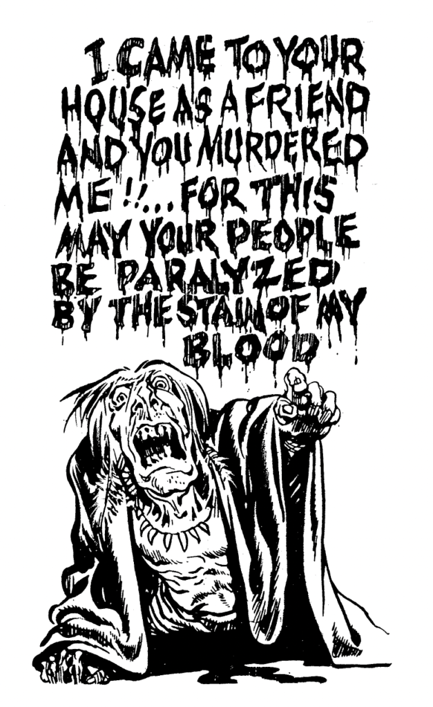
Comics often use hand lettering in speech bubbles. The way letters look and whether they are handwritten (or use a handwritten-looking font) or use a set-type font such as a sans serif font influences the emotion the text conveys. Different kinds of handwriting are not only the personal style of the artist, but they can also express the personality features of characters. So, the choice of font for each text should be considered because it also influences the emotion the whole image portrays. (cf. Eisner 1985: 27)

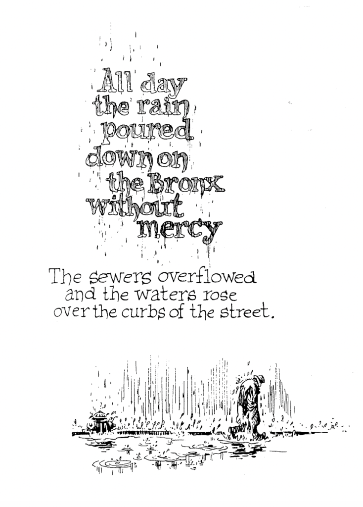
Next to using text in an image in the form of squares or speech bubbles on top of the drawing, Eisner points out that text can also be artistically integrated into an image. Designing text or choosing fonts so they match the current emotion in the image can make the text feel more involved in the story and convey emotions stronger. (cf. Eisner 1985: 10-12)
Bibliography:
Eisner, Will (1985). Comics and Sequential Art. Tamarac, FL: Poorhouse Press.
Mateu-Mestre, Marcos (2010). Framed Ink: Drawing and Composition for Visual Storytellers. Culver City, CA: Design Studio Press.