After having created different variations for a trial of an A/B-test for visual web aesthetics and their effect on users, I decided to put those to a small, first test. For this, I showed the variations to 4 test subjects and asked them the following question: “Please grade the pleasantness of the following screens (1= very unpleasant to 5= very pleasant). In this, ignore the context of the app and focus only on the visuals.”
Of course, this tests only the perceived pleasantness, rendering this mini-test neither representative nor complete, with certain obvious limitations (small sample size, way of creation of testable visual web aesthetics, amount and nature of questions, …). Nevertheless, this will be sufficient for a first small trial run.
The test results were as follows:
| Subject 1 | Subject 2 | Subject 3 | Subject 4 | Average grading | |
| blue-green colour | 5 | 1 | 5 | 4 | 3,75 |
| brown colour | 1 | 3 | 2 | 2 | 2 |
| orange colour | 3 | 4 | 2 | 1 | 2,5 |
| blue colour | 3 | 5 | 4 | 2 | 3,5 |
| magenta colour | 2 | 3 | 1 | 3 | 2,25 |
| yellow-green colour | 2 | 5 | 5 | 2 | 3,5 |
| Roboto | 5 | 5 | 5 | 5 | 5 |
| Raleway | 5 | 5 | 4 | 5 | 4,75 |
| Roboto Slab | 4 | 4 | 3 | 4 | 3,75 |
| Comic Sans | 1 | 1 | 1 | 1 | 1 |
| Playfair Display | 3 | 3 | 2 | 3 | 2,75 |
| Papyrus | 1 | 1 | 1 | 1 | 1 |
| Courgette | 1 | 1 | 1 | 1 | 1 |
| low amount of white space | 3 | 2 | 1 | 1 | 1,75 |
| medium amount of white space | 1 | 3 | 3 | 3 | 2,5 |
| high amount of white space | 2 | 1 | 2 | 2 | 1,75 |
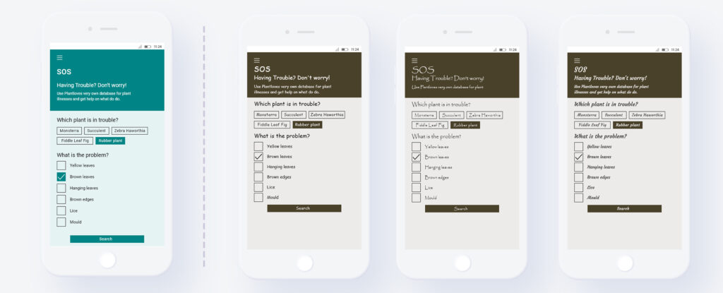
From this concludes the most beautiful combination of typography, coloring and white space (left) and the three least pleasant options (right), each with an equally low rating.
To summarize this, it can be said that the results from this mini-test were interesting in the sense that the expectations matched the results (especially when regarding the colors). Of course this experiment only determines what is regarded as beautiful by test subjects with a very simple question and no full test of the perceived usability has been tested. This would require a larger-scale test with a functioning prototype that participants can interact with. So there remains a lot of room for further exploration: In the future, I could improve the framework of aesthetic criteria, focus on a specific use case, use more test subjects or focus on the cultural influences. Yet overall I felt that I gained important insights into the puzzle pieces that make up web aesthetics and their connection to UX design. Especially since I come from a communication design background, working at the intersection between graphic and UX design has been eye opening, and I feel that I was able to broaden my horizon.
As a final word, I want to conclude my research for this semester with two interesting notions I came across while researching this topic. Firstly, Brielmann & Pelli (2018, p. 861) note that even though beauty is central to the human experience, it is “also worth bearing in mind that sometimes deliberate deviations from on-average appealing features can hold a special appeal, too”. So it might not be the most “perfect” app design, that is perceived as the most touching, but some imperfections could actually make something even better. And in addition, Redies (2015) makes an even bolder statement by saying that “in a subset of (post-)modern art, beauty no longer plays a prominent role”. If this holds true, will of course still have to be determined, nevertheless, I found it very thought provoking. I am excited to see where my journey into visual web aesthetics will take me in the future…
References:
- Brielmann, A. A., & Pelli, D. G. (2018). Aesthetics. Current Biology, 28, 859–863.
- Redies, C. (2015). Combining universal beauty and cultural context in a unifying model of visual aesthetic experience. Frontiers in Human Neuroscience, 09. https://doi.org/10.3389/fnhum.2015.00218