While in my previous blog posts, I focused more on how to create or compose single images in a visual story, in this blog post I would like to explore how to create a story with a sequence of images, for example for a comic. In the book Comics and Sequential Art, Will Eisner explains the effects different graphical elements in comics have on the reader and how to compose a story in images in a way that truly conveys what we want it to convey. In the book, Eisner gives a lot of advice on telling a story with comic panels, shapes and text, etc.
Conveying Time
Critical to the success of a visual narrative is the ability to convey time. It is the dimension of human understanding that enables us to recognize and be empathetic to surprise, humor, terror and the whole range of human experience.
(Eisner 1985: 26)
According to Eisner, it is first of all important to convey time in a comic in a natural way. However, he distinguishes between time and timing. While he considers time as our natural perception of time and how it is recreated in comics, he defines timing as manipulating the “elements of time to achieve a specific message or emotion” (Eisner 1985: 26). This change in timing can be achieved by adding panels or elements to stretch scenes, for example. (cf. Eisner 1985: 26)
In order to make the reader clearly recognize how long a certain scene is supposed to be and how much time is supposed to pass in the story between panels, it is good to use elements of which everyone knows how long they take to happen. In order to illustrate the passage of time, elements like a dripping water faucet, striking a match or actions like a character brushing their teeth or walking up a staircase can be integrated into the illustrations because we instinctively get a feeling for the time that passed without anyone having to tell us directly. (cf. Eisner 1985: 30)
Effect of Different Panel Shapes, Sizes, Placements and Borders
So, the idea is to tell and portray our story at the pace we intend. In fast-paced, thrilling scenes, we want to convey a different emotion and visual than in scenes that are supposed to be relaxed and calm. Eisner explains how we can influence how fast-paced or slow-paced scenes or a sequence of panels are perceived. How many panels there are in a row, for example, how big they are and whether they are perfectly square-shaped, landscape format and wide or long and narrow – all of this influences how we perceive the scenes and story. (cf. Eisner 1985: 30)
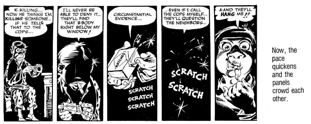
Long narrow panels, especially the use of many long panels next to each other make the scene feel more fast-paced and thrilling because they evoke a crowded feeling:
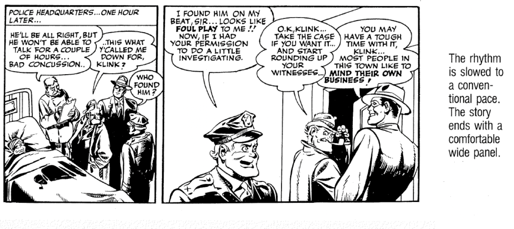
When the story events become more relaxed or if a certain moment should feel drawn out, wider panels can be used:
Of course, not all comics use panels in different sizes or shapes. In many graphic novels and newspaper comics, all panels have the same shape and size, and the narration is only done by what is shown in each panel and through text. Eisner explains the emotional effect of panels as they are commonly found in more traditional comic books. However, in my opinion, this knowledge about which emotions certain shapes and compositions evoke can be applied to more than just traditional comic books.
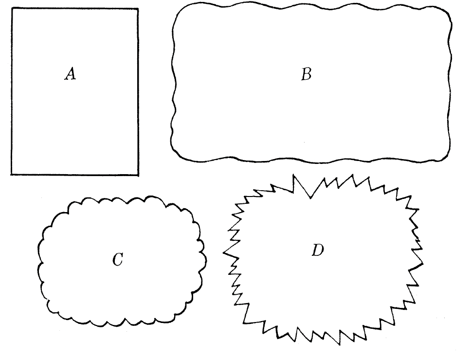
In addition to the panel’s shape and size, the border of the panel can also help express different feelings or happenings. The panel border does not have to be drawn in simple straight lines, it can also be drawn with wavy lines in order to express a flashback, for example. Panel “C” in the figure may be recognized as a typical thought bubble and panel “D” is associated with noises, something loud, emotional or explosive. (cf. Eisner 1985: 44)
We can also design the panels in a way that visually supports or mimics whatever is happening in the story at that specific moment:
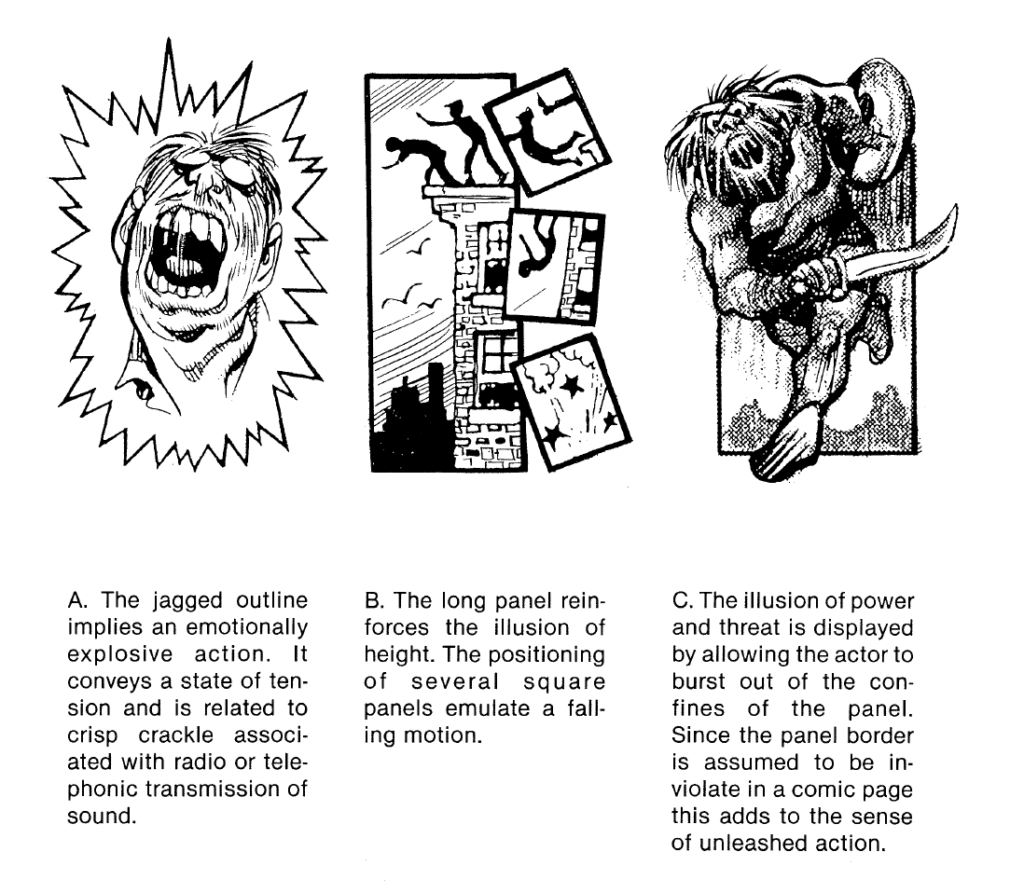
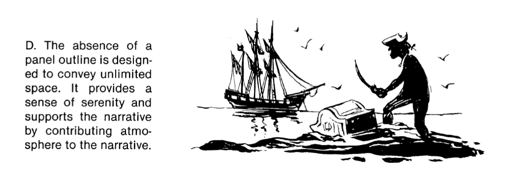
We can also leave some panel outlines away entirely to make a scene feel like it is happening in a very wide, open area:
Planning And Composing The Panels
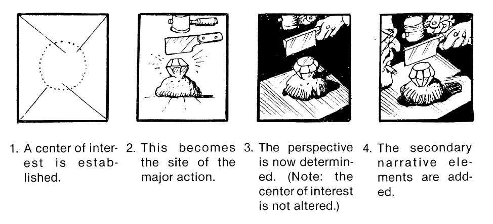
Next to determining the flow of the story and how the panels support this flow, we also need to consider what is in each panel, of course. We need to establish what character, object or action we need to depict in each panel, where the center of attention is to place this main object or character, and then we need to think about which perspective or lighting best supports the message of the panel. (cf. Eisner 1985: 44)
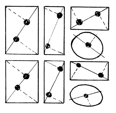
To decide where in a panel to place our main object or character, we can find out where the focal points are in the panel – they are the approximate areas our eyes tend to fall on first when looking at the panel. These focal points are determined as depicted in the following image and they depend on the shape of the panel. (cf. Eisner 1985: 151)
Bibliography:
Eisner, Will (1985). Comics and Sequential Art. Tamarac, FL: Poorhouse Press.