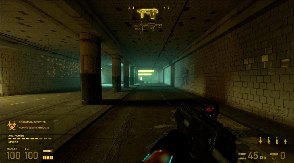
Half Life 2
The Half Life 2 HUD is praised for its simple, clean and unobtrusive design that complement the game‘s overall aesthetic. The monochromatic amber palette gives it a distinctive look and makes it a part of the game‘s identity. The HUD is simple and effective, as it only displays necessary information. The Half Life 2 HUD shows that a game‘s HUD can be more than just a necessary element and can be both beautiful and functional.
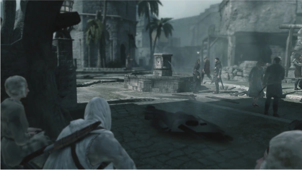
Assassin‘s Creed
The game was designed without a HUD in mind, and the pure presentation of the action creates a more engaging and rewarding experience compared to having icons on a mini-map. The absence of a HUD requires a specific approach to environment design, mission design, and dialogue writing, making the game more interactive and allowing players to learn the city and find their goals.
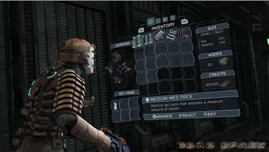
Dead Space
Dead Space teaches that a HUD can be effectively integrated into the game to maintain player immersion without sacrificing functionality. The game is praised for its unique approach to the HUD, which was a mix of shooter and survival horror genres and helped keep players focused in the moment. The health bar and map projection contributed to the mood and tension, while also guiding players through complicated levels and making them vulnerable when they stop to review their objective. This made the player experience more engaging and added to the suspense of the game. Dead Space demonstrates that good design can transform the HUD into an integral part of the game world.
https://www.gamedeveloper.com/audio/6-examples-of-ui-design-that-every-game-developer-should-study: Best Practice Examples https://uxstudioteam.com/ux-blog/whats-make-or-break-in-game-ui-design/: Best Practice Examples