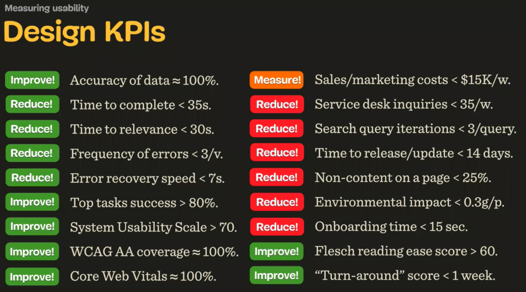
Vitaly Fridman has published several books and articles in Smashing Magazine. He is currently the editor-in-chief of Smashing Magazine. His masterclass is about complex UI design. He starts with a big question: How do you measure design? You measure design with design KPI’s. You have a set of performance indicators to measure the quality of the design. Before the designer starts his work, he has to know the goals. Fridman distinguishes between art and design with a simple statement: design solves a problem. Therefore, one can judge whether a design is good or not by evaluating which design solves the problem better. In his opinion, design is a matter of effectiveness, not taste. He explained the KPI workflow with a list of possible KPIs. Depending on the project, there will be different KPIs, and different KPIs will matter. Does the time to task completion need to be improved? Or are other KPIs more relevant? Like, for example, how accurate is the data?
The four most important KPI´s, which define the experience of the user.
- Time on task
- Task success rates
- Error Frequency
- How quickly people recover from errors
Everything the system and user environment must be taken seriously, and everything must be measured. A designer should talk to marketing and sales about customer complaints, consider technical problems and so on. Because all these insights lead to better problem solving. If you improve search, you need less money for advertising, or you make more money because people find the product faster. These KPI’s should be measured continuously.
Before it comes to the evaluation, the designer has to decide which design pattern is most suitable for this product. Again, you decide on the list of KPIs, and you can prioritise certain KPIs, and you also need to consider the type of user. For example: Do we have more new users or users who revisit the site? Do we have beginners or more experienced users.
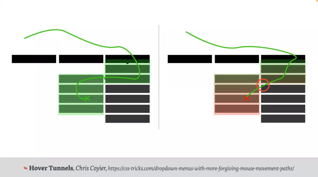
Based on this KPS and the user analysis, you select the pattern that meets the requirements. Like the Hover navigation. A mega-menu can be complex and difficult to digest, but on the other hand, offering a mega-menu with a hover path is a big hassle if you have more than two levels. At some point the mouse pointer leaves the hover area and the sub navigation is closed. The user then has to hover through the submenus again. A mega-menu slows the user down at first, but leads to a faster result. Hover menus are not suitable for mobile phones.
Navigation patterns on mobile devices with more than one level have often come from patterns that do not fit the KPI. Slide-in navigation may look good, but an accordion menu is faster to navigate because you see all the information at once and don’t have to jump back and forth. (Alliance) A good solution would be to split the screen and show the first and second level on one screen. If you have a long list, the A-Z pattern works very well. Breadcrumbs are also an important navigational element, but if you break the pattern, it can get confusing like arrows pointing in the wrong direction or disabled breadcrumbs. The disabled breadcrumbs are due to the hover menu, where certain entries don´t have a single page.

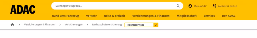
The navigation should move visitors forward, if they need to go back, you provide breadcrumbs. The ADAC shows a dropdown within the breadcrumbs, which should replace a sidebar. On the Swiss government website, the main navigation is within the breadcrumbs. This concept also works for mobile devices.
Interestingly, this behaviour was also found on other Swiss websites, while the reverse breadcrumb error was found on websites in Denmark and the Netherlands. It only showed up on a few websites, so it needs to be further investigated whether there is a behaviour of using certain patterns for certain regions – which could make sense as the designers might know the websites in their own country better.
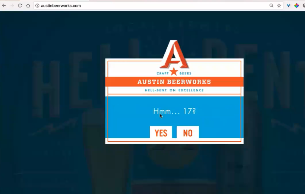
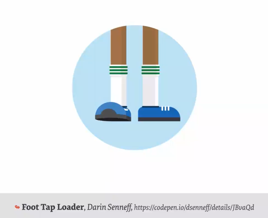
The choice of pattern is closely related to what the user wants and needs to do to complete their task. Dropdowns, for example, are the slowest element of interaction, while buttons are the fastest. But not in every case is the time to complete the task the most important KPI. If certain interactions are too fast, they can lead to more errors, which is not in the user’s interest. Sometimes the fastest way is not the best experience either. Having fun can lead to a much better experience. If it’s exciting, people will remember the website. For a playful approach, you can use micro-interactions or unusual loading spinners.
[1] Vitaly Friedman – Masterclass Talk – Complex UI Design Practical Techniques at Interaction Design Foundation.