Alexander’s intention with the design pattern in architecture was to involve the inhabitants of a house and give them a tool to communicate their needs to the architect. His approach was user centred. He created a structure for his architecture pattern consisting of name, ranking, picture, context, problem statement, problem description, solution, diagram (graphical explanation), references. So, the structure is very similar to the structure used in software and HCI pattern. Software patterns consist of name, context, problem, solution, examples, diagrams, and cross-references. In software development, however, the pattern language was not intended to involve users in the process, but rather to allow developers to communicate with each other. The idea of UI patterns as described by Alexander influenced Norman in Psychology of Everyday Things (published 1988; p. 229). Apple’s Human Interface Guidelines also referred to it, and the Utrecht School of Arts used patterns in their teaching. (In the year 2000, however, there was still no binding pattern language.) [1]
Jenifer Tidwell recognised 1997 in her article A Pattern Language for Human-Computer Interface Design that designing user interfaces requires a systematic approach. She also mentioned that the creation of good design solutions often worked better when the designers were talented but, above all, experienced. As in any other discipline, designers in the user interface field benefited from studying and adopting the work of other designers and applying already successful solutions. Reinventing solutions is not only time-consuming, it can also lead to results that do not meet the desired expectations. Tidwell speaks of bizarre solutions that are the result of reinventing common designs. Experienced designers, on the other hand, use their knowledge of design principles and process to make ideas feasible in a new context. Experience, on the other hand, requires time and making mistakes to gain the knowledge. In her first article on the subject, Tidwell argues that there should be a simpler solution, a shortcut. She sees this shortcut in the introduction of design patterns along the lines of software development and architecture. The advantages for designers are that they can draw on accumulated knowledge and have a common language that simplifies communication within the team and with the client, thus reducing misunderstandings. In addition, new solutions can come about when creatives are forced to stay within a certain framework and focus on that one task. Design patterns could also form the basis for frameworks for programming. Design patterns also represent advantages for the entire community of HCI designers. The usability of an interface design could be discussed on this basis – if the solution works or not. The patterns could also take over working solutions from other analogue fields and exchange them in an interdisciplinary context. Solutions that already work well elsewhere can also be helpful in user interface design. This has already been done (e.g. metaphor for the desktop) but it would be possible on a more abstract level. We could also learn from solutions that have been dismissed for various reasons, e.g. due to unfashionability. The exchange of ideas could be greatly facilitated and made accessible to a broader community. It would be easier to build on existing results and find new solutions more quickly, innovatively and across sectors. [2]
Basically, all these ideas are not new, they have just not yet been sufficiently emphasised and systematically introduced in this young discipline. It is no secret that our knowledge is based on the knowledge of our ancestors, that we learn quickly and easily through imitation. That this behavioural pattern: learning by imitation also extends to this new discipline is therefore no surprise. What is important in these beginnings of design patterns, however, is the systematic approach in which a broader mass can benefit from prior knowledge and insights. As has been shown throughout humanity, the more people have access to existing knowledge and can build on it to develop new ideas, technologies, and approaches, the faster we develop. For me, this is also a call to form a worldwide community that supports each other, analogous to the beginning of globalization and the start of the WWW.
In her article, Tidwell proposes an approach for a design pattern library for the first time. Analogous to software patterns, each design pattern should include the problem to be solved, the context of use, a primary rule, and good and bad examples. However, it is important to note that these descriptions are not recipes, nor should the design patterns reference the GUI directly. Just as a user need should not include a design suggestion to leave the design space as open as possible, the pattern should not be too prescriptive either. For Tidwell, one of the most important points in terms of acceptance of a pattern is if the basic concept can be applied in other disciplines (also analogue). If the pattern works in a different context, if it would work outside the HCI/GUI environment, it is most likely a good solution. (example)
In the same way, the pattern language can also be used to analyse existing interfaces. The structure of the pattern language itself is easy to understand. But to use it, you need to understand the purpose of the solution and the factors that are relevant to solving the problem. It is also important to make the process iterative. Tidwell’s intention for the development of a pattern language is to ensure a high level of quality in the interaction between human and machine aka the software. High quality is when the user has a successful and satisfying experience. This means that the content has been adequately prepared and presented for the user so that the user fully understands the content and is able to use it. Furthermore, the software guides and supports the user to the necessary extent and pace in their task. Successful software supports in such a way that the user can fully concentrate on his task and the software “to fade from the user’s awareness”. If these two goals are met and learnability, user empowerment, and enjoyability are added, the criterion of “high-quality interaction” is fulfilled. Tidwell divides the patterns into “primary patterns” from which larger patterns can be composed. The content Narrative, High-density Information like Maps, tables, and charts or as Status Display the state of something that will change like clock or dashboard. The primary patterns for actions can be Forms, Control Panel, WYSIWYG Editor, Command-line, Social Spaces like Newsgroups and Chat Rooms. The action primary patterns are very limited with the things users can do. A control panel with one button reduces the complexity to this one action, where the button can be used multiple times in many ways. Tidwell says that unlike the pattern languages that evolved from Alexander’s theory, this language can be arbitrarily combined and used on a larger or smaller scale. Form filling can appear as the main action on the page, or only as a small secondary action – depending on the context. (p. 11) In her article, Tidwell has compiled an approximately 70-page collection of patterns, which she has structured according to the method Example, Context, Problem, Forces, Solution, Resulting Context, Notes.[2]
Tidwell called her pattern language Common Ground. Common Ground (Tidwell 1998) or the Web patterns collection (Perzel and Kane 1999) are pattern collections that were created around this time. Martijn van Welie and Hallvard Trætteberg created their own pattern collection around 2000. In their article they criticise the lack of user perspective in the pattern collections of Tidwell, Perzel and Kane. They have created their own collection to compensate for this lack. And they present a different format that can remedy this deficiency. They focus more on the end-user and the problems they may have when using the software. For them, usability is the focus of the pattern language. Tidwell’s language is more for designers than users, while they want a solution which is more user centred. Their argument cannot be dismissed: If a pattern fits for a user, it fits for a designer, but the reverse is not always the case.
The focus of this pattern collection should be on user centred design and usability. For this reason, it is very important to consider the how and the why in the format. In the pattern the description must explain how the solution works and why it is a good solution. The focus on user centred design is also important to ensure usability and not to put the interests of the stakeholders above those of the users. Banners and splash screens for advertising purposes are considered a good solution at the time but are neither important for usability nor certainly do not enhance the user experience. The pattern collection has been structured with reference to Norman’s interface principles formulated in 1988.
- Visibility – Gives the user the ability to find out how to use something simply by looking at it.
- Affordance – Refers to the perceived and actual properties of an object that indicate how to use the object.
- Natural Mapping – Creates a clear relationship between what the user wants to do and the mechanism by which they can do it. To complete my task, I need to select this option, enter this information, and then press this button….
- Constraints – Reduces the number of ways to perform a task and the amount of knowledge required to perform a task, making it more manageable. Oh no, what do I have to enter here? Ok, I only have these choices….
- Conceptual models – A good conceptual model is one where the user’s understanding of how.
- how something works matches the way it works. This way the user can confidently predict the effects of their actions.
- Feedback – Indicates to the user that a task is being performed and that the task is being performed correctly.
- Safety – The user must be protected from unintended actions or errors.
- Flexibility – Users can change their minds and each user can do things differently.
The increase/improvement of usability should be in the foreground when creating the pattern and should cover the following criteria: learnability, memorability, speed of performance, error rate, satisfaction, and task completion. These are called usage indicators and each pattern must cover at least one of these indicators.
Structure of Wellie:
Progress ( by Martijn van Welie, p. 7)
- Problem Description
- Usability Principle which it confirms.
- Context
- Forces
- Solution
- Rationale
- Examples
- Known Uses
- Counter Example
- Related Patterns
Example for this pattern:
Problem
The user wants to know whether or not the operation is still being performed as well as how much longer the user will need to wait.
Usability Principal Guidance
Feedback
Context
Systems tasks that take a long time (typically more than a few seconds) and must be completed before the next tasks can be started.
Forces
- The performance of the operation cannot always be controlled/avoided by the user (or designer), e.g. because it relies on an external system or hardware, which may fail, block or have low performance.
- The users do not want to wait need clear feedback on the progress and estimated time
to completion. - The users may not be familiar with the complexity of the task.
During the operation the user might decide to interrupt the operation because it will
take too long.
Solutions
Show that the application is still working and give an indication of the progress. Provide feedback at a rate that gives the user the impression that the operation is still being performed e.g. every 2 seconds using animation. Additionally, provide a valid indication of the progress. Progress is typically the remaining time for completing, the number of units processed, or the percentage of work done. The progress can be shown using a widget such as a progress bar. The progress bar must have a label stating the relative progress or the unit in which it is measured.
Rationale
By providing new feedback at a rate around 1 or 2 seconds, the user can see whether the application is still processing and has not died. The progress indication gives feedback on how long the application will remain in this state. Combining these two aspects relieves the user’s worries. Leaving one of the two out would not solve the user’s problem. The solution increases satisfaction because the user knows what is going on and how much longer the user needs to wait. It increases the sense of control. The pattern also avoids additional system load by avoiding retries from users.
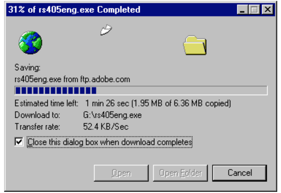
Examples
When downloading a file using Internet Explorer 5, the user is presented with this dialog. It shows the progress in percentage as well as the amount of kilobytes of received data. Additionally, the estimated time left is shown and updated couple of seconds. An animation of a flying document shows that the download has not stalled. Known Uses Netscape’s Download box, Apple’s file cop [3]
[1] Jan O. Borchers. 2000. A pattern approach to interaction design. In Proceedings of the 3rd conference on Designing interactive systems: processes, practices, methods, and techniques (DIS ’00). Association for Computing Machinery, New York, NY, USA, 369–378. https://doi.org/10.1145/347642.347795
[2] A Pattern Language for Human-Computer Interface Design, Jenifer Tidwell, May 17, 1997, p. 1-5
[3] INTERACTION PATTERNS IN USER INTERFACES, Martijn van Welie, Hallvard Trætteberg, 2000