The design of a user interface varies depending on the genre, theme, and style, but there are fundamental guidelines to create a good UI.
Research
Designing a user interface for a video game involves considering the conventions and successful design patterns used in similar games. It is recommended researching and looking to other games in the same genre for inspiration. It‘s important to understand the conventions of the genre, such as the placement of health bars, and the color coding used for different elements. The UI should also match the theme of the game, taking into account how other games with similar themes approach their aesthetic. However, it‘s important to follow conventions, there‘s also room for creativity and innovation in UI design.
Right Placement of UI Elements
This is done through wireframing, where a greyscale diagram is created to show what the UI will look like. During this process, the focus is on the placement and shape of UI elements, not on color. The idea is to ensure the fundamentals of UI and UX are solid before adding the aesthetic elements. The wireframe structure should be based on the genre of the game and the UI should be based on the theme of the game. To design effective UI, it‘s important to always keep the player‘s perspective in mind and anticipate how they will interact with the UI.

Hierarchy
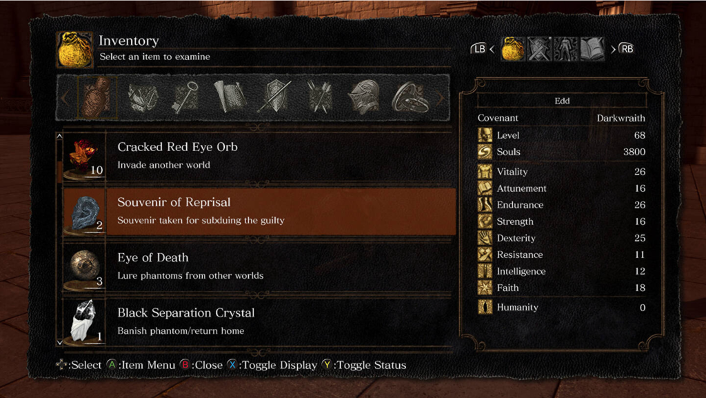
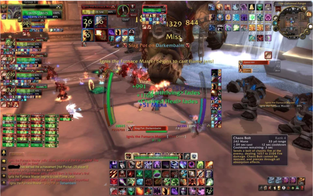
When designing UI, it is important to consider what information the player is likely to want to know or see, and arrange the UI elements in a hierarchy of importance. The inventory screen in „Dark Souls“ is a good example, where the inventory is the main focus and the controls are secondary. It is also effective to gate off information, reducing the amount of UI elements on the screen to draw attention to the most important elements. Clutter is the main factor that can cause a game‘s UI to fail. Multiplayer games are particularly prone to having cluttered visuals, as they often require players to attend to many tasks simultaneously while only having one screen to do it all on. This includes gameplay, upgrading, strategizing, executing special attacks, reading a map, and communicating with other players.

Animation
Animation can be used to enhance the visual design of the UI, making it more appealing and lively. This could be in the form of a subtle pulse effect or moving backdrop. However, it should not detract from the functionality of the UI and should guide the player‘s eyes to the information, the interface, and menu options. The text should be easily readable to ensure the player knows where to focus.
Feedback
In designing UI it is important to gather feedback from players. It is crucial to ask for their opinions on icon design as the meaning of an icon may be different for different people. It is best to ask open-ended questions about what they think the UI is trying to convey and what they expect to happen when they press certain buttons. Also, it is important to gather feedback about their experience with the UI and identify any confusion or misunderstandings. Always prioritize the player‘s experience and never assume what they think.
https://www.mockplus.com/blog/post/game-ui-design: Tipps for designing UI in Games https://www.gamesindustry.biz/best-practices-for-designing-an-effective-video-game-ui: Tipps for designing UI in Games https://uxstudioteam.com/ux-blog/whats-make-or-break-in-game-ui-design/: Tipps for designing UI in Games