As a light intro to my deep dive into many different new AI tools, I will start with Adobe Illustrator. I want to get Illustrator ‘out of the way’ quickly, since it is the program I will most likely get the least use out of for my master’s thesis, but I for sure wouldn’t want to ignore it.
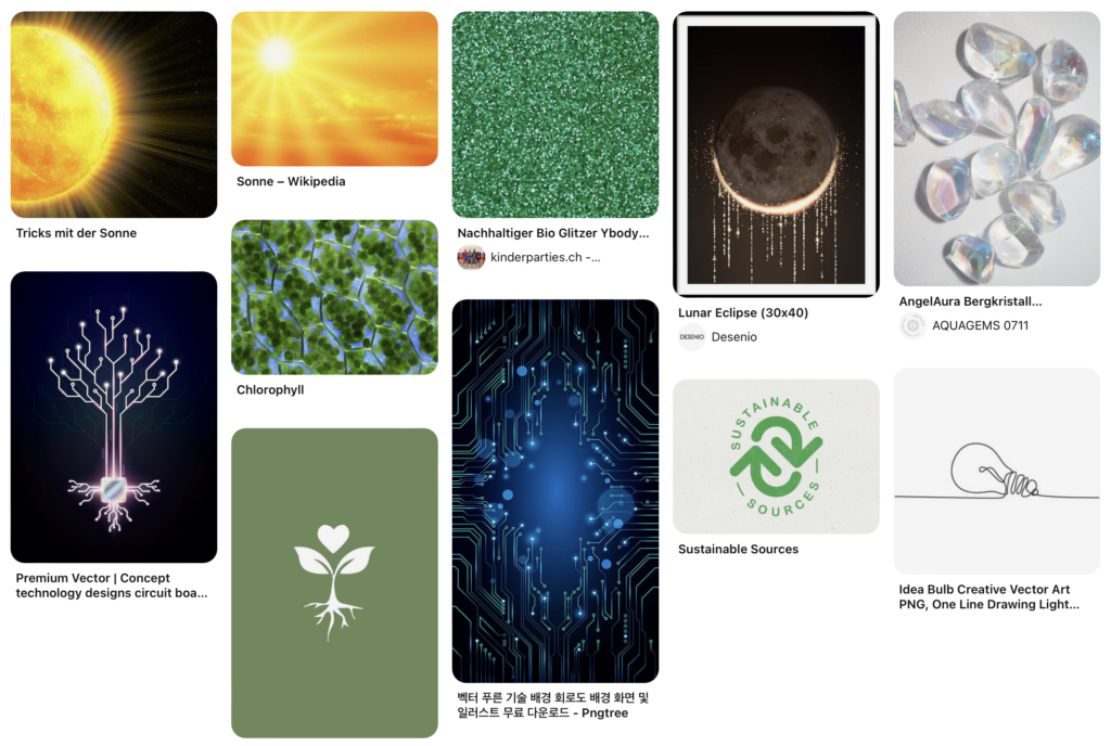
To test it out I will be putting it to the test for a client who have requested a logo for their tech startup “SoluCore” focussed on a sustainable alternative to traditional catalysts (I’m not entirely sure what they actually do but I don’t need to understand anyways). The client has provided a mood board and a sample font they like the style of:

Text to Vector Graphic
Illustrator’s new AI centrepiece and pendant to photoshop’s generative fill gives the user a prompt textbox, the option to match the style of a user specified artboard, artwork or image as well as four generation types to choose from: Subject, Icon, Scene and Pattern.
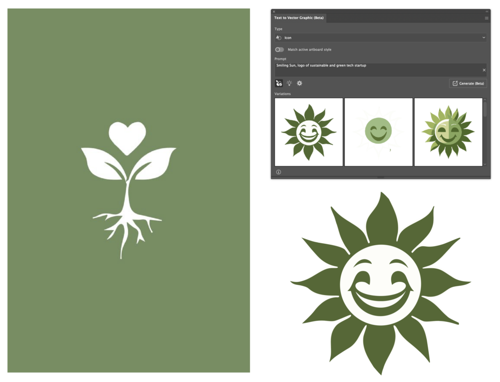
Starting with the ‘Subject‘ mode, I prompted the AI to generate a ‘Smiling Sun, logo of sustainable and green tech startup’:
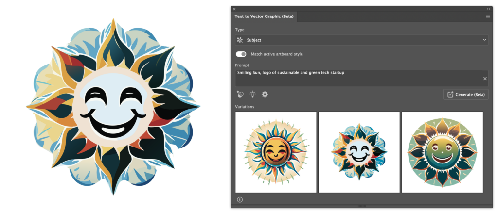
The results are fine I suppose, they remind me of a similar Photoshop where I also wanted to create a smiling sun, makes sense when considering that both are trained on Adobe Stock images.
Here is the same prompt using the ‘Icon‘ generation type:
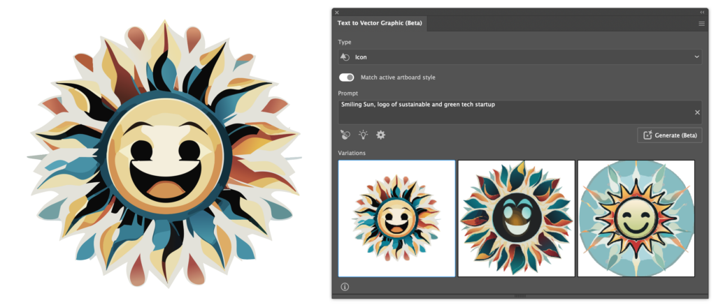
At first I was suprised at just how similar the results were to the previous results, but soon realised that the ‘Match active artboard style‘ option is switched on by default, which I find to be counterintuitive. I must say, though, that the AI did a fantastic job at matching the previous style. Having turned that off, The AI gave me the following results:
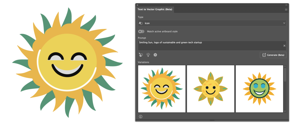
The decrease in detail and difference in style is immediately noticeable.
Though not remarkably applicable for my usecase, here are the results for the ‘Scene‘ option:

What becomes apparent here, is that the user can specify the region the AI should generate to using vector shapes or selections. Having specified no region on an empty artboard, the AI defaults to a roughly 512px x 512px square. Selecting the entire artboard and modifying the prompt to describe a scene to “Smiling sun setting over a field of sunflowers” gives these results:
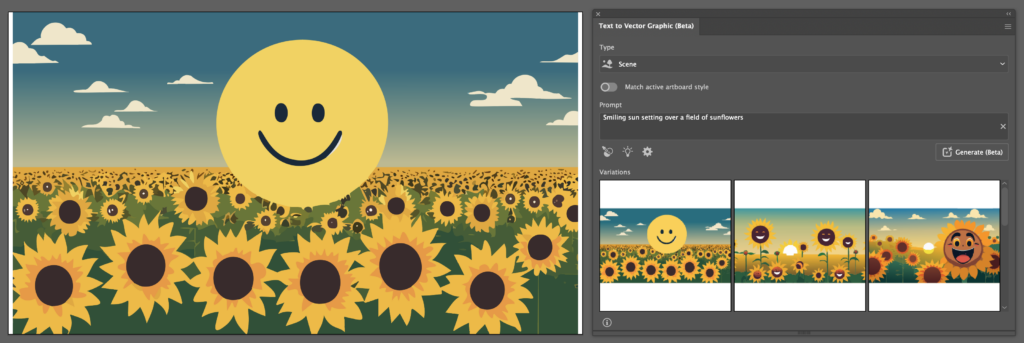
Terrifying, I agree. Here, some inaccuracies of the AI seem to show. Not only did it leave space on either side of my selection, but also what should be a simply designed sun shows imperfections and inaccuracies. Isolating the sun and quickly rebuilding it by hand highlights this:

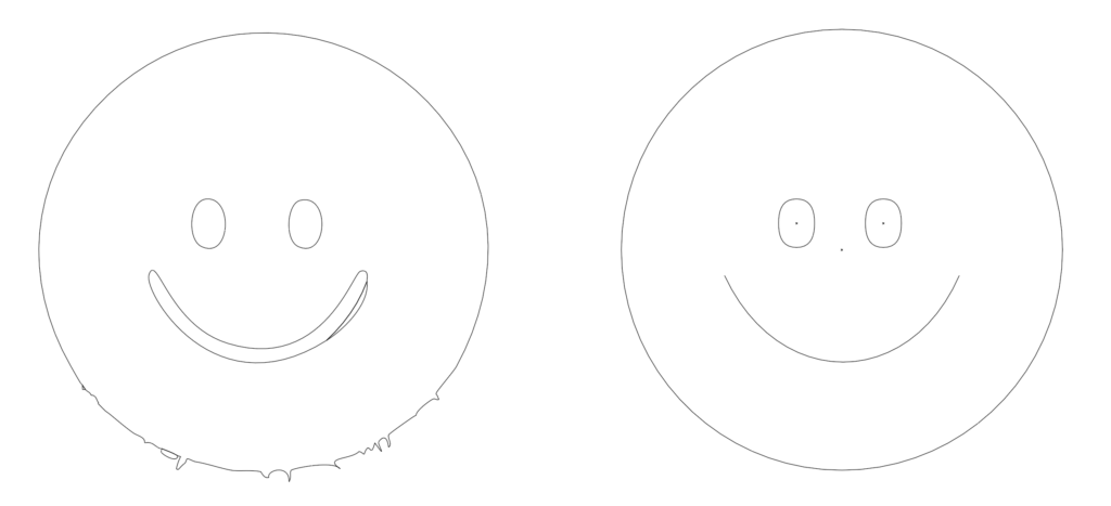
The artwork the AI generates usually have little anchor points, making them efficient, but these inaccuracies mean that cleanups will be needed frequently. Additionally, the AI has yet to generate strokes or smart shapes and, instead relying on vector shapes entirely.
Reverting back to the “Smiling Sun, logo of sustainable and green tech startup” prompt, I used the pattern mode for the next generation:
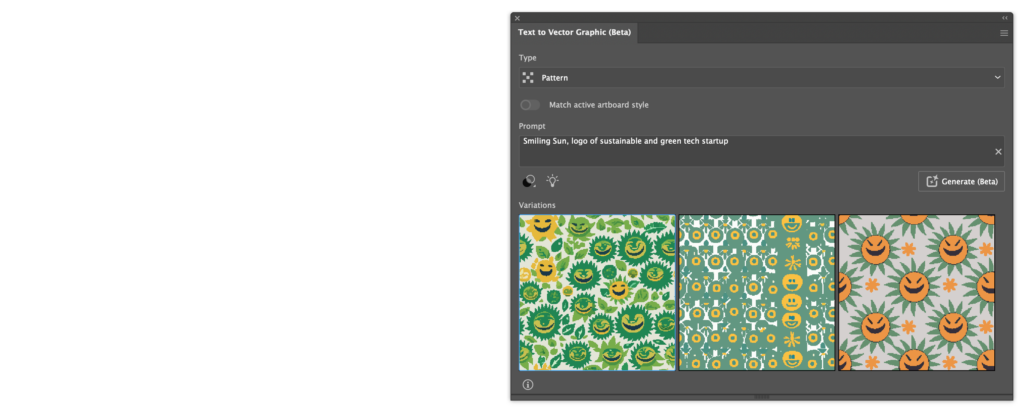
Worryingly, these results look the least promising by far, showing inaccuracies and unappealing results in general. Also, the AI does not generate artwork directly onto the artboard and instead adds the created patterns to the user’s swatches when a prompt is clicked.
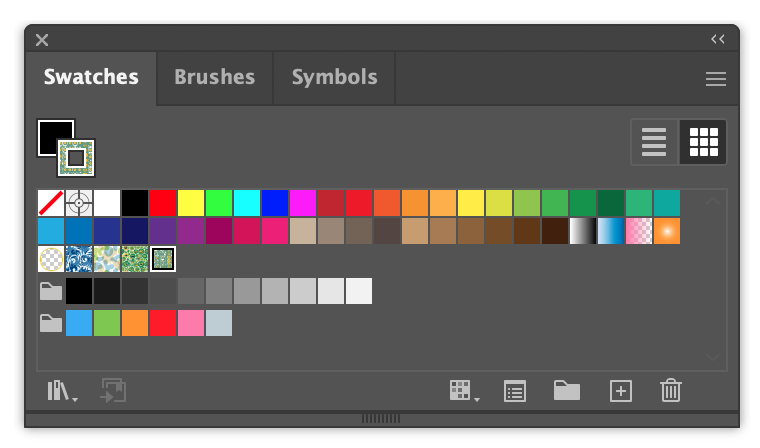
Another counterintuitive behaviour, yet, I think a useful one. I personally have not been using the ‘Swatches’ feature myself but I could definitely see it being used by people who rely on Illustrator daily. With a bit of work, or perhaps different prompts, this feature could have great potential.
Next, I wanted to use one of the client’s provided sample logos and the Style picker to tell the AI to generate a sun using its style.
The color is immediately recognised and I can definitely see the shape language carry through as well.
Generative Recolor
An older feature infused with AI I still haven’t gotten around to trying, generative recolor allows the user to provide the AI with a prompt, upon which Illustrater will, well, recolor the artwork. The user can also provide specific colors the generations should definitely include using Illustrator’s swatches.
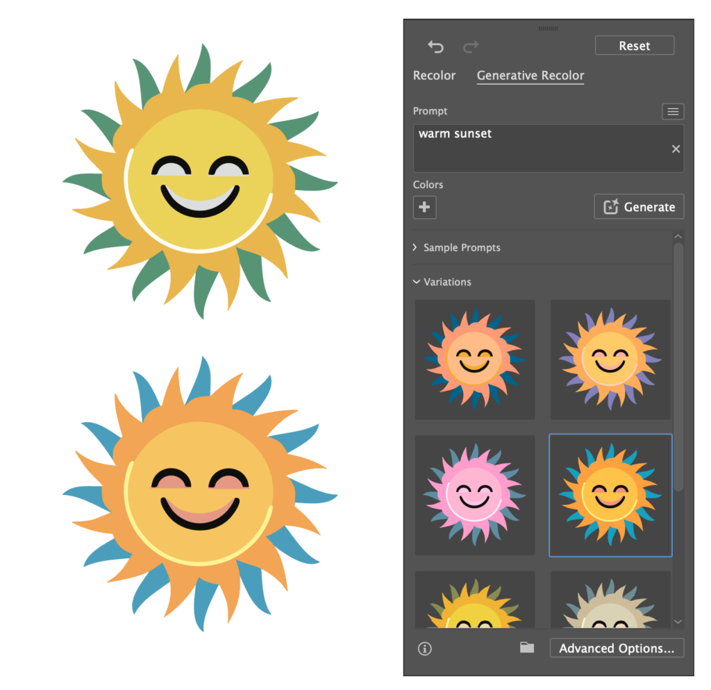
Retype
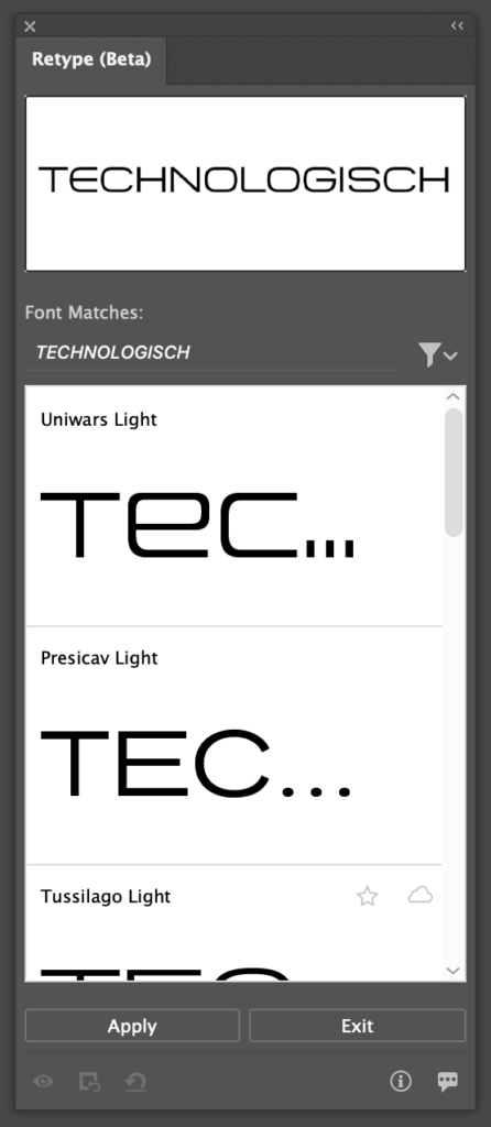
A feature I am particularly excited about, Retype, allows the user to analyse vector or rasterised graphics based on its text contents. Firefly will then attempt to match the font to an installed font as closely as possible and in optimal scenarios even allows the user to edit the text directly. For my example, I provided the AI with the font sample I recieved from the client.
The AI took surprisingly long to analyse the image, however that is only when compared to the rapid speeds of the other AI tools, we are talking about 30 seconds at most here. The AI was not able to find the exact font, but found 6-7 fonts that match the aesthetic of the original very well. In my opinion, it is not a problem at all that the AI was not able to find the exact font used in the image, since I have no way of knowing about the licensing of the original font.
After hitting ‘Apply’, the AI used the font I selected and made the text in the provided image editable. Strangely, the AI only activated the exact Adobe font it detected in the image, not the entire family, leaving it up to me to search for it manually and download the rest for more variety. This behaviour too should be changed in my opinion.


Getting a similar font to what the client requested is a fantastic feature, yet if I could wish for something it would have to be a ‘Text to font‘ generative AI in which a user could input a prompt for a style of font they wanted and have Illustrator provide suggestions based on the prompt. I’m sure Adobe has the resources to train an AI on many different font types to have it understand styles and aesthetics beyond the already existing sorting features inside of Adobe Illustrator.
It is also counterintuitive how to get back to the Retype panel, it’s very easy to lose and upon reopening the project file, the other font types are not shown anymore in the Retype panel. The user can then not select text and have the retype panel suggest similar fonts anymore. A workaround, silly as it may sound, is to convert the text to vector shapes or a rasterised image, and then run the retype tool again to get similar fonts.
Getting to work
Using the aforementioned tools, I got to work on the client request for the logo of ‘SoluCore’ featuring either a smiling sun or a flexing sun. Here are the results:
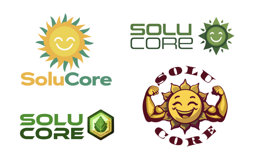
Working with the AI for the first time was challenging but engaging and dare I say fun. It allowed me to get access to many different ideas quickly. However, the inaccuracy of the AI forced me to recreate some of the results, especially the ones that use basic shapes and mimic accurate geometric forms. As for the more complex results like the flexing sun, I had to have many iterations be generated until I was happy with a result. The arms looked great but the smiling sun itself was rough. Using the arms as a stylistic input for the AI led to better results. Once I was happy, there was still a lot of cleaning up to do. The generative recolor was also struggling with the more complex generations and still required a lot of human input.
Conclusion
This ultimately led to me not saving a lot of time, if any. The AI was helpful, of course, but the overall time spent on the designs was similar to regular logo design. Also, the font choices were still almost completely dependant on myself, so this could be a place where a potential AI tool could help out a lot. In the end, the client asked me to remove the smile of the smiling suns and went for this result:

Luckily, this result was relatively clean and I did not have to do much cleaning up in order to deliver the logo to the client. If they had chosen another option, I would have had to do a lot of tedious cleanup work, digging through the strangely grouped generated vector shapes. If I’m being honest, I would probably have even considered recreating the more complex designs from scratch had the clients chosen one of those. This cleanup phase is needed in traditional logo work as well, just that the amount of cleanup work required with AI is hard to determine, since the quality and cleanliness of the results differ so much.
All in all, the experience was definitely more positive than negative, my main gripe concerning the cleanup phase could also be a result of my infrequent use of Illustrator and rare occasions where I need to design logos, combined with being spoiled with other AI that need little work post generation. Whenever I will need to use Illustrator, I will definitely include AI into my workflow, even If I’d end up not using any of the results, using it is so quick that it will likely never hurt to try.