This knowledge is incredibly important when we look back at our main question. When the goal is to influence the audience and transport emotions it is important to know which colours evoke which response in the audience. But more on that later.
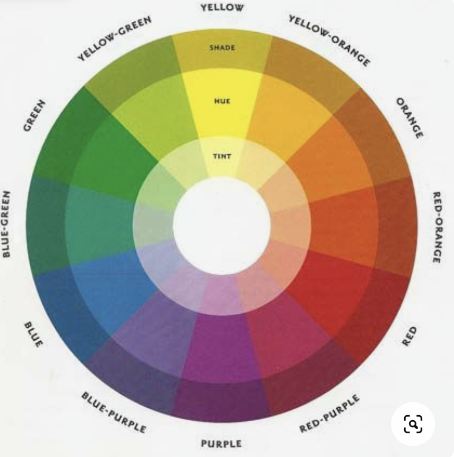
When we take a closer look at the colour wheel we can see that we not only can separate colours into warm and cold colours but we can also operate each colour in hue chroma and value or as seen in the graphic in hue, tint and shade. Hue is defined as the colour. That means that yellow, yellow-orange, orange, red-orange, red, red purple, purple, blue-purple, blue, blue-green, green, and yellow-green are hues. Chroma is the saturation of the hue. It defines how saturated or dull the colour is. The Value defines how bright the colour is. To better imagine the difference between a high and low brightness of a colour it is best to imagine that colour under the influence of different lights. For example, blue will look very different in the late evening compared to midday.
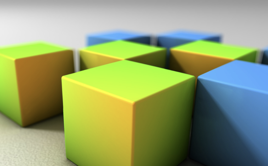
But why is it important to know how outside factors like the current time influence colours? To answer this it is best to look at some phenomena from the field of perception psychology. Not only the time of day can influence the perception of colours but also neighbouring colours and different backgrounds. Depending on the situation our brain can be tricked into perceiving things differently than they are. Usually, the brain is excellent at decoding the world around us. For example when an object is surrounded. The brain can recognize a familiar object as being a consistent colour regardless of the amount or wavelengths of light reflecting from it. When you look at the cube you can tell that it is a consistent yellow, even though the surface looks green in some parts because of the blue cubes that surround the yellow ones.
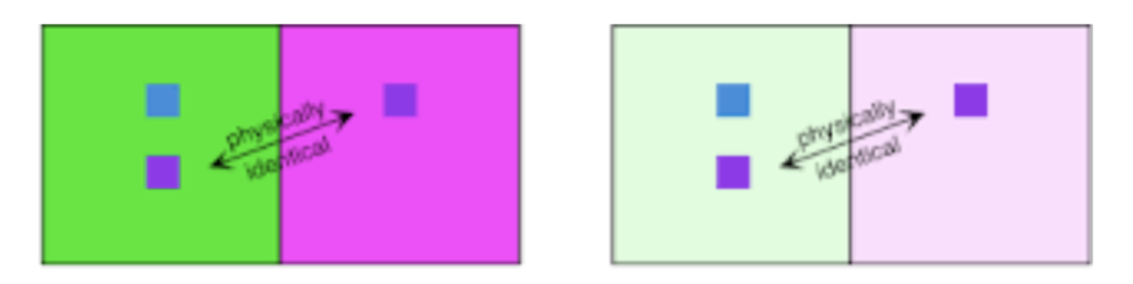
This phenomenon is called consistency of colour. In other situations however the brain is tricked. When we look at squares whose colour is identical but are placed on two different backgrounds, we perceive the tone and hue of the square differently. This phenomenon is called simultan contrast. It works the same way with black and white.