Colour Harmonies
Knowing how different colours react to each other is especially important in cinematography since there will always be a multitude of colours, or more precise hues, chromas and values in every single frame. To be able to use this advantageously it is mandatory to understand the interference between those colours, to understand colour harmonies. In the following part of the post, we will discuss colour harmonies and their effect on the audience.
Monochromatic:
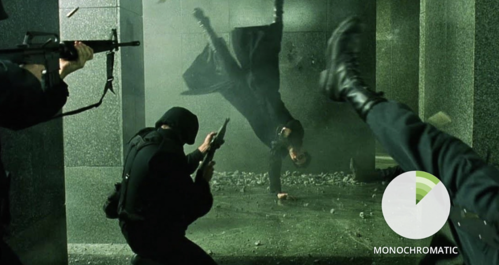
When we speak of monochromatic images it doesn’t mean that the image is black and white. Monochromatic however means that the colours used originate from the same hue. Matrix is a good example of a film that uses a monochromatic colour scheme. The difference in chroma and value is enough to create tension, drama and a threedimensional image. A Monochromatic look doesn’t aim at realistic colours. It weighs this special look over realistic tones in the skin or the environment
Analogue:
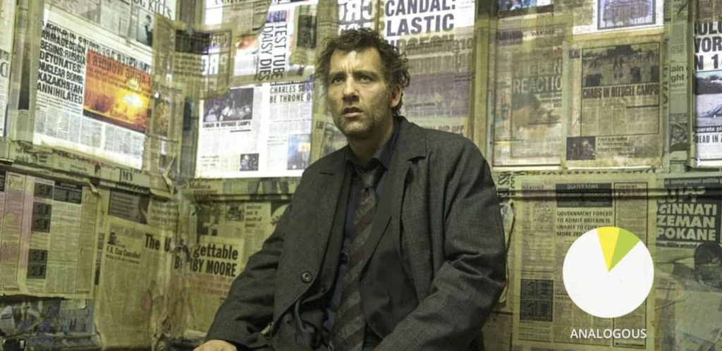
Analogous means colours bordering the main colour in the colour wheel. For example, the main colour in this scene from children of men is a mix of green and yellow. If you look at the image you will find parts that are green and parts that are yellow. So the colours that are directly adjacent to the main colour in the scene.
Complementary
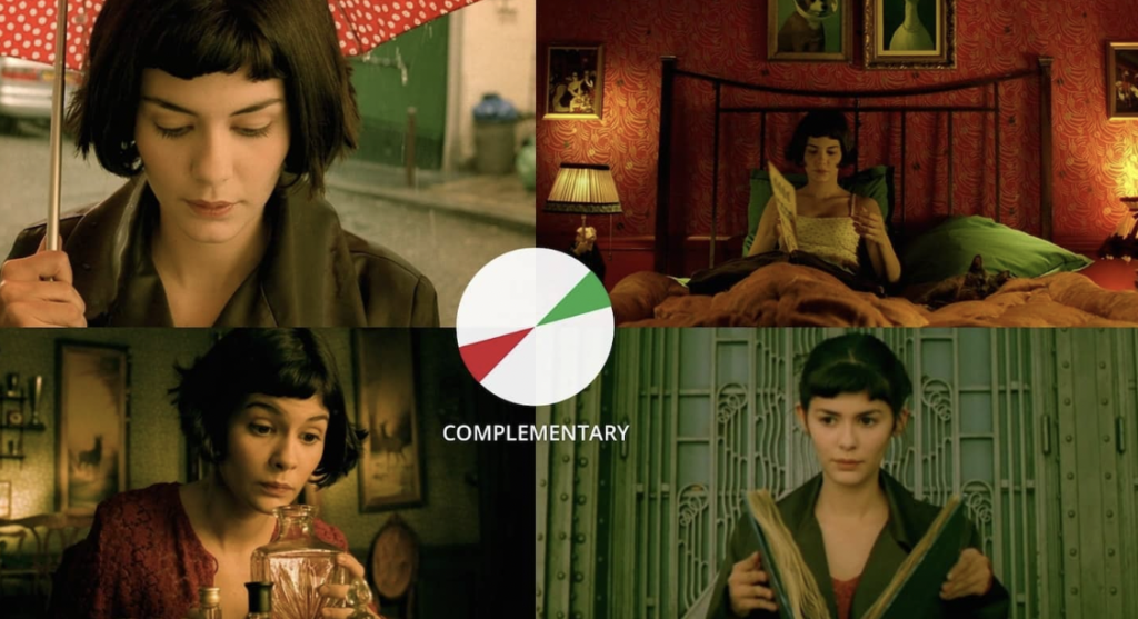
Complementary colour harmony is probably the most used in modern film. In complementary harmonies, two hues are used that are direct opposites on the colour wheel. An especially often used colour harmony is teal and orange. But every colour opposites are possible. Complementary colours are often used to make the subject of a scene stand out from the background. For example, the film the fabulous world of Amelie uses the colours green and red to create a contrast between Amelie and her surroundings to underline that she doesn’t fit in in the „normal world“. A complementary colour split doesn’t have to be an exact 50/50 split.
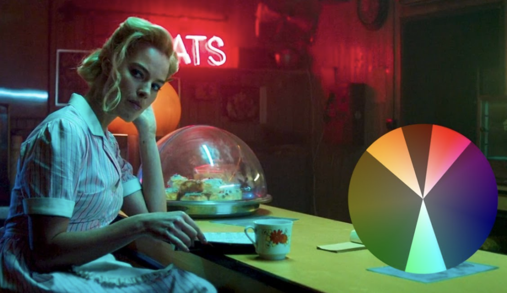
Split complementary
Split complementary colour harmony is probably one of the harder ones to create in filmmaking since it has to be set up and thought about while shooting the film. It is especially hard to create this look only in post-production. A split complementary harmony is very similar to a normal complementary colour harmony. The only difference is that for the secondary colour, the scene doesn’t use the polar opposite of the main colour but splits up in a Y shape. For example in this scene from terminal the main colour is green. But the secondary colours split up into red and orange.