The philological method is usually applied to works of art. But art had become a part of our daily lives. Never before has this kind of art played the role as it does today.
Subjection of man to the impersonal necessities of social, economy and political life. An emphasis on the beautiful has penetrated in all levels; it has also penetrated to the forms of propaganda used to advertise these goods.
And the success of such attempts at aesthetic appeal achieved by modern advertising is confirmed by many exhibits of original commercial designs which have attracted a large public.
There exists today whole literature devoted to the requirements of effective advertisements
(H.F. Adams – Advertising and its Laws/ H.E. Burtt – Psychology of Advertising)
In such treatments the emphasis is generally placed on the psychological element and on the utilitarian efficacy of the propaganda
Attempt to appeal aesthetic The success of modern advertisement in its attempts to appeal aesthetic.
In this Commercial for Sunkist oranges is the scene so perfect with a nice mountain view snow that shimmers in de sun and the color of the juice is perfect. > but in the whole commercial there is nothing said about the juice itself how healthy it is and how nice the taste is. There is no human only the nature and how you can experience the miracle you would experience when you drink the orange juice.
The fact that these oranges have to be transported kilometers to end at our house is not a matter.
Advertisements need to be aesthetically pleasing and need to provoke a feeling you get the product out of the ideal world. The origin of the product doesn’t matter. The aim of the advertisement is to sell and make money and not inform people.
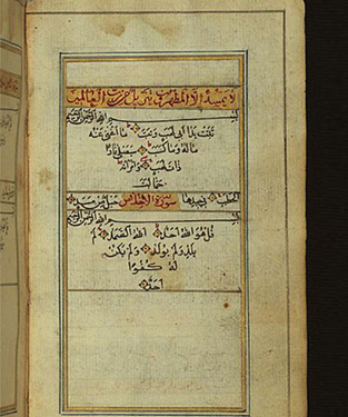
While I am waiting for a book on Arabic typography to arrive from another library, I did some online research on the topic. Unfortunately, the resources are very limited, so I could not find much valuable information. The following paragraphs summarize my findings from the online research.
Early development of Arabic scripts
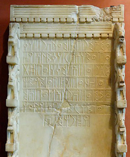
Archaeologists have discovered inscriptions that prove a close connection between Arabic scripts and several earlier scripts, such as the Canaanite and Aramaic Nabataean alphabets which were discovered in the north of the Arabian Peninsula. These writings originate from the 14th century BC.
Arabic Musnad
The cursive appearance of modern Arabic scripts is not present in the first Arabic script, Arabic Musnad. This script was used up until the sixth century and was found in Yemen, in the southern part of the Arabian Peninsula – it was discovered around 500 BC. Its shapes were quite simple and more closely resembled the Nabataean and Canaanite alphabets than they did the shapes of modern Arabic.
Al-Jazm
The Al-Jazm script, which was utilized by northern tribes in the Arabian Peninsula, is the earliest type of an alphabet which is similar to Arabic. However, the early Arabic scripts also appear to have been influenced by other scripts in the region, such as the Syriac and Persian scripts. Many scholars believe that this script’s origins lie in the Nabatean script. In Mecca and Medina, in the western part of the Arabian Peninsula, the Al-Jazm script continued to advance until the early Islamic period.
The script used in Al-Jazm evolved into a variety of styles, including Hiri, Anbari, Makki, and Madani. Other scripts emerged around this time, including the Ma’il, which is considered to be the predecessor of the Kufic script. Other scripts, such the Mukawwar, Mubsoott, and Mashq, did not make it through the development stage. These scripts were widely utilized before and throughout the early years of the Arabian Peninsula’s Islamic Empire.
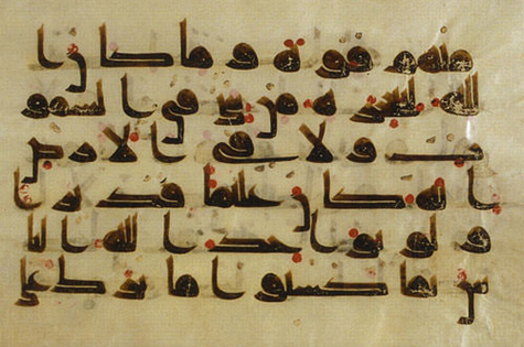
Kufic script
The Kufic script developed as the subsequent step in the evolution of Arabic calligraphy following the Arabic Musnad and Al-Jazm. We can recognize existing letter forms in the early Kufic script development, unlike the other ancient scripts. The Qur’an Kareem, the Muslim holy book, was written in the Kufic script, which developed over the course of the 7th century and was widely used up to the 13th century. Although the script’s name is a reference to the Iraqi city of Kufa, where it initially emerged, the majority of instances could be located in Medina on the Arabian Peninsula, where the Prophet Mohammed lived after leaving Mecca.
The dots which are familiar to us from modern Arabic scripts were absent from the Kufic script in its early phases of development. During the later development of these and other scripts, the letter dots (Nuqat) were introduced. Additionally, at a later point in time, the diacritical marks (Tashkeel) that represent the vowels of the letters were created by Abul Aswad Al Du’ali and Al Khalil Ibn Ahmed Al Farahidi.
If we look closely at inscriptions written in the Kufic script, we’ll see certain traits like angular forms and long vertical lines. Writing long text used to be more challenging since the script letters used to be wider. Nevertheless, the writing was utilized to decorate the outside of structures like mosques, palaces, and schools.
Although Kufic has been around for a long time and is one of the more widely used scripts in Islamic civilisation, several variations of it were developed in particular regions, like Egypt and Iraq. The following are some variations and advancements of the Kufic script: The thick Kufic script, Magribi Kufic script, Mashriqi Kufic script, Piramouz script, Ghaznavid and Khourasan scripts, Fatimid Kufic and Square Kufic.
Abbasid Dynasty
The Abbasid dynasty (750–1258 CE), which followed the Umayyad dynasty, refined Arabic calligraphy. Thuluth and Naskh were developed during this time. These advancements were brought about by three calligraphers: Ibn Muqlah, Ibn Al Bawwab and Yaqut Al Musta’simi.
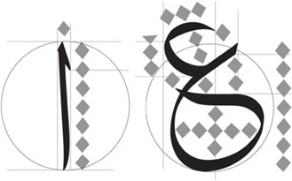
Ibn Muqlah limited the number of cursive script proportions styles to six, including the Thuluth, Naskh, and Muhaqqaq. The rhombic dot, the alif, the circle, and the similarity system are the four foundational parts of these rules.
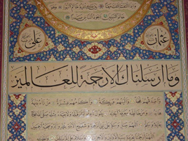
Thuluth script
Thuluth, which means “one third,” may allude to the size of the pen that was used for writing. It was frequently used to embellish mosques and various texts. During the Ottoman dynasty, calligrapher Seyh Hamdullah improved the Thuluth script, which was initially created in the 11th century by the Abbasid dynasty. It serves as the foundation for later scripts, such the Jeli Thuluth, Naskh, and Muhaqqaq.
Naskh script
Another primary script was formed around the same time. Naskh, which means “copy,” was initially used to copy texts, particularly the Holy Qur’an, but was later improved by Islamic calligraphy master Seyh Hamdullah under the Ottoman dynasty. The Naskh was traditionally used for long writings and inscriptions because of its legible characters. Due to its contemporary appearance and cursive letters, it is still used in printed Arabic books today.
Safavid Dynasty
The Safavid dynasty (1502–1736), which was established in Persia after the Abbasid dynasty, made significant contributions to Islamic arts and calligraphy. During the rule of Shah Islma’il and his successor, Shah Tahmasp, it improved the Ta’liq script that was already in existence and created a more developed variant, known as Nasta’liq.
Ta’liq script
The script’s lines, which appear to be hanging together, were the inspiration for the term Ta’liq, meaning “suspension.” The Ta’liq script, which is still in use today, was refined in Persia around the 13th century and is widely used for a variety of things, including messages, books, letters, and poems.
The letters are rounded and have many curves, and as was already noted, the words seem to hang together and link to one another. The script is frequently written with a wide spacing between lines to give the eye more room to distinguish letters and words to increase legibility. The spaces between lines are useful, but they also occupy space on the page, which is an issue when there isn’t much space or if the content is long.
Nasta’liq script
Although it has aspects of Naskh, the Nasta’liq is a polished variant of the Ta’liq script. In Turkey and Persia, it emerged in the 15th century and persisted into the 16th. It is still used in Persia, India, and Pakistan for writing Persian, Urdu, and Punjabi. It combines the traits of both scripts, such as the short vertical lines of Naskh and the long, curved horizontal strokes of Ta’liq. It is more legible than the Ta’liq but more challenging to read than Naskh.
Similar to the Ta’liq script, the letters are slightly hooked and fluctuate in thickness. Although the letter arrangement is harmonious and flows well, it is more difficult to write and less readable compared to many other scripts. Persian art and architecture have been influenced by both the Ta’liq and Nasta’liq scripts, and you can clearly recognize Persian inscriptions by the scripts they are written in.
The Maghribi
The Islamic Empire’s western part of North Africa is referred to as Maghrib. The Maghribi script, which is used in texts, inscriptions, and monuments, distinguishes this region. The 10th-century Maghribi script, which is still in use today in Spain and western North Africa, is most prominent in Morocco, Algeria, and Tunisia. In this manner, the Maghribi script diverged from the scripts that originated in the Middle East and Arabian Peninsula.
The Maghribi script is characterized by letters with uniform thicknesses and descending lines drawn with unusually big bowls. Its distinctive beauty and ease of reading even in lengthy texts are a result of the distinctive letterform.
Ottoman Dynasty
Many scripts, including Diwani, Riq’a, Jeli Dewani, Tughra’a, and Siyaqat, were developed during the course of the Ottoman Empire’s four centuries. Numerous calligraphers, such as Mustafa Halim, Nejmiddin Okyay, and Hamid Aytac Al-Amadi, made contributions to the development of Arabic calligraphy.
Diwani script
The name of the Ottoman royal chancery, “Diwan,” inspired the name of this script. In the courts, it was used to write official papers. It was created in the sixteenth century, achieved its ultimate form in the nineteenth, and is still in use today.
It is characterized by the lovely curving letters that combine to create intricate patterns and ornamental designs. A less complex version of the script is required if it is to be used for long texts since its intricacy makes it difficult to use.
Riq’a script
The word “Riq’a” refers to the little pieces of paper or fabric on which the script was originally written. Having been created in the 18th century and still being used today, it appears to be one of the more modern scripts.
The Riq’a script is renowned for its straightforward structure, which makes it ideal for paragraphs and long texts. It is particularly simple to transform into a digital font because of the way its letters are joined. However, because it lacks the intricate letterforms of the Diwani, Thuluth, and Kufic scripts, it is not very appealing for titles or decorations.
While in my previous blog posts, I focused more on how to create or compose single images in a visual story, in this blog post I would like to explore how to create a story with a sequence of images, for example for a comic. In the book Comics and Sequential Art, Will Eisner explains the effects different graphical elements in comics have on the reader and how to compose a story in images in a way that truly conveys what we want it to convey. In the book, Eisner gives a lot of advice on telling a story with comic panels, shapes and text, etc.
Conveying Time
Critical to the success of a visual narrative is the ability to convey time. It is the dimension of human understanding that enables us to recognize and be empathetic to surprise, humor, terror and the whole range of human experience.
(Eisner 1985: 26)
According to Eisner, it is first of all important to convey time in a comic in a natural way. However, he distinguishes between time and timing. While he considers time as our natural perception of time and how it is recreated in comics, he defines timing as manipulating the “elements of time to achieve a specific message or emotion” (Eisner 1985: 26). This change in timing can be achieved by adding panels or elements to stretch scenes, for example. (cf. Eisner 1985: 26)
In order to make the reader clearly recognize how long a certain scene is supposed to be and how much time is supposed to pass in the story between panels, it is good to use elements of which everyone knows how long they take to happen. In order to illustrate the passage of time, elements like a dripping water faucet, striking a match or actions like a character brushing their teeth or walking up a staircase can be integrated into the illustrations because we instinctively get a feeling for the time that passed without anyone having to tell us directly. (cf. Eisner 1985: 30)
Effect of Different Panel Shapes, Sizes, Placements and Borders
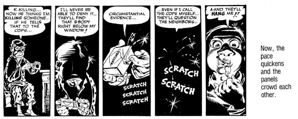
So, the idea is to tell and portray our story at the pace we intend. In fast-paced, thrilling scenes, we want to convey a different emotion and visual than in scenes that are supposed to be relaxed and calm. Eisner explains how we can influence how fast-paced or slow-paced scenes or a sequence of panels are perceived. How many panels there are in a row, for example, how big they are and whether they are perfectly square-shaped, landscape format and wide or long and narrow – all of this influences how we perceive the scenes and story. (cf. Eisner 1985: 30)
Long narrow panels, especially the use of many long panels next to each other make the scene feel more fast-paced and thrilling because they evoke a crowded feeling:
Figure: Eisner, Will (1985). Comics and Sequential Art, p. 35
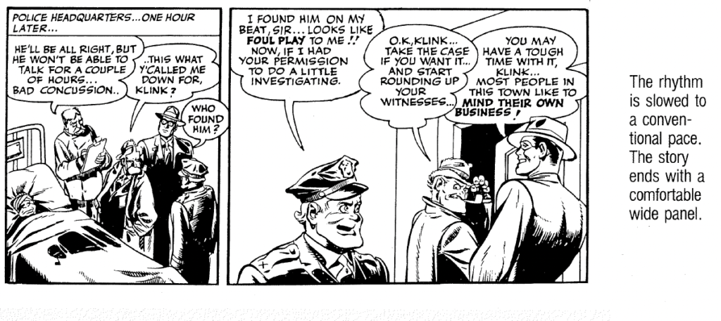
When the story events become more relaxed or if a certain moment should feel drawn out, wider panels can be used:
Figure: Eisner, Will (1985). Comics and Sequential Art, p. 37
Of course, not all comics use panels in different sizes or shapes. In many graphic novels and newspaper comics, all panels have the same shape and size, and the narration is only done by what is shown in each panel and through text. Eisner explains the emotional effect of panels as they are commonly found in more traditional comic books. However, in my opinion, this knowledge about which emotions certain shapes and compositions evoke can be applied to more than just traditional comic books.
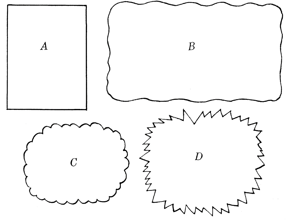
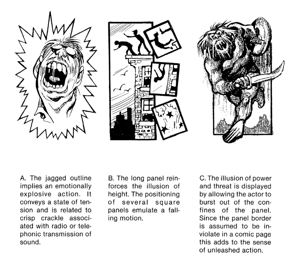
In addition to the panel’s shape and size, the border of the panel can also help express different feelings or happenings. The panel border does not have to be drawn in simple straight lines, it can also be drawn with wavy lines in order to express a flashback, for example. Panel “C” in the figure may be recognized as a typical thought bubble and panel “D” is associated with noises, something loud, emotional or explosive. (cf. Eisner 1985: 44)
Figure: Eisner, Will (1985). Comics and Sequential Art, p. 44
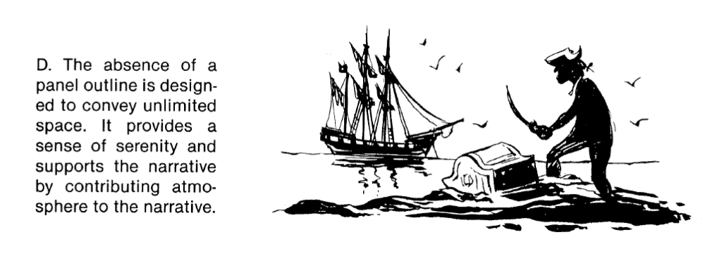
We can also design the panels in a way that visually supports or mimics whatever is happening in the story at that specific moment:
Figure: Eisner, Will (1985). Comics and Sequential Art, p. 46
We can also leave some panel outlines away entirely to make a scene feel like it is happening in a very wide, open area:
Figure: Eisner, Will (1985). Comics and Sequential Art, p. 47
Planning And Composing The Panels
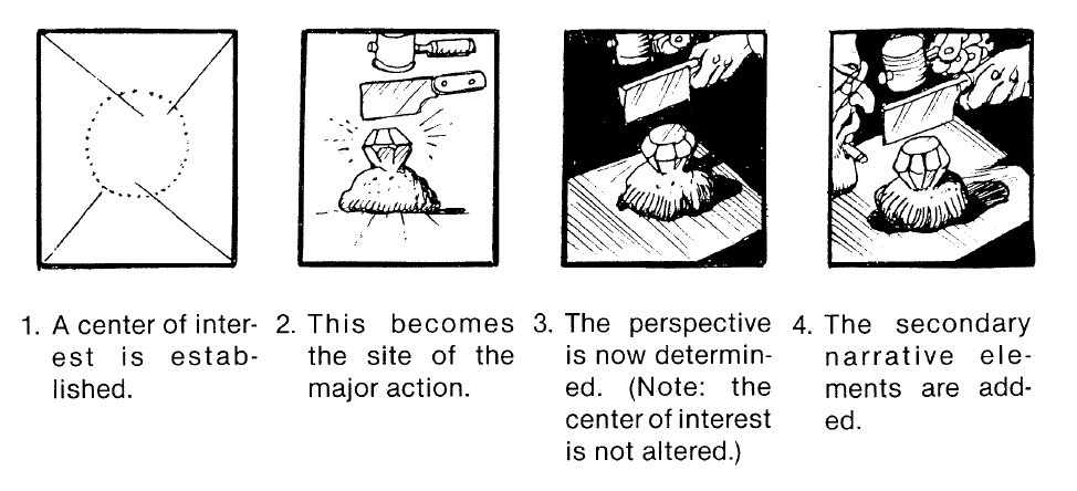
Next to determining the flow of the story and how the panels support this flow, we also need to consider what is in each panel, of course. We need to establish what character, object or action we need to depict in each panel, where the center of attention is to place this main object or character, and then we need to think about which perspective or lighting best supports the message of the panel. (cf. Eisner 1985: 44)
Figure: Eisner, Will (1985). Comics and Sequential Art, p. 88
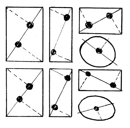
To decide where in a panel to place our main object or character, we can find out where the focal points are in the panel – they are the approximate areas our eyes tend to fall on first when looking at the panel. These focal points are determined as depicted in the following image and they depend on the shape of the panel. (cf. Eisner 1985: 151)
Figure: Eisner, Will (1985). Comics and Sequential Art, p. 151
Bibliography:
Eisner, Will (1985). Comics and Sequential Art. Tamarac, FL: Poorhouse Press.
In meiner Recherche wollte ich auch herausfinden, wann und wie Storytelling überhaupt entstanden ist und habe mich auch den Anfängen und der Geschichte des Storytellings gewidmet.
Storytelling ist schon seit Tausenden von Jahren ein aktiver Bestandteil des menschlichen Lebens.Geschichten sind in den meisten menschlichen Gesellschaften zu finden, sie tauchen in Form von Mythen, Legenden oder am häufigsten in Form von Religion auf.
Visuelles Storytelling – seit 30.000 v. Chr.
In den Chauvet-Höhlen in Südfrankreich wurden frühe Aufzeichnungen von Kunstwerken entdeckt, die Alltagsbilder darstellen und die Fähigkeit des Menschen belegen, Ereignisse zu reflektieren oder vorwegzunehmen.
Das visuelle Erzählen von Geschichten hat sich weiterentwickelt und ist zu einem Grundpfeiler der menschlichen Zivilisation geworden. Die Kunst war ein Medium, das es den Menschen ermöglichte, Geschichte und Legenden durch Bilder weiterzugeben. Historische Beispiele für visuelles Erzählen finden sich in ägyptischen Pyramiden, auf antiken griechischen Vasen und Fresken, chinesischen Wandteppichen, Statuen, Leinwänden etc.
Mündliches Storytelling – seit ca. 50.000 Jahren
Obwohl es kein genaues Geburtsdatum für das mündliches Geschichtenerzählen gibt, geht man davon aus, dass es eine der ältesten Formen ist, deren Ursprung auf die Entstehung der Sprache vor schätzungsweise 50.000 bis 2 Millionen Jahren zurückgeht. Es ist definitiv immer noch eine der beliebtesten Formen des Geschichtenerzählens.
Historisch gesehen sind die bekanntesten und ältesten Geschichtenerzähler die australischen Ureinwohner, deren Erzählrituale vermutlich zwischen 18.000 und 7.000 Jahren zurückreichen. Ihre Erzählmethoden beschreiben die Traumzeit, also die Erklärung, wie die Welt entstanden ist.
Schriftliches Storytelling – seit ca. 3.400 Jahren
Die frühesten Beispiele für menschliche Schrift stammen von den Sumerern und Ägyptern mit ihren Hieroglyphen, die schätzungsweise 3.400 Jahre alt sind. Die Schrift veränderte den Lauf der Geschichte.
In ihren Anfängen war das schriftliche Geschichtenerzählen eine elitäre Kunst, die Lese- und Schreibkenntnisse voraussetzte. Historisch gesehen war Bildung unter der Durchschnittsbevölkerung alles andere als üblich, so dass sie den Wohlhabenden eine besondere Bedeutung zukommen ließ und den Gebildeten im Wesentlichen mehr Macht verlieh. Die Art und Weise, wie wir geschriebene Geschichten konsumieren, änderte sich mit der Erfindung des Buchdrucks im Jahr 1440 und der ersten gedruckten Zeitung im Jahr 1690 massiv. Nach und nach wurden geschriebene Geschichten für den Durchschnittsbürger zugänglicher.
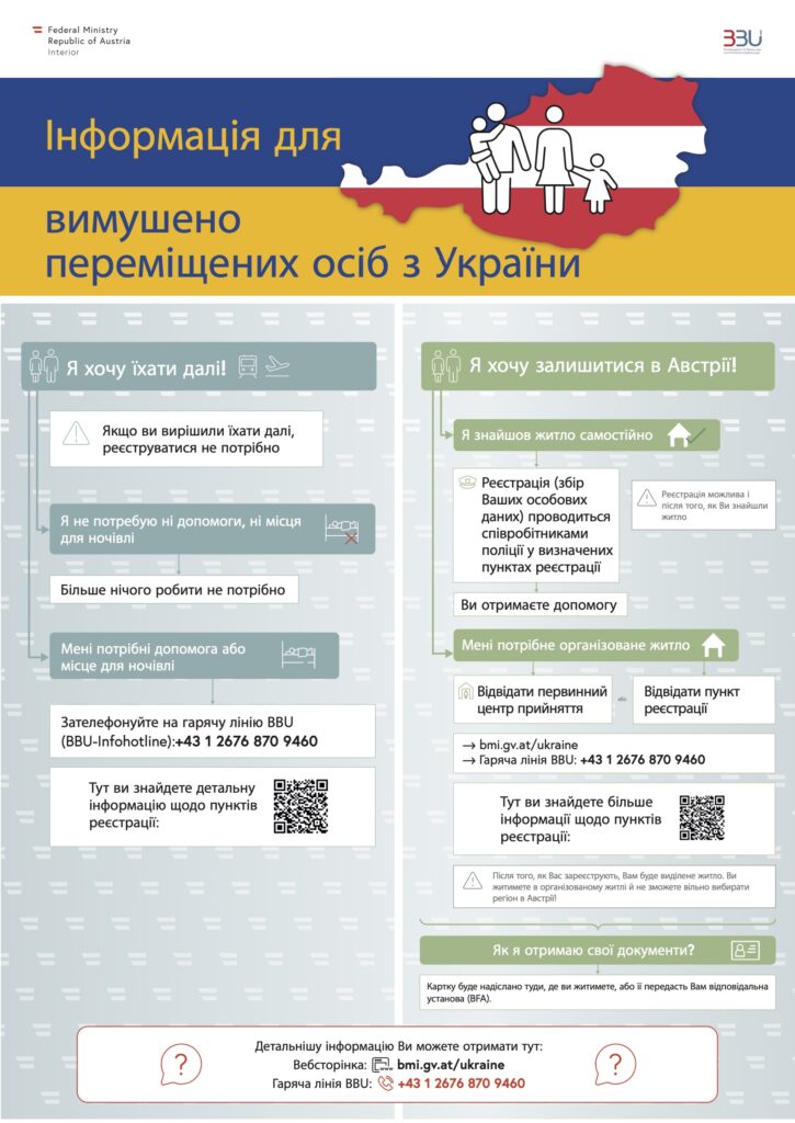
Due to Russia’s invasion of Ukraine, the Austrian Government made a point of saying that they would aid Ukrainian refugees, who are trying to flee from the war. Every country has different rules for what you need to do, have, and get in order to stay in the country as a refugee. In some cases, it can affect the decision-making of which country to choose (if there is a possibility to choose or to have time to think about that).
So I decided to do research on how Austria helps refugees, how it provides them with the important/needed information and about the path a refugee takes from the beginning of their arrival in Austria.
What to my mind was done really well is this illustration, which was provided by the Federal Ministry Republic of Austria:
Unfortunately it is only in Ukrainian language but provides a refugee with two types of ways they could take:
The first one (the blue one) is for people who don’t plan to stay in Austria and want to travel further. And the person instantly gets the info that he doesn’t need to register, and the arrows indicate possible needs that may arise (such as accommodation for one or several nights) and where to find the right help for this type of situation.
Another one (the green one) is for people who want to stay in Austria. A refugee gets instant information that they have to find accommodation in order to register, where to do that, and the information about how exactly they will receive their documents in Austria.
Also, there are QR codes with additional information + phone numbers. [1]
The Federal Ministry Republic of Austria also created a PDF document with questions and answers regarding staying in Austria, registration, and finding accommodation [5]. What helps a lot is that in this PDF refugees can find the offices they need for a specific type of problem in different regions of Austria, their addresses, emails, and phone numbers, and most importantly working hours and if a refugee would need to make an appointment for that or not. This is very important because in Ukraine we don’t really have a culture of making appointments, we just find the working hours of a certain office and go whenever suits us. Because of this mentality difference, the culture of making an appointment is unfamiliar and strange to many Ukrainians, especially those who have never been to other countries before. I found this out by going through and analysing some messages in online group chats created by Ukrainian refugees, who are now staying in Austria. A lot of people just get confused and surprised by that information.
In order to have access to the Austrian labor market, one must first register at the place of residence, then register with the police as a temporarily displaced person – and receive a “blue card”(«Ausweis für Vertriebene») about two weeks later. Having such a card, Ukrainians receive the same rights as EU citizens. The card is still valid until March 2023. And as I researched through messages I found out that most people prefer this, instead of registering as a refugee because this will allow them to move between countries, visit people they know in other countries, and work. [2] [3]
Therefore, there are different paths/opportunities for a refugee in Austria. If one is only travelling through Austria to another country, he can receive needed help and doesn’t need to register. But if he wants to stay in Austria, then there are two ways:
Getting a blue “blue card”, which allows a refugee to move between countries, opens the door to the labor market in Austria.
Registering as a refugee, which will require to register at Caritas and allow receiving a minimum support from Caritas in the amount of 200 euros.
The European Union Agency for Asylum created a PDF file as well for Ukrainian refugees about not only refugee protection, entry and staying in Austria, etc but also the general information about Austria itself, its administrative settings, language, population, and emergency contacts [4]. They also added information about the Ukrainian diaspora in Austria. Moreover, refugees are also able to find information about what everyday life in Austria looks like, when most shops are open/closed (by the way, the working hours of the shops completely differ from those in Ukraine), how schools and universities work and overall access to education.
This kind of information is crucial because a lot of things are different in terms of how everything works, cultural and administrative differences, which can make staying as a refugee either easier and smoother or more complicated and stressful. This can also affect how easy it will be for a refugee to integrate into a new environment and start life from scratch.
Routine kann sich positiv auf den Menschen auswirken, indem sie dazu beiträgt, dass er sich sicherer und souveräner fühlt, da er weiß, was er erwartet. Es kann auch helfen, Ziele zu erreichen, da man durch Routinen leichter an die erforderlichen Aufgaben erinnert wird. So entwickelt der Mensch Gewohnheiten, welche, je intensiver diese werden, körperliche Reaktionen hervorbringen. Zum Beispiel das Stellen des Weckers. Steht man morgens immer zur selben Zeit auf, wird man früher oder später auch ohne Wecker zur gleichen Zeit aufwachen. Dieses Prinzip wird im Gamedesign genutzt, um Menschen zu Daily-Log-Ins zu bewegen, wo Spieler*innen tägliche kleine Aufgaben absolvieren müssen, nichts aufwendiges, um gewisse Belohnungen zu erhalten. [1]
Durch die Umwandlung von regelmäßigen Terminen in interaktive Events, wie beispielsweise Adventkalender oder saisonale Aktionen auf einer Website, kann man die User*innen dazu animieren, immer wieder auf die Website zurückzukehren, um ihre kleine Belohnung abzuholen. Jedes Türchen im Dezember bietet eine neue Interaktion und einen Anreiz, um die Website zu besuchen und die Aktion zu verfolgen.
4. Level und Fortschrittsbalken
Die Verwendung von Fortschrittsbalken oder ähnlichen Visualisierungen können dazu beitragen, um den Fortschritt von Nutzer*innen anzuzeigen und ihnen Feedback zu geben.
Sie können anhand von diesen Balken nicht nur ihre Aktionen verfolgen, wie weit sie in ihrer User-Journey gekommen sind, sondern auch einschätzen, ob sie sich die Mühe antun möchten weiterzugehen, da sie die Länge eines Weges durch die Fortschrittsbalken kennen. Das verleiht eine gewisse Transparenz und Vorstellung wo sie stehen und wie weit sie noch von ihrem Ziel entfernt sind, und ermöglicht es ihnen dadurch, ihre Anstrengungen besser zu planen.[2]
Auf Websites trifft man gerne auf Fortschrittsbalken bei der Anmeldung eines Newsletters oder dem Onlinekauferlebnis vom Warenkorb bis zum Check Out. Käufer*innen bekommen damit einen schnellen Überblick, wie weit wie bereits gekommen sind, um den Vorgang abzuschließen. Wenn Nutzer*innen eine Aufgabe oder ein Ziel erfolgreich abschließen, kann ein voller Fortschrittsbalken ein sehr befriedigendes Erfolgserlebnis sein, was sie wiederum motiviert, weiterzumachen oder im besten Fall wiederzukommen.
Die Festlegung von bestimmten Zielen oder Aufgaben, die erfüllt werden müssen, um virtuelle Auszeichnungen oder Trophäen zu erhalten. Es ist wichtig darauf zu achten, dass die Darstellung der Erfolge und Trophäen ansprechend und benutzerfreundlich ist, um die Motivation und das Engagement der Nutzer*innen zu erhöhen.
Eine Trophäe ist ein „Siegeszeichen“ und repräsentiert ein Objekt als Zeichens des Triumphes. Trophäen werden oftmals mit Stolz präsentiert und ausgestellt. [3]
So können auch Abzeichen als Trophäen herhalten, wo beispielsweise Autoplaketten ein arbiträres Statussymbol repräsentieren. Diese zeigen an, welche Art von Motor in einem Fahrzeug verbaut ist und welches Preisschild beim Händler angebracht war. Diese Plaketten werden gerne an prominenter Stelle am Fahrzeug montiert. Menschen haben unterschiedliche Gründe, solche Plaketten beziehungsweise Autos zu präsentieren. Das Prinzip von Stolz und Freude wird im Kontext von Gamification angewandt, um die Nutzer*innen mit Abzeichen zu belohnen, wenn gewisse Aktionen von ihnen durchgeführt wurden. Für Spieldesigner*innen sind Plaketten und Abzeichen eine gute Möglichkeit, soziale Förderung zu erreichen und Ziele und den Fortschritt im Spiel darzustellen.[4]
Eine beliebte App und Website zum Lernen von Sprachen ist https://de.duolingo.com/ auf der man Abzeichen für das Erreichen bestimmter Meilensteine im Lernprozess verdient. So geben die Abzeichen Anreiz die Nutzer*innen zu motivieren, weiterzumachen und ihre Ziele zu erreichen. Jedes Abzeichen hat eine eigene Farbe und ein eigenes Symbol, und sie werden auf einer eigenen Abzeichensammlungs-seite angezeigt, wo man sie betrachten und teilen kann. Es sind oft auch noch weitere Belohnungen, wie z.B. Trophäen oder Extras die man gewinnen kann. Tägliche Abzeichen, Streak-Abzeichen oder beispielsweise Wettbewerbsabzeichen von Duolingo zeigen den Lernenden, aber auch anderen User*innen, wie gut oder brav die Teilnehmer*innen von Duolingo lernen.
Now that I know more about the the future Academy Award guidelines (from 2024) for “Best Picture” nominations, I would like to take a closer look at the television and cinema scene in Austria. What film funding opportunities are there and is there already a clear guideline for a more diverse production crew or stories. What is the status quo among filmmakers in Austria and do they even need these guidelines?
The largest funding institutions are the state-owned “Österreichisches Filminstitut” (Austrian Film Institute), the “Filmfonds Wien” (Vienna Film Fund) and RTR’s “Fernsehfonds Austria” (Austria Television Fund), which together represent around three-quarters of the total Austrian film funding budget. During my research I only found gender specific guidelines for the “Österreichisches Filminstitut – öfi”.
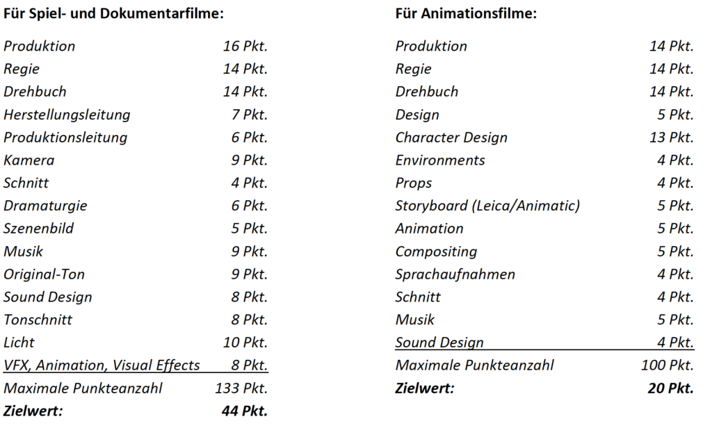
Since the beginning of 2019 filmmakers in Austria have the possibility to qualify themselves for the “Gender Incentive” which is an additional financial support of 30,000€ when reaching a specific number of points. How the points are received is shown in the next illustration. This concerns only the people behind the production and not the creative work/plot/characters.
breakdown of the Gender Initiative scoring system (“the imbalance of the points of the individual departments does not represent a valuation, but rather corresponds to the degree of underrepresentation of women in the areas affected.”)
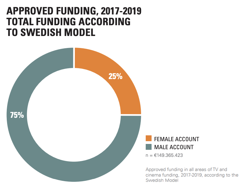
Second Austrian Film Gender Report
The University of Innsbruck has compiled an “Austrian Film Gender Report” on behalf of the öfi. Therefore, a quantitative analysis of the film and television projects funded by the largest Austrian subsidizers has been made (2017 to 2019). The following statements (and more) can be taken throughout this report:
Women receive only 25% of film funding in Austria
More money equals fewer women
Years will pass before gender equality
Decision-making department heads are men
More diversity in female-driven films
Since the data is only available before 2019, it is difficult do say if the Gender Initiative of the öfi already had an impact.
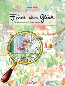
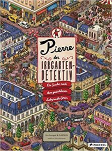
Der “Vater der Wimmelbücher” Ali Mitgutsch würde dazu ein klares “Nein” abgeben. Laut ihm können sich Kinder sowie Erwachsene für Wimmelbücher begeistern und “auch mal daneben benehmen”. (https://taz.de/Wimmelbuecher-von-Ali-Mitgutsch/!5137008/). Mitgutsch’s Bücher prägten viele Kinder so stark, dass viele Erwachsene heute mit Nostalgie durch seine Bücher blättern.
Ali Mitgutsch (1935-2022) gilt als Vater der Wimmelbücher. Inspiriert wurde er von Dioramen – Schaukästen, in denen Szenen mit Modellfiguren und -landschaften vor einem oft halbkreisförmigen, bemalten Hintergrund dargestellt werden. Seine Bücher bestanden aus Doppelseiten, welche kleine detailierte Alltagssituationen zeigten. Sein Markenzeichen dabei war, dass jede Zeichnung einen nackten Jungen “Manneken pis” beinhaltet, welcher ungeniert uriniert.
Wimmelbücher sind generell “All-Age-Bücher”, das heißt sie richten sich meist an eine breite Altersgruppe. Da sie ohne Text auskommen und sich die Handlung ausschließlich aus den zusammengesetzten Zeichnungen ergibt, regen sie die Fantasie stark an. Erwachsene haben so den positiven Effekt sich gehen lassen zu können und die Gedanken frei wandern zu lassen. Auch gegen “Lesefaulheit” kommen Wimmelbücher an, da sie durch ihre vielen bunten Bilder Neugier erwecken und zum “Lesen” einladen.
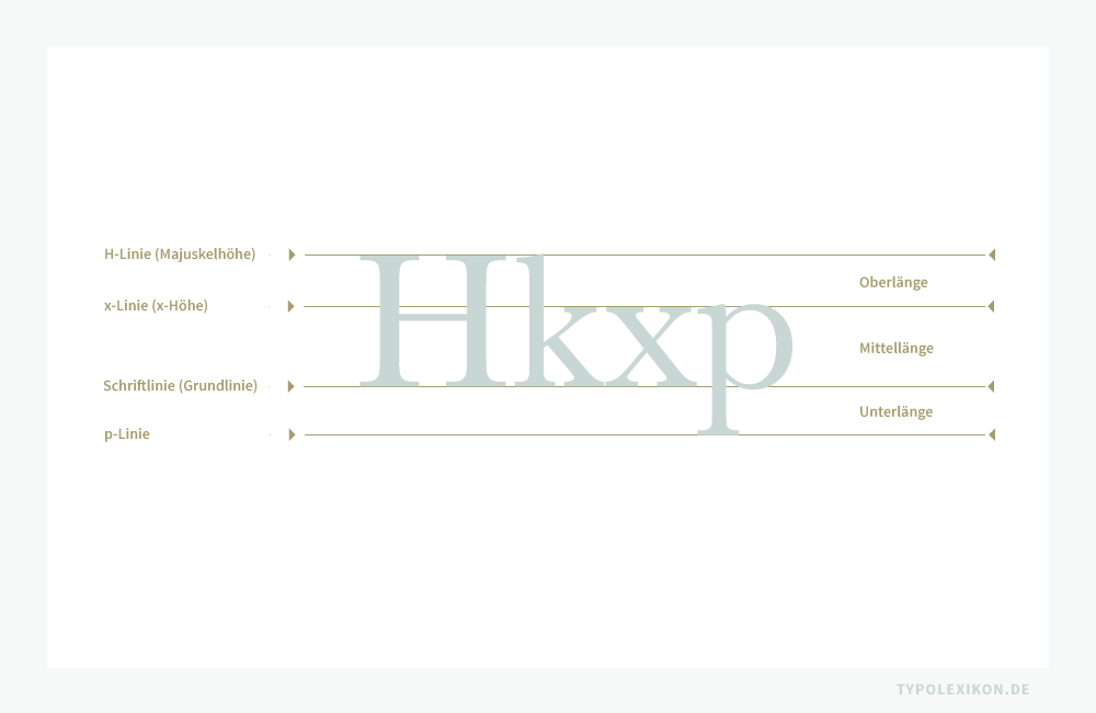
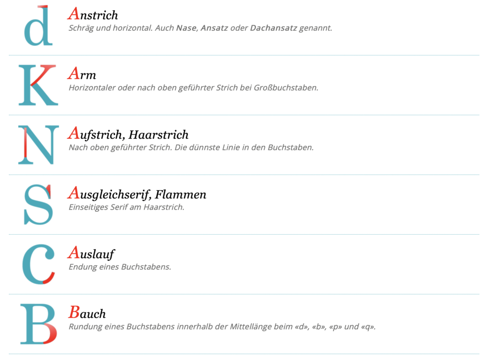
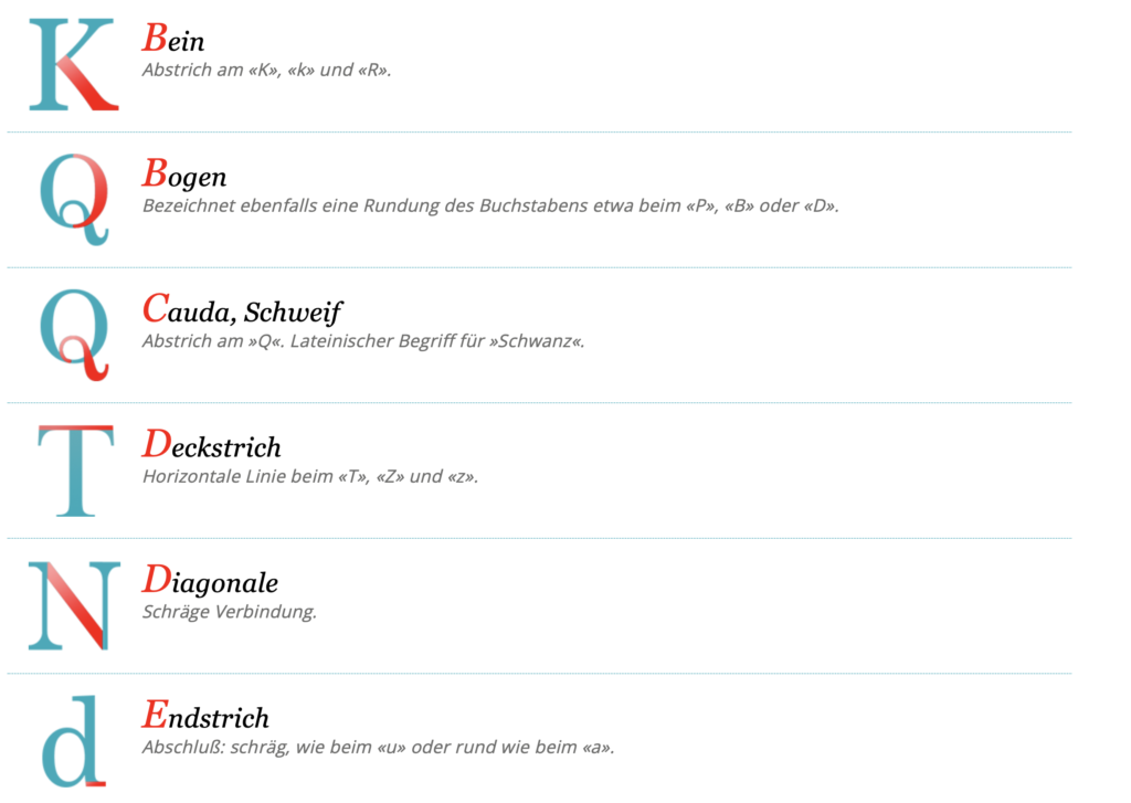
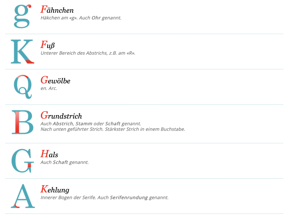
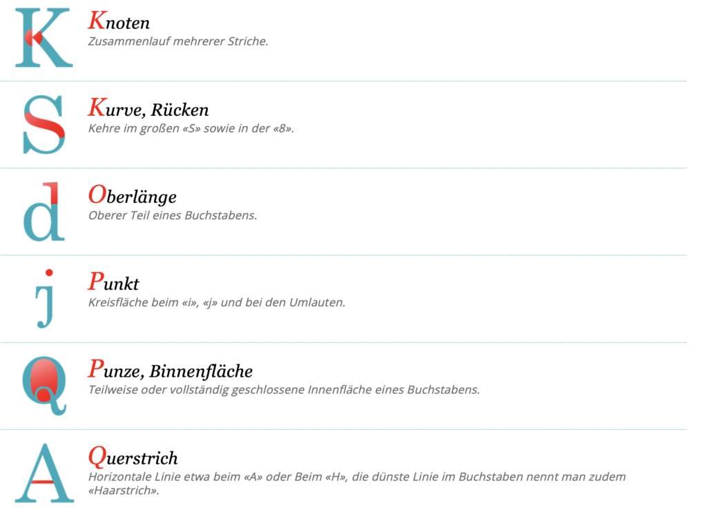
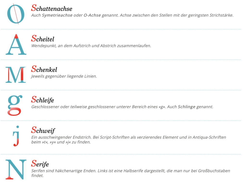
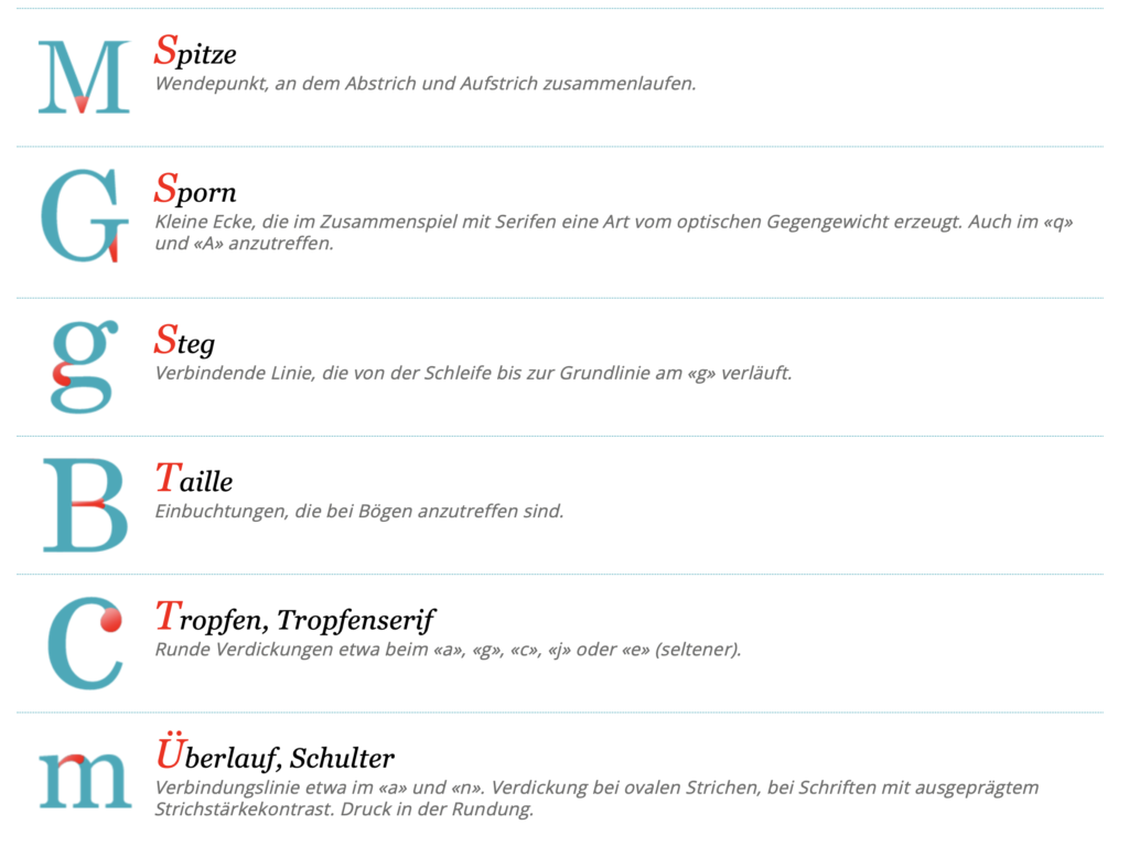
Im nächsten Part meiner Recherche bin ich auf die Bestandteile der Buchstaben eingegangen, da es essenziell ist diese zu kennen um damit arbeiten zu können. Nur wer ein geschultes Auge dafür hat kann z.B. passende Schriftmischungen erkennen. Auch essentiell für Schriftmischung sind die Klassifizierungen auf welche ich anführend noch eingehen werden.
Detail-Typografie
Buchstabe – Gestaltung
Horizontale wirken immer stärker als vertikal: deswegen müssen etwas dünner werden
o wirkt immer etwas kleiner und teilweise zu rund deswegen ausgleichen
Merkmale müssen sich immer wieder wiederholen
Wort – Zurichtung
Abstände zwischen Buchstaben sind auf jeweilige Kombi eingestellt
Z.B: zwischen p und e wird weniger Abstand benötigt als zwischen t und y
Wort – Kerning
Änderung des Abstandes zwischen zwei Buchstaben
Wenn enger: wird vom lesen her schwierig, für Logo etc. ok
Betrifft nur Buchstabenpaar
Wort – Laufweite (VA)
Kleinen Schriften (unter 12) tut eine Laufweitenerhöhung meist gut
Je größer die Schrift desto weniger Laufweite wird benötigt
Betrifft ganze Zeile
Wort – Lesbarkeit
O fällt eig am meisten auf weil am meisten Weißraum: deswegen Kerning anpassen
Wort – Abstand
Geviert: stammt von M, dann daraus gehend immer abgestuf: halbgeviert, viertelgeviert..
Abstände definieren wesentlich Lesefluss
Wort – Wortabstand
Condened braucht weniger Leeraum als extended Schrift
Sowie auch bei fetter und dünner
Zeile – Zeilenabstand
Schriften mit größere x höhe brauchen vl größeren Abstand weil sie sonst zu nah kommen
ZA wird auch definiert durch Breite der Zeile
Ideale Wortanzahl pro Zeile: 8-13
Bei sehr großen Schriften wirkt ein „normaler“ ZA oft zu groß
Je größer die Zeilenbreite desto höher der Zeilenabstand
Hands-on exhibits are interactive experiences that are designed to engage visitors and facilitate learning through exploration and experimentation. These exhibits can be found in museums, science centers, and other educational settings and often use a variety of technologies, such as computer displays, sensors and robotics to create interactive experiences.
In my opinion, one approach to designing and implementing hands-on exhibits is the principle of Lifelong Kindergarten, developed by the Lifelong Kindergarten group from the Media Lab at the Massachusetts Institute of Technology (MIT). This approach is based on the idea that learning is most effective when it is an active process of constructing knowledge instead of a passive process of receiving information. The principle of Lifelong Kindergarten emphasizes hands-on, experiential learning, and encourages learners to actively construct their own understanding of new concepts and ideas through exploration, experimentation, and problem-solving. Mitch Resnick who is leading the Lifelong Kindergarten group says that school and the rest of life should become more like Froebel’s kindergarten – driven by what he calls the “Four Ps”: Projects, Passion, Peers, and Play. More details of his theory can be found in his book called Lifelong Kindergarten, Cultivating Creativity through Projects, Passion, Peers, and Play and maybe I will write a separate blog post on his principles in the future.[1][2][3]
In the context of hands-on exhibits, the principle of Lifelong Kindergarten can be used to design interactive experiences that are engaging and effective in making learning more fun and exciting. This might involve using technologies such as openFrameworks, Processing, Unity3D or vvvv – toolkits and programs that can be used to create interactive media and visualizations. [4][5][6]
Another related concept is the philosophy of serious games, which refers to the use of games and game-like approaches for the purposes beyond entertainment. In the context of hands-on exhibits, this philosophy can be used to create interactive exhibits that use game-like elements to teach specific concepts, engage visitors in problem-solving or decision-making activities. [7]
In my opinion the principles of Lifelong Kindergarten from MIT and the philosophy of serious games can be combined and a useful approach when designing and implementing hands-on exhibits. Especially in the context of science, technology and society, which I want to focus on, one can develop exhibits that are engaging and effective for playful learning to raise awareness and explain complex problems, difficult to talk about.
References:
[1] Lifelong Kindergarten, Cultivating Creativity through Projects, Passion, Peers, and Play; Mitchel Resnick MIT Media Lab; 2017


