Schriften können die Bedeutung eines Worts völlig neu definieren, eine Hintergrundgeschichte geben oder Persönlichkeit verschaffen. So kann Schrift maßgebend die Wahrnehmung beeinflussen.
Aber wie funktioniert das? Und vor allem wie funktioniert es ohne dass wir es merken? Schriften kommunizieren mit uns unterbewusst. Unser bewusstes Gehirn liest was das Wort bedeutet und wir denken dass wir der Schrift selbst dabei eigentlich keine große Bedeutung schenken, doch genau das tun wir, nur eben unbewusst.
Diese unterbewusste Wahrnehmung erfolgt auf zwei Wegen:
Erstens: Informationen die in unserer DNA verankert sind
Aufgrund von menschlicher Intuition wissen wir z.B. zum Beispiel dass etwas rundes, helles, knalliges, rotes bedeutet dass etwas reif ist oder das etwas unförmiges, bräunliches, schrumpeliges nicht mehr genießbar ist.
Genau diese Intuition beeinflusst auch Schrift maßgeblich
Bei einem Experiment wurden Probanden zwei exakt gleiche Jellybeans zum Verkosten vorgesetzt. Während die erste gegessen wurde, schauten sie auf eine runde Schrift, während der zweiten auf eine eckige, unförmige. Die Ergebnisse waren dass die erste Jellybean um 17% süßer wahrgenommen wurde und die zweite um 11% saurer, obwohl beide exakt gleich waren.
Zweitens: Gelernte Assoziationen
Auch beeinflusst wird unsere Wahrnehmung von Schirft von den gesammelten Assoziationen welche sich über unser ganzes bisheriges Leben angesammelt haben.
Dies entsteht aus dem Kontext, in dem man die Schrift bisher gesehen hat
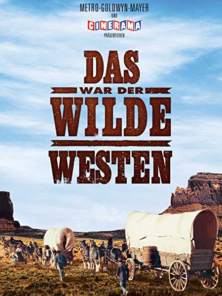
Z.B. denkt bei dieser Font jeder sofort an den Wilden Westen und Cowboys weil wir sie so bereits in zahlreichen Filmen gesehen haben
„Fonts turn words into stories“
Fonts definieren die Story eines Produkts. Sie lassen z.B. erahnen was sich in einer Verpackung befinden könnte. Bereits in der Kindheit werden davon z.B. am Süßigkeiten Regal beeinflusst. Der saure Flic’n’lic Lolly kommuniziert ebenso über die Verpackung mittely Typografie und es lässt sich so ohne Bildmaterial der Geschmack erahnen.
Gerade in der Werbebranche wird von dieser Manipulation oft Gebraucht gemacht um z.B. Logos durch bewusst gewählte Schriften mit Werten aufzuladen, die zur Marke passen. Typografie lässt uns außerdem schmecken, riechen und fühlen.
By now, I already know that being a production manager is a lot of planning work. Before talking to Barbara Eppensteiner at the beginning of December (see the last blog post) I thought the go-to tool to work on Dispos and other plannings was Excel. However, she told me that there are better ways to work on pre-production!
Initially she recommended a tool called Fuzzlecheck that her workplace uses for said purpose. However, they do not offer a free license or trial time with which I could have tested and used the program. For that reason, I did my own research and stumbled across another, visually way more pleasing option called StudioBinder. I tried it out for a small private project and would love to share my findings with you.
What is StudioBinder?
According to their own website, StudioBinder is an industry leading software for the production of various sorts of media such as photo, film, TV and movie. It is said to be used by a lot of big networks including BuzzFeed. Their producer says the following about the software:
StudioBinder is an invaluable tool for our production workflow. The sleek design and smart features like call sheet tracking bring organization, efficiency and automation to our shoots, and greatly increases our productivity.
Trevor Fernando (Producer at BuzzFeed)
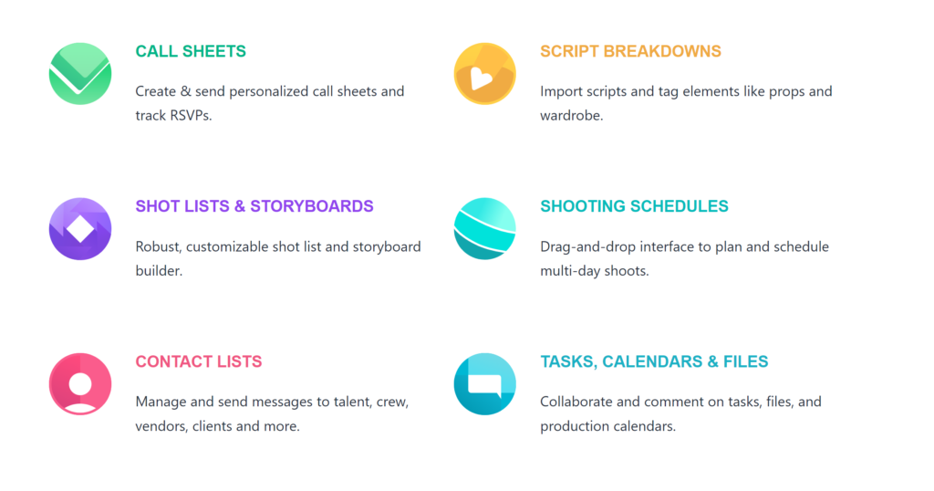
Above that, what cought my attention was the variety of features the program offers:
Screenshot from StudioBinder’s Website (https://www.studiobinder.com/)
It seems that one can find every single feature any production manager could dream of. So it makes sense that after spotting the “TRY FOR FREE” button I just had to download it immediately! And after creating an account, I could get started with my own project right away.
The Test
As mentioned above, I wanted to test the software with one of my own projects to see how applicable it would be for an average filmmaker who is just getting started. As my skills in production management are not that sophisticated yet, I concentrated on the features that I would profit from the most at the moment: Scripting, the Shot List and the Production Calendar.
As a test project I chose my latest crazy idea – a scripted mountainbike short movie about the freedom of bikes (my first ever non-documentary project). I know, as my topic is about the production management of documentary films it might not be the best to use my first scripted project as an example. However, this time it just made more sense because I could test the scripting and script distribution features StudioBinder comes with. Also, this is the only project I have going on right now that has passed the “I’m talking to potential protagonists” stage (and is therefore the only one I could have used in the first place).
1. Scripting
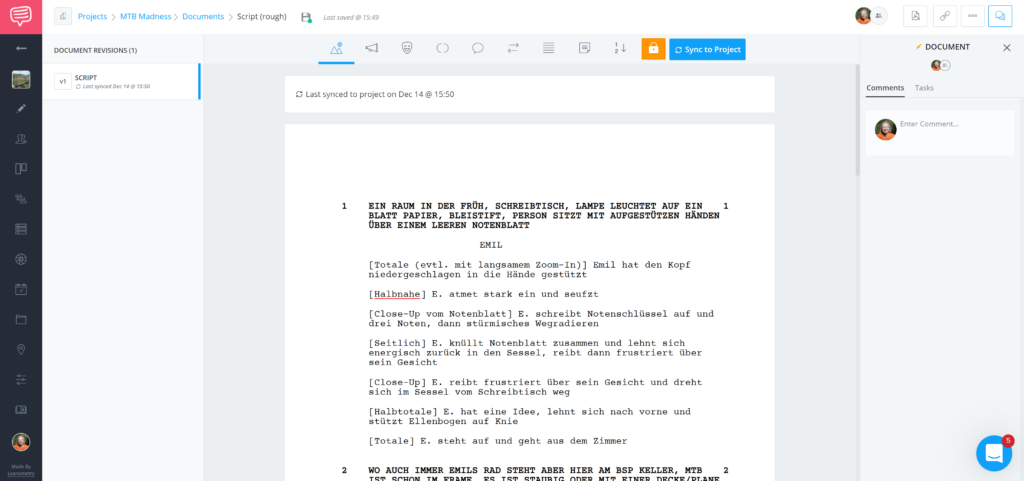
Long story short: I got started by writing my script in StudioBinder. And let me tell you, their scripting feature is awesome. It not only automatically has the right form and fonts but it also gives you some buttons on top where you can choose if the line is the charachter description, a dialogue, a location, director’s comments, etc.! The program then adapts the form according to the type of content you have chosen. This is especially handy if you’re just trying out your first script drafts or have a limited amount of experience in that field.
Here’s a screenshot where you can take a closer look at everything. Please ignore the way I mixed in camera comments into the script and keep in mind that this is my first script (selftaught) hence there are for sure some mistakes. We’re here to test the software, not to judge my script skills.
Screenshot of the scripting option in the StudioBinder software
For those who are already a little bit more sophisticated in script writing, you can also import existing scripts. Also, there’s a feature where you can turn your scenes and other parts of the script into scenes for your shot list, storyboard and production plan. Generally, a lot of features are intertwined with each other in StudioBinder which allows you to work seamlessly and optimize your time. That way, you don’t have to rewrite the contents of your script when it comes to your shot list planning.
2. Shot List
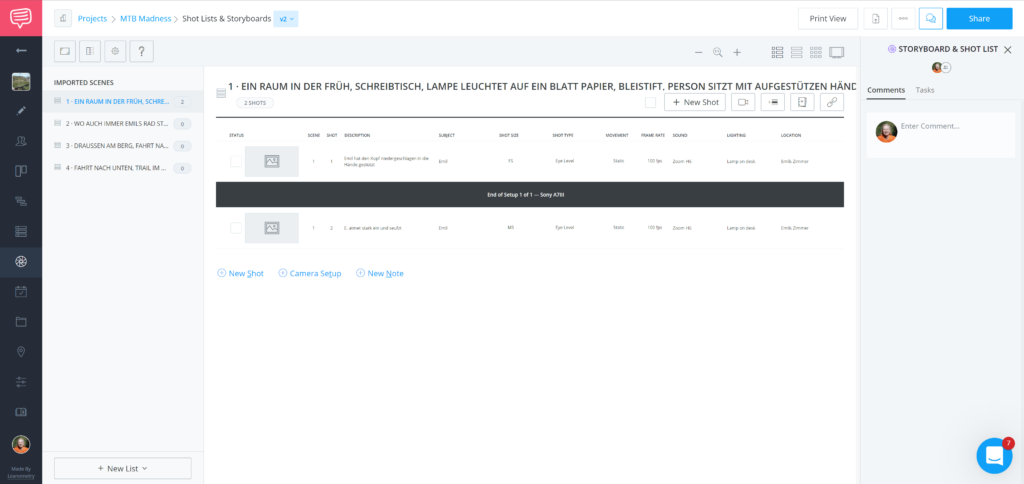
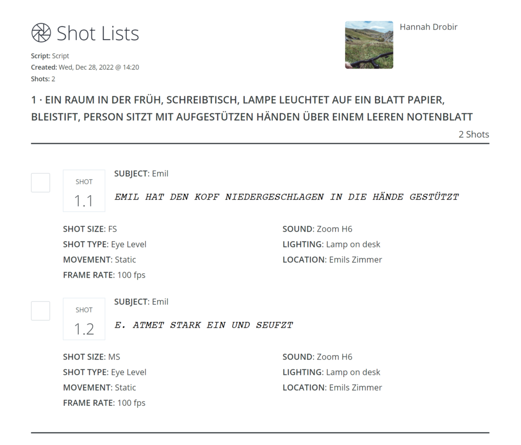
Speaking of, the shot list in StudioBinder was the second thing I tried out. As I had marked my scenes in the script already, the software automatically suggested these for the creation of the shot lists. I don’t exactly know if that’s the way to go for big, professional productions but for me it made sense to write a shot list divided into the different scenes. What I ended up with was a list of shots already numbered with a lot of information that was nice to have before the shoot. Here’s a screenshot of two of them:
Screenshot of the StudioBinder Shot List tool
As you can see, you can add a lot of different information to every shot. You can customize the details you would like to display and add. That way you only see what you need. There’s also the possibility to create setups. On top of that, you can add your frames from the storyboard and will end up with a perfect collection of shots to shoot on set.
If you’re done writing your shot list, you can access the print view and print out your shot list. That way, you don’t have to carry your laptop everywhere to tick of shots and can easily come back later to simply update your list. The print view is well-designed and has all the details at the same time. It will look something like this:
Screenshot of the Print Preview of the Shot List
With all these features the shot list in StudioBinder can be a valuable tool in your production management workflow.
3. Production Calendar
The final feature I wanted to try was the production calendar. As a small filmmaker I mostly work as a one-woman show. Being able to manage and have an overview of all the different tasks combined with a calender therefore is worth a lot. StudioBinder offers exactly that!
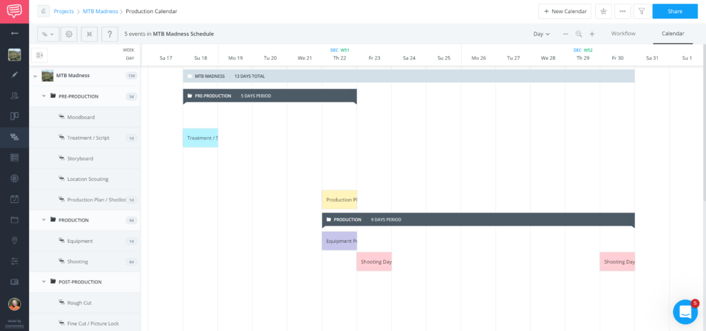
The production calendar is divided in different sections which can be seen in the left collumn in the following screenshot. You can then go ahead and drag your to-dos across the dates you’ll be working on them. After that, you can assign colors (which makes every designer’s heart beat faster), add to-dos for every single task, add collaborators, assign roles and so on. You’ll then end up with a production calendar that is accessible to everyone and is easy to understand. Here’s a quick screenshot of how that could look:
Screenshot of the Production Calendar feature in StudioBinder
You can also share the production calendar with people who are not users of StudioBinder. I sent the calendar to my protagonist and we could easily discuss dates and deadlines with this as a basis. I also enjoy that for every event in the calendar, StudioBinder automatically creates a Workflow element that can be viewed in a seperate tab. It works like a to-do list and is divided into categories such as “on hold”, “in progress” or “needs review”.
Final Opinion
After using StudioBinder for the production planning of a small project (and using the printed version of my script and shot list during the shoot itself) I am 100% sure that I will continue using this software. However, I quickly want to mention the limitations of the free version before I close off this post.
When using the free StudioBinder version, you can only have one project at a time, the number of calendar entries is limited as well as the number of shots for your shot list and storyboard contents. For me personally that is no problem. As I am not obligated right now by sponsors or customers to keep my project plans, I can just delete them after downloading the print version and screenshotting the calendar. If you wanted to use the software for more serious stuff or bigger projects, I would definitely recommend buying a license.
The licenses can be bought via the website and can be billed annually or monthly. There is the possibility to get a student discount if you have created your profile with your edu email adress. After that you just have to write them a quick message and they will tell you more about the discount.
To sum up, I really recommend trying out the software at least for one project. It might take some time until you understand the various features but I am sure it will pay off. Project management is one of the most important skills every filmmaker (especially if you’re kinda just starting to be one) should learn.
If you need help with that, StudioBinder also has a really great Blog where you can find tips and tricks on a lot of different Media Design topics.
That’s it for this blog post and my StudioBinder test. If you want to try it out and need some help, hit me up. Other than that, enjoy the rest of the year!
.
.
.
Sources
StudioBinder: A seamless production workflow — all in one place. In: StudioBinder, https://www.studiobinder.com/ (last seen December 28 2022)
As the world becomes increasingly digitalized, it is more important than ever to consider how our design choices can impact the environment. Interaction design has a lot of potentials to help create a sustainable future, through things like increasing efficiency and reducing waste. For example, designing user interfaces that are easy to use and understand can help reduce the need for paper instructions or disposable packaging. And by making products and services more efficient, we can help conserve resources and reduce emissions.
There are lots of small ways that interaction designers can make a big difference in creating a sustainable future. So let us commit to using our skills for good and make the world a better place! Interaction design is a powerful tool to help create a sustainable future. The way information is presented, and the tone of the message can be used to influence people’s decisions. For example, if an environmental organization were to simply tell people to stop using plastic, they would likely not be taken seriously. However, if they were to explain the long-term effects of plastic pollution and why it is crucial to reduce our reliance on single-use plastics, their message may be more persuasive. By understanding how different tones can affect people’s attitudes and behavior, designers can create experiences that inspire positive action.
In addition to tonality, interaction design can also use visuals and animations to help make a message more impactful. For instance, designers could create visuals that illustrate the effects of climate change or show what steps people can take to reduce their carbon footprint. In this way, interactive designs can help make complex topics easier for people to understand and provide them with tangible actions they can take to contribute towards a sustainable future.
Finally, interaction design can be used as an opportunity for collaboration between businesses and individuals. Designers could create platforms that allow companies to connect with local communities in order to promote sustainable practices or develop interactive tools that allow individuals to track their own sustainability efforts over time. By providing users with a platform where they can work together towards a common goal, designers have the potential to create powerful experiences that unite people around environmental initiatives.
Overall, interaction design has the potential to play a key role in creating a sustainable future by influencing tonality, using visuals and animations, and fostering collaboration between businesses and individuals. With thoughtful design approaches, designers have the power to inspire positive action towards environmental initiatives and ultimately shape the future of our planet – one design at a time! As we look to the future of our planet, it is clear that we need to find new ways to create a more sustainable society. One way that interaction designers can help is by using our skills and expertise to create solutions that are environmentally friendly.
Semiotics is the study of signs and symbols as a means of communication. The word semiotics comes from the Greek sēmeĩon sign or signal. Semiotics is about signs and symbols in general, not just visual signs. Semiotic studies include the study of language, written texts, images, gestures, fashion or any other form of symbolic expression that can be interpreted through a system of codes or rules. Semiotics has its roots in linguistics but has since expanded to include all forms of human communication. [1] Therefore, it is also relevant for user interface design.
Signs have their own meaning, which is given to the sign and interpreted by the viewers. The social and cultural context plays a role in the interpretation of the signs. In UI Design, Designers have a special role in choosing signs for the interface. That means not only icons, but written as a word, graphical or in some other way.
They must convey a message and provide an interaction, which is specified by user tasks but also by the goals of the stakeholders. Not only do they have to take the user’s context into account, they also have to convey the message that the stakeholders want to convey via the user interface. [2] For example, an interface must reflect the brand identity and speak the language of the user. This underlines the importance of knowing and understanding the user and his environment, in order to assess whether he or she understands the words, icons or methapers used. When talking about Semoric it is also significant to consider the socio-cultural preferences of the target group. Using language that is appropriate for the target audience, such as youth language or specialized language, or considering codes in a specific industry can help deliver a better message. That is also true for the design of user interfaces.
For De Souza, the relationship between designer and user has a special role in the UI communication process. Basically, the designers are in a conversation with the user. The designer is the sender of the message, while the user is the receiver. The message can be conveyed through words, images, graphics, explanatory texts and behaviour (of the UI). Thus, designers must also be aware of their own communicative behaviour. According to this theory, the designer communicates with the user, not the system. The message that the designer conveys must be interpreted by the user when he interacts with the system. [3]
Especially complex software programs can benefit from the semiotic approach. If they only follow guidelines and laws, then they do not communicate the true intellectual value of the software. They should communicate the value of the software solution to the user instead of just showing them how to use it. If users are not aware that the software can offer them much more, if the designers do not communicate the real value of the software, then this can have serious consequences for the user experience. Why should a user learn a new technology or continue to use the program if it is less efficient than another method? [4]
In many cases of B2B software, where software products are commissioned by companies for reasons of digitization, the end users are very often not involved and the value of the new software is not communicated to them. Presenting the user with a fait accompli is in many cases the reason why the acceptance of new tools and software fails. Furthermore, the success of the software is not measured by the user experience, but by the satisfaction of the project managers and the numbers of usage. If we look at the user interface design from the semiotic point of view, then explaining the strategies of the application is a more important point than the handling itself.[5] This approach, the focus on the communication between designer and user could support design patterns to produce better usability and user experience. In order to achieve this, designers must have high communication skills – they must communicate their intentions and reasons concisely and understandably, in a way that the user can absorb quickly and easily. [6] According to the semiotic process, users interpret the user interface according to their intentions. If these match the designer’s intentions, then the communication has been successful. [7] Users interpret all the time. Sometimes their guess is correct, sometimes not, but all are either for “why” or for “what”. Evaluating these guesses leads to interactive patterns. [8] The understanding of methapers must also be taken into account. The use of methapers to increase understanding of a new kind of development is well known. The “desktop” methaper references the physical desktop to help the user deal with documents and their filing system in folders.[9]
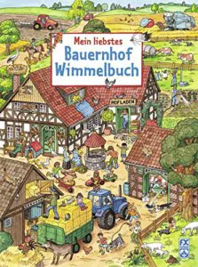
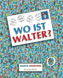
Wimmelbuch = vielfältiges Bilderbuch ohne Text, kommt ohne Text aus → die Handlung ergibt sich ausschließlich aus den Bildern
Wimmelbücher sind All-Age-Bücher. Sie sollen Kindern die reale Vorgänge ihrer unmittelbaren Umwelt veranschaulichen. Sie bieten Kindern und Erwachsenen die Möglichkeit, intensiv miteinander in Kontakt und kreativen Austausch zu treten. Die Kinder können in ihrem eigenen Tempo und nach ihren momentanen Interessen die Seiten „lesen“. Sie interpretieren die Bilder individuell und erzählen somit ihre eigenen Geschichten. Wortschatz, Sprache, Ausdruck und Sprechfreudigkeit werden dabei gefördert und bilden einen wichtigen Grundstein für die Zukunft.
Da Wimmelbücher einen sehr breitgefächerten Inhalt besitzen eignen sie sich auch für die unterschiedlichen Altersgruppen, welche ich in meinem letzten Post behandelt habe. Weiters gibt es Wimmelbücher in Altersabstufungen wie “Mein allererstes Wimmelbuch”, welches einfacher gestaltet ist und sie nach den Richtlinien für jüngere Zielgruppen richtet. Wimmelbücher zeigen den Alltag, verschiedene Berufe, Biologie, Lebensräume und sollen Kindern durch Visualisierung dabei helfen die Welt besser zu verstehen.
Bekannte Wimmelbücher: “Wo ist Walter?”, “Mein großes Wimmelbuch”
Nach der Erfindung der Filmkamera werden Anfang des 20 Jahrhunderts div. Tricktechniken wie Stop Motion, Phasentrick oder Rotoskoping erfunden. Durch weitere elektronische Entwicklungen entstehen ab 1950 die ersten Computeranimationen. Technische Errungenschaften und gestalterische Meilensteine wechseln einander ab. Am Anfang der Animationsentwicklung sind die technischen Erfinder meist auch die kreativen Umsetzer der Animationen. Die Filmemacher, die die Möglichkeit haben, mit der neuen Technik zu experimentieren, sind gleichzeitig technische Erfinder und Animationsproduzenten. Meliés, ein Trickpionier der ersten Stunde, entdeckt durch experimentellen Umgang bereits eine Unmenge an Tricktechniken. Nebenbei definiert er aber auch Science Fiction als Genre. Mit dem Digitalisierungsprozess ist generell eine Trennung zwischen Technik und Gestaltung festzustellen. Animationshäuser wie Pixar oder Disney trennen Technik (Technical Director) und Gestaltung (Art Director). Die neuen Errungenschaften werden meist von Mathematikern oder Physikern wie Blinn, Catmull oder Phong formuliert. Oftmals entstehen aus gestalterischen Vorhaben technische Erneuerungen wie z.B. 1983 Revers bei dem Film “DER ZORN DES KAHN” / Star Trek / Lukas Film. Reevers muss die Aufgabe lösen, einen mondähnlichen Planeten durch Morphing zum erblühen zu bringen. Seine damaligen Überlegungen enden bei der Erfindung der Partikelsysteme. Viele Animateure oder auch Animationshäuser entwickeln neue Animationsstile. Disney prägt seit Anbeginn den Phasentrick, Ray Harryhausen etabliert Stop Motion in den 50er Jahren und die Aardman Studios definieren in den 80ern einen neuen Animationsstil mit Plastilin. Tex Avery, bekannt für seine extremen Animationsverformungen, stellt sich mit seinem übertriebenen Stil bewusst gegen die Arbeiten der Disney-Produktionen.
Die folgende Auflistung zeigt wichtige technische Errungenschaften und gestalterische Meilensteine in der Geschichte der Animation.
1895
Stop-Motion: Alfred Clark entdeckt vermutlich als erster, dass durch das Anhalten der Kamera Trickeffekte erzielt werden können. Er verwendet in Edisons Film “THE EXECUTION OF MARY, QUEEN OF SCOTS” eine Puppe für die Szene, in der Mary gehängt wird und gilt somit als Erfinder des Stopp-Tricks.
ab 1895
George Méliès ist der Trickpionier. Im Gegensatz zu den Gebrüdern Lumière, die dokumentarisch arbeiten, beschäftigt sich Méliès mit Illusionen und fantastischen Elementen. Er gilt als der Begründer des Fiktionalen Filmes. Er verwendet bereits um 1900 viele Filmtricks wie Stoptrick, Split-screen-Verfahren, Mehrfachbelichtungen, Matte-Effekte, Miniaturaufnahmen, Zeitlupe und Zeitraffer. 1902 dreht er seinen bekanntesten Film <Le Voyage dans la Lune> (Reise zum Mond), der als erster Sciencfiction-Film in die Geschichte eingeht.
1900
James Stuart Blackton (1875 -1941) erzeugt in dem Film “THE ENCHANTED DRAWING” bewegte Karikaturen. Er stopppt die Kamera und verändert die Zeichnung. Dabei handelt es sich um eine Vorstufe der Animation, bei der allerdings noch nicht kontinuirlich Frame by Frame modifizeirt wird.
1906
Zeichentrick: Blacktons berühmteste Produktion ist “HUMOROUS PHASES OF FUNNY FACES”. Er zeichnet div. Portraits nach dem Frame by Frame-Prinzip. Die Zeichnung steht im Vordergrund, nur die Hand des Künstlers ist auf dem Film zu sehen. Der Film geht als erster Zeichentrick in die Geschichte ein.
1907
Erster Legetrick: Blacktons nächster Film “THE HAUNTED HOTEL”. Es werden starre Objekte animiert.
1908
Emile Cohl, ein französischer Karikaturist und Photograph kommt 1907 zum Film und geht 1910 in die USA. Bis 1923 produziert er über 250 Filme. Es entstehen Zeichentrickfilme und Experimente mit Puppen und Gegenständen, wie z. B. mit Streichhölzern und Scherenschnitten.
1911
Winsor McCay erstellt den Zeichentrickfilm “LITTLE NEMO”.
1913
Otto Messmer(1892-1985) der spätere Animator von “FELIX THE CAT” beginnt seine Arbeit.
1914
“GERTI THE DINOSAUR” von Winsor McCay gilt als Meilenstein für Charakteranimation. Dieser Film wird bereits im Theater vor einem größeren Publikum präsentiert.
1914/15
Earl Hurd patentiert den Phasentrick (Cel Process). Diese Technik revolutioniert den Zeichentrick: Verschiedene Zelluloid-Bilder werden in verschiedenen Schichten übereinander gelegt. Bewegte Bildteile können vor statischen Bildteilen wie z.B. einem Hintergrund vorbeigezogen werden. Diese Optimierung ermöglicht größere Zeichentrickproduktionen.
1915
Max Fleischer erfindet das Rotoskopie-Verfahren. Mit dem Rotoskop können Realfilm-Szenen in gezeichnete Animationen umgewandelt werden. Rotoscoping: Über einen Umlenkspiegel wird eine Realaufnahme auf eine Mattscheibe eines Tricktischs projiziert. Die Bewegungen können Bild für Bild nachgezeichnet und auf die zu animierende Figur übertragen werden.
1917
Willis O’Brien produziert “THE DINOSAUR AND THE MISSING LINK”, einer der ersten Clay-Animation-Filme.
1919
“FELIX THE CAT” (Otto Messmer) Eine in schwarz-weiße gezeichnete Vorläuferfigur von Mickey Mouse. Die Figur wird ab 1922 für Paramount’s newsreel Screen Magazine produziert. Die Animationen werden später mit Musik nachbearbeitet.
ab 1923
Tonfilm
1925
Willis O’Brien produziert die Stop-Motion-Animation “THE LOST WORLD”. Es werden starre und verformbare Objekte animiert und er mischt Live-Aktion und Stop Motion Aufnahmen hintereinander.
1926
Cut-Out-Animation: Lotte Reinigers Animationsfilm ” DIE ABENTEUER DES PRINZEN ACHMED” ist der erste Scherenschnitttrick in Spielfilmlänge.16 mm Film wird erfunden.
1928
Walt Disney gründet das Disney-Unternehmen. “STEAMBOAT WILLIE” von Walt Disney ist der erste gezeichnete Tonfilm, der ein kommerzieller Erfolg wird.
1932
dreifarbige Technicolor-Verfahren: Disney sichert sich für “FLOWERS AND TREES” die Exklusiv-Rechte für diese Technik. Durch den Einsatz von Rotoskoping und Phasentrick verschafft er dem Zeichentrick den Durchbruch.
ab 1933
Studios wie MGM – Metro Goldwyn Mayer, Warner Bros. oder Disney produzieren Zeichentrickfilme.Willis O´Brein produziert seinen letzten revolutionären Film “KING KONG”. Er gilt als Mentor von Ray Harryhausen.
1937
Disney – “SNOW WHITE AND THE SEVEN DWARFS” ist der erster Zeichentrickfilm in Spielfilmlänge. Die Bewegung der Tänzerin Marge Champion wird durch das Rotoskopverfahren auf die Zeichentrickfigur Schneewitchen übertragen.
ab 1945
Die Entwicklung von “Whirlwind Computer”, der die erste Computeranimation berechnen wird, startet am MIT.
1945
UPA (United Productions of America) wird von scheidenden Disneyanimatoren gegründet.
1946
Compositing: Walt Disney produziert “SONG OF THE SOUTH”, eine Kombination aus Zeichentrick und Realfilm.
1948
Jirí Trnka – Puppentrick aus Tschechien: Der aus dem heutigen Tschechien stammende Jirí Trnka animiert “THE EMPERORS NIGHTENFALE” – ein Puppentrick in Spielfilmlänge. In Tschechien entsteht eine Stop-Motion-Bewegung.
ab 1950
Animation und vor allem Zeichentrick erobern das Fernsehen. Werbung zählt zu den bevorzugten Anwendungsbereichen.
1951
Die erste Computeranimation wird am MIT auf dem ersten Echtzeit-Digitalrechner der Welt, dem Whirlwind-Computergeneriert.
1953
Farbfernsehen (NTSC) wird in den USA eingeführt.
1958
Ray Harryhausen, der in den 50er und 60er Jahren Meilensteine wie “JASON AND THE ARGONAUTS” oder “SINDBAD AND THE EYE OF THE TIGER” umsetzt, entwickelt eine neue Technick für Stop Motion: Dynamation:Eine Split-Screen-Technik, die die Kombination aus Realfilm und Stop Motion Animation ermöglicht.
1961
Edvard Zajac, Forscher an den Bell Laboratorien, erstellt den ersten computeranimierten Film auf einem IBM 7090. Der Film ist vier Minuten lang und veranschaulicht die Bewegung und Eigendrehung eines Satelliten.Spacewars: Erstes Videospiel wird von Steve Russell am MIT entwickelt
1963
Mouse als Eingabegerät wird entwickelt.
1970
Pierre Bézier, ein Ingenieur bei Renault, entwickelt die Bézier-Kurve.
1972
Gründung des Britischen Animationsfimstudios Aardman Animations LTD. Animateure wie Peter Lord und Nick Park definieren die Clay-Animation neu.
1974
Ed Catmull entwickelt den z-buffer-Algorythmus.Bill Gates gründet Microsoft.
1975
Bui-Toung Phong entwickelt das Phong shading
1976
Jim Blinn entwickelt Reflection / Enviroment Mapping.Ed Catmull entwickelt eine “tweening” Software.Steve Jobs and Steve Wozniak starten mit Apple.
1978
J. Blinn stellt Bump mapping vor.
1979
George Lucas gründet mit Ed Catmull, Ralph Guggenheim und Alvy Ray Smith Lucasfilm.
1981
Der Musikkanal MTV wird gegründet.
1982
Jim Clark gründet Silicon Graphics Inc. und beginnt mit der Entwicklung spezieller Workstations für den Grafik- und Animationsbereich.AutoDesk wird gegründet und bringt AutoCAD auf den Markt.Disney veröffentilcht “TRON”: In diesem Fim sind 15 Minuten ausschließlich digital generiert. Weiters werden bereits digitale und reale Szenen miteinander kombiniert. Der Film geht als tricktechnischer Meilenstein und gleichzeitig als finanzieller Flop in die Filmgeschichte ein.
1983
Reevers entwickelt im Rahmen des Films “Der Zorn des Kahn” / Star Trek / Lukasfilm Particelsysteme.Alias wird gegründet.
1984
Wavefront Technologies bringt das erste kommerzielle 3D-Animationspaket auf den Markt.John Lasseter, ein Mitbegründer von Pixar, wechselt zu Lucasfilm.
1985
Pixar wird gegründet
1986
“LUXOR JR.” von John Lasetter entsteht.Softimage wird gegründet.mental images, die Entwickler von “mental ray renderer”, wird in Berlin gegründettiff- Format
1987
Dateiformate wie gif und jpg werden definiertLucasArts wird gegründetAdobe IllustratorSide Effects Software, die später Houdini auf den Markt bringen, wird gegründet.
1989
Adobe Photoshop startet
1990
3D Studio (AutoDesk), der Vorgänger von 3ds max, wird veröffentlicht.
1991
ILM produzieren Spezialeffekte für Terminator 2mpeg
1992
OpenGL wird von SGI veröffentlicht
1993
DoomMystDigital Domain wird gegründet.
1994
Linux 1.0Microsoft kauft SoftimageVRML
1995
Pixar und Disney zeigen nach einer vierjährigen Produktionsphase das erste gemeinsame Werk: “TOY STORY” ist der erste vollständig am Computer animierte 3D-Film. Weitere gemeinsame Produktionen folgen.Wavefront und Alias fusionieren.DreamWorks wird gegründet.
1996
Die GIF-Animation erobert das Internet.Macromedia Flash, ein vektorbasierendes 2D-Animationspaket, erscheint in der Version 1.0.
1998
Alias Wavefront Maya wird veröffentlicht.Pixar / Disney produziert “A BUG´S LIFE”ILM porduziert Spezialeffekte für “Abyss”
1999
Pixar: “TOY STORY II”ILM: “STAR WARS EPISODE 1”
2000
Playstation 2
2001
Machinima: Mit Hilfe von Game-Engines erstellte Animationen. Setzt sich aus den Begriffen “machine”, “cinema” und “animation” zusammen.
In my last post, I dived deep into the topic of whether Communication Design can stimulate behavioural change, while focusing specifically on sustainable behaviour. From this, it becomes clear that graphic means could possibly aid a behavioural change by sensitizing people, creating awareness, engaging them emotionally or translating complex matters into a language comprehensible to the target audience.
As a next step for my research, I decided to dive into the practical field again and look at some examples, where those notions were put into practice.
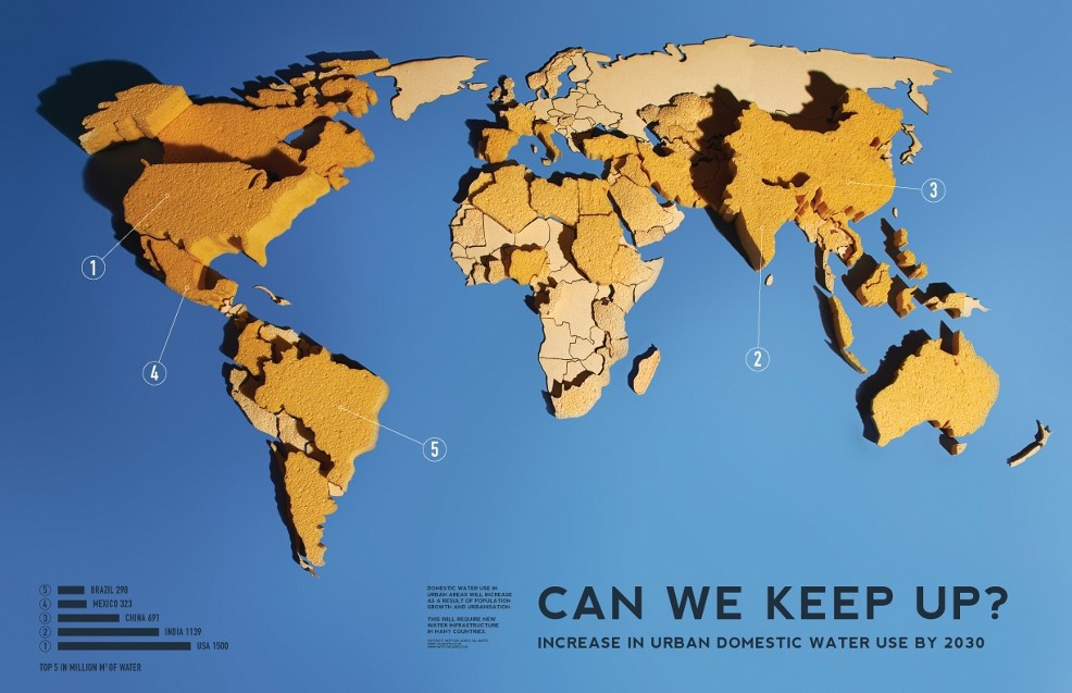
Infographic” Urban Water Needs—Can We Keep Up? (Increase in Urban Domestic Water Use by 2030)” by Matt and Hal Watts
The infographic by Matt and Hal Watts showcases beautifully how Communication Design can aide translating a complex topic into an image I can grasp within seconds: the bigger the sponge, the higher the urban domestic water use increase.
This video from Greenpeace raises awareness for deforestation and uses a beautiful emotionally-laden visual language reminiscent of children’s books.
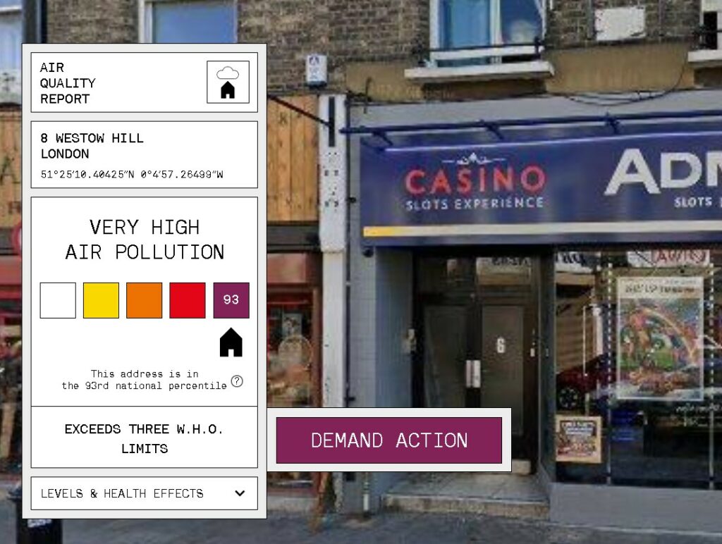
Website “addresspolution.org”
Note. From [Screenshot of the website addresspollution.org], by Central Office of Public Interest, 2022 (https://addresspollution.org/results/f0e570ee-f242-4e38-8a0e-9431f4676bed). Copyright 2022 Central Office of Public Interest.
The website “addresspollution.org” lets residents of London enter their address and returns the air pollution score. With this, the users can see the direct effect pollution has on their very own lives.
References
Barker, M. (n.d.). Soup [Poster]. Mandy Barker. https://www.mandy-barker.com/soup-2.
Central Office of Public Interest (2022). [Screenshot of the website addresspollution.org]. Central Office of Public Interest. https://addresspollution.org/results/f0e570ee-f242-4e38-8a0e-9431f4676bed.
Greenpeace International. (2020). There’s a monster in my kitchen . YouTube AT. https://www.youtube.com/watch?v=prg24EWHNJg.
Watts, H., Watts, M. (2011). Can We Keep Up? Increase in Urban Domestic Water Use by 2030 [Infographic]. circle of blue. https://www.circleofblue.org/2011/world/infographic-can-we-keep-up-increase-in-urban-domestic-water-use-by-2.
Die Geschichte des Brutalismus beginnt nach dem Zweiten Weltkrieg. Viele Gebäude Großbritanniens sind zerstört, dem Land mangelt es an Baumaterialien.
In der Sowjetunion sind die urbanen Zentren überbevölkert. Die kommunistische Regierung hat der Bevölkerung jedoch Wohnraum für alle versprochen. So beginnen sie Chruschtschowkas zu bauen, das sind vorgefertigte Plattenbauten. Sie haben alle denselben Grundriss und bestehen aus billigen Baumaterialien. Die Gebäude sind effizient und stehen für den Kommunismus – also gegen jegliche Überheblichkeiten und für soziale Gleichheit.
Im Westen werden die Gebäude jedoch kritischer gesehen. Für sie sind sie ein Zeichen von Armut und von Uniformität. Dadurch beginnen immer mehr britische Designer:innen sich diesem Zwiespalt zu stellen. Mithilfe von günstigen aber dennoch auffällig aussehenden Rohstoffen beginnen sie die kahlen Betongebäude, die in den Städten entstehen zu verschönern.
1953 taucht im Magazin „Architectural Digest“ das erste mal der Begriff „Neuer Brutalismus“ auf.
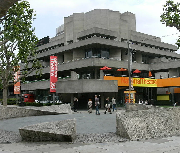
The National Theatre South Bank London. Quelle: https://99designs.de/blog/designgeschichte-stroemungen/brutalismus-im-design/
Der moderne Brutalismus
In den letzten Jahren wurde der Brutalismus vermehrt im Webdesign eingesetzt. Dies erschien vorerst ungewöhnlich, weil der Brutalismus sehr eng mit dem Rohzustand der Materialien bzw. mit Beton verknüpft war.
Pascal Deville, Mitgründer der Agentur Freundliche Grüße, gilt als Vorreiter des Verwenden vom Begriffe „Brutalismus“ in Kontext mit digitalem Design. Er beschreibt den Stil als „jugendliche Rebellion“ gegen andere Formen wie Flat Design oder Material Design, die er eher als sanft und massenfreundlich beschreibt.
Typografie und Farbe bringen in dem digitalem Fall den Brutalismus zur Geltung.
Auch moderner Brutalismus besinnt sich auf die Gegebenheiten des Betons und des Rohstoffes zurück. So sind auch bei Webdesign die Betonplatten, blanke Stellen und raue Kanten sehr wichtige Bestandteile des Designs. Brutalistische Designer vermeiden redlich Bearbeitung, sie besinnen sich auf standardmäßige Computerschriften und quadratische Bilder. Die Größe dieser damaligen imposanten Betongebäude wird meist durch eine sehr groß verwendete Typografie widergespiegelt.
Beim Designen von brutalistischen Arbeiten muss unbedingt die Zielgruppe des Kunden bedacht werden. Wie Deville schon erklärt hat, ist Brutalismus rebellisch und jugendlich. Dies lässt auf eine jüngere Zielgruppe deuten. Gut bieten sich brutalistische Arbeiten für persönliche Projekte wie Portfolios an, oder auch für Projekte die einem einen großen kreativen Freiraum bieten.
Beide Bewegungen haben ihre Ähnlichkeiten, wie zum Beispiel unbearbeitete Elemente oder der Verzicht auf konventionelle Designprinzipien. Antidesign spielt mit dem Hässlichen. Das heißt es werden Farben verwendet, die sich etwas beißen oder konventionelle Hierarchien werden verstoßen. Wobei Antidesign eine Punk-Mentalität verkörpert, liegt der Ursprung des Brutalsimus in der Effizienz und der Funktionalität.
Immer wieder kommt zur Sprache, dass die digitalen Medien, Printmedien ersetzen werden. Dabei wird oft auf die Vorteile der Printwelt vergessen. Was für diese spricht und wann sie am besten eingesetzt werden, wird in den folgenden Punkten erläutert.
Printmedien für Inhalte die Emotionen wecken
Digital ist hervorragend geeignet für alles bei dem Aktivität gemessen werden soll – von Klicks über Seitenaufrufe bis hin zu Vorlieben. Trotzdem ist es schwierig in der schnelllebigen Onlinewelt in die Tiefe zu gehen und aufzufallen. Selten werden Beiträge nochmal geklickt oder weitergeleitet. Bei Print ist das anders. Gelesenes wird gerne besprochen, weitererzählt oder durchdacht.
Jeder zweite Leser teilt Anzeigen, die er in Zeitschriften liest, mit Freunden und Familie. Acht von zehn Menschen haben etwas gekauft oder eine Webseite besucht, nachdem sie in einer Zeitschrift darüber gelesen haben.
Man nimmt sich Zeit für Print
Nur weil die Nutzung von Smartphones stark zugenommen hat, heißt das nicht, dass sich die Menschen keine Zeit mehr nehmen, qualitativ hochwertige, längere Inhalte zu konsumieren – vor allem, wenn sie in gedruckter Form zur Verfügung stehen.
Laut MNI lesen Baby Boomers 9,2 Printmagazine, die Generation X 9,1 und Millennials 8,9 Magazine im Monat. Der Unterschied zwischen der älteren und der jüngeren Generation ist sehr klein. Zeitschriften haben also weiterhin eine große Anziehungskraft, die auch nicht nachlässt.
Laut einer Umfrage von Code Computerlove verbringen 16-24-Jährige am Tag durchschnittlich drei Stunden und 23 Minuten mit ihrem Smartphone. Aber dieses schwer abzulegende Verhalten ist der Generation Z sehr bewusst, und viele suchen Wege, es zu reduzieren. Fast zwei Drittel (61%) glauben, dass sie und ihre Altersgenossen davon profitieren, wenn sie öfter mal offline gehen.
Stärkeres Vertrauen in Print
Digital hat gegenüber Print einen klaren Tempovorteil – Inhalte können mit nur wenigen Klicks veröffentlicht werden. Wo es aber nicht mithalten kann, ist Vertrauen. Laut einer Kantar-Umfrage unter 8.000 Verbrauchern in den USA, Frankreich, Brasilien und Großbritannien sind gedruckte Nachrichtenmagazine die vertrauenswürdigste Quelle für Nachrichten, gefolgt von 24/7-Fernsehnachrichten, Radiosendungen und nationalen Tageszeitungen.
Print gewinnt mehr Aufmerksamkeit
Die Verbraucher nehmen sich Zeit für Printmedien – 60% der Zeitungsleserkonsumieren keine anderen Medien während sie Zeitung lesen.
Durch die Corona-Pandemie haben die Menschen mittlerweile sogar noch mehr Zeit mit Printmedien verbracht – die Lesezeit von Zeitschriften stieg von 44 auf 56 Minuten am Tag.
Gedruckte Botschaften bleiben im Kopf
Bei Printmedien kommt ein wichtiger Sinn hinzu – die Haptik. Menschen würdigen etwas, das sie sowohl berühren als auch sehen können, um 24% mehr, als etwas, das sie nur sehen können. Haptische Objekte erscheinen dem Gehirn im wahrsten Sinne des Wortes realer – was zu einer intensiveren Auseinandersetzung mit dem entsprechenden Inhalt führt.
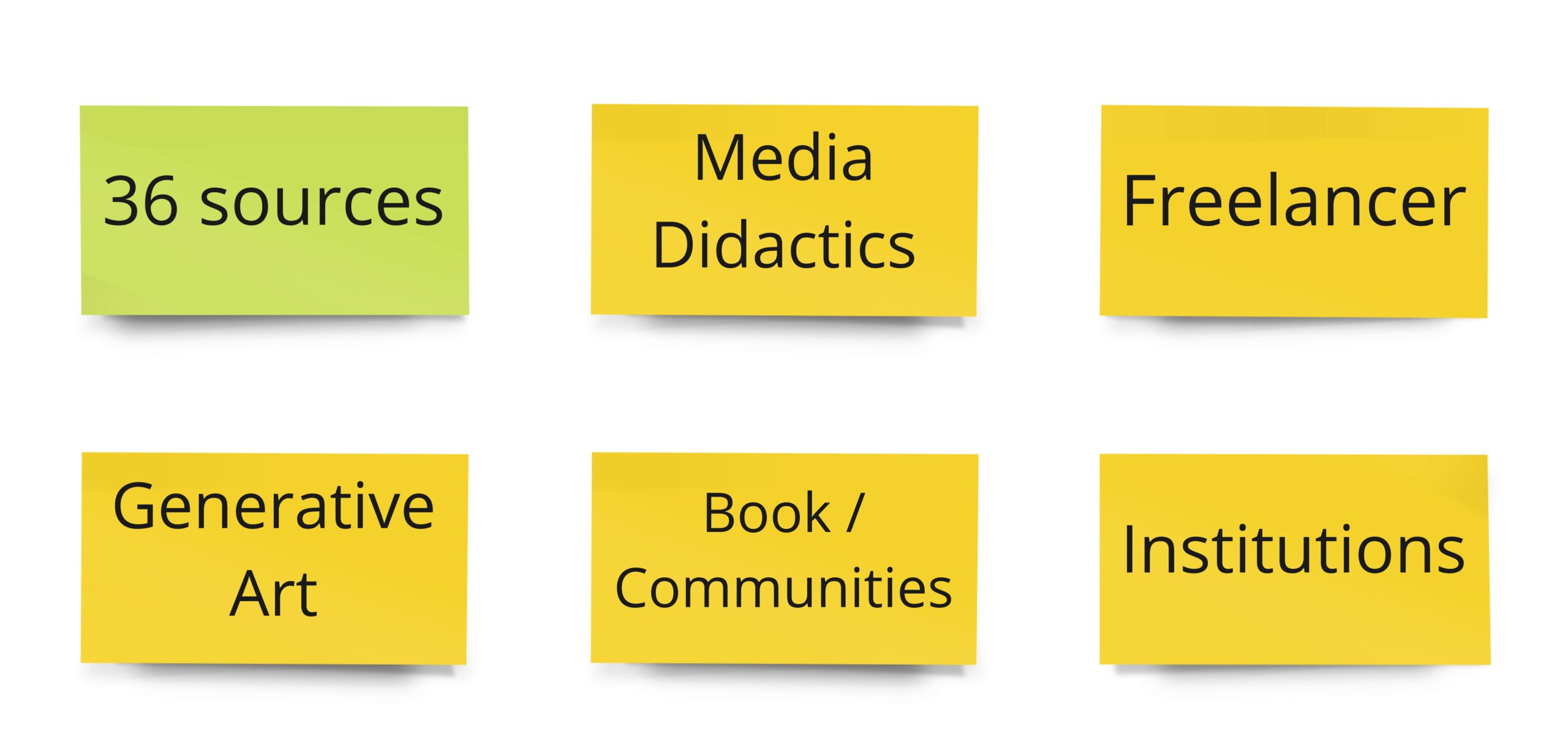
In this blog post I’m going to focus on the topics I worked on during the last two weeks. Inspired from a lecturer I did my research about all the topics connected to my proposed master thesis, that I got in touch during the last year. In the first week I searched for different keywords exclusively, giving me the freedom to dive deeper into very different disciplines without getting lost in detail. The second week was dedicated to clustering, arranging and finally lead to a mind-map.
topics for mind-map
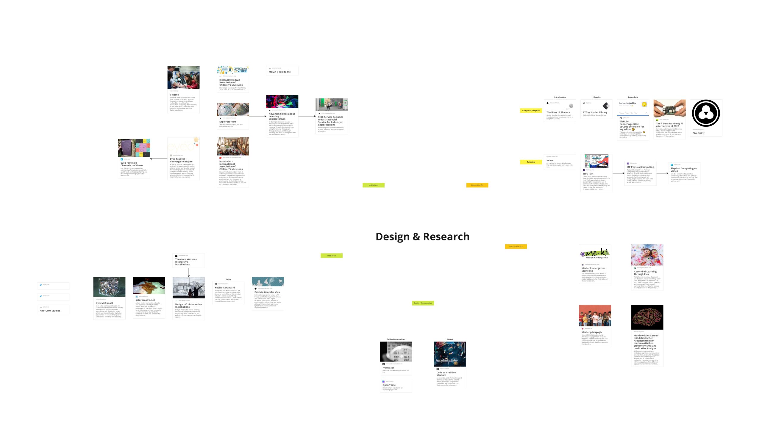
In the following section I want to give an overview of the mind-map and discuss how working with a mind map helped me in my research. The mind-map itself was made with a tool called Miro and shows the clustered topics according the ones mentioned in the upper section.
With the described approach, I want to overcome the pressure I put on me when researching topics. By separating data collection and processing, I want to achieve a feeling of freedom and curiosity that gives me excess to my true interests without being influenced by narratives distracting me. Moreover, this process gives me the freedom needed to switch my focus within topics without the urge of coming to a conclusions, as this will be done later while data processing.
While this is only the clustering of my findings and not all of this year’s topics are on the map, this process truly helped me visualizing my findings as well as showing me potential intersections.
The following blog posts will provide a closer look at the topics including filtering the most relevant aspects and further developing the map.