Digital tools and social networks are becoming more and more crucial in determining how people respond to certain life events. Refugees use electronic devices, such as phones, laptops, and tablets to browse the internet, find reliable information sources, and communicate with family, friends, and also other refugees mostly to seek support and direction from societal organizations that assist asylum seekers. Digital tools can also increase access to educational platforms, health services, and job opportunities.
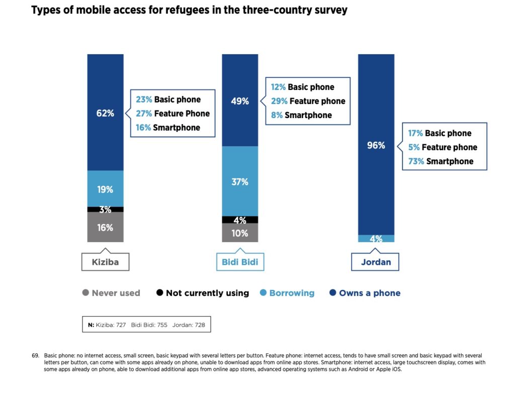
Based on the research by The GSMA, depending on their environment, refugees get mobile services in different ways, such as by sharing or borrowing phones and using different SIM cards. Most of them use their own phone and their own SIM card, for those who do not have them, borrowing is an important part of connecting with other people.
The most popular mobile service is calling. SMS is the second-most popular cellphone service. Qualitative research across all contexts indicates that the cost of using SMS messaging is one of the biggest barriers for refugees. The research data also indicates that refugees would like to use mobile internet more than they are currently able to.
“I use WhatsApp because it is easier. I have a relative who went to America. It is cheaper to call on WhatsApp and it is easy [to arrange] when they want to send me money.”
(Female, Refugee, Rwanda)
Because of that, online communication is thought to be more affordable and cost-effective than calling, particularly when connecting with individuals abroad. For refugees who are cut off from friends and family, communication (voice and text) on social media is seen to be especially crucial for creating a sense of connectedness and community. Entertainment is the third most frequent usage case, along with monitoring news and information.
Refugees can stay in touch with their family and the outside world thanks to their mobile phones. Their frequent use of phones for basic communication shows the importance of mobile for satisfying a social needs.
For my third blog entry I am taking a closer look into the status quo situation regarding apprenticeships in Austria.
Apprenticeship training procedure
In Austria, apprenticeships are strucutres as a “dual system”. The training takes place in the company and in a vocationals school. For around 80 % the training is spend at the company and 20 % taking place at the vocational school. At the vocational school appretices get theoretical skills thaught, which are needed to pass the apprenticeship. The subjects depend on the chosen industry. The aim of training at vocational schools is to supplement the technical training in the company, to improve the general education of the trainees and to acquire foreign language skills tailored to the training occupation.
The vocational schools can be divided in to three types:
All year-round: apprentices attend classes at least once a weak for the whole year
Course-based: apprentices attend a course over a specific period of time
Seasonal: Training is delivered in blocks at a certain time of the year. [1]
In Austria, apprenticeships are the most common type of primary vocational training. It offers the opportunity to obtain various qualifications in addition to become a skilled worker. For instance, an apprenticeship can be finished concurrent with the “Matura” or new skills can be aquired through a variety of alternative training programs. [2]
Facts and figures
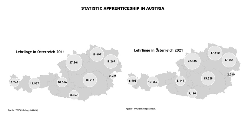
In 2021, 107,593 teenagers were undergoing an apprenticeship. Compared to 2011, there were 128,082 people in apprenticeship training. [3]In recent years, a rapid decrease in apprentices has been recorded. The reasons for this are that the number of young people aged 15-19 is steadily decreasing and the number of apprenticeship companies is decreasing. Many young people decide to pursue further education because of the wide range of schools being offered. In 1980, 70% of young people started an apprenticeship and in 2018 only 40%.
Most apprentices are trained in the commerce and trade sectors, followed by industry and trade. In 2021, around 107,500 apprentices were undergoing training in around 29,000 companies. Most apprentices are in Upper Austria (20,9%), followed by Vienna (16,1%), Lower Austria (15,9%) and Styria (14.2%).
Among girls, the most popular apprenticeships are: retail trade, office clerk and hairdresser/wigmaker. This concerns 43.3% of all female apprentices in Austria. It is therefore worthwhile for every young person to also think about alternative apprenticeship occupations in order to increase their chances of finding permanent employment. 35.1 % of all boys choose modular apprenticeships in metal technology, electrical engineering or automotive engineering.[4]
Die Entwicklung der Werbung spiegelt die Entwicklung der Gesellschaft, der Technik und des Handels wider. Sie musste sich stets an Fortschritte anpassen und entwickelte sich von der reinen Warenproduktion bis hin zur Differenzierung. Das Wort „Werbung“ musste bereits so einige Schreibweisen und Bedeutungsansätze mitmachen, bis es bei den für uns gängigen Assoziationen „Reklame machen“ oder „Propaganda machen“ angelangt ist.
Die Urform der Werbung kann unterschiedlich betrachtet werden. Eine Basis wäre beispielweise die Ansicht der Beeinflussung. Diese gibt es bereits seit dem Beginn der Menschheit und wurde bereits mit der Gebärdensprache verwendet. Zum anderen gibt es noch die Basis der Massenmedien und dessen gekoppelte Eigenschaft der Beeinflussung ganzer Zielgruppen.
Die ersten Werbemaßnahmen wurden mit dem gesprochenen Wort getroffen. Für Personen, die Waren produzierten und diese tauschen oder verkaufen wollten, zähle die Mundpropaganda zum wichtigsten Werbemittel ihrer Zeit. Als Schriften und Zahlungsmittle entwickelt wurden waren Tontafeln mit Warenauflistungen die ersten dokumentierten Werbemittel.
Antike: In der Antike wurden Markierungen auf Waren verwendet, um den/die Hersteller*innen kennzeichnen zu können und auf dessen Qualität hinweisen zu können. Diese Markierungen waren eine Art Gütesiegel und Werbemaßnahme zur Bekanntmachung. Zu dieser Zeit entwickelte sich ebenfalls das Wort „Reklame“. Unter Reklame versteht man „marktschreierische Anpreisungen“ die von Ausrufern auf Marktplätzen verwendet wurden, um auf Angebote oder Nachrichten aufmerksam zu machen. Zu dem kamen dann noch Aushängeschilder für die Kennzeichnung von Gaststätten, Händlern und Handwerker, sowie Papyrus als Möglichkeit größere Stückzahlen von Werbung zu ermöglichen, hinzu.
Mittelalter: Im Mittelalter gab es aufgrund religiöser Auseinandersetzungen weniger Entwicklungen. Was jedoch dazukam war „Direktwerbung“. In diesem Fall waren es päpstliche Briefe zur Zeit der Kreuzzüge. Mit der Entwicklung von Papier, verbreiteten sich auch die Werbung weiter. Es entstanden die ersten Marken und Konkurrenzkämpfe. Durch die Zunahme von Produktionsvolumen wurde auch die Intensität von Werbung angekurbelt. Als neue Werbefläche tat sich das Messegelände von Waren- und Mustermessen auf. Der erste Meilenstein für Massenmedien legte Johannes Gutenberg mit der Erfindung des Buchdrucks. Mit der Reformation nutze man das neu entwickelte Medium um Propaganda zu verbreiten. Mit der Entwicklung der Zeitung kann ein neues Werbemedium auf – die Anzeige. Die Nutzung von gewerblichen Anzeigen wurde jedoch noch bis zur Gewerbefreiheit 1850 zurückgehalten.
Von allen designten Objekten sind Buchstaben die wohl allgegenwärtigsten. Sie sind uns sehr vertraut jedoch sind sie erstaunlich unterschiedlich in ihrer Erscheinung. Sie variieren von sehr expressionistisch, auffälligen hin zu gänzlich reduzierten Stilen.
Aufgrund der Allgegenwärtigkeit von Schrift wird der Einsatz von Typografie als selbstverständlich angesehen. Dabei steckt dahinter erheblich viel Theorie und vor allem eine lange Geschichte, die uns erst den Einsatz wie wir ihn heute kennen ermöglichen.
Jeden Tag werden wir einer Vielzahl an Typografie ausgesetzt doch nehmen diese meist nur unbewusst war, da uns Schrift schon unser ganzes Leben begleitet. Gerade als nicht design-affiner Mensch wird der Schriftgestaltung nur wenig Aufmerksamkeit geschenkt und es ist selten bewusst wie sehr Schrift beeinflussen kann und wie sehr sie z.B. das gesamte Auftreten einer Marke maßgeblich prägt. Doch gute Typografie fällt nicht auf und daher kann diese Wahrnehmung eigentlich als positiv angesehen werden. Einer Schrift wird dann keine größere Beachtung geschenkt wenn sie der erwarteten Vorstellung entspricht.
Hinter dem gelungen „Endprodukt“ für den Betrachter steckt jedoch sehr viel Recherche und Arbeit für den Grafiker drin. Denn Schrift beeinflusst nicht nur unseren Alltag und den öffentlichen Raum maßgeblich sondern spielt auch eine enorm hohe Rolle im Grafikdesign. Eine präzise und durchdachte Schriftwahl ist unumgänglich für ein gelungenes Projekt und kann dieses maßgeblich positiv beeinflussen.
Ziel dieser Forschung ist es die Wichtigkeit von Typografie insbesondere den Einsatz im Grafikdesign zu beleuchten und hervorzuheben um so die enorme Beeinflussung durch Schrift im Alltag aufzuzeigen. Um dies zu untermauern wird auch auf die Grundlagen der Typografie eingegangen, um die Komplexität dieser Thematik zu beleuchten und aufzuzeigen wie wichtig eine intensive Befassung für jeden Designer ist.
Since looking at examples of design activism and the medium of the poster, I have dived deeper into the underlying principles behind Social Visual Communication. When observing the graphic artworks produced by the “Ateliers Populaire” in 1968, I could not help but wonder if the students rioting did indeed achieve their goal? Did they catch the onlooker’s eye and maybe even change the opinion of someone with just their printed flyers and posters?
Those musings lead me to the underlying inquiry of whether you can actually influence someone with a poster at all? If yes, what should a poster (or any graphic design) look like and which features should it have to impact someone’s behaviour?
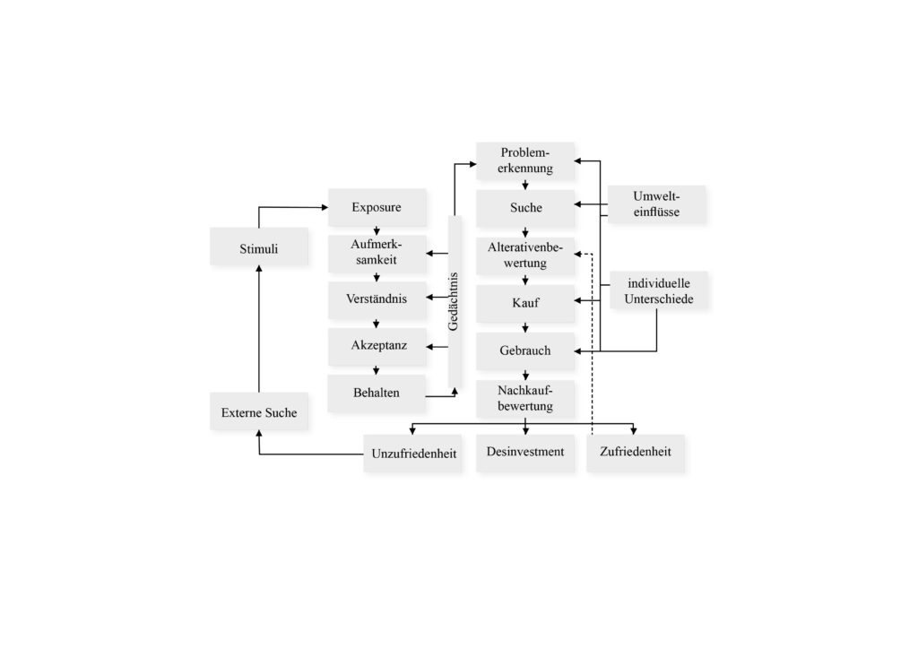
To begin unravelling this aforementioned mystery, I firstly looked back on previous research I conducted. For my bachelor thesis I observed social influencers and their influence on the attitude behaviour gap in the sustainability behaviour of generations Y and Z. While researching this topic, I came across several models and determinants of behaviour, which were albeit focused on consumer behaviour alone. For instance, Blackwell et al. developed a total model to map the entire purchase decision process which can be viewed below (Hoffmann & Akbar, 2019):
Total model of consumer behaviour from Blackwell/Miniard/Engel (Hoffmann & Akbar, 2019)
During the further course of my work, I dived deeper into sustainable behaviour and eco-conscious consumption, explored what barriers hinder people from such and finally researched if influencers on social media could make a positive impact on this. When observing this, I imagine Communication Design could maybe impact the exposure, attention, and comprehension stages of behaviour, but since my work only focussed on the impact of influencers and not design, it is impossible to tell just yet.
Fortunately, after some more reading, I happened upon a book called “Cause and effect – Visualizing sustainability” (2012), which contains examples design approaches that try to raise awareness and stimulate sustainable behaviour.
In the book, the authors describe the unique importance of the communication industry for conveying the necessary knowledge for sustainable practices (Bohle, 2012, p.2-3). They define the concept of sustainability communication:
“What distinguishes successful sustainability communication is that it sensitizes people, puts its finger on problems, and creates a sense of awareness. It arouses enthusiasm, offers guidance, and motivates people to take action. It addresses specific target groups with the aim of reaching the most various stakeholders. It communicates topics of sustainability, conducts PR and communication for environmental and social activities, disseminates information on the environmental impact and social compatibility of products and services, designs sales promotions and events conveying aspects of sustainability, supports and advances strategic consumption, and activates people for the aims of sustainable development. Successful sustainability communication gives attention to the real-life situations of people so that sustainability does not remain an abstract and empty word, but gains relevance”.
(Bohle, 2012, p.2-3)
When it comes to concrete ways with which design could aid the cause of changing people’s behaviour in a positive way, the authors mainly focus on the way topics should be communicated and which topics should be highlighted: “Each and every day, people deal with more than 10,000 units of information. The consequence is an information overload of around 99 percent, meaning that only 1 percent of the information we take in winds up in our short-term or long-term memory. To “slip into” this 1 percent is one of the three barriers that sustainability communication must overcome. […] First it must invite us to take a look by making use of unusual picture combinations. It must develop a pictorial and formal vocabulary that is extraordinary and sets itself off from everyday monotony” (Bohle, 2012, p.6). In addition to this, they also describe that sustainability communication must touch the onlookers emotionally in order to overcome the hurdle of people not feeling personally affected by climate change and must “translate the highly complex and in part complicated interrelations of sustainability into a comprehensible language” (Bohle, 2012, p.6).
The factors mentioned here are very interesting, but I am still wondering of how the visual aspect could aide or hamper inspiring onlookers to change their behaviour to safe our planet. In addition, I am also curious about in how far the learnings from this book could also be transferred to other causes like Social Movement campaigns etc. However, this question shall be the topic of further exploration…
References:
Bohle, S. (2012). Cause and effect – Visualizing sustainability. gestalten.
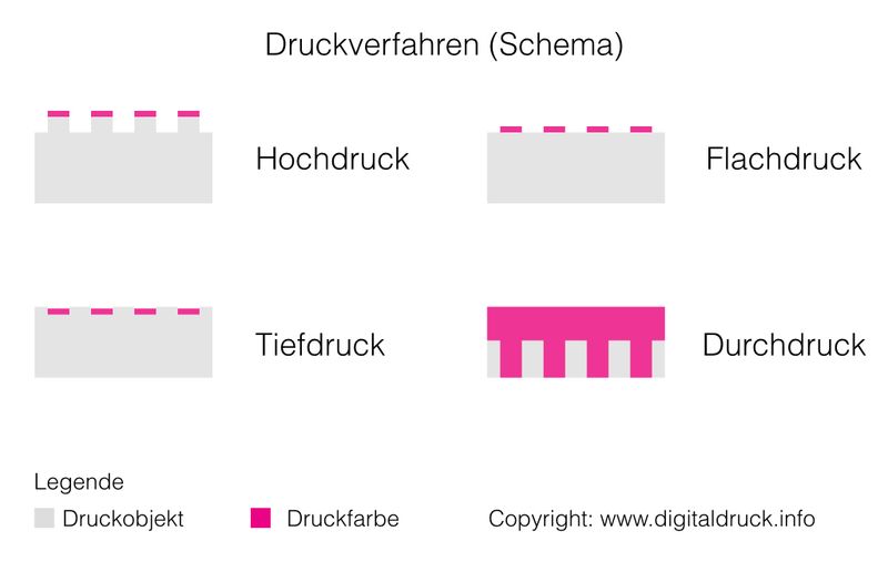
In diesem Blogpost werden die wichtigsten Druckverfahren behandelt. Zu diesen zählen Hochdruck, Tiefdruck, Flachtruck, Durchdruck & Digitaldruck. Jede von ihnen weist verschiedene Vor- und Nachteile auf und wird deshalb für bestimmte Produktionen verwendet. Die vier Hauptdruckverfahren (Hochdruck, Tiefdruck, Flachdruck, Durchdruck) unterscheiden sich vornehmlich durch die Oberflächenstruktur der Druckformen und die damit verbundene Art des Farbtransfers. Weitere wichtige Unterscheidungsmerkmale sind die Übertragungsart (direktes oder indirektes Drucken) sowie die Druckformen-Herstellung (beispielsweise elektrostatisch, chemisch, manuell).
Druckverfahren – Funktionsweisen
Hochdruck
Der Hochdruck ist das älteste Druckverfahren und war in Form des Stempeldrucks bereits in der Antike bekannt. Die im 15. Jahrhundert von Johannes Gutenberg erfundene Buchpresse nutzte diese Methode und begründete die moderne Druckindustrie. (Mehr davon im Blogpost “Die Geschichte des Drucks) Der Name leitet sich von den hochgestellten Teilen der Druckformen ab. Wie bei einem Stempel bilden die freizulassen Stellen die flache Basis der Druckform, während die zu druckenden Stellen erhaben sind. Die Farbe wird – beispielsweise mit einer Walze – auf die erhabenen Flächen der Druckform aufgetragen, die dann auf das Papier gedrückt wird. Neben dem klassischen Buchdruck zählt der Flexodruck zu dieser Direktdruck-Methode. Letzterer kommt heutzutage vor allem beim Bedrucken von Kunststoffverpackungen zum Einsatz. Der klassische Buchdruck findet heute kaum noch Verwendung, da die Herstellung der Druckformen sehr kosten- und arbeitsintensiv ist. Gelegentlich ist es noch in Form von Holz- und Linolschnitt-Techniken im Kunsthandwerk zu finden.
Tiefdruck
Beim Ende des 19. Jahrhunderts erfundenen Tiefdruckverfahren sind die zu druckende Bereiche vertieft. Mittels Lasergravur oder Ätzung wird das gewünschte Druckbild in die Druckformen gebrannt. Nach dem Auftragen der Farbe verbleibt diese nur in den Vertiefungen. Der eigentliche Druck erfolgt direkt durch kräftiges Anpressen der Form auf das Papier, wo die Farbe durch Adhäsion haften bleibt. Der Tiefdruck bietet sehr gute Qualität und ist wirtschaftlich rentabel bei großen Auflagen für Magazine, Kataloge, dekorative Verpackungen und Zierfolien. Zu diesem Druckerfahren gehören der Rotationstiefdruck und der Bogentiefdruck. Ersterer ermöglicht eine hohe Druckgeschwindigkeit, während der Bogentiefdruck durch seine Farbechtheit vor allem bei qualitativ hochwertigen Drucken Verwendung findet.
Flachdruck
Bei diesem indirekten Druckverfahren liegen die zu druckenden und die frei bleibenen Stellen auf gleicher Höhe. Mithilfe des chemischen Prinzips von der gegenseitigen Abstoßung von Fett und Wasser lassen sich die Bereiche trennen. Die zu druckenden Stellen werden mit Fotopolymeren oder anderen Wasser abweisenden Stoffen behandelt. Wird die Druckform befeuchtet, stoßen die wasserhaltigen Stellen die fetthaltige Farbe ab, während die behandelten Stellen sie annehmen. Der Druck erfolgt indirekt, indem die Druckform die Farbe zunächst auf eine Gummiwalze überträgt, die das eigentliche Medium bedruckt. Neben den heute veralteten Steindruck- und Lichtdruckverfahren zählen der Polyfoliendruck und der weitverbreitete Offsetdruck zu diesem Druckverfahren. Auch der Laserdruck wird häufig als eine elektrostatische Variante dieser Methode betrachtet. Der Flachdruck ist sehr vielseitig und vergleichsweise günstig. Er eignet sich für fast alle Drucke ab mittlerer Auflagenstärke.
Durchdruck
Beim Durchdruck wird die Farbe mit einem Pinsel, einer Bürste oder Rakel durch eine Schablone auf das Druckmedium gedrückt. Als Schablone kommen Siebe oder textile Stoffe zum Einsatz, wobei die zu druckenden Stellen durchlässig und frei bleibende Bereiche undurchlässig sind. Dieses direkte Druckverfahren ist sehr günstig und hat den Vorteil, auf fast allen Materialien und Objekten anwendbar zu sein. Der Siebdruck ist bis heute ein gängiges Verfahren für Textilien wie T-Shirts sowie für Werbeplakate, Flyer und dergleichen. Es ist allerdings nur bei kleinen Stückzahlen wirtschaftlich rentabel. Zum Durchdruck gehören ebenfalls die Siebdruck-Varianten Risographie und der Flockdruck.
Digitaldruck
Digitaldruck ist ein Sammelbegriff, der eine Vielzahl ähnlicher Drucktechniken zusammenfasst. Kennzeichnend ist das Fehlen einer Druckform. Stattdessen sendet ein Computer das Druckbild direkt an den Drucker. Mithilfe von Tintenstrahldüsen oder per Verdampfung gelangt die Farbe auf das Medium. Seit Anfang der 1990er finden diese Verfahren immer mehr Verbreitung. Ihre Vorteile liegen in der sehr hohen Druckgeschwindigkeit und den niedrigen Kosten bei kleinen bis mittleren Stückzahlen. Zum Digitaldruck gehören der Tintenstrahldruck sowie die verschiedenen Thermodruck-Techniken. Umstritten ist, inwieweit der Laserdruck zu den Digitaldruck-Techniken zu zählen ist. Er wird häufig dem Flachdruck zugeschrieben, da die Farbübertragung mittels einer Bildtrommel stattfindend, die eine Variante der Druckform darstellt.
The development towards today’s interface can be roughly divided into 3 phases: In the early days of computer technology the command line, from 1980 onwards the development of graphical user interfaces, which made the personal computer possible in the first place, and from the beginning of 2000 onwards the emergence of attentive user interfaces and assistance systems such as Google Glasses and Alexa and Siri. With the increase in technology, the requirements for the user interface also changed. Whereas in the beginning we had a computer with a screen, today we have different sized computers from smartphones to smartwatches. Some devices, such as Alexa, no longer have a graphical user interface at all, but interact by means of voice control. And while the computer was initially a device of science, it is now increasingly integrated everywhere in our lives. [1] The Morse telegraph service was the precursor of the command line. It generated readable text already at that time, so it was not necessary to know Morse code. The directly entered text was translated into Morse code by the machine, sent and output again into readable text by the receiving machine. The punch card also played an important role in computer programming. Here, however, the contents had to be translated back into machine-readable combinations. From 1960 until the early 1990s the command line was used to interact with the computer. Similar to the morse code recorder, the entered text is translated into machine language, whereupon the machine can execute the command and output the information in human-readable text. [2] The punch card and batch processing had the disadvantage that this type of interaction was very tedious. The computer processed the punched cards batch by batch and printed out the finished data, which could take a up to an hour. In addition to the first approaches to timesharing, J.C.R. Licklider at the Massachusetts Institute of Technology (MIT) came up with the idea for the first real interaction with the computer. His idea involved entering data on a keyboard and then receiving immediate feedback from the computer on an output device. It resulted in buliding the computer named Whirlwind between 1948 – 1951. It was the first computer that could operate while processing and gave back information immediatly. [3] The further development of time-sharing and the command line was the next stage of interface evolution in 1970. Xerox PARC developed the first concept and, with Xerox Alto in 1973, the first computer with a graphical user interface (GUI) that could be operated with a mouse.[4] This invention led to raster graphics-based networked workstations and “point-and-click” WIMP GUIs. WIMP GUI stands for graphical user interfaces based on windows, icons, menus, and a pointing device, typically a mouse. [5] This concept was further developed by Steve Jobs in 1984 at Apple and later also used from Windows. This type of use interfaces still exists until today. The main advantage of graphical user interfaces was that they were easy to learn and easier to use, therefore the personal computer gained popularity so fast. [4] Andries van Dam from Brown University’s faculty and one of it´s Computer Science Department’s founders refers 1997 to post-WIMP user interfaces. These are controlled by gestures and voice and do not require manual input with a tool. The first attempts were made in 1990, but should take some time before they were implemented.[5] Apple also gave its programmers Human Interface Guidelines from the beginning to address the needs of the users. In 1989 Tim Berners-Lee created HTML and a first browser and thus invented the Internet. The structure of the Bowser window (Mosaic 1, 1993) with address line, forward and back buttons is still used today. [6] The emergence of the first mobile devices and later the development of smartphones and tablets require different usability approaches and different user interfaces than the computer. The touchscreen enables intuitive operation and the feeling of direct interaction, but also places different demands on the design of the user interface. Many elements simply do not fit on the small screens. Therefore, many user flows must be oriented differently than on the larger screen. The information architecture must take into account that not all information fits on one view. Many functions had be reduced to essential functions and add not so frequently used features on other levels. [7]
—
1 User Interface Design, Alexander Florin, 2015, P. 74-75.
2 User Interface Design, Alexander Florin, 2015 p. 101-103
You probably would not want to sleep in a room lit in red light or even walls painted in red. Colours have a psychological effect on us and can transport emotions. To understand the why and how and be able to actively use colour to evoke a specific feeling in an audience it is mandatory to understand the science behind colour.
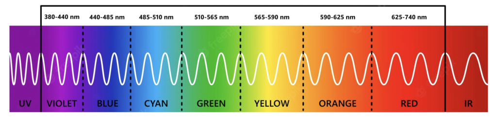
When we look at history we see that it was always there but not scientifically understood and researched. The first scientist we associate with deductions in this particular field is Sir Isaac Newton. He experimented with sunlight and prisms. He discovered that the spectrum of light visible to the human eye consists of seven colours: Red, Orange, Yellow, Green, Blue, Indigo, and Violet.
Roy GBiv
Newton also concluded that every colour in this spectrum is a mix of Red, Yellow and Blue, which is not entirely true.
More modern scientific approaches corrected Yellow to Green and reduced the main colours from seven to six. Indigo got removed because it was hard to distinguish it from its surrounding colours.
Roy GBv
The Visible Spectrum
Yet the spectrum of light ranges further. The human eye is however restricted to the wavelengths of light mentioned above. These wavelengths are measured in nanometres. The part of the spectrum visible to humans ranges from 380 to 700 nanometres.
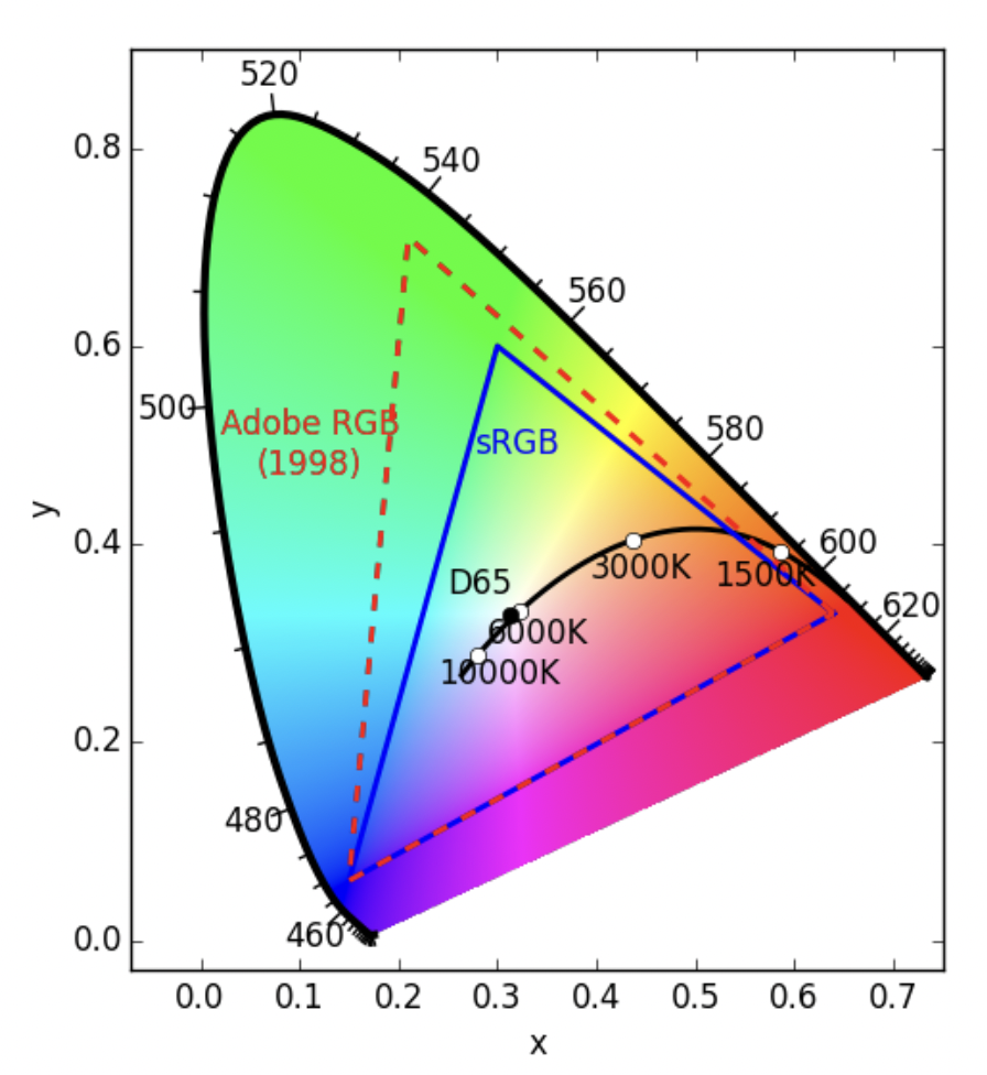
When it comes to colour in films, however, another diagram is more important. The CIE or horseshoe diagram also displays the whole spectrum of colours just as the visible spectrum but in it, there are different colour gamuts. Those gamuts are essentially the ranges of colour a display can portray. Since a film has to be shown on some display regardless, every colour outside these gamuts is rendered useless for filmmakers. The most common types of gamuts are the Adobe RGB Gamut and the SRGB Gamut, in both of which D65 is the white point.
CIE Diagram
Furthermore, the CIE diagram also displays the colour temperature. Colour Temperature is measured in Kelvin. “The color temperature model is based on the relationship between the temperature of a theoretical standardized material, called a black body radiator, and the energy distribution of its emitted light as the radiator is brought to increasingly higher temperatures.” In its original sense is used to measure how warm or cold the colour temperature of the light source feels. For example, a clear blue sky emits light we interpret as cold, whereas light in the early morning or evening is warm. This colour or light temperature, however, can also be applied directly to colours, whereas colours on the left of the D65 White Point can be seen as cold and colours on the right side of the white point can be seen as warm colours.
Research Problem / Research Question / Research Hypotheses:
How does the development of gender relations in film relate to contemporary society? How meaningful are the “Bechdel Test” and the “Mako Mori Test” as a general tool for measuring feminism? Why are female hero roles in action films so lacking in depth, and what constitutes strong, feminine roles? How are the main female characters portrayed through visual appearance / language / behavior?
Methodology:
-Content analysis: selected films are tested using a coding sheet with 15 test items; comparison of character portrayals, plot interpretations, and realistic reflections;
Analysis of sexual objectification (amount of visible skin) of main and supporting female characters compared to box office ranking;
-Textual analysis: selected films are analyzed based on film reviews.
Comparison of cinematic feminism in mainstream blockbuster films and non-blockbuster arthouse films.
Selection of successful films in five(?) year intervals over a period of time to show any changes in the portrayal of women over time
2022: Top Gun: Maverick $1,484,620,609
2021: Spider-Man: No Way Home $739,351,607
2020: Bad Boys for Life $426,505,244
2019: Avengers: Endgame $2,797,800,564
2018: Avengers: Infinity War $2,048,359,754
Sources:
Women-led films: different female representations in popular cinemas
Palatable Feminism: Reinforcing and Challenging Gender Stereotypes in Contemporary Hollywood Action Films:
The Empowering (Super) Heroine? The Effects of Sexualized Female Characters in Superhero Films on Women
The role of women in film: Supporting the men — An analysis of how culture influences the changing discourse on gender representations in film
BADASS BITCHES, DAMSELS IN DISTRESS, OR SOMETHING IN BETWEEN? Representation of female characters in superhero action films
Before the actual research process I started with a small dump of questions that could further define my possible areas of interest. This first post is supposed to serve as an orientation session, finding ways to further develop my skills and reach for new content in different directions. While following my mental path of questions about character animation, I discovered another interesting topic: 3D shaders and different ways of stylisation. Here are the questions i came up with.
Animation:
State of the art analysis: Which animation studios are currently most present? How do big animation studios animate? Do they have their own style? What is the difference between 2D and 3D animation? What are the main differences between character animation vs. facial animation practices? What are the established workflows? Key poses, in-betweens, animation smears and stretches, dynamics How can the animation principles be applied in character and facial animation? What extra steps are needed to animate for video games? Animation loops / idle animation How is work departmentalised / what is the pipeline in big studios? Which tools does the industry use to animate? How is such work possible as an individual? Which tools can be used, what helps facilitate the workflow? How can motion capture be used to help get quicker results than with manual keyframe animation?
Shaders:
How do material shaders work in 3D? In which style can a 3D piece be displayed? How can shaders influence these styles? 3D vs 2D shaders How can shaders be used to achieve certain styles? 90’s anime look / Arcane style / hand-painted look / watercolour / toon shader
Examples
Here I collected some example links, visualising what I thought of and found in this process.
This is a collection of works that can serve as a good foundation for research in the future.
Pallant, C. and Holliday, C. (2020) Snow White and the seven dwarfs. First edition..
Williams, R. (2009) The animator’s survival kit : [a manual of methods, principles and formulas, for classical, computer, games, stop motion and internet animators]. expanded ed.; 1. publ..
Primig, L. (2015) Rigging cartoony characters : am Beispiel des animierten Kurzfilms “The Rainbowmaker”
Schantl, D. (2013) Disney character animation : considering the example of Snow White and the seven dwarfs.
Wretschko, Bettina. 3D Character Animation : von der Idee bis zur Bewegung. 2015.