Multimodal learning in the context of social and ecological problems
No matter if old or young, exploring and understanding the unknown is truly one of many characteristics defining human beings. Developing hands-on-exhibits that empower users and touch them emotionally through interactive storytelling matters a lot to me. Participants should be encouraged to be curious – to touch, to hear, to try something out!
I hear and I forget. I see and I remember. I do and I understand.
Confucius
Therefore, I want to explore current state of the art approaches of hands-on and get insight into the latest scientific discoveries in the field of media didactic. By combining my findings, I want to find new ways to raise awareness for social and ecological problems and challenge the observer to rethink the status-quo.
Children ask lots of questions. Their curiosity and thirst for knowledge often seems insatiable – this is the motivation needed for all learning and the driving forces […].
ZOOM children’s museum
The motivation comes truly from my previous bachelor program “Environmental System Science”, as well as workshops, projects and people I met during this time. Experiencing how difficult it is to raise questions of emotional topics, I tried different approaches of science communication. Ranging from podcasts to theater, always trying to combine both scientific evidence and enjoyment. I realized that one should not always force people to talk about problems but rather invite them to a voyage of discovery.
Here I want to show some hands-on approaches that inspire me. As this collection can be seen as an ongoing process it will be updated from time to time. Maybe this section will also lead to a separate more detailed blog post in the future.
Das erweiterte Museum – Medien, Technologien und Internet; 2019 Give P’S a Chance: Projects, Peers, Passion, Play; Mitchel Resnick; 2014 Wissenschaftskommunikation – Schlüsselideen, Akteure, Fallbeispiele; 2016 Learning through play – A review of the evidence, The Lego Foundation, 2019
Designpattern – helpful concept or simple habit? We live with pattern every day. In fact, our brains are hardwired with pattern. Pattern recognition is a basic human information processing skill and an important process for perceiving our environment. Perception depends on knowledge and experience that people already have. The brain compares stimuli to previously stored information in long-term memory to categorize them. Without previously acquired experience, humans cannot recognize patterns. [1]
It is related to habit because habit is a routine of behavior that is repeated regularly and usually takes place automatically. It is related to habit because habit is a behavioral routine that is regularly repeated and usually automatic. We follow habits and patterns because they make things easier for us, but sometimes this behavior is even fatal, as common diseases of civilization prove. I was wondering if the same is true for UI/UX patterns.
In UI design, Usability is one of the most important factors to consider when designing a UI. And Usability is often critical for a good User Experience. To ensure good usability, designers need not only carefully consider their design but also use a common design pattern. Jenifer Tidwell, a renowned interface designer, is responsible for bringing pattern design into the world of UI design. She created many of the first patterns that are now used in modern web and app design. Since then, Designers have also built up design pattern libraries, which hold a solution for a variety of Interface Design Problems. [2] But does that mean if we follow design patterns and design principles the UI will always turn out good? Therefore, I want to explore what distinguishes good from bad UI design, and whether following design patterns is always a good idea, or whether constant repetition of past solutions tends to prevent innovative ideas.
Design Pattern – definition of term A pattern is something that repeats itself and has a predictable outcome. Even though people’s experiences are tied to their past empirical experiences, the way the human brain and perception works makes behavior predictable. Design patterns are based on the fact that humans repeat behavior and act in a certain way. [3] Common patterns like login and registration processes, social logins, user on boarding, breadcrumbs, date pickers have become established in digital products nowadays. One rule of good interface design is to repeat what’s already in use. Indeed, using a tried and tested solution, does not even save time for developing concept and UI design but also promotes the users learnability curve. [4]
The Concept and term was first defined by the Austrian-born U.S. architect and architectural theorist Christopher Alexander [5] in early 1977, who created his own design patterns for architecture. [6] This approach was later used in software development where patterns became proven, tested methods for developing software faster. The use of pattern can save time in the development process and reduce the potential for unexpected issues. Also it makes code more understandable which is also true for general understanding and communication approaches in the field of UI/UX design.[7] With the close relationship between the two disciplines, the leap to UI design was not far.
Design Pattern – then, now, forever the same? According to current knowledge about perception and human behavior, the use of design patterns is a good thing, as they help save time in development and improve UX. But is this really true, or are designers and developers simply addicted to a self-perpetuating habit, even though the solution may not be the best – just as some habits turn out not to be good. When we break free from constant repetition, do we gain a new perspective and find even better solutions to UI problems?
Another considerable aspect is the innate human drive to progress. When do we reach the point where we get tired and bored of repeating the same thing over and over again? There are already movements that intentionally break patterns, like Brutalism in web design. That might be an indicator that we need some change. Many new trends in disciplines like architecture, art, and fashion have been created in opposition to conformity. Brutalism in 2019 came up as a protest against the very shiny design of mainstream website design and fed the retro feeling at the time. It did not catch on, but is an interesting new approach to making web design less conformist and developing independent design styles. [8]
Designpattern – predict the future Once a pattern is invented, is it valid forever or does it change over time and especially with technological change? In fact, design patterns naturally change over time, especially as technology advances. When the mobile phone came along, designers had to find new ways to design concepts and interfaces, they had to adapt to voice-controlled devices like Alexa, and they will continue to have to find new ways with new inventions in the future. Another interesting aspect of change in the future is the evolution of AI. If we consider all the rules and patterns that already exist, can AI be useful for UI/UX engineers?
I would also like to make a short digression on the question: If we follow the don´t-make-them-think paradigm, will users not think at all in the future? Will designers make us think and will they relieve our cognitive processes and allow us to engage in more relevant thoughts, or will they impair the human ability to think in complex ways?
Youguo Pi, Wenzhi Liao, Mingyou Liu and Jianping Lu (2008). Theory of Cognitive Pattern Recognition, Pattern Recognition Techniques, Technology and Applications, Peng-Yeng Yin (Ed.) InTech, S.434-435 Available from: http://www.intechopen.com/books/pattern_recognition_techniques_technology_and_applications/theory_of_cognitive_pattern_recognition –
Using Design Patterns in User Interface Design, Chelsea Chase, 2012, S. 2
Designing Interfaces, Jenifer Tidwell, 2005, S. 11
It is said that the future of a society lies in its children. Besides the focus on personal development or the management of several crises is there an awareness or interest of the political future of our society? What are the influences or reasons that younger people are avoiding or focusing on political topics?
Two world wars, several economic crises, slave trade, archaic sexism, monarchy, autocracy, democracy – to name just a few points that have shaped the European continent. Sometimes it seems as if some of the traumas of history are forgotten after a short time and the mistakes are constantly repeated. But who is responsible for breaking this cycle of experiencing and forgetting? Is it fair for a society to always look to the youngest generation and leave the future to the children of the third millennium? If you look at the latest voter flow analyses of the last National Council elections in Austria (of the under-30s), you can see that society is slowly drifting apart. The parties of the centre are becoming less and less interesting for various reasons and the camps of the political fringes are slowly gaining ground. This development is certainly not bad per se – but when you look at the issues or the way politics is communicated, you sometimes feel like you’ve been transported back in time.
But what experience and history teach us is that peoples and governments have never learned anything from history and acted on the lessons that could have been learned from it.
Georg Wilhelm Friedrich Hegel (1770-1831)
In my opinion this quote still fits pretty well. It is up to us as a society to pass on the knowledge and experience we have gained. But what about the willingness of Generation Z or Alpha to absorb and use existing knowledge, or are these generations in particular already severely underestimated? What factors play a role when children or young people engage with the topic of history or politics for the first time or turn away from it? I would like to deal with these and other questions in my future research, because I think that a peaceful future should be an interesting topic for all of us.
My motivation for the project is to raise the political awareness of children and young people. I think it is wrong that young voters today are seen as a potential electorate for political parties, but are not really interested in issues that affect young people. This state of affairs creates disenchantment and weakens confidence in our democratic apparatus.
It is this state of affairs that I will be analysing over the coming weeks. I will focus on young people’s interest, disenchantment and enthusiasm towards political content. When is information interesting, what are the social backgrounds behind various opinions and to what extent can one react to this topic as an interaction designer?
After collecting some information on the topic, I would like to focus on my possibilities as a designer. I am convinced that as designers we share a certain quality – creativity. Through creative ways of interaction it becomes possible to target specific groups in society. There are various ways to share information or stimulate discourse. I am curious to see where my research will lead me and what kind of discussion can be concluded from it.
Let’s reminisce back in the days, when you were 14 years old. You just finished Secondary Modern school, and you are about to make (professional) decisions which might have a huge impact for the rest of your life. Not an easy one. You might get a lot of information about different school types and vocational programs in school, on educational fairs or find them online. Especially when looking for a vocational program, you might get tons of theoretical information, but how these jobs will look like in real life is often very difficult to imagine.
A wide variety of media can be used to present information. Most of these media approaches provide a very superficial impression and the chances to get deeper insights into the job are quite low.
For this topic, I was inspired by my nephew. He is 14 years old and currently attending the “Polytechnische Schule”. Next fall he will start a vocational program, but where he will end up is not defined yet. In the first semester of his last year at school the pupils have two weeks in total to get deeper insights first experiences into the chosen companies. It is their choice where they want to go but the options are limited especially in the region where I grew up. When I was in the same situation if I want to continue attending further school or choosing a vocational program, I did not really know what I want to become. I was still motivated to learn and therefore I chose to get further education. Even though I had access to all the information I needed, I was not able to get a more practical insight into different programs and jobs.
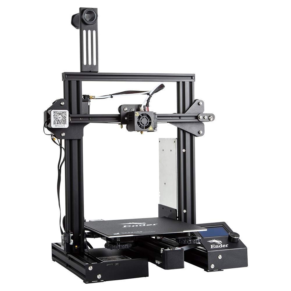
Therefore, I was asking myself, how can pupils at the age between 12 and 15 get a more and deeper insights into different vocational programs. First ideas which go into the direction of Virtual Environment (VE) have been researched but need to be more examined. For further research I want to analyze different media approaches and kinds of infotainment.
Sources
Checa, David, und Andres Bustillo. „A review of immersive virtual reality serious games to enhance learning and training“. Multimedia Tools and Applica- tions 79, Nr. 9 (1. März 2020): 5501–27. https://doi.org/10.1007/s11042-019- 08348-9.
Ferguson, Chris, Egon L. van den Broek, und Herre van Oostendorp. „On the role of interaction mode and story structure in virtual reality serious games“. Computers & Education 143 (1. Januar 2020): 103671. https://doi. org/10.1016/j.compedu.2019.103671.
Makransky, Guido, Gustav Petersen, und Sara Klingenberg. „Can an Immersive Virtual Reality Simulation Increase Students’ Interest and Career Aspirations in Science?“ British Journal of Educational Technology 51 (22. April 2020). https://doi.org/10.1111/bjet.12954.
Österreichische Gewerkschaftsjugend. „Zahlen & Fakten zur Lehre“, o. J. https://www.oegj.at/meine-situation/ich-bin-lehrling/fakten-zur-lehre.
Veermans, Koen, und Tomi Jaakkola. „Pedagogy in Educational Simulations and Games“. In VR, Simulations and Serious Games for Education, herausge- geben von Yiyu Cai, Wouter van Joolingen, und Zachary Walker, 5–14. Singa- pore: Springer Singapore, 2019. https://doi.org/10.1007/978-981-13-2844- 2_2.
For many people, the forgetful guy, the emotion driven kid, the easily distracted student are the image of how a person with learning and task managing difficulties is. We often find ourselves blaming the actor but not the context, thinking the way someone is without taking into consideration that we live in a society made for stereotypical, and ‘normal people’.
This encourages us to put a part of society into labels and groups segregating them, creating insecurities and doubts amount a group of people that lives in a neurotypical designed society. They are not forgetful, easily distracted, or sensitive, these are actions, or the lack of them, triggered by a one type of mentally stimulated context. What would happen if their contexts and the objects they interact with were simpler and carefully designed to consider not only different physical capacities but also mental ones?
Every mind is a whole different universe, this means, that we all have different ways of learning, of retaining information, remembering things, controling emotions, feeling and thinking. When it comes to our brains, there are two types of brains, the neurotypical ones, which are known as ‘the normal people’, and the neurodiversity ones, ‘the people who have troubles’. But the correct definition for neurodiversity is the variations in sensory, cognitive, affectual, and intellectual functioning of the brain, because of a normal and natural variation of the human genome, which socially situates people as ‘other than the norm’.
As designers we try to reach as much users as possible, but we find ourselves design within the norms of users being part of the predominant neurotype, while there is a huge population there’s a need to bring inclusivity and effortless interfaces in a society where everything has been created for neurotypical users, but to be included in it. We must redefine the approach the discipline should take; it is not only considering the business and its profits but looking more into how design can create tools in diverse contexts to benefit other industries and users.
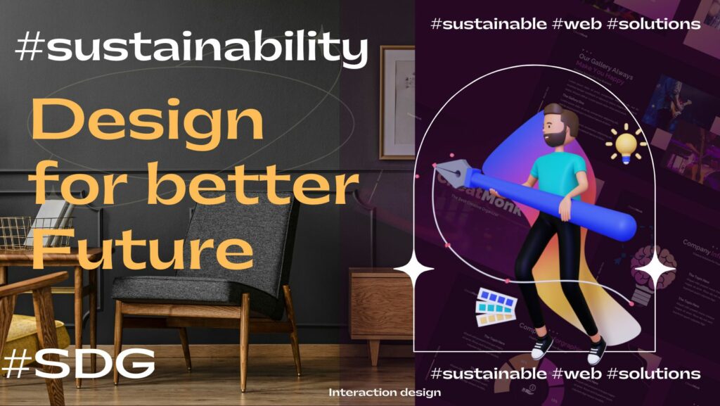
This publication aims solely to find an answer to the question of how can interaction design contribute to #sustainability, in an attempt to show on one hand some of the hidden faces of new technologies and on the other hand our share of responsibility as actors and users of digital tools and services in the drought and disasters we are currently experiencing, but also to promote some design approach that can ensure sustainability in the use of new technologies. We believe that design plays an important role in the development of products and services we use every day. “Design is a complex endeavor, covering many disciplines. Engineers create bridges and dams, as well as electronic circuits and new materials.” wrote Donald Norman in his book The Design of Everyday Things.
So, what is Interaction Design and how could it help in designing sustainable solutions? Interaction Design“is the design of interactive products and services” in which the focus of the designer extends beyond the item under development to include how users will interact with it. Thus, a close examination of users’ needs, limitations, and contexts, among other things, enables designers to tailor the output to meet specific demands. It is also useful when creating physical products, as it explores how a user might interact with them.
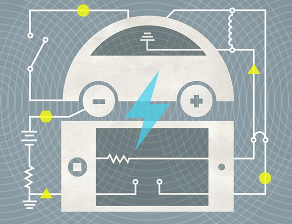
For instance, everyone who uses the internet and new technologies should be aware that they are two-edged swords. Climate change is more than just a scourge caused by deforestation, the use of chemical fertilizers, and the use of fossil fuels. Let me assure you that the #digital industry is not an immaterial industry. New technologies have a direct negative impact on the #environment, even if we don’t see it. According to studies, #digitalization emits far more CO2 and consumes far more fossil energy than we realize. A smartphone, for example, consumes 80 times more energy than a car (see illustration below). Recently, youths in Switzerland have expressed concern about data centers’ use of electricity, particularly during the energy crisis, and have begun to inquire about the measures the government will propose to reduce the digital footprint of the data consumed.
llustration-by-chad-hagen
The objective of interaction design is to develop products that help users achieve their goals as effectively as feasible. It is a set of “techniques and tools” that enable designers to address actual issues, which has a variety of advantages. If we want to effectively gain benefit from various advantages that Interaction design principles offer, we have to encourage decision-making at each stage of the design process that will lessen adverse effects on the environment and the health of the inhabitants without sacrificing the bottom line should be made possible by combining a sustainability concept with a “design philosophy”. It is a comprehensive, integrated strategy that promotes “negotiation and trade-offs”.
Humans can now communicate more easily as a result of technological advancements. But what are we willing to give up for those advantages? The sustainable design aims to reduce negative environmental and health impacts. Technology has streamlined our lives and improved our comprehension of the world. The key focus is that we are building not just for ourselves or for our immediate needs, but also for the future. This suggests once more that interaction design’s main goal ought to be sustainability. However, the term “sustainability” nowadays is quite ambiguous. To align with our topic, we will emphasize that designing for sustainability also entails designers, specifically interaction designers, taking an approach in product development processes that will provide better user experiences while not compromising on social, environmental, and ecological issues. Furthermore, Eli Blevis, professor of Informatics in Human-centered Computer Interaction Design at the Luddy School of informatics, computing, and engineering at Indiana University, Bloomington wrote a paper entitled Sustainable Interaction Design: Invention & Disposal, Renewal & Reuse where he went further in describing the concepts of sustainable Interaction design. Blevis provided us with a clear image of what sustainability should entail by emphasizing the interplay between people and nature from a more behavioral perspective. According to him, “The focus is primarily on environmental sustainability and the link between interactive technologies and the use of resources, both from the point of view of how interactive technologies can be used to promote more sustainable behaviors and—with more emphasis here—from the point of view of how sustainability can be applied as a critical lens to the design of interactive systems, themselves”.
Interaction design may contribute to sustainability by providing interfaces that make it simple for users to conserve energy. Designing systems that provide feedback on energy usage, creating incentives for energy-saving behaviors, and making it simple for users to modify settings that affect energy consumption are all examples of this.
Another critical part of interaction design for a sustainable future is the development of longer-lasting products and services. This can include creating systems that are easily upgraded and repaired, as well as mechanisms for recycling and reuse. This not only reduces waste but also helps to conserve resources.
In addition to encouraging ecological sustainability, interaction design can also help to promote social sustainability. This includes creating technologies that are accessible and inclusive to everyone, regardless of ability, age, or background. As well as considering the impact on underprivileged communities and striving to develop technologies that aid and empower them.
Overall, interaction design has a significant impact on the development of technology and society. Interaction designers can contribute to a more sustainable future for all by addressing the ecological and social consequences of their designs.
In den vergangenen Wochen habe ich mich auf die Recherche meines Themas fokussiert. Ich habe mich entschieden, die Informationen für mein Topic aus dem Buch „Theory of Type Design“ von Gerard Unger zu nehmen.
Auch die Vorlesung von Kurt Glänzer vergangene Woche passte sehr gut zu den Themen die ich anschneiden möchte, daher werde ich auch seine Imputs miteinbeziehen. Meine Research soll folgende Themen umfassen:
Um ein besseres Verständnis für die heutigen Methoden des Drucks zu bekommen, ist es wichtig die Geschichte dahinter zu kennen. Ohne den Druck wären wir in unserer Entwicklung als Menschen nicht da wo wir heute sind. Viel mehr Personen könnten bis heute nicht lesen und große wissenschaftliche Ereignisse, wären erst viel später zu uns gekommen. Hier werde ich die wichtigsten Phasen der Druckgeschichte behandeln.
01 Blockdruck
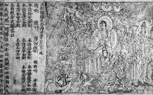
Die Geschichte beginnt im 6. Jh. n. Cr. in China. Während der Tang-Dynastie war der Blockdruck einer der größten Errungenschaften/Erfindungen dieser Zeit. Hier wurden aus Holz, Texte und Abbildungen geschnitzt, die danach eingefärbt und auf Papier gedruckt wurden. Heute ist uns dieses Verfahren noch als Holzschnitt oder Linoldruck bekannt. Die Reichweite dieser Erfindung ist dermaßen groß, dass der Druck in der modernen chinesischen Geschichtsschreibung als eine der vier großen Erfindungen des Chinesischen Altertums gilt. Den Weg nach Europa fand es erst im 14. Jahrhundert und zählt als Vorreiter des Buchdrucks von Johannes Gutenberg.
Eines der ersten Werke, das mit Blockdruck erstellt wurde: Diamant-Sutra (868 n. Chr.)
02 Druck mit beweglichen Lettern
Diese Phase der Druckgeschichte beginnt bereits vor Gutenberg. Im Jahre 1041 erfindet der Typograf Bi Sheng bewegliche Lettern aus Ton, die jedoch leicht zerbrachen. 1298 verwendet ein anderer Erfinder erstmals widerstandsfähigere Lettern aus Holz und erfindet zudem ein komplexes System aus drehbaren Tafeln, wodurch die Qualität des Drucks verbessert wird.
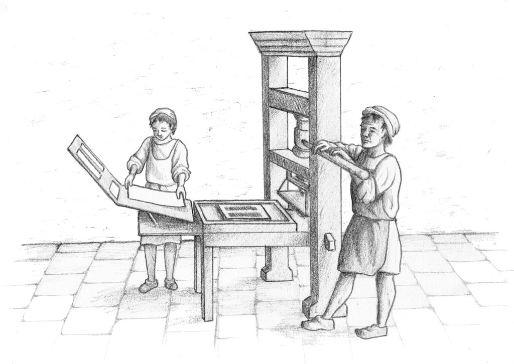
In Europa war Johannes Gutenberg derjenige, der im 15. Jahrhundert die beweglichen Lettern einführte. Das fortschrittliche an seiner Technik war die Punze. Das ist der Stahl-Rahmen, an dessen Kopfende das spiegelverkehrte Relief des zu druckenden Zeichens (Zahl, Buchstabe oder Satzzeichen) liegt. Durch Einschlagen der Punze wird die Matrize gebildet, in der die Buchstaben gegossen werden. Diese werden anschließend auf einem Tablett angeordnet, mit Druckfarbe bestrichen und auf Papier aufgedruckt.
Gutenberg verwendet zum ersten Mal Druckfarbe auf Ölbasis, die länger haltbar als die vorangegangenen Farben auf Wasserbasis ist
widerstandsfähigere Lettern aus einer Legierung aus Zinn, Blei und Antimon
Erfindung der ersten Druckpresse, deren Funktionsweise sich an einer Weinpresse orientiert
Nach etwa einem Jahr des Experimentierens wird am 23. Februar 1455 die Gutenberg-Bibel mit einer Auflage von 180 Ausgaben gedruckt.
Illustration von der Druckpresse nach Johannes Gutenberg
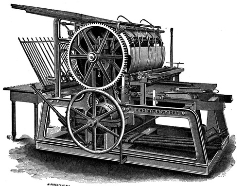
03 Rotationsdruckmaschine
Der nächste große Meilenstein in der Geschichte war die erste Maschine für große Auflagen. 1843 erfindet ein Amerikaner die Rotationsdruckmaschine. Zu Beginn wurde noch auf einzelne Papierbögen gedruckt, die 20 Jahre später durch die Rollenpapierzufuhr ersetzt wurden. Nun liegen die zu druckenden Bilder auf einem rotierenden Zylinder auf und nicht mehr auf einer ebenen, pressenden Oberfläche, und das Papier läuft über einen Zylinder, der einen viel höheren Druck ausübt. Dank der Mechanisierung des Verfahrens und der Einführung der Papierrolle druckt die Rotationsdruckmaschine bis zu 8.000 Exemplare pro Stunde, was auch für Tageszeitungen einen großen Fortschritt bedeutete.
Rotationsdruckmaschine
04 Offsetdruck
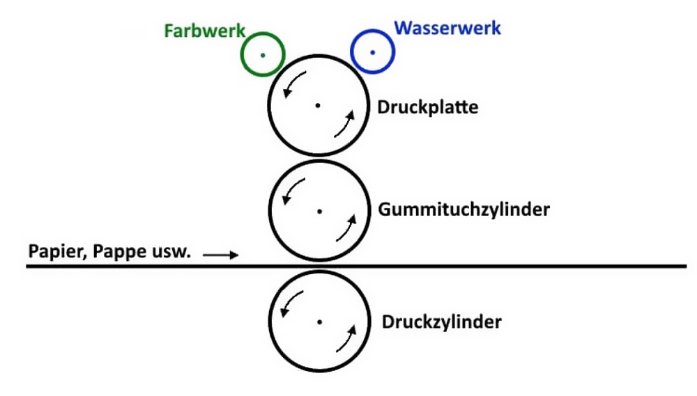
1904 wird die Technik des Offsetdrucks (welcher 1875 erfunden wurde) erstmals auf Papier angewendet. Dabei handelt es sich um ein indirektes Druckverfahren, das auf dem einfachen chemisch-physikalischen Prinzip basiert, nach dem sich Wasser und Fett abstoßen. Dieses Druckverfahren ist um einiges komplexer, als seine Vorgänger. Im Mittelpunkt steht die Offsetplatte, die in zwei Bereiche untergliedert ist – die druckenden Elemente, von denen Wasser abperlt (an denen demnach die Druckfarbe anhaften kann), und die nichtdruckenden Elemente, welche Wasser aufnehmen (an denen also keine Druckfarbe anhaften kann). Die Platte wird mit einer Lösung befeuchtet, die sich mit den druckenden Elementen verbindet, und wird anschließend mit Druckfarbe versehen. Die auf diese Weise an den druckenden Elementen anhaftende Farbe wird zuerst auf einen Gummituchzylinder übertragen und anschließend auf Papier gedruckt. Die Offsetmaschinen sind sehr groß und müssen oft gewartet werden, weshalb sie sich nur für große Produktionen lohnen.
Die Vorteile des Offsetdrucks sind:
Sehr hohe Definition und Auflösung.
Hohe Druckqualität auf jeder Art von Papier, auch solches, das keine glatte Oberfläche aufweist
Funktionsweise des Offsetdrucks
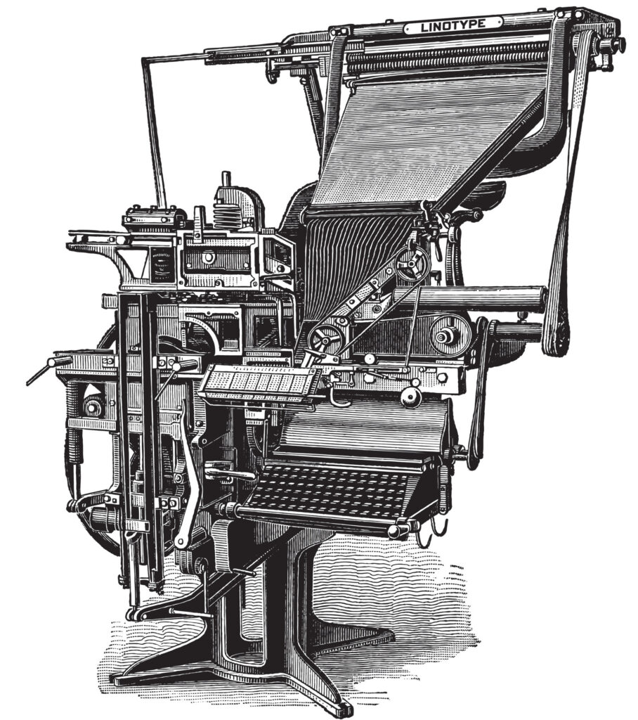
05 Linotype-Setzmaschine
1885 wird in Deutschland die Linotype erfunden. Der Vorteil dieser Setzmaschine liegt darin, dass damit die aus Lettern bestehenden Textzeilen automatisch angeordnet werden. Die Funktionsweise ist sehr einfach und ähnelt der einer Schreibmaschine: Der Schriftsetzer gibt über eine Tastatur die Wörter des Textes ein. Durch das Drücken der Tasten werden entsprechende Matrizen (die jeweils einer Letter entsprechen) gelöst und nebeneinander in einer Zeile angeordnet. Die Matrizenzeile wird mit flüssigem Blei gefüllt, mit Druckfarbe bestrichen und schließlich zum Bedrucken der Papierbögen verwendet. Auch wenn dieses Verfahren sehr komplex erscheint, wird durch die Linotype der Druckprozess stark beschleunigt. Ab diesem Zeitpunkt wird alles maschinell erledigt und die Schriftsetzer müssen die zu druckenden Zeilen nicht mehr Type für Type zusammensetzen. Die Linotype-Setzmaschine wurde auch bei Tageszeitungen eingesetzt.
Linotype-Setzmaschine
06 Laserdrucker
1971 entwickelt die Xerox Corporation die Lasertechnologie.In einem Laserdrucker werden die zu druckenden Inhalte durch elektronische Prozesse erzeugt und direkt auf Papierbögen übertragen. Im Genaueren heißt das, dass das Bild vom Laser auf einen lichtempfindlichen Zylinder mit Selen-Beschichtung (genannt Trommel oder Magnetwalze) übertragen und von hier durch den Toner direkt auf das Papier aufgebracht wird. Mit diesem Verfahren können in Rekordzeit ca. 20.000 Zeilen/Minute gedruckt werden. Vor allem aber kann ab diesem Zeitpunkt jeder selbständig das ausdrucken, was er oder sie braucht.
Die ersten Laserdruckermodelle sind nicht das, was wir heute gewohnt sind – noch sind sie sperrig, komplex und sehr teuer. Es dauert bis 1982, bis der erste Tischlaserdrucker von Canon produziert wird. Der Preis des Gerätes bleibt jedoch noch zu hoch, als dass man es als Produkt für jedermann bezeichnen könnte. Die große Verbreitung der Laserdrucker beginnt erst zu Beginn der 90er-Jahre mit den Tintenstrahlmodellen, die mit Nadeln und Sublimation arbeiten. Von diesem Moment an werden die Drucker immer günstiger, immer kompakter und immer effizienter.
Erster xerographischer Laserdrucker von 1977
07 3D-Drucker
Der letzte Bereich der Druckverfahren widmet sich dem 3D-Drucker. Wenn man es genau betrachtet, entsteht diese Drucktechnik bereits vor einigen Jahren, nämlich 1983, als zum ersten Mal UV-Strahlen zum Härten von Lacken verwendet wurden. Der Erfinder nennt seine es „Stereolithografie“; dieses Verfahren ermöglicht, mit dem schichtweisen Aufbau eines lichtempfindlichen, flüssigen Polymers, das UV-Licht ausgesetzt wird, feste Gegenstände herzustellen.
Heute gibt es mehrere Technologien für den 3D-Druck. Sie unterscheiden sich vor allem in der Art, in der die einzelnen Schichten aufgebaut werden: Verwendet werden können Materialien, die durch Wärme schmelzen, flüssige Materialien, die aushärten oder Materialien, die laminiert und miteinander verbunden werden.
Bis der 3D-Druck ein Massenphänomen wurde, dauerte es einige Jahre. Der Grund dafür liegt in den Preisen dieser Technologie, die zu Beginn extrem hoch waren. Heutzutage wird er in den verschiedensten Bereichen angewandt, von der Architektur, über die Kunst, das Gesundheitswesen, bis hin zur Archäologie.
Das gemeinsame Lesen von Kinderbüchern stärkt nicht nur die Beziehung zwischen Kind und Bezugsperson. In vielen Untersuchungen hat die Leseforschung festgestellt, dass das spätere Leseverhalten im frühkindlichen Stadium entscheidend geprägt wird.
Schon lange bevor Kinder lesen und schreiben können, entwickeln sie bei der Betrachtung von Bilderbüchern und dem Vorlesen entscheidende Lese- und Sprachkompetenzen. Außerdem fördert das gemeinsame Betrachten von Bilderbüchern mit einer erwachsenen Person, die Erzählfähigkeit der Kinder. Sie lernen wie Geschichten aufgebaut sind und welche sprachlichen Muster und Handlungsmuster vorkommen.
-> Wie oft und intensiv Eltern gemeinsam mit ihren Kindern lesen, hat dabei große Auswirkungen auf die spätere Lesekompetenz und Lesefreude der Kinder.
Die Universität Boston hat sich in einer Studie mit dem Programm “Zero to three” damit beschäftigt, welche Kriterien für die Auswahl von Bilderbüchern für die Altersgruppe 0 – 3 Jahre zu berücksichtigen sind. Welchen sprachlichen und illustrativen Mittel verwenden Bilderbücher in den jeweiligen Stadien und was gefällt dabei Kindern an Bildern und Sprache.
große Formate aus Stoff, dickem Karton oder beispielsweise Plastik
6-12 Monate: Bilder oder Fotos von der eigenen Lebensrealität (um diese verständlicher und greifbar zu machen) → Bilder und Fotos von anderen Säuglingen, von der bekannten Umgebung (Stuhl, Tisch, Bett, Babyspielzeug, Haus, etc.), Bilder von Familienmitgliedern (Mama, Papa, Geschwister),
große Formate aus Stoff, dickem Karton oder beispielsweise Plastik
12-24 Monate: Bücher, die an die Erfahrungen der Kinder anknüpfen, mit leicht vorhersagbaren Handlungen, kurzer Text mit Reimen die zum Bild passen, mit Tieren, Kuscheltieren, Fahrzeugen wie Polizei, Feuerwehr, Kinderarzt etc.
große Formate aus Stoff, dickem Karton oder beispielsweise Plastik
24-36 Monate: Bücher mit kurzen Geschichten → Reimtexte zum leichten merken und nachsagen, Geschichte mit leichter wiederholender Struktur, Thematisierung von Größen, Mengen, Zahlen und Buchstaben, Bücher über Kinder aus aller Welt, verschiedene Lebensformen
3-4 Jahre: Bücher mit lustigen Texten, auch mit Widersprüchen und Ironie als Stilmittel, Bücher, die mit Rollenbildern spielen und diese umkehren, Bücher die mit Sprache spielen, Illustrationen / Wimmelbilder, auf denen sich zahlreiche Geschichten entdecken lassen, Geschichten, die zum Nachdenken anregen
5-6 Jahre: Kinder können in diesem Alter bereits längere Geschichten mit weniger Illustrationen erfassen → Bilderbücher, in denen die kindlichen Interessen aufgegriffen werden (Hobbies, zur Schule gehen, Berufe), Serien-Bücher in den Geschichten von den gleichen Helden erzählt werden
In meiner Recherche über Visual Storytelling habe ich mich zuerst mit Storytelling im Allgemeinen beschäftig, um herauszufinden was eine gute Geschichte ausmacht. Denn wenn eine Geschichte ihre Audienz nicht in den Bann zieht, wird sie keinen Erfolg haben egal ob sie mit Worten oder Bildern erzählt wird.
Es gibt unterschiedlichste Strukturen des Storytellings, in die sich die meisten Geschichten einteilen lassen.
Eine dieser Strukturen ist zum Beispiel die 3-Akt-Struktur:
Akt 1 : Das Set-up, hier erfahren wir, was los ist, und das auslösende Ereignis tritt ein.
Akt 2: Es gibt Hindernisse/Herausforderungen, die Spannung nimmt zu, der Einsatz wird erhöht, hier ist die Mitte der Geschichte.
Akt 3: Es gibt eine Krise/einen Höhepunkt und nachdem die Spannung nachlässt, wird die Geschichte aufgelöst und alles erklärt.
Oder auch die 5-Akt-Struktur:
Akt 1: Das Set-up. Was passiert? Das auslösende Ereignis tritt ein.
Akt 2: Zunehmende Spannung. Konflikte treten auf.
Akt 3: Alles erreicht einen Höhepunkt.
Akt 4: Die Spannung lässt nach. Offene Enden werden gelöst und alles wird erklärt.
Akt 5: Auflösung/Lösung. Kann zeigen, wie es jetzt weitergeht.
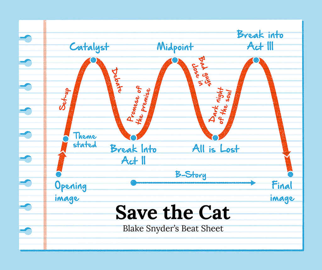
Auch die Save the Cat Struktur ist ein beliebtes Hilfsmittel um Geschichten zu entwickeln. Sie wurde vom US-amerikanischen Drehbuchautor Blake Snyder entwickelt.
Die 15 Schritte von Save the Cat:
Opening Image: Ein Eröffnungsbild
Theme Stated: Wir werden in das zentrale Thema oder die Lektion der Geschichte eingeführt.
Set Up: Der Held und die “normale Welt” werden vorgestellt.
Catalyst: Es geschieht etwas, das die Geschichte in Gang bringt.
Debate: Der Held zögert, etwas zu unternehmen.
Break Into Two: Der Held nimmt die Herausforderung an
B Story: Die Nebenhandlung setzt ein und führt eine Figur ein, die dem Helden bei seiner Verwandlung hilft.
Fun and Games: Der Held befindet sich mitten in seiner Herausforderung oder Reise..
Midpoint: Der Einsatz wird erhöht
Bad Guys Close In: Die Dinge gehen bergab für den Helden
All is Lost: Die Dinge werden immer schlimmer. Der Held erreicht den Tiefpunkt.
Dark Night of the Soul: Im Angesicht der Niederlage muss der Held mit seinem Verlust und der Art und Weise, wie es dazu kam, fertig werden.
Break Into Three: Der Held erkennt eine Wahrheit, die ihm die ganze Zeit über entgangen ist.
Finale: Der Held setzt sein neues Bewusstsein in die Tat um und besiegt die Bösewichte.
Final Image: Eine Momentaufnahme, die das Anfangsbild widerspiegelt oder kontrastiert.