In the end of September 2023 I visited the exhibition of the world press photos ’23 in the viennese photo gallery Westlicht. I visited this exhibtion for the last 8 years because it combines two topics that I’m really interested in. On one hand whats going on the world, on the other hand reportage photography.
I think its very important as a designer to know in which kind of world or society we live in. What are the effects of climate change, dictatorship, certain illnesses, religion or cultural characteristics. I once got told in my product design bachelors that we as designers are the painters, and the world is our canvas somehow. Of course thats a very exaggerated point of view but at least a tiny bit is true about that approach. A lot of problems on our planet are caused because of the endless need of resources or products. Countries with less resources or products are poor countries or have boiling societies. Countries that are rich of resources (and money is probably the most important resource) are most likely to have social peace and stability. So resources or rather products that are made of resources or lead to gain value or else, are able to define where we as human beings are leading with the world we live in. Thats why its very important to not just through trashy not purpose driven products on the market. One important person once said that good design solves a problem and I think thats a good path to follow.
The world press photo exhibition always reminds me on how blessed I am to live in Europe and to be able to sit in a well tempered room, writing this blog post right now. Even if some of us in Europe don’t know, but we have the power to change the world. Not as individual but as society we do live in. So lets be careful what we are adding to this humanity. (This applies not only to designers but to virtually everyone)
Impulse #7: Final Exhibition of CMS22
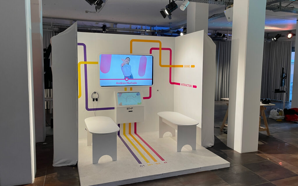
As the final project of our final semester before the master thesis we, as the whole degree, where supposed to organise an exhibition. Not only every degree was able to present some of their individual single- or group-projects, also a big portfolio machine had to be built in order to show the portfolios of every individual of the degree of Communication, Media, Sound and Interaction Design.
The portfolio machine was the probably biggest exhibit of this exhibition and was completely developed by the interaction design degree. We where able to choose in which team we’d like to be in order to follow an well organised process. There was the building team, the screen design team, the coding team, the media team and the content section. I chose to be in the building team since I’m already experienced in carpentry and building furniture or other constructions.
During the whole process of the portfolio machine it got even more clear on which different experience levels we’re working. Also the different focuses we are setting towards our creative process or creative work got point out drastically. It very interesting for me to see how different backgrounds like art, industrial design, coding or even psychology inflluences the approach to design. Sometimes a bit shocking but mostly eye-opening. Since I’m studiing and working in the design branch for 10 yrs now, I got kinda blind in terms of approaching a creative project or task. But obviously there are a lot of different approaches when it comes to design. Of course not all of them are leading to creative success or are following the rules of design theory, but thats a road every creative has to go himself.
I’m happy with result of the portfolio machine – it was defenitly a long and sometimes bumpy road to the finish line but in the end we managed pretty good and learned a lot.
New Focus: Less empirical research – more actual design work!
I almost ditched the topic of my thesis because I was afraid to be drowned in empirical research organisations. I was fearing beeing too busy with running from school to school interviewing children or teenagers about their political opinions or awareness. After my talk with Mrs. Ursula Lagger she gave me the hint that I dont have to focus on empirical research in terms of interviewing people myself. Unlike my bachelor thesis, I can totally focus on my design work and don’t have to have a certain amount of people interviewed in a qualitative or quantitative way. So that gave me confidence of beeing able to focus on an iterative approach to a well designed and user centered concept.
In the following i’d like to describe my approach to this thesis i discussed with Mrs. Lagger. First i’d like to gain an overview of all the necessary material thats already there. Such as papers, statistics and articles about the awareness of younger people towards democracy in Austria. Since i’d like to do some user testings and fill a hole in the spectrum of information channels for younger people i’d like to focus on austrian user groups. Even logistically its more easy for me especially when it comes to qualitative interviews or actual focus group testings. After gaining that overview I have to sort and subdivide the content in order to be able to structure my ongoing process. I’ll probably have to look through a lot of literature in the field of sociology and political sciences rather than actual design related papers.
After that I’d like to start my design process with defining a problem and analyzing it to see whats beyond the obvious. Then I’d like to build up a portfolio of solutions so to say in order to interview experts of certain fields to gain more knowledge of which way to go to be as user or teenager-centered as possible. Using various design tools or methods will help me to point out a final solution for my problem. Afterwards I will move from low-fidelity prototypes to highfidelity ones. All and all in an iterative process.
To be able to think more of how to subdivide and look through the existing content in order to focus on actual user experience design is calming me a lot and motivates me at the same time to develop a tool with an actual positive purpose.
End of wahlkabine.at – opportunity for my thesis?
After more than 20 years, the political orientation aid “wahlkabine.at” will no longer exist in the upcoming 2024 election year.
The newspaper “derstandard.at” was publishing following article about it:
“Financial difficulties are cited as the reason: “We have always taken care not to become dependent and to keep ourselves free from political or commercial interests,” says initiator Konrad Becker from the Institute for New Cultural Technologies. As an independent organisation, financing the project has become increasingly difficult. In Austria, state elections in Styria and Vorarlberg are due in 2024 in addition to the National Council and European elections. Before elections, the platform had always developed a catalogue of questions on current political issues and sent them to the candidates to answer. 25 selected questions then made it into an online questionnaire, which potential voters could answer in order to identify possible voting preferences by comparing the matches.
“wahlkabine.at” is a project of the Institute for New Cultural Technologies in cooperation with the Austrian Society for Political Science, the Society for Political Enlightenment and the Institute for Political Science at the University of Innsbruck. Since 2002, over five million questionnaires have been completed before elections.”
In one of my other blogposts I analyzed the platform wahlkabine.at and had a closer look on its usability and pain points regarding especially younger users. Of course its sad that this platform got switched off but I see a clear possibility there to develop a more user friendly version of this tool. Adding some nice interface design and more thoughts of the user flow and target group I see a lot serious potential in that field of digital education tools. Made me even more curious to start working on my thesis!
Impulse #1 Abstrakt: Ian Spalter – Digital Product Design
Couple of Months ago I watched an episode of the netflix-show “Abstrakt”. This one was about the head of design of Instagram Ian Spalter from San Francisco. He explained the history and power of user experience and user interface design.
I thoroughly enjoyed this episode because digital product design is a field I’m truly passionate about. What struck me as particularly fascinating was the realization of how Steve Jobs laid the groundwork for modern digital product design, especially in the mobile realm. The iPhone’s impact on mobile UI/UX is profound, and it’s intriguing to consider how different the landscape might be without it – Instagram and many other apps might not even exist. In the realm of digital product design, there’s a continuous process of building on others’ ideas, inventions, and designs, whether it’s Ian Spalter reimagining Instagram or the very concept of a Graphical User Interface (GUI).
Ian Spalter’s approach to encouraging his team to explore bold designs resonated with me. Having been in less receptive work environments before, where change and new ideas faced resistance, I appreciate Spalter’s effective management style in fostering creativity within a product design team. The challenges Ian Spalter faced after the Instagram update, with its negative feedback, must have been incredibly stressful and discouraging. Examining Snapchat’s downfall due to a poorly received redesign highlights the critical role design plays in a product’s success. Interestingly, Instagram’s adoption of stories contributed to Snapchat’s decline, showcasing how designers can iterate on each other’s work, even though ethical concerns may arise.
While I thoroughly enjoyed the episode, I wished for a deeper dive into product design specifics. Perhaps, having worked in the field myself, I felt the episode didn’t explore the UI/UX design process in as much detail as I would have liked, focusing instead on non-design-related aspects. Of course it’s just an episode of a netflix show and made for a broad audience but some more educational facts would’ve been nice. Anyways, this little journey into the life of a typical silicon-valley-head of design was very inspiring to watch!
Exposé: Master Thesis
Working title = provisional title
| A user centered tool to increase the democratic awareness of children and people of younger ages (Generation Z & Alpha) |
An exposé provides information about:
1. the problem (Starting point, problem description)
| On the one hand, the problem is that political parties in Austria have no idea how to appeal to young voters. On the other hand, interest in democracy and politics is constantly declining. Information is often formulated in a rather complicated way and tends to deter children and young people. A component or rather proof of the lagging behind of political actors is also shown by their social media presence or the survey results of the leading female candidates among under 20-year-olds. For young people, Austrian politics often seems outdated, uninteresting and also often as if the young voter group and its issues are rather unpopular. This opens the gates and receptiveness of young people to populism and sensationalist politics. I would like to get to the bottom of this thesis with my work and find out how young people understand politics and develop and offer an interactive service design for this. |
2. state of research
| Unfortunately, there is not yet much specialised literature, statistics or other theses that deal with the topic of “politics and youth”. Although I have already come across a few theses, particularly in the field of journalism and media, there are unfortunately not (yet) many large-scale studies or relevant specialised literature. |
3. the question
| What is the political awareness of children and young people in Austria and which parameters are decisive for the political success or failure of established parties? |
4. the hypothesis resp. the objective
| Firstly, I would like to find out more about the current situation and draw a picture of the present. The challenges that political actors face when it comes to the young target group will be analysed. Once the problems have been explained, I would like to present systematic solutions in the form of tools. This could be an app, a workshop idea or a board game/mini-game. It depends on the results of the empirical part of the scientific work. At the moment, I am strongly leaning towards an app that diplomatically categorises complicated political content and explains the basic cornerstones of a democracy. Due to the voting age in Austria (16 years old), I would limit the target group to 13-18 year olds. |
5. the reference to theory
| In my opinion, there are two fundamental problems that cross-fertilise each other. On the one hand, politics and democracy-related subjects are taught far too late. Young people learn about the Austrian state and the prevailing democratic system in primary school, but they can do little with it at primary school age and then hear nothing more about it for a relatively long time before it is usually referred to again at the age of 14/15. As a result, in addition to the basic subjects of maths, English, German and the like, a subjectively lower prioritisation towards politics and democracy develops. The second problem I see is that children and young people are often taught that politics is an “adult thing” and that most decisions are not made for them but for other age groups. I think this is understandable from a demographic point of view but more than unwise from a social point of view. Issues such as education, sustainability or security are mainly played out by political “extreme parties” (extreme right or extreme left), which I think is a shame. I would like to see political centre parties also focus more on these issues. To cut a long story short: I am curious to see whether my research supports or refutes these theses. |
6. the method
| Formulate the problem on the basis of existing empirical studies or call out a scientific thesis Develop a type of questionnairem or interview guide Conduct qualitative (and possibly also quantitative) surveys Analyse the results and either substantiate or modify the thesis Incorporate relevant theory (specialist literature, other statistics) Identify possible solutions as an interaction designer Develop/design tool |
7. the material
| Various specialised literature, surveys/statistics, reports or news articles, videos, other theses |
8. (preliminary) bibliography
| theres a already a lot of literature available. Detailed titles or sources will be announced soonish. |
9. (preliminary) structre
| Here I refer to point 6 and add the following: 1. Theory/Empiricism 2. Ideation 3. Practical Part |
10. the timetable (project phases and duration)
| I expect to complete my work towards the end of the summer. I would categorise the time periods as follows: 1. theory/empiricism – 300 hours 2. ideation – 100 hours 3. practical part – 300 hours |
11. Projectteam
| At the moment I am on my own, but I can imagine that I will work with schools, teachers or counselling centres in the future. |
12. Financing
| At the moment, apart from the printing of the thesis, no costs are planned. |
12. Risk factors
| The risks, as with presumably all scientific work, are as follows: 1. time management – do not spend too much/too little time on the research 2. quality of the work – do not neglect the precise elaboration of the empirical results due to time stress or the like 3. spectrum – it is important to depict several social strata and groups so as not to research only in certain milieus. Otherwise, the research results could be distorted. |
Research Planning Matrix
| Aims | Objectives | Methods | Outcomes | Outputs |
| To have a closer look on the current status of awareness of younger people towards democracy and develop a tool that improves the current state towards more understanding of democratic values. After the research phase it is planned to develop a user-centered tool that provides information and enhances the understanding of democracy among young or soon-to-be-voters in austria. | 1. Get a good overview of all the research that is already done and available. 2. Analyze the current situation and define the problem 3. Develop and design a tool that helps solving the problem. 4. Analyze and test the functionality of the developed tool to be able to improve the thesis through an iterative process. | Classic literature research, build up focus groups, eventually online testings/surveys, qualitative interviews in schools or with sociologists or politicians, marketing experts | The research should lead to a better understanding of the situation and to undermine the idea of this thesis. I’d like to have a closer look onto teenager behaviours when it comes to politics or democratic attitudes. (not only in big scale) | The research output should be the detailed definition of a problem in order to be able to start a design process of a tool that will solve or works on the solution of that problem. |
Ontology & Epistemology
I will reflect on those two topics regarding my thesis-topic, in the following two collums.
Ontology:
Exploring the awareness of younger individuals towards democracy involves understanding how young people perceive and engage with the democratic system. It delves into their knowledge, attitudes, and participation in democratic processes. Key elements include examining the influence of factors like education, societal influences, and the political environment. Additionally, temporal aspects such as changes over time and developmental stages within the younger population contribute to shaping their awareness of democracy. This analysis aims to create a structured framework for comprehending the intricate relationships and dynamics associated with this important societal aspect. Once this dynamic or maybe problem is understand its possible work on a problem-solving educational tool.
Epistemology:
In developing a tool to enhance awareness of democracy among younger individuals, I’ll draw on a variety of scientific sources, including papers, books, articles, and statistics. I’ll critically assess the validity and reliability of these sources, considering the methodologies used in research. By integrating findings from diverse studies, I aim to gain a comprehensive understanding of factors influencing awareness. This synthesized knowledge will guide the development of the awareness tool, with ongoing feedback and iterations based on research and user responses. Ethical considerations will underpin the project to ensure accuracy, privacy, and cultural sensitivity. This approach aligns with a dynamic and robust epistemological framework.
Impulse #8 – Great Things Are Made Together
For the last semester were we as a group of students are still working together before starting with our master theses, we worked with all four departments (Communication, Media, Sound & Interaction Design). The exhibition included all sorts of projects that we have created over the 1,5 years at FH.
For this exhibition I was one of the tutors who mainly managed the organization of the exhibition. We made an excel sheet with all the needed information. Exhibits, Teams, Budget, Sponsors, Working hours, Meeting protocols, Logistics, Timeline & etc.
At the beginning I thought it would be impossible to organize an event like this in this short time with also working on other projects but in the end it all worked out. I noticed it was stressful not only for me but also for the other students but the result was worth it.
I don’t know if I would do a lot different if we have to do it again. Maybe make a better time schedule for when what need to be done. And divide the work more equally over all students. In the end there were some few students that really made this exhibition happen. And other students that were less motivated. But you will always have that in projects like this. But I learned it is okay to ask for help and you don’t have to do everything on your own and it’s also important to offer help because some people have troubles asking of it.
But with the opening it showed again that we as a group all grew a little bit closer to each other and I think we have a really great team to make stuff together.
Great things are made together.
Research Planning Matrix
Aims
My theses aimes to research where UI pattern come from and if they are still the best solution. E.g. Desktop methapor as officetable.
Analysing current design pattern on their usefuleness.
Objectives
I will search in literature for the history of certain patterns. I will analyse the pattern and maybe show alternatives but i will most likely not create new patterns, as planed originally. I will put more effort in analysing and also testing the old pattern with users.
- Literature research on history of pattern and kultural background of certain UI pattern/interaction pattern
- Classify UI Pattern (like Mobile, Web, HMI)
- Identify pattern that are no longer approbriate or pattern that could use a makeover
- Context Analysis: Analyse what´s not good about this pattern
- Make some user interview/testing what people think about this (maybe love/hate letters from other UX Designers and normal users.
- Offer suggestions for a better solution (maybe)
Methods
- Find information on that topic
- Interview people how they experience a pattern
- Analysing
Outcomes
- Get an inside where changing a pattern might be useful.
- Knowledge about where and when a pattern is outdated and should be renewed
Outputs
- Criteria catalog for validating a pattern