Wir hatten im Zuge von Design and Reserach ein Gespräch mit Gabriele Lechner geführt, die mit uns unsere Themenwahl für die zukünftige Masterarbeit besprochen hat. Ich habe mit ihr über Drucktechniken und die Einbindung von analogen Gestaltungsmethoden in digitale Arbeitsprozesse gesprochen.
Da sie mit mir auch über ihre Ideen und Zweifel am Thema gesprochen hatte wurde mir bewusst, dass ich mich doch lieber weiters auf die Suche nach einem anderen Thema machen werde. Drucktechniken ist ein schon sehr detailliert erforschtes Thema, welches wenig Spielraum für eigenständige Recherche bietet. Die Einbindung mit digitalen Prozessen kann interessant sein, weist jedoch einige Schwierigkeiten auf. Hier wäre eine genauere Themendefinition wichtig, um die Recherchearbeit einzugrenzen.
Nach etwas Brainstorming sind wir auch noch nicht auf ein passendes Thema gestoßen.
Dieses Semester möchte ich einem Research Thema widmen, welches bereits an meinem Masterarbeit’s Thema anlehnt und mich wirklich interessiert. Meine Masterarbeit wird eine Art Leitfaden für Kommunikations Designer werden, welche sich dauerhaft für die Selbstständigkeit entscheiden und ich werde verschiedenste positive sowie negative Aspekte bearbeiten und die Unterschiede vergleichen sowie recherchieren was es braucht um erfolgreich zu werden. Ich möchte mich auch mit der Preispolitik in Agenturen vs. Freelancer beschäftigen und vergleichen. Außerdem möchte ich mich darauf fokussieren, wie man auch kleine Unternehmer abholen kann, da sich meist nur Großunternehmer ein wirklich gutes und durchgängiges Branding leisten können und ich schon oft in Situationen kam wo kleine Unternehmer mit wenig Budget an mich traten und nur einen Flyer benötigten ohne jegliches CD. Auch untersuchen werde ich den Stellenwert den Grafikdesign für die Kunden hat und damit, wie oft es unterschätzt wird.
Zudem möchte ich als Werkstück meine eigene visuelle Identität aufbauen inkl. Website, Social Media inkl. Content Creation etc.
Für Design&Research werde ich neben meinen Blogbeiträgen, bei welchen ich weiter meine Gedanken zum Thema festhalten und weiter recherchieren werde um erste Grundlagen für meine Masterarbeit zu setzen, als Events viele weitere Podcasts anhören, Beiträge und Magazine lesen, Filme ansehen und Recherche über andere selbstständige Grafikdesigner machen.
Vor kurzem hatten wir Feedback-Gespräche über unser Masterarbeitsthema mit Frau Gabriele Lechner.
Bei dem Gespräch mit Frau Lechner bekam ich das Feedback, mit Storytelling ein sehr geeignetes Thema für eine Masterarbeit gefunden zu haben. Die Frage war nur, auf welchen Bereich des Designs ich das Thema Storytelling beziehe. Frau Lechner gab mir Tipps zu möglichen engeren Themengebieten wie Beispielsweise Storytelling im Branding, bei Magazinen wie beispielsweise speziell Wirtschafts- oder Frauenmagazine. Auch meine spontane Idee eines Leitfadens oder Guidebooks für Storytelling im Grafikdesign fand Frau Lechner spannend.
Ich glaube, dass mir diese Idee am besten gefällt und kann mir sehr gut vorstellen, ein Guidebook zu planen und zu gestalten. Ich denke aber auch, dass ich das Thema vielleicht noch auf einen kleineren Bereich des Designs eingrenzen muss, wie beispielsweise Kommunikationsdesign, Editorial Design oder Poster Design.
Artificial intelligence has been developing at a rapid pace during the last few years, so much so that I needed to reevaluate what direction my master’s thesis was going. Initially I had planned on using simple text to image models to create style frames, mood and storyboards and possibly even AI generated image textures to help in creating a short film project in a genuinely new way to breathe fresh air into the motion graphic and media design industry.
However, not only have multibillion dollar companies, but also smaller teams and creatives around the world beaten me to it in spectacular ways, with Adobe having implemented many AI assisted tools directly into their software and companies like Curious Refuge having established fully fledged AI workflows for film making.
What this is
For the aforementioned reasons I have abandoned the idea of creating a genuinely new approach to AI film making and will therefore do my best to keep researching the technological state of AI going forward, and aim to create a short film project using cutting edge AI tools.
This blog post is supposed to be a repository for the most advanced tools available at the moment. I want to keep updating this list, though I’m unsure if I should come back to this list or duplicate it, time will tell.
In any case, whenever I decide to start work on the practical part of my Master’s thesis, I will use whatever tools will be available at that time to create a short film.
List of tools
Text To Image
DALL-E 3
Firefly 2
Midjourney
Adobe Photoshop & Illustrator
Curious Refuge seems to recommend Midjourney for the most cinematic results, I’ll be following the development of Chat-GPT which can work directly with DALL-E 3 as well as Midjourney to see what fits best.
Adobe Firefly also seems to be producing images of fantastic quality and even offers camera settings in its prompts, information that is crucial in the creative decisions behind shots. Moreover, Firefly is, in my opinion, the most morally sound option, since the AI was trained using only images Adobe themselves also own the rights to, an important point for me to consider since I am thinking about putting an emphasis on moral soundness for my paper.
Adobe’s Photoshop and Illustrator tools are remarkable as well, I have already planned on dedicated blog posts testing out their new features and will definitely implement them into my daily workflow as a freelance motion designer, but I am unsure how they could fit into my current plan of making a short film for my master’s thesis.
Scripting & Storyboarding
Chat-GPT 4 directly integrated with DALL-E 3
At the moment, Chat-GPT seems to be by far the most promising Text based AI. With the brand new Chat-GPT 4 working directly with DALL-E 3, this combinations is likely to be the most powerful when it comes to the conceptualisation phase. This is also a tool that I would confidently use in its current state.
Prompt to Video
Pika Labs with Midjourney
Both work through Discord Servers, I am not sure how well this can work as a specialised workflow, Midjourney has since published a web application. However, this means that the combination of Pika Labs and Midjourney is quite efficient, as users don’t need to switch applications as much. Results are still rough, Pika Labs is still in its early development stages after all, a lot of post processing and careful prompting needs to be done to achieve usable results.
3D Models (Image to 3D & Text to Image)
NVIDIA MasterpieceX
Wonder3D
DreamCraft3D
As far as 3D asset creation is concerned, a lot has happened since my last blog posts about the topic. There are a multitude of promising tools, most notably of which is MasterpieceX by NVIDIA, as it seems to be capable of generating fully rigged character models which could work well with AI powered animation tools. How well the rigs work needs to be tested but visually all three models seem advanced enough to use for, at least stylised, film making workflows.
3D Animation
Chat-GPT 4 & Blender
AI Powered Motion capture
DeepMotion
Rokoko Vision
MOVE.AI
In line with the 3D models, it seems that many AI assisted motion capture tools are already very capable of delivering usable results, I am not yet sure which one is the best, but time will tell. Non motion capture based animation knows almost no limits with the use of Chat-GPT, as it is able to program scripts, finish animations and create ones from scratch in a variety of tools.
Gaussian Splatting
Polycam
A very new technology that will surely spawn many other iterations is gaussian splatting. Using simple video footage, AI is able to determine and re-create accurate and photorealistic 3D environments and models. Some developments have even shown it working in real-time. While I am excited to see what the future of this technology will hold and that it will play a huge roll in the world of VFX, I am not sure how I would use it in my short film project.
Post
Topaz Gigapixel Image / Video AI
Premiere Pro
Unfortunately, if I wanted to use video AI tools in their current state, a lot of post processing would need to be done to the results to make them usable.
However, there is another, more traditional point to be made in favour of Topaz Labs, in that using its upscaling features saves a lot of time in almost any production phase, as using lower resolutions will always speed up processes, regardless of application. Due to its pricetag of 300USD I am not sure if I will use the AI for my educational purposes, but I am convinced it is a must when pursuing commercial projects simply because of the time saved.
Premiere Pro’s new features are impressive to say the least but I feel work best in a production that works with real shot footage and a more traditional media design workflow. I’m unsure how I could be using Premiere’s AI features to their fullest extent, but my work will need to go through an editing software of some kind, so I will see.
Conclusions
After today’s research session, it has become even more apparent that the world of AI is developing at mind boggling speeds. On one hand it’s amazing what technology is capable of already and even more exciting to think about the future, on the other hand the moral and legal implications of AI tools are also increasingly concerning, and with AI having transformed into a household name, I fear that the novelty of the technology will have worn off when I start to write my thesis.
So today I am left with a bittersweet mixture of feelings made up of the excitement of the wonderful possibilities of AI and concern that my thesis will be lacking in substance, uniqueness or worst of all, scientific relevance. I will definitely need to spend some time thinking about the theoretical part of my paper.
As far as the practical part of the paper goes, I must not succumb to FOBO and decide on how much I want to leave my comfort zone for this project. I fear that if I lean too much into the AI direction, my work will not only become harder, but also less applicable in real world motion and media design scenarios. Whatever solution I come up with, I want to maximise real world application.
Am 13. Oktober hatte ich das Vergnügen zusammen mit meinen Arbeitskolleginnen, den Feschmarkt in der Seifenfabrik zu besuchen – eine Veranstaltung, die Künstler und Handwerker aus der Region zusammenbringt und ihnen eine Plattform bietet, um sich zu präsentieren. Der Markt hat nicht nur eine Vielfalt an handgefertigten Produkten geboten, sondern auch einige wichtige Erkenntnisse und Inspirationen für mein vorläufiges Masterarbeitsthema (Social Media Marketing für Handarbeitsunternehmen).
Ein bunter Markt voller Kreativität und Diversität
Beim Betreten des Feschmarkts fiel mir auf, dass die Aussteller:innen im Mittelpunkt stehen, da die Halle selbst ganz dezent und einfach gehalten ist und so nicht von den Handarbeiten ablenkt. Es gab zahlreiche verschiedene Stände, die Dinge wie Kleidung, Schmuck, Kunst oder Essen anboten.
Persönliche Begegnungen mit Kreativen Köpfen
Ein Vorteil des Feschmarkts ist die Möglichkeit, mit den Künstler:innen und Handwerker:innen direkt zu sprechen. Hinter jedem Stand verbirgt sich eine einzigartige Geschichte, sei es die Inspiration für ein bestimmtes Produkt oder der kreative Prozess hinter der Fertigung. Diese persönlichen Einblicke waren besonders interessant, da sie bei mir die emotionale Bindung zu einzelnen Produkten stärkten und mich gewillter machten etwas zu kaufen. Dies zeigt mir, dass die Person hinter dem Produkt einen ganz hohen Stellenwert in der Handarbeitsszene hat.
Impulse für meine Masterarbeit
Da sich mein vorläufiges Masterarbeitsthema speziell auf digitales Marketing auf Social Media Plattformen fokussiert, war ich besonders darauf bedacht, wie die Aussteller:innen ihre Präsenz in der digitalen Welt gestalten. Viele der Aussteller nutzen bereits Plattformen wie Instagram und Facebook, um ihre Produkte zu präsentieren und mit ihrer Zielgruppe in Kontakt zu treten. Mein Besuch beim Feschmarkt verstärkte meine Überzeugung, dass Social Media eine entscheidende Rolle im Marketing für Handarbeitsunternehmen spielt. Durch die Pflege von ansprechenden Instagram-Profilen oder die Nutzung von Facebook-Gruppen können diese Künstler nicht nur ihre Werke präsentieren, sondern auch eine aktive Community aufbauen. Eine weitere Erkenntnis für mich war die Bedeutung visueller Inhalte. Handgefertigte Produkte zeichnen sich oft durch ihre Einzigartigkeit und Schönheit aus, die auf Fotos besonders gut zur Geltung kommen. Daher wird ein geschickter Einsatz von visuellem Content auf Social Media Plattformen zu einem entscheidenden Element, um das Interesse potenzieller Kunden zu wecken.
Fazit: Eine Erfahrung voller Erkenntnisse
Der Besuch des Feschmarkts in Graz war nicht nur ein inspirierender Ausflug in die Welt des Handwerks und der Kunst, sondern auch ein wichtiger Impuls für meine Masterarbeit. Die direkten Gespräche mit den Künstlern und die Beobachtung ihrer Social Media Aktivitäten haben mir wertvolle Einblicke verschafft, wie diese Branche von einer gezielten digitalen Präsenz profitieren kann.
Der Feschmarkt und seine kreativen Köpfe haben meine Überzeugung gestärkt, dass Social Media Marketing nicht nur ein Tool ist, um Produkte zu verkaufen, sondern auch eine Plattform, um Geschichten zu erzählen und echte Verbindungen mit der Zielgruppe aufzubauen. Ich freue mich darauf, diese Erkenntnisse in meiner Masterarbeit zu vertiefen und die Welt des Handwerks in der Zeit der sozialen Medien weiter zu erkunden.
Thisteenagelife – a project that aims to support young people in connecting with themselves, each other, and caring adults through meaningful conversations around personally relevant topics that are not traditionally explored in middle and high school classes. The project consists of a podcast, an Instagram page and its own website. It was founded by a group of teenagers, which you can join yourself, who create content for other teenagers, discuss topics, give advice and try to answer a teenager’s questions. For me, this project is a positive example of how social media (like Instagram) can be used for teenagers and give them a platform for all their struggles. There is plenty of content out there that can be very helpful for teenagers and it’s relieving to know that there are others out there who are feeling the same way as you, pondering the same questions and feeling insecure too. Instagram doesn’t always have to be bad and toxic (especially for this age group), it can also educate, help and actually connect. Through sites like these, you can also find the podcast, the website and similar projects. I think I would have wished for something like this in my teenage years and see it as motivation to keep working on my research topic in order to make the Instagram platform more teen-friendly and give more space to pages and topics like this.
Kevin German stellt sich in seinem TED-Talk der Frage, ob sich Design, bzw. ein Design Prozess, automatisieren lässt.
Ein Design Prozess lässt sich in fünf Phasen einteilen: Briefing, Recherche, Konzept, Design, Prototyp.
Recherche lässt sich leicht automatisieren. In der Konzept-Phase muss man kreativ sein. Man schafft aus einem „Nichts“ ein Design. Deshalb gilt sie auch als die schwierigste Phase des Designprozesses, aber auch als die schwierigste für künstliche intelligenz zu automatisieren.
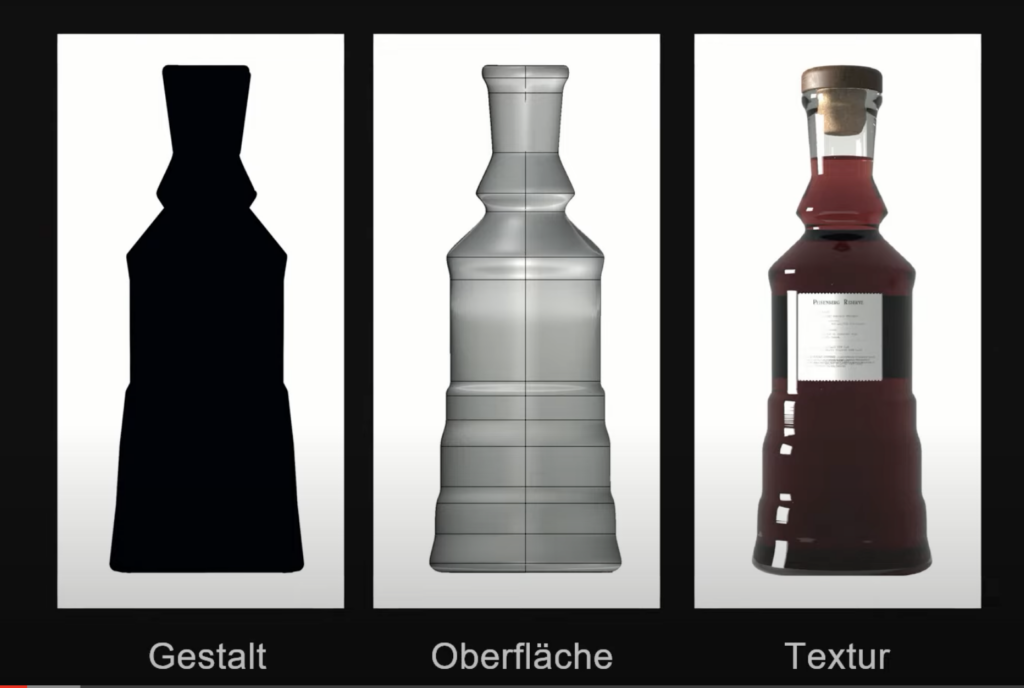
Design lässt sich in drei Ebenen einteilen:
Die Gestalt (Die Silhouette), Die Oberfläche, Die Textur (Farbgebung, Logos)
Bei KI denken wir hauptsächlich an künstliche neuronale Netze, welche unseren biologischen neuronalen Netzen im Gehirn sehr ähnlich sind.
Kevin German beantwortet seine Frage am Ende ob sich Design automatisieren lässt mit einem „Jain“. Nach seiner Meinung nach lassen sich teile des Designprozesses sinnvoll unterstützen. Z.B. bei der Konzept-Erstellung. Im Endeffekt ginge es laut ihm aber immer noch für ein Design, das FÜR Menschen geschaffen wird. Deshalb können auch Menschen selbst am ehesten wissen, wie etwas für diese am besten gefertigt wird.
Bei Kreativität wird zwischen kleiner und großer Kreativität unterschieden. Kleine Kreativität erschafft verschiedene Variationen (z.B. ein Kuchenrezept wird leicht verändert) von etwas das schon besteht. Die große Kreativität erschafft etwas nie da Gewesenes (etwas Disruptives, Innovatives).
Er endet seinem Talk mit der Feststellung, dass Künstliche Intelligenz kleine Kreativität beherrscht, aber große Kreativität sei uns Menschen aber noch für nicht absehbare Zeit vorgehalten.
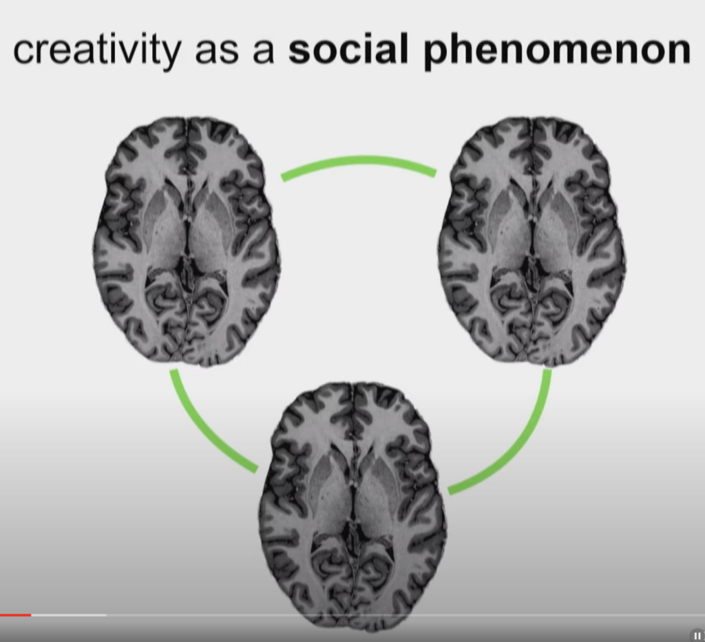
TEDx Talks: How AI shapes a new form of creativity von Johannes Stelzer
Johannes startet seinen TED Talk mit Leonardo da Vinci. Er zeigt das Gehirn von Leonardo und das dieses gar nicht so viel anders aussieht als des anderen Menschen. Um Kreatitvät zu verstehen, kann nicht nur ein Gehirn betrachtet werden, sondern es geht auch um die Kommunikation zwischen verschiedenen Personen.
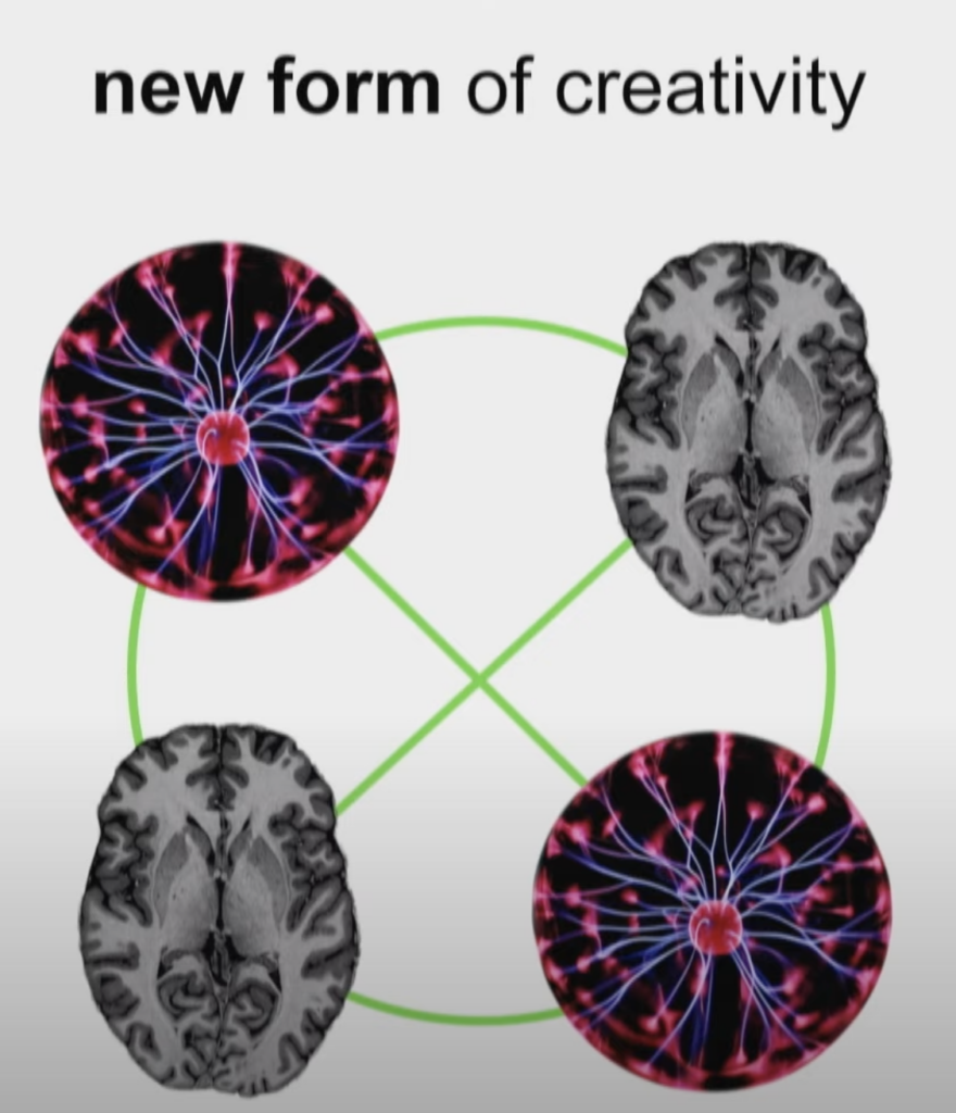
Kreative Künstliche Intelligenz ist eine ganze Familie von Methoden. Diese können neue Dinge erschaffen, welche einzigartig und originell sind. Ideen zu generieren und diese in die Praktik umzusetzen, ist ein Skill, dass uns Menschen vorbehalten war. Deshalb könnten Pessimisten denken, dass AI sehr gefährlich ist und uns ersetzen könnten.
Johannes Stelzer schlägt vor, diese neue Errungenschaft für sich zu nutzen und eine neue Form von Kreativität zu entwickeln. Nämlich eine Symbiose von Menschen und Maschine.
Er sieht drei Key-Felder in denen dies eine große Rolle spielen könnte, nämlich Kunst, Wissenschaft und Design. Denn obwohl diese Errungenschaft erst so kurze Zeit im Gespräch ist, gibt es schon Beispiele in denen dies umgesetzt wurde.
Kunst: Ein experimentelles Kunst-Projekt („Wer malt denn da?“), in dem die Besucher der Ausstellung aufgefordert werden, inspiriert zu sein und ein Kunstwerk zu schaffen. Die Werke wurden in ein AI-System gegeben und mit Expressionisten verwoben. Die AI schaffte ein neues Kunstwerk daraus.
Wissenschaft: Im Max-Plank Institut wurde ein MRI Scanner geschaffen. AI wird gefragt um neue Bilder mit dem Scanner zu erschaffen.
Design: Hier gibt es sehr viele Beispiele.
TEDx Talks: Can artificial intelligence be creative? Von Ahaan Pandya
Viele stellen sich immer noch einen Roboter unter AI vor.
Es gibt den Glauben das AI „unbiased“ ist. Welcher aber falsch ist, denn AI kann nur von Daten lernen, deshalb ist AI nur so unvoreingenommen wie die selbst Datensätze sind.
Ist AI unsere nächste große Revolution? AI kann manche Arten von Krebs besser feststellen als Ärzte mit viel Erfahrung. Die COVID Impfung könnte auch nur mit der Hilfe von Künstlicher Intelligenz so schnell erforscht werden.
Aber kann AI auch kreativ sein? DALL-E 2 kann Kunst und Bilder herstellen nur von einem Prompt.
Nachteile: AI hat keine menschliche Ethik.
TEDx Talks: What Happens When Art Meets AI? Von Bendikte Wallace
Benedikte erklärt, dass wir ob Wissenschaft und Kunst als zwei komplett verschieden Fronten sehen. Sie erklärt, wie sie ihren Weg gefunden hat und versucht Computern Kunst beizubringen. In einem Beispiel versuchte sie, dem Computer einen Tanz beizubringen. Sie zeigte dem Computer viele Videos von Tänzer. Dieser suchte sich Punkte, an die er sich hält. Der Computer erschuf drei verschiede Beispiele. Eines war technisch gesehen am „menschlichsten“, aber ist dies interessant? Ist die Kunst? Wenn nur etwas gemimikt wird?
Benedikte sagt, dass sie sich sicher ist, dass AI ein großes Potential birgt. Sie möchte ihrem Computer aber eher erklären, wie sie kollabieren können. Sie möchte den Computer als Tool nutzen, das IHR hilft. Denn Mensch + Maschine können im Moment das optimale Ergebnis schaffen.
Im Ergebnis fragt sich noch in die Runde, ob AI überhaupt so kreativ sein muss, um allein zu arbeiten? Oder ob es nicht einfach die Lösung ist MIT ihm zu arbeiten.
Am Freitag hatte ich das Gespräch mit Frau Lechner bezüglich unserem Plan für die Masterarbeit. Ich habe ihr von meinen bisherigen Recherchen erzählt und dass ich mir persönlich nicht vorstellen kann, Buchbinden als Thema für meine Masterarbeit zu wählen. Sie hat mir dabei zugestimmt und mir auch grundsätzlich von Printthemen abgeraten. Wir haben dann gemeinsam versucht in meinen Stärken im Design und meinen persönlichen Interessen irgendetwas zu finden, was sich als Thema eignen könnte. Der Prozess war sehr zäh und zuerst auch scheinbar aussichtslos, aber zum Schluss konnten wir dann doch noch eine mögliche Richtung finden.
Ich habe ihr von meiner Leidenschaft für Handarbeiten erzählt und sie hat mich auf die Idee gebracht, dies mit der digitalen Welt zu verknüpfen. Wie können Handwerker:innen Social Media effektiv für sich nutzen? Welche Marketingstrategien funktionieren, welche nicht? Wer ist das Publikum und wie kann man diese gezielt ansprechen? Dies sind alles Fragen, die ich in einer Masterarbeit behandeln könnte – das Thema ist durchaus umfangreich und bietet sich auch gut für Experimente (verschiedene Strategien und Designs können auf Social Media Plattformen getestet werden), Experteninterviews (erfolgreiche Betreiber von Handarbeits-Social-Media-Accounts können befragt werden) und auch Umfragen an.
Als erster Ansatz war das Gespräch schon sehr hilfreich – nun muss ich mir genauere Überlegungen zu dem Thema machen und es dann konkretisieren.
Die Design Thinking Conference zum 15 jährigen Design Thinking im Hasso Plattner Institut fand in einer hybriden Form von 15. bis 16. September 2022 statt. Dr. Julia von Thienen eröffnete das Event mit ein paar Einblicken in die derzeitigen Forschungsprojekte.
Auf dieser Konferenz wurde auch das Thema Neurodesign behandelt. Online dazu geschalten waren zwei Neuroforscher von der Standford Universität, die als Pioniere in dieser Thematik gelten. Das ist einerseits Prof. Dr. Allan Reiss und Prof. Manish Saggar. Einer der Projekte, an denen sie jetzt schon mehrere Jahre arbeiten ist, die Untersuchung des Gehirn bei Kreativität. Von Interesse ist, was genau passiert, wenn man Kreativität erhöht bzw. verbessert. Sie verwenden dabei Tools wie z.B. MRI Experimente oder FRMI Scans. Ein Produkt muss neu und effektiv sein, damit es als kreativ bezeichnet wird. Hierbei wird auch das Verhalten untersucht, in welchen verschiedenen Arten Personen ihr Ziel erreichen. Wenn ich immer dieselbe Strategie verwende, ist sie zwar effektiv, aber nicht kreativ.
Zu Gast war auch Pia Gebbing, die gerade ihren PhD macht und sie beleuchtet die Thematik nicht nur aus Sicht der Neuroforschung, sondern auch aus Unternehmenssicht. Sie erwähnt das berühmte Zitat
“Die Dinge richtig machen vs die richtigen Dinge machen.”
Die richtigen Dinge –> Unternehmersicht
Die Dinge richtig machen –> Sicht Neuroforschung
Es ist wichtig eine gemeinsame Sprache zwischen den zwei Disziplinen zu finden, um es für die Unternehmen auch interessanter bzw. verständlicher zu machen, damit sie die Erkenntnisse implementieren können. Die Forscher haben Angst, dass Unternehmer Ergebnisse anderer nicht richtig interpretieren und sie versuchen zu generalisieren. Man muss den Unternehmen die Vorteile der Forschung klar machen, auch wenn sie sehr teuer ist im Gegensatz zu einer Umfrage beispielsweise. Jedoch sind die Ergebnisse von hoher Relevanz.
Eine Frage aus dem Publikum war, ob auch untersucht wird, was Kunden an Produkten mögen bzw. worauf sie beim Kauf achten.
Ein Marketing-Team befasst sich mittels Eye-Tracking mit dieser Thematik. Ebenfalls werden in Geschäften funktionale Spiegel aufgestellt, um noch genauer ihr Verhalten zu analysieren. Auch wird mittels einem EEG-Gerät die genaue Gehirnaktivität gemessen, um herauszufinden, ob man einen Kauf voraussagen kann. Für Prof. Dr. Allan Reiss fangt der Prozess jedoch schon bei der Kommunikation des Produktes an. War die Kommunikation davon effektiv? Aus diesem Grund betrachten sie auch oft Bewertung außerhalb der Testpersonen.
Prof. Dr. Allan Reiss erzählte auch von einer Studie der “National academy of sciences”, die eine funktionale MRI Studie durchgeführt hat, welche sich mit dem Belohnungssystem bzw. Motivationssystem des Gehirn gefasste. In dieser Studie hatten die teilnehmenden Personen einen risikoreiche Aufgabe. Durch Beobachtung der intrinsische Variabilität dieser Gehirnregion konnte das Verhalten der Personen vorausgesagt werden.
Die Forscher betonen, dass noch viel Potential in der Zukunft liegt und man mit der immer neuer wachsenden Technologie noch mehr herausfinden wird. Ist das Gehirn programmierbar?
As a big fan of NYU TISCH and their two programs named Interactive Telecommunications Program and Interactive Media Arts, I often search for their teachers GitHub Accounts as many of them provide open access to lecture materials. By doing so they give people who are not studying at this institution the chance of getting in touch with state-of-the-art research for artistic expression.
One of these teachers is Derrick Schultz who not only shares his code and slides but also uploads his entire classes on YouTube. By doing so I was able to follow his Artificial Images class and learn the basics of artificial image creation and state-of-the-art algorithms working under the hood.
Derrick Schultz introduced in his class the following algorithms that are currently used to generate images:
Style Transfer
Pix2Pix Model
Next Frame Prediction (NFP)
CycleGAN / MUNIT
StyleGAN
He also gives his opinion on the difficulty of each model and orders them from easiest to hardest.
Style Transfer
SinGAN
NFP
MUNIT/CycleGAN
StyleGAN
Pix2PIX
After comparing the different models, I found two algorithms that could produce the needed video material for my installation.
Pix2Pix
StyleGAN
Unfortunately, those are also the ones rated to be the most difficult ones. The difficulty is not only the coding but also data quality and quantity, GPU power and processing time.
In the following section I will analyze the two algorithms and give my opinion whether they could help me generating the visuals for the interactive iceberg texture of my project.
Pix2Pix
As already mentioned, this algorithm can take either image or a video as input and produces according to the training data a fixed output. I could use images of icebergs from NASA or Google Earth as my data set and detect with canny edge algorithm the edges of my images. By doing so, I get from every image in my data set the corresponding edge texture and therefore train the Pix2Pix algorithm to draw iceberg texture by giving edge textures as input.
The need to develop an algorithm that generates interactive edges.
Depending on the training set the output can look very different and in the worst case can not be associated with iceberg texture. A lot of training and tweaking results in many iterations of model training.
StyleGAN
In this scenario I could again use iceberg textures from NASA or Google Earth as training data and produce an animation of cracking iceberg texture that shrinks. Since this algorithm produces no fixed output, one can produce endless variations of image material.
A sample animation made by the teacher can be seen here:
Problems:
Getting in control of the output data of the algorithm is very difficult as it produces random interpolations based on the training data.
Heavy manipulation of training data might be needed to get the desired outcome. This results in many iterations of model training and therefore a lot of time, computer power, heavy GPU processing and costs.
Big data set of at least 1000 images recommended.
Link to the Lecture: https://www.youtube.com/@ArtificialImages