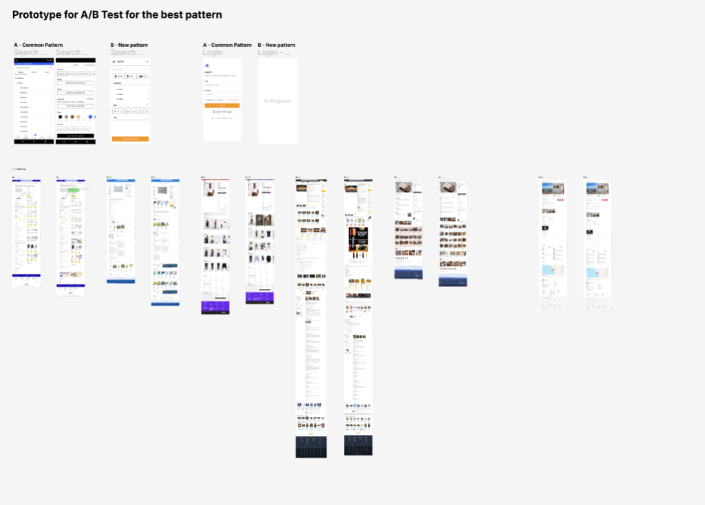
Prototype and Video
If I was to work further on this prototype I am now at the stage where I would get some input from possible users. Doing a few informal tests would most likely give me more information and some new perspectives to further develop my prototype. This would help me to get it to a stage where I can learn more from more “proper” testing.
After this development I would do a more extensive testing round to decide whether or not this is the right direction. I would anyways have new perspectives to bring to a different prototype, so my work would not be lost if I found that a different format would be necessary.
In the digital age, where information overload is a common challenge, effective information design plays a crucial role in conveying messages clearly and engagingly.
Information design in digital media enhances user comprehension by presenting complex information in a visually organized and digestible format. In their research paper, Ware and Mikaelian (2015) highlight the importance of visual design principles, such as clear hierarchy, visual cues, and effective use of typography, in facilitating information understanding.
Visual design elements, including layout, color, imagery, and typography, can significantly impact user perceptions and engagement. Effective use of these design elements captures attention, conveys brand identity, and influences user emotions, resulting in a more immersive and enjoyable user experience.
A well-designed information layout, combined with visually appealing elements, creates a seamless and memorable user journey. As digital platforms continue to evolve, the importance of information design remains critical in delivering clear, engaging, and user-centric experiences that leave a lasting impact on users.
Sources:
Ware, C., & Mikaelian, H. (2015). Information Design: Research and Practice. In The Handbook of Communication Design (pp. 201-214). Wiley.
Lohse, G. L., & Spiller, P. (1999). Internet Retail Store Design: How the User Interface Influences Traffic and Sales. Journal of Retailing, 75(2), 185-203.
In today’s rapidly evolving digital landscape, designing inclusive and accessible experiences is crucial. Microsoft, has taken a significant step towards promoting inclusivity with its Inclusive Design Toolkit.
Inclusive design aims to create products and experiences that targets a diverse range of users, regardless of their abilities or backgrounds. Microsoft’s Inclusive Design Toolkit is built on this philosophy, emphasizing the importance of empathy and understanding diverse user needs. According to Microsoft, inclusive design is a creative problem-solving approach that seeks to address the needs of as many people as possible by involving and learning from people with a wide range of abilities and perspectives.
The toolkit offers a range of inclusive design principles, techniques, and case studies to inspire and inform designers. It includes tools such as personas, scenarios, and the Inclusive Design Guide, which helps designers understand common barriers and provides strategies to overcome them. By incorporating these resources, designers can create products and experiences that resonate with diverse users and promote a sense of belonging and inclusivity.
Microsoft’s Inclusive Design Toolkit has had a profound impact on the design community. It has enabled designers to shift their mindset from focusing on a narrow user base to considering the needs of a wider audience. Through the toolkit’s principles and resources, designers can better understand the challenges faced by individuals with disabilities and create solutions that accommodate their requirements.
In the realm of design, two prominent concepts, universal design and inclusive design, aim to ensure that everyone, regardless of their abilities or characteristics, can fully engage with products, services, and environments. While both approaches share the objective of promoting accessibility and inclusivity, they differ in their core principles and methodologies.
Universal design focuses on creating products, services, and environments that are accessible to a wide range of users, including those with disabilities. In their paper, “Universal Design and the Challenge of Diversity,” Preiser and Ostroff (2001) emphasize the importance of equitable access and emphasize that universal design should be integrated into the design process from the outset. Which encompass elements such as equitable use, flexibility, simple and intuitive use, perceptible information, tolerance for error, low physical effort, and appropriate size and space.
Inclusive design emphasizes the active participation and representation of diverse individuals in the design process. Heylighen and Neuckermans (2003) in their paper, “Inclusive Design: A Morphological Analysis of the Concept and Its Interpretations,” highlight that inclusive design seeks to address the needs of various users by considering factors such as abilities, cultural backgrounds, age, and more. The authors argue that inclusive design goes beyond mere accessibility and aims to eliminate barriers and biases that may exclude certain individuals.
Universal design focuses on creating products and environments that are usable by a diverse range of individuals, while inclusive design emphasizes the active involvement and representation of diverse perspectives in the design process. By combining the principles of universal design with the empathetic and inclusive approach of inclusive design, designers can bridge gaps and create experiences that empower and include everyone. Together, these design philosophies pave the way for a more inclusive and accessible future, where barriers are dismantled, and everyone can fully participate and engage in the world around them.
Sources:
Preiser, W. F. E., & Ostroff, E. (2001). Universal Design and the Challenge of Diversity. In E. Steinfeld & S. Danford (Eds.), Universal Design Handbook (pp. 3-15). McGraw-Hill.
Heylighen, A., & Neuckermans, H. (2003). Inclusive Design: A Morphological Analysis of the Concept and Its Interpretations. Design Studies, 24(5), 437-456.
Eichner, P., Meijering, L., & Steuten, C. (2016). Universal Design and Inclusive Design: Towards an Analytical Model. The Design Journal, 19(6), 905-923.
Welcome to the enigmatic world of dark patterns, where designers become the crafty illusionists of the digital world. Dark patterns are deliberately crafted design choices that nudge users towards specific actions that may not align with their true intentions.
These patterns exploit psychologically the users, manipulating them into making choices that benefit the designer or organization, often at the expense of the user. It highlights examples of common dark patterns, such as “misdirection,” where users are guided towards a particular option, and “roach motel,” which makes it easy to sign up for a service but challenging to cancel.
The UX Design (Game Design) source sheds light on dark patterns in the context of game design. It discusses how game designers employ manipulative techniques to keep players engaged and potentially addicted. Examples include “artificial scarcity,” where limited resources are introduced to create a sense of urgency, and “extrinsic rewards,” which exploit our desire for achievement. These dark patterns can lead to detrimental effects, such as excessive gaming, addictive behaviors, and psychological distress.
Dark patterns represent a concerning aspect of UX and game design, capable of manipulating user behavior and compromising user well-being. As designers and consumers, it is essential to recognize the existence of these deceptive practices and take steps to mitigate their negative impact.
Designers have a vital role in shaping user experiences that prioritize transparency and respect. Let’s create a world where trust and empowerment flourish! By embracing ethical design practices, we can build bridges of understanding between users and designers. Together, we can champion a user-centric approach that celebrates choice, is transparent, and leaves dark patterns in the dust.
Sources:
https://medium.muz.li/malachidigest-3cad286bba02
https://uxdesign.cc/dark-patterns-in-ux-design-7009a83b233c
https://uxdesign.cc/game-design-dark-patterns-that-keep-you-hooked-a3988395533c
The following aspects are things I took into account while working on my prototype so far:
Audio Features
I decided to focus on a younger target group (4-6 year-olds) for this prototype since I plan on having two main target groups. The children in this group either can’t read yet or just started learning, which means the app relies on the audio features and needs a narrator to explain everything to the children. The audios can be played again and again to ensure that everything was heard and the kids understood the information/tasks.
Object Size
I made sure that all of the buttons and objects the children would need to interact with are big enough, since their aim isn’t as precise as that of adults. This also results in fewer distractions on the screen, since the screen space is limited and not that much can fit on it.
Seasonal Quests
In order for there to be a bigger incentive to play regular, there will be seasonal quests with tasks that are only possible during that season, meaning the quests have a timeframe in which they can be solved. This means there could be tasks revolving around flowers and plants that are currently blooming or the color of the trees’ leafs for example.
Besides the seasonal quests there will be a normal single player and multiplayer mode.
In the next steps I will make wireframes to show how the gap between presenting useful information and giving tasks related to that information could potentially be bridged.
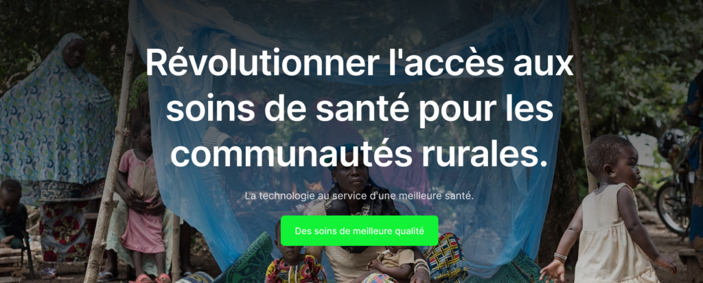
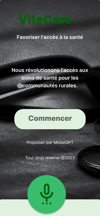
In the pursuit of addressing healthcare challenges in rural areas of Benin Republic, the research and development of an eHealth app for sustainable healthcare has emerged as a transformative solution. This article aims to provide a comprehensive overview of the process undertaken to research and develop a prototype for this project. Building upon the existing knowledge and previous articles on eHealth and sustainable healthcare (1, 2, 3, 4) , we delve into the key steps and considerations involved in creating an innovative solution that can improve healthcare access and support sustainable development. we are integrating the innovative MoiseGpt super-application into our eHealth app. Developed by renowned African entrepreneur Alain Towedo Capo-Chichi, MoiseGpt offers a powerful voice assistant feature that enhances user experiences through seamless interaction. This article presents a comprehensive overview of the ongoing research and development process, highlighting the integration of MoiseGpt and its potential to revolutionize healthcare access through a user-friendly voice interface. we also want to take advantage of previous project in the field of health in the region to capitalize the best pratices and lesson learn. For example, the project SATMED,a satellite based communication solution aimed to improve public health in emerging and developing countries.
Identifying the Problem and Research Question
The initial stage involved a meticulous analysis of the challenges faced by individuals in rural communities regarding healthcare access and affordability. By exploring existing literature, and consulting with healthcare experts, a clear problem statement was formulated, leading to the definition of the research question: “What if we design an app that helps tackle the lack of medical service offerings, specifically in rural communities of Benin Republic?”
Conducting User-Centered Research
To ensure the prototype addressed the needs and preferences of the target users, a user-centered research approach was adopted. This involved conducting interviews, surveys, and behavioral studies to gain insights into the healthcare-seeking behaviors, literacy levels, and technological proficiency of the population. These findings served as a foundation for designing an app that is accessible, user-friendly, and tailored to the specific context of Benin Republic.
Developing the Prototype
Armed with the first research insights, the next phase focused on translating the identified requirements into a tangible prototype. Utilizing industry-standard tools like Figma, we were able to design the user interface of the eHealth app, incorporating MoiseGpt’s voice assistant capabilities. The visually appealing and intuitive design takes into account the literacy levels and technological constraints of the target population, ensuring accessibility and ease of use that considered the literacy levels and technological constraints of the target population.
First draft of the prototype website
The first feedback we received from this current version of the web platform for the solution is from our supervision who suggested to make it simplified and easy to read and navigate. The next iteration of the prototype will integrate that and many other feedbacks we are going to receive through our planned survey and further researchs include a field research.
First draft of the mobile app prototype
Iterative Testing and Refinement
To ensure the prototype met user expectations and delivered a seamless experience, iterative testing and refinement were conducted. Next stage of the Usability tests will be carried out with representative users from rural communities so collect provided valuable feedback on the app’s features, navigation, and overall usability. This iterative shall process helped identify and rectify any usability issues, ensuring a user-centric and effective design.
Planned Ethnographic Research for Solution Refinement
In our commitment to continuously improving the proposed solution, a planned ethnographic research study will be conducted in the upcoming summer or next year. This research approach will involve immersing researchers in the rural communities of Benin Republic to observe and document the daily lives, healthcare practices, and unique challenges faced by the residents. By gathering in-depth qualitative data, this ethnographic research aims to further refine the proposed eHealth app, ensuring it is truly aligned with the needs, behaviors, and cultural context of the target population.
Conclusion
The process of researching and developing a prototype for sustainable healthcare has been a journey driven by the vision of improving healthcare access and supporting sustainable development in Benin Republic. By identifying the problem, conducting user-centered research, developing the prototype, and engaging stakeholders, the project has made significant strides towards creating an innovative eHealth app that can bridge the gap in healthcare services and contribute to the well-being of rural communities. The planned ethnographic research study will provide invaluable insights for further refining the proposed solution and ensuring its efficacy in addressing the specific needs of the population. The lessons learned and experiences gained from this process will pave the way for a more inclusive, accessible, and sustainable future in healthcare delivery.
In the ever-evolving landscape of healthcare, digital innovation has emerged as an indispensable instrument for improving access, quality, and affordability. E-health, defined as the utilization of information and communication technologies (ICT) for health services and information, carries the potential to revolutionize healthcare systems across the globe, particularly in countries like Benin Republic and other African nations. with no doubt we can affirm tht eHealth offers a promising potential to transform health care delivery in Africa by offering a platform for comprehensive data management, provider efficiency, and patient engagement. “Health systems strengthening is a critical path to achieving health outcomes, health security and financial protection, improving social well-being and fostering sustainable development.” -as described in the published Framework for Health Systems Development Towards Universal Health Coverage in the Context of the Sustainable Development Goals in the African by Region the World Health Organization’s Regional Comitte for Africa secretariat report1.
E-Health in Benin Republic and Africa: A Glimpse of the Future
While Benin, like many other African countries, has encountered challenges in healthcare infrastructure, the eHealth sector presents an innovative, resilient solution. From telemedicine consultations to AI-powered diagnoses and digital health records, the scope for growth is enormous. Mobile technology ownership, which is growing rapidly across Africa, serves as a strong foundation for eHealth expansion2.
In Benin there are no known health plaform for say but lesson learned form regional initiative and secure funding to tackle the issue of healthcare (for example the USAID Integrated Health Services Activity in Benin) are promising path for the realization of such plaform. A shining example of this potential is shown from the most popular ehealth solution in continent, they are mostly mHealth platform that brings doctors and patients together through mobile devices3. Additionally, Nigeria’s healthtech startup, Helium Health, has exhibited how digital innovation can leapfrog existing infrastructural limitations4.
The Advantages and the Hurdles
E-health solutions offer the possibility of overcoming geographical barriers, improving access to diagnostic and treatment services, and optimizing the use of limited resources. A quick look at the HealthEnabled’s work make use confident that Benin and africa will soon be able to profit from eHealth solutions. The elegance of eHealth lies in its ability to deliver solutions right at your fingertips, thereby making healthcare accessible even in the most secluded parts of the continent 5.
However, implementing eHealth in Benin and the wider African region is not without challenges. Issues such as the digital divide, data privacy concerns, inadequate ICT infrastructure, and lack of digital literacy need to be addressed for successful adoption.
E-Health and the Road Ahead
Despite the challenges, the potential benefits of eHealth are worth pursuing. Governments, private institutions, and international organizations should collaborate to nurture this sector, investing in infrastructure, education, and regulations. The future of eHealth in Benin and Africa is hopeful.
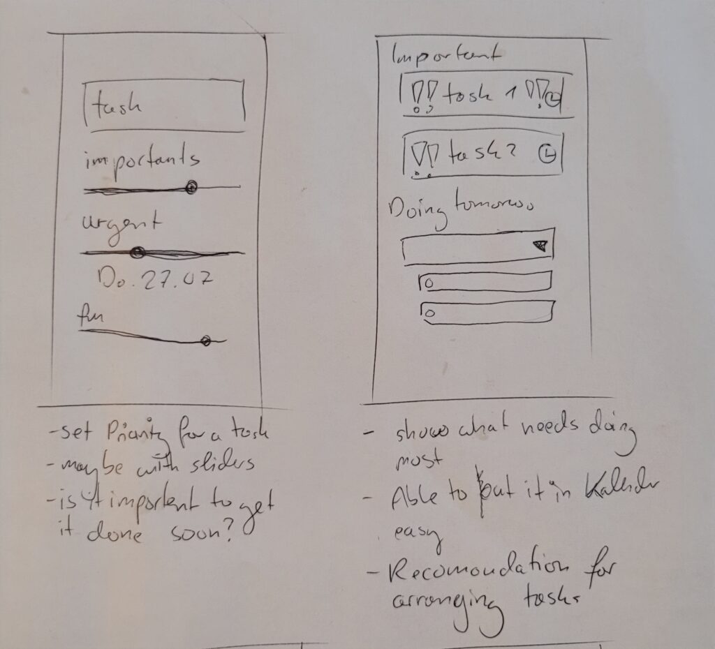
My prototype shows 4 scenarios and their solutions in an app that will be created especially for ADHD people. It is designed to organize and prioritize tasks and to work through them in a structured way.
These scenarios can be tested in the further course of the work of people with ADHD.
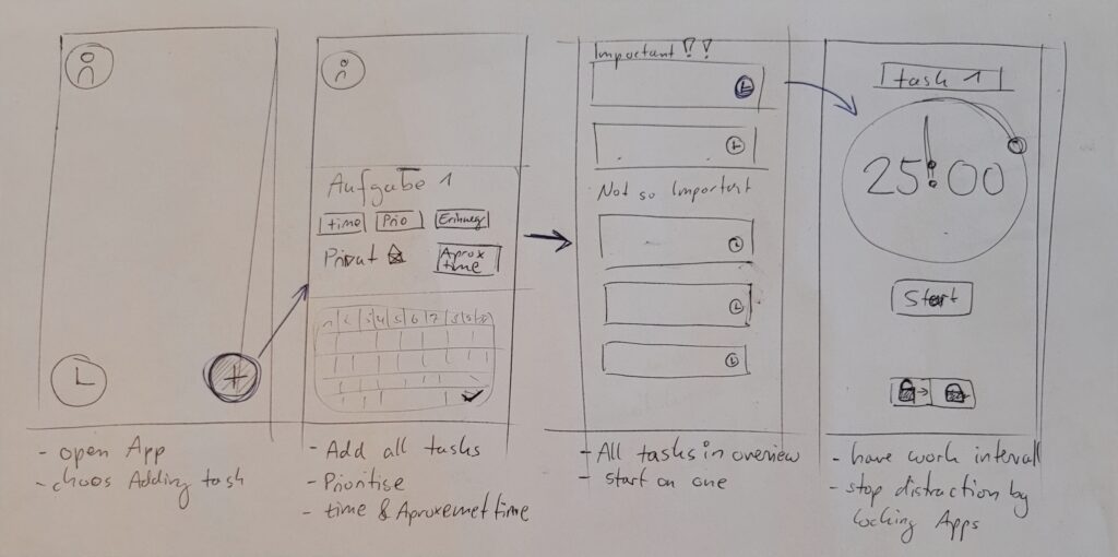
Scenario 01 – Overwhelm
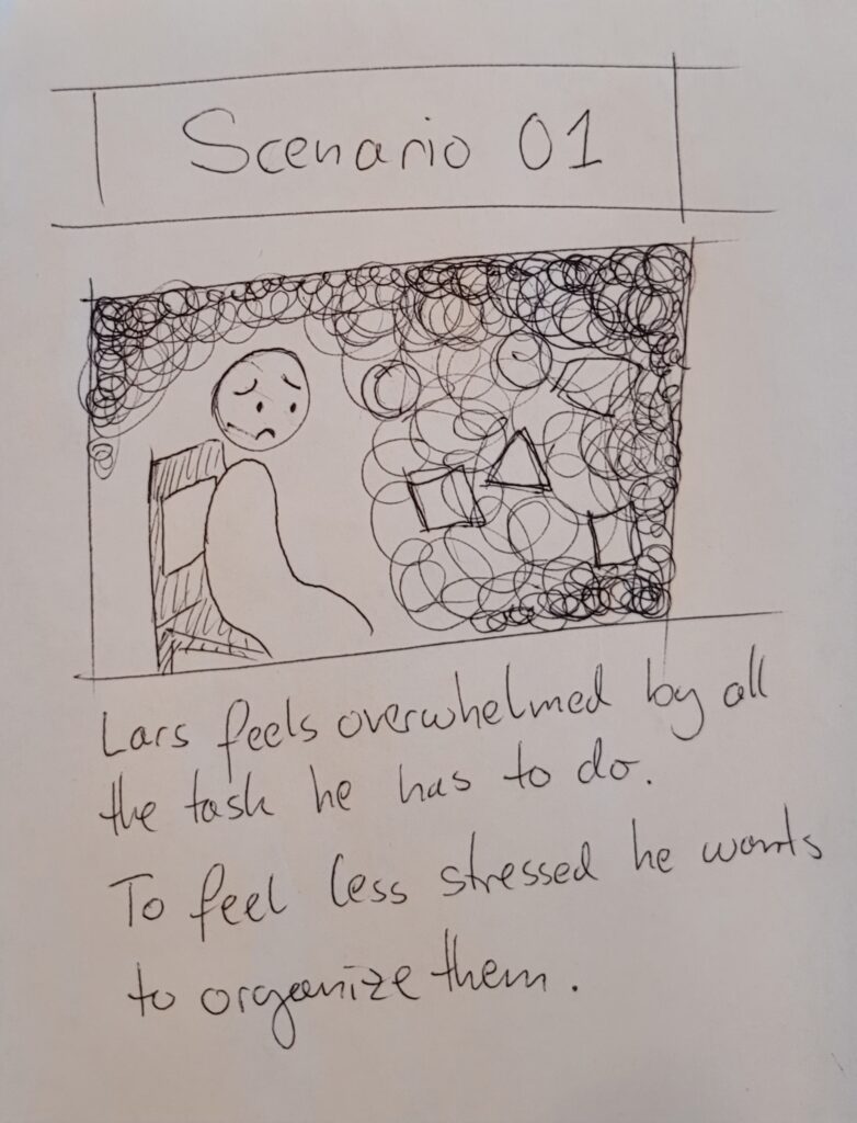
Lars feels overwhelmed by all the task he ahs to do. To feel less stressed he wants to otganize them.
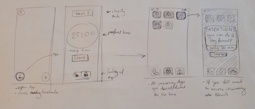
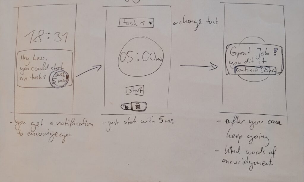
Scenario 02 – Distraction
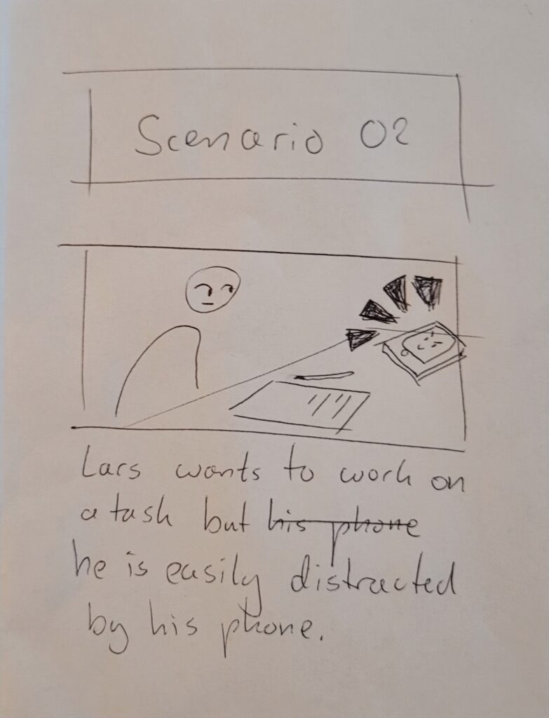
Lars wants to work on a task but he is easily distracted by his phone. He wants to be more productive.
Scenario 03 – Prioritisation
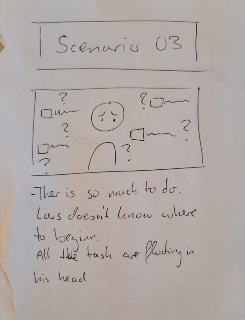
Ther is so much to do. Lars doesn´t know where to beginn. All the Tasks are just floating in his head.
Scenatio 04 – Geting started
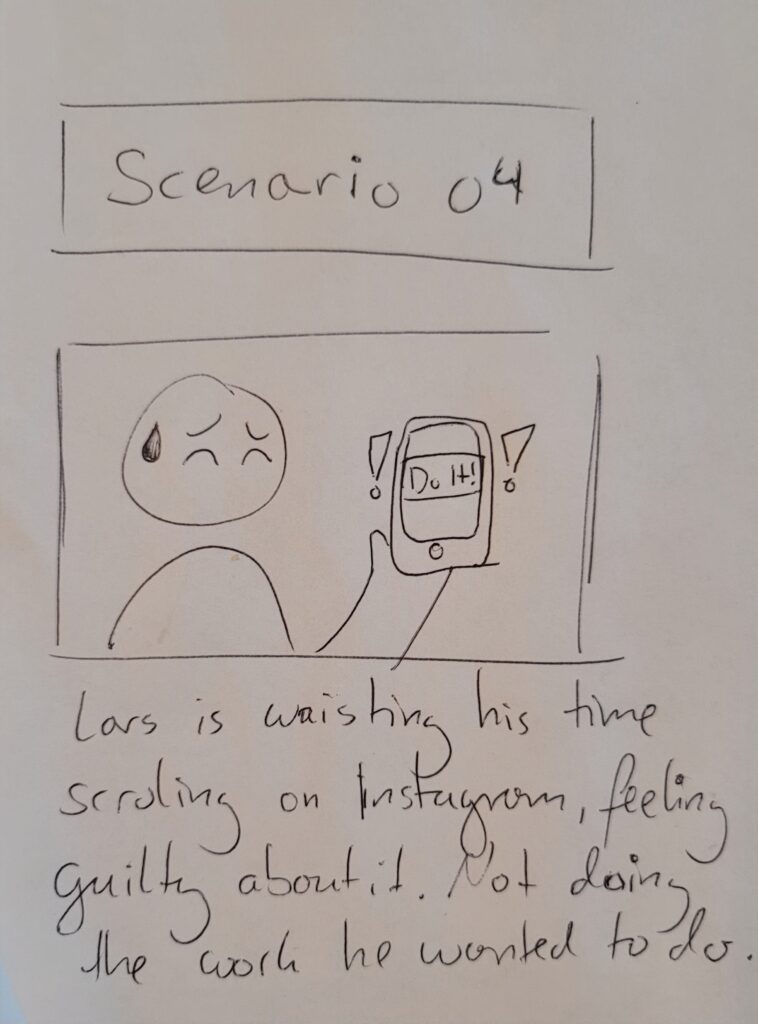
Lars is waisting his time scroling on instagram. feeling very guilty about it. Not doing the work he wanted to do.
Prototype Video