Combating the shortage of skilled workers: Unlocking the potential of careers in the tourism industry

In my last blog post, I discussed creating a storyboard for a virtual reality experience targeting car mechanics. However, upon reflection, I realized that I may have rushed into the decision of which apprenticeship to choose as the topic. After conducting further research, I discovered that there are numerous jobs and industries in Austria currently facing a skilled labor shortage in 2023.

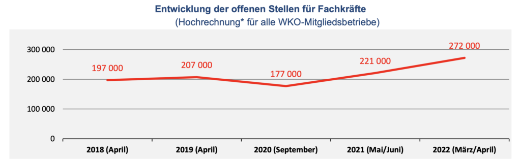
One article I came across specifically highlighted the issue of “Fachkräftemangel” or skilled labor shortage in 2022, focusing on sectors such as tourism (81%) and construction. Other industries, including the manufacture of wooden products and transportation, were also experiencing shortages. According to Figure 1, which depicts the development of open positions for skilled workers, the peak was reached in March/April 2022 with 272,000 open positions [1].

Considering that many of us enjoy dining out and socializing at restaurants, it is challenging for the tourism and restaurant sectors to find passionate and skilled workers. These industries were hit particularly hard during the pandemic, leading many employees to seek more stable positions in other business sectors. Growing up in a village dominated by tourism, I can empathize with the desperate situation faced by hotels and restaurants [2]. The industry can be hectic and may not always be perceived as attractive, especially due to the often demanding working hours, which typically include weekends. Young people, in particular, value their freedom and prefer to spend time with friends during weekends.

By shifting my focus to the tourism industry, specifically the job positions of chefs, I aim to demonstrate that this line of work can be versatile and enjoyable. It’s important to highlight the potential for creativity and the satisfaction of serving delicious meals to appreciative guests. Furthermore, the tourism sector offers opportunities for personal and professional growth, including the chance to work in diverse environments and interact with people from various cultures.

Despite the challenges faced by the tourism industry, there is still a demand for skilled workers, and pursuing a career in this field can lead to fulfilling and rewarding experiences. By showcasing the positive aspects and dispelling misconceptions about working in the tourism sector, I hope to encourage more individuals, especially young talents, to consider vocational training or apprenticeships in this industry. Ultimately, bridging the skilled labor gap in the tourism sector can contribute to its recovery and long-term sustainability.

Sources:

[1] https://www.wko.at/service/unternehmensfuehrung-finanzierung-foerderungen/ibw-summary_Fachkraeftebedarf_mangel-in-Oesterreich-2022.pdf

[2] https://www.wifo.ac.at/jart/prj3/wifo/resources/person_dokument/person_dokument.jart?publikationsid=69629&mime_type=application/pdf

Anti-pattern

Anti-patterns often result from a quickfix to a problem. They might look like the right solution but are not that good in practice. Anti-pattern are also not dark pattern. The difference is that dark pattern use psychological knowledge to mislead while anti-pattern design happens when the solution does not fit the context, and is still recurring in the design. Anti-pattern are created out of fixing problems. The solution should solve a problem and seems to help in the short term but is not a good solution on the long run. The solution would be okay but does not fit the specific context. There are structural problems or issues with management that lead to bad design. Also finding a workaround for an issue caused by outdated technology can lead to anti-pattern design.

Anti-patterns can be categorised according to the problems they cause.

There might be an increased cost of interaction, which means additional taps for certain features or increased thumb stretching, like if buttons are located at a hard-to-reach position for the thumb. Also increased context switching can appear when not using transitions for changing the layout.
Increased confusion across platforms can happen when icons are used that usually mean something else.

By observing the usual rules those problems can be avoided. It becomes more difficult when the anti-pattern grows into an established design pattern. For example, the use of the hamburger menu, evolving when phones and tablets got popular. Therfore every new UI pattern has to be very well considered.

As normal design pattern had their origin in software, antipatterns also appear in software development. Apps have to be constantly adapted to new user requirements and in the process, solutions may not fit, thus unintentionally creating bad solutions, i.e. antipatterns. Detecting and improving these antipatterns improves the quality of the software. Using antipattern can also lead to higher costs for maintance. [2]

Design patterns have been introduced to collect solutions that have proven to be good, while anti-patterns represent solutions that have not proven to be good.

There are a number of rules and guidelines for the design of user interfaces. These are often too simple or abstract, or they conflict with other rules. It also depends on the designer whether he understands the underlying problem and how to solve it, and how he interprets the guidelines. Guidelines are more on the meta-level, whereas design patterns start from a concrete problem and are much more specific which makes them a better tool than guidelines.

Appleton [B. Appleton, “Patterns and Software: Essential Concepts and
Terminology,” http://www.bradapp.com/docs/patterns-
intro.html, retrieved: January 2017.] distinguishes between two kinds of anti-patterns:

1. Those that describe a bad solution to a problem,
which resulted in a bad situation.
2. Those that describe how to get out of a bad situation and how to proceed from there to a good solution.
The second type of anti-pattern is also known as an “Amelioration Pattern” [The Portland Pattern Repository Wiki. http://c2.com/cgi/wiki,
retrieved: January 2017.].

Amelioration patterns are a combination of the first category, the description of a bad solution with showing a regular pattern for the solution.

Antipatterns are often created with the best intentions – they might “look like a good idea, but whichbackfire badly when applied.” [J. O. Coplien, “Software Patterns,” SIGS Books, New York, NY, USA, 1996.] Often it is not so obvious if the solution is a dark pattern.

Mirnig and Tscheligi decribed a in their paper what what criteria an antipattern must fulfil, based on the criteria a regular pattern must have.

The antipattern musst like the regular pattern be available and be easily found. It needs an description of the problem and a context description. The structure is almost the same, because the reader needs to understand why the solution is not working in this context. The only difference comes with the descriptio of the usage. Regular patterns offer a solution that fits the problem, while in anti-pattern the steps to the solution should be documented. To understand why the pattern is not working the designer musst understand the decicions made leading to this bad solution. It should also offer a better way to solve the problem with comparing it to the result that is considered the better solution. The anti-pattern should also contain at least one example.

[1] P. Tiangpanich and A. Nimkoompai, “An Analysis of Differences between Dark Pattern and Anti-Pattern to Increase Efficiency Application Design,” 2022 7th International Conference on Business and Industrial Research (ICBIR), Bangkok, Thailand, 2022, pp. 416-421, doi: 10.1109/ICBIR54589.2022.9786470.

[2] G. Hecht, R. Rouvoy, N. Moha and L. Duchien, “Detecting Antipatterns in Android Apps,” 2015 2nd ACM International Conference on Mobile Software Engineering and Systems, Florence, Italy, 2015, pp. 148-149, doi: 10.1109/MobileSoft.2015.38.

[3] Mirnig, A.G. and Tscheligi, M., An Initial Analysis and Classification of Regular, Anti-, and Dark Patterns. PATTERNS 2017 : The Ninth International Conferences on Pervasive Patterns and Applications, 2017

Underwater microphone

In order to build a microphone I used a website as a reference point:
https://felixblume.com/hydrophone/

Recordings of tap water:

Recordings of rain

Conclusions:
The hum occurred during recording, which is the result of bad connection of the piezo wires to the mono cable. I also experienced instability when recording a signal. Therefore, the DIY piezzo underwater microphone will not be used for further exploration.

Lighting in exhibition design

In most cases, a combination of track lights and linear lights are used in exhibition halls, as these types of lights provide even illumination and can be easily adjusted to create the desired effect. Poor lighting can be a major issue in exhibition halls, as it can make the exhibition space feel dark and uninviting.

The lighting of museums and gallery spaces needs to highlight and accentuate the texture, colour and shape of exhibits, whether they are historic artefacts, modern art, 2D paintings or 3D sculptures. The play of light and dark can be used to great effect in display environments.

An artifact’s exposure to light can be predicted based on the light levels and the length of the exhibit. Exposure can be controlled by limiting the light level, the time exposed, or a combination of the two factors.

Lighting with a warm white color temperature (3000K) is our recommendation and is used in the vast majority of art galleries. A 3000K warm white temperature creates a relaxed and inviting atmosphere for visitors. It’s also easier to create a CRI value of 95 with a warm white light.

As a general rule the lights should be positioned so that they hit the centre of the artwork when at an angle of 30 degrees. If the angle is too far below this then the lights are too close to the piece of art and will cast long unwanted shadows over the art.

Follow these rules to ensure the longevity of your collection:

  • Avoid displaying artwork in direct sunlight. Ultraviolet light and infrared radiation can cause fading.
  • Don’t allow light to directly face artwork. This will protect your artwork against heat damage.
  • Avoid fluorescent lighting.

Lighting makes the image appear to jump off the canvas, and gives the scene a three dimensional feel. Lighting can also highlight the intended texture of elements within the composition.

Now that we’ve covered some of the science, let’s get back to the colors themselves. But first, keep this in mind: it’s not just the color that makes an impact; the intensity of each is also important.

Blue

Blue is an intellectual color. It represents trust, logic, communication, and efficiency. Use blue as the primary color in office areas that require focus and mental strain.

Red

Red is a physical color. It represents courage, strength, and excitement. It’s a great color to use in areas of the workplace that demand physical exertion.

Yellow

Yellow is the emotional color. It represents creativity, friendliness, optimism, and confidence. Incorporate yellow when you want to stimulate positivity, creativity and happiness.

Green

Green provides balance. It represents harmony, nature, and restoration. Green proves to be a great color in offices that require people to work long hours, since it’s the easiest color on the eyes (requiring no adjustment). It’s also a great color to use anytime a sense of balance is top priority, which is why it’s commonly found in medical offices.

Purple

Purple is often associated with spirituality or luxury. It can promote deep contemplation or luxury, but should be used carefully, as too much (or the wrong tone) can have an opposite effect.

Orange

Orange blends the physical (red) and emotional (yellow), creating a sense of comfort. It is often associated with food and warmth, and is therefore a natural choice in kitchens. When used appropriately, it is also a fu n color, making it an option for a casual office lounge.

Grey

Grey often represents neutrality. We commonly see it used in offices attempting to look sleek or modern. However, when used inappropriately, it suggests a lack of confidence and can stimulate a depressing mood. As a result, be cautious when incorporating grey in certain spaces.

Generally, cool or blue light gives the audience a sense of calm during the film. But it can also be used to create a somber or suspenseful scene. Warm lighting, on the other hand, is more comforting. It can conjure up feelings of joy and ease

Exposure to natural light helps our bodies produce Vitamin D, improves our circadian rhythms and sleep patterns, helps us to focus, enables us to get more done, and even makes us happier.

Simple brightness and shadow, when utilized well, can make the audience feel intensely about the actors in a shot. Cast your subject in bright and shining light, and the audience will see them as good, clean, and positive in the story.

Lighting will be able to tell your audience the setting of the play. Through the lighting, they will be able to tell whether the play takes place in an indoor or outside environment, the time of the year, and the time of the day. Lighting can also be used to establish the period in which the play takes place.

Angle, Size, Distance, Shape, Duration, and Color are each qualities of light that photographers can combine and manipulate these qualities in setting the look of their photograph for impact beyond just illumination.

OFFF Conference 2023

Together we went to Barcelona to attend the OFFF Conference for 3 days. People from different corners of the creative industry told us about their profession, their career, their tasks and their passions. Several universal pieces of advice stuck with me:

– Never let yourself be dissuaded from doing what you enjoy.
– Don’t let clients, bosses or deadlines drag you down.
– Never stop being curious
– and mistakes are there to be learned from, everyone makes them.

It was especially inspiring to listen to designers from all over the world and hear about their daily agency life. Some of them are now so well known that they no longer work in agencies or are self-employed. I remembered them above all others: David Carson, Bureau Borsche, ZetaFonts Foundry and the Panic Studio from Latvia. At the end of the excursion we visited the studio of DomesticStreamers which was also a totally inspiring experience. Although I have worked in a few agencies before, I was very surprised by the joy, ambition and morals with which they worked there. That was very impressive.
It was really good to be surrounded by so much creativity and Spanish joie de vivre over such a long period of time. It was also very nice to get to know my design colleagues better within the class. All in all, a very successful excursion!

Experiment (Artivive & Webbasierte AR) 2

Die Verwendung von Augmented Reality (AR) war eine aufregende Erfahrung. Es gab jedoch auch einige Herausforderungen, mit denen ich während der Umsetzung konfrontiert wurde. In diesem Blogbeitrag möchte ich über zwei spezifische Schwierigkeiten sprechen, die ich während des Prozesses erlebt habe.

Die erste Herausforderung bestand darin, dass die Animation meiner 3D-Objekte in Artivive nicht genau so funktionierte, wie ich es ursprünglich geplant hatte. Während ich meine Animationen in einer externen Software entwickelte, wurden sie in Artivive anders dargestellt. Einige Bewegungen waren nicht so flüssig wie erwartet und andere Bewegungselemente schienen nicht richtig zu funktionieren. Es erforderte mehrere Versuche und Anpassungen, um die gewünschten Ergebnisse zu erzielen. Diese Diskrepanz zwischen meinem ursprünglichen Design und der tatsächlichen Darstellung in Artivive stellte mich vor eine große Herausforderung und erforderte eine flexible Herangehensweise, um die gewünschten visuellen Effekte zu erzielen.

Die zweite Herausforderung, mit der ich mich auseinandersetzen musste, war die begrenzte Größe der Daten, die ich in Artivive hochladen konnte. Insbesondere bei der Integration von 3D-Objekten und komplexen Animationen stieß ich an die Grenzen der Upload-Kapazität. Die begrenzte Datenmenge erforderte Kompromisse bei der Qualität und Detaillierung meiner Kunstwerke. Ich musste die Dateigrößen optimieren und verschiedene Komprimierungstechniken anwenden, um innerhalb der Grenzen von Artivive zu bleiben. Dies bedeutete, dass einige Details verloren gingen und die visuelle Qualität meiner AR-Kunst möglicherweise nicht so hoch war, wie ich es mir gewünscht hätte.

Trotz dieser Herausforderungen war die Verwendung von Artivive dennoch eine lohnende Erfahrung. Es ermöglichte mir, meine Designs zum Leben zu erwecken und eine neue interaktive Dimension hinzuzufügen. Die Fähigkeit, meine Kunst mit einem AR-Layer zu ergänzen, öffnete neue Möglichkeiten der Präsentation und schaffte eine faszinierende Verbindung zwischen der physischen und digitalen Welt.

Es ist wichtig anzumerken, dass die oben genannten Herausforderungen nicht ausschließlich auf Artivive beschränkt sind. Bei der Implementierung von AR in Kunstwerken treten häufig technische Schwierigkeiten auf, insbesondere wenn es um Animationen und komplexe 3D-Objekte geht. Jede AR-Plattform hat ihre eigenen Beschränkungen und erfordert Anpassungen und Experimente, um die gewünschten Ergebnisse zu erzielen. Alles in Allem war ich trotzdem beeindruckt, wie einfach es ist eine AR-Layer mit Artivive zu erstellen.

Mit Artivive könnt ihr gerne probieren die folgenden beiden Bilder zu scannen:

Statistiken lügen nicht

Auf meinen Überlegungen welches Experiment ich starten könnte, bin ich auf Statistiken von Statista gestoßen. Da Statistiken selten lügen, oder nicht lügen sollten, da sie sonst nicht vertrauenswürdig wären war ich sehr gespannt auf die Ergebnisse. 

Die erste Statistik trägt den Namen „Sind Sie durch soziale Netzwerke schon einmal auf Produkte oder Dienstleistungen aufmerksam geworden, die Sie später gekauft haben?“. Sie wurde am 05.05.2023 von L. Lohmaier veröffentlicht.
Spannend war, dass nur 59% der befragten Personen schon mal war gekauft haben, dass sie vorher online gesehen haben. Ich habe ehrlich gesagt mit mehr gerechnet. 

https://de.statista.com/statistik/daten/studie/1348816/umfrage/beeinflussung-der-kaufbereitschaft-durch-soziale-netzwerke-in-deutschland/

Die zweite Statistik geht es um das Medium mit dem größten Einfluss auf die Kaufentscheidung. Hierbei handelt es sich um eine Befragung die im Jahr 2011 vom Statista Research Department veröffentlicht wurde. Interessant zu wissen wäre, wie stark sich die Medien bis zum Jahr 2023 verändert hat. 

https://de.statista.com/statistik/daten/studie/192652/umfrage/einfluss-von-werbung-auf-kaufentscheidung-nach-ausgewaehlten-medien/

René Bocksch hat eine Umfrage mit über 2.000 Personen gemacht. Als Ergebnis stellte sich heraus, dass ganze 44% genervt von Onlinewerbung sind. 40% hingegen haben kein Problem damit, solange sie eine kostenlose Inhalte erhalten. 

https://de.statista.com/infografik/24637/anteil-der-befragten-die-folgenden-aussagen-ueber-onlinewerbung-zustimmen/

International Week Workshop

Im Zuge der International Week habe ich den Workshop Graphics & AI gewählt. Dieser wurde von Nicholas Tilly und Emmanuel Cyriaque von der École Supérieure d’Art et Design d’Orléans geleitet.

Mithilfe von Chat GPT haben wir eine Geschichte erstellt, die von einer Raumfahrt handelt. Es geht darum, dass Astronauten einen neuen Planeten entdecken und sich mit den Aliens anfreunden.

Danach durften wir das Online-Tool Midjourney austesten. Das Generieren der Bilder hat sich schwerer erwiesen als wir gedacht hätten. Es hat etwas gedauert, bis wir die richtigen Prompts herausgefunden haben, die wir geben mussten, um die Grafiken zu bekommen die wir erreichen wollten. Es war aber ein sehr cooles Erlebnis sich dafür richtig Zeit zu nehmen und zu experimentieren. Hier einige der Bilder Bilder, die wir generiert haben:

Im Anschluss haben wir aus den besten Bildern ein Plakat gestaltet und dieses dann durch Blender auf eine 3-dimensionale Fläche gelegt. Um dem Plakat etwas Tiefe zu geben, haben wir uns noch dazu entschlossen ein paar Kometen vor und hinter das Plakat zu setzen.

Des Weiteren haben wir auch sehr praktische Tools kennengelernt wie ClipDrop, dass den Hintergrund eines Fotos schnell und viel einfacher als bei Photoshop entfernt.

Hier noch einige Fotos und Videos von unserem Plakat in AR:

Image Processing

In this blogpost we are looking into a second feature of ZigSim which uses a video-over-IP protocol called NDI™ to transmit video and audio captured by the device. The data can be received with any NDI client apps – in our case we use vvvv and OpenFrameworks to get familiar with the corresponding workflows.

Setup:

The goal is to setup a connection between our sender (iPad Pro) and receiver (Laptop) to have a second possibility for tracking physical objects via a local network.

First, we need to install the NDI® Tools which can be found here:

https://www.ndi.tv/tools/

They contain several applications (like Test Patterns and Screen Capture) to create NDI Sources on the computer.

For our first test we run the Studio Monitor app and select the broadcast from the ZigSim iOS app.

Note: After some debugging, I found out that ZigSim does not always connect successfully with the computer – without raising an error. So if your device does not show up, just force close the ZigSim app and open it again.

1. Example: Setup for vvvv

For displaying video content within vvvv we need an addon called VL.IO.NDI which can be downloaded under the following link:

https://github.com/vvvv/VL.IO.NDI

Be aware that this addon needs the latest vvvv preview build (5.0) to work properly!

2. Example: Setup for OpenFrameworks

For testing the connection in OpenFrameworks we use the ofNDI addon which can be downloaded under the following link:

https://github.com/leadedge/ofxNDI

After opening the project with the OpenFrameworks project generator we need to build the app in Visual Studio. While running, the app searches for available sources and lets us display the video output within the app.

With the help of various image detection, tracking or machine learning tools like TenserFlow or OpenCV this video source can be processed within vvvv or OpenFrameworks.

The following prebuild vvvv example shows how the Yolo3 algorithm successfully recognizes objects within a picture. The amount and accuracy depends on the data set which could also be custom made to suite the use case of a given exhibit.