Ich habe einen Thereminbausatz online bestellt und ihn zusammengelötet.
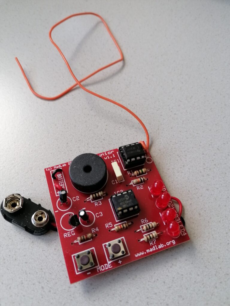
Leider hat das Theremin nur kurz funktioniert. Aktuell versuche ich eine Person zu finden, die mir mit eventuellen elektrotechnischen Problemen helfen kann.
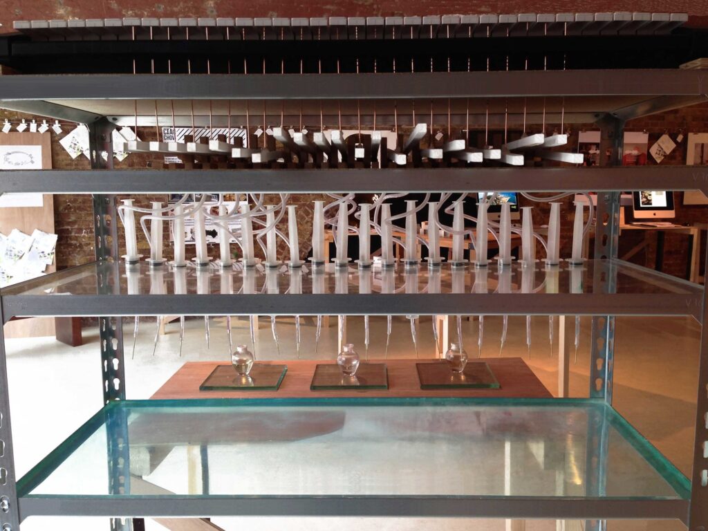
Es wurden weitere Experimente zur Anregung/Manipulation des Beckens gemacht. Das Abdämpfen des Beckens mit Stoff oder Ähnlichem führt zu keiner deutlichen Klangveränderung im Frequenzverlauf, dämpft aber die Länge des Nachhalls spürbar. Das Hinzufügen eines Kontaktmikrons in den Signalfluss hat die Möglichkeiten deutlich erweitert. Man kann nun zum Beispiel über die Fläche auf die es geklebt ist das Becken spielen. Außerdem kann man es für Rückkopplungssysteme nutzen.
Eine Überlegung wäre es, Sprache und Bewegungen/Schrittgeräusche der Besucher über das Becken wiederzugeben. Das würde meiner Meinung nach auch gut zum Konzept der berührungslosen Spielbarkeit passen.
Last semester I explored sustainability in fashion. Many companies have some sort of strategy to reduce their carbon footprint, but most of these incentives are not effective. I did however find some examples of companies trying to make a real difference. This in combination to big reports led me to some conclusions of what is important when designing and marketing clothing items:
Customer behavior and habits are affected by the environment and market the fashion industry creates. Therefore it is important to focus on the industry (in combination with expanding second hand options etc.).
The focus this semester will therefore be on the fashion designer. This is my user group. My goal is to help designers design for keep-worthiness and longevity (KWL). Included in this is visual/aesthetical sustainability, high quality/durability and versatility. Repairability is also important.
This semester’s design process will consist of work in the third and fourth part in the double diamond. I will first explore what possible solutions there are and then converge into developing one idea.
Die große Menge an Informationen, mit der wir heutzutage konfrontiert sind, beeinflusst unsere Fähigkeit, uns auf etwas zu konzentrieren. Forscher haben eine Studie durchgeführt, bei der sie untersuchten, wie sich die ständige Flut von Informationen auf unsere Denkleistung auswirkt. Die Teilnehmer der Studie wurden gebeten, eine Aufgabe zu erledigen, während ihnen irrelevante Informationen präsentiert wurden. Es stellte sich heraus, dass diejenigen, die mehr ablenkenden Informationen ausgesetzt waren, eine kürzere Aufmerksamkeitsspanne hatten und schlechter bei der Aufgabenbewältigung abschnitten. Die Studie zeigt, dass die ständige Ablenkung durch Informationen negative Auswirkungen auf unsere Denkleistung haben kann. Die Autoren der Studie betonen die Wichtigkeit, Strategien zu entwickeln, um mit dieser Informationsflut umzugehen und unsere Konzentration und Denkleistung zu verbessern.
Exhibition spaces can mean many things to many people. Art museums, galleries, and critique spaces are all considered exhibit spaces. Numerous factors are involved in the design of an exhibition space. Lighting, visitor circulation, layout, and color are all elements that are included in the strategic planning of an exhibit. The spatial atmosphere in which the art is displayed impacts the exhibition a great deal.
During the 19th century, museums became more aware that they isolate artwork on walls to avoid overcrowding and visitors having to crane their necks . Placement of artwork began to appear more at eye level leaving the walls emptier and the color of the wall becoming more apparent in the space.
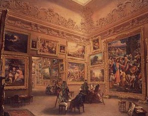
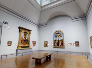
In the later part of the 20th century, the White Cube concept, a style which emphasized the artwork focusing on the relationship between space and visitor became a popular form of exhibition design. This approach minimized visual distractions with the use of bare spaces, white walls, and minimalist frames .
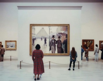
Designing an exhibit is a form of communication perceived differently to each visitor. The exhibition space becomes a space of experience for a specific audience. That space can be influential or unpleasant, the success of the exhibit depends on the visitor’s experience.
Exhibits are successful based on the visitor experience; visitors give museums a purpose and the design of the space influences the visitors throughout the exhibit space. When it comes to visitor experience it is best represented through patterns in which the visitors relate to the exhibits. Design of the exhibit can influence visitor flow, the level and quality of social interactions, visitor attention, and affective responses .Wall color, organization of the artwork, and the direction in which the visitors are guided throughout the space are all factors that create the overall spatial atmosphere that influences a visitor’s mood or behavior.
In den letzten Jahren lassen sich vermehrt Kunstperformances, die Geruch und Klang verbinden, entdecken (vgl. Di Stefano et al., 2022: 166). Im Jahr 2016 wurde das experimentelle Stück “Scent of Memory” des Australian Art Quartets präsentiert: eine Kombination aus Düften und klassischer Musik (ebda.). Der Parfumeur Carlos Huber entwarf eigens dafür Düfte, die an gewisse historische Ereignisse oder Stimmungen erinnern sollten: Arvo Pärts “Fratres” nahm das Quartett mit auf eine Reise, nicht in die 1970er Jahre (d. h. das Jahrzehnt, in dem das Stück komponiert wurde), sondern zurück zu einem japanischen Galion aus dem 17. Jahrhundert auf dem Pazifik, beladen mit einer wertvollen Fracht: Gewürzen, schwarzem Pfeffer, spanischem Leder und Weihrauch. Es folgten weitere Düfte, darunter der frische Duft von Salbei, Zimt, Orangenblütenwasser und marokkanischem Rosmarin, abgestimmt auf “Danzón No 2” des mexikanischen Komponisten Arturo Márquez. Coco repräsentierte den Reichtum der Neuen Welt in dem Duft “Anima Dulcis”, kombiniert mit George Gurdjieffs “Chant from a Holy Book”. Der letzte Duft, mit einer leichten Champagnernote und blumigen Akzenten, wurde mit Tschaikowskis Scherzo & Finale aus Quartett Nr. 1 assoziiert. Er sollte eine frühere Ära der Opern heraufbeschwören, einst besucht von Männern mit weißen Gardenien und eleganten Damen (vgl. Di Stefano et al., 2022: 166).
Der Ingenieur Chang Hee Lee, hat ein weiteres faszinierendes Projekt realisiert: “Essence in Space”. Es basiert auf einer modifizierten Klaviatur, die in der Lage ist, Klang und Duft in ein Parfüm zu verwandeln. Jede Taste war mechanisch mit einem Duft verbunden, der darunter platziert war. Sobald eine Taste betätigt wurde, wurde ein Tropfen Parfüm freigesetzt und in einer Flasche gesammelt. Dieser Vorgang wiederholte sich mit jedem Anschlag. Am Ende der “Vorstellung” wurde somit eine einzigartige Duftmischung erlangt (vgl. Di Stefano et al., 2022: 166).
Die oben genannten Beispiele zeigen, dass das Erleben von Musik durchaus bereichert werden kann, indem bewusst Gerüche akustischen Reizen beigefügt werden.
Quellen:
Crossmodal Correspondences in Art and Science: Odours, Poetry, and Music
Nicola Di Stefano, Maddalena Murari, and Charles Spence (2022).
Weitere Überlegungen im Bereich “Farbliche Hervorhebung”. Die Verwendung bestimmter Farben könnte dazu beitragen, geschlechtergerechte Ausdrücke visuell hervorzuheben und so deutlich sichtbar zu machen. Dadurch könnte in der Gesellschaft Platz für das nicht-heterosexuelle Stereotyp eingeräumt werden, welches sonst unterdrückt und ignoriert wird.
Hierbei stellt sich die Frage: Welche Farben sind am besten geeignet, um geschlechtsneutrale Pronomen oder gendergerechte Ausdrücke hervorzuheben? Eine Möglichkeit besteht darin, eine Farbe auszuwählen, die sich von der umgebenden Textfarbe deutlich abhebt, um die Aufmerksamkeit der Leser:innen zu lenken. Eine andere Möglichkeit ist die Wahl einer Farbe, die in Bezug auf Geschlechterstereotype neutral ist.
Wichtige Fraktoren, die meiner Meinung nach im Zusammenhang mit der Verwendung von Farbe zu beachten sind:
After writing and learning more about shooting plans during the work on my last post, I found out that a shooting plan can be influenced by several factors when put into practice. These factors might differ when talking about outdoor documentaries rather than a classic film set. Therefore, I want to dive deeper into this special form of work with the shooting plan today.
Disclaimer: Since my main source for this post is a book written in German, the following information will also be in German. The source can be found below.
Bei der Drehplanung müssen während der Erstellung diverse Faktoren beachtet werden. Zum Beispiel muss sich das Planungsteam auch im regulären Film umfassend mit dem Wetter befassen.
Beim Drehen und Planen von Outdoor Dokumentationen sind Einflüsse, die durch Naturgewalten bestehen, besonders in Betracht zu ziehen. Nicht nur das Wetter, sondern auch andere Punkte wie Sonnenaufgang und Untergang und Logistik sind hier speziell zu beachten.
[Aus eigener Erfahrung] Allerdings kann mit verschiedene Wetterverhältnisse im Dokumentarfilm (entgegen einer Spielfilmproduktion) wesentlich leichter umgegangen werden. Denkt man an die Ansprüche, die die beiden Zielgruppen an den jeweiligen Film haben, merkt man schnell, dass es beim Drehen von Filmen mit Authentizitätsanspruch weniger schlimm ist, wenn es leichte Lichtsprünge oder Wetteränderungen gibt.
Vor allem im Bereich des Bergfilms können solche leicht gerechtfertigt werden. Im alpinen Gelände kommt es schnell zu Änderungen der Bedingungen und jede Person, die schon mal auf einem Berg war, weiß, wie unbeständig die Verhältnisse dort sind. Das Planungs- und Regieteam sollte sich in diesem Fall während der Planung vermutlich mehr auf die Sicherheit des Teams fokussieren, als auf die perfekten Wetterbedingungen. Dazu wird deshalb ein separater Blogpost folgen.
Grundsätzlich sind Niederschlag und Temperaturen kein allzu großes Problem in der Drehplanung, wenn die Bedingungen dramaturgisch nicht relevant sind. Lediglich die Dreharbeit an sich kann anstrengend und langatmig werde. Allerdings:
Man kann von einem Team erwarten, dass es für alle klimatischen Bedingungen ausgerüstet ist und den Drehablauf bei jedem Wetter bedienen kann, egal wie anstrengend und nervig das sein mag.
Jesper Petzke
Petzke beschreibt in seinem Buch Drehplanung die Arbeit mit Niederschlag als recht zeitintensiv. Im Spielfilm mit fixem Drehbuch muss bei Regen gewartet (sofern er dramaturgisch ungewollt ist) und danach das Set wieder getrocknet werden. Das nimmt sehr viel Zeit in Anspruch und kann leicht den Ablauf eines Drehtages in Gefahr bringen.
Ist das der Fall, gibt es zwei verschiedene Möglichkeiten, die Pensen im Drehplan zu verschieben. In der Praxis plant man dann einen Außendreh nur halbtags und für den anderen Tag ist ein Innendreh geplant. So kann man auf Wetter reagieren und die beiden Halbtage einfach tauschen. Das geht jedoch nur, wenn das ungewünschte Wetter nicht den ganzen Tag anhält.
Die zweite Möglichkeit ist ein Pensentausch zwischen verschiedenen Tagen. Ist absehbar, dass die Pensen des Außendrehs aufgrund des Wetters nicht erreicht werden können, gibt es die Möglichkeit, die geplanten Drehtage zu tauschen. Allerdings muss hier eine frühzeitige Bekanntgabe an die Crew und den Cast erfolgen. Sonst ist eine geordnete und qualitativ hohe Arbeit an den geplanten Bildern nur erschwert möglich, da jedes Department eine gewisse Vorlaufzeit für Einrichtung braucht. Bei Wetterentscheidungen gilt dann: So früh wie nötig aber so spät wie möglich.
Ein solcher alternativer Drehplan (Dispo) nennt sich Wettercover. Von einem Coverset spricht man dann, wenn das alternative Set, welches zur Ablöse von unerwünscht regnerischen Tagen verwendet werden kann, während der ganzen Drehzeit als solches bereit steht. Hier muss jedoch der Nachteil der Kosten in Betracht gezogen werden. Auf der anderen Seite meint Petzke:
Für eine Produktion, deren Gelingen in starkem Maße vom Wetter abhängig ist, kann die Bereitstellung eines Coversets allerdings überaus wertvoll sein.
Jesper Petzke
Grundsätzlich steht und fällt jegliche Wetterentscheidung mit der Art der Kommunikation. Es müssen nicht nur Produktion und Regie mit der Entscheidung im Reinen sein, sondern auch die Crew ist angewiesen auf eine rechtzeitige Kommunikation der Änderungen. Das Ziel sollte hier sein, ein gutes Gespür dafür zu entwickeln, wann eine wetterbedingte Anpassung wirklich notwendig ist und wann man das Risiko in Kauf nehmen sollte. So kann zusätzliche Belastung für alle beteiligten Departments niedrig gehalten werden.
[Aus eigener Erfahrung] Wie oben schon erwähnt, sind bei einer Outdoor Dokumentation solche Tauschs eher sicherheitsbedingt als dramaturgisch bedingt. Oft kann ein Wetterwechsel sogar von der Regie und Produktion begrüßt werden und stilistisch in die Geschichte einfließen. Hier ist eine hohe Flexibilität von Drehbuch und Arbeit am Set nötig.
Even though the production team has a lot of responsibility over decisions which influence the whole team, there are various strategies to avoid stress and pressure on the production during weather changes. For documentary filmmaking, the focus is probably more on safety while a feature film puts dramaturgy first.
After writing this post, I am now eager to learn more about weather related safety measures that can be taken and planned for the production of outdoor documentaries. Afterall, the planning of high-altitude shoots has to include information far more detailed than the planned weather cover.
.
.
.
Sources
Petzke, Jesper: Drehplanung. Konstanz: UVK Verlag 2015
A strong brand identity can help a company stand out in a crowded market, connect with its target audience, and build trust and loyalty with customers. In the last semester I wrote about fashion logos and now I want to expand my topic on the topic how to create a strong fashion brand identity. In this article, I will discuss the key elements of brand identity and tools we can conduct to improve a brand identity.
Brand identity is the collection of visual and verbal elements that represent a brand. These elements include the brand name, logo, tagline, colour palette, typography, imagery, tone of voice, and overall aesthetic. Together, these elements create a consistent and recognizable look and feel that distinguishes a brand from its competitors.
One experiment that I can conduct to improve a brand identity is to conduct a brand audit. A brand audit is a thorough analysis of all the visual and verbal elements that make up a brand identity. This can include reviewing the brand guidelines, analysing the website and social media profiles, and conducting surveys or focus groups to gather feedback from your target audience.
Creating a brand identity is a crucial step for any business or organization. A brand identity represents the visual and aesthetic elements of a brand, such as the logo, color scheme, typography, and overall style. These elements communicate the values and personality of the brand to the audience, making it essential to get it right.
Fortunately, there are numerous tools available that can help you design a brand identity. In this article, I’ll take a look at some of the best tools for designing a brand identity.
Adobe Creative Cloud
Adobe Creative Cloud is a comprehensive suite of software tools that includes Adobe Illustrator, Photoshop, InDesign, and other programs. These tools are the industry standard for creating professional-grade design elements, including logos, typography, and layouts. With Adobe Creative Cloud, you have access to a vast library of fonts, graphics, and templates, making it easy to create a cohesive brand identity.
Canva
Canva is a user-friendly online graphic design platform that offers a wide range of templates and design elements. It’s perfect for those who are not familiar with design software or need to create a brand identity quickly. Canva provides templates for logos, business cards, social media graphics, and other design elements. You can customize these templates with your brand colors, fonts, and images to create a unique brand identity.
Sketch
Sketch is a vector-based design tool that’s popular among designers and is commonly used for designing mobile apps, websites, and user interfaces. However, it’s also an excellent tool for creating brand identities, including logos, icons, and typography. Sketch has an intuitive interface, and it offers a wide range of plugins that can help you streamline your workflow.
Figma
Figma is a cloud-based design tool that enables collaboration among team members, making it ideal for remote teams. It’s easy to use, and it offers a wide range of design tools, including vector graphics, typography, and image editing. Figma also includes prototyping and animation features, making it a versatile tool for creating a brand identity.
Gravit Designer
Gravit Designer is a free vector design tool that’s similar to Adobe Illustrator. It’s a versatile tool that’s ideal for creating logos, icons, and other brand identity elements. Gravit Designer includes a vast library of design assets, such as shapes, icons, and fonts. It’s a user-friendly tool that’s ideal for beginners or those on a tight budget.
In conclusion, designing a brand identity requires careful planning, research, and creativity. These tools can help you create a professional-grade brand identity that accurately represents your brand. Whether you’re a beginner or an experienced designer, there’s a tool out there that can help us bring our brand identity to life.
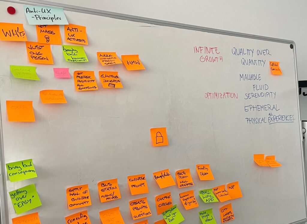
Last week I had the opportunity to participate in the Humane Design workshop during the International Design Week. I thought that it would be interesting to try something new, that would also give me ideas for my next steps or ideas in general for my topic for the Design & Research class.
Humane Interaction Design’s main focus is on designing for humans in the real world, which aligns with my topic. The goal is to create interfaces that do not sell anything, that don’t try to change your mind, manipulate you, etc. Nowadays many businesses, and companies strive to create products that do not really serve people. Most of them are too capitalized and focus only on getting something out of it, rather than doing something for the user. This results in people losing trust in technology and everything modern.
Humane design focuses on designing with empathy and ethics. To my mind, this is necessary for my topic because, through the design process, it ensures that interfaces are not only usable but also respectful of the user’s diverse culture and background, which I think sometimes is overlooked. We could see and experience this when we were talking about the results of our experiments. Being more empathic helped us connect with people on a deeper level, learn about their life stories and understand their problems more.
During our workshop, I also learned that people actually strive for connecting with someone or something that would appreciate their culture, background, and their differences. No matter what or where they come from, people want to feel seen and understood. I think it would be challenging and interesting at the same time to design an interface that would answer those needs and feel humane during usage.
This workshop experience was really nice because it was completely different from what we are used to doing in everyday life. It reminded us about the values of connecting with people, experiencing emotions in real life, and about the importance of staying human.