– by Elena Waschl
@Thomas Hundt & Ingo Zirngibl
Markeninszinierung im Raum
CA vs Produkten variiert in der Ortsgenbundenheit!
Gebäüde = Ort, Kontext, ihre Kraft und Besonderheit
ZIEL = aus Marke heraus entwickelte Idee im Raum fokussiert darzustellen! Begehbares Markenbild!
Begehbare Marke / erlebbar machen / Grundthesen spüren / Botschaft im Raum omnipräsent / detailiert / vielschichtig zu kommunizieren und präsentieren!
@ Michael Ostertag_Henning
Integrierte Markenführung
ständig wachsende Bedürfnisse d. Target Group – Reizüberflutung
= Ob Marke & Produkt authentisch wahrgenommen werden hängt von durchgängigen Erscheinungsform ab die trotz Vielschichtigkeit überall erkennbar sein soll!
Zusammenhänge in allen Bereichen: Print – Imagekampagne – Film – Social Media – Raum – Architektur etc.!
@ Uwe R. Brückner
Szenographie ist eine Identitätsbildende und bewahrende Gestaltungsdisziplin (Kombination v. Gestaltungselementen / Medien im Raum)
Choreografie von und im Raum / Raumabfolgen – Dramaturgie der Innenarchitektur – Darstellung von Content im Kontext!
Die Szenographie bedient sich hierfür an Architektur, Innenarchitektur, Theater, Oper, Film, Video, Ton, Kunst Installationen, Performance, etc. = Ergebnis ist das Erlebnis (INEINANDER VERSCHMELZEN)
c wird zu Ausgrenzung Eingrenzung von Umgebung, Handlungs- Denks und Spielraum, haptik, Material, Licht, Kombinationen davon, narrative, Raumabfolge, kalkuliertes Verhalten d. Besucher, Sprache & Sound, etc.
C*-Scenographie = Erweiterung des CI in dreidimensionalen Raum
> Übermittlung der Werte & Philosophie = Inhalte attraktiv zu präsentieren Intuition der Marke spüren
FORM FOLLOWS CONTENT!
Wo?
- Messen & Expos (Zeitlimitiert)
- Permanent = Firmengebäuden
- Markenmuseen
- Shops & Partnerstores
- Etc.
Emotionale Aufladen themenadäquater Atmosphäre – Narrative umsetzen – einen Spannungsbogen aufbauen
Zugang zur Marke Schaffen
@ Christoph Böninger
C*- Product Design
Energien eines Unternehmens richten sich direkt od. indirekt auf den Markterfolg d. Produktes.
>> Design & Kommunikation Maßnahmen nach außen (Marke, Architektur, Messe, Verpackung, Grafik, Werbung)
Produktmängel & Qualitätsmängel = mindern Vertrauen & formen schlechtes Image = schwer korrigierbar
Produktdesign ist Summe der Talente (Mitwirken) und Kompetenzen aller Mitarbeiter
>> Designprozess ist von linearen System zu Parallelensystem geworden (=glz. höherer Komplexität, Fachkompetenzen und sozialen Kompetenzen + Druck)
Rolle des Designer: alle Mitwirkenden auf ein Konzept zu einzuschwören
Positionierung der Produkte genau planen!
> früher noch mehr Zeit für Trial & Error
> heute verkürzte Zeit & mehr Druck
= strategisch, von Marketing gesteuerten Produktdefinitionsprozess BASIS Marktforschung
qualitativ: Interviews>> Langfristige gesellschaftliche Veränderungen auf soziokultureller Ebene erahnen und so Produktvorteil schaffen
od. quantitativ: kurzzeitiges Abfragen von Akzeptanz von Design mittels Modellen, etc.
Wandel = wissenschaftlich = unzweifelhaft
Fortschritt = ethisch = streitbar
Immer knapper werdender Ressourcen > wichtig die RICHTIGEN Produkte zu erschaffen
Qualität = tech. Innovation, gebrauchstechnischer Erwägung, kulturelle Verpflichtungen & umwelttechnische Notwendigkeit >> Designer muss alle Aspekte glaubhaft & sinnvoll zusammenführen
Designer sollte „Anwalt“ des Kunden sein und mittel-langfristige Interessen verfolgen!
10 Thesen by Dieter Rams:
Gutes Design
… ist Innovation
…macht ein Produkt brauchbar
…ist ehrlich (manipuliert Käufer nicht)
…etc.
@ Armin Angerer
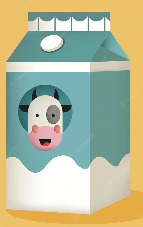
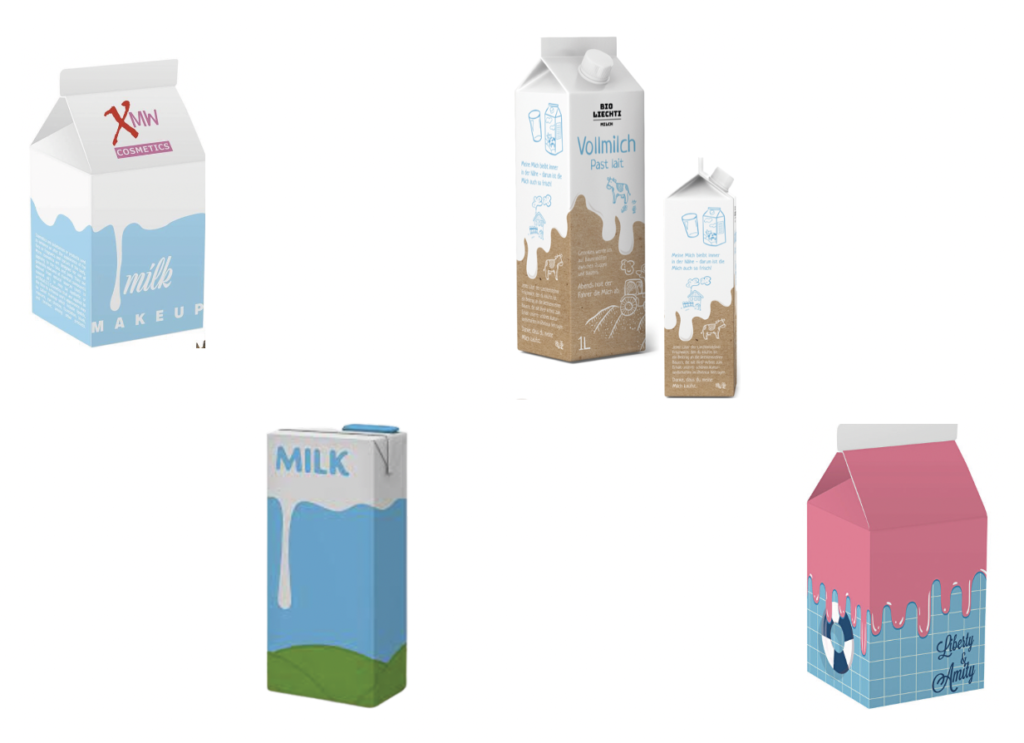
C*- Packaging
0.5sec Produktkauf JA / NEIN
Dh. Produktdesign muss winziger Augenblick interessanter sein als andere!
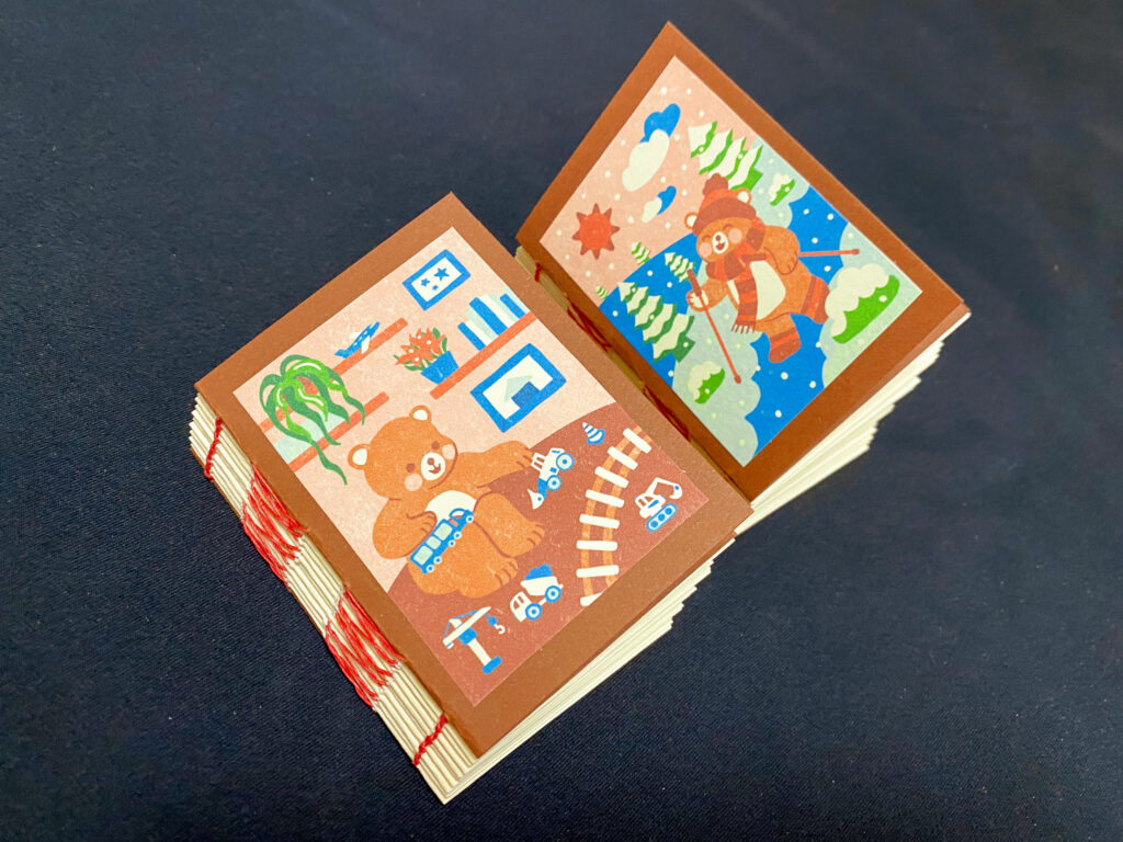
Wir alle lieben Geschichten! Mitnehmen in andere Welt – emotionen 🙂
Wichtig Proof = beim Auspacken (+ Die Geschichte muss auch weiter authentisch sein >> Homepage,etc.)
Verpackung als Visual Merch. > Achte auf verwendetes Material
PoS > wie groß sind Elemente?! Abstand?
Verpackung kann auch ein Erlebnis sein!
Guter Packaging Designer > guter Geschichtenerzähler (Touchpoints – jeder ist eine Botschaft)
@ Regina Henkel
C*- Fashion
Mitarbeiter sind glz. Visitenkarte = Erscheinungsbild NICHT Zufall! Performance die die Firma wiederspiegelt
WAS? Unternehmen spezifische Kleidung an CI orientiert.
- Klären wer soll sie tragen?
- Design / Material / Kollektion & Größen
- Unterschied zur C*Fashion >> Merchandise Fashion Richtet sich an die Kunden
Potenzial: Repräsentation eines einheitlichen Konzeptes / Wiedererkennung nach außen
Interne & Externe Wirkung
Kleidung transportiert Botschaften
Prinzip der Standardisierung – Uniformen vereinheitlichen Menschen
>> muss mir Gedanken machen wo macht es Sinn?! Wie Streng?!
Kleidung definiert die Rolle der Interaktionspartner!
C*_Fashion legt tlw. durch Schnitt & Material fest wie sich die Menschen verhalten sollen
>> GLZ. existiert sie fast nur in Bereichen mit Kundenkontakt!
Merke:
- Einbeziehen der betroffenen „Tragenden“
- Orientierung an bereits bestehenden
- Varianz der Kollektion
- Pflegeleicht
- Reinigungsmöglichkeit?
- Durchführung von Tragetests in Konzeptionsphase
@ Matthias Beyrow
Merkwert Marke
MARKE & FUNKTION
- Steht für einen Absender der eine Leistung bereit stellt
- Ist emotional aufgeladen (durch Erfahrungen, Erlebnisse, Ruf,etc.)
- = Entlastungs-, Garantie- und Vertrauensfunktion
- Marken helfen bei Entscheidungen
PROJEKTION
- Eine Marke hat Bedeutungskraft und schafft Identität
- Marken haben einen Wert > Prestigefunktion Kommunikation & Inklusionsfunktion
- Repräsentieren den Konsumenten
ERSCHEINUNG
- Prägnant? = dann auch unverwechselbar
- Name, Schriftzug, Logo, Slogan, Farbe, Verpackung, Melodie, usw.
- Markenzeichen
- Marken schaffen bei Überangebot einen Überblick!
- Merkmale zur Wiedererkennung müssen konsequent sein!
Alle optischen Merkmale zur Erzeugung eines konsistenten visuellen Erscheinungsbildes nennen die Autoren Corporate Design.
= Definierte Elemente*, die mittels bestimmter Methoden auf Medien (Touchpoints) angewendet werden
*Zeichen, Typo, Farbe, Format, Foto & Darstellung
FORM
Eine Form ergibt sich durch Farbe, Platzierung, Größe, Silhouette,etc. – in Komposition od. als Störer
Manchmal Zusatzfunktionen = Textträger, Aufteilen v. Format, schaffen Kontrast, etc.
SCHRIFT
Wahl der Schrift befördert Assoziationen
Schrift wirkt unbewusst
Ästhetik + Funktion
FARBE
Ganz oben in menschlicher Wahrnehmungspsychologie
enormes Potential
schwer besitzen aber wohl besetzen!
Farbe kann inhaltlich bedeutend sein >> Assoziationen schafft
Farbe ist mächtigste Werkzeug im CD
Herausforderung der Farbechtheit in Bezug auf Reproduktion
LOGO; SIGNET; MARKE
Logo eig. Falsch etabliert und dürfte nur für Wort, Zahl & Buchstabenzeichen verwendet werden
>korrekt: Signet (lat. Signum = Zeichen)
Marke > griech. Marka = Zeichen
… transportiert Wert & Qualität des Unternehmens (Wort-, Bild- od. Wort-Bildmarke)
Markenzeichen IST NICHT Corporate Design!
IST NICHT Erscheinungsbild!
Redesign zieht Entwicklung v. Gestaltungsrichtlinien, Erwerb v. Rechten (Schrift, Bild, etc.), Implementierung an versch. Touchpoints
Markenzeichen sind Repräsentanten >> Bedeutung aufladen?
Voraussetzung: Absender! Was hat er zu erzählen (oft komplex) = Reduktion auf das Richtige
Rezept für gutes Design gibt es nicht aber Strategie! (Relevanz ist dann messbar)
- Präsenz = schafft Attention / Formal & quantitativ
Von Umgebung kontrastiert > mithilfe von Farbe, Form, Dimension, Gewicht
- Substanz = vermittelt Kompetenz / konkret & qualitativ
Vermittlung v. Markenkern, USP, W-Fragen, Leistung einer Marke, Diensten, Vorteile, etc.
- Referenz = belegt Anspruch / mit Bezugnahme auf Werte od. Konventionen
Quelle:
Corporate Identity & Corporate Design _ Das Kompendium
Hrsg. Matthias Beyrow / Petra Kiedaisch / Norbert W. Dadrop