Since for my nature documentary / conservation film the protagonist will be the focus point of the film I choose to take a look at how hook the audience in classic documentaries where the character and their story is basically the only possibility to keep the audience interested.
The first major point here is an intro that hooks the audience. He uses mystery to make people wanna know more. He uses some of the strongest statements and strongest visuals in the beginning. He furthermore says that for documentaries is to staying true to your subject matter without trying to make the film or story something that is isn’t. For the middle part he advises to focus on the history and the current conflict of the subject. He also emphasizes to show and not tell and to trust the audience. There has to be one main message, a red line running trough the film. For the ending he recommends to show a revelation of either the protagonist or the a revelation for the audience.
Personally I think there are many takeaways from this video and the way the maker of this video does tell his stories is very similar to the way I wanna tell mine. There is a lot to learn, also in his other videos which all show important aspects of how to hook your audience
I watched this because of the title. I deemed it pretty interesting since my film will center around the protagonist or scientist and their motivation and not on for example the wildlife. I thought maybe the video will explore exactly that. However I was disappointed. The Videomaker instead tries to make a documentary with only stock footage which is the opposite of what I want to do. He also explored what makes a documentary good. This is were it got interesting again. He concluded that narrative, visuals, good, foly music and narration are important. Which is not really news. The final product was a an okay trailer for a documentary. The use of foly however was quite interesting and leveled up everything by a lot. I will definitely keep this in mind for my film to not forget about the importance of good sound. The rest of the video was rather useless.
The Short Video series explores why the relatively new Planet Earth II looks so much more cinematic than it’s predecessor. Moreover it deals with other advancements made to make the visuals of Planet Earth more fascinating. The starting episode however was from its title the most interesting to me since I want to make a cinematic documentary for my thesis. They found that the main factor contributing to the more cinematic look and feel is advancements in stabilization. For Planet Earth II it was possible for the first time to use hand held gimbals and small drones which it made it possible to incorporate moving shots more frequently and film entire sequences like a wolf hunt in one shot. Also they filmed their shots from the animals perspective for a more personal take without being anthropomorphic. The Video is interesting however for someone with knowledge in that area there is nothing really shocking in it. I will definitely actively remember to include moving shots in my film however. But there are surely a lot more factors contributing to a cinematic look. The other parts of the series deal with ways to film the earth by night which are also interesting bit not really applicable since slow motion cameras and infrared cameras neither suit my budget nor my story ideas.
Since I finally have a possible project for my master thesis I thought this to be a good point in time to think about a structure for the written part, so I know what to research and where to start.
In the following I will write down the possible chapter and briefly address why I think them important and what they will contain.
Theoretical Part:
The importance of our oceans
This chapter will discuss why the ocean is so important to our existence as humans. Since the thesis will strongly focus on arctic oceans this chapter will possibly also discuss specifics of the importance of especially arctic oceans
The ocean in the Anthropocene
This chapter will focus on the current state of our oceans and to what extent humans are
responsible for it’s current developments. This chapter will also delve deeper in regard to
state of arctic oceans.
Noise pollution in the ocean
This chapter will discuss the dramatic effects noise pollution has on our oceans, especially the arctic.
Conservation film
This chapter will discuss what a conservation film is.
History of conservation films
This chapter will discuss the history of conservation films, its milestones and developments.
Impact of conservation films
This chapter will discuss how effective conservation films actually are and what can be achieved with them.
How to create an impact with conservation films
This chapter will deal with all the opportunities to create impact. This chapter will basically function as the bridge between the theoretical part and the methodology. This chapter will explore all possibilities to create impact or an emotional connection with the audience that
the thesis will explore in the following parts. For example story, colour grading, sound and actually being relevant for the time the film is produced in. Or in other words hitting the Zeitgeist.
Methodology:
The second part or the theis will deal with the question on how to actually hit the zeitgeist and create an impactful film. After that is done the rest of this part will follow the structure of making a conservation film and will talk about how these findings where implemented and moreover how other factors like colour grading can be used to further strengthen the the emotional impact the film has on the audience.
Before I delve into the method of how I want to find out what the zeitgeist is and will be in the years to come,
I want to adress that my methodology is not yet final and I first want to talk to my professor and you if that really makes sense for this project.
But first I should probably explain what this methodology that I am thinking about actually is.
I am currently enrolled in the course Sustainability Transitions at NTNU and the main goal of the course basically is to predict the future. In the course we use the ViP model analyze a current situation deconstruct it, find patterns and try to predict societal transformations to ultimately introduce theories and methods for sustainability transitions. In my case I would use this model to see what will be important for future auciences. The whole process however is very philosophical and very ambivalent and leaves a lot of room for interpretation. Thats why I am not sure if it’s a good fit for the thesis. Nevertheless I find this approach really interesting and I think it could yield very interesting results.
Pre Production
All the subchapters in this part will inccoporate findings from the methodology
Idea
Research
Storytelling
Production
Lighting
Soundrecording
Angels
Post production
Editing
Color Grading
Marketing
Film Festivals
Social Media
For all prodcution related chapters I will most likely add more chapters in the proecess.
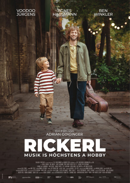
Die österreichische Kinofilm-Produktion „Rickerl“ des Regisseurs Adrian Goiginger läuft seit Jänner 2024 im Kino. Voodoo Jürgens, ein österreichischer Liedermacher, ist in der Hauptrolle zu sehen und verkörpert Rickerl, einen Straßen- und Beislmusiker, der sich persönlich und finanziell am Limit bewegt, von der Hand in den Mund lebt und durch Auftritte in verrauchten Lokalen mehr schlecht als recht über die Runden kommt. Rickerl ist außerdem Vater eines achtjährigen Sohns, der aus einer früheren zerbrochenen Beziehung stammt und mit seiner Mutter und ihrem neuen wohlhabenden Lebensgefährten im gut situierten 13. Wiener Gemeindebezirk lebt. Hier prallen zwei Welten aufeinander – Rickerl bemüht sich trotzdem, seinem Sohn eine schöne Zeit zu bescheren und nach seinen Möglichkeiten ein guter Vater zu sein.
Das Sounddesign des Films, für das Marvin H. Keil verantwortlich zeichnet, ist dezent und ansprechend gestaltet, dieser Blogeintrag beschäftigt sich allerdings mit dem Soundtrack der Produktion. Eigenkompositionen Rickerls (also Voodoo Jürgens) sind tragende Elemente des Films und beziehen sich auf die Lebenswelt der Hauptperson; diese hat er auf schlampig beschriebenen Zetteln in seinem Gitarrenkoffer stets bei sich. Bei Rickerls Gigs sind jedoch eher wohlbekannte Lieder des Austropops gefragt. Sein Manager verlangt etwa von ihm, während eines Auftritts bei einer Hochzeit, populäre Stücke wie zum Beispiel „Fürstenfeld“ der Gruppe „STS“ zu spielen, die Rickerl etwas widerwillig zum Besten gibt. Als die Hochzeit aufgrund eines Streits aus dem Ruder läuft, wird aber Rickerl von der Band, die ihn begleitet, ermutigt, eines seiner unveröffentlichten Stücke zu performen. Inmitten des Chaos der Hochzeit ist nun Rickerls eigene Musik zu hören. In diesem Moment gewinnt der Protagonist einen neuen Bezug zu seinem künstlerischen Schaffen. Der Film präsentiert etablierte Austropop-Klassiker und die ungeschliffenen Lieder Rickerls, die aus einer tristen, jedoch inspirierenden „Unterwelt“ stammen, als Gegensätze. Neben den Bezügen auf die oben erwähnten Hits der österreichischen Popularmusik ist der Film aber auch mit älteren eher unentdeckten Titeln bekannter Interpreten gespickt, die den zugehörigen Abschnitten zu besonderer emotionaler Tiefe verhelfen. Eine berührende Tanzszene mit Rickerl und seiner Exfreundin, der Mutter seines Kindes, in einem verrauchten Beisl, kurz vor Sperrstunde, wird mit Hans Orsolics’ „Märchen“ untermalt – ein Austropop-Lied mit für das Genre eher unüblichem „knackigen“ Synthesizer-Instrumentalsound. „I bin Miad“ von Wolfang Ambros verschafft einer ruhigen, kontemplativen Szene eine melancholische Stimmung. In „Rickerl“ fügen sich populäre Klassiker, Lieder mit Seltenheitswert und Rickerls „rohe“ Kompositionen aneinander und ergeben ein stimmiges Gesamtkonzept. Eine große Empfehlung für Kenner des Austropops, für all jene, die das noch werden wollen und für alle, die einen tiefen Einblick in die dunklen Ecken der österreichischen Seele erlangen möchten.
“Our relationship with the underwater environment is fundamentally defined by how alien it is, an uninhabitable medium, which we can access through active imagination and immersion. “ [ paper: Understanding Underwater: the Art and Science of Interpreting Whale Sounds. By Yolande Harris] http://www.interferencejournal.org/understanding-underwater/
Except for sailor’s tales of deep-sea monsters, the underwater environment has been considered as a silent place. The assumption that the sea is silent, comes from the limitations of human hearing. The vastness, complexity and fractional knowledge we have of ocean ecologies suggests that we need to change this attitude to find sustainable solutions. The relationship between biological sound and anthropogenic technological sound is not just a theoretical distinction. It is central to our understanding and hearing underwater, and so is built into the history of human relationships with underwater environments.
Research on underwater sound is intimately bound up with the story of the whale. These underwater mammals are known to use sound in a very sophisticated manner.
“Underwater soundscapes are dynamic, they vary in space and time” [paper: “Exploring the Ocean Through Soundscapes”] https://acousticstoday.org/wp-content/uploads/2018/03/Exploring-the-Ocean-Through-Soundscapes.pdf
Blue, fin, sei, Bryde’s and humpback whales all communicate within the 10- to 200-Hz frequency spectrum. Infrasound from waves crashing onshore (that marine animals likely use for orientation) is also in this band. Understanding how marine life uses this frequency band and the effects of human contributions in this same frequency band is the subject of many soundscape studies.
Shipping activities have caused a 10- to 12-dB increase in the 20- to 40-Hz band between 1965 and 2003. Moreover, endeavors such as oil and gas exploration, as well as the development of renewable energy sources, have contributed to an overall escalation in sound levels within this band. It is likely that biotic sound levels have also surged due to the recovery of whale populations and the “Lombard effect.” This phenomenon, observed in both humans and various animal species, involves an increase in vocalization amplitude to offset higher levels of ambient noise. Consequently, the Lombard effect may be a contributing factor to the escalating levels of low-frequency sounds as animals vocalize more loudly to overcome background noise.
References:
Paper: Understanding Underwater: the Art and Science of Interpreting Whale Sounds. By Yolande Harris
Paper: Exploring the Ocean Through Soundscapes By Jennifer L. Miksis-Olds, Bruce Martin, Peter L. Tyack
For this impulse I wanted to do a long overdue deep dive on Corridor Digital’s AI anime videos as well as their making-offs and other similar videos, to get to a reasonable watch time for an impulse.
The Animes
Honestly, I’m not a huge fan of how the videos turned out. I know, kill me on the spot. But to me it just looks like the most complex way of rotoscoping ever (talking about rotoscoping animation like Wald Disney did back in the day, not the modern use of the word). Sure, they got the style and the tone right but the proportions and faces are far too human for my taste. Apart from that, the story doesn’t really go anywhere and is at the same time a bit too intense and too boring, it almost seems like ChatGPT wrote it. Hmmm.
Anyway, the video still shows that this sort of quick and dirty production is possible and that the AI can do all the heavy lifting, leaving the creative side of things to the humans, which I think is still very very cool.
Making Off
In their ‘Did We Just Change Animation Forever?’ video, they brake down their technical approach and workflow, but I’m more interested in their philosophy. Essentially, they wanted to create an anime with their known workflows – with filming real footage on a greenscreen and then VFXing their way through the process without having to worry about the anime stylisation and animation, which they can’t do.
That sounds pretty much like what I want to do except I want to refrain from filming real humans and stay more true to the original anime style. They also talk about the democratisation about their process, claiming that they want to share every step of the way with the community to ensure that anyone can recreate what they have made, using free and open source software. This can’t be said for traditional animation, since animation studios rely on skilled and experienced artists to create their films. But this way, anyone can tell their stories in a style that fits that story best, while letting AI do the heavy lifting.
Their video has sparked some controversy, however, with many anime-based influencers across social media platforms arguing whether this is crossing a line, or AI is even art, going so far as to call the video itself offensive. I think it’s pretty obvious what my stance on the matter is, but I’ve included a link to a video going into more detail about the controversy below.
Qualities of Anime
Anime is a notoriously hard style and medium to recreate, and Corridor Digital have made a dedicated video talking about what goes wrong in most live-action adaptations of anime and what makes anime so great in the first place. I highly recommend the video to anyone interested in either of both styles.
First and foremost, they make the point that anime is heavily character-driven. Each character is introduced carefully and thoughtfully and shows their traits in every action they take. With live-action and especially Hollywood adaptations, individual characters and their personalities aren’t as important, more so who is portraying them, which is understandable since many productions rely on a big name to have enough people to come see their movie so they don’t go bankrupt immediately.
Next, they claim that storytelling in anime is incredibly efficient and decisive: Each shot has a purpose and a meaning. I have to say that this is mostly true, but there is of course the edge case of anime series with limited budget trying to elongate certain shots to get more runtime or even creating entire filler episodes that serve literally no function for the plot of the series.
But for the most part it’s true and they come up with an interesting reason as to why this could be: On a film set it’s not unusual to have multiple cameras filming a scene with different actors, each focussing on a different one, and then maybe some more for wide establishing shots. Once everything is filmed, it’s during editing where it’s decided which shot looks will be used. Animated productions could never afford animating a scene from multiple angles just to have some more freedom in the edit, so every single shot needs to be decided on from the start, which in turn means every shot must have a good reason for being the way it is. Of course, budget is also a huge concern, but this video talks more about the creative qualities behind it all.
Some other miscellaneous features they point out is the importance of impacts and the use of internal monologues which is actually very intriguing for my anime film, because it would mean I wouldn’t have to animate so much.
Of course, there’s also anime’s more extreme camera angles, the often distorted anatomy and inaccurate scales to sell certain emotions, actions or impacts and the action anime lines that are frequently used, but that’s all getting a little too detailed and is perhaps best reserved for my master’s thesis.
Oh and apparently the Death Note live action adaptation is actually good?? Have to check that out.
After researching and beating around the bush for months, it’s finally time for me to actually do some AI based animation. But first, some more researching and beating around the bush by watching some tutorials! Luckily, it seems that the most recent version of Pika, 1.0, has especially good anime style capabilities, which work well with Midjourney generations, since Midjourney has excellent stylistic understandings in my opinion. So things are looking promising in theory.
For this test I want to try to animate my AI anime trailer I made in the last semester. The trailer featured essentially no animation but moderately good consistency in my main character, something I’m still a bit afraid of for the master’s thesis project. I want to see what the best method for Pika is to get my character moving, trying out both the entire frame and isolated character on plain backgrounds since my generated backgrounds don’t need animating.
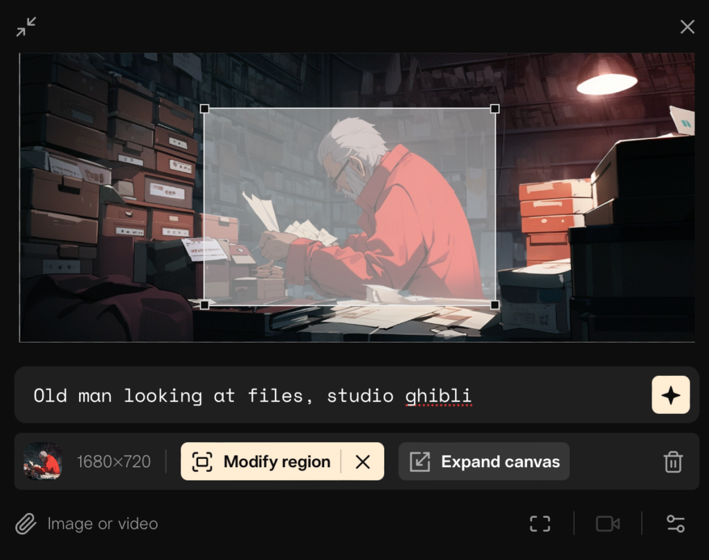
I will be using scene 200 as a sort of playground to try all of this out, here’s what the original version of that looks like as it could be seen at the CMSI exhibition:
Video to video
Starting with maybe the most complex approach, I rendered out a clean version of the scene without subtitles or post processing and then told Pika which region to modify. And well, I think the results speak for themselves.
Prompt: Old man looking at files, studio ghibli Negative Prompts: oversaturated, ugly, bad anatomy, morphing, flickering
Prompt: Old man in a red coat looking at files, studio ghibli Negative Prompts: oversaturated, ugly, bad anatomy, morphing, flickering
After immediately noticing that the first character looks nothing like my generated one, I tried adding ‘In a red coat’ to the prompt, but honestly got an even worse result. Pika understands the lighting conditions well, but just about everything else is unusable; bad anatomy and faces, too drastic of a change in pose and look and uninspired, weird movement. Video to video generation also does not support motion control, leaving me with no control over the animation. Yikes. But it did leave the parts of the video outside of the specified region intact which is something i guess.
Image to video
Since that did not work in the slightest and limits my control even more, let’s move on to stills.
Entire frame
I uploaded a still of the scene with the character and the foreground and background elements visible. I also made use of the Motion control feature, setting the camera to a pan to the left with a strength of 0 to replicate the original motion.
Prompt: Old man in a red coat looking at files, studio ghibli Negative Prompts: oversaturated, ugly, bad anatomy, morphing, flickering
Well at least it got the pan right, kind of – even at a motion strength of 0 (which controls both the animation within the frame as well as the camera motion) it’s still way too fast. My character stayed kind of the same this time, but only because for most of the animation, he didn’t actually move. When he did, he quickly distorted strangely, despite my negative prompts.
Subject only
Starting with a still of just the isolated character on a green background, I hoped for the best results, still more or less using the same prompts:
Prompt: Old man in a red coat looking at files, studio ghibli Negative Prompts: oversaturated, ugly, bad anatomy, morphing, flickering
Ok so green doesn’t work, period. From what I can tell through the clutter, the animation actually looks somewhat decent, but this is obviously unusable, especially since the green background clutter spills into my subject. I don’t understand why Pika won’t allow the user to specify a region when uploading a reference image, I feel like that could have helped a lot here.
Prompt: Old man in a red coat looking at files, studio ghibli Negative Prompts: oversaturated, ugly, bad anatomy, morphing, flickering
Progress is being made! A black background seems to work pretty well, pika perfectly understands that the black parts of the image need to stay black, making compositing easier, at least in theory. It still exhibits quite heavy flickering and the resolution is pretty bad. But the motion is quite nice! This is by far the most promising result so far.
Prompt: Old man in a red coat looking at files, studio ghibli Negative Prompts: oversaturated, ugly, bad anatomy, morphing, flickering
The white background version works great, too! Still the same flickering issue though and while I hoped that the white background would help preserve the outline of the character, the result is so blurry that that advantage is lost, I’m thinking the black background is going to be better.
Prompt: Old man in a red coat looking at files, studio ghibli Negative Prompts: oversaturated, ugly, bad anatomy, morphing, flickering
Just for fun, I also tried uploading a png with actual transparency to see what I would get and the result looks REALLY COOL but not very useful for a clean approach. The artefacts around the subject are 100% created by Pika, the png had a clean alpha, I promise. But maybe this is something to bear in mind in case I want to go into a “data corruption / technology / AI is bad and evil” type of thematic direction, could be very fun.
Prompt: Old man in a red coat looking at files, studio ghibli Negative Prompts: oversaturated, ugly, bad anatomy, morphing, flickering
Finally, I wanted to see what would happen if I gave Pika just the background and told it to create the old man and the camera move. Unfortunately, no character is to be seen an the pan is again, far to aggressive even at a motion strength of 0 and the video is incredibly choppy, at around 6-7 fps despite that being set to 24. The paper flying around is nice, though – maybe this could be useful for animating miscellaneous stuff in the background? But then again, that’s easily and quickly done in After Effects with minimal effort and maximum control.
Text to video
Fortunately the isolated animation looks promising, especially on the black background, but maybe I will want to generate some assets directly in Pika. Honestly, probably not because it takes away a LOT of control, but I wanted to try it out anyway by trying to give Pika a similar prompt to that I used for the original Midjourney generation and seeing if I was happy with anything.
Prompt: 80s anime still of an old man in a red coat sitting in a dimly lit archive going through files, wide shot, studio ghibli style, red and blue color grade Negative Prompts: oversaturated, ugly, bad anatomy, morphing, flickering Consistency with the text: 25 Camera control: pan right, strength of motion: 4
Ok so none of these are really usable. Pika ignored the ‘wide shot’ prompt most of the time, the framing is all over the place as is the motion and the setting and background in general is very very messy. From what I’ve seen in tutorials and other showcases of good anime generations by pika, the prompts are much, much simpler. I’ll try again with something less specific.
Prompt: old man in a red coat Negative Prompts: oversaturated, ugly, bad anatomy, morphing, flickering Consistency with the text: 15 Camera control: strength of motion: 1
Prompt: old man in a red coat Negative Prompts: oversaturated, ugly, bad anatomy, morphing, flickering Consistency with the text: 15 Camera control: pan right, strength of motion: 2
Well the results look acceptable, but obviously unusable for my trailer. Note the extreme differences in the two results that had the same prompts; I’m not even going to bother listing everything that changed, the only thing that remained kind of the same was the color of the character’s jacket.
These shots do show that the AI is powerful, but not very versatile – it can’t adapt well do more specific prompts like Midjourney can. Style is no issue but the results are so drastically different that any story with characters that should appear in more than one shot are out of the question.
Looks like Midjourney will stay as the tool of choice for still creation, but I’ll have to tackle the issue of character consistency there, too. I just got lucky the only reference for an anime old man in a red coat seems to be Stan Lee.
Optimisation (for now)
I want to get at least one shot done today, so I’ll try to get the best result out of the version with the black background. First of all, I want to get rid of the flickering, after that I can worry about the animation and the resolution. I’m doing this mainly by adding negative prompts and telling Pika to stay more consistent with my text input.
Prompt: an old man in a red coat looking at files, studio ghibli Negative Prompts: oversaturated, ugly, bad anatomy, distortion, inaccurate limbs, morphing, flickering, flicker, strobe effect Consistency with the text: 25 (max) Camera control: strength of motion: 1
Pretty good start, the flicker seems to be mostly gone, but I think that the high consistency caused the ‘oversaturated’ negative prompt to go a little crazy, giving us this washed out look. I put that prompt in there since most image to video generations apparently get oversaturated quickly, but let’s try removing that:
Prompt: an old man in a red coat looking at files, studio ghibli Negative Prompts: ugly, bad anatomy, distortion, inaccurate limbs, morphing, flickering, flicker, strobe effect Consistency with the text: 25 (max) Camera control: strength of motion: 1
Well that’s weird – removing the ‘oversaturation’ negative prompt has increased the flicker drastically. Hmm, let’s add that back in and try to turn down the consistency.
Prompt: an old man in a red coat looking at files, studio ghibli Negative Prompts: oversaturated, ugly, bad anatomy, distortion, inaccurate limbs, morphing, flickering, flicker, strobe effect Consistency with the text: 20 Camera control: strength of motion: 1
Well, it looks like the flicker is back – I think I’ll go back to a consistency of 25 since that looked the best and washed out colors are easier to fix than flickering. However, I started to notice that there is a slight zoom in with all of these generations, despite my camera controls being empty. I’ll try adding a negative prompt to prevent zooms, and if that doesn’t help I’ll have to reduce the strength of motion to 0, which I want to avoid since that will also affect my character animation.
Prompt: an old man in a red coat looking at files, studio ghibli Negative Prompts: oversaturated, ugly, bad anatomy, distortion, inaccurate limbs, morphing, flickering, flicker, strobe effect, camera zoom, camera tilt, camera pan, camera rotation Consistency with the text: 25 Camera control: strength of motion: 1
God damn it, I don’t know what it is but my negative prompts don’t seem to represent exactly what’s happening with the generations – the flicker is gone, sure. But the zoom is still there, and what’s worse is that the animation is terrible this time. I think the amount of negative prompts may be too much for Pika, leaving it wondering which ones to consider more than others.
Prompt: an old man in a red coat looking at files, studio ghibli Negative Prompts: oversaturated, ugly, bad anatomy, distortion, inaccurate limbs, morphing, flickering Consistency with the text: 25 Camera control: strength of motion: 0
This time, i reduced the amount of negative prompts and the strength of motion to 0, but as suspected, this reduced the animation of my character to almost nothing 🙁
I went back to the first settings but found that my prompts didn’t matter that much, with iterations of the same exact prompts resulting in different outcomes, randomly adhering or ignoring negative prompts and specifications.
However, what did make a big difference was the seed. I tried running the same exact prompt, even with the same seed and got a much more similar result. I think that’s the method here – not worrying too much about the negative prompts and reiterating until you are happy with a certain seed, then reiterate further with that specific seed if needed.
After I chose a version I was happy with, I added four seconds to the animation, since my original shot is around 5 seconds long, making sure to include the seed for that as well.
Prompt: an old man in a red coat looking at files, studio ghibli, +4 seconds Negative Prompts: N/A Consistency with the text: 25 Camera control: strength of motion: 1
I did not, however notice that using the ‘add four seconds’ feature does not include your negative prompts for no apparent reason, leaving me this abomination. Gotta fix that real quick.
Prompt: an old man in a red coat looking at files, studio ghibli, +4 seconds Negative Prompts: oversaturated, ugly, bad anatomy, distortion, inaccurate limbs, morphing, flickering Consistency with the text: 25 Camera control: strength of motion: 1
Ok, this finally works somewhat, though it’s still quite rough. Moving on to After Effects. And the next blog post because this already took hours.
Alright it’s over. We’ve figured out video AI. Those were essentially my first thoughts when I first saw OpenAI’s newest development, Sora: their impressive own generative video AI. The diffusion transformer model is capable of generating up to a minute of fullHD video based on text prompts, and/or input images and videos, even being able to merge/transition between two input videos, though it does seem to alter the given videos quite drastically.
Strengths
Most examples show realistic styles but the model also seems to be capable of stylised 3D and 2D video and still generations. But the focus seems to be especially on realistic generations, many of which are essentially flawless.
Text to Image
Prompt: A stylish woman walks down a Tokyo street filled with warm glowing neon and animated city signage. She wears a black leather jacket, a long red dress, and black boots, and carries a black purse. She wears sunglasses and red lipstick. She walks confidently and casually. The street is damp and reflective, creating a mirror effect of the colorful lights. Many pedestrians walk about.
As seen here, the model has exceptional understanding of 3D space, geometry, human anatomy as well as lighting and, perhaps most impressively, reflections. It’s not perfect, of course, but considering this is the worst the model will ever perform, I’d say we aren’t far from it.
In this example, the model shows excellent understandings of the chameleon’s anatomy and motion as well as the camera’s optics and overall geometric consistency. Again, it’s not perfect, but it is still incredibly impressive.
Prompt: This close-up shot of a chameleon showcases its striking color changing capabilities. The background is blurred, drawing attention to the animal’s striking appearance.
Image to Video
Here we see Sora’s first stylised performance, using an image generated by DALL-E 2 or DALL-E 3, which of the two was used for this particular image was not disclosed.
The model shows appropriate understanding of how 2D characters like these are often animated, but the result is rougher than the more realistic approaches, showing weird motion and morphing of body parts. It is also the only 2D example they gave, which leaves me worrying a bit for my anime application.
Prompt: Monster Illustration in flat design style of a diverse family of monsters. The group includes a furry brown monster, a sleek black monster with antennas, a spotted green monster, and a tiny polka-dotted monster, all interacting in a playful environment.
Furthermore, OpenAI did not disclose whether the prompt was given to DALL-E 2, DALL-E 3 or Sora, so it is a bit difficult to judge the model’s performance.
Video to Video
Sora is capable of ingesting any video, be it “real” or AI-Generated and changing certain aspects of it. At the moment it looks like the AI only affects the entire frame, and changes aspects of the video the user does not specify to be changed. This behaviour reminds me a bit of ChatGPT failing to generate, say, a “room without an elephant in it”, but as I mentioned before – this version of Sora is the worst we will ever have.
The base video, its prompt not being given on disclosed.
As we can see, the AI changes the entire frame, completely changing the car and even altering the road slightly.
Prompt: change the setting to be a lush jungle
Here, even after specifically asking the AI to “Keep the video the same”, it is still making drastic changes in my opinion.
Prompt: keep the video the same but make it be winter
An intriguing feature is Sora’s ability to blend between two videos, creating creative transitions that show the model’s exceptional understandings of 3D space, and motion, but definitely also shows it struggling with scale.
Input video 1
Prompt undisclosed
Input video 2
Prompt undisclosed
Connected video.
Prompt undisclosed
As previously mentioned, the model finds creative ways to combine the videos and there are many more examples on OpenAI’s website which I have linked below, but it does get the scale pretty wrong. What I find impressive is that even though the input videos are being changed very drastically, the first frame of video 1 and the last frame of video 2 match perfectly with Sora’s stitched generation, meaning one could use shorter transitions and have original footage before after the transition with no hiccups.
Simulation
I’m not sure to call this a feature, as OpenAI seems to use the term ‘Simulation’ to show off the model’s understandings of 3D, object permeance and object interactions. But they also point out that Sora has a good understanding of virtual worlds and rulesets complete with its contents, objects and subjects, as can be seen here:
Prompt semi-disclosed: ‘captions mentioning “Minecraft.”’ as per OpenAI
OpenAI say that this development is promising in possible actual simulation applications of AI, not just Minecraft. But apart from the pig fading out of existence spontaneously it is very impressive; what surprises me the most is the consistency in the player HUD, sword and movement of the character through the virtual world. OpenAI claim that Sora is capable of “simultaneously controlling the player (…) while also rendering the world”, but don’t go in too much detail. I wonder how good Sora’s understanding of the virtual world actually is and how well it understands the user’s prompts.
Weaknesses
Apart from the familiar struggles with human anatomy, especially hands and fingers, the model does not seem to like physics very much, generating illogical motion when asked to produce things like explosions or destruction.
Prompt undisclosed
Some errors are more familiar, again, like objects or subjects popping in and out of existence and sometimes even merging with each other.
Prompt: Five gray wolf pups frolicking and chasing each other around a remote gravel road, surrounded by grass. The pups run and leap, chasing each other, and nipping at each other, playing.
And some errors are just pretty funny.
Prompt: Step-printing scene of a person running, cinematic film shot in 35mm.
Safety
In the name of safety, Sora is not yet available to the public, only being entrusted to a number of “red teamers”, a selection of experts in misinformation, hateful content and bias and will be testing the model before it is released. OpenAI will naturally apply similar text classification processes that it is already using for DALL-E and ChatGPT to reject text input that features likenesses, intellectual property or sexual content. Additionally, before a video is presented to the user, Sora checks every frame of generated content for potentially violating results. OpenAI is also focussing on developing methods to detect whether content is AI-Generated or not and directly embedding robust metadata into any generations by Sora.
Thoughts
WELL. Given that the technology of Text to Video AI is only about a year old, this obviously shows just how fast things are moving at the moment, and therefore also underlines the potentially short significance of my master’s thesis. Anime AI generation seems to be a very, very niche application, so I have that going for me, which is nice, but the development is crazy fast, moving from horrifying AI generated video that are obviously unusable and only a technical showcase of what could be possible to nearly flawless results within one year.
Prompt: Will Smith eating Spaghetti (March 2023, Stable Diffusion)
I still think that my thesis will have its own value, especially if I focus on comparing traditional with AI-assisted methods and also talk about the creative aspect of the whole media design process. And new developments are seldom bad – let’s hope that these developments are also beneficial for me.
After having spent some time off after a busy fifth semester it’s now time for me to take the whole master’s thesis thing seriously. 2024, albeit mostly filled with meeting deadlines for our short movie and the exhibition, already presented me with two very interesting meetings, one with Roman Pürcher, followed closely with a meeting with Ursula Lagger.
Both meetings gave me valuable input on my thesis and I’ve more or less summarised them in my last blog post so I won’t go into detail here. Coming back after my time off and looking at the state of my thesis, I noticed that my exposé, even the revised one from early January, was very outdated and confused about the focus of the thesis, especially its preliminary structure.
This is what I want to update today – I want to restructure everything based on my last two meetings, my last blog post and what I really want to create and say with the thesis. Following that, I want to do a quick literature research to see what I can find about which topic and maybe adjust the structure accordingly.
Revised structure as of 17.02.24
Introduction
1.1. Applications of AI in graphic and motion design
1.2. Introduction to Generative Models
Methodology
2.1.Creative Methodology & Storytelling
2.1.1. Examples with a focus on Anime and Manga
2.1.1.1. Traditional
2.1.1.2. AI-Assisted
2.1.2. My approach
2.2.Technical Methodology
2.2.1. Examples
2.2.1.1. Traditional
2.2.1.2. AI-Assisted
2.2.2. My approach
Practical Implementation: Short Anime Movie
3.1. Preproduction
3.1.1. Concept
3.1.2. Script
3.1.3. Storyboard
3.2. Production
3.2.1. Text-To-Image
3.2.2. AI-Animation
3.3. Post Production
3.3.1. Editing
3.3.2. Sound Design
Results and Discussion
4.1. Analysis of the Short Anime Movie
4.2. Comparisons to aforementioned Examples
4.2.1. Technically
4.2.2. Creatively
4.3. Potential Impacts of AI on the Creative Industry (?)
Conclusion
Bibliography
Appendix, Images and Interviews
Thoughts
I feel like this structure is much more streamlined and feels more focused. However, I could not find a way to comfortably and purposefully work in my proposed theoretical part on paradigm shifts in the past vs. now, since I believe that is what we are experiencing with AI at the moment. I feel like I could write an entire paper about just that but that would probably mean omitting a practical part and would essentially be a cultural / historical paper which is not what my master is about.
So what do I include? Speculation about AI in the creative industries? Maybe; nobody can prove me wrong there and I’m sure I will be able to use my experiences and findings to make some claims. However, Ursula Lagger has also stated that a speculative section necessitates a proper historical and cultural part to back my claims up, which is missing the point again.
It looks like the theoretical approach will focus more on the comparisons I will draw between traditional anime production as well as other contemporary AI-assisted approaches and my own work. Again, this feels like a much more streamlined direction for the paper and more appropriate for my master’s thesis. I hope I can find enough literature for this part, too. Unlike my bachelor’s thesis, I want to focus more on the creative process rather than the technical part, but that will have to be included in some capacity too, I guess I’ll see.
I also spoke to Ursula Lagger about potential expert interviews and she suggested conducting one with a futurologist to get more insight on the current developments of AI with someone who has a good understanding of the past, but now that seems inappropriate. I think it would be much more valuable to interview a contemporary artist that uses AI in a similar way to me, ideally someone who also has traditional experience. I’ll see who I can find, I may want to go big on this one and try to shoot many big artists messages about email interviews, which are of course not as good as actual talks but are less work for the artists, which may increase my odds of one of them actually panning out.
All in all, while this structure is objectively better, I’m not sure if its theoretical and scientific contents are enough for a master’s thesis. But that’s something I can and will talk about with my supervisor.