I chose to explore Sam Bilbow’s paper ‘Evaluating polaris~ – An Audiovisual Augmented Reality Experience Built on Open-Source Hardware and Software’.
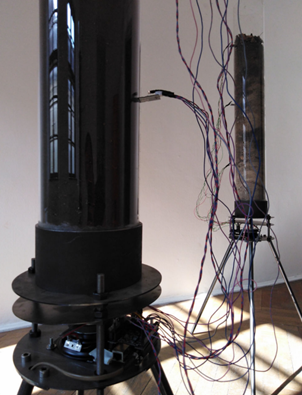
The text discusses how augmented reality technology is being used in artistic practice to create experiences that combine virtual and real-world elements. The paper introduces an AR experience called polaris~, which was created using a combination of open-source hardware and software. The experience is designed to be cost-effective and privacy-respecting. The AR elements are spatially aligned with the real-world environment using Unity and PureData, and can be interacted with gesturally to foster artistic and musical expression.
To evaluate the polaris~ experience, the author recruited 10 participants who spent about 30 minutes each in the AR scene and were interviewed about their experience. The results showed that the experience engaged participants effectively, allowing them to express themselves audiovisually in creative ways.
Overall, the paper presents a framework for creating similar AR experiences using open-source components and highlights the potential of AR as a medium for artistic expression. The polaris~ experience and the framework used to create it are available on Github, providing a valuable resource for other artists and developers interested in exploring the creative possibilities of AR technology.
One big advantage of this project is the focus on using open-source hardware and software to create cost-effective and privacy-respecting AR experiences. This is an important consideration given the potential privacy concerns associated with AR technology and the need to make it accessible to a wide range of users.
In my opinion this project provides a valuable contribution to the field of AR art and offers a useful framework for creating similar AR experiences.