A very big problem for people not getting the help they need with psychological problems is often fear. Individuals fear judgment they would receive from others, change, and the unknown. There are many mental blocks and stereotypes that get stuck in our heads due to social stigmas that need to be removed. However, this is not an easy process. In the following, a few creative solutions will be presented.
Campaigns
Educational campaigns serve to disseminate information about specific facts, products or regional conditions in a targeted and widespread manner. In the area of health, the aim is to educate/inform about health risks that result from a certain behavior, are associated with the consumption of certain products or arise from regional conditions. At the same time, information is usually given on recommended behavior.
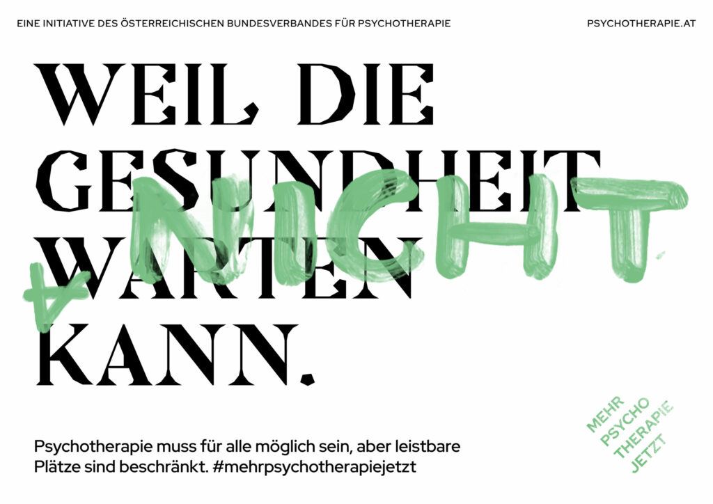
The Austrian Federal Association for Psychotherapy has launched #mehrpsychotherapiejetzt.
The Campain Goals are:
More places for psychotherapy financed by health insurance funds
The destigmatization of mental illnesses, because going to psychotherapy is as normal as treatment for physical illnesses.
Psychotherapy for all on a health insurance voucher, i.e. a complete abolition of quotas.
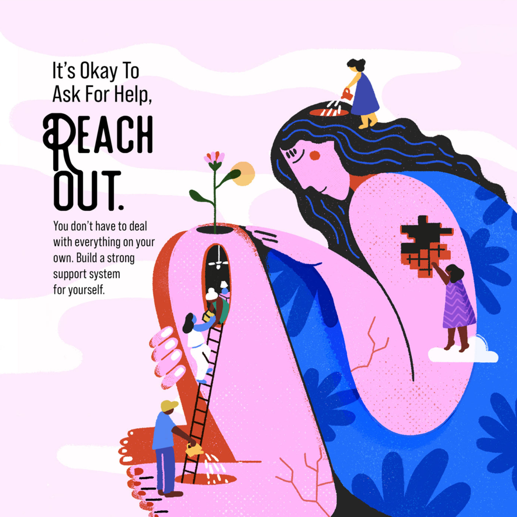
Let´s Talk in an illustrated Mental health Campaign.
It´s natural for feelings, thoughts, and emotions to build uo over a period of time.
This can create, loneliness, feelings of isolation and stress amongst many other things.
The illustrator Nayantara Surendranath worked with Disney Star on their mental health campaign to address these very issues, to encourage people to voice their feelings and to speak to a mental health professional should they need to.
Books
Picture books are a great tool to educate children in particular and to prevent stigma and prejudice against therapy.
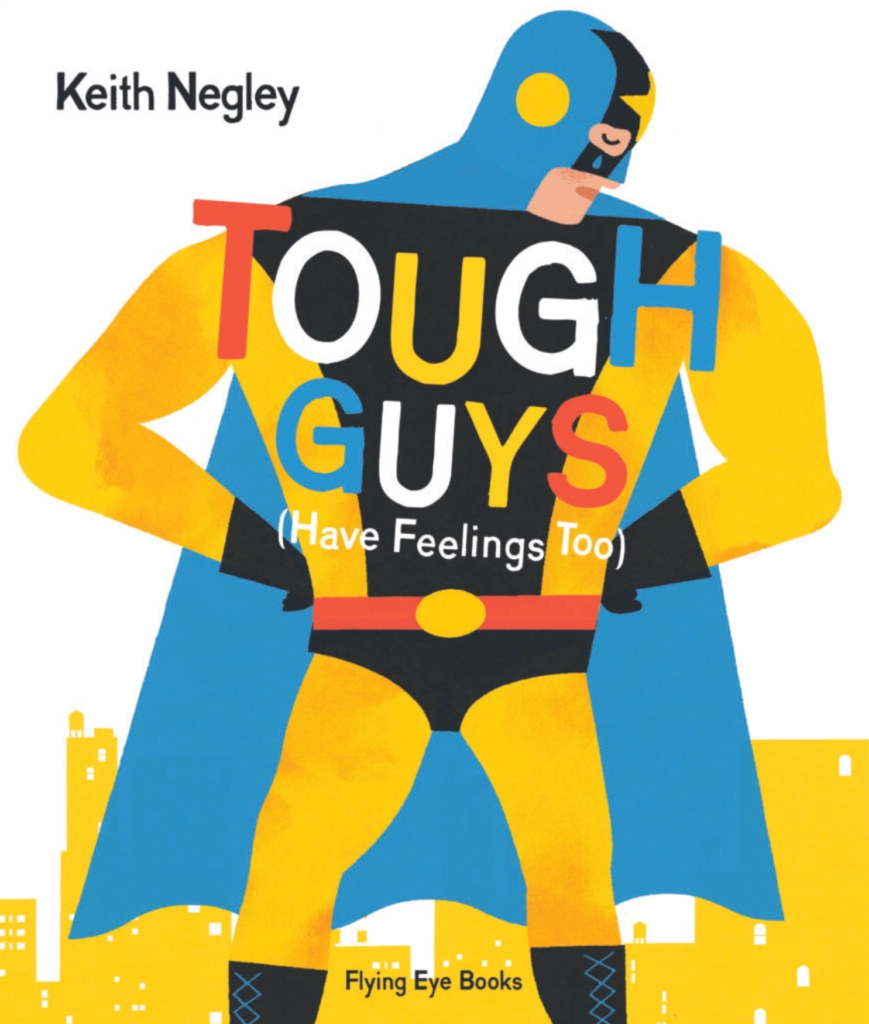
Keith Negley – Tough Guys (have feelings too)
A boldly illustrated picture book read-aloud about how everyone gets sad—ninjas, wrestlers, knights, superheroes, everyone . . . even daddies have emotions to show destigmatize men not having feelings.
Did you know that wrestlers have feelings? Knights do too. Even superheroes feel sad sometimes. In fact everyone has feelings – even dads who love their children!
Children will love to recognise the feelings in Keith Negley’s bold illustrations which accompany a fun-to-read aloud narrative. Parents can enjoy and engage with children in a light-hearted discussion about emotions and how they affect us all.
Exhebitions
Interest in the use of museums to address mental health stigma seems to be growing. In its 2022 Trendwatch report, the American Alliance of Museums devoted an entire section to how museums can be community pillars in the realm of mental health, and another section to how museums can be pillars for the education of children and also for adults.
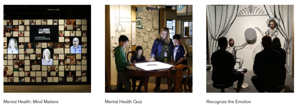
Mental Health: Mind Matters
A new traveling exhibit called Mental Health: Mind Matters, which has just opened at Museum of Science Bosten, points toward a potentially different way to initiate conversations about mental health issues that can engage parents and children alike. Addressing stigma among children is especially important since we know that negative stereotypes are absorbed during childhood as part of the socialization process (including from popular media such as movies), such that they are considered to be part of the general knowledge about the world that one takes for granted by the time one reaches adulthood.
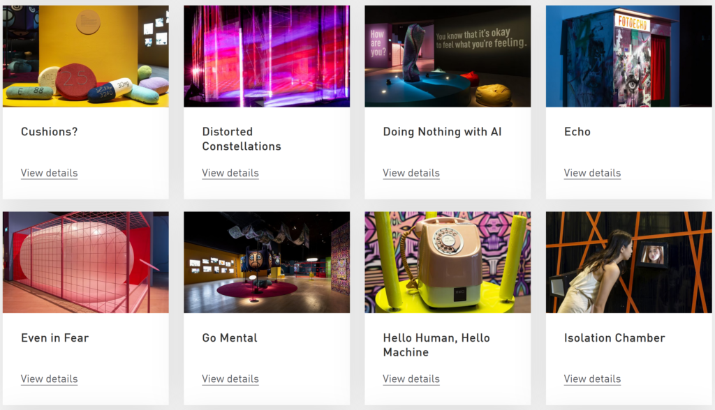
MENTAL: Colours of Wellbeing
MENTAL: Colours of Wellbeing is not an exhibition about mental illness, treatments or cures. It is a welcoming place where you can confront societal bias and stereotypes around mental health. MENTAL invites you to embark on an intimate and personal journey that explores the many different ways of being, surviving and making connections, that have become of increasing importance to us all.
This exhibition features 24 interactive exhibits, art projects and large-scale installations by international artists, makers, scientists and designers that reflect a range of perspectives on mental health and ways of being. In addition, there are seven artworks by Singaporean and Southeast Asian artists that explore mental health from a uniquely Southeast Asian perspective.