Bei meiner Recherche über Visual Storytelling bin ich auf das Buch „Framed Ink: Drawing and Composition for Visual Storytellers“ von Marcos Mateu-mestre gestoßen.
Laut Marcos Mateu-Mestre müssen wir uns über folgende Dinge klarwerden wenn wir eine Geschichte erzählen wollen:
- Was wollen wir mit unserer Erzählung sagen?
- In welche Stimmung wollen wir unser Publikum während der Geschichte versetzen?
- Wie wollen wir unser Publikum in diese Stimmung versetzten?
- Was ist die Funktion dieser Szene in der Geschichte?
- Was in unserer Zeichnung trägt zu unserer Gesamtaussage bei?
- Was können wir weglassen, ohne unsere Aussage zu verändern?
Wenn ein Bild keinen Zweck innerhalb des Gesamtbildes erfüllt und nichts zur Geschichte beiträgt, wird es die Betrachter aus der Erzählung reißen.
Um die gewünschte Stimmung zu erzeugen und die Geschichte eindrucksvoll und glaubwürdig zu erzählen nennt Marcos Mateu-Mestre folgende Elemente die man in der Komposition anwenden kann:
Totale:
Diese Perspektive zeigt, wo sich der Charakter befindet. Er zeigt den Charakter zusammen mit seiner Umgebung und in welche Situation er gerade ist.
Halbtotale:
Auch hier ist noch viel von der Umgebung zu sehen aber Elemente, die von der Botschaft der Szene ablenken würden, befinden sich nun außerhalb des Bildrands.
Nahaufnahme:
Hier wird sich auf den Charakter selbst und seine Reaktion fokussiert. In diesem Ausschnitt ist die Reaktion des Charakters wichtiger als die Ursache die sie ausgelöst hat.
Extreme Nahaufnahme:
Eine noch nähere Abbildung, um kleine Details oder Emotionen des Charakters in den Fokus zu rücken.
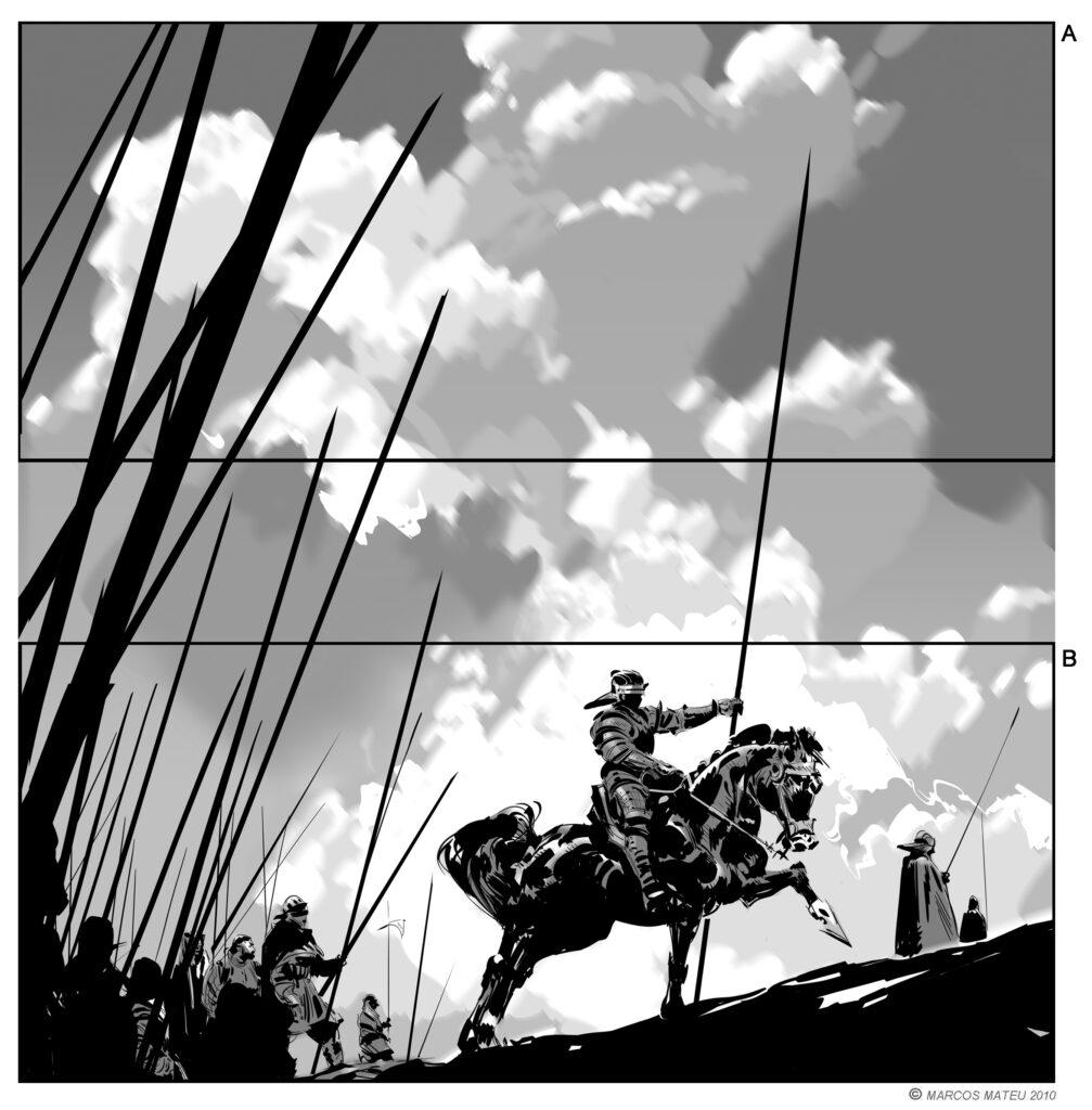
Drittelregel:
Bei dieser Regel wird das Bild gedanklich durch je zwei horizontale und vertikale Linien geteilt und so in neun gleiche Teile gegliedert. Die Hauptelemente auf eine der Linien oder deren Schnittpunkten zu setzen hilft dabei ein interessantes Gesamtbild zu erhalten.
Licht:
Durch den Einsatz von Licht und Kontrast kann man den Fokus auf bestimmte Stellen des Bildes zu lenken und die Stimmung des Bildes maßgeblich beeinflussen.
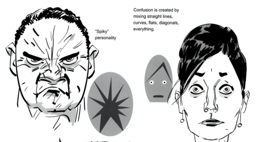
Linien:
Linien dienen dazu die Blicke auf bestimmte Elemente des Bildes zu lenken.
Auch die Form der Linien hat einen großen Einfluss darauf wie das Bild wahrgenommen wird.
Gerundete Linien wirken friedlich, diagonale Linien hingegen wirken dynamisch und aggressiv wirken.
Vermeide Tangenten und seltsame Berührungspunkte:
Solche Punkte lenken von der eigentlichen Geschichte ab und erwecken, das Gefühl dass etwas nicht ganz stimmig ist.
Größenunterschiede:
Eine ungleiche Balance von Formen und Figuren in einem Bild macht ein Bild tiefer, dynamischer und interessanter. Es gibt auch die Möglichkeit bestimmten Elementen des Bildes mehr Gewicht zu geben und in den Vordergrund zu rücken.
Perspektive:
Wir neigen dazu, den Blick auf den Fluchtpunkt zu richten. Insbesondere bei architektonischen Umgebungen sind alle Linien auf diesen Punkt ausgerichtet und lassen so einen offensichtlichen Punkt da auf den sich unsere Augen fokussieren.
Blickrichtung:
Die Richtung, in der ein Hauptcharakter blickt beeinflusst die komplette Komposition und lenkt den Blick des Betrachtenden ebenfalls dorthin. So wird das Gefühl vermittelt, dass dort etwas Wichtiges geschieht.